---
title: "Biodiversity and ecosystem function in R"
description: "The biodiversity-ecosystem function relationship in R: relative yields, overyielding, and why beating the average monoculture differs from beating the best."
date: "2026-06-29 10:00"
categories: [ecology tutorial, R, biodiversity, ecosystem function, community ecology]
image: thumbnail.png
image-alt: "Bar chart of three yields in grams per square metre: average monoculture near 340, the mixture near 470 picked out in dark green, and best monoculture at 600. The mixture bar stands above the monoculture average but clearly below the best monoculture."
---
```{r setup}
#| code-fold: true
#| code-summary: "Setup: packages, colours and plot theme"
#| results: hide
#| message: false
#| warning: false
knitr::opts_chunk$set(echo = TRUE, message = FALSE, warning = FALSE,
                      dev = "png", dpi = 120, fig.path = "figures/",
                      fig.width = 7, fig.height = 4.4)
library(ggplot2)
theme_te <- theme_minimal(base_size = 12) +
  theme(panel.background = element_rect(fill = "#f5f4ee", colour = NA),
        plot.background  = element_rect(fill = "#f5f4ee", colour = NA),
        panel.grid.minor = element_blank(),
        plot.title = element_text(face = "bold", size = 12))
theme_set(theme_te)
col_mono <- "#8aa29e"; col_mix <- "#3a6b52"; col_exp <- "#b5651d"; col_ref <- "#555555"

## ---- flagship four-species example (exact) ----
M    <- c(100, 250, 400, 600)
N    <- length(M)
RYe  <- rep(1/N, N)
YE   <- sum(RYe * M)                 # expected mixture yield (substitutive)
RYo  <- RYe + 0.10                   # a uniform complementarity boost
YO   <- sum(RYo * M)                 # observed mixture yield
dY   <- YO - YE                      # net biodiversity effect
RYT  <- sum(RYo)                     # relative yield total
mean_mono <- mean(M); max_mono <- max(M)
gain_avg  <- 100 * (YO/mean_mono - 1)
short_best <- 100 * (1 - YO/max_mono)

## ---- a biodiversity gradient (simulation) ----
set.seed(387)
pool   <- 12
M_pool <- round(exp(rnorm(pool, log(300), 0.5)))
reps   <- 200
rich   <- 1:8
res <- data.frame()
for (k in rich) {
  for (r in 1:reps) {
    sp <- sample(pool, k); Mk <- M_pool[sp]; RYek <- rep(1/k, k)
    if (k == 1) { mixY <- Mk[1]; net <- 0 } else {
      dRY <- 0.06 + 0.00025 * (Mk - mean(Mk)) + rnorm(k, 0, 0.02)
      RYok <- pmax(RYek + dRY, 0)
      mixY <- sum(RYok * Mk); net <- mixY - sum(RYek * Mk)
    }
    res <- rbind(res, data.frame(k = k, mixY = mixY, meanMono = mean(Mk),
                                 maxMono = max(Mk), net = net,
                                 transg = as.integer(mixY > max(Mk))))
  }
}
agg   <- aggregate(cbind(mixY, meanMono, maxMono, net, transg) ~ k, res, mean)
slope <- coef(lm(mixY ~ log(k), data = res))[2]
transg_pct <- 100 * mean(res$transg[res$k >= 2])
net_k8 <- mean(res$net[res$k == 8])
mixY_k1 <- agg$mixY[agg$k == 1]; mixY_k8 <- agg$mixY[agg$k == 8]
```
A recurring result in community ecology is that a mixture of species often produces more (more biomass, more yield, more of whatever function you measure) than you would guess from growing each species on its own. This is the biodiversity-ecosystem function relationship, and it sits behind a large experimental literature (Tilman et al. 2001 Science 294(5543):843-845; Cardinale et al. 2012 Nature 486(7401):59-67).
The idea is simple, but two versions of it get mixed up, and they are not the same claim. The first: does a mixture beat the **average** of its component monocultures? The second: does a mixture beat the **best** single species grown alone? The first is the everyday biodiversity-ecosystem function signal. The second, called transgressive overyielding, is a much stronger statement, and it is far rarer. This post builds both in R, and the follow-up posts take apart *why* a mixture overyields.
## One mixture, worked by hand
Take four grassland species with monoculture yields of `r M[1]`, `r M[2]`, `r M[3]` and `r M[4]` g/m^2^. We sow them in an equal, replacement (substitutive) mixture: each species gets a quarter of the plot, so its expected relative yield is `r sprintf("%.2f", RYe[1])`. With no interaction at all, each species should return a quarter of its monoculture, and the mixture should yield the average monoculture.
```{r flagship}
M   <- c(100, 250, 400, 600)
RYe <- rep(1/4, 4)
YE  <- sum(RYe * M)          # expected: no interaction
RYo <- RYe + 0.10           # observed relative yields: a complementarity boost
YO  <- sum(RYo * M)         # observed mixture yield
c(expected = YE, observed = YO, net = YO - YE, RYT = sum(RYo))
```
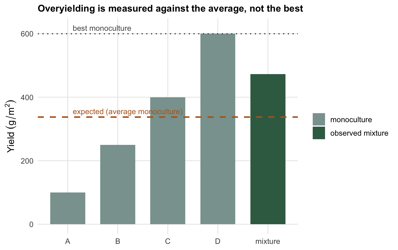
The expected yield is `r sprintf("%.1f", YE)` g/m^2^, exactly the mean of the four monocultures. The observed mixture returns `r sprintf("%.1f", YO)`, so the net biodiversity effect is `r sprintf("%.1f", dY)` g/m^2^: the mixture overyields its average monoculture by `r sprintf("%.0f", gain_avg)`%.
Now the second question. The best single species yields `r max_mono` g/m^2^ on its own. The mixture returns `r sprintf("%.1f", YO)`, which falls `r sprintf("%.0f", short_best)`% short of that. So the same mixture that clearly beats the average monoculture still loses to the best one. Both statements are true at once, and reporting only the first while implying the second is one of the most common overstatements in the field.
```{r fig-flagship}
#| fig-cap: "Four monoculture yields (grey), the expected mixture (no interaction, ochre) and the observed mixture (green). The mixture beats the average monoculture but not the tallest bar."
#| fig-alt: "Bar chart: four grey monoculture bars of increasing height; a green mixture bar sits above the average but below the tallest grey bar; a dashed line marks the average monoculture and a dotted line the best."
d <- data.frame(sp = factor(c("A","B","C","D","mixture")),
                y  = c(M, YO),
                kind = c(rep("monoculture",4), "observed mixture"))
ggplot(d, aes(sp, y, fill = kind)) +
  geom_col(width = 0.7) +
  geom_hline(yintercept = YE, colour = col_exp, linewidth = 0.9, linetype = "dashed") +
  geom_hline(yintercept = max(M), colour = col_ref, linewidth = 0.7, linetype = "dotted") +
  annotate("text", x = 1.1, y = YE + 18, label = "expected (average monoculture)",
           colour = col_exp, hjust = 0, size = 3.4) +
  annotate("text", x = 1.1, y = max(M) + 18, label = "best monoculture",
           colour = col_ref, hjust = 0, size = 3.4) +
  scale_fill_manual(values = c("monoculture" = col_mono, "observed mixture" = col_mix)) +
  labs(x = NULL, y = expression(Yield~(g/m^2)), fill = NULL,
       title = "Overyielding is measured against the average, not the best")
```
## Relative yields and the total
The quantity doing the work above is the **relative yield**: a species' yield in the mixture divided by its yield in monoculture. Summed over the species, it gives the relative yield total (RYT). If every species returns exactly its sown fraction, RYT is one and there is no net effect. Here RYT is `r sprintf("%.2f", RYT)`, above one, which is the signature of complementarity: together the species use the plot more completely than the replacement expectation (Loreau 1998 Oikos 82(3):600-602). RYT below one would mean the species interfere with each other.
Relative yield is why monoculture references matter so much. Every number in this literature is anchored to how each species performs alone, measured in the same conditions. Get the monocultures wrong and the whole partition drifts; the checking post returns to this.
## The relationship across a richness gradient
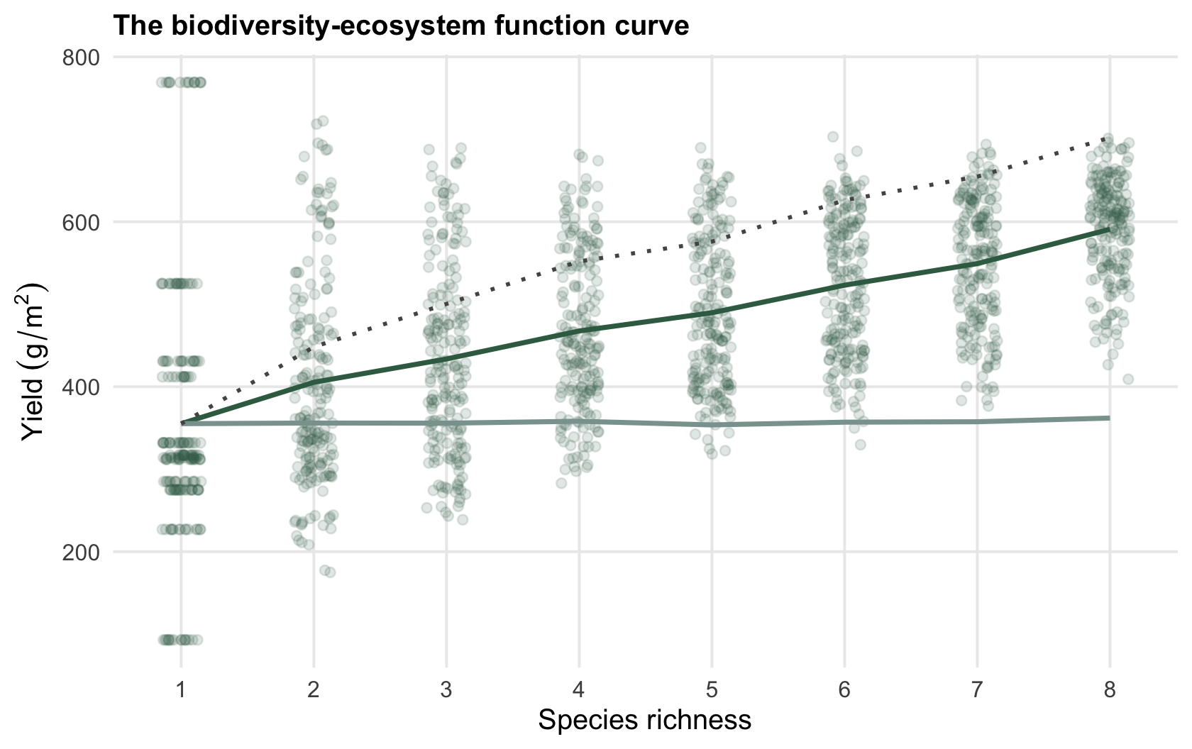
One mixture is an anecdote. The biodiversity-ecosystem function relationship is a *curve*: function plotted against the number of species. Here is a synthetic experiment with a pool of `r pool` species, drawing many random mixtures at each richness level from one to eight and giving each mixture a modest complementarity boost.
```{r fig-gradient}
#| fig-cap: "Mixture yield rising with species richness (green points, jittered; line is the mean). The average monoculture (grey) stays flat; the best monoculture (dotted) climbs because richer draws are more likely to include a productive species."
#| fig-alt: "Scatter of mixture yield against species richness from one to eight, rising from left to right; a flat grey line marks the average monoculture and a rising dotted line marks the best monoculture."
ggplot(res, aes(k, mixY)) +
  geom_jitter(width = 0.15, height = 0, alpha = 0.15, colour = col_mix) +
  geom_line(data = agg, aes(k, mixY), colour = col_mix, linewidth = 1) +
  geom_line(data = agg, aes(k, meanMono), colour = col_mono, linewidth = 1) +
  geom_line(data = agg, aes(k, maxMono), colour = col_ref, linewidth = 0.8, linetype = "dotted") +
  scale_x_continuous(breaks = 1:8) +
  labs(x = "Species richness", y = expression(Yield~(g/m^2)),
       title = "The biodiversity-ecosystem function curve")
```
Mean mixture yield climbs from `r sprintf("%.0f", mixY_k1)` g/m^2^ in monoculture to `r sprintf("%.0f", mixY_k8)` at eight species, a log-linear rise of about `r sprintf("%.0f", slope)` g/m^2^ per unit of log richness. The net biodiversity effect at eight species averages `r sprintf("%.0f", net_k8)` g/m^2^. The average monoculture line, by contrast, is flat: adding species to a plot does not change what the typical species does alone.
The dotted line is the quiet complication. As richness rises, the best monoculture in the draw also rises, because a larger random sample is more likely to contain a highly productive species. That is the sampling effect (Huston 1997): part of what looks like a diversity benefit is just a better chance of including a winner. Across all mixtures of two or more species here, only `r sprintf("%.0f", transg_pct)`% actually beat their best monoculture. The average is easy to beat; the best is not.
## What the curve does and does not say
A rising biodiversity-ecosystem function curve is real and repeatable, and it is a genuine argument that species number matters for function (Hector et al. 1999 Science 286(5442):1123-1127; Isbell et al. 2011 Nature 477(7363):199-202). But on its own it does not tell you *why*. A positive net effect can come from species partitioning resources, from one species subsidising the others, or simply from a productive species being present and dominating. RYT above one narrows it to "the mixture uses the site more completely than expected", and no further.
Separating those causes is the job of the additive partition, which splits the net effect into a complementarity part and a selection part. That is the next post. For now the honest summary is two sentences: mixtures here beat their average monoculture almost always, and beat their best monoculture about one time in five. Keep those two claims apart and most of the confusion in this literature disappears.
A last caution, because these data are often pushed one step further into a claim about stability. Stability is usually quoted as a mean divided by a standard deviation, and where variance scales as a power of the mean, `sd = c * mu^(z/2)`, that ratio goes as `mu^(1 - z/2)`. So the arithmetic hands out a free gain only while the exponent `z` stays below two: there a mixture that simply yields more collects a stability gain of `(mean ratio)^(1 - z/2)` before any species has stabilised anything. At `z` equal to two the ratio does not move with the mean at all and the free gain is exactly zero, and above two it runs the other way, so the more productive mixture scores as the less stable one for the same arithmetic reason. Which side of two the exponent falls on is an empirical question about the data in hand rather than a background assumption, and it is worth settling before the ratio is quoted at all. Part of any diversity-stability slope is the mean-variance relationship rather than an insurance effect, and a stability ratio quoted without both the mean and the exponent beside it cannot be read as either.
## References
- Cardinale BJ et al. 2012. Nature 486(7401):59-67 (10.1038/nature11148).
- Hector A et al. 1999. Science 286(5442):1123-1127 (10.1126/science.286.5442.1123).
- Huston MA 1997. Oecologia 110(4):449-460 (10.1007/s004420050180).
- Isbell F et al. 2011. Nature 477(7363):199-202 (10.1038/nature10282).
- Loreau M 1998. Oikos 82(3):600-602 (10.2307/3546381).
- Tilman D et al. 2001. Science 294(5543):843-845 (10.1126/science.1060391).
## Related tutorials
- [Partitioning the net biodiversity effect](../partitioning-the-net-biodiversity-effect/)
- [Ecosystem multifunctionality and its threshold](../multifunctionality-and-the-threshold/)
- [Species synchrony and community stability](../synchrony-and-community-stability/)
- [Additive diversity partitioning](../additive-diversity-partitioning/)