---
title: "Model selection with AIC in R for ecology"
description: "Compare candidate models in R with AIC, AICc and BIC: read delta values, weigh models with Akaike weights and evidence ratios, then average their predictions."
date: "2026-06-25 13:00"
categories: [R, model selection, AIC, regression, statistics]
image: thumbnail.png
image-alt: "A lollipop chart of delta AIC values for four candidate models, with point size showing Akaike weight."
---
Several tutorials on this blog rank a handful of models and keep the one with the lowest AIC. The [species abundance distribution post](../species-abundance-distributions-radfit/) lets `radfit` order five distributions that way, the [zero-inflated count models post](../zero-inflated-count-models/) compares a Poisson, a negative binomial and a zero-inflated fit, and the [GAM response curve post](../gam-species-response-curves/) chooses between a straight line and a smooth term. Each of those leans on AIC without stopping to say what the number means. This post fills that gap: what AIC scores, how to read the differences between models, and how to act when two models are close.
## What AIC actually measures
The Akaike information criterion balances two things that pull against each other. The first is fit, measured by the maximised log-likelihood: a model that tracks the data closely earns a higher likelihood. The second is complexity, measured by `k`, the number of estimated parameters. AIC is
$$
\text{AIC} = -2\,\log L + 2k,
$$
so a better fit lowers the score and every extra parameter raises it by two. Lower is better. The penalty is what stops you from rewarding a model just for having more knobs to turn, because a more flexible model can always chase the noise in one sample.
Two cautions come straight out of that formula. The absolute value of AIC is meaningless on its own; it depends on the sample and the constant terms in the likelihood, so a value of 1025 tells you nothing until you have a second model to compare it against. And AIC ranks the models you hand it. It cannot tell you that a better model exists outside your set, and it is not a hypothesis test.
## A candidate set for a humped gradient
Many species peak at some intermediate point along an environmental gradient and fall away on either side. We simulate counts with a quadratic mean on the log scale, tuned so the peak sits at the centre of the gradient, and add overdispersion through a negative binomial draw.
```{r}
#| label: data
#| message: false
#| warning: false
library(MASS)
library(mgcv)
library(dplyr)
library(ggplot2)

set.seed(48)
n   <- 180
env <- runif(n, 0, 10)
b0  <- -0.23; b1 <- 1.20; b2 <- -0.12     # peak at env = 5
mu  <- exp(b0 + b1 * env + b2 * env^2)
y   <- rnbinom(n, mu = mu, size = 2.0)
dat <- data.frame(env, y)

c(peak = -b1 / (2 * b2), mean_count = mean(y), max = max(y), zeros = sum(y == 0))
```
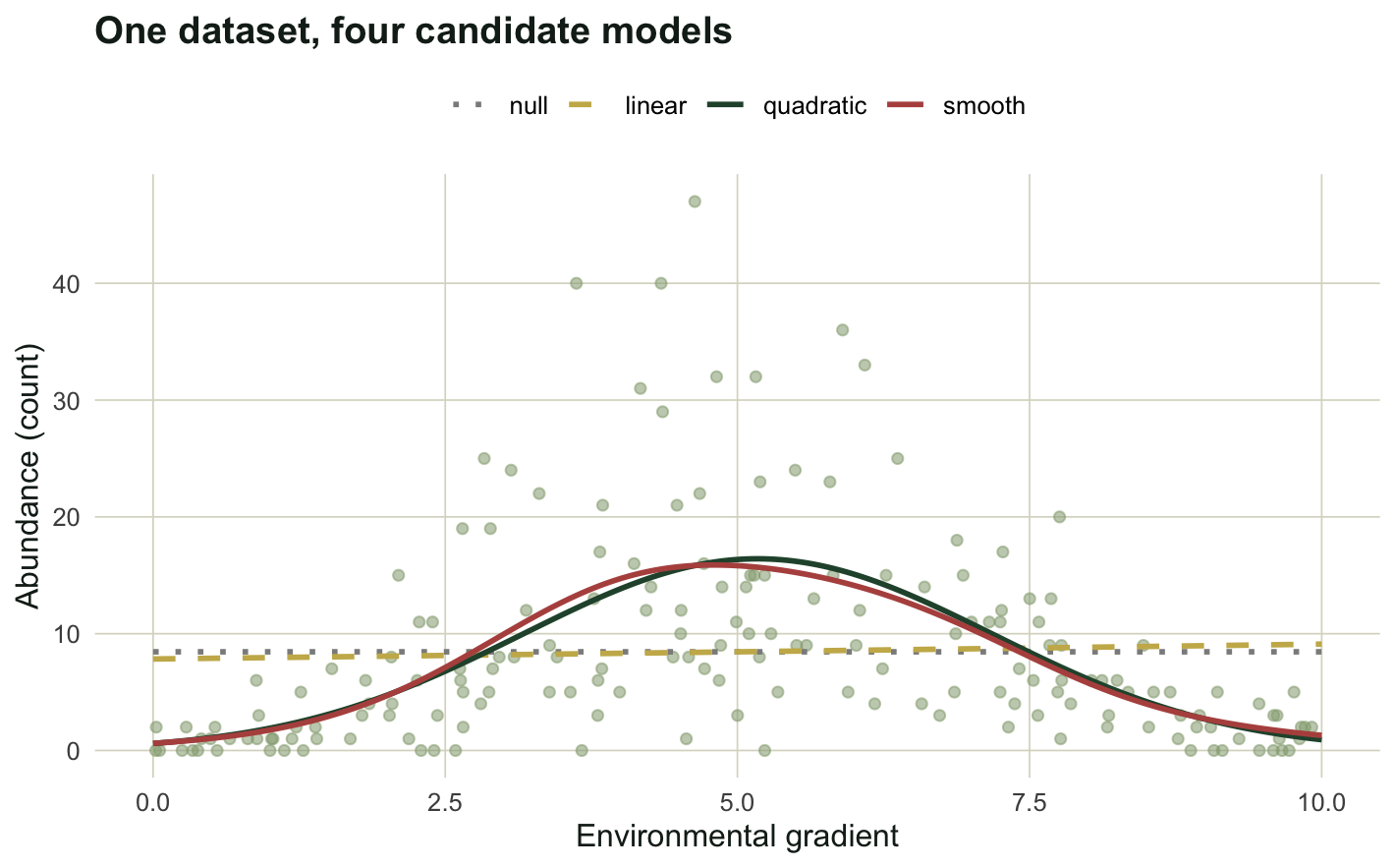
The mean count is about 8.5, the largest count is 47, and 21 of the 180 sites hold zero individuals. Now we fit four candidate models for the same response: an intercept-only null, a linear term, a quadratic term, and a smooth term from a generalised additive model. All four use the negative binomial family so the comparison is about the shape of the mean, not the distribution.
```{r}
#| label: fit
#| message: false
#| warning: false
m0 <- glm.nb(y ~ 1, dat)
m1 <- glm.nb(y ~ env, dat)
m2 <- glm.nb(y ~ env + I(env^2), dat)
m3 <- gam(y ~ s(env), family = nb(), data = dat, method = "REML")
```
## Reading the AIC table
The raw scores are hard to compare by eye, so the working currency of model selection is the difference from the best model, written delta AIC. From those differences we build Akaike weights, which rescale the evidence so it sums to one across the set, and evidence ratios, which say how many times more support the best model has than each competitor.
```{r}
#| label: aic-table
aic  <- c(null = AIC(m0), linear = AIC(m1),
          quadratic = AIC(m2), smooth = AIC(m3))
dAIC <- aic - min(aic)
w    <- exp(-dAIC / 2); w <- w / sum(w)

tab <- data.frame(
  model    = names(aic),
  k        = c(2, 3, 4, round(sum(m3$edf) + 1, 1)),
  AIC      = round(aic, 2),
  dAIC     = round(dAIC, 2),
  weight   = round(w, 3),
  ev_ratio = round(max(w) / w, 1))
tab[order(tab$AIC), ]
```
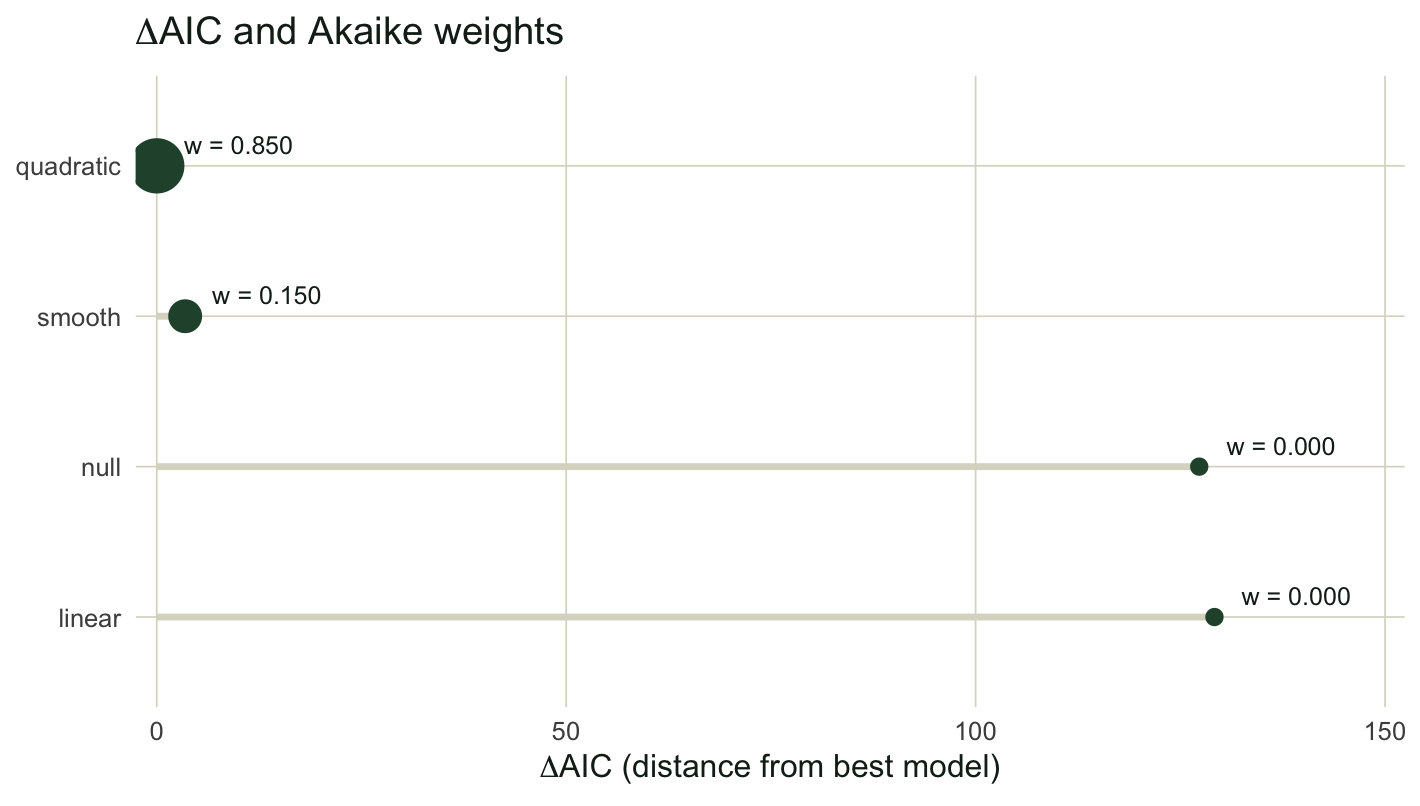
The quadratic model wins with a weight of 0.85. The smooth term sits 3.47 AIC units behind it, holds the remaining weight of 0.15, and carries an evidence ratio of 5.7, meaning the quadratic has roughly six times the support. The null and linear models are out of contention: their delta values of 127 and 129 push their weights to effectively zero.
A common rule of thumb, from Burnham and Anderson, treats models within about 2 AIC units of the best as having substantial support, models between 4 and 7 as having considerably less, and models beyond about 10 as implausible. The smooth term at 3.47 is in the grey zone, which is exactly what you would expect: a flexible smoother can mimic a true quadratic, but it spends extra degrees of freedom (its effective parameter count is about 6.7) to do so, and AIC charges it for them.
```{r}
#| label: fig-curves
#| fig-cap: "One simulated dataset with the four candidate models overlaid. The null and linear fits are nearly flat because the hump has no net direction; the quadratic and the smooth both capture the peak."
#| fig-alt: "Scatter of counts against an environmental gradient with four fitted lines. A dotted null line and dashed linear line are almost flat near the mean, while a solid quadratic and a solid smooth both rise to a peak near the centre and fall away."
#| fig-width: 7.4
#| fig-height: 4.6
#| message: false
#| warning: false
te_forest <- "#275139"; te_gold <- "#c9b458"; te_red <- "#b5534e"
te_sage   <- "#93a87f"; te_ink  <- "#16241d"; te_line <- "#dad9ca"; te_high <- "#1d5b4e"
base_t <- theme_minimal(base_size = 12) +
  theme(panel.grid.minor = element_blank(),
        panel.grid.major = element_line(colour = te_line, linewidth = .3),
        plot.title = element_text(face = "bold", colour = te_ink),
        plot.subtitle = element_text(colour = "#5d6b61"),
        axis.title = element_text(colour = te_ink), legend.position = "top")

grid <- data.frame(env = seq(0, 10, length.out = 200))
pr   <- sapply(list(m0, m1, m2, m3),
               function(m) predict(m, grid, type = "response"))
colnames(pr) <- names(aic)
fitdf <- bind_rows(lapply(names(aic), function(nm)
  data.frame(env = grid$env, fit = pr[, nm], model = nm)))
fitdf$model <- factor(fitdf$model,
                      levels = c("null", "linear", "quadratic", "smooth"))

ggplot() +
  geom_point(data = dat, aes(env, y), colour = te_sage, alpha = .55, size = 1.6) +
  geom_line(data = fitdf, aes(env, fit, colour = model, linetype = model), linewidth = 1) +
  scale_colour_manual(values = c(null = "grey55", linear = te_gold,
                                 quadratic = te_forest, smooth = te_red)) +
  scale_linetype_manual(values = c(null = "dotted", linear = "dashed",
                                   quadratic = "solid", smooth = "solid")) +
  labs(title = "One dataset, four candidate models",
       x = "Environmental gradient", y = "Abundance (count)",
       colour = NULL, linetype = NULL) + base_t
```
## Why the likelihood-ratio test agrees, with one twist
Three of these models are nested, so we can also compare them with a likelihood-ratio test. The result carries a lesson worth pausing on.
```{r}
#| label: lrt
a <- anova(m0, m1, m2, test = "Chisq")
cat("null -> linear: LR =", round(a$`LR stat.`[2], 2),
    " p =", round(a$`Pr(Chi)`[2], 3), "\n")
cat("linear -> quadratic: LR =", round(a$`LR stat.`[3], 1),
    " p =", signif(a$`Pr(Chi)`[3], 2), "\n")
```
Adding the linear term to the null buys almost nothing: the test statistic is 0.14 with a p-value of 0.71. Read carelessly, that says the gradient does not matter. It does not say that. A symmetric hump rises and then falls, so a single straight line through it has no net slope, and a test built on that slope finds nothing. The relationship is real; it simply is not linear. The same point appears in the [GAM response curve post](../gam-species-response-curves/), where a humped species shows a near-zero, non-significant linear coefficient while the smooth term lights up. Adding the quadratic, by contrast, gives a test statistic of 131 and a vanishingly small p-value, which matches the verdict from AIC.
## Small samples: AICc
The factor of `2k` in AIC is a large-sample approximation. When the sample is small relative to the number of parameters, AIC under-penalises complexity and tends to favour models that are too rich. The corrected criterion AICc adds a term that bites hardest when `k` is a sizeable fraction of `n`.
$$
\text{AICc} = \text{AIC} + \frac{2k(k+1)}{n - k - 1}.
$$
```{r}
#| label: aicc
extra <- function(k, N) 2 * k * (k + 1) / (N - k - 1)
cat("extra penalty for k = 4 at n = 180:", round(extra(4, 180), 2), "\n")
cat("extra penalty for k = 4 at n = 24: ", round(extra(4, 24), 2), "\n")
cat("ratio of the two penalties:", round(extra(4, 24) / extra(4, 180), 1), "\n")
```
At our full sample of 180 the correction adds only about a fifth of a unit, so AIC and AICc give the same ranking. Shrink the sample to 24 and the same four-parameter model is charged an extra 2.1 units, roughly nine times heavier. To see this change a decision, we refit the null and quadratic on a 24-row subset.
```{r}
#| label: aicc-subset
#| message: false
#| warning: false
AICc <- function(mod, N) {
  ll <- as.numeric(logLik(mod)); kk <- attr(logLik(mod), "df")
  -2 * ll + 2 * kk + 2 * kk * (kk + 1) / (N - kk - 1)
}
set.seed(7); idx <- sample(n, 24); ds <- dat[idx, ]
s0 <- glm.nb(y ~ 1, ds); s2 <- glm.nb(y ~ env + I(env^2), ds)
cat("quadratic minus null, delta AIC: ",  round(AIC(s2) - AIC(s0), 2), "\n")
cat("quadratic minus null, delta AICc:", round(AICc(s2, 24) - AICc(s0, 24), 2), "\n")
```
The quadratic still wins on the small sample, but its lead narrows from 4.9 units on AIC to 3.4 on AICc. The correction is cheap to compute and harmless at large `n`, so for the sample sizes common in field ecology AICc is the sensible default.
## BIC, and selecting the distribution too
The Bayesian information criterion replaces the factor of two with `log(n)`, so its penalty grows with sample size and it favours simpler models more aggressively than AIC. The two criteria answer slightly different questions, AIC aiming at predictive accuracy and BIC at identifying a true model among the candidates, but here they agree on the ordering.
```{r}
#| label: bic
c(null = BIC(m0), linear = BIC(m1), quadratic = BIC(m2))
```
So far every model used the negative binomial family. Because AIC compares likelihoods, it can also tell you whether you picked the right distribution, as long as the response and the data are held fixed. We refit the quadratic mean with a Poisson family and compare.
```{r}
#| label: pois-vs-nb
#| message: false
#| warning: false
mp <- glm(y ~ env + I(env^2), poisson, data = dat)
cat("Poisson minus NB, delta AIC:", round(AIC(mp) - AIC(m2), 0), "\n")
cat("Poisson Pearson dispersion: ",
    round(sum(residuals(mp, "pearson")^2) / df.residual(mp), 2), "\n")
cat("negative binomial theta: ", round(m2$theta, 2), "\n")
```
The Poisson is worse by 355 AIC units. The reason is overdispersion: the Poisson Pearson dispersion is 4.5, far above the value of one it assumes, while the negative binomial estimates a theta of 2.4 to absorb the extra spread. This is the same diagnostic used in the [count data GLM post](../glm-count-data-abundance/), now read through AIC.
## When models are close: averaging
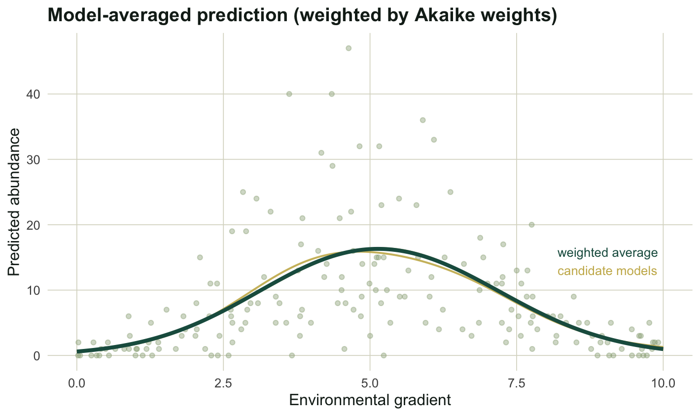
The quadratic and the smooth are close enough that picking one and discarding the other throws away information. Multimodel inference offers an alternative: predict from each model and average the predictions, weighted by the Akaike weights. Models with more support contribute more.
```{r}
#| label: model-average
avg <- as.numeric(pr %*% w)             # Akaike-weighted average prediction
at5 <- which.min(abs(grid$env - 5))
cat("model-averaged mean at env = 5:", round(avg[at5], 2), "\n")
cat("quadratic-only mean at env = 5:", round(pr[at5, "quadratic"], 2), "\n")
```
```{r}
#| label: fig-average
#| fig-cap: "The Akaike-weighted average prediction (dark line) against the two supported candidate curves (gold). With one model dominating the weights, the average sits close to the quadratic."
#| fig-alt: "A scatter of counts with two faint gold candidate curves and one dark heavier line for the weighted average, all peaking near the centre of the gradient and overlapping closely."
#| fig-width: 7.4
#| fig-height: 4.4
avgdf <- data.frame(env = grid$env, avg = avg)
faded <- fitdf %>% filter(model %in% c("quadratic", "smooth"))
ggplot() +
  geom_point(data = dat, aes(env, y), colour = te_sage, alpha = .4, size = 1.4) +
  geom_line(data = faded, aes(env, fit, group = model),
            colour = te_gold, linewidth = .7, alpha = .9) +
  geom_line(data = avgdf, aes(env, avg), colour = te_high, linewidth = 1.4) +
  annotate("text", x = 8.2, y = max(avg) * 0.97, label = "weighted average",
           colour = te_high, size = 3.4, hjust = 0) +
  annotate("text", x = 8.2, y = max(avg) * 0.80, label = "candidate models",
           colour = te_gold, size = 3.4, hjust = 0) +
  labs(title = "Model-averaged prediction (weighted by Akaike weights)",
       x = "Environmental gradient", y = "Predicted abundance") + base_t
```
Here the averaged mean at the gradient centre is 16.3, essentially the same as the quadratic-only value of 16.3, because one model holds most of the weight. The payoff is larger when two or three models share the weight more evenly: averaging then carries the uncertainty about model shape forward into the prediction instead of hiding it behind a single choice.
```{r}
#| label: fig-weights
#| fig-cap: "Delta AIC for each candidate, with point size proportional to its Akaike weight. The quadratic anchors the set at zero; the smooth is the only real competitor."
#| fig-alt: "A horizontal lollipop chart. The quadratic model is at delta AIC zero with a large point, the smooth is near 3.5 with a smaller point, and the null and linear models are far to the right near 127 and 129 with tiny points."
#| fig-width: 7.4
#| fig-height: 4.2
lol <- tab[order(tab$AIC), ]
lol$model <- factor(lol$model, levels = rev(lol$model))
ggplot(lol, aes(dAIC, model)) +
  geom_segment(aes(x = 0, xend = dAIC, yend = model),
               colour = te_line, linewidth = 1.2) +
  geom_point(aes(size = weight), colour = te_forest) +
  geom_text(aes(label = sprintf("w = %.3f", weight)),
            hjust = -0.25, vjust = -0.7, size = 3.3, colour = te_ink) +
  scale_size(range = c(2.5, 9), guide = "none") +
  scale_x_continuous(expand = expansion(mult = c(.02, .18))) +
  labs(title = expression(paste(Delta, "AIC and Akaike weights")),
       x = expression(paste(Delta, "AIC (distance from best model)")),
       y = NULL) + base_t + theme(legend.position = "none")
```
## What AIC will not do
Three limits are worth keeping in front of you. AIC ranks within the set you supply; it never validates the set, so if every candidate is wrong, AIC simply finds the least wrong of a bad lot. It requires the same response for every model, which means you cannot use it to compare a model of raw counts against a model of log-transformed counts, or a Poisson fit against a model with a different number of rows after dropping cases. And a low delta AIC is not a p-value: it is a statement of relative support, not a test against a null. Used with those limits in mind, AIC, its small-sample correction AICc, and the weights and evidence ratios built on them give a clear, reproducible way to choose among ecological models, and a way to keep more than one when the data do not single out a winner.
## References
Akaike H 1974 IEEE Transactions on Automatic Control 19(6):716-723 (10.1109/TAC.1974.1100705)
Schwarz G 1978 Annals of Statistics 6(2):461-464 (10.1214/aos/1176344136)
Hurvich CM, Tsai CL 1989 Biometrika 76(2):297-307 (10.1093/biomet/76.2.297)
Burnham KP, Anderson DR 2002. Model Selection and Multimodel Inference: A Practical Information-Theoretic Approach, 2nd edition. Springer (ISBN 978-0-387-95364-9)