library(ggplot2)

theme_te <- function() {
  theme_minimal(base_size = 12) +
    theme(
          plot.background  = element_rect(fill = "#f5f4ee", colour = NA),
          panel.background = element_rect(fill = "#f5f4ee", colour = NA),
          panel.grid.minor = element_blank(),
      panel.grid.major = element_line(colour = "#e7e6da", linewidth = 0.3),
      plot.title = element_text(face = "bold", size = 13),
      axis.title = element_text(colour = "#46604a"),
      strip.text = element_text(face = "bold", colour = "#275139")
    )
}
paper_forest <- c("#f5f4ee", "#c9b458", "#2f8f63", "#1d5b4e")

gx <- 60; gy <- 60
temp  <- seq(5, 25, length.out = gx)
moist <- seq(0, 1, length.out = gy)
grid  <- expand.grid(temp = temp, moist = moist)

# availability: how much of each environment exists in the study region
avail <- with(grid, dnorm(temp, 15, 4) * dnorm(moist, 0.5, 0.22))
avail <- avail / sum(avail)Niche overlap: Schoener’s D and Warren’s I
R
niche overlap
species distribution models
ecology tutorial
Measuring environmental niche overlap between two species in R with Schoener’s D and Warren’s I, the density-comparison metrics behind ENMTools and ecospat.
Two species live along the same environmental gradients. Do they use the same climates, or different ones? The usual way to put a number on that question is to compare their distributions in an environmental space, and the two numbers people report are Schoener’s D and Warren’s I. Both come out of software like ENMTools and ecospat, both run from 0 (no shared environment) to 1 (identical), and both are easy to compute by hand once you see that they are just two ways of measuring how much two densities overlap.
This post builds the environmental space, places two species in it, and computes D and I from first principles. Two things fall out that are worth carrying into any niche comparison: D and I are density-comparison metrics, so they need both species mapped onto the same grid, and I sits systematically above D for the same pair of species.
The environmental space
Start with two environmental gradients, temperature and moisture, laid out as a grid of cells. Each cell is a combination of climate values. A niche, in this framework, is a density over that grid: how much of its occurrence a species places in each environment. That density is the product of two things, how much of each environment exists (availability) and how strongly the species prefers it (a preference function), normalised so the whole grid sums to one.
The occurrence density for a species is availability multiplied by a Gaussian preference, then normalised. Three species: A prefers cool, moderate-moisture conditions; B prefers slightly warmer; C sits in a warm, wet corner well away from the other two.
occ_density <- function(t0, m0, st = 2.5, sm = 0.14) {
  d <- avail * with(grid, dnorm(grid$temp, t0, st) * dnorm(grid$moist, m0, sm))
  d / sum(d)
}
A <- occ_density(14, 0.42)
B <- occ_density(17, 0.52)
C <- occ_density(22, 0.80)
df <- rbind(
data.frame(grid, dens = A, species = "Species A"),
data.frame(grid, dens = B, species = "Species B"),
data.frame(grid, dens = C, species = "Species C")
)
ggplot(df, aes(temp, moist, fill = dens)) +
geom_raster() +
facet_wrap(~species) +
scale_fill_gradientn(colours = paper_forest, name = "density") +
labs(title = "Three species in environmental space",
x = "temperature", y = "moisture") +
theme_te() +
theme(legend.position = "right")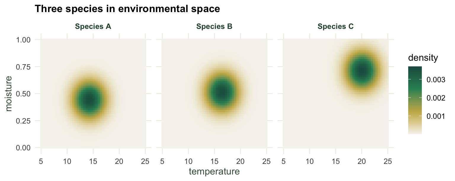
Schoener’s D is the intersection; Warren’s I is the Bhattacharyya coefficient
Schoener’s D compares two normalised densities p and q cell by cell:
\[D = 1 - \tfrac{1}{2}\sum_i |p_i - q_i|.\]
Warren’s I uses the square roots instead:
\[I = 1 - \tfrac{1}{2}\sum_i \left(\sqrt{p_i} - \sqrt{q_i}\right)^2.\]
Written this way the two look like arbitrary formulas, but each collapses to something familiar. Expand the absolute-difference sum and Schoener’s D becomes the sum of the cell-by-cell minimum, the shared area under the two densities (the histogram intersection). Expand the square and Warren’s I becomes the sum of the geometric means, which is the Bhattacharyya coefficient. Both identities hold to machine precision.
schoener_D <- function(p, q) sum(pmin(p, q))               # intersection
warren_I   <- function(p, q) sum(sqrt(p * q))              # Bhattacharyya coefficient
D_formula  <- function(p, q) 1 - 0.5 * sum(abs(p - q))
I_formula  <- function(p, q) 1 - 0.5 * sum((sqrt(p) - sqrt(q))^2)

gap_D <- max(abs(c(schoener_D(A, B) - D_formula(A, B),
                   schoener_D(A, C) - D_formula(A, C))))
gap_I <- max(abs(c(warren_I(A, B) - I_formula(A, B),
                   warren_I(A, C) - I_formula(A, C))))
max_gap <- max(gap_D, gap_I)
The intersection form of D and the Bhattacharyya form of I match the textbook formulas to within floating-point rounding, so the two ways of writing each metric are the same calculation. That is more than a curiosity: the intersection makes it obvious that D counts shared probability mass, and the Bhattacharyya coefficient explains why I behaves differently, which is the next point.
Two boundary cases confirm the scale. Compare a species to itself and both metrics return one; put two densities on cells that never coincide and both return zero.
self_D <- schoener_D(A, A); self_I <- warren_I(A, A)
disj <- rep(0, nrow(grid)); disj2 <- rep(0, nrow(grid))
disj[1] <- 1; disj2[2] <- 1
d0 <- schoener_D(disj, disj2); i0 <- warren_I(disj, disj2)
Identical densities give D = 1, I = 1; disjoint densities give D = 0, I = 0.
I sits above D for the same species
Run the two metrics on the three pairs and a pattern appears: for any pair, I is larger than D.
D_AB <- schoener_D(A, B); I_AB <- warren_I(A, B)
D_AC <- schoener_D(A, C); I_AC <- warren_I(A, C)
D_BC <- schoener_D(B, C); I_BC <- warren_I(B, C)

ovl <- data.frame(
  pair   = rep(c("A vs B", "A vs C", "B vs C"), 2),
  metric = rep(c("Schoener's D", "Warren's I"), each = 3),
  value  = c(D_AB, D_AC, D_BC, I_AB, I_AC, I_BC)
)
i_ge_d <- all(c(I_AB >= D_AB, I_AC >= D_AC, I_BC >= D_BC))
termwise_min <- min(sqrt(A * B) - pmin(A, B))
The neighbouring species A and B overlap at D = 0.554 but I = 0.840, a gap of 0.285. The distant pair A and C sits at D = 0.076, I = 0.208. In every pair here I is at least as large as D (TRUE), and this is not an accident of the example. Cell by cell the geometric mean is never below the minimum: \(\sqrt{p_i q_i} \ge \min(p_i, q_i)\), with the smallest such difference across the grid equal to \(8 \times 10^{-13}\) (non-negative). Summing gives \(I \ge D\) for every pair of densities, with equality exactly when every cell has either \(p_i = q_i\) or one of the two at zero: identical densities and the disjoint pair built above both sit on that boundary.
ggplot(ovl, aes(pair, value, fill = metric)) +
  geom_col(position = position_dodge(width = 0.7), width = 0.6) +
  geom_text(aes(label = sprintf("%.2f", value)),
            position = position_dodge(width = 0.7), vjust = -0.4, size = 3.4,
            colour = "#2c3a31") +
  scale_fill_manual(values = c("Schoener's D" = "#cda23f", "Warren's I" = "#2f8f63"),
                    name = NULL) +
  scale_y_continuous(limits = c(0, 1), expand = expansion(mult = c(0, 0.08))) +
  labs(title = "Warren's I sits above Schoener's D",
       x = NULL, y = "overlap") +
  theme_te() +
  theme(legend.position = "top")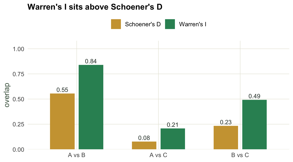
The practical reading is that D and I answer the same question on different scales. I is more forgiving of small mismatches because the square root pulls the two densities together before they are compared, so a pair that looks moderately separate under D can look well matched under I. Reporting both, as ENMTools does, is sensible precisely because they disagree by a predictable amount.
What the number does not tell you
D and I are honest as descriptions: they say how much two densities overlap on the grid you built. What they do not carry is any of the machinery behind that grid. Both numbers depend on where the environmental space starts and stops and how finely it is divided, because that decides which cells the sum runs over. Both compare occurrence densities, which mix a species’ preference with what environments were available to it, so a low overlap can mean different preferences or just different available climates. And neither one comes with a test: a D of 0.554 is not, on its own, high or low, similar or different.
The next three posts take those gaps in turn. First, whether a measured overlap is more or less than chance, which needs a permutation test rather than a threshold. Then how much the number moves when you change the environmental background, with the species held fixed. And finally, a set of checks for when a niche comparison is quietly telling you about geography instead of biology.
Where to go next
If you have not fitted the distributions these densities come from, the species distribution modelling posts are the place to start, and the compositional-data posts cover the same simplex geometry that these normalised niche densities live on. From here, the natural next step is the permutation tests that turn a raw overlap into a comparison against a null.
References
Schoener 1968 Ecology 49(4):704-726 (10.2307/1935534)
Warren, Glor, Turelli 2008 Evolution 62(11):2868-2883 (10.1111/j.1558-5646.2008.00482.x)
Warren, Glor, Turelli 2010 Ecography 33(3):607-611 (10.1111/j.1600-0587.2009.06142.x)
Broennimann, Fitzpatrick, Pearman, Petitpierre, Pellissier, Yoccoz, Thuiller, Fortin, Randin, Zimmermann, Graham, Guisan 2012 Global Ecology and Biogeography 21(4):481-497 (10.1111/j.1466-8238.2011.00698.x)