---
title: "Interaction terms in ecological GLMs"
description: "Interaction terms in count GLMs set how one predictor bends another's slope. Read them through predictions, centre your variables, and check the link scale, not the count scale."
date: "2026-06-26 11:00"
categories: [GLM, interactions, count data, ecology]
image: thumbnail.png
image-alt: "Predicted abundance against soil moisture drawn as three lines of different slope, one per management type, so the moisture effect depends on management."
---
An interaction says the effect of one predictor depends on another. A species might respond to soil moisture in abandoned plots but barely at all under grazing; canopy might matter more for abundance high on a mountain than at its foot. These are routine in field data, and the coefficient table for a model that contains them is one of the most misread outputs in ecology. The fix is to stop reading the interaction off the coefficients and start reading it off the [predicted values](../predicting-glm-response-scale/).
## A model with an interaction
We simulate counts along a moisture gradient under three management types, built so the moisture slope differs by management. The factor levels are set with Grazed first, which makes it the reference category.
```{r}
#| label: data-a
#| warning: false
#| message: false
library(MASS)
library(ggplot2)

set.seed(99)
ng    <- 60
mgmt  <- factor(rep(c("Grazed","Mown","Abandoned"), each = ng),
                levels = c("Grazed","Mown","Abandoned"))     # Grazed = reference
moist <- runif(3 * ng, 0, 1)
slope <- c(Grazed = 0.2, Mown = 1.3, Abandoned = 2.5)[as.character(mgmt)]
abund <- rnbinom(3 * ng, size = 4, mu = exp(1.5 + slope * moist))
A     <- data.frame(abund, moist, mgmt)

mA <- glm.nb(abund ~ moist * mgmt, data = A)
round(summary(mA)$coefficients, 3)
```
```{r}
#| label: setup
#| include: false
ink<-"#16241d"; body<-"#2c3a31"; forest<-"#275139"; gold<-"#c9b458"
paper<-"#f5f4ee"; line<-"#dad9ca"; faint<-"#5d6b61"
graz<-"#cda23f"; mown<-"#2f8f63"; aban<-"#b5534e"
mgmt_cols <- c(Grazed=graz, Mown=mown, Abandoned=aban)
theme_te <- function(){
theme_minimal(base_size = 12) +
theme(plot.background=element_rect(fill=paper,colour=NA),
panel.background=element_rect(fill=paper,colour=NA),
panel.grid.minor=element_blank(),
panel.grid.major=element_line(colour=line,linewidth=.3),
axis.title=element_text(colour=ink), axis.text=element_text(colour=faint),
plot.title=element_text(colour=ink,size=12,face="bold"),
strip.text=element_text(colour=ink,face="bold"),
legend.position="bottom", legend.title=element_text(colour=ink),
legend.text=element_text(colour=body))
}
crit <- qnorm(0.975)
```
The table has a `moist` row, two `mgmt` rows, and two `moist:mgmt` rows. The `moist:mgmtMown` and `moist:mgmtAbandoned` entries are the interaction; everything written `A:B` is a product term. Reading these six numbers as six separate effects is where it goes wrong.
## The interaction is a difference in slopes
With treatment contrasts, the `moist` coefficient is the moisture slope in the reference group, and each `moist:mgmt` coefficient is how much that slope changes in another group. The slope in any group is the sum of the two:
```{r}
#| label: slopes-a
b <- coef(mA)
c(Grazed    = b["moist"],
  Mown      = b["moist"] + b["moist:mgmtMown"],
  Abandoned = b["moist"] + b["moist:mgmtAbandoned"])
```
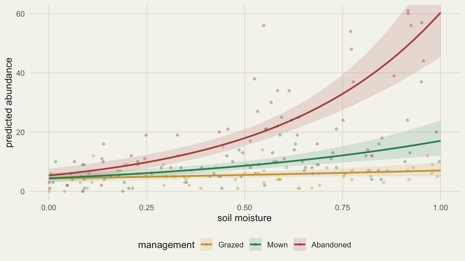
The moisture slope runs from about 0.48 in grazed plots to 1.36 under mowing to 2.43 in abandoned plots, all on the log scale. Plotting the predicted abundance per management shows the same thing without the arithmetic: three lines of visibly different slope. That divergence in slope is the interaction.
```{r}
#| label: fig-interaction
#| fig-cap: "Predicted abundance against soil moisture for each management type, from the model with a moisture by management interaction. The slopes differ, which is what the interaction encodes."
#| fig-alt: "Three rising curves of predicted abundance against soil moisture. The grazed curve is nearly flat, the mown curve rises moderately, and the abandoned curve rises steeply, with points coloured by management."
#| fig-width: 8.0
#| fig-height: 4.5
gA <- expand.grid(moist = seq(0,1,length.out=100), mgmt = levels(A$mgmt))
pA <- predict(mA, gA, type = "link", se.fit = TRUE)
gA$mu <- exp(pA$fit); gA$lo <- exp(pA$fit-crit*pA$se.fit); gA$hi <- exp(pA$fit+crit*pA$se.fit)
ggplot(gA, aes(moist, mu, colour = mgmt, fill = mgmt)) +
  geom_point(data = A, aes(moist, abund, colour = mgmt), alpha=.35, size=1.1, inherit.aes=FALSE) +
  geom_ribbon(aes(ymin = lo, ymax = hi), alpha = .15, colour = NA) +
  geom_line(linewidth = 1) +
  scale_colour_manual(values = mgmt_cols) + scale_fill_manual(values = mgmt_cols) +
  coord_cartesian(ylim = c(0, 60)) +
  labs(x = "soil moisture", y = "predicted abundance", colour = "management", fill = "management") +
  theme_te()
```
## A non-significant main effect is not no effect
Look again at the `moist` row of the table: an estimate near 0.48 with a p-value around 0.12, not significant. It is tempting to write "moisture had no effect." That reading is wrong, and the plot says why. The `moist` coefficient is not the effect of moisture in general; it is the slope in the reference group, grazed plots, where the curve really is close to flat. Moisture matters a great deal under mowing and abandonment, where the interaction terms carry the steeper slopes.
The clearest demonstration is to change nothing but the reference category. Releveling so abandoned plots are the reference makes the `moist` row report that group's slope instead:
```{r}
#| label: relabel
A2  <- transform(A, mgmt = relevel(mgmt, ref = "Abandoned"))
mA2 <- glm.nb(abund ~ moist * mgmt, data = A2)
round(summary(mA2)$coefficients["moist", ], 4)
```
Now the moisture main effect is about 2.43 with a vanishingly small p-value. Same data, same model, same fit; only the label "main effect of moisture" has moved to a different group. A main effect in a model with interactions is always conditional on where the other predictors sit, so a single significance star on that row answers a narrower question than it appears to.
The predictions, in contrast, do not care which group is the reference:
```{r}
#| label: relabel-pred
g  <- expand.grid(moist = c(0.2, 0.8), mgmt = levels(A$mgmt))
p1 <- predict(mA,  newdata = g, type = "response")
g2 <- transform(g, mgmt = relevel(factor(mgmt, levels = levels(A$mgmt)), ref = "Abandoned"))
p2 <- predict(mA2, newdata = g2, type = "response")
max(abs(p1 - p2))
```
The two parameterisations give the same predicted counts to machine precision. This is the general lesson: coefficients shift with the contrast coding, predictions do not, so report the predictions.
## Centre your predictors so the main effect means something
The same conditional logic bites with two continuous predictors. Here abundance depends on canopy openness and elevation, with an interaction so the canopy slope grows with elevation. Elevation is in hundreds of metres.
```{r}
#| label: data-b
#| warning: false
#| message: false
set.seed(91)
nB      <- 200
canopy  <- runif(nB, 0.05, 0.95)
elev_hm <- runif(nB, 2, 15)                  # elevation, hundreds of metres (200 to 1500 m)
count   <- rnbinom(nB, size = 3,
                   mu = exp(1.6 + 0.3*canopy - 0.08*elev_hm + 0.18*canopy*elev_hm))
B  <- data.frame(count, canopy, elev_hm)

mB <- glm.nb(count ~ canopy * elev_hm, data = B)
round(coef(mB), 4)
```
The `canopy` coefficient is 0.066. Taken at face value that says canopy hardly matters, yet the canopy slope is `0.066 + 0.192 * elevation`, so it climbs steeply across the gradient:
```{r}
#| label: slope-by-elev
bc <- coef(mB)
sapply(c(`200 m` = 2, `850 m` = 8.5, `1500 m` = 15),
       function(e) unname(bc["canopy"] + bc["canopy:elev_hm"] * e))
```
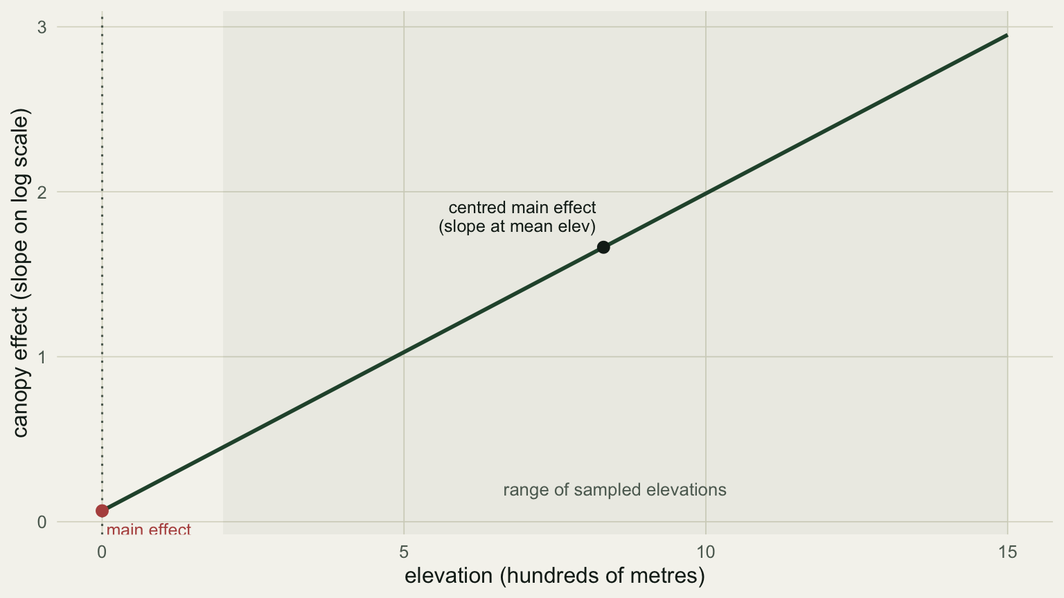
The puzzle dissolves once you see where 0.066 applies: it is the canopy slope at `elev_hm = 0`, sea level, which is far below the lowest plot at 200 m. The main effect is being read at a place no data exist. Centre elevation on its mean and the same coefficient becomes the slope at the middle of the gradient instead:
```{r}
#| label: centre
B$elev_c <- B$elev_hm - mean(B$elev_hm)
mBc <- glm.nb(count ~ canopy * elev_c, data = B)
c(uncentred_canopy = unname(coef(mB)["canopy"]),
  centred_canopy   = unname(coef(mBc)["canopy"]),
  mean_elev_m      = mean(B$elev_hm) * 100)
```
The centred canopy effect is about 1.66, the slope at the mean elevation of 831 m, which is a number you can defend. Two things did not change: the interaction coefficient is identical either way, and the fitted predictions are identical, since centring only shifts where the intercept and main effects are evaluated (Schielzeth 2010).
```{r}
#| label: fig-slope
#| fig-cap: "The canopy slope as a function of elevation. The uncentred main effect reads this line at elevation zero, outside the sampled range; centring reads it at the mean elevation."
#| fig-alt: "A rising straight line of canopy slope against elevation. A point at elevation zero, left of the shaded sampled range, is labelled main effect; a point at the mean elevation inside the range is labelled centred main effect."
#| fig-width: 8.0
#| fig-height: 4.5
ev   <- seq(0, 15, length.out = 100)
sl   <- data.frame(elev_hm = ev, slope = bc["canopy"] + bc["canopy:elev_hm"] * ev)
me   <- mean(B$elev_hm)
pts  <- data.frame(elev_hm = c(0, me),
                   slope = bc["canopy"] + bc["canopy:elev_hm"] * c(0, me),
                   lab = c("main effect\n(slope at elev = 0)", "centred main effect\n(slope at mean elev)"))
ggplot(sl, aes(elev_hm, slope)) +
  annotate("rect", xmin = 2, xmax = 15, ymin = -Inf, ymax = Inf, fill = forest, alpha = .05) +
  annotate("text", x = 8.5, y = 0.2, label = "range of sampled elevations", colour = faint, size = 3.4) +
  geom_line(colour = forest, linewidth = 1) +
  geom_vline(xintercept = 0, colour = faint, linetype = "dotted") +
  geom_point(data = pts, aes(elev_hm, slope), colour = c(aban, ink), size = 2.6) +
  geom_text(data = pts, aes(elev_hm, slope, label = lab), colour = c(aban, ink),
            hjust = c(-0.05, 1.05), vjust = c(1.4, -0.5), size = 3.3, lineheight = .9) +
  labs(x = "elevation (hundreds of metres)", y = "canopy effect (slope on log scale)") +
  theme_te()
```
## Fanning is not the same as interaction
One more trap is specific to GLMs with a log link. Drop the interaction from the management model and fit an additive one: every group now shares a single moisture slope. On the log scale that means parallel lines. On the count scale it does not.
```{r}
#| label: additive
mAdd <- glm.nb(abund ~ moist + mgmt, data = A)
gAdd <- expand.grid(moist = c(0, 1), mgmt = levels(A$mgmt))
gAdd$pred <- predict(mAdd, gAdd, type = "response")
w <- reshape(gAdd, idvar = "mgmt", timevar = "moist", direction = "wide")
data.frame(mgmt = w$mgmt, count_gap = round(w$"pred.1" - w$"pred.0", 2))
```
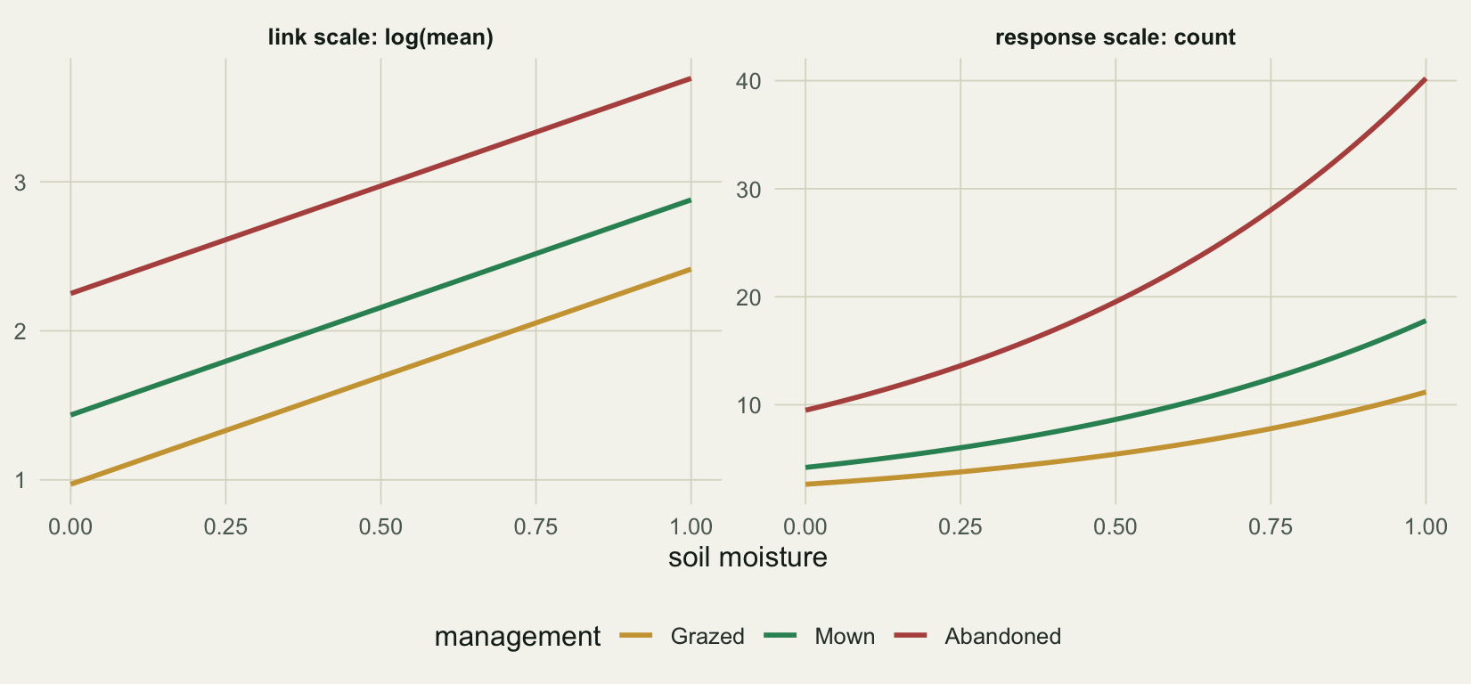
With one shared slope of about 1.44 on the log scale, the additive model still predicts a moisture gap of roughly 9 counts in grazed plots and 31 in abandoned plots. The exponential turns a shared additive slope into group-specific multiplicative change, so the count-scale curves fan apart even though there is no interaction. The figure shows both scales side by side.
```{r}
#| label: fig-fanning
#| fig-cap: "An additive model with no interaction, drawn on both scales. The lines are parallel on the link scale and fan out on the count scale, so fanning curves alone are not evidence of an interaction."
#| fig-alt: "Two panels of the same additive model. On the log scale, three parallel rising lines. On the count scale, the same three lines spread apart as moisture increases."
#| fig-width: 8.6
#| fig-height: 4.0
gA2 <- expand.grid(moist = seq(0,1,length.out=100), mgmt = levels(A$mgmt))
gA2$link <- predict(mAdd, gA2, type = "link"); gA2$resp <- exp(gA2$link)
add2 <- rbind(
  data.frame(moist=gA2$moist, mgmt=gA2$mgmt, y=gA2$link, scale="link scale: log(mean)"),
  data.frame(moist=gA2$moist, mgmt=gA2$mgmt, y=gA2$resp, scale="response scale: count"))
add2$scale <- factor(add2$scale, levels = unique(add2$scale))
ggplot(add2, aes(moist, y, colour = mgmt)) +
  geom_line(linewidth = 1) +
  facet_wrap(~scale, scales = "free_y") +
  scale_colour_manual(values = mgmt_cols) +
  labs(x = "soil moisture", y = NULL, colour = "management") +
  theme_te()
```
To judge whether an interaction is present, compare slopes on the link scale, where the model is additive and parallel lines mean no interaction. Divergence on the count scale is the default behaviour of a log link, not a finding.
## What to carry over
Three habits cover most of the trouble. Read interactions from predicted values, not from the coefficient table, because the coefficients are slope differences against an arbitrary reference. Centre continuous predictors so each main effect is the slope at the centre of the data rather than at an extrapolated zero. Check parallelism on the link scale, since a log link fans the lines apart on its own.
Interactions also cost information: estimating how a slope changes needs more data than estimating the slope itself, so a marginal interaction term deserves caution rather than a paragraph. The helpers from the [prediction post](../predicting-glm-response-scale/), `effects` (Fox 2003) and `ggeffects` (Ludecke 2018), build these predicted lines and surfaces directly and are the practical way to plot an interaction once the mechanics are clear. The grouping in this example also ignored that plots within a management type are not independent, which is the subject of the [GLMM post](../glmm-nested-counts-pseudoreplication/).
## References
Fox J (2003). Effect Displays in R for Generalised Linear Models. *Journal of Statistical Software* 8(15):1-27. doi:10.18637/jss.v008.i15
Ludecke D (2018). ggeffects: Tidy Data Frames of Marginal Effects from Regression Models. *Journal of Open Source Software* 3(26):772. doi:10.21105/joss.00772
McCullagh P, Nelder JA (1989). *Generalized Linear Models*, 2nd ed. Chapman and Hall. ISBN 0-412-31760-5
Schielzeth H (2010). Simple Means to Improve the Interpretability of Regression Coefficients. *Methods in Ecology and Evolution* 1(2):103-113. doi:10.1111/j.2041-210X.2010.00012.x