library(ggplot2)

sci_tex <- function(x, digits = 2) {
  s <- formatC(x, format = "e", digits = digits)
  paste0("$", sub("e.*", "", s), " \\times 10^{", as.integer(sub(".*e", "", s)), "}$")
}

te_pal <- list(forest = "#275139", green = "#2f8f63", sage = "#93a87f",
               clay = "#b5534e", gold = "#cda23f", line = "#dad9ca",
               ink = "#16241d")

theme_te <- function() {
  theme_minimal(base_size = 12) +
    theme(panel.grid.minor = element_blank(),
          panel.grid.major = element_line(colour = "#e7e6dc"),
          plot.background = element_rect(fill = "#f5f4ee", colour = NA),
          panel.background = element_rect(fill = "#f5f4ee", colour = NA),
          plot.title = element_text(face = "bold", colour = te_pal$ink),
          axis.title = element_text(colour = "#2c3a31"))
}Hardy-Weinberg expectations in R
R
population genetics
ecology tutorial
ggplot2
Test Hardy-Weinberg proportions in R with a chi-square and an exact test, and see why a heterozygote deficit is weak evidence of inbreeding in a real sample.
Corrected 15 October 2026: in the dropout example the Fis of the true genotypes was computed from the expected heterozygosity of the simulated population rather than from the sample’s own allele frequency, as the scored Fis beside it is, and now uses the sample’s; the power the smaller deficit reaches at the largest sample size, a simulation estimate a little above the exact power, is now given as an approximate figure.
Corrected 30 September 2026: the post read a non-significant Hardy-Weinberg test as showing that nothing was out of order; it now says the test found no evidence of a departure, which the power section shows is a weaker statement.
Genotype data almost always gets checked against Hardy-Weinberg proportions before anything else happens to it. The check is cheap, it needs no model beyond random mating, and it catches a surprising range of problems: mis-scored markers, mixed samples, duplicated individuals, a locus that is really two loci. What it does not do is tell you which of those problems you have.
This post builds the expectation from allele counts, runs both the chi-square test and the exact test, and then shows two mechanisms that produce the same heterozygote deficit for completely different reasons. The point of the last section is the practical one: the test is a smoke alarm, not a diagnosis.
Counting alleles, then expecting genotypes
Everything starts with gene counting. A diploid individual carries two alleles, so a sample of n individuals carries 2n alleles, and the allele frequency is a count divided by a count. The Hardy-Weinberg expectation follows from drawing two of those alleles independently.
obs <- c(AA = 63, AB = 94, BB = 43)
n_ind <- sum(obs)
n_A <- 2 * obs["AA"] + obs["AB"]
n_B <- 2 * obs["BB"] + obs["AB"]
p_hat <- as.numeric(n_A / (2 * n_ind))

cat("individuals:", n_ind, " A alleles:", n_A, " B alleles:", n_B,
    " p:", round(p_hat, 4), "\n")
individuals: 200 A alleles: 220 B alleles: 180 p: 0.55 expfreq <- c(AA = p_hat^2, AB = 2 * p_hat * (1 - p_hat), BB = (1 - p_hat)^2)
expected <- expfreq * n_ind
print(round(rbind(observed = obs, expected = expected), 2)) AA AB BB
observed 63.0 94 43.0
expected 60.5 99 40.5With 200 individuals the allele frequency is 0.55, and the expected counts are 60.5, 99 and 40.5 against observed 63, 94 and 43. The sample carries slightly fewer heterozygotes than expected, which is the direction almost every real data set leans.
Two summaries carry the whole comparison. Observed heterozygosity is the fraction of heterozygotes; expected heterozygosity is 2pq; and the inbreeding coefficient F is the proportional shortfall of one against the other.
chi2 <- sum((obs - expected)^2 / expected)
p_chi <- pchisq(chi2, df = 1, lower.tail = FALSE)

het_obs <- as.numeric(obs["AB"] / n_ind)
het_exp <- as.numeric(expfreq["AB"])
f_is <- 1 - het_obs / het_exp

cat("chi-square:", round(chi2, 4), " df 1, p:", round(p_chi, 4), "\n")
chi-square: 0.5102 df 1, p: 0.4751 cat("Ho:", round(het_obs, 4), " He:", round(het_exp, 4),
" Fis:", round(f_is, 4), "\n")Ho: 0.47 He: 0.495 Fis: 0.0505 The chi-square statistic is 0.5102 on one degree of freedom, so p is 0.4751 and the test finds no evidence of a departure from Hardy-Weinberg proportions; as the power section below shows, that is not the same as showing there is none. Note the degrees of freedom: three genotype classes, minus one for the total, minus one for the estimated allele frequency, leaves one. The deficit that looked like something is Fis = 0.0505, well inside sampling noise at this sample size.
Where the chi-square approximation breaks
The chi-square test compares a discrete table to a continuous distribution, and the approximation gets worse as expected counts shrink. In genotype data the smallest expected count is q^2 * n, which collapses quickly when one allele is rare: a minor allele frequency of 0.11 in 50 individuals expects 0.6 homozygotes.
The exact test avoids the approximation. Condition on the observed allele counts, enumerate every genotype table that could produce them, give each table its multinomial probability, and add up the probabilities of tables no more likely than the observed one. That enumeration is one line of seq() and one line of lfactorial().
hwe_exact <- function(n_aa, n_ab, n_bb) {
  n <- n_aa + n_ab + n_bb
  na <- 2 * n_aa + n_ab
  nb <- 2 * n_bb + n_ab
  het <- seq(na %% 2, min(na, nb), by = 2)
  hom_a <- (na - het) / 2
  hom_b <- (nb - het) / 2
  logp <- lfactorial(n) - lfactorial(hom_a) - lfactorial(het) -
    lfactorial(hom_b) + het * log(2) +
    lfactorial(na) + lfactorial(nb) - lfactorial(2 * n)
  prob <- exp(logp)
  list(het = het, prob = prob,
       p_value = sum(prob[prob <= prob[het == n_ab] * (1 + 1e-9)]))
}

ex_big <- hwe_exact(obs["AA"], obs["AB"], obs["BB"])
cat("null probabilities sum to:", round(sum(ex_big$prob), 12), "\n")
null probabilities sum to: 1 cat("exact p:", round(ex_big$p_value, 4),
" chi-square p:", round(p_chi, 4), "\n")exact p: 0.4771 chi-square p: 0.4751 The enumeration sums to 1, which is the check that the combinatorics is right, and on the well behaved sample the two tests agree to two decimals (0.4771 against 0.4751). Now the same comparison on a rare allele.
rare <- c(AA = 41, AB = 7, BB = 2)
n_rare <- sum(rare)
p_rare <- as.numeric((2 * rare["AA"] + rare["AB"]) / (2 * n_rare))
exp_rare <- c(p_rare^2, 2 * p_rare * (1 - p_rare), (1 - p_rare)^2) * n_rare
chi2_rare <- sum((rare - exp_rare)^2 / exp_rare)
ex_rare <- hwe_exact(rare["AA"], rare["AB"], rare["BB"])

cat("minor allele frequency:", round(1 - p_rare, 4), "\n")
minor allele frequency: 0.11 cat("expected counts:", round(exp_rare, 3), "\n")expected counts: 39.605 9.79 0.605 cat("chi-square p:", round(pchisq(chi2_rare, 1, lower.tail = FALSE), 4),
" exact p:", round(ex_rare$p_value, 4), "\n")chi-square p: 0.0439 exact p: 0.0885 Here the two tests disagree across the conventional threshold. The chi-square p is 0.0439 and the exact p is 0.0885: one rejects and the other does not, on identical data. The smallest expected count is 0.605, which is the warning sign, and it is the chi-square that is wrong. This is not a rare configuration in practice; it is what a low frequency marker looks like in a modest sample.
The exact null distribution shows why. The number of heterozygotes cannot take any value it likes: with 89 A alleles and 11 B alleles the count must be odd, and it can only be 1, 3, 5 and so on. A smooth reference distribution cannot represent that.
null_df <- data.frame(het = ex_rare$het, prob = ex_rare$prob)
ggplot(null_df, aes(het, prob)) +
  geom_col(fill = te_pal$sage, colour = te_pal$forest, width = 1.4) +
  geom_col(data = subset(null_df, het == 7), fill = te_pal$clay,
           colour = te_pal$forest, width = 1.4) +
  scale_x_continuous(breaks = null_df$het) +
  labs(title = "Only odd heterozygote counts are possible",
       subtitle = "41 / 7 / 2 genotypes, conditioning on 89 A and 11 B alleles",
       x = "heterozygotes in the sample", y = "probability under HWE") +
  theme_te()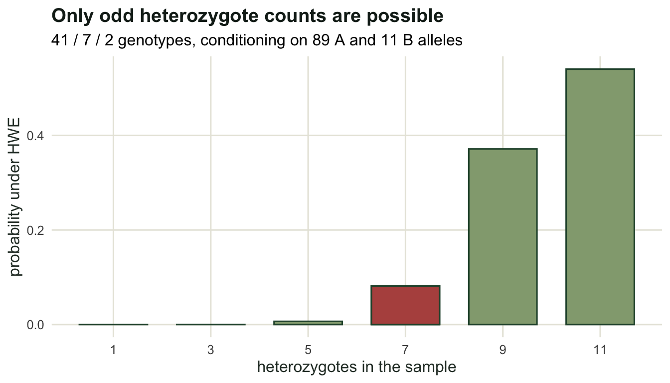
The same deficit, two different causes
A significant deficit of heterozygotes is usually reported as evidence of inbreeding or non-random mating. It is worth being slower than that, because at least two mundane mechanisms produce the identical signature.
The first is population structure, and it is a mathematical identity rather than an effect. Take two subpopulations, each in perfect Hardy-Weinberg proportions internally, with allele frequencies 0.2 and 0.8. Pool them in equal numbers. The pooled heterozygosity is the average of the within-group heterozygosities, but the pooled expectation is computed from the average allele frequency, and 2pq is not a linear function of p, so the two cannot agree.
p_sub <- c(0.2, 0.8)
ho_sub <- 2 * p_sub * (1 - p_sub)
p_bar <- mean(p_sub)
he_tot <- 2 * p_bar * (1 - p_bar)
ho_pool <- mean(ho_sub)
var_p <- mean((p_sub - p_bar)^2)

cat("Ho pooled:", ho_pool, " He from pooled frequency:", he_tot,
    " Fis:", round(1 - ho_pool / he_tot, 4), "\n")
Ho pooled: 0.32 He from pooled frequency: 0.5 Fis: 0.36 cat("He - Ho:", he_tot - ho_pool, " 2 * var(p):", 2 * var_p, "\n")He - Ho: 0.18 2 * var(p): 0.18 print(all.equal(he_tot - ho_pool, 2 * var_p))[1] TRUEcat("var(p) / (pbar * qbar):", var_p / (p_bar * (1 - p_bar)), "\n")var(p) / (pbar * qbar): 0.36 The gap between expected and observed heterozygosity is exactly twice the variance in allele frequency among groups (both quantities print as 0.18, and all.equal confirms it). Divide that gap by 2 * pbar * qbar and you get 0.36, which is the pooled Fis, and which is also the among-group variance ratio that the next tutorial calls Fst. This is the Wahlund effect: mixing populations makes homozygotes without anybody mating with a relative.
Simulating a mixed sample confirms that the test fires hard.
set.seed(459)

draw_geno <- function(n, p, f = 0) {
  probs <- c(p^2 + f * p * (1 - p),
             2 * p * (1 - p) * (1 - f),
             (1 - p)^2 + f * p * (1 - p))
  as.vector(rmultinom(1, n, probs))
}

mix <- draw_geno(100, p_sub[1]) + draw_geno(100, p_sub[2])
names(mix) <- c("AA", "AB", "BB")
p_mix <- as.numeric((2 * mix["AA"] + mix["AB"]) / (2 * sum(mix)))
fis_mix <- 1 - as.numeric(mix["AB"] / sum(mix)) / (2 * p_mix * (1 - p_mix))

print(mix)
AA AB BB
70 69 61 cat("p:", round(p_mix, 4), " Fis:", round(fis_mix, 4),
" exact p:", signif(hwe_exact(mix[1], mix[2], mix[3])$p_value, 3), "\n")p: 0.5225 Fis: 0.3086 exact p: 1.12e-05 The second mechanism is a scoring artefact. If one allele sometimes fails to amplify, a heterozygote is recorded as a homozygote for whichever allele did amplify. Let each heterozygote be mis-scored with probability 0.3, the failing allele chosen at random so that allele frequencies stay put.
set.seed(460)

true_geno <- draw_geno(300, 0.5)
lost <- rbinom(1, true_geno[2], 0.3)
lost_a <- rbinom(1, lost, 0.5)
scored <- c(true_geno[1] + lost_a, true_geno[2] - lost,
            true_geno[3] + lost - lost_a)
names(scored) <- names(true_geno) <- c("AA", "AB", "BB")
print(rbind(truth = true_geno, scored = scored))
AA AB BB
truth 82 148 70
scored 106 95 99p_sc <- as.numeric((2 * scored["AA"] + scored["AB"]) / (2 * sum(scored)))
fis_sc <- 1 - as.numeric(scored["AB"] / sum(scored)) / (2 * p_sc * (1 - p_sc))
cat("mis-scored heterozygotes:", lost, " p:", round(p_sc, 4),
" Fis:", round(fis_sc, 4),
" exact p:", signif(hwe_exact(scored[1], scored[2], scored[3])$p_value, 3),
"\n")mis-scored heterozygotes: 53 p: 0.5117 Fis: 0.3663 exact p: 1.52e-10 p_true <- as.numeric((2 * true_geno["AA"] + true_geno["AB"]) / (2 * sum(true_geno)))
cat("truth, same sample: p:", sprintf("%.4f", p_true), " Fis:",
round(1 - as.numeric(true_geno["AB"] / sum(true_geno)) / (2 * p_true * (1 - p_true)), 4),
" exact p:",
round(hwe_exact(true_geno[1], true_geno[2], true_geno[3])$p_value, 4), "\n")truth, same sample: p: 0.5200 Fis: 0.0118 exact p: 0.8181 Of 148 true heterozygotes, 53 were recorded as homozygotes. The same 300 individuals go from Fis 0.0118 with an exact p of 0.8181 to Fis 0.3663 with an exact p of \(1.5 \times 10^{-10}\), while the allele frequency barely stirs: p moves from 0.5200 to 0.5117, since the failing allele was drawn at random and the 53 lost heterozygotes need not split evenly between the two homozygote classes. Both simulations return a positive Fis of the same order, both reject Hardy-Weinberg, and no property of the genotype table separates them. Population structure and allelic dropout are told apart by other evidence: dropout hits one locus while structure shifts every locus in the same direction, and that contrast is the diagnostic used in the checking tutorial at the end of this cluster.
The test is weaker than it looks
The last thing to know about the Hardy-Weinberg test is how little it detects. Simulate genotypes with a known F, run the exact test, and count rejections at the five per cent level.
set.seed(461)

power_hwe <- function(n, f, p = 0.3, nsim = 2000, alpha = 0.05) {
  rej <- 0
  for (i in seq_len(nsim)) {
    g <- draw_geno(n, p, f)
    rej <- rej + (hwe_exact(g[1], g[2], g[3])$p_value < alpha)
  }
  rej / nsim
}

grid_n <- c(25, 50, 100, 200, 400, 800)
pow <- data.frame(n = rep(grid_n, 2),
                  f_true = rep(c(0.1, 0.2), each = length(grid_n)))
pow$power <- mapply(power_hwe, pow$n, pow$f_true)
print(pow)
n f_true power
1 25 0.1 0.0480
2 50 0.1 0.0870
3 100 0.1 0.1450
4 200 0.1 0.2585
5 400 0.1 0.4840
6 800 0.1 0.8100
7 25 0.2 0.1120
8 50 0.2 0.2435
9 100 0.2 0.4625
10 200 0.2 0.7715
11 400 0.2 0.9735
12 800 0.2 1.0000ggplot(pow, aes(n, power, colour = factor(f_true))) +
geom_hline(yintercept = 0.8, linetype = "dashed", colour = te_pal$line) +
geom_line(linewidth = 0.9) +
geom_point(size = 2.2) +
scale_x_log10(breaks = grid_n) +
scale_colour_manual(values = c(`0.1` = te_pal$gold, `0.2` = te_pal$forest),
name = "true F") +
labs(title = "A modest heterozygote deficit needs a large sample",
subtitle = "exact test, alpha 0.05, minor allele frequency 0.3",
x = "individuals genotyped (log scale)", y = "power") +
theme_te()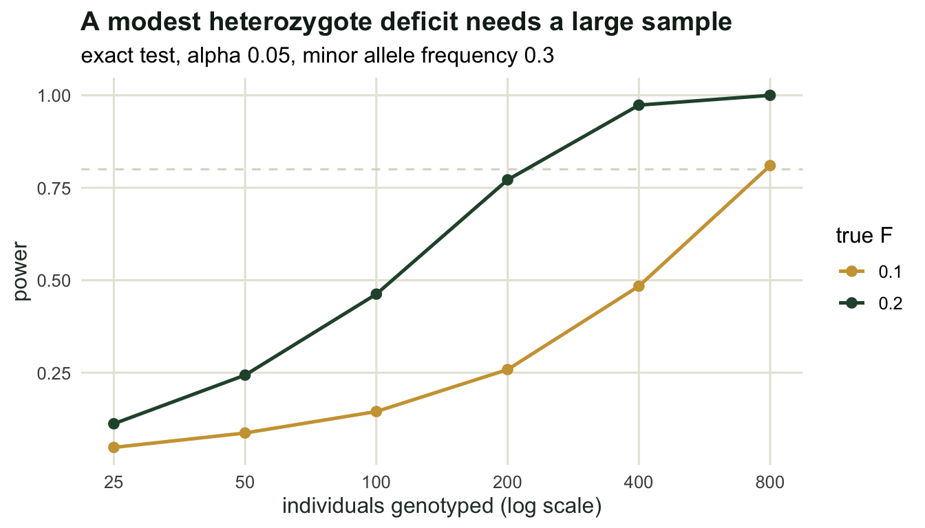
An F of 0.1 is detected 14.5 per cent of the time in 100 individuals and 25.9 per cent in 200; reaching about 80 per cent takes 800. Doubling the deficit to 0.2 brings 77.2 per cent power at 200 individuals. So a locus that passes the test has not been shown to be in Hardy-Weinberg proportions, it has been shown not to fail loudly, and with typical sample sizes those are different statements. This asymmetry is the reason the test is better used as a data quality screen across many loci than as a per-locus verdict about mating.
Where to go next
Nothing here needed more than one population, and that is the limitation. The heterozygote deficit produced by the Wahlund effect was 0.36 for a reason: it equals the among-group variance in allele frequency, scaled by the maximum that variance could reach. That quantity has a name and a whole toolbox around it, which is the subject of the next tutorial. The scoring artefact points the other way, towards the checking tutorial, where the per-locus pattern of Fis is used to separate a marker problem from a biological one.
References
Hardy GH 1908 Science 28(706):49-50 (10.1126/science.28.706.49)
Wigginton JE, Cutler DJ, Abecasis GR 2005 American Journal of Human Genetics 76(5):887-893 (10.1086/429864)
Waples RS 2015 Journal of Heredity 106(1):1-19 (10.1093/jhered/esu062)
Wahlund S 1928 Hereditas 11:65-106 (10.1111/j.1601-5223.1928.tb02483.x)
Dakin EE, Avise JC 2004 Heredity 93(5):504-509 (10.1038/sj.hdy.6800545)
Hartl DL, Clark AG 2007 Principles of Population Genetics, 4th edition, Sinauer, ISBN 978-0878933082