library(ggplot2)
library(terra)

te_pal <- list(forest = "#275139", green = "#2f8f63", sage = "#93a87f",
               clay = "#b5534e", gold = "#cda23f", line = "#dad9ca",
               ink = "#16241d", paper = "#f5f4ee")

theme_te <- function() {
  theme_minimal(base_size = 12) +
    theme(panel.grid.minor = element_blank(),
          panel.grid.major = element_line(colour = "#e7e6dc"),
          plot.background = element_rect(fill = "#f5f4ee", colour = NA),
          panel.background = element_rect(fill = "#f5f4ee", colour = NA),
          plot.title = element_text(face = "bold", colour = te_pal$ink),
          axis.title = element_text(colour = "#2c3a31"))
}Georeferencing RMS is not accuracy
QGIS
R
terra
GIS
spatial
ecology tutorial
The QGIS Georeferencer reports the residual at its own control points, not the accuracy of the result. Measured with GDAL on a sheet whose truth is known.
A scanned survey sheet, a dozen marks clicked in the QGIS Georeferencer, and a number at the bottom of the control point table. The habit that follows is to read that number as the accuracy of the georeferenced raster, put it in the methods section, and move on. Then somebody switches the transformation from Polynomial 1 to Polynomial 3, watches the number drop, and takes the drop as an improvement.
The number is not the accuracy. It is the residual of the fit at the very points the fit was given, so it measures how well the transformation reproduces its own input. It falls as the transformation is given more freedom, and it keeps falling after the fit has stopped being any good anywhere else on the sheet. Thin plate spline is the clearest case: it passes exactly through every control point, so it reports exactly 0.00 no matter how badly it behaves between them and beyond them. A statistic that is structurally zero cannot carry information about error.
This tutorial does the thing you can almost never do with a real sheet. It georeferences a scan whose true map coordinates are known everywhere, so the error can be measured rather than estimated, at points the fit never saw.
The sheet, and why it has a truth
Three files sit next to this post. scanned-sheet.png is the sheet to georeference. control-points-truth.csv gives 26 survey marks with both their exact pixel position on the scan and their exact map coordinate. reference-layer.gpkg holds the same marks plus the undistorted map features they belong to.
Everything on the sheet is invented. Voskar Basin, the settlements and the Gulf of Kelbray do not exist, no real survey data went into it, and the point of the exercise is that the answer is known in advance.
marks <- read.csv("control-points-truth.csv")
sheet <- rast("scanned-sheet.png")
Warning: [rast] unknown extentref <- vect("reference-layer.gpkg", layer = "landmarks")
cat(sprintf("scan: %d by %d pixels, %d bands\n",
ncol(sheet), nrow(sheet), nlyr(sheet)))scan: 4000 by 3000 pixels, 3 bandscat(sprintf("marks with known truth: %d, reference layer CRS EPSG:%s\n",
nrow(marks), crs(ref, describe = TRUE)$code))marks with known truth: 26, reference layer CRS EPSG:32633cat(sprintf("truth spans easting %.0f to %.0f, northing %.0f to %.0f\n",
min(marks$mapX), max(marks$mapX), min(marks$mapY), max(marks$mapY)))truth spans easting 512666 to 521685, northing 5264916 to 5271194print(head(marks, 3), row.names = FALSE) label pixelX pixelY mapX mapY
A1 260 240 512910.8 5271194
A2 980 380 514697.1 5270745
A3 1720 250 516576.8 5270957The scan is 4000 by 3000 pixels in three bands, and terra warns that its extent is unknown, which is the correct complaint: a PNG carries no georeferencing. That absence has a practical edge before any of the fitting starts: with no geotransform to go on, GDAL versions disagree about which end of the file is the top of the picture, so the chunk that draws the sheet measures the orientation instead of trusting it. The 26 marks are drawn on the sheet as triangle and cross symbols labelled A1 to A26, and their truth is in EPSG:32633.
# A PNG carries no geotransform, and GDAL versions disagree about which end of the
# file is the top of the picture, so the orientation is measured rather than assumed.
# The Gulf of Kelbray runs along the bottom of the sheet, so the lower fifth of the
# raster has to be the bluer one; if it is not, the raster is upside down.
blue_share <- function(r) {
  v <- values(r)
  mean(v[, 3] > v[, 1] + 20, na.rm = TRUE)
}
upper <- crop(sheet, ext(0, ncol(sheet), 0.8 * nrow(sheet), nrow(sheet)))
lower <- crop(sheet, ext(0, ncol(sheet), 0, 0.2 * nrow(sheet)))
if (blue_share(upper) > blue_share(lower)) sheet <- flip(sheet, "vertical")

op <- par(bg = te_pal$paper, mar = c(0, 0, 0, 0))
plotRGB(sheet, maxcell = 1.2e6, mar = 0)
par(op)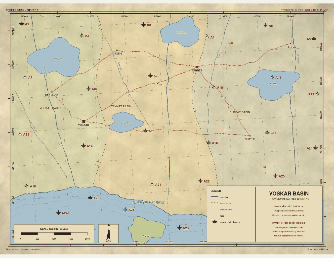
The sheet was not drawn straight. Every feature was placed at the position a real scan would put it: rotated by 3.2 degrees, scaled by slightly different amounts along rows and columns, and then bent by a paper deformation. The deformation is a low frequency wave across the sheet plus two local bumps, one towards the lower left and one towards the upper right. That choice matters and is the subject of a correction further down.
W <- 4000
H <- 3000
theta <- 3.2 * pi / 180
sx <- 2.51
sy <- 2.46
x0 <- 512300
y0 <- 5271800

affine_map <- function(px, py)
  list(X = x0 + sx * (cos(theta) * px - sin(theta) * py),
       Y = y0 - sy * (sin(theta) * px + cos(theta) * py))

true_map <- function(px, py) {
  u <- (px - W / 2) / (W / 2)
  v <- (py - H / 2) / (H / 2)
  bx <- 18 * sin(2.1 * u + 0.4) * cos(1.3 * v) +
        12 * exp(-((u + 0.45)^2 + (v - 0.35)^2) / 0.10)
  by <- 15 * sin(1.7 * v - 0.3) - 9 * cos(2.4 * u) * v +
        10 * exp(-((u - 0.50)^2 + (v + 0.40)^2) / 0.12)
  affine_map(px + bx / sx, py + by / sy)
}

fld <- expand.grid(px = seq(0, W, length.out = 60),
                   py = seq(0, H, length.out = 45))
aff <- affine_map(fld$px, fld$py)
tru <- true_map(fld$px, fld$py)
fld$bend <- sqrt((tru$X - aff$X)^2 + (tru$Y - aff$Y)^2)

cat(sprintf("paper deformation: %.1f m median over the sheet, %.1f m at worst\n",
            median(fld$bend), max(fld$bend)))
paper deformation: 13.6 m median over the sheet, 22.5 m at worstcsv_chk <- true_map(marks$pixelX, marks$pixelY)
cat(sprintf("the CSV reproduces the model to %.0e m\n",
max(abs(csv_chk$X - marks$mapX), abs(csv_chk$Y - marks$mapY))))the CSV reproduces the model to 5e-05 mThe paper is 13.6 m away from its unbent position at the median pixel and 22.5 m away at worst, so on a sheet of this scale the deformation is the dominant error source and everything below is about how well each transformation removes it. The CSV agrees with the model to the rounding of the CSV itself, which is what makes the file usable as a truth.
Real sheets carry a real version of this. Jenny and Hurni analysed and visualised the geometric distortions of historic maps, which is this same quantity, the displacement between a map and its true geometry, and the patterns they recover never look like a low order polynomial either.
ggplot(fld, aes(px, py, fill = bend)) +
  geom_raster() +
  scale_y_reverse() +
  coord_equal(expand = FALSE) +
  scale_fill_gradient(low = te_pal$paper, high = te_pal$forest, name = "metres") +
  labs(title = "The paper deformation is not a polynomial",
       subtitle = "distance from the position a pure rotation and scale would give",
       x = "scan column (pixels)", y = "scan row (pixels)") +
  theme_te()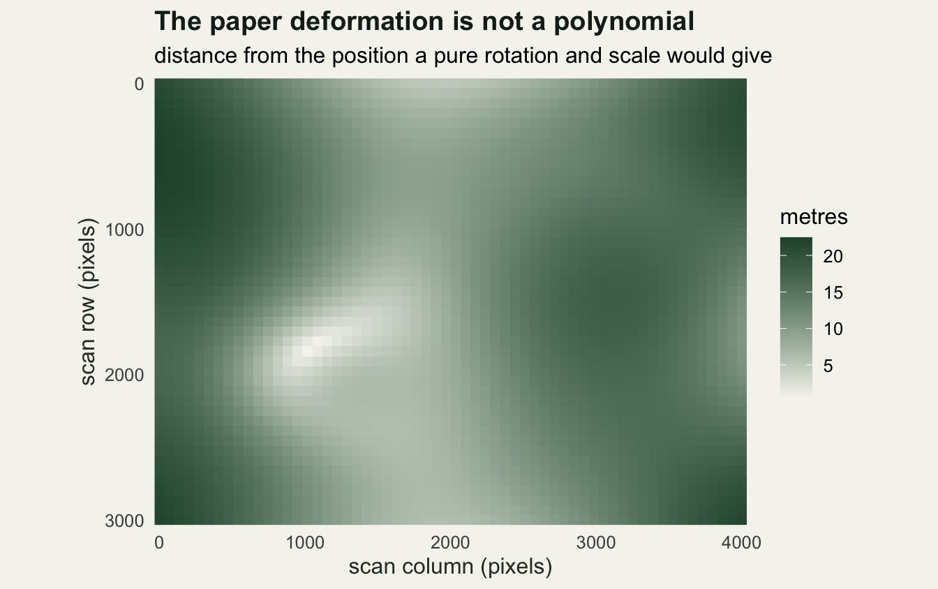
Georeferencing it in QGIS 3.44
Open Layer > Georeferencer. In QGIS 3.44 it lives in the Layer menu, not the Raster menu where older tutorials and older versions put it. The Georeferencer opens as its own window with an empty canvas; load scanned-sheet.png into it with File > Open Raster or the first toolbar button.
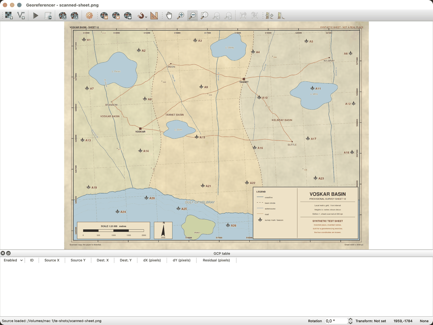
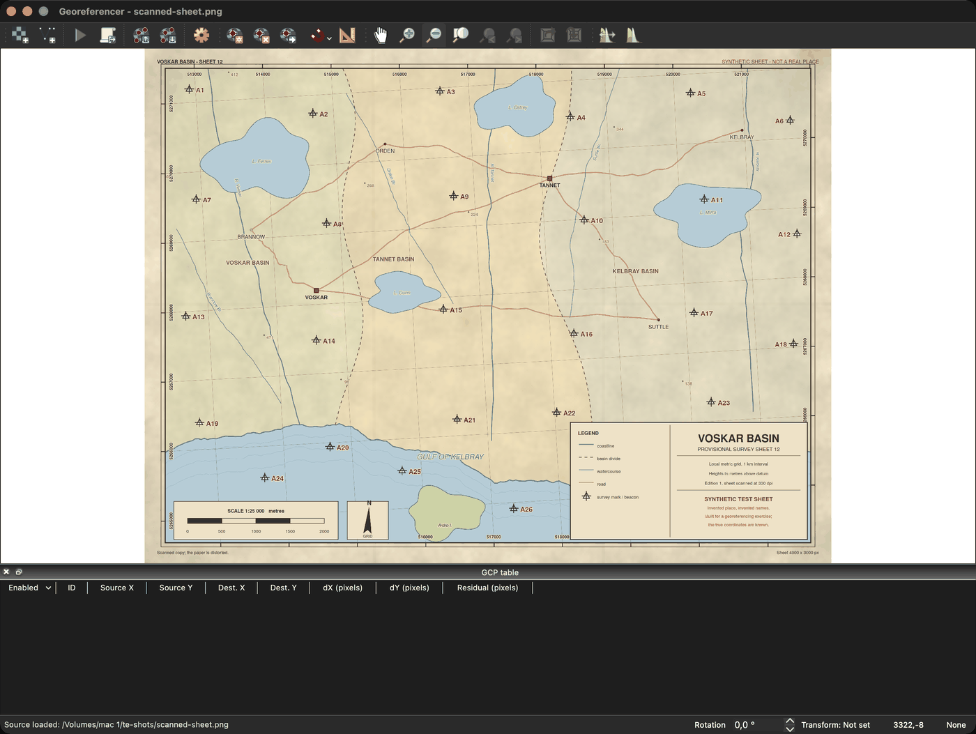
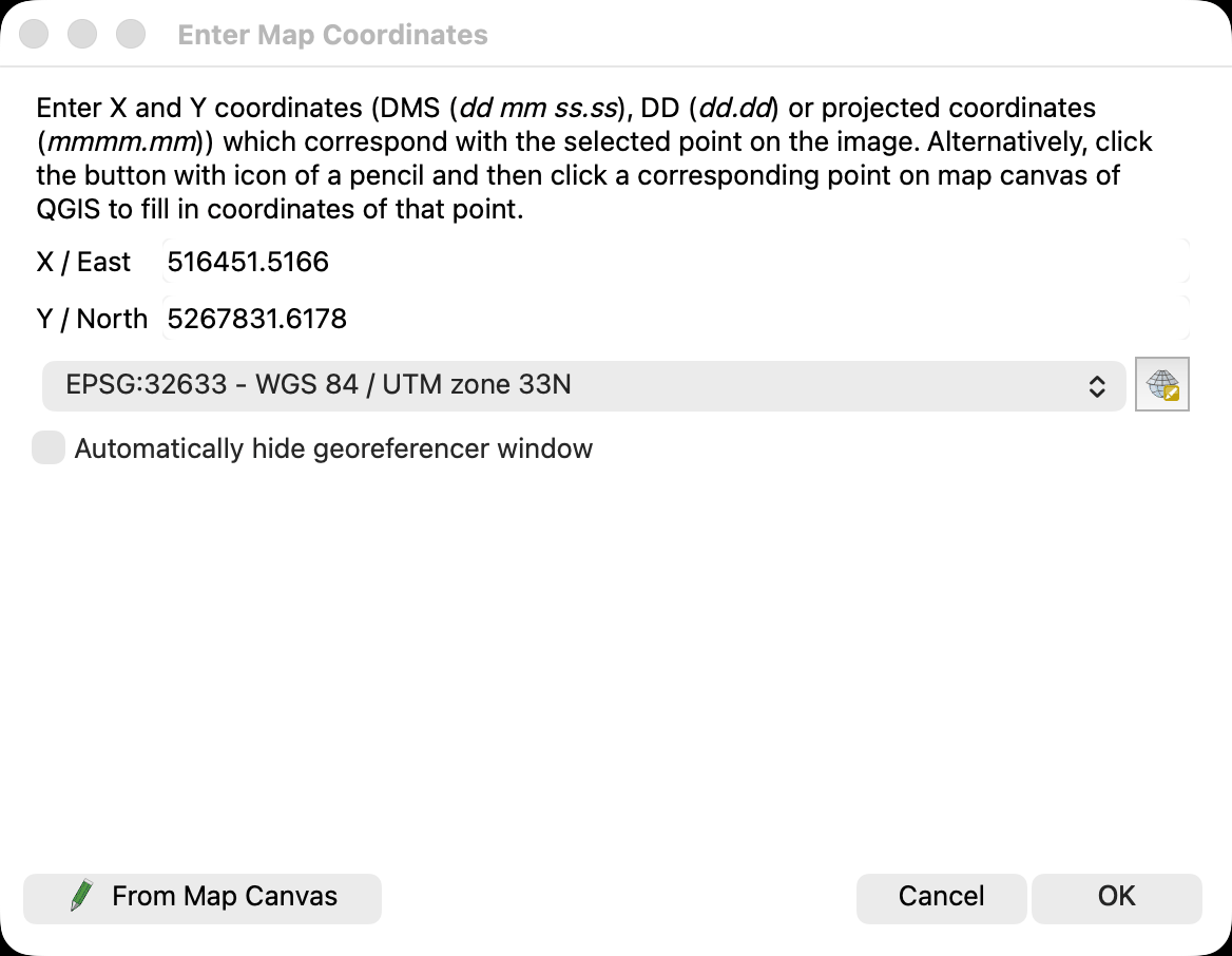
Adding a control point takes two clicks. Zoom until the centre of a survey mark is unambiguous, press Add Point, click the centre of the cross, and the Enter Map Coordinates dialog appears. Type the mapX and mapY for that label from control-points-truth.csv, or press From Map Canvas and click the matching feature in the landmarks layer of reference-layer.gpkg if you have it loaded in the main QGIS window.
Once there are enough points, Transformation Settings decides what happens to them. QGIS 3.44 offers seven transformation types, each with a minimum number of control points it will accept.
| transformation type | minimum control points |
|---|---|
| Linear | 2 |
| Helmert | 2 |
| Polynomial 1 | 3 |
| Polynomial 2 | 6 |
| Polynomial 3 | 10 |
| Projective | 4 |
| Thin Plate Spline | 10 |
The resampling method in the same dialog is a separate decision about pixel values, not about geometry: Nearest neighbour, Bilinear, Cubic, Cubic B-Spline and Lanczos. Nearest neighbour keeps the original values, which is what you want if the raster is a class map; the others interpolate, which is what you want if it is a photograph or a scan.
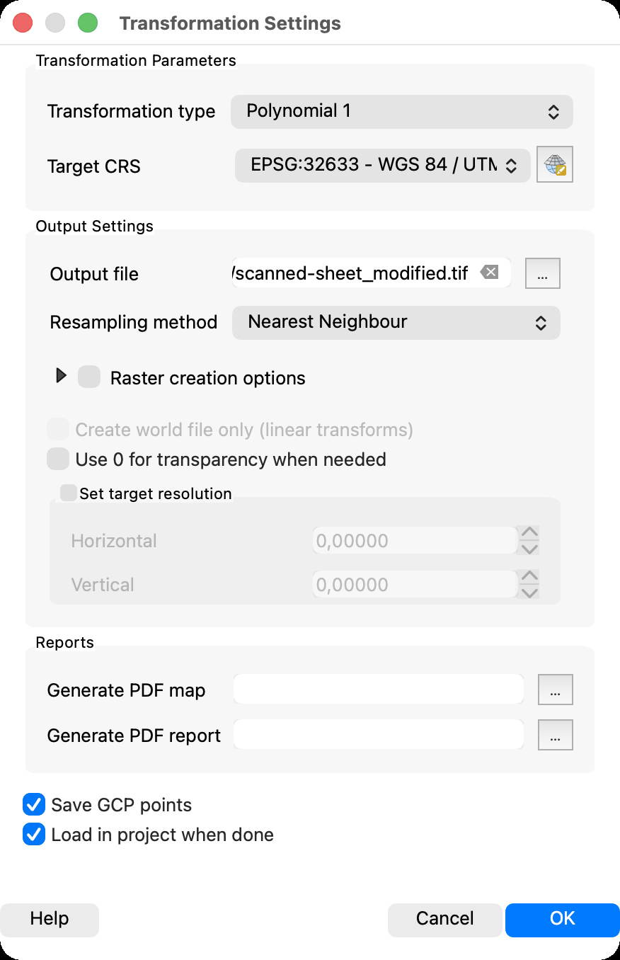
Tick Save GCP Points and QGIS writes a [filename].points text file next to the raster, with mapX, mapY, pixelX and pixelY columns. That file is the reproducible part of the whole operation: it is the only record of where you clicked, it can be reloaded into the Georeferencer, and it can be handed straight to GDAL. Save it, commit it, and treat a georeferencing job without one as unrepeatable.
With the points in place, the GCP table at the bottom of the window fills with a residual for every point and a single summary figure at the bottom edge. That summary is the number this whole post is about.
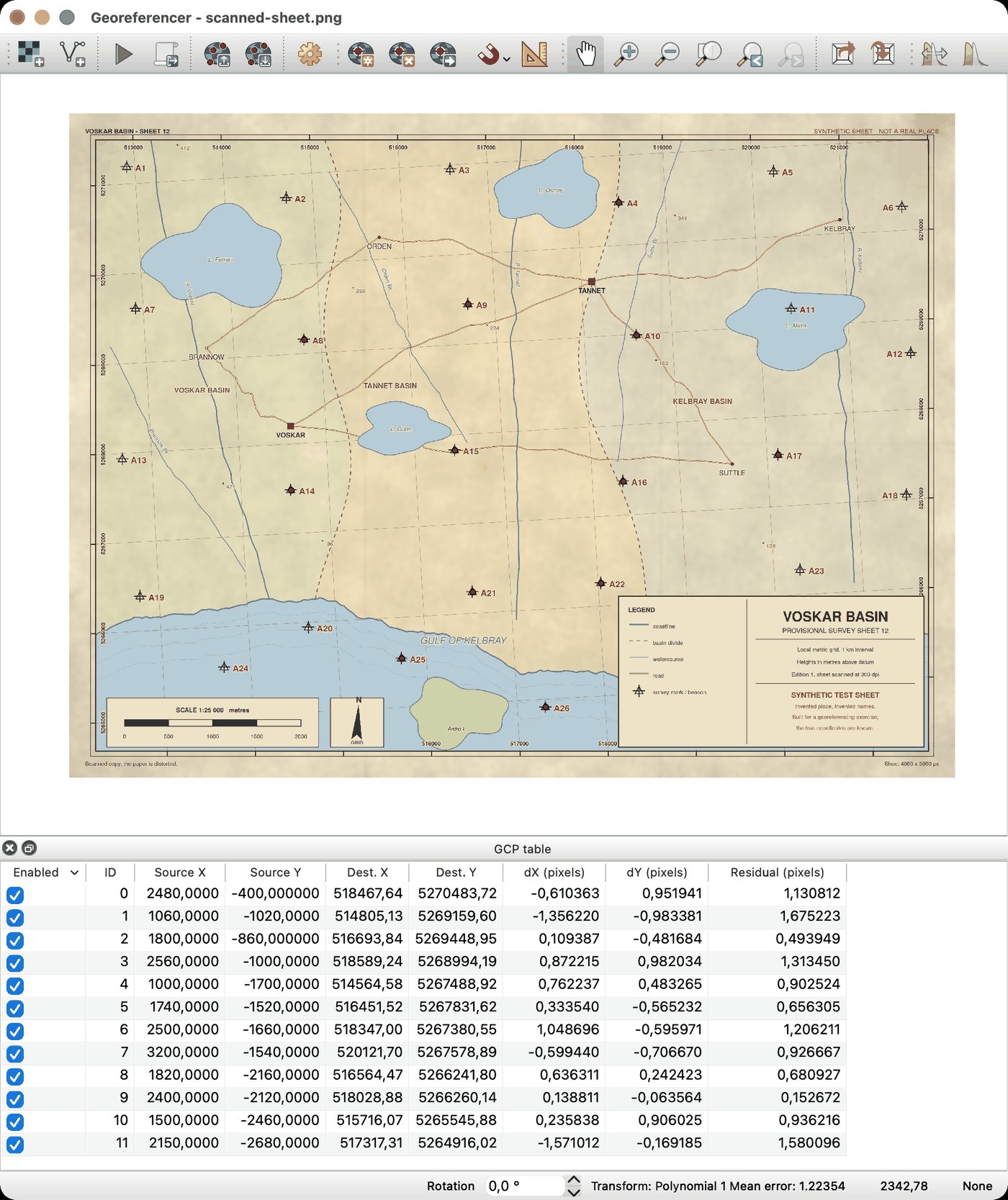
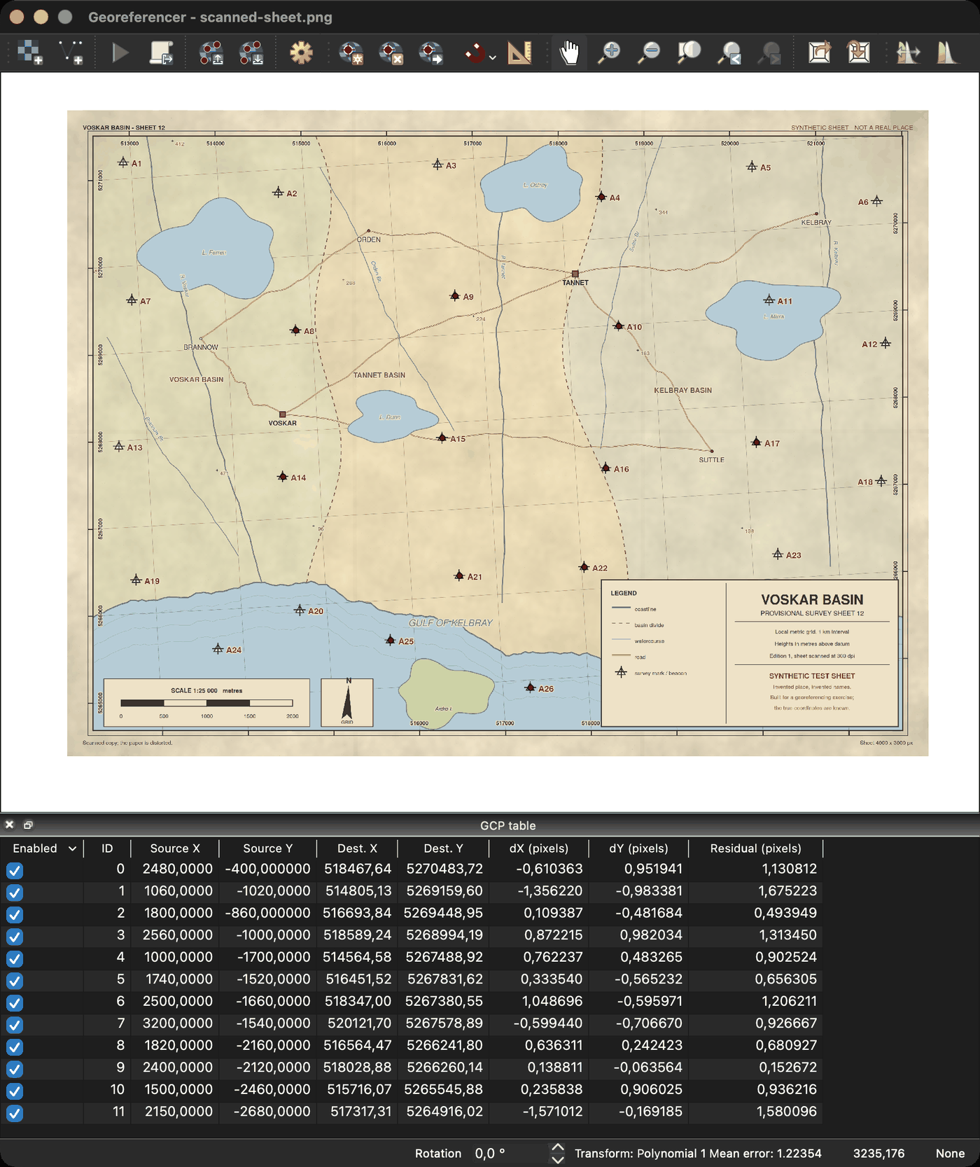
QGIS calls it mean error and GDAL calls it RMS, and the two are not quite the same arithmetic. QGIS sums the squared residuals and divides by the number of enabled control points minus the minimum count that transformation needs, the figure in the right-hand column of the table above; a plain root mean square divides by the number of points instead. The smaller divisor makes the QGIS figure the larger of the two, so it is the less flattering of the pair. Neither the name nor the divisor changes the argument below: both are computed at the control points and nowhere else, and both fall to zero when the transformation interpolates.
The same transformations, fitted by GDAL
The QGIS Georeferencer does not implement the transformations itself. It collects control points, passes them to GDAL’s transformer, and displays what comes back. So the fits below are not a reimplementation of the Georeferencer: they are the same GDAL, called through gdaltransform, which takes a list of control points as -gcp flags and pushes coordinates through the fitted transformation. Polynomials come from -order 1, -order 2 and -order 3; the thin plate spline comes from -tps.
fit_and_apply <- function(gcp, mode, px, py) {
  args <- paste(sprintf("-gcp %.4f %.4f %.4f %.4f",
                        gcp$px, gcp$py, gcp$X, gcp$Y), collapse = " ")
  fin <- tempfile()
  writeLines(sprintf("%.6f %.6f", px, py), fin)
  raw <- system(sprintf("gdaltransform %s %s < %s", args, mode, fin),
                intern = TRUE, ignore.stderr = TRUE)
  unlink(fin)
  m <- do.call(rbind, lapply(strsplit(trimws(raw), "\\s+"), as.numeric))
  data.frame(X = m[, 1], Y = m[, 2])
}

modes <- c("Polynomial 1" = "-order 1", "Polynomial 2" = "-order 2",
           "Polynomial 3" = "-order 3", "Thin plate spline" = "-tps")

hull_of <- function(px, py)
  vect(cbind(px, py)[chull(px, py), ], type = "polygons")
in_hull <- function(px, py, hp)
  as.vector(relate(vect(cbind(px, py)), hp, "intersects"))
The thin plate spline is the interpolating member of that list by construction. Bookstein’s formulation bends a surface through every control point while minimising bending energy, so it passes through all of them exactly and its residual at those points is zero for any data whatsoever.
Two quantities come out of every fit. The reported figure is the root mean square distance between where the fitted transformation sends each control point and where that control point was said to be. The true error is the same distance computed at marks the fit never saw. Nothing here is an argument against the root mean square as a summary: Chai and Draxler set out where it is the right choice and where the mean absolute error is. The argument is about which points it is computed at.
What the reported figure did to the sheet
Take the twelve marks nearest the middle of the sheet as control points, which is roughly what a clustered click pattern looks like when the identifiable features sit in the interior, and hold the other fourteen back.
marks$role <- ifelse(rank(sqrt((marks$pixelX - W / 2)^2 +
                               (marks$pixelY - H / 2)^2)) <= 12,
                     "control", "held back")
gcp <- with(marks[marks$role == "control", ],
            data.frame(px = pixelX, py = pixelY, X = mapX, Y = mapY))
held <- marks[marks$role == "held back", ]
held$inside <- in_hull(held$pixelX, held$pixelY, hull_of(gcp$px, gcp$py))

cat(sprintf("control marks: %s\n",
            paste(marks$label[marks$role == "control"], collapse = " ")))
control marks: A4 A8 A9 A10 A14 A15 A16 A17 A21 A22 A25 A26cat(sprintf("held back: %d marks, %d of them inside the control hull\n",
nrow(held), sum(held$inside)))held back: 14 marks, 0 of them inside the control hullsheet_tab <- do.call(rbind, lapply(names(modes), function(nm) {
g <- fit_and_apply(gcp, modes[[nm]], gcp$px, gcp$py)
k <- fit_and_apply(gcp, modes[[nm]], held$pixelX, held$pixelY)
e <- sqrt((k$X - held$mapX)^2 + (k$Y - held$mapY)^2)
data.frame(transform = nm,
reported = round(sqrt(mean((g$X - gcp$X)^2 + (g$Y - gcp$Y)^2)), 2),
held_out = round(sqrt(mean(e^2)), 2),
worst = round(max(e), 2))
}))
print(sheet_tab, row.names = FALSE) transform reported held_out worst
Polynomial 1 2.65 9.23 18.75
Polynomial 2 1.01 13.19 32.04
Polynomial 3 0.65 11.44 22.33
Thin plate spline 0.00 7.80 15.62The reported figure runs 2.65, 1.01, 0.65 and 0.00 metres down the four transformations, so on the screen the job appears to get better and better and to end perfect. At the fourteen held-back marks the true error runs 9.23, 13.19, 11.44 and 7.80 metres, and the worst single mark is 18.75, 32.04, 22.33 and 15.62 metres out. Every reported figure understates the truth, Polynomial 2 is worse than Polynomial 1 on the sheet while looking better on the screen, and the thin plate spline reports a perfect fit while being 7.80 metres out on average and 15.62 metres out at worst.
All fourteen held-back marks lie outside the convex hull of the control points, which is why the errors here are large. That is the extrapolation regime, and it is where the reported figure is least informative. To separate the two regimes properly the experiment has to be run many times with check points on both sides of the hull.
One sheet is an anecdote
Draw a fresh sheet a hundred times. Each one gets twelve control points scattered over the middle of the sheet, nine check points drawn from the central half and nine from the margins, all pushed through the same paper deformation. Nothing is fitted in R: every transformation is gdaltransform.
draw_sheet <- function(click = 0) {
  g <- data.frame(px = runif(12, 0.18 * W, 0.82 * W),
                  py = runif(12, 0.18 * H, 0.82 * H))
  tr <- true_map(g$px, g$py)
  g$X <- tr$X + rnorm(12, 0, click)
  g$Y <- tr$Y + rnorm(12, 0, click)
  inx <- runif(9, 0.25 * W, 0.75 * W)
  iny <- runif(9, 0.25 * H, 0.75 * H)
  outx <- c(runif(5, 0.02 * W, 0.14 * W), runif(4, 0.86 * W, 0.98 * W))
  outy <- c(runif(5, 0.02 * H, 0.98 * H), runif(4, 0.02 * H, 0.98 * H))
  k <- data.frame(px = c(inx, outx), py = c(iny, outy),
                  where = rep(c("central", "marginal"), c(9, 9)))
  tr <- true_map(k$px, k$py)
  k$X <- tr$X
  k$Y <- tr$Y
  list(gcp = g, chk = k)
}

score_sheet <- function(sh) vapply(modes, function(md) {
  g <- fit_and_apply(sh$gcp, md, sh$gcp$px, sh$gcp$py)
  k <- fit_and_apply(sh$gcp, md, sh$chk$px, sh$chk$py)
  e <- sqrt((k$X - sh$chk$X)^2 + (k$Y - sh$chk$Y)^2)
  c(reported = sqrt(mean((g$X - sh$gcp$X)^2 + (g$Y - sh$gcp$Y)^2)),
    central = sqrt(mean(e[sh$chk$where == "central"]^2)),
    marginal = sqrt(mean(e[sh$chk$where == "marginal"]^2)),
    worst = max(e))
}, numeric(4))

run_sheets <- function(click = 0, reps = 100) {
  set.seed(227)
  acc <- array(NA_real_, c(reps, 4, 4),
               dimnames = list(NULL, names(modes),
                               c("reported", "central", "marginal", "worst")))
  hits <- matrix(0L, reps, 2, dimnames = list(NULL, c("central", "marginal")))
  for (r in seq_len(reps)) {
    sh <- draw_sheet(click)
    acc[r, , ] <- t(score_sheet(sh))
    ok <- in_hull(sh$chk$px, sh$chk$py, hull_of(sh$gcp$px, sh$gcp$py))
    hits[r, ] <- c(sum(ok[1:9]), sum(ok[10:18]))
  }
  list(acc = acc, hits = hits)
}

set.seed(227)
demo <- draw_sheet()
demo$chk$inside <- in_hull(demo$chk$px, demo$chk$py,
                           hull_of(demo$gcp$px, demo$gcp$py))
print(table(drawn = demo$chk$where, in_control_hull = demo$chk$inside))
in_control_hull
drawn FALSE TRUE
central 3 6
marginal 9 0The two groups of check points are drawn from boxes, not from the hull, so the labels need a caveat. On the sheet drawn above, six of the nine central check points really do sit inside the convex hull of the control points and three fall just outside it, while all nine marginal points are outside. Over the full hundred sheets the central points are inside the hull 73.2 per cent of the time and the marginal points 0.0 per cent of the time, so central reads as mostly interpolation and marginal reads as always extrapolation.
gcp_d <- demo$gcp
hull_d <- gcp_d[chull(gcp_d$px, gcp_d$py), ]
hull_d <- rbind(hull_d, hull_d[1, ])

ggplot() +
  annotate("rect", xmin = 0, xmax = W, ymin = 0, ymax = H, fill = NA,
           colour = te_pal$ink, linewidth = 0.4) +
  geom_path(data = hull_d, aes(px, py), colour = te_pal$gold,
            linewidth = 0.9, linetype = "dashed") +
  geom_point(data = gcp_d, aes(px, py), colour = te_pal$forest,
             size = 3.2, shape = 17) +
  geom_point(data = demo$chk, aes(px, py, colour = where), size = 2.6) +
  scale_colour_manual(values = c(central = te_pal$green,
                                 marginal = te_pal$clay),
                      name = "check point") +
  scale_y_reverse() +
  coord_equal() +
  labs(title = "Twelve control points, eighteen check points",
       subtitle = "triangles are control points; the dashed line is their convex hull",
       x = "scan column (pixels)", y = "scan row (pixels)") +
  theme_te()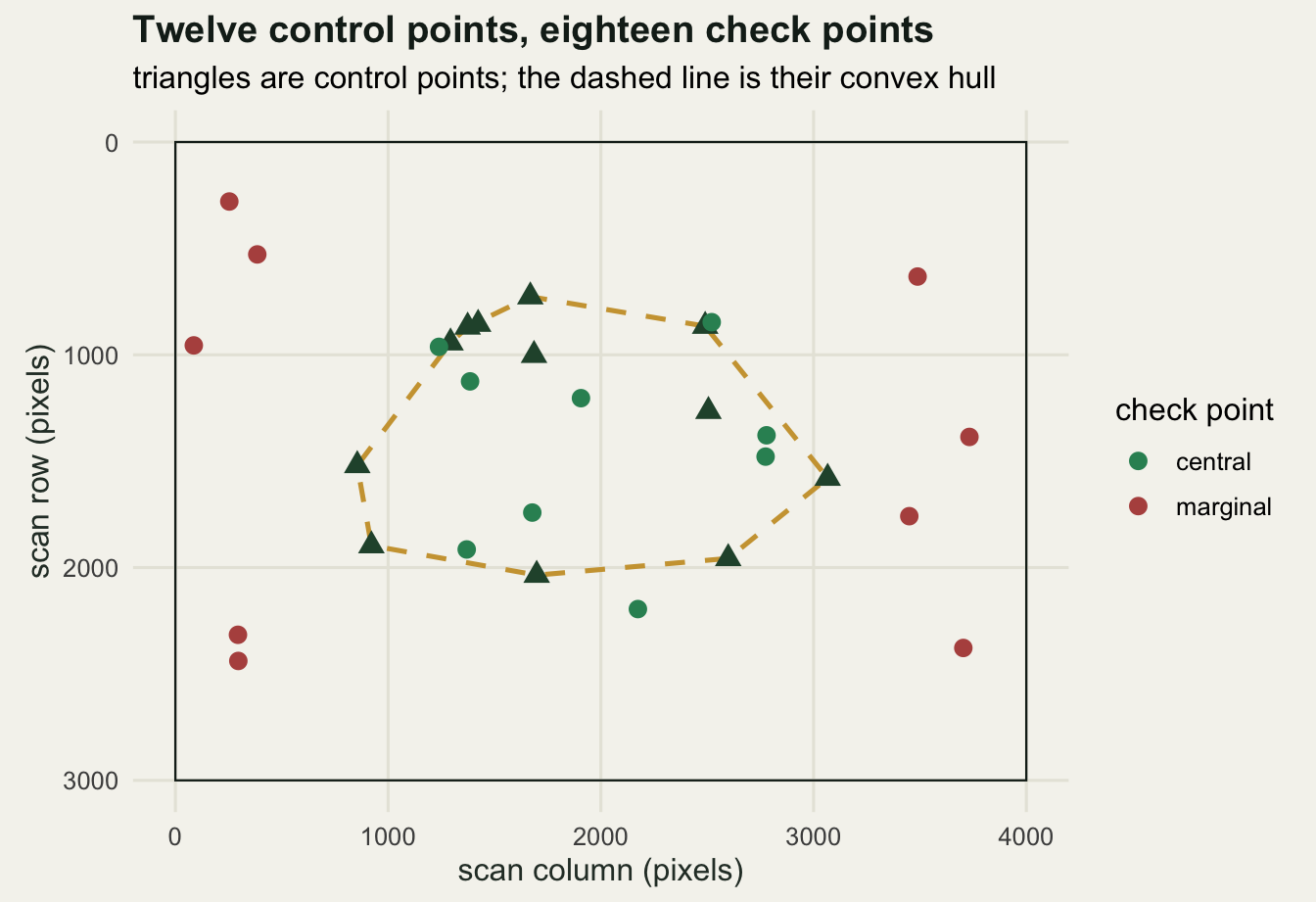
exact <- run_sheets(click = 0)
print(round(t(apply(exact$acc, c(2, 3), median)), 2))
Polynomial 1 Polynomial 2 Polynomial 3 Thin plate spline
reported 2.59 1.13 0.23 0.00
central 3.09 1.99 2.51 1.41
marginal 11.33 14.75 28.45 10.17
worst 19.28 27.76 59.37 16.97Read that table one row at a time. The reported figure falls from 2.59 to 1.13 to 0.23 metres and then to 0.00 for the thin plate spline, more than tenfold between Polynomial 1 and Polynomial 3, and a clean zero at the end. The true error at the central check points goes 3.09, 1.99, 2.51, 1.41: it improves from Polynomial 1 to Polynomial 2, then gets worse again at Polynomial 3, and the ordering of the last three has nothing to do with the ordering of the reported figures. The true error at the marginal check points goes 11.33, 14.75, 28.45, 10.17, which is the opposite direction entirely for the polynomials: the more freedom the transformation gets, the worse it extrapolates. The median worst single check point runs 19.28, 27.76, 59.37 and 16.97 metres.
med <- apply(exact$acc, c(2, 3), median)
cmp_df <- data.frame(
  tf = factor(rep(names(modes), times = 3), levels = rev(names(modes))),
  what = rep(c("reported RMS at the control points",
               "true error at central check points",
               "true error at marginal check points"), each = 4),
  value = c(med[, "reported"], med[, "central"], med[, "marginal"]))

ggplot(cmp_df, aes(value, tf, colour = what)) +
  geom_point(size = 3.6) +
  scale_colour_manual(values = c(te_pal$gold, te_pal$green, te_pal$clay),
                      name = NULL) +
  labs(title = "The number on the screen falls; the error does not",
       subtitle = "median over 100 replicate sheets, 12 control points each",
       x = "metres on the ground", y = NULL) +
  theme_te() +
  theme(legend.position = "bottom") +
  guides(colour = guide_legend(ncol = 1))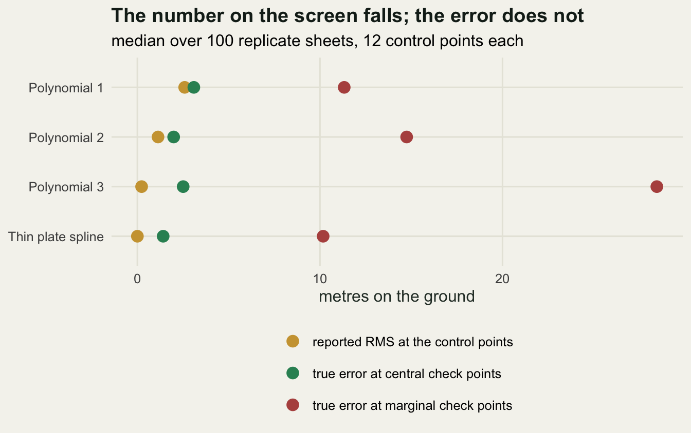
Medians hide how often the pattern holds, so count sheets instead.
cat("central check points inside the control hull:",
    sprintf("%.1f %%\n", 100 * sum(exact$hits[, "central"]) / (100 * 9)))
central check points inside the control hull: 73.2 %cat("marginal check points inside the control hull:",
sprintf("%.1f %%\n", 100 * sum(exact$hits[, "marginal"]) / (100 * 9)))marginal check points inside the control hull: 0.0 %cat("\nsheets where the reported RMS is below the true central error\n")
sheets where the reported RMS is below the true central errorfor (nm in names(modes))
cat(sprintf(" %-18s %5.1f %%\n", nm,
100 * mean(exact$acc[, nm, "reported"] <
exact$acc[, nm, "central"]))) Polynomial 1 69.0 %
Polynomial 2 94.0 %
Polynomial 3 100.0 %
Thin plate spline 100.0 %cat(sprintf("\nsheets where Polynomial 3 extrapolates worse than Polynomial 1: %.1f %%\n",
100 * mean(exact$acc[, "Polynomial 3", "marginal"] >
exact$acc[, "Polynomial 1", "marginal"])))
sheets where Polynomial 3 extrapolates worse than Polynomial 1: 94.0 %The reported figure understates the true error in the easiest possible comparison, at central check points, on 69.0 per cent of sheets for Polynomial 1, 94.0 per cent for Polynomial 2, and 100.0 per cent for both Polynomial 3 and the thin plate spline. The last two are not close calls and not sampling noise: with ten or twelve control points a cubic polynomial has nearly enough freedom to interpolate them, and a thin plate spline has exactly enough, so the residual it reports is a number about the fit and not about the map. Polynomial 3 extrapolates worse than Polynomial 1 on 94.0 per cent of sheets while reporting a figure more than ten times smaller.
extrap_df <- data.frame(a = exact$acc[, "Polynomial 1", "marginal"],
                        b = exact$acc[, "Polynomial 3", "marginal"])

ggplot(extrap_df, aes(a, b)) +
  geom_abline(slope = 1, intercept = 0, linetype = "dashed",
              colour = te_pal$ink) +
  geom_point(colour = te_pal$clay, alpha = 0.75, size = 2.2) +
  scale_x_log10(breaks = c(8, 10, 12, 15, 18)) +
  scale_y_log10() +
  labs(title = "More freedom, worse extrapolation",
       subtitle = "error at the marginal check points, one point per sheet, log axes",
       x = "Polynomial 1 (metres)", y = "Polynomial 3 (metres)") +
  theme_te()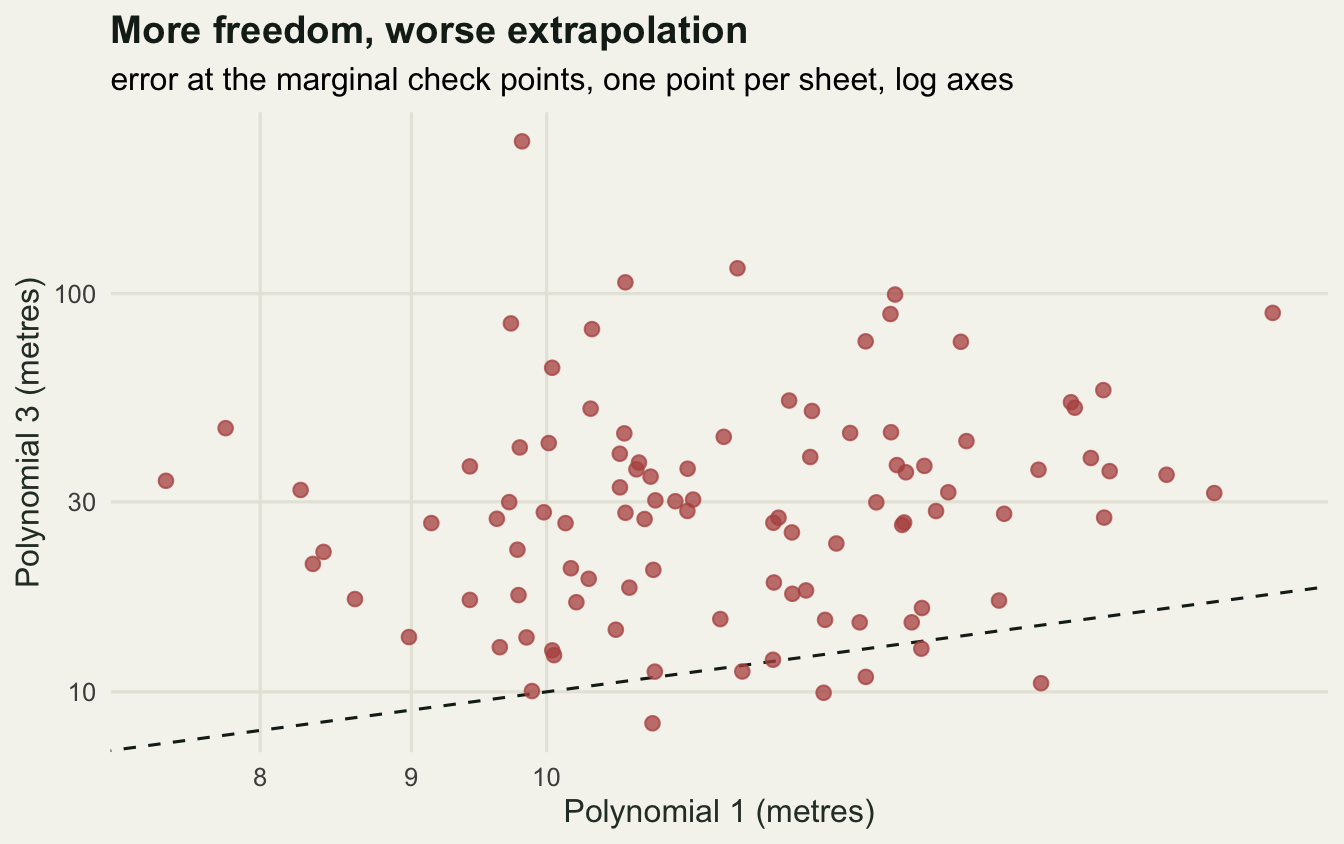
A correction, because the first version of this was an identity
The first version of this experiment gave the sheet a cubic paper deformation, on the reasoning that a smooth bow is a fair model of a curled sheet. Polynomial 3 then recovered the deformation exactly and returned zero error everywhere, inside the hull and outside it. That is not a result about georeferencing. It is the statement that a cubic polynomial can represent a cubic polynomial, and any experiment that produces it has measured its own setup.
The deformation used here is deliberately not a polynomial of any order: a low frequency sine wave across the sheet in both axes plus two local Gaussian bumps. No polynomial order can absorb it exactly, which is why the polynomial rows above all leave a residual that the reported figure does not reveal. The correction matters more than the original run did, because the same trap catches real work: if the thing you simulate is inside the family your method fits, the method will look perfect and you will have learned nothing.
The control points here are perfect, and yours are not
Every control point above was given its exact map coordinate. Real clicking is worse than that: the centre of a survey mark on a 300 dpi scan is uncertain by a pixel or two, and the reference coordinate has its own error. Repeat the whole experiment with a two pixel click error, about five metres on the ground, on both coordinates of every control point.
noisy <- run_sheets(click = 5)
print(round(t(apply(noisy$acc, c(2, 3), median)), 2))
Polynomial 1 Polynomial 2 Polynomial 3 Thin plate spline
reported 6.57 5.16 2.81 0.00
central 4.20 5.70 16.17 7.55
marginal 12.94 26.50 189.80 18.56
worst 21.44 47.99 379.62 28.65The thin plate spline still reports 0.00 metres, and its true error at central check points has gone from 1.41 to 7.55 metres. That is the sharpest form of the problem in this post: the reported figure has not moved at all while the actual error has risen more than fivefold, because a transformation that interpolates its control points absorbs their error instead of averaging it away. Polynomial 3 is worse still, at 16.17 metres centrally and 189.80 metres at the margins against a reported 2.81. Polynomial 1, the least flexible option, degrades the least: 4.20 metres centrally against 3.09 with exact points.
So the ordering in the earlier table is not a recommendation to use a thin plate spline. It was measured with exact control points, which nobody has. With clicking error the stiff transformation is the safer one, and the reported figure is the only thing that improves as you move away from it.
What to do instead
Hold points back. If you have identified fifteen marks, fit on ten and check on five, then report the error at the five. It costs nothing except the temptation to use every point you found, and it is the only number in the whole workflow that answers the question anyone actually asked. This is standard practice in photogrammetry: Hughes and colleagues assessed the accuracy of georectified aerial photographs against independent points rather than against the fit, and worked through what the resulting error means for measuring lateral channel movement in a GIS. Roberts and colleagues make the same argument for ecological models, where any statistic computed on the data a model was fitted to is optimistic by construction.
Put the check points where the analysis will be. Error inside the control hull and error outside it are different quantities by factors of two to twelve in the tables above, so a check point sitting next to your study plots tells you something a check point in the middle of the sheet does not.
Prefer the stiffest transformation the deformation allows. Polynomial 1 handles rotation, scale and shear; going up an order buys flexibility that has to be paid for at the sheet edges, and the payment does not show up in the reported figure.
Do not use anything outside the convex hull of your control points. Every transformation here degrades outside it, the flexible ones catastrophically, and no reported statistic warns you.
Save the .points file and record the transformation type, the resampling method and the target CRS next to whatever you measured off the raster. A distance measured from a georeferenced scan carries the georeferencing error into the ecology: a home range polygon digitised from a sheet inherits the sheet error along its whole boundary, and a habitat class read off at a point near the sheet edge can simply be the wrong class.
Where to go next
The error measured here is a positional error on a raster, and it does not stay there. Once records or plot centres are assigned to habitat classes through that raster, the coordinate error turns into a classification error at a rate that depends on the geometry of the habitat map rather than on the georeferencing, which is the subject of the coordinate error tutorial below.
References
Bookstein FL 1989 IEEE Transactions on Pattern Analysis and Machine Intelligence 11(6):567-585 (10.1109/34.24792)
Hughes ML, McDowell PF, Marcus WA 2006 Geomorphology 74(1-4):1-16 (10.1016/j.geomorph.2005.07.001)
Jenny B, Hurni L 2011 Computers & Graphics 35(2):402-411 (10.1016/j.cag.2011.01.005)
Chai T, Draxler RR 2014 Geoscientific Model Development 7(3):1247-1250 (10.5194/gmd-7-1247-2014)
Roberts DR, Bahn V, Ciuti S, Boyce MS, Elith J, Guillera-Arroita G, Hauenstein S, Lahoz-Monfort JJ, Schroder B, Thuiller W, Warton DI, Wintle BA, Hartig F, Dormann CF 2017 Ecography 40(8):913-929 (10.1111/ecog.02881)