library(ggplot2)
library(patchwork)

te_paper  <- "#f5f4ee"
te_ink    <- "#16241d"
te_body   <- "#2c3a31"
te_forest <- "#275139"
te_rust   <- "#b5534e"
te_gold   <- "#c9b458"
te_line   <- "#dad9ca"

theme_datasheet <- function() {
  theme_minimal(base_size = 12) +
    theme(plot.background  = element_rect(fill = te_paper, colour = NA),
          panel.background = element_rect(fill = te_paper, colour = NA),
          panel.grid.major = element_line(colour = te_line, linewidth = 0.3),
          panel.grid.minor = element_blank(),
          text             = element_text(colour = te_body),
          plot.title       = element_text(colour = te_ink, face = "bold"),
          plot.subtitle    = element_text(colour = te_body),
          axis.text        = element_text(colour = te_body))
}Genotype-environment scans under shared ancestry
R
ggplot2
population genetics
landscape genetics
GLS
ecology tutorial
A per-locus scan of allele frequency on environment flags half a neutral genome under isolation by distance. The repair uses the other loci, not the map.
Thirty sampling sites run along a valley, thirty beetles caught at each, two thousand markers scored, and one environmental variable measured per site. The analysis that follows is almost always the same: regress the allele frequency of each marker on the environment, keep the markers with small p-values, and hand the list to whoever does the gene ontology. The regression is a two-column model fitted two thousand times, and every one of those fits assumes the thirty sites are thirty independent observations.
They are not. The sites exchange migrants with their neighbours, so their allele frequencies covary, and the covariance runs along the same axis as the valley. An environment that also runs along the valley is then correlated with almost every marker in the genome before selection has done anything at all.
This site has the general version of that complaint three times already. Generalised least squares for spatial data maps the residuals of an ordinary fit, finds them clumped, and puts a distance-based correlation structure on them. Spatial+ and the attenuated slope prices the other side of the same trade: a spatial smoother that removes the confounding also removes the part of the predictor the slope was estimated from. Multiple matrix regression with MMRR counts how often a test on distance matrices rejects when the truth is zero. All three fix the problem with coordinates.
The reason a genome scan is not just another instance of that is what the fix has to be. A scan has two thousand response vectors measured on the same thirty sites, which means the covariance among sites can be estimated from the data themselves rather than assumed from a map. That is what Coop and colleagues built the environmental correlation model around in 2010, and what Bayenv and LFMM do under their own names. Checking a population genetics analysis names it in Check 4, as “a scan that conditions on the observed covariance among populations”, and does not run one.
This post runs one. It measures four things: how far the ordinary scan is wrong on a spatial environment and how repeatable that number is; what a spatially unstructured environment actually does, which turns out not to be what a single simulation would suggest; what the coordinate-based fix costs when it is applied to a genome scan; and when the covariance estimated from the loci stops being a neutral null.
A genome with an ancestry axis
The generator is a one-dimensional stepping stone in allele-frequency form. Thirty demes sit in a line, each holding a hundred diploids; a fraction of each deme is replaced every generation by migrants split evenly between the two neighbours; then binomial sampling does the drift. Two thousand loci start from a beta(2, 2) draw shared by no one and drift independently, so any covariance among demes at the end is built by migration alone. Thirty diploids are sampled per deme at the end, which adds the sampling noise a real study has.
Every constant below was fixed before the first run: thirty demes, a hundred diploids per deme, a migration rate of a tenth, a hundred and fifty generations, two thousand loci, thirty diploids sampled, a minor allele frequency filter at five per cent, and a test level of five per cent. None was revised afterwards.
n_demes  <- 30
n_diploid <- 100
mig_rate <- 0.1
n_gen    <- 150
n_loci   <- 2000
n_sample <- 30
maf_cut  <- 0.05
test_lev <- 0.05
ridge    <- 1e-3
site_pos <- seq_len(n_demes)

sim_genome <- function(env, n_sel = 0, s_sel = 0) {
  freq <- matrix(rbeta(n_demes * n_loci, 2, 2), n_demes, n_loci)
  sel_id <- seq_len(n_sel)
  for (gen in seq_len(n_gen)) {
    mix <- freq
    mix[2:(n_demes - 1), ] <- (1 - mig_rate) * freq[2:(n_demes - 1), ] +
      mig_rate / 2 * (freq[1:(n_demes - 2), ] + freq[3:n_demes, ])
    mix[1, ] <- (1 - mig_rate / 2) * freq[1, ] + mig_rate / 2 * freq[2, ]
    mix[n_demes, ] <- (1 - mig_rate / 2) * freq[n_demes, ] +
      mig_rate / 2 * freq[n_demes - 1, ]
    if (n_sel > 0) {
      mix[, sel_id] <- mix[, sel_id] +
        s_sel * env * mix[, sel_id] * (1 - mix[, sel_id])
    }
    mix <- pmin(pmax(mix, 0), 1)
    freq <- matrix(rbinom(n_demes * n_loci, 2 * n_diploid, mix),
                   n_demes, n_loci) / (2 * n_diploid)
  }
  matrix(rbinom(n_demes * n_loci, 2 * n_sample, freq),
         n_demes, n_loci) / (2 * n_sample)
}

standardise <- function(ph) {
  keep <- colMeans(ph) > maf_cut & colMeans(ph) < 1 - maf_cut
  mat <- ph[, keep, drop = FALSE]
  pbar <- colMeans(mat)
  list(Z = sweep(sweep(mat, 2, pbar), 2, sqrt(pbar * (1 - pbar)), "/"),
       keep = keep)
}

omega_of <- function(Zmat) {
  om <- tcrossprod(Zmat) / ncol(Zmat)
  om + diag(ridge * mean(diag(om)), n_demes)
}
The standardised frequencies are the usual ones: subtract the mean frequency of the locus across demes, divide by the square root of that mean times its complement. The among-deme covariance is then the outer product of that matrix with itself, averaged over loci, which is the matrix Coop and colleagues call omega. A ridge of a thousandth of the mean diagonal keeps it invertible at thirty demes.
The three environments are one gradient (the site coordinate plus a small wobble), one patchy field (a first-order autoregressive series with a lag-one correlation of 0.8, spatially structured but not monotone) and one white vector (independent normal draws, no spatial structure at all). Each is centred and scaled, so the three differ only in their spatial arrangement.
env_gradient <- function() {
  scale((site_pos - mean(site_pos)) / n_demes + rnorm(n_demes, 0, 0.1))[, 1]
}
env_patchy <- function() {
  scale(as.numeric(arima.sim(list(ar = 0.8), n_demes)))[, 1]
}
env_white <- function() scale(rnorm(n_demes))[, 1]

set.seed(31)
e_grad  <- env_gradient()
e_patch <- env_patchy()
e_white <- env_white()

gen_one <- standardise(sim_genome(rep(0, n_demes)))
om_one  <- omega_of(gen_one$Z)
centre_mat <- diag(n_demes) - matrix(1 / n_demes, n_demes, n_demes)
om_centred <- centre_mat %*% om_one %*% centre_mat
eig_one <- eigen(om_centred, symmetric = TRUE)
eig_share <- eig_one$values / sum(eig_one$values)
pc_one <- eig_one$vectors[, 1]

n_kept  <- sum(gen_one$keep)
pc_axis <- abs(cor(pc_one, site_pos))
cor_env <- c(gradient = abs(cor(e_grad, pc_one)),
             patchy   = abs(cor(e_patch, pc_one)),
             white    = abs(cor(e_white, pc_one)))
The minor allele frequency filter removed 0 of the 2000 loci, so the shares below are over the whole genome; at this migration rate and this run length the filter never binds. The leading eigenvector of the centred covariance carries 24.8 per cent of the total variance and its correlation with the site coordinate is 0.987. The first three axes together carry 54.9 per cent. That concentration is the whole problem: shared ancestry is not spread evenly over thirty directions, it is concentrated on the axis the valley runs along.
The three environments sit at very different angles to that axis. The gradient correlates 0.93 with it, the patchy field 0.78, and the white vector 0.02.
om_df <- data.frame(row_site = rep(site_pos, times = n_demes),
                    col_site = rep(site_pos, each = n_demes),
                    value = as.vector(om_centred))

p_cov <- ggplot(om_df, aes(col_site, row_site, fill = value)) +
  geom_raster() +
  scale_fill_gradient2(low = te_rust, mid = te_paper, high = te_forest,
                       midpoint = 0, name = NULL, breaks = c(0, 0.1),
                       guide = guide_colourbar(barwidth = unit(2.4, "cm"),
                                               barheight = unit(0.25, "cm"))) +
  coord_equal(expand = FALSE) +
  labs(x = "site", y = "site", title = "Shared ancestry",
       subtitle = "covariance from the loci") +
  theme_datasheet() +
  theme(legend.position = "bottom", legend.key.height = unit(0.25, "cm"))

env_df <- rbind(
  data.frame(site = site_pos, value = e_grad, class = "gradient"),
  data.frame(site = site_pos, value = e_patch, class = "patchy"),
  data.frame(site = site_pos, value = e_white, class = "white"))

p_env <- ggplot(env_df, aes(site, value, colour = class)) +
  geom_hline(yintercept = 0, colour = te_line, linewidth = 0.4) +
  geom_line(linewidth = 0.8) +
  scale_colour_manual(values = c(gradient = te_forest, patchy = te_gold,
                                 white = te_rust), name = NULL) +
  labs(x = "site", y = "environment (standardised)",
       title = "Three environments",
       subtitle = "same mean and variance") +
  theme_datasheet() +
  theme(legend.position = "bottom")

(p_cov | p_env) + plot_annotation(theme = theme_datasheet())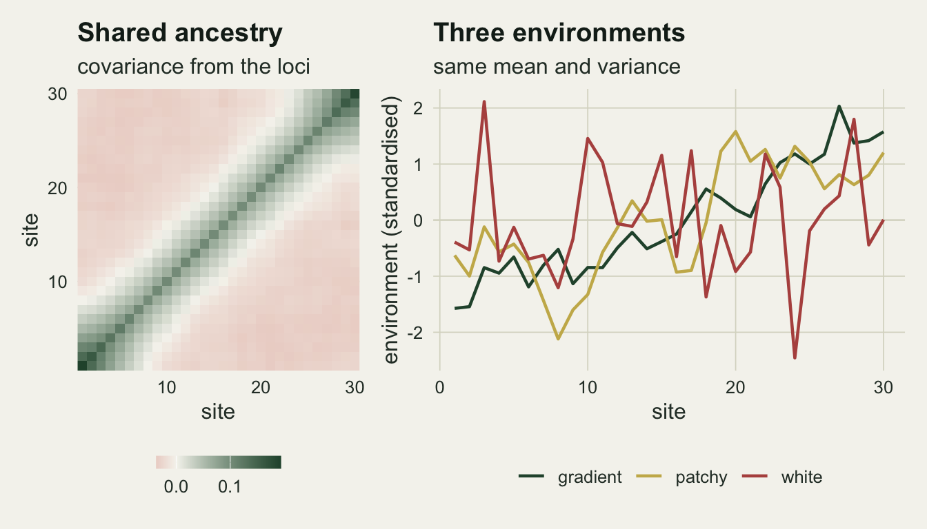
One genome, three environments, one scan
Three tests are run on every locus. The first is ordinary least squares on the standardised frequency against the environment, with the t statistic on twenty-eight degrees of freedom. The second is a generalised least squares fit with the estimated among-deme covariance as the error structure, which is the Coop model without its Bayesian layer. The third is the coordinate-based fix this site would reach for elsewhere: ordinary least squares with a cubic polynomial in the site coordinate added as a nuisance term, on twenty-five degrees of freedom.
Because the neutral genome does not depend on the environment at all, the same simulated genome can be scanned against all three environments. Any difference between the three columns below is caused by the environment vector alone.
scan_all <- function(Zmat, env, om) {
  des <- cbind(1, env)
  b_ols <- solve(crossprod(des), crossprod(des, Zmat))
  r_ols <- Zmat - des %*% b_ols
  t_ols <- b_ols[2, ] / sqrt(colSums(r_ols^2) / (n_demes - 2) *
                               solve(crossprod(des))[2, 2])
  om_inv <- solve(om)
  cross <- crossprod(des, om_inv)
  vmat <- solve(cross %*% des)
  b_gls <- vmat %*% cross %*% Zmat
  r_gls <- Zmat - des %*% b_gls
  t_gls <- b_gls[2, ] / sqrt(colSums(r_gls * (om_inv %*% r_gls)) /
                               (n_demes - 2) * vmat[2, 2])
  des_sp <- cbind(1, env, poly(site_pos, 3))
  b_sp <- solve(crossprod(des_sp), crossprod(des_sp, Zmat))
  r_sp <- Zmat - des_sp %*% b_sp
  t_sp <- b_sp[2, ] / sqrt(colSums(r_sp^2) / (n_demes - 5) *
                             solve(crossprod(des_sp))[2, 2])
  list(ols = t_ols, gls = t_gls, coords = t_sp)
}

flagged <- function(tv, dfree) abs(tv) > qt(1 - test_lev / 2, dfree)

one_scan <- function(env) {
  sc <- scan_all(gen_one$Z, env, om_one)
  c(ols    = mean(flagged(sc$ols, n_demes - 2)),
    gls    = mean(flagged(sc$gls, n_demes - 2)),
    coords = mean(flagged(sc$coords, n_demes - 5)))
}

rate_tab <- rbind(gradient = one_scan(e_grad),
                  patchy   = one_scan(e_patch),
                  white    = one_scan(e_white))
round(rate_tab, 4)
ols gls coords
gradient 0.4895 0.048 0.0665
patchy 0.4130 0.051 0.1115
white 0.0145 0.047 0.0475mc_bin <- sqrt(0.25 / n_kept)Nothing in this genome is under selection, so every flagged locus is a false positive. At a nominal five per cent the ordinary scan flags 48.9 per cent of the genome on the gradient environment, 41.3 per cent on the patchy field, and 1.5 per cent on the white one. Same genome, same nominal level, same number of sites; only the arrangement of the environment changed.
The generalised fit returns 0.048, 0.051 and 0.047 on the same three environments, all within a Monte Carlo standard error or two of the nominal 0.05 (the binomial standard error over 2000 loci is 0.011, and it is a lower bound because loci in one genome are not independent of each other).
The coordinate fix behaves differently on the two spatial environments. On the gradient it gives 0.067, a little above nominal; on the patchy field it gives 0.112, more than twice the level it was asked for. A cubic in the coordinate can absorb a monotone trend, and the ancestry covariance is mostly a monotone trend, but the patchy field has structure at a scale the cubic cannot represent, and what the cubic cannot represent stays in the residual and stays correlated with the environment.
rate_df <- data.frame(
  class = rep(rownames(rate_tab), times = 3),
  method = rep(c("OLS", "GLS, genome covariance", "OLS + cubic in coordinate"),
               each = 3),
  rate = as.vector(rate_tab))
rate_df$method <- factor(rate_df$method,
  levels = c("OLS", "GLS, genome covariance", "OLS + cubic in coordinate"))
rate_df$class <- factor(rate_df$class, levels = c("gradient", "patchy", "white"))

ggplot(rate_df, aes(class, rate, fill = method)) +
  geom_col(position = position_dodge(width = 0.75), width = 0.68) +
  geom_hline(yintercept = test_lev, linetype = "dashed",
             colour = te_ink, linewidth = 0.6) +
  scale_fill_manual(values = c(te_forest, te_gold, te_rust), name = NULL) +
  labs(x = "environment", y = "share of neutral loci flagged",
       title = "The same genome, three environments",
       subtitle = "dashed line: the nominal five per cent") +
  theme_datasheet() +
  theme(legend.position = "bottom")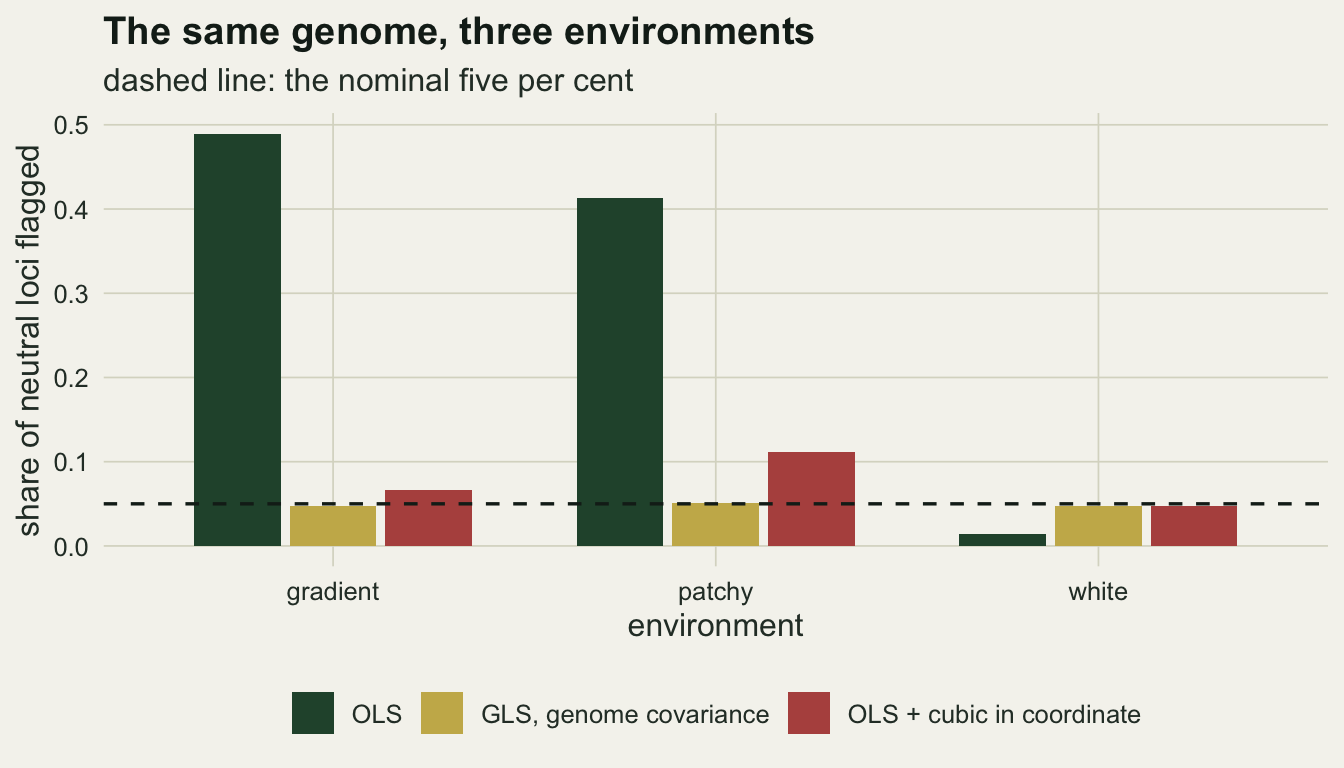
The white environment is a lottery, not a safeguard
A single run makes the white environment look safe, even over-cautious. It is not, and the reason is worth the arithmetic.
Write the centred environment as a vector and the centred ancestry covariance as a matrix. For a locus whose deme frequencies have that covariance, the sampling variance of the ordinary slope is a quadratic form in the environment divided by the squared length of the environment, while the ordinary residual variance estimates something close to the average of the covariance eigenvalues. Their ratio is the inflation factor: a weighted average of the eigenvalues, with weights summing to one, divided by their mean, so its expectation over random draws is exactly one. Its median is below one, because the eigenvalue spectrum is skewed: one large eigenvalue on the valley axis and twenty-nine small ones. So more white draws land under the mean than above it and look conservative, and a few land on the big eigenvalue and do not.
That last claim is arithmetic, not a simulation result, so it can be checked against the spectrum directly rather than against sixty draws.
n_theory <- 1e5
set.seed(2)
ev_pos <- pmax(eig_one$values, 0)[1:(n_demes - 1)]
gsq <- matrix(rnorm(n_theory * (n_demes - 1))^2, n_demes - 1, n_theory)
rat_theory <- as.numeric(crossprod(ev_pos, gsq) / colSums(gsq)) /
  (sum(ev_pos) / (n_demes - 1))
theory_low <- mean(rat_theory < 1)
theory_med <- median(rat_theory)
theory_mean <- mean(rat_theory)
Drawing 100,000 white environments against this genome’s own eigenvalue spectrum puts the chance of an inflation factor below one at 0.59, with a median of 0.91 and a mean of 1.00.
The test below runs 20 fresh environment draws of each class against each of three independently simulated neutral genomes, and records both the false-positive share and that ratio.
n_draw <- 20
set.seed(5)
gen_set <- list(gen_one, standardise(sim_genome(rep(0, n_demes))),
                standardise(sim_genome(rep(0, n_demes))))

draw_env <- function(cls) {
  switch(cls, gradient = env_gradient(), patchy = env_patchy(), env_white())
}

lot <- do.call(rbind, lapply(seq_along(gen_set), function(gi) {
  gg <- gen_set[[gi]]
  om <- omega_of(gg$Z)
  om_c <- centre_mat %*% om %*% centre_mat
  ev_mean <- sum(diag(om_c)) / (n_demes - 1)
  do.call(rbind, lapply(c("gradient", "patchy", "white"), function(cls) {
    do.call(rbind, lapply(seq_len(n_draw), function(i) {
      env <- draw_env(cls)
      sc <- scan_all(gg$Z, env, om)
      data.frame(genome = gi, class = cls,
                 ols = mean(flagged(sc$ols, n_demes - 2)),
                 gls = mean(flagged(sc$gls, n_demes - 2)),
                 coords = mean(flagged(sc$coords, n_demes - 5)),
                 ratio = as.numeric(crossprod(env, om_c %*% env)) /
                   sum(env^2) / ev_mean)
    }))
  }))
}))

by_class <- function(cls, col) lot[[col]][lot$class == cls]
white_ratio <- by_class("white", "ratio")
ratio_mean <- mean(white_ratio)
ratio_se   <- sd(white_ratio) / sqrt(length(white_ratio))
ratio_med  <- median(white_ratio)
share_low  <- mean(white_ratio < 1)
n_total    <- nrow(lot)

lot$pred <- 2 * (1 - pt(qt(1 - test_lev / 2, n_demes - 2) / sqrt(lot$ratio),
                        n_demes - 2))
cor_pred   <- cor(log(lot$pred), log(lot$ols))
cor_pooled <- cor(log(lot$ratio), log(lot$ols))
by_cls <- function(f) vapply(c("gradient", "patchy", "white"), f, numeric(1))
cor_within <- by_cls(function(cl) cor(log(lot$ratio[lot$class == cl]),
                                      log(lot$ols[lot$class == cl])))
op_med <- by_cls(function(cl) median(lot$ols[lot$class == cl] /
                                       lot$pred[lot$class == cl]))
The gradient environment is the reliable case, and it is reliable in the wrong direction. Across 60 gradient draws on three genomes the ordinary scan flagged between 46.2 and 50.8 per cent of neutral loci. That is a law, not an accident: a gradient environment is nearly the leading ancestry axis every time it is drawn, so the inflation is always large. The ratio ran from 5.63 to 6.79 over the sixty gradient draws, far enough above one that the share flagged barely moves. The patchy field is looser, from 8.2 to 43.8 per cent, because an autoregressive draw can happen to run with the valley or across it.
With a spatially white environment the per-locus scan is not conservative by rule. Its false-positive share depends on how that one environment vector happens to line up with the leading axes of shared ancestry, and across 60 white draws it ranged from 0.15 to 21.10 per cent, with a median of 3.53 per cent. The generalised fit stayed between 0.039 and 0.060 in all 180 draws of all three classes. Anyone who runs one white simulation and reports the number as the error rate of the method has reported a property of their environment vector.
The quadratic form predicts all of it. Over the white draws the inflation ratio averaged 1.042 with a Monte Carlo standard error of 0.053, against a theoretical expectation of one, and its median was 0.952. 57 per cent of the sixty draws fell below one, against the 59 per cent the spectrum implies; the sixty draws on their own carry a standard error of 0.065 on that share, so they confirm the arithmetic rather than establish it.
The ratio can be turned into a predicted share, which is what makes it a prediction rather than a diagnostic: a test whose sampling variance is inflated by a factor, while its residual variance estimate stays at the eigenvalue average, rejects at 2 * (1 - pt(t_crit / sqrt(ratio), 28)), where t_crit is the two-sided five per cent critical value on the same twenty-eight degrees of freedom. Across all 180 draws the correlation between that logged predicted share and the logged observed share is 0.996, and the median observed share is 1.15 times the predicted one on the gradient, 1.13 on the patchy field and 0.92 on the white one. The bare correlation between the logged ratio and the logged share is 0.967 pooled over the three classes, but that one number hides how differently the three classes behave: it is 0.98 within the patchy class and 0.98 within the white one, and only 0.47 within the gradient class, where the ratio never comes near one and the share flagged barely moves. One scalar computed from the environment and the covariance, before any test is run, says how bad the scan will be.
lot_long <- rbind(
  data.frame(class = lot$class, rate = lot$ols, method = "OLS"),
  data.frame(class = lot$class, rate = lot$gls,
             method = "GLS, genome covariance"))
lot_long$class <- factor(lot_long$class,
                         levels = c("gradient", "patchy", "white"))
lot_long$method <- factor(lot_long$method,
                          levels = c("OLS", "GLS, genome covariance"))

p_lot <- ggplot(lot_long, aes(class, rate, colour = method)) +
  geom_hline(yintercept = test_lev, linetype = "dashed",
             colour = te_ink, linewidth = 0.5) +
  geom_point(position = position_jitterdodge(jitter.width = 0.22,
                                             dodge.width = 0.6, seed = 7),
             size = 1.5, alpha = 0.8) +
  scale_y_log10() +
  scale_colour_manual(values = c(te_forest, te_gold), name = NULL) +
  labs(x = "environment class", y = "share flagged",
       title = "Sixty draws per class",
       subtitle = "dashed: nominal level") +
  theme_datasheet() +
  theme(legend.position = "bottom")

p_pred <- ggplot(lot, aes(ratio, ols)) +
  geom_hline(yintercept = test_lev, linetype = "dashed",
             colour = te_ink, linewidth = 0.5) +
  geom_vline(xintercept = 1, linetype = "dashed",
             colour = te_ink, linewidth = 0.5) +
  geom_line(data = lot[order(lot$ratio), ], aes(ratio, pred),
            colour = te_ink, linewidth = 0.7) +
  geom_point(aes(colour = class), size = 1.5, alpha = 0.85) +
  scale_x_log10() +
  scale_y_log10() +
  scale_colour_manual(values = c(gradient = te_forest, patchy = te_gold,
                                 white = te_rust), name = NULL) +
  labs(x = "inflation ratio", y = "share flagged",
       title = "One scalar predicts it",
       subtitle = "line: the closed-form prediction") +
  theme_datasheet() +
  theme(legend.position = "bottom")

(p_lot | p_pred) + plot_annotation(theme = theme_datasheet())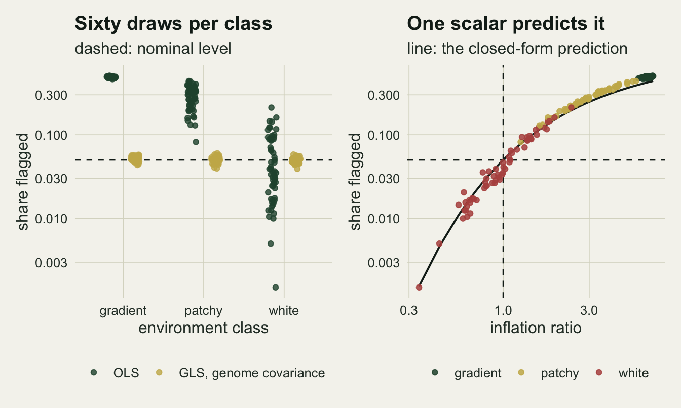
Coordinates are the wrong covariance
Controlling the false-positive rate is half the job. The other half is whether the loci under selection still come out on top. This run puts 30 environment-responding loci into the genome, with a selection coefficient from a grid fixed in advance, and scores three things per cell: the share of neutral loci flagged, the share of responding loci flagged, and the share of the top thirty loci by absolute t statistic that are genuinely responding.
n_sel <- 30
s_grid <- c(0.005, 0.01, 0.02, 0.05)
set.seed(909)
s_tab <- do.call(rbind, lapply(c("gradient", "patchy", "white"), function(cls) {
  env <- switch(cls, gradient = e_grad, patchy = e_patch, white = e_white)
  do.call(rbind, lapply(s_grid, function(s_use) {
    gg <- standardise(sim_genome(env, n_sel, s_use))
    sc <- scan_all(gg$Z, env, omega_of(gg$Z))
    is_sel <- which(gg$keep) <= n_sel
    prec <- function(tv) mean(is_sel[order(-abs(tv))[1:n_sel]])
    data.frame(class = cls, s_sel = s_use,
      pow_ols = mean(flagged(sc$ols[is_sel], n_demes - 2)),
      pow_gls = mean(flagged(sc$gls[is_sel], n_demes - 2)),
      pow_coords = mean(flagged(sc$coords[is_sel], n_demes - 5)),
      fpr_ols = mean(flagged(sc$ols[!is_sel], n_demes - 2)),
      fpr_gls = mean(flagged(sc$gls[!is_sel], n_demes - 2)),
      fpr_coords = mean(flagged(sc$coords[!is_sel], n_demes - 5)),
      prec_ols = prec(sc$ols), prec_gls = prec(sc$gls),
      prec_coords = prec(sc$coords))
  }))
}))

cell <- function(cls, s_use, col) {
  s_tab[[col]][s_tab$class == cls & s_tab$s_sel == s_use]
}
mc_sel <- sqrt(0.25 / n_sel)
s_top <- max(s_grid)
At the strongest selection on the grid, a coefficient of 0.05, the three methods separate cleanly on the gradient environment. The ordinary scan puts 0.93 of the top thirty loci on genuinely responding markers, the generalised fit 0.63, and the coordinate fix 0.00. The standard error of a share over 30 loci is at most 0.09, so the gap between the first two is real and the third is not a near miss: the coordinate fix found nothing.
That last number is the point of the section. When the environment is the axis of structure, a cubic in the coordinate explains the environment almost perfectly, so the residual the environment coefficient is estimated from is close to noise. Its power at this selection coefficient is 0.10, against 1.00 for the generalised fit. This is the same trade the spatial+ post prices for a single regression, and a genome scan pays it at every locus at once. The genome covariance does not pay it, because it does not know where the sites are: it knows only which sites resemble each other, and a locus that departs from that resemblance in the direction of the environment still stands out.
The ordinary scan looks best of the three on precision, and it is a trap. Its top thirty are mostly right because selection at 0.05 is strong, but the same scan is flagging 47.5 per cent of the neutral genome, which at two thousand loci is roughly 935 false candidates sitting under the top thirty. Precision at a fixed list length flatters any test that ranks well and calibrates badly.
On the patchy environment the coordinate fix is no longer useless, 0.57 precision against 0.77 for the generalised fit, but it is still flagging 11.0 per cent of neutral loci where the generalised fit flags 3.7 per cent. On the white environment, where there is no confounding to remove, the ordinary scan leads on precision with 0.97, the coordinate fix loses little at 0.87, and the generalised fit is the worst of the three at 0.63. Conditioning on the covariance costs power whether or not the covariance was doing any harm.
pow_df <- data.frame(class = s_tab$class, s_sel = s_tab$s_sel,
                     power = s_tab$pow_gls)
ref_df <- data.frame(class = s_tab$class, fpr = s_tab$fpr_ols)
ref_df <- aggregate(fpr ~ class, ref_df, mean)

p_pow <- ggplot(pow_df, aes(s_sel, power, colour = class)) +
  geom_hline(data = ref_df, aes(yintercept = fpr, colour = class),
             linetype = "dotted", linewidth = 0.7) +
  geom_line(linewidth = 0.9) +
  geom_point(size = 2) +
  scale_x_log10() +
  scale_y_continuous(limits = c(0, 1)) +
  scale_colour_manual(values = c(gradient = te_forest, patchy = te_gold,
                                 white = te_rust), name = NULL) +
  labs(x = "selection coefficient", y = "power of the generalised fit",
       title = "Power against the wolf rate",
       subtitle = "dotted: neutral share the ordinary scan flags") +
  theme_datasheet() +
  theme(legend.position = "bottom")

top_df <- s_tab[s_tab$s_sel == s_top, ]
prec_df <- data.frame(
  class = rep(top_df$class, times = 3),
  method = rep(c("OLS", "GLS, genome covariance", "OLS + cubic in coordinate"),
               each = nrow(top_df)),
  prec = c(top_df$prec_ols, top_df$prec_gls, top_df$prec_coords))
prec_df$method <- factor(prec_df$method,
  levels = c("OLS", "GLS, genome covariance", "OLS + cubic in coordinate"))
prec_df$class <- factor(prec_df$class, levels = c("gradient", "patchy", "white"))

p_prec <- ggplot(prec_df, aes(class, prec, fill = method)) +
  geom_col(position = position_dodge(width = 0.75), width = 0.68) +
  scale_fill_manual(values = c(te_forest, te_gold, te_rust), name = NULL) +
  scale_y_continuous(limits = c(0, 1)) +
  labs(x = "environment", y = "share of the top thirty that respond",
       title = "Precision at the strongest selection",
       subtitle = paste("selection coefficient", sprintf("%.2f", s_top))) +
  theme_datasheet() +
  theme(legend.position = "bottom")

(p_pow / p_prec) + plot_annotation(theme = theme_datasheet())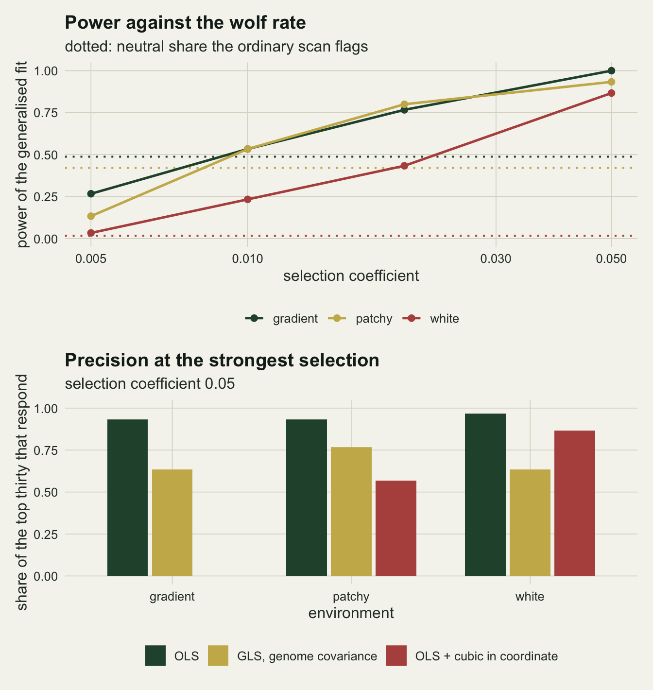
The covariance is only as neutral as the genome
The obvious objection to estimating the covariance from the loci is that the tested locus is one of the two thousand that built it. The fix people reach for is to hold loci out. This run does that properly, and also does the thing that actually matters, which is to vary how much of the genome responds to the environment: thirty, one hundred, two hundred and four hundred loci out of two thousand, at the strongest selection coefficient, on the gradient environment. Three covariance matrices are compared per level: one from all loci, one from a random half of them with the results reported only for the loci that stayed out of that half, and one from the neutral loci only, which no real study can build and which is here as the reference. Splitting the loci is what makes the second arm a hold-out rather than a relabelling: build the matrix from half and score the other half, so no tested locus is inside its own covariance.
set.seed(404)
leak <- do.call(rbind, lapply(c(30, 100, 200, 400), function(ns) {
  gg <- standardise(sim_genome(e_grad, ns, s_top))
  n_keep <- ncol(gg$Z)
  is_sel <- which(gg$keep) <= ns
  half <- sample(rep(c(TRUE, FALSE), length.out = n_keep))
  om_list <- list(`all loci` = omega_of(gg$Z),
                  `held-out half` = omega_of(gg$Z[, half]),
                  `neutral loci only` = omega_of(gg$Z[, !is_sel]))
  do.call(rbind, lapply(names(om_list), function(src) {
    sc <- scan_all(gg$Z, e_grad, om_list[[src]])
    tst <- if (src == "held-out half") !half else rep(TRUE, n_keep)
    tv <- sc$gls[tst]
    sel <- is_sel[tst]
    data.frame(n_sel = ns, share = ns / n_loci, source = src,
      n_test = sum(sel),
      pow = mean(flagged(tv[sel], n_demes - 2)),
      fpr = mean(flagged(tv[!sel], n_demes - 2)),
      prec = mean(sel[order(-abs(tv))[1:sum(sel)]]))
  }))
}))

lk <- function(ns, src, col) leak[[col]][leak$n_sel == ns & leak$source == src]
prec_gap <- lk(30, "neutral loci only", "prec") - lk(30, "all loci", "prec")
At thirty responding loci, 1.5 per cent of the genome, the hold-out changes almost nothing: power is 1.00 with the covariance from all loci and 1.00 on the 14 responding loci that stayed out of it, and the false-positive share moves from 0.044 to 0.035. Self-inclusion of the tested locus among two thousand does not drive the power or the error rate, which answers the question in the form it is usually asked.
The ranking is another matter. Precision among the top thirty is 0.57 from the covariance built on all loci and 0.83 from one built only on the neutral loci, a gap of 0.27, which is 2.9 times the standard error of a share over thirty loci and comes from a single replicate. Even at 1.5 per cent responding, the order of the candidate list is not indifferent to what went into the matrix, though the flagging decision is.
The aggregate is where it hurts. At 5 per cent responding loci the hold-out still buys something: power is 0.64 from all loci and 0.85 on the 54 responding loci held out of the matrix. By 10 per cent both are gone, 0.14 and 0.16, because the half that built the matrix carries the same share of responding loci and therefore the same environment-aligned component. With the covariance built from the neutral loci only, power at that level is 1.00. At 20 per cent the all-loci version is down to 0.04 and the hold-out to 0.10, while the neutral reference is still 1.00. Coop and colleagues build their matrix from control loci for exactly this reason; the neutral arm here is that design with perfect knowledge of which loci are controls, and it is the only one of the three that survives.
Note what does not move: the false-positive share stays near nominal in every cell, between 0.035 and 0.054. The leak does not break the calibration, it eats the signal. A scan that has quietly become blind will not announce it with an inflated error rate; it will announce it with an empty candidate list, which is much easier to mistake for a real negative result.
leak$source <- factor(leak$source,
  levels = c("all loci", "held-out half", "neutral loci only"))
leak$pct <- 100 * leak$share

p_lpow <- ggplot(leak, aes(pct, pow, colour = source)) +
  geom_line(linewidth = 0.9) +
  geom_point(size = 2) +
  scale_y_continuous(limits = c(0, 1)) +
  scale_colour_manual(values = c(te_forest, te_gold, te_rust), name = NULL) +
  labs(x = "per cent of loci responding", y = "power",
       title = "The leak eats the signal",
       subtitle = "covariance built three ways") +
  theme_datasheet() +
  theme(legend.position = "bottom")

p_lprec <- ggplot(leak, aes(pct, prec, colour = source)) +
  geom_line(linewidth = 0.9) +
  geom_point(size = 2) +
  scale_y_continuous(limits = c(0, 1)) +
  scale_colour_manual(values = c(te_forest, te_gold, te_rust), name = NULL) +
  labs(x = "per cent of loci responding", y = "share of the top list",
       title = "A held-out half is no repair",
       subtitle = "it carries the same share") +
  theme_datasheet() +
  theme(legend.position = "bottom")

(p_lpow | p_lprec) + plot_layout(guides = "collect") +
  plot_annotation(theme = theme_datasheet()) &
  theme(legend.position = "bottom")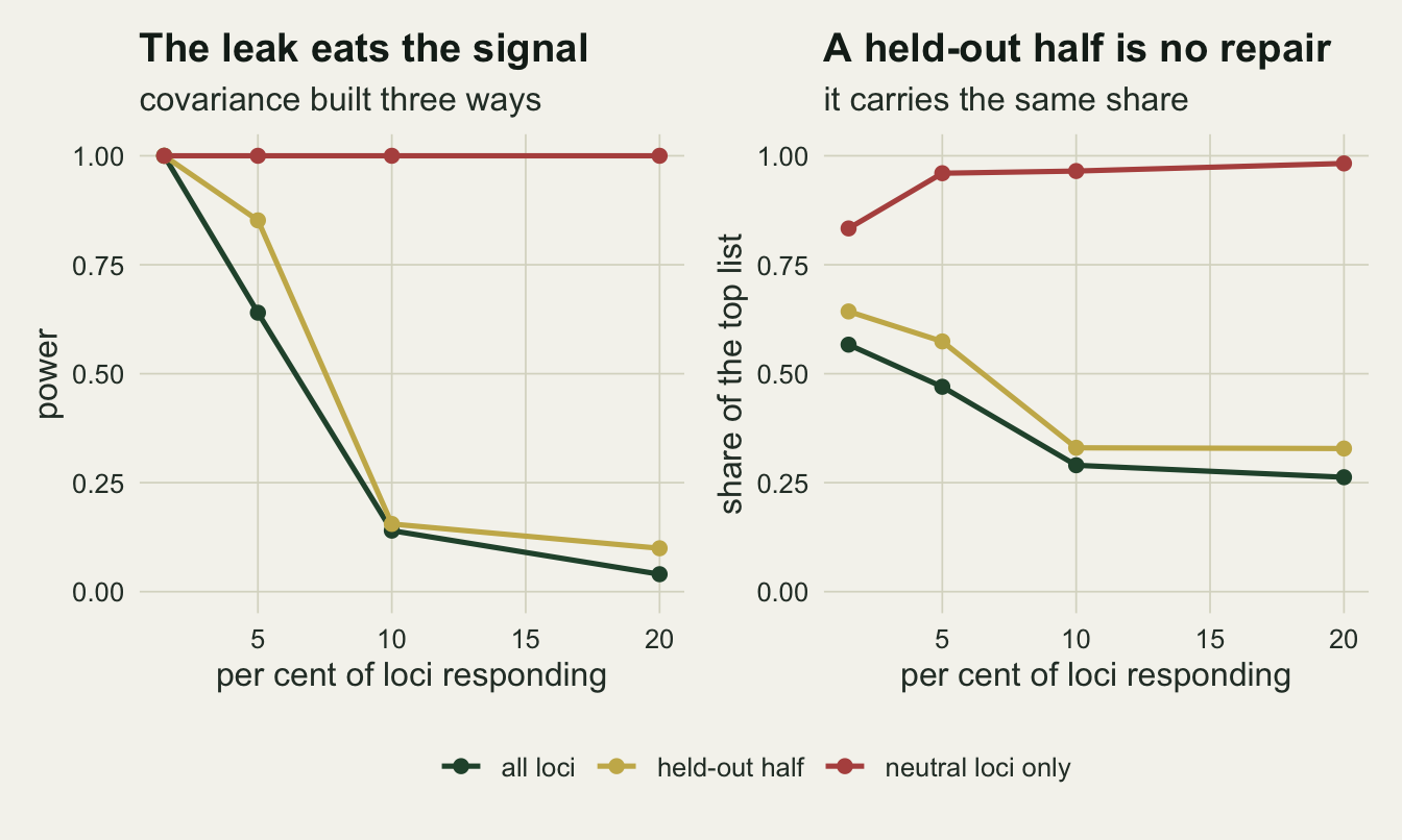
When the scan is not worth running
The grid above answers a question worth asking before any of this is run: at what point does the corrected scan find fewer real loci than the uncorrected scan invents false ones? Compare the power of the generalised fit against the false-positive share of the ordinary scan in the same cell.
cross_at <- function(cls) {
  rows <- s_tab[s_tab$class == cls, ]
  ref <- mean(rows$fpr_ols)
  ok <- rows$pow_gls > ref & rows$pow_gls > rows$fpr_gls
  c(ref = ref, s_min = if (any(ok)) min(rows$s_sel[ok]) else NA_real_)
}
cross_grad  <- cross_at("gradient")
cross_patch <- cross_at("patchy")
cross_white <- cross_at("white")

false_per_true <- function(pw, fp) fp * (n_loci - n_sel) / (pw * n_sel)
s_tab$fpt_ols <- false_per_true(s_tab$pow_ols, s_tab$fpr_ols)
s_tab$fpt_gls <- false_per_true(s_tab$pow_gls, s_tab$fpr_gls)
spatial <- s_tab$class != "white"
n_gls_better <- sum(s_tab$fpt_gls[spatial] < s_tab$fpt_ols[spatial])
n_ols_better <- sum(s_tab$fpt_ols[!spatial] < s_tab$fpt_gls[!spatial])
On the gradient environment, where the environment correlates 0.93 with the leading ancestry axis, the ordinary scan flags 0.49 of neutral loci, and the generalised fit only beats that from a selection coefficient of 0.010 upwards. Below that, a landscape genomics project on this design is producing a candidate list in which the honest method finds fewer true loci than the naive method invents false ones, per locus. On the patchy field, correlation 0.78, the threshold is the same 0.010. On the white environment, correlation 0.02, the ordinary scan flags only 0.02, so that comparison stops being informative and what binds instead is the size of the test: at the weakest coefficient on the grid the generalised fit rejects 0.033 of the responding loci against 0.048 of the neutral ones, which is no detection at all. The first grid point where it rejects responding loci more often than neutral ones is 0.010.
The grid is coarse, so these thresholds are grid points rather than crossings, and a share over 30 responding loci carries a standard error up to 0.09. What the threshold marks also has to be read carefully. It is not the point at which the generalised fit becomes the better method, because the comparison behind it sets a power over 30 responding loci against an error share over 1970 neutral ones. Count candidates instead: on the two spatially structured environments the generalised fit returns fewer false candidates per true one in every cell of the grid, 8 out of 8: 13 against 36 on the gradient at the weakest coefficient, and 2 against 31 at the strongest. On the white environment, where there is nothing to correct, the ordinary scan has the better list in every cell, 4 out of 4. The threshold is where the corrected scan starts finding anything, not where it starts beating the naive one.
What to report
Report the among-deme covariance itself, not just the fact that a correction was applied. Its leading eigenvalue share, here 0.25, and the correlation of its leading eigenvector with geography, here 0.99, tell a reader in two numbers how much room there is for a spatial environment to be confounded with ancestry. Both come from one call to eigen on a matrix the scan has already built.
Report the correlation between the environment and the leading ancestry axes, here 0.93 for the gradient and 0.02 for the white vector. The inflation depends on it, and the share predicted from the quadratic form tracked the measured share with a correlation of 0.996 on the log scale across 180 environment draws in this simulation.
Never report a false-positive rate from a single simulated environment. On a white environment the share ranged from 0.15 to 21.10 per cent across 60 draws on the same three genomes. If a method paper or a referee reply needs a number, it needs a distribution over environment draws, and the environment draws have to be redrawn independently of the genome.
Say what fraction of the loci are expected to respond to the environment, and say where the covariance came from. If a substantial share of the genome tracks the same variable, the covariance estimated from that genome absorbs the signal, and holding out half the loci does not help: at 10 per cent responding loci the power was 0.14 from all loci and 0.16 scoring only the loci held out of the matrix, against 1.00 from a neutral set. An iterated scan that drops the top candidates before rebuilding the covariance is the practical version of that reference.
Do not use a spatial smoother as the correction for a genome scan on a monotone gradient. Its precision among the top thirty here was 0.00 against 0.63 for the genome covariance, and its power 0.10 against 1.00. On a patchy environment it is the other failure: a false-positive share of 0.110 where the genome covariance gives 0.037.
Honest limits
The simulation is a line of demes, which is a friendly case for a coordinate-based correction, because ancestry there really is almost one-dimensional. A two-dimensional lattice with unequal deme sizes has a flatter ancestry spectrum, and the draw dependence should narrow with it. That is checkable, so it is checked.
n_row <- 5
n_col <- 6
set.seed(1212)
size_vec <- sample(c(rep(40, 10), rep(100, 10), rep(300, 10)))
cells <- expand.grid(row = seq_len(n_row), col = seq_len(n_col))
mig_mat <- matrix(0, n_demes, n_demes)
for (i in seq_len(n_demes)) {
  nb <- which(abs(cells$row - cells$row[i]) + abs(cells$col - cells$col[i]) == 1)
  mig_mat[i, nb] <- mig_rate / length(nb)
}
diag(mig_mat) <- 1 - rowSums(mig_mat)

freq_2d <- matrix(rbeta(n_demes * n_loci, 2, 2), n_demes, n_loci)
for (gen in seq_len(n_gen)) {
  mix2 <- mig_mat %*% freq_2d
  freq_2d <- matrix(rbinom(n_demes * n_loci, 2 * size_vec, mix2),
                    n_demes, n_loci) / (2 * size_vec)
}
gen_2d <- standardise(matrix(rbinom(n_demes * n_loci, 2 * n_sample, freq_2d),
                             n_demes, n_loci) / (2 * n_sample))
om_2d <- omega_of(gen_2d$Z)
om2c <- centre_mat %*% om_2d %*% centre_mat
eig_2d <- eigen(om2c, symmetric = TRUE)$values
share_2d <- eig_2d[1] / sum(eig_2d)

ev_mean_2d <- sum(diag(om2c)) / (n_demes - 1)
set.seed(88)
lat <- t(vapply(seq_len(n_draw), function(i) {
  env <- env_white()
  sc <- scan_all(gen_2d$Z, env, om_2d)
  c(ols = mean(flagged(sc$ols, n_demes - 2)),
    gls = mean(flagged(sc$gls, n_demes - 2)),
    ratio = as.numeric(crossprod(env, om2c %*% env)) / sum(env^2) / ev_mean_2d)
}, numeric(3)))
ratio_1d <- diff(range(white_ratio))
ratio_2d <- diff(range(lat[, "ratio"]))
On the two-dimensional lattice the leading eigenvalue carries 19.2 per cent of the ancestry variance against 24.8 per cent on the line, and over 20 white environment draws the ordinary scan flagged between 1.35 and 10.45 per cent of neutral loci, against 0.15 to 21.10 per cent on the line. The generalised fit held 4.40 to 5.40 per cent. The lottery is narrower but it has not gone away, and the inflation ratio narrows with it: its range over the white draws is 0.91 on the lattice against 2.04 on the line. That is what the quadratic-form account predicts, because the spread of the ratio follows the spread of the eigenvalues.
The false-positive shares are shares over loci within one simulated genome, and loci in one genome share the same realised history, so the binomial standard error of 0.011 understates the uncertainty of any single cell. The lottery section is the honest error bar for the environment side of that, and the three independent genomes there are the honest error bar for the genome side; the power and precision cells in the selection grid have no such replication and carry a standard error up to 0.09 from the 30 responding loci alone.
Selection here acts on allele frequency directly, proportional to the environment and to the heterozygosity of the locus, with no dominance, no linkage and no epistasis. Two thousand independent loci is a convenient fiction: a real genome has linkage blocks, so the effective number of independent tests is smaller than the locus count, candidate loci arrive in correlated clusters, and the covariance matrix is estimated from fewer independent pieces of information than its denominator suggests. Nothing here measures that.
The environment is measured without error and is the same variable selection acted on. Both are generous. Measurement error in the environment attenuates the slope at every locus, and a real study usually tests a proxy (annual mean temperature, say) for whatever the organism actually responds to, which attenuates it further. The relative ranking of the three methods should survive that, but the power numbers will not.
The generalised fit here uses the covariance as a fixed, known error structure, estimated once and plugged in. It is not the full Bayenv model, which puts a prior on the covariance and integrates over it, and it is not LFMM, which estimates latent factors jointly with the environmental effect. Frichot and colleagues set out the latent-factor version, and de Villemereuil and colleagues compared several of these methods against demographic models more complicated than a stepping stone. The plug-in version was chosen here because it is fifteen lines of base R and because the point of the post is where the covariance comes from, not which estimator wraps it.
Finally, the whole comparison is at one design: thirty demes, a hundred diploids each, migration of a tenth, and a hundred and fifty generations. The demes also start from independent beta(2, 2) draws rather than from a common ancestral frequency, so the run approaches its spectrum from maximum differentiation rather than from none, and nothing here checks that a hundred and fifty generations at a hundred diploids is long enough for that spectrum to settle. The leading eigenvalue share of 24.8 per cent, which the whole lottery argument rests on, is a property of the initial condition and the run length as much as of the migration rate. A weaker migration rate builds more structure and more inflation; a stronger one builds less. Lotterhos and Whitlock showed that the ranking of genome scan methods itself moves with the sampling design and the demographic history, so the ordering measured here is evidence about this design, not a general league table.
References
Coop G, Witonsky D, Di Rienzo A, Pritchard JK 2010 Genetics 185(4):1411-1423 (10.1534/genetics.110.114819)
de Villemereuil P, Frichot E, Bazin E, Francois O, Gaggiotti OE 2014 Molecular Ecology 23(8):2006-2019 (10.1111/mec.12705)
Lotterhos KE, Whitlock MC 2015 Molecular Ecology 24(5):1031-1046 (10.1111/mec.13100)
Frichot E, Schoville SD, Bouchard G, Francois O 2013 Molecular Biology and Evolution 30(7):1687-1699 (10.1093/molbev/mst063)