library(ggplot2)

te_paper  <- "#f5f4ee"
te_ink    <- "#16241d"
te_body   <- "#2c3a31"
te_forest <- "#275139"
te_rust   <- "#b5534e"
te_gold   <- "#c9b458"
te_line   <- "#dad9ca"

theme_datasheet <- function() {
  theme_minimal(base_size = 12) +
    theme(plot.background  = element_rect(fill = te_paper, colour = NA),
          panel.background = element_rect(fill = te_paper, colour = NA),
          panel.grid.major = element_line(colour = te_line, linewidth = 0.3),
          panel.grid.minor = element_blank(),
          text             = element_text(colour = te_body),
          axis.text        = element_text(colour = te_body),
          strip.text       = element_text(colour = te_ink, face = "bold"))
}ggplot2 facets: fixed or free axis scales
R
ggplot2
data visualisation
monitoring
ecology tutorial
Fixed or free_y scales in ggplot2 facet_wrap(): what each does to trend lines, measured off the built plot on simulated wetland counts, and an index as the fix.
Six wetlands have been counted for wintering teal every January since 2013, and the counts go into one figure with a panel per site. The biggest site holds around five hundred birds, the smallest a handful. With the facet_wrap() default the small sites are flat lines along the bottom of their panels, so the analyst adds scales = "free_y", and now every site fills its panel and every trend line has room to look steep. Some of these sites lost most of their birds and some lost almost none. Which figure is telling the truth?
Your first ggplot mentions facet_wrap() in one line; this post is about its scales argument. It measures what each setting does to the trend lines a reader compares, using the same idea as the truncated-axis check in Checking a figure: read the drawn axis range back out of the built plot and turn “looks steep” into a number.
The short answer. Keep the default, scales = "fixed", when the reader should compare the panels on one axis. When the sites differ so much in size that the small ones flatten out, scales = "free_y" is not the cure: it stretches every panel to fit its own data, so the height of a line no longer says how much the site changed but how clearly the change stands out from that site’s own noise. If the question is which sites changed most, put that quantity on the y axis (a count divided by the site’s starting level) and keep the scales fixed. Free scales are for panels that show different things.
The data are simulated; the seed is in the code.
Twelve winters at six sites
Each site gets an expected count in the first winter and a true change over the twelve winters, and the expected count moves between the two at a constant rate. The observed counts are Poisson draws around it. The design constants were fixed before any plot was drawn: the starting sizes span two orders of magnitude, one site is flat, one increases, and the declines run from 10 to 70 per cent, with the smallest decline at the largest site.
set.seed(1015)
sites <- data.frame(
  site   = c("Mill Pond", "Reed Bed", "Fen Edge", "Gravel Pit", "North Marsh", "Ditch Meadow"),
  start  = c(520, 180, 90, 40, 20, 6),                # expected count in 2013
  change = c(-0.10, 0.00, -0.40, 0.30, -0.70, -0.20)) # true change, 2013 to 2024
years <- 2013:2024

teal <- expand.grid(year = years, site = sites$site, stringsAsFactors = FALSE)
teal <- merge(teal, sites, by = "site")
teal <- teal[order(teal$site, teal$year), ]
teal$expected <- teal$start * (1 + teal$change)^((teal$year - 2013) / 11)
teal$count <- rpois(nrow(teal), teal$expected)
teal$site <- factor(teal$site, levels = sites$site)    # panel order = level order

head(teal[, c("site", "year", "count")], 3)
site year count
1 Ditch Meadow 2013 8
2 Ditch Meadow 2014 2
3 Ditch Meadow 2015 6A trend line per site comes from one Poisson GLM with a separate intercept and slope for each site, the log-linear trend that Estimating population trends in R fits one site at a time. Its fitted values give the line to draw and the fitted change over the series:
fit <- glm(count ~ site * year, family = poisson, data = teal)
teal$fitted <- fitted(fit)

first <- teal[teal$year == 2013, ]
last  <- teal[teal$year == 2024, ]
fitted_change <- setNames(last$fitted / first$fitted - 1, as.character(first$site))
round(rbind(true = sites$change, fitted = fitted_change[sites$site]), 3)
Mill Pond Reed Bed Fen Edge Gravel Pit North Marsh Ditch Meadow
true -0.100 0.000 -0.400 0.300 -0.700 -0.200
fitted -0.045 -0.058 -0.398 0.203 -0.628 -0.233The fitted changes are not the true ones: twelve counts per site carry sampling noise, and the flat Reed Bed comes out at -5.8 per cent, Mill Pond at -4.5 per cent against its true -10 per cent. No figure can do better than the fitted line; the question here is whether the figure shows the fitted line’s change faithfully.
What the scales argument does
The three plots below differ in one argument:
p_counts <- ggplot(teal, aes(year, count)) +
  geom_point(colour = te_forest, alpha = 0.6, size = 1.6) +
  geom_line(aes(y = fitted), colour = te_rust, linewidth = 0.9) +
  scale_x_continuous(breaks = c(2014, 2018, 2022)) +
  labs(x = NULL, y = "teal counted") +
  theme_datasheet()

p_fixed <- p_counts + facet_wrap(~ site)                     # the default: scales = "fixed"
p_free  <- p_counts + facet_wrap(~ site, scales = "free_y")  # each panel its own y range
p_both  <- p_counts + facet_wrap(~ site, scales = "free")    # x and y both free
With "fixed", every panel shares one y axis, wide enough for the largest count at any site. With "free_y", each panel’s y axis runs over that panel’s own data, and the x axis stays shared. "free" frees both; here every site has the same twelve years, so it looks like "free_y". Faceting is one component of the layered grammar that ggplot2 implements (Wickham 2010), and the ggplot2 book covers faceting and its scale options (Wickham 2016). The help page states the default, and the next chunk checks it and the two range rules against the built plots. ggplot_build() returns everything ggplot2 computed before drawing, including each panel’s y range after the default expansion, which pads a continuous axis by 5 per cent of its span at each end:
panel_ranges <- function(p) {
  built <- ggplot_build(p)
  lay <- built$layout$layout                           # one row per panel
  ranges <- t(sapply(built$layout$panel_params, function(pp) pp$y.range))
  rownames(ranges) <- as.character(lay$site[order(as.integer(lay$PANEL))])
  ranges
}
pad <- function(r) r + c(-1, 1) * 0.05 * diff(r)       # the default expansion

stopifnot(identical(formals(facet_wrap)$scales, "fixed"))    # the default

# fixed: every panel gets the range of all the data
fixed_ranges <- panel_ranges(p_fixed)
all_data <- range(teal$count, teal$fitted)
stopifnot(all(apply(fixed_ranges, 1, function(r) isTRUE(all.equal(r, pad(all_data))))))

# free_y: each panel gets the range of its own points and line
free_ranges <- panel_ranges(p_free)
for (s in levels(teal$site)) {
  own <- range(teal$count[teal$site == s], teal$fitted[teal$site == s])
  stopifnot(isTRUE(all.equal(free_ranges[s, ], pad(own), check.attributes = FALSE)))
}

# free_y leaves x shared; panels follow the factor levels
built_free <- ggplot_build(p_free)
x_ranges <- sapply(built_free$layout$panel_params, function(pp) pp$x.range)
stopifnot(all(x_ranges == x_ranges[, 1]),
          identical(as.character(built_free$layout$layout$site), levels(teal$site)))

# free: with the same years at every site, it matches free_y here
both_x <- sapply(ggplot_build(p_both)$layout$panel_params, function(pp) pp$x.range)
stopifnot(isTRUE(all.equal(panel_ranges(p_both), free_ranges)), all(both_x == x_ranges))
round(cbind(fixed_ranges[, 2], free_ranges), 1)
[,1] [,2] [,3]
Mill Pond 575.4 436.7 553.3
Reed Bed 575.4 164.1 205.9
Fen Edge 575.4 38.5 92.4
Gravel Pit 575.4 35.8 62.2
North Marsh 575.4 2.1 20.9
Ditch Meadow 575.4 0.6 8.3Under the default, every panel runs up to 575 birds; under "free_y", Ditch Meadow’s panel stops at 8.3. The panels come out in the order of the factor levels, which is set here by hand; Factor levels in R covers how.
Measuring what the eye compares
A reader looking at the facets compares how far each trend line falls or rises across its panel. That can be measured: the change of the fitted line from 2013 to 2024, divided by the height of the panel it is drawn in. A value of -0.5 means the line falls through half the panel. The function reads the panel heights from the built plot, so it measures exactly what is drawn:
line_move <- function(p, yvar) {
  ranges <- panel_ranges(p)
  heights <- ranges[, 2] - ranges[, 1]
  move <- setNames(last[[yvar]] - first[[yvar]], as.character(first$site))
  (move / heights[names(move)])[levels(teal$site)]
}

moves <- data.frame(true_change   = sites$change,
                    fitted_change = fitted_change[sites$site],
                    fixed         = line_move(p_fixed, "fitted"),
                    free_y        = line_move(p_free, "fitted"),
                    row.names     = sites$site)
round(moves, 3)
true_change fitted_change fixed free_y
Mill Pond -0.1 -0.045 -0.037 -0.191
Reed Bed 0.0 -0.058 -0.018 -0.259
Fen Edge -0.4 -0.398 -0.057 -0.640
Gravel Pit 0.3 0.203 0.014 0.328
North Marsh -0.7 -0.628 -0.019 -0.595
Ditch Meadow -0.2 -0.233 -0.002 -0.135rank_fixed <- cor(moves$fixed, moves$true_change, method = "spearman")
rank_free <- cor(moves$free_y, moves$true_change, method = "spearman")
steep_free <- moves["North Marsh", "free_y"] / moves["Mill Pond", "free_y"]
steep_fit <- moves["North Marsh", "fitted_change"] / moves["Mill Pond", "fitted_change"]
round(c(rank_fixed = rank_fixed, rank_free = rank_free, steep_free = steep_free), 2)rank_fixed rank_free steep_free
0.60 0.71 3.11 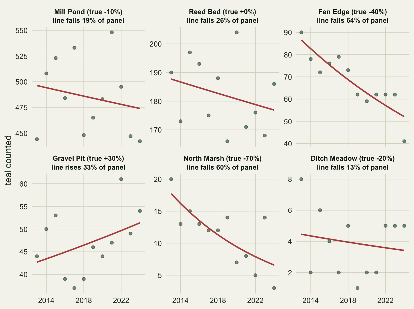
Under "free_y" two very different declines are drawn alike. North Marsh, which lost 70 per cent of its birds by design, has a line that falls 60 per cent of its panel; Fen Edge (true -40 per cent) falls 64 per cent, slightly more. Mill Pond (true -10 per cent) falls 19 per cent, so North Marsh’s line is drawn 3.1 times as steep as Mill Pond’s, while its fitted change is 14.0 times as large. And Reed Bed, flat by design, gets a line that falls 26 per cent of its panel, more than Mill Pond’s: a fitted change of -5.8 per cent stretched to fill the space.
The default errs the other way. With one axis up to 575 birds, every line barely moves (none by more than 6 per cent of the panel), and the order follows birds, not per cent: North Marsh’s falls 1.9 per cent of the panel and Ditch Meadow’s 0.2 per cent, while Mill Pond’s falls 3.7 per cent. On the fixed axis the 10 per cent decline at the big site is drawn steeper than the 70 per cent decline at the small one.
The rank correlation between the drawn move and the true change is 0.71 under "free_y" and 0.60 under the default (1 would be a perfect ordering). So "free_y" keeps the rough order of the sites, but not the size of the differences between them. One simulated data set could be a lucky or an unlucky one, so the next chunk repeats the design on fresh data a thousand times. It computes the panel ranges with the rule the guard chunk checked, instead of building a thousand plots:
one_survey <- function() {
  per_site <- t(sapply(seq_len(nrow(sites)), function(i) {
    mu <- sites$start[i] * (1 + sites$change[i])^((years - 2013) / 11)
    y  <- rpois(length(years), mu)
    f  <- fitted(glm(y ~ years, family = poisson))
    c(first = f[[1]], last = f[[length(f)]], low = min(y, f), high = max(y, f),
      ilow = min(y, f) / f[[1]], ihigh = max(y, f) / f[[1]])
  }))
  change <- per_site[, "last"] - per_site[, "first"]
  free   <- change / (1.1 * (per_site[, "high"] - per_site[, "low"]))
  fixed  <- change / (1.1 * (max(per_site[, "high"]) - min(per_site[, "low"])))
  index  <- (per_site[, "last"] / per_site[, "first"] - 1) /
            (1.1 * (max(per_site[, "ihigh"]) - min(per_site[, "ilow"])))
  c(fixed = cor(fixed, sites$change, method = "spearman"),
    free_y = cor(free, sites$change, method = "spearman"),
    index = cor(index, sites$change, method = "spearman"),
    steep_free = free[5] / free[1], f = free)          # f1 to f6: each panel's drawn move
}

set.seed(2015)
reps <- replicate(1000, one_survey())
rank_medians <- apply(reps[1:3, ], 1, median)
under_two <- mean(reps["steep_free", ] < 2)
under_two_mcse <- sqrt(under_two * (1 - under_two) / ncol(reps))
as_steep <- mean(reps["steep_free", ] >= steep_free)   # as kind as the data set above
free_reps <- reps[paste0("f", 1:6), ]
rownames(free_reps) <- sites$site
typical_move <- apply(free_reps, 1, median)
nm_less_steep <- mean(free_reps["North Marsh", ] > free_reps["Mill Pond", ])
round(c(rank_medians, steep_free_median = median(reps["steep_free", ]),
        share_under_2 = under_two, mc_se = under_two_mcse, as_steep = as_steep,
        nm_less_steep = nm_less_steep), 3)
fixed free_y index steep_free_median
0.543 0.829 0.943 1.300
share_under_2 mc_se as_steep nm_less_steep
0.835 0.012 0.045 0.194 round(typical_move, 2) Mill Pond Reed Bed Fen Edge Gravel Pit North Marsh Ditch Meadow
-0.55 -0.01 -0.71 0.44 -0.71 -0.17 Over a thousand simulated surveys the median rank correlation is 0.83 under "free_y" and 0.54 under the default: the order survives a free scale better than a fixed one. The sizes do not. The median ratio of North Marsh’s drawn fall to Mill Pond’s under "free_y" is 1.3, against a true ratio of 7, and in 84 per cent of surveys (Monte Carlo standard error 1.2 percentage points) the site that lost 70 per cent is drawn less than twice as steep as the site that lost 10; in 19 per cent it is drawn less steep. The figure above is a mild case for "free_y". In a typical survey Mill Pond’s line falls 55 per cent of its panel, not the 19 per cent in the figure, while North Marsh’s falls 71 and Fen Edge’s 71; only 4.5 per cent of the surveys drew North Marsh’s line at least 3.1 times as steep as Mill Pond’s.
The reason is in the range rule checked above. A free panel runs from the lowest to the highest value at that site, so its height is the site’s change plus its year-to-year noise, and the share of the panel the line takes up depends on how large the change is compared with that noise. A Poisson count has a standard deviation equal to the square root of its mean:
change_birds <- sites$start * sites$change   # true change in birds, 2013 to 2024
noise_sd     <- sqrt(sites$start)            # Poisson SD at the 2013 count
names(change_birds) <- names(noise_sd) <- sites$site
in_noise_units <- change_birds / noise_sd
round(rbind(change_birds, noise_sd, in_noise_units), 2)
Mill Pond Reed Bed Fen Edge Gravel Pit North Marsh Ditch Meadow
change_birds -52.00 0.00 -36.00 12.00 -14.00 -1.20
noise_sd 22.80 13.42 9.49 6.32 4.47 2.45
in_noise_units -2.28 0.00 -3.79 1.90 -3.13 -0.49# which ranking does the drawn move under free_y follow, over the thousand surveys?
rank_noise <- median(apply(free_reps, 2, cor, y = in_noise_units, method = "spearman"))
rank_true <- median(apply(free_reps, 2, cor, y = sites$change, method = "spearman"))
round(c(rank_noise = rank_noise, rank_true = rank_true), 2)rank_noise rank_true
0.94 0.83 # the ceiling: a line can never cross more than 1/1.1 of its own free panel
stopifnot(all(abs(moves$free_y) <= 1 / 1.1),
all(abs(free_reps) <= 1 / 1.1 + 1e-12))At Mill Pond a 10 per cent decline is 52 birds against a standard deviation of 22.8 at the 2013 count, or 2.3 standard deviations. At North Marsh a 70 per cent decline is 14 birds against 4.5, or 3.1 standard deviations. Ranked by the change in standard deviations, the sites line up with their drawn lines better than when ranked by the true change: over the thousand surveys the median rank correlation with the drawn move is 0.94, against 0.83 for the true change.
The sizes are squeezed for a second reason, which needs no simulation. A free panel’s range is set by the points and the fitted line together, so both ends of the line lie inside it, and the default expansion makes the panel 1.1 times that range. A line can therefore never move more than 1/1.1 of its panel, 91 per cent, however large the change; the stopifnot() at the end of the chunk checks this for the figure and for all 6000 simulated panels. A decline that is large against its noise already uses up much of the room under that ceiling, and a still larger one has little left to add: in the typical survey North Marsh (true -70 per cent) falls 71 per cent of its panel and Fen Edge (true -40 per cent) 71 per cent, out of a possible 91. What the eye reads off a free panel is the change measured against the site’s own noise, squeezed under a fixed ceiling, not the change in birds or in per cent. Cleveland and McGill (1984) found that readers judge positions along a common scale more accurately than positions along separate scales that are not aligned; free panels go one step further and give each panel a different scale as well.
The fix: put the comparison on the y axis
If the question is “which site changed most, relative to its size”, the y axis should carry that quantity, and then one shared axis is what makes the panels comparable. Dividing each count by the site’s fitted 2013 value turns every series into an index that starts near 1; ave() does it within each site in one line. scales stays at its default:
teal$first_fit <- ave(teal$fitted, teal$site, FUN = function(v) v[1])
teal$index     <- teal$count / teal$first_fit
teal$index_fit <- teal$fitted / teal$first_fit
first <- teal[teal$year == 2013, ]
last  <- teal[teal$year == 2024, ]

p_index <- ggplot(teal, aes(year, index)) +
  geom_hline(yintercept = 1, colour = te_line, linewidth = 0.8) +
  geom_point(colour = te_forest, alpha = 0.6, size = 1.6) +
  geom_line(aes(y = index_fit), colour = te_rust, linewidth = 0.9) +
  scale_x_continuous(breaks = c(2014, 2018, 2022)) +
  facet_wrap(~ site) +
  labs(x = NULL, y = "count / fitted 2013 count") +
  theme_datasheet()

moves$index <- line_move(p_index, "index_fit")
index_height <- diff(panel_ranges(p_index)[1, ])
stopifnot(isTRUE(all.equal(moves$index * index_height, moves$fitted_change)))
rank_index <- cor(moves$index, moves$true_change, method = "spearman")
index_top <- names(which.max(tapply(teal$index, teal$site, max)))   # who sets the top
stopifnot(index_top == sites$site[which.min(sites$start)])          # the smallest site
round(moves[, c("true_change", "fitted_change", "index")], 3)
true_change fitted_change index
Mill Pond -0.1 -0.045 -0.025
Reed Bed 0.0 -0.058 -0.032
Fen Edge -0.4 -0.398 -0.223
Gravel Pit 0.3 0.203 0.113
North Marsh -0.7 -0.628 -0.351
Ditch Meadow -0.2 -0.233 -0.130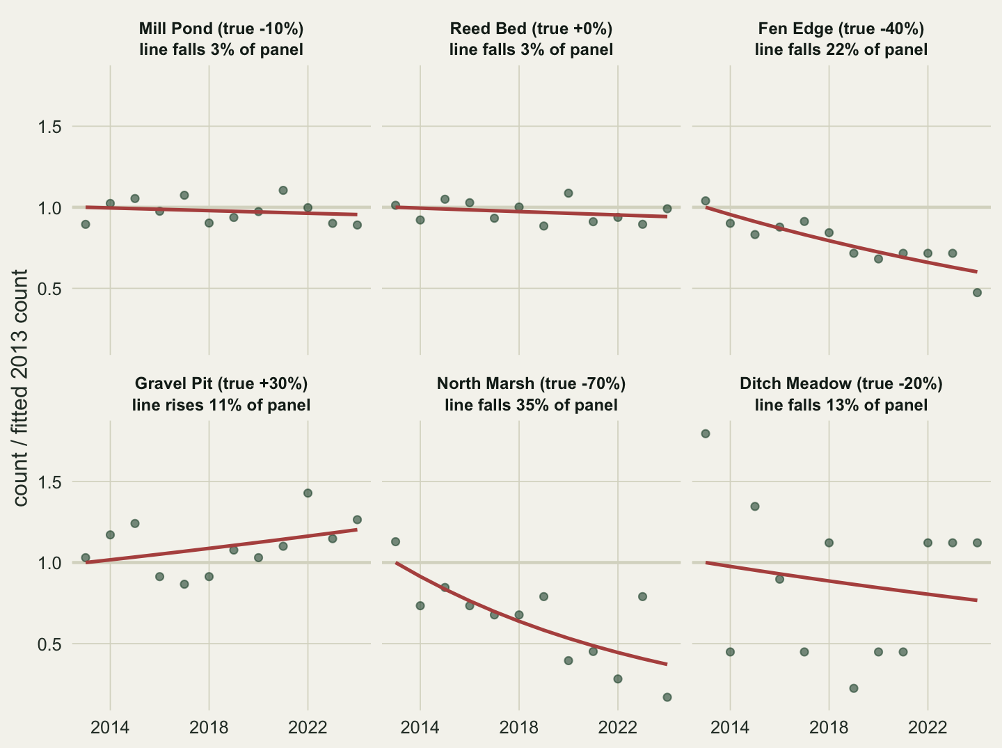
On the index scale every panel has the same height, 1.79 index units, so the drawn move of each line is its fitted change divided by one common number; the check in the chunk confirms it. North Marsh’s line now falls 35 per cent of the panel and Mill Pond’s 3 per cent, and the rank correlation with the true change is 0.94 (median over the thousand surveys: 0.94). What is left of the disagreement with the true changes is the sampling noise in the fitted trends, and every version of the figure carries that. The common height comes from the extremes of all six series, and the highest point of all, an index value of 1.79, is Ditch Meadow’s: the smallest site has the noisiest index.
A log axis with fixed scales does a similar job, because equal ratios become equal distances:
p_log <- p_fixed + scale_y_log10()
log_height <- diff(panel_ranges(p_log)[1, ])           # in log10 units
log_change <- setNames(log10(last$fitted) - log10(first$fitted), as.character(first$site))
moves$log10 <- log_change[levels(teal$site)] / log_height
rank_log <- cor(moves$log10, moves$true_change, method = "spearman")

# a zero count on a log axis
zero_plot <- ggplot(data.frame(year = 1:3, count = c(3, 0, 2)), aes(year, count)) +
  geom_point() + scale_y_log10()
zero_warn <- character(0)
zero_built <- withCallingHandlers(ggplot_build(zero_plot), warning = function(w) {
  zero_warn <<- c(zero_warn, conditionMessage(w)); invokeRestart("muffleWarning") })
zero_grob <- suppressWarnings(ggplotGrob(zero_plot))
zero_panel <- zero_grob$grobs[[which(zero_grob$layout$name == "panel")]]
zero_points <- zero_panel$children[[grep("point", names(zero_panel$children))]]
stopifnot(is.infinite(log10(0)), any(grepl("introduced infinite values", zero_warn)),
          is.infinite(zero_built$data[[1]]$y[2]),                  # the zero became -Inf
          isTRUE(all.equal(as.numeric(zero_points$y)[2], 0)))      # drawn on the bottom edge
c(rank_log = round(rank_log, 2), zero_count_in_data = sum(teal$count == 0))
rank_log zero_count_in_data
0.94 0.00 The rank correlation on the log axis is 0.94. The catch is zero counts: log10(0) is -Inf, ggplot2 warns that the transformation introduced infinite values, and the point is then drawn on the bottom edge of the panel, where it looks like a small count rather than no birds at all. These simulated data happen to contain no zeros; real series from small sites often do. Either plot count + 1 and say so in the axis label, or use the index, which handles a zero like any other value. How a log scale changes what a fitted mean means is a separate question, covered in Back-transforming a log-scale model.
When a free scale is the right choice
Free scales answer a different question: what does each panel look like on its own? That is the right question when the panels show different variables or units, say January temperature, rainfall and water level at one site, where comparing heights across panels means nothing anyway. It is also the right question when the reader should look at the shape of each series (the timing of a peak, a change of direction) and not its size. In both cases say in the caption that the y axes differ, and keep the tick labels, so a reader who does compare panels can see why they should not.
What to check in your own data
Before choosing a setting, write down the comparison the figure is for. If it is “which site has more”, the default fixed scale is the honest one, even with small sites squashed; if it is “which site changed more”, plot an index or use a log axis with fixed scales.
When you see scales = "free_y" in your code or someone else’s, look at the y axis labels of two panels side by side. If one panel spans 500 birds and the other 25, a line of the same slope means a twentyfold difference in birds.
For a figure that will be read quickly, compute the fitted change per group as a number and check sizes, not only order. Take two groups, divide the drawn move of one by the drawn move of the other, and set that against the ratio of their fitted changes; under "free_y" the order can survive while the ratio does not, as it failed here. The line_move() function above can be adapted to any faceted plot with a fitted column. On an index axis, look at which group sets the shared height: if one very small site stretches it for everyone, show that site separately or leave it out and say so.
If you use a log axis, count the zeros first with sum(x == 0). Any zero will sit on the bottom edge of its panel and look like a small count.
References
Cleveland WS, McGill R 1984 Journal of the American Statistical Association 79(387):531-554 (10.1080/01621459.1984.10478080)
Wickham H 2010 Journal of Computational and Graphical Statistics 19(1):3-28 (10.1198/jcgs.2009.07098)
Wickham H 2016 ggplot2: Elegant Graphics for Data Analysis, 2nd edition, Springer (ISBN 978-3-319-24275-0)