library(ggplot2)

te_pal <- list(forest = "#275139", green = "#2f8f63", sage = "#93a87f",
               clay = "#b5534e", gold = "#cda23f", line = "#dad9ca",
               ink = "#16241d", paper = "#f5f4ee")

theme_te <- function() {
  theme_minimal(base_size = 12) +
    theme(panel.grid.minor = element_blank(),
          panel.grid.major = element_line(colour = "#e7e6dc"),
          plot.background = element_rect(fill = "#f5f4ee", colour = NA),
          panel.background = element_rect(fill = "#f5f4ee", colour = NA),
          plot.title = element_text(face = "bold", colour = te_pal$ink),
          axis.title = element_text(colour = "#2c3a31"))
}Checking a figure
R
data visualisation
ggplot2
ecology tutorial
Four measured checks on an ecological figure in R: a truncated axis, a title too wide for the canvas, colour vision loss, and a title that reads as a claim.
A figure goes into a report on Friday afternoon. It has a title, four bars, a colour for each management block, and an axis that looks fine on the screen. Nobody rereads it, because the numbers behind it were checked and the numbers are what people think a figure is. Six months later a reviewer writes that the ungrazed block does not look different from the lightly grazed one, which is exactly what the data say and the opposite of what the figure says.
This post runs four checks on one small ecological figure. Each check ends in a measured number rather than a preference: how much larger the difference looks when the axis is cut, how much wider than its room a title is before it runs off the canvas, how far apart the block colours are for a reader with red-green colour vision loss, and whether the claim in the title survives the sampling error in the data underneath it. Two of the four checks measure the layout rather than the data, because the failure they look for is invisible in the source code and in the numbers behind it.
The neighbouring post Publication-quality ggplot figures covers the export side: size, resolution, font size and file format. Nothing here is about export. These are checks on the design decisions that survive any export setting, and the colour arithmetic in check 3 is the method built in Choosing colours for ecological data, applied to one concrete figure with a pass or fail at the end.
The figure under test
Ground beetles were caught in pitfall traps in four grassland blocks of a lowland reserve: an ungrazed control, a block under light cattle grazing, a block under heavy grazing, and a block abandoned from management some years ago. Twelve traps in each block, one winter, catch per trap as the response. The figure that came out of it is a bar chart of the four block means with a title above it, which is what most such figures are.
set.seed(20260809)
blocks <- c("ungrazed", "light grazing", "heavy grazing", "abandoned")
n_trap <- 12
catch <- sapply(c(38.0, 41.6, 30.5, 34.0), function(m) rpois(n_trap, m))
colnames(catch) <- blocks
mn <- colMeans(catch)
sdv <- apply(catch, 2, sd)
sev <- sdv / sqrt(n_trap)
print(round(rbind(mean = mn, sd = sdv, se = sev), 3))
ungrazed light grazing heavy grazing abandoned
mean 38.000 42.250 30.750 34.917
sd 3.045 10.110 6.283 5.915
se 0.879 2.918 1.814 1.708c(traps_per_block = n_trap, blocks = length(blocks))traps_per_block blocks
12 4 Two of the four checks are about the drawing rather than the data, so the toolkit comes first. They need three quantities and none of them requires a rasterised image. The first is the drawn range of an axis, which ggplot_build will hand over after it has applied the expansion, and the name of the field holding it has moved between ggplot2 versions, so the helper looks for it rather than assuming it. The second is the room the layout leaves for text: ggplotGrob turns the plot into a table whose column widths are all fixed except the panel, which takes whatever is left, so the panel width is the canvas width minus the sum of the fixed columns. The third is the width of a piece of text when it is set, which is strwidth on a pdf(NULL) device, with cex scaling the theme’s 12 point base up to the title size or down to the tick label size. That device opens no file and writes nothing; it reports the Adobe font metrics compiled into R, which are the same numbers on every machine. Both helpers open it themselves, because convertWidth needs a current device and would otherwise measure against whatever the session happened to leave open.
text_in <- function(s, cex = 1.2, font = 2, family = "sans") {
  pdf(NULL, width = 20, height = 20)
  on.exit(dev.off())
  par(ps = 12, family = family, font = font, mar = rep(0, 4))
  plot.new()
  strwidth(s, units = "inches", cex = cex)
}

layout_in <- function(p, width = 8.2, height = 4.6) {
  pdf(NULL, width = width, height = height)
  on.exit(dev.off())
  g <- ggplotGrob(p)
  w <- grid::convertWidth(g$widths, "in", valueOnly = TRUE)
  lay <- g$layout
  pl <- min(lay$l[lay$name == "panel"])
  pr <- max(lay$r[lay$name == "panel"])
  left <- sum(w[seq_len(pl - 1)])
  right <- sum(w[seq(pr + 1, length(w))])
  c(left_in = left, right_in = right, panel_in = width - left - right)
}

drawn_range <- function(p, ax = "y") {
  pp <- ggplot_build(p)$layout$panel_params[[1]]
  nm <- paste0(ax, c(".range", "_range"))
  nm <- nm[nm %in% names(pp)]
  if (length(nm)) list(field = nm[1], range = pp[[nm[1]]])
  else list(field = paste0(ax, "$continuous_range"),
            range = pp[[ax]]$continuous_range)
}

four_bars <- ggplot(data.frame(x = factor(blocks, levels = blocks), m = mn),
               aes(x, m)) +
  geom_col(fill = te_pal$forest, width = 0.65) +
  theme_te() + labs(x = NULL, y = "Catch per trap")
cat("drawn y range read from the field:", drawn_range(four_bars)$field, "\n")
drawn y range read from the field: y.range round(c(canvas_width_in = 8.2, canvas_height_in = 4.6,
layout_in(four_bars), title_pt = 14.4, tick_pt = 9.6), 4) canvas_width_in canvas_height_in left_in right_in
8.2000 4.6000 0.5100 0.0830
panel_in title_pt tick_pt
7.6069 14.4000 9.6000 The panel of that figure starts 0.51 inches from the left edge, where the axis title and the tick labels live, and stops 0.083 inches short of the right edge, which is the plot margin. What is left, 7.6069 inches, is both the width of the panel and the room a title has, because ggplot2 aligns the title to the panel and lets anything longer run off the end. Checks 1 and 2 are arithmetic on those numbers, on the drawn axis range, and on the extent of the strings themselves at the two sizes the theme uses: 14.4 points bold for the title, 9.6 points plain for the tick labels.
Check 1: the axis that does not start at zero
The first check is the one everybody has heard of and almost nobody measures. A bar encodes a quantity by its length, so the reader compares lengths; if the axis starts somewhere other than zero, the length is no longer the quantity and the comparison the reader makes is not the comparison in the data. The question is not whether that is bad in principle but how large the error is in a specific figure, and the answer is exact rather than approximate: ask the plot what y range it drew, work out where the bottom of each bar ended up in that range, and take the ratio of the two drawn lengths against the ratio of the two values.
d_ab <- data.frame(block = factor(blocks[1:2], levels = blocks[1:2]), m = mn[1:2])
bar_zero <- ggplot(d_ab, aes(block, m)) +
  geom_col(fill = te_pal$forest, width = 0.6) +
  scale_y_continuous(limits = c(0, NA)) +
  theme_te() + labs(x = NULL, y = "Catch per trap")
bar_cut <- ggplot(d_ab, aes(block, m)) +
  geom_col(fill = te_pal$forest, width = 0.6) +
  coord_cartesian(ylim = c(36, 44)) +
  theme_te() + labs(x = NULL, y = "Catch per trap")

bars_of <- function(p, v) {
  v <- unname(v)
  yr <- drawn_range(p)$range
  base <- max(0, yr[1])
  c(panel_low = yr[1], panel_high = yr[2], drawn_base = base,
    first_len = v[1] - base, second_len = v[2] - base)
}
b_zero <- bars_of(bar_zero, mn[1:2])
b_cut <- bars_of(bar_cut, mn[1:2])
print(round(rbind(zero_axis = b_zero, cut_axis = b_cut), 4))
panel_low panel_high drawn_base first_len second_len
zero_axis -2.1125 44.3625 0.0 38.0 42.25
cut_axis 35.6000 44.4000 35.6 2.4 6.65r_true <- unname(mn[2] / mn[1])
r_zero <- unname(b_zero["second_len"] / b_zero["first_len"])
r_cut <- unname(b_cut["second_len"] / b_cut["first_len"])
round(c(true_ratio = r_true, drawn_ratio_zero = r_zero,
zero_error = r_zero - r_true, drawn_ratio_cut = r_cut,
exaggeration = r_cut / r_true), 4) true_ratio drawn_ratio_zero zero_error drawn_ratio_cut
1.1118 1.1118 0.0000 2.7708
exaggeration
2.4921 arith <- unname((mn[2] - 36) / (mn[1] - 36))
round(c(typed_baseline = 36, arithmetic_ratio = arith,
drawn_baseline = unname(b_cut["drawn_base"]),
expansion_units = 36 - unname(b_cut["drawn_base"]),
arithmetic_error_pct = 100 * (arith - r_cut) / r_cut), 4) typed_baseline arithmetic_ratio drawn_baseline
36.000 3.125 35.600
expansion_units arithmetic_error_pct
0.400 12.782 With the axis running from zero the bars are drawn 38 and 42.25 units long, because a column starts at zero and the panel floor is below it at -2.1125, where nothing is drawn. The drawn ratio is 1.1118 and the true ratio is 1.1118: the disagreement is not small, it is 0, so the zero based bar chart is telling the exact truth and not an approximate one. Cutting the axis at 36 leaves bars of 2.4 and 6.65 units, a drawn ratio of 2.7708. The reader who compares lengths reads a difference 2.4921 times larger than the one in the data, from a figure where no number has been altered.
The measurement also catches something the arithmetic gets wrong. Working it out on paper, the ratio after cutting at 36 should be 42.25 minus 36 over 38 minus 36, which is 3.1250. The drawn ratio is 2.7708. The difference is the default expansion of a continuous scale: ggplot2 adds five per cent of the range at each end, 0.4 units here, so the baseline actually drawn is 35.6 rather than the 36 that was typed. Anyone predicting the distortion from the code, without asking the plot what it drew, would have been wrong by 12.782 per cent of the effect. This is the small version of the argument for the whole post.
p_dot <- ggplot(d_ab, aes(block, m)) +
  geom_point(size = 3) +
  geom_errorbar(aes(ymin = m - 1.96 * sev[1:2], ymax = m + 1.96 * sev[1:2]),
                width = 0.12) +
  theme_te()
yr <- drawn_range(p_dot)$range
round(c(default_lower = yr[1], default_upper = yr[2],
        default_ratio = unname((mn[2] - yr[1]) / (mn[1] - yr[1])),
        default_exaggeration = unname(((mn[2] - yr[1]) / (mn[1] - yr[1])) / r_true)), 4)
default_lower default_upper default_ratio
35.6924 48.5547 2.8418
default_exaggeration
2.5559 set.seed(20260809)
ditch <- 12.42 + cumsum(rnorm(40, 0, 0.035))
round(c(level_low = min(ditch), level_high = max(ditch),
level_span = diff(range(ditch)),
span_share_of_zero_panel = 100 * diff(range(ditch)) / (max(ditch) * 1.05)), 3) level_low level_high level_span
12.423 12.647 0.225
span_share_of_zero_panel
1.692 Now the part that makes this more than a morality tale. Drawing the same two means as points with error bars, which is the recommended alternative to bars and the thing a careful person does, gives an axis running from 35.6924 to 48.5547, because ggplot2 sets the limits from the data and nobody asked it not to. The distance from that lower limit to the two means is in the ratio 2.8418, an exaggeration of 2.5559. The default axis is a cut nobody typed, and on this run it is a slightly worse one than the cut that was typed. Truncated axes are not mainly the work of people trying to mislead; they are the work of people who plotted means without bars and never looked at the axis.
The reverse mistake is real too. The last block above is the water level in a ditch on the same reserve, in metres above a local datum, running from 12.423 to 12.647 over the winter. Forcing that series onto an axis starting at zero compresses its whole range into 1.692 per cent of the panel height, which erases the signal completely. Zero is a meaningful reference for a count of beetles and meaningless for an elevation, a temperature or a pH. The rule is not that axes must start at zero; it is that a bar length must be proportional to the quantity, and that a truncated axis on any other kind of plot has to be stated where the reader will see it, in the axis label or the caption, rather than left for them to notice.
base_seq <- seq(0, 36.6, length.out = 400)
exag <- data.frame(baseline = base_seq,
                   factor = ((mn[2] - base_seq) / (mn[1] - base_seq)) / r_true)
marks <- data.frame(x = c(unname(b_cut["drawn_base"]), yr[1]),
                    lab = c("drawn by the cut bar chart", "ggplot2 default for points"))

ggplot(exag, aes(baseline, factor)) +
  geom_hline(yintercept = 1, colour = te_pal$line, linewidth = 0.9) +
  geom_vline(data = marks, aes(xintercept = x), colour = te_pal$clay,
             linetype = "22", linewidth = 0.6) +
  geom_line(colour = te_pal$forest, linewidth = 1) +
  annotate("text", x = 35.2, y = 3.85, hjust = 1, vjust = 0.5, size = 3.1,
           colour = te_pal$clay,
           label = "both baselines are here: 35.6 and 35.6924") +
  annotate("segment", x = 35.35, xend = 35.55, y = 3.85, yend = 3.85,
           colour = te_pal$clay, linewidth = 0.4) +
  annotate("text", x = 0.6, y = 1.13, hjust = 0, vjust = 0, size = 3,
           colour = "#7d7d72", label = "no exaggeration") +
  coord_cartesian(ylim = c(0.8, 4.2), xlim = c(0, 37.4)) +
  scale_x_continuous(breaks = seq(0, 36, by = 6)) +
  labs(x = "Baseline of the drawn axis (catch per trap)",
       y = "Apparent difference over true difference",
       title = "Where the axis starts decides how big the difference looks") +
  theme_te()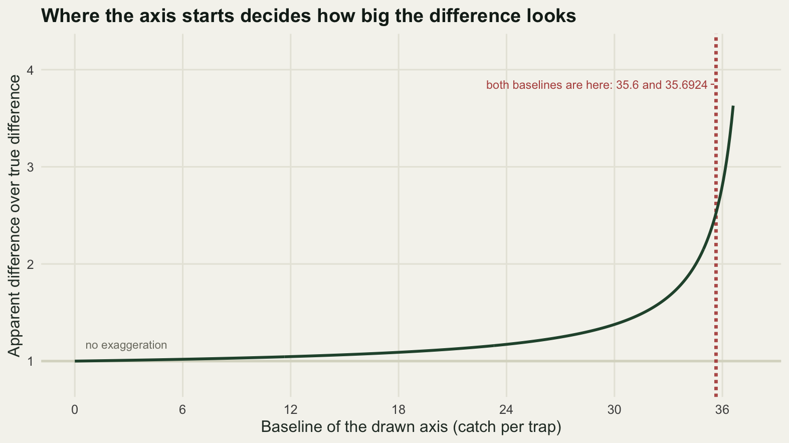
Check 2: the label that runs off the canvas
A title that is too long for the canvas is cut off at the edge. The reason this failure survives review is that it is invisible to every check that runs on the source: the string in the labs() call is complete, it has no strange characters, it passes a spell check, and its length in characters is whatever the author decided was reasonable. What decides the outcome is not the number of characters but the width the string takes when it is set in the title face, against the room the layout leaves for it, and both of those are numbers rather than opinions.
Which makes the check simple to state. The room is the panel width, because the title is aligned to the panel and the only thing to the right of the panel is the plot margin. The demand is the extent of the string. A title is safe when the extent is comfortably inside the room, at risk when it is close, and cut when it is larger. The gate below asks for a margin of 5 per cent of the room, and the reason for that margin is the subject of the honest limit at the end of the post.
long_title <- "Ground beetle activity density in the four grassland blocks over the winter of the survey"
short_title <- "Beetle catches in the four blocks"
room_of <- function(width) unname(layout_in(four_bars, width = width)["panel_in"])
room82 <- room_of(8.2)

fit_of <- function(s, room = room82) {
  w <- text_in(s)
  c(chars = nchar(s), wanted_in = w, room_in = room,
    over_in = w - room, used = w / room)
}
print(round(rbind(long = fit_of(long_title), short = fit_of(short_title)), 4))
chars wanted_in room_in over_in used
long 89 8.1074 7.6069 0.5004 1.0658
short 33 3.0248 7.6069 -4.5822 0.3976alt <- c(sans = text_in(long_title), serif = text_in(long_title, family = "serif"))
round(c(alt, family_shift_pct = 100 * (alt[["serif"]] - alt[["sans"]]) / alt[["sans"]],
margin_pct = 5), 3) sans serif family_shift_pct margin_pct
8.107 7.266 -10.373 5.000 The long title asks for 8.1074 inches of a room that is 7.6069 inches wide, so it asks for 1.0658 of the room. It runs past the right edge of the panel by 0.5004 inches, or 0.0658 of the room, and since the only thing outside the panel is 0.083 inches of margin, most of that overhang is off the canvas and the end of the last word never gets drawn. The short title asks for 3.0248 inches, 0.3976 of the room, and is safe by any reading. That is the gate, and there is no judgement involved in it: a title passes when it uses less than 0.95 of the room.
The second line of output is the size of the thing the gate cannot see. Setting the same sentence in the serif face instead of the sans face changes its width by 10.373 per cent, on the same device, at the same point size. Font is not a detail of this measurement; it is most of it. Every number in this section is a statement about one face at one size, which is why the gate keeps 5 per cent in hand.
Two things follow. The first is that the budget is a width and not a character count. The second is that the width costs nothing to compute, since neither the room nor the extent needs the figure to be drawn. The sweep below tests both claims on the same sentence truncated at nineteen different lengths, on two canvas widths.
sentence <- paste("Beetle catches were higher in the lightly grazed block",
                  "than in the ungrazed block in the winter of this survey")
prefix <- sub(" +$", "", substring(sentence, 1, seq(24, 96, by = 4)))
sweep_at <- function(width) {
  w <- sapply(prefix, text_in)
  room <- room_of(width)
  data.frame(canvas = width, chars = nchar(prefix), wanted = w,
             room = room, used = w / room, row.names = NULL)
}
sw <- rbind(sweep_at(8.2), sweep_at(6.0))
sw$fits <- sw$used <= 1
sw$safe <- sw$used <= 0.95
brackets <- do.call(rbind, lapply(split(sw, sw$canvas), function(g)
  rbind(g[g$fits, ][which.max(g$wanted[g$fits]), ],
        g[!g$fits, ][which.min(g$wanted[!g$fits]), ])))
print(round(brackets[, c("canvas", "chars", "wanted", "room", "used")], 4),
      row.names = FALSE)
canvas chars wanted room used
6.0 59 5.4050 5.4069 0.9996
6.0 64 5.7507 5.4069 1.0636
8.2 80 7.3498 7.6069 0.9662
8.2 84 7.6809 7.6069 1.0097print(round(rbind(room = tapply(sw$room, sw$canvas, max),
widest_fitting = tapply(sw$wanted[sw$fits], sw$canvas[sw$fits], max),
chars_fitting = tapply(sw$chars[sw$fits], sw$canvas[sw$fits], max),
chars_within_margin = tapply(sw$chars[sw$safe], sw$canvas[sw$safe],
max)), 4)) 6 8.2
room 5.4069 7.6069
widest_fitting 5.4050 7.3498
chars_fitting 59.0000 80.0000
chars_within_margin 56.0000 75.0000round(c(titles_tested = nrow(sw), over_the_room = sum(!sw$fits),
fitting_but_inside_the_margin = sum(sw$fits & !sw$safe),
tightest_fit = max(sw$used[sw$fits]), widest_ask = max(sw$used)), 4) titles_tested over_the_room
38.0000 13.0000
fitting_but_inside_the_margin tightest_fit
2.0000 0.9996
widest_ask
1.6004 On the 8.2 inch canvas the widest title that fits asks for 7.3498 inches and the next one up asks for 7.6809, so the transition brackets the 7.6069 inches the layout says are there. On the 6.0 inch canvas the bracket is 5.4050 to 5.7507 around a room of 5.4069. The rule is a width and not a character count, and the two canvases show why: 80 characters of this sentence fit at 8.2 inches, 59 characters of the same sentence fit at 6.0 inches, so the same count passes on one canvas and fails on the other. The 89 character title in the previous block fits neither, because the 8.1074 inches it asks for is more than either room.
The last line is the reason the gate keeps 5 per cent in hand. Of the 38 titles tested, 13 ask for more room than there is and are cut. Two more fit, but only just: the tightest of them uses 0.9996 of the room, which leaves four parts in ten thousand in hand on a title nearly five and a half inches wide. Nothing about the way that number was produced is accurate to four parts in ten thousand. Calling it a pass would be a bet on the font, and the honest reading is that anything above 0.95 has not been shown to fit. With the margin applied the budget drops from 80 characters to 75 on the wide canvas and from 59 to 56 on the narrow one, which is the price of not guessing.
sw$canvas_lab <- factor(paste(sw$canvas, "inch canvas"),
                        levels = c("6 inch canvas", "8.2 inch canvas"))
rules <- data.frame(y = c(1, 0.95),
                    lab = c("fills the room exactly", "the gate keeps 5 per cent back"))

ggplot(sw, aes(chars, used, colour = canvas_lab)) +
  geom_hline(yintercept = 1, colour = te_pal$ink, linetype = "22", linewidth = 0.5) +
  geom_hline(yintercept = 0.95, colour = "#9c9c90", linewidth = 0.5) +
  geom_line(linewidth = 0.9) +
  geom_point(size = 2) +
  geom_text(data = rules, aes(x = 24, y = y + c(0.045, -0.055), label = lab),
            inherit.aes = FALSE, hjust = 0, vjust = 0.5, size = 3,
            colour = te_pal$ink) +
  expand_limits(y = c(0.25, 1.72)) +
  scale_colour_manual(values = c(te_pal$clay, te_pal$forest), name = NULL) +
  scale_x_continuous(breaks = seq(30, 90, by = 15)) +
  labs(x = "Characters in the title",
       y = "Width asked for over room available",
       title = "A title that fits the wide canvas overflows the narrow one") +
  theme_te() +
  theme(legend.position = "top")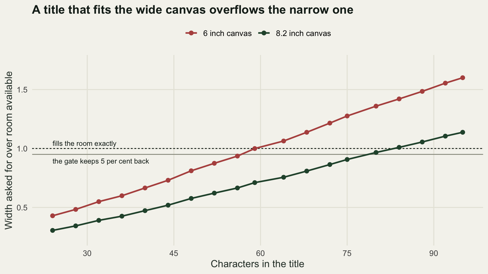
Long tick labels fail the same way and are worth a separate measurement, because the standard advice about them is to rotate, and rotation moves the problem rather than removing it.
set.seed(20260809)
lab8 <- paste(rep(blocks, each = 2), rep(c("winter 1", "winter 2"), 4), sep = ", ")
d8 <- data.frame(block = factor(lab8, levels = lab8),
                 m = rep(mn, each = 2) * runif(8, 0.9, 1.1))
fig8 <- ggplot(d8, aes(block, m)) +
  geom_col(fill = te_pal$forest, width = 0.65) +
  theme_te() + labs(x = NULL, y = "Catch per trap",
                    title = "Beetle catches by block and winter")
g8 <- layout_in(fig8)
xr <- drawn_range(fig8, "x")$range
per_cat <- unname(g8["panel_in"]) / diff(xr)
room_right <- (xr[2] - length(lab8)) * per_cat + unname(g8["right_in"])
room_left <- (1 - xr[1]) * per_cat + unname(g8["left_in"])
w8 <- sapply(lab8, text_in, cex = 0.8, font = 1)
print(round(c(categories = length(lab8), inches_per_category = per_cat,
              room_right_in = room_right, room_left_in = room_left,
              last_label_in = unname(w8[length(w8)]),
              first_label_in = unname(w8[1])), 4))
categories inches_per_category room_right_in room_left_in
8.0000 0.9277 0.6396 1.0666
last_label_in first_label_in
1.2585 1.1390 flat <- c(left = unname(w8[1]) / 2 / room_left,
right = unname(w8[length(w8)]) / 2 / room_right)
tilt <- c(left = unname(w8[1]) * cos(pi / 6) / room_left, right = 0)
print(round(rbind(horizontal = flat, rotated = tilt), 4)) left right
horizontal 0.5339 0.9838
rotated 0.9248 0.0000round(c(longest_label = max(nchar(lab8)), rotation_degrees = 30, cos_of_that = cos(pi / 6),
horizontal_right_slack_in = room_right - unname(w8[length(w8)]) / 2,
rotated_left_slack_in = room_left - unname(w8[1]) * cos(pi / 6)), 4) longest_label rotation_degrees cos_of_that
23.0000 30.0000 0.8660
horizontal_right_slack_in rotated_left_slack_in
0.0104 0.0802 Horizontal labels use 0.9838 of the room on the right, which is inside the 5 per cent margin and therefore a fail: the last label, “abandoned, winter 2”, reaches to within 0.0104 inches of the edge of the canvas, and a face a couple of per cent wider puts it over. Rotating the labels by 30 degrees takes the right side to 0 and moves the load to the left, where it uses 0.9248 of a much larger room and passes. The mechanism is worth stating because it decides when rotation helps and when it does not. A horizontal label overhangs on both sides of its tick, and the tick of the last category sits near the right edge, where the only spare room is the scale expansion beyond that tick plus the plot margin, 0.6396 inches in all. A rotated label with hjust = 1 overhangs to the left of its tick, by its width times the cosine of the angle, 0.866 of it here, and on the left the axis title and the tick labels have already reserved part of the 1.0666 inches available. Rotation works here because the layout is asymmetric, not because rotation is safe. On a figure with no y axis apparatus, the same rotation moves the problem from the right margin to the left.
Check 3: the colours, seen by a deuteranope
The four blocks are drawn in four colours. On the usual estimate, around one man in twelve of northern European descent has a form of red-green colour vision loss, so the question is whether those four colours stay apart for that reader. The way to answer it is to simulate the reduced vision and measure the distances again.
The simulation needs three pieces of arithmetic and no package. Screen values are converted from the compressed sRGB encoding to linear light, then into the responses of the three cone types with a published transform. A deuteranope lacks the middle-wavelength cone, so the simulation replaces that response with a linear combination of the other two: the combination is fixed by requiring that white and a pure blue come through unchanged, which is what the two anchor colours in the block below do. Solving those two equations gives coefficients of 0.4942 and 1.2483, which are the values used in the standard published simulation, arrived at here from the anchors rather than copied. Distances are then measured in the CIE 1976 lightness and opponent-colour space, where a euclidean distance is a rough stand-in for how different two colours look.
lin_of <- function(u) ifelse(u <= 0.04045, u / 12.92, ((u + 0.055) / 1.055)^2.4)
unlin_of <- function(u) ifelse(u <= 0.0031308, 12.92 * u, 1.055 * u^(1 / 2.4) - 0.055)
rgb_lin <- function(hex) lin_of(t(col2rgb(hex)) / 255)

M_lms <- matrix(c(17.8824, 43.5161, 4.11935,
                  3.45565, 27.1554, 3.86714,
                  0.0299566, 0.184309, 1.46709), 3, 3, byrow = TRUE)
anchor <- rgb_lin(c("#ffffff", "#0000ff")) %*% t(M_lms)
k_deut <- solve(anchor[, c(1, 3)], anchor[, 2])

deuter_of <- function(hex) {
  lms <- rgb_lin(hex) %*% t(M_lms)
  lms[, 2] <- k_deut[1] * lms[, 1] + k_deut[2] * lms[, 3]
  back <- lms %*% t(solve(M_lms))
  back[back < 0] <- 0
  back[back > 1] <- 1
  out <- unlin_of(back)
  rgb(out[, 1], out[, 2], out[, 3])
}
lab_of <- function(hex) {
  xyz <- rgb_lin(hex) %*% t(matrix(c(0.4124564, 0.3575761, 0.1804375,
                                     0.2126729, 0.7151522, 0.0721750,
                                     0.0193339, 0.1191920, 0.9503041),
                                   3, 3, byrow = TRUE))
  rel <- xyz / matrix(c(0.95047, 1, 1.08883), nrow(xyz), 3, byrow = TRUE)
  f <- ifelse(rel > (6 / 29)^3, rel^(1 / 3), rel / (3 * (6 / 29)^2) + 4 / 29)
  cbind(L = 116 * f[, 2] - 16, a = 500 * (f[, 1] - f[, 2]),
        b = 200 * (f[, 2] - f[, 3]))
}
gap_of <- function(hex) as.matrix(dist(lab_of(hex)))
round(k_deut, 4)
[1] 0.4942 1.2483ramp <- rgb(colorRamp(c(te_pal$forest, te_pal$paper))(seq(0, 1, length.out = 5)) / 255)
g_ramp <- gap_of(ramp)
round(sapply(1:4, function(i) g_ramp[i, i + 1]), 3)[1] 18.474 17.555 16.701 15.952The threshold has to come from somewhere other than authority, so it comes from the palette itself. A five step sequential ramp from the darkest theme colour to the paper has steps of 18.474, 17.555, 16.701 and 15.952 distance units, and five classes is about as many as a reader can hold apart on a map. A working threshold of 15 units is therefore one ramp step: two colours closer than that are as similar as two adjacent classes in a five-class legend, which is the edge of usable and not the middle of it. It is a convention adopted here, not a standard.
pal4 <- c(ungrazed = te_pal$forest, light = te_pal$clay,
          heavy = te_pal$gold, abandoned = te_pal$sage)
sim4 <- deuter_of(pal4)
print(rbind(normal = pal4, deuteranope = sim4))
ungrazed light heavy abandoned
normal "#275139" "#b5534e" "#cda23f" "#93a87f"
deuteranope "#48483A" "#7B7B4A" "#B0B03B" "#A2A280"dn <- gap_of(pal4)
dd <- gap_of(sim4)
ij <- which(upper.tri(dn), arr.ind = TRUE)
pairs4 <- data.frame(pair = paste(names(pal4)[ij[, 1]], "and", names(pal4)[ij[, 2]]),
normal = dn[upper.tri(dn)], deuter = dd[upper.tri(dd)])
pairs4$kept <- pairs4$deuter / pairs4$normal
print(round(pairs4[order(pairs4$deuter), 2:4], 3), row.names = FALSE) normal deuter kept
57.461 17.879 0.311
63.936 27.876 0.436
51.883 36.763 0.709
37.086 36.932 0.996
42.124 40.750 0.967
65.219 64.075 0.982print(pairs4$pair[order(pairs4$deuter)])[1] "light and abandoned" "ungrazed and light" "light and heavy"
[4] "ungrazed and abandoned" "heavy and abandoned" "ungrazed and heavy" round(c(min_normal = min(pairs4$normal), min_deuter = min(pairs4$deuter),
worst_kept = min(pairs4$kept), below_15 = sum(pairs4$deuter < 15)), 3)min_normal min_deuter worst_kept below_15
37.086 17.879 0.311 0.000 two_col <- function(a, b) {
d <- c(normal = gap_of(c(a, b))[1, 2], deuter = gap_of(deuter_of(c(a, b)))[1, 2])
c(d, kept = unname(d[2] / d[1]))
}
print(round(rbind("theme red and green" = two_col(te_pal$clay, te_pal$green),
"common red and green" = two_col("#d62728", "#2ca02c")), 3)) normal deuter kept
theme red and green 78.493 14.707 0.187
common red and green 119.771 8.196 0.068The four block colours pass, but with much less room than they appear to have. The closest pair in normal vision is the forest green and the sage green, 37.086 units apart, and that pair survives almost untouched. The closest pair for a deuteranope is a different one, the clay red and the sage green at 17.879 units, which clears the threshold of 15 but only just, and it does so after losing most of what it had: it keeps 0.311 of its normal separation. A palette that looked comfortable is running on about one ramp step of separation, and any further change, a lighter print, a projector, a smaller mark, spends it.
The two extra pairs at the end are the ones this check exists for. The theme’s own red and green, used together as a two-level treatment contrast, are 78.493 units apart in normal vision and 14.707 apart for a deuteranope: a pair that looks unmistakable to most readers keeps 0.187 of its separation and falls below the threshold. The red and green from the most common default categorical palette in scientific software go from 119.771 to 8.196, keeping 0.068. The colours that look the furthest apart of anything on the screen become the closest pair in the figure. That is the shape of this failure in general: the red-green axis carries most of the apparent contrast in normal vision and almost none of it here, so the more a palette leans on that axis, the more it has to lose.
pair_plot <- rbind(pairs4[, c("pair", "normal", "deuter")],
                   data.frame(pair = c("theme red and green", "common red and green"),
                              normal = c(two_col(te_pal$clay, te_pal$green)[["normal"]],
                                         two_col("#d62728", "#2ca02c")[["normal"]]),
                              deuter = c(two_col(te_pal$clay, te_pal$green)[["deuter"]],
                                         two_col("#d62728", "#2ca02c")[["deuter"]])))
pair_plot$fails <- ifelse(pair_plot$deuter < 15, "below the threshold", "usable")
pair_plot$lx <- pair_plot$normal
pair_plot$ly <- pair_plot$deuter
pair_plot$vj <- -0.9
crowd <- match(c("ungrazed and abandoned", "heavy and abandoned",
                 "light and heavy"), pair_plot$pair)
pair_plot$lx[crowd] <- c(14, 34, 63)
pair_plot$ly[crowd] <- c(46, 55, 46)
pair_plot$vj[crowd] <- 0.5
leaders <- data.frame(x = c(28.0, 40.0, 56.0), y = c(45.2, 53.4, 44.8),
                      xend = c(36.4, 42.1, 52.6), yend = c(37.9, 42.5, 38.3))

ggplot(pair_plot, aes(normal, deuter)) +
  geom_abline(slope = 1, intercept = 0, colour = te_pal$line, linewidth = 0.9) +
  geom_hline(yintercept = 15, colour = te_pal$ink, linetype = "22", linewidth = 0.5) +
  geom_segment(data = leaders, aes(x = x, y = y, xend = xend, yend = yend),
               inherit.aes = FALSE, colour = "#9c9c90", linewidth = 0.35) +
  geom_point(aes(colour = fails), size = 3.4) +
  geom_text(aes(x = lx, y = ly, label = pair, vjust = vj), hjust = 0.5,
            size = 3.1, colour = te_pal$ink) +
  annotate("text", x = -6, y = 15.9, label = "threshold", hjust = 0, vjust = 0,
           size = 3, colour = te_pal$ink) +
  scale_colour_manual(values = c(te_pal$clay, te_pal$forest), name = NULL) +
  scale_x_continuous(limits = c(-6, 132), breaks = seq(0, 120, by = 30)) +
  scale_y_continuous(limits = c(0, 72)) +
  labs(x = "Distance in normal vision",
       y = "Distance in the deuteranope simulation",
       title = "Colours that separate in normal vision can collapse here") +
  theme_te() +
  theme(legend.position = "top")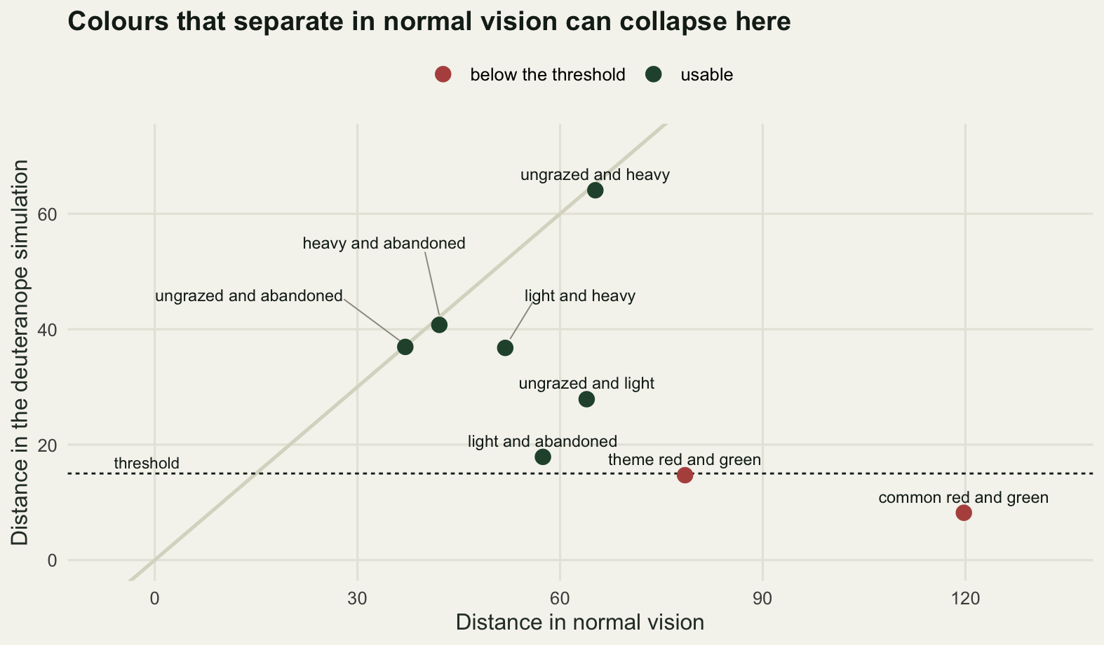
The simulation is an approximation and should be described as one. It models a deuteranope, a person with no middle-wavelength cone at all, which is the severe end; the far more common deuteranomaly is a shifted cone rather than a missing one, and its effect is somewhere between the two figures above. It is a calculation about light and cones, not a clinical test, and it says nothing about how a particular reader has learned to compensate. What it does reliably is rank pairs, and ranking is enough to decide which pair to change.
Check 4: the title as a claim
A figure title is either a description or a claim. “Beetle catches in the four blocks” is a description and cannot be wrong. “Grazing raises beetle activity” is a claim, and a claim has to be measured against the same uncertainty as any sentence in the results section. The check is to take the claim seriously and ask what the data say about it.
set.seed(20260809)
d_obs <- unname(mn[2] - mn[1])
se_d <- unname(sqrt(sev[2]^2 + sev[1]^2))
df_w <- unname(se_d^4 / (sev[2]^4 / (n_trap - 1) + sev[1]^4 / (n_trap - 1)))
ci <- d_obs + c(-1, 1) * qt(0.975, df_w) * se_d
round(c(difference = d_obs, se = se_d, t = d_obs / se_d, df = df_w,
        p = 2 * pt(-abs(d_obs / se_d), df_w), lower = ci[1], upper = ci[2]), 4)
difference se t df p lower upper
4.2500 3.0479 1.3944 12.9797 0.1866 -2.3357 10.8357 n_rep <- 20000
pooled <- c(catch[, 1], catch[, 2])
perm <- replicate(n_rep, {
s <- sample(pooled)
mean(s[13:24]) - mean(s[1:12])
})
bm <- sapply(1:4, function(j)
rowMeans(matrix(sample(catch[, j], n_trap * n_rep, replace = TRUE), n_rep)))
ord <- order(mn, decreasing = TRUE)
flipped <- mean(bm[, 2] - bm[, 1] <= 0)
kept_order <- mean(bm[, ord[1]] > bm[, ord[2]] & bm[, ord[2]] > bm[, ord[3]] &
bm[, ord[3]] > bm[, ord[4]])
c(replicates = n_rep, traps_shuffled = 2 * n_trap) replicates traps_shuffled
20000 24 round(c(permutation_p = mean(abs(perm) >= abs(d_obs)), sign_reversed = flipped,
top_block_same = mean(max.col(bm) == ord[1]),
whole_order_same = kept_order), 4) permutation_p sign_reversed top_block_same whole_order_same
0.1887 0.0759 0.9242 0.8375 round(c(one_survey_in_reversed = 1 / flipped,
one_survey_in_reordered = 1 / (1 - kept_order)), 2) one_survey_in_reversed one_survey_in_reordered
13.18 6.15 The lightly grazed block caught 4.2500 more beetles per trap than the ungrazed block, with a standard error of 3.0479 on that difference, a Welch t of 1.3944 on 12.9797 degrees of freedom and a p value of 0.1866. A permutation test on the same two blocks, shuffling the 24 traps between labels 20000 times, gives 0.1887, so the two ways of asking agree. The 95 per cent interval on the difference runs from -2.3357 to 10.8357 and contains zero. The title “Grazing raises beetle activity” is not supported by this figure, and the bars in the figure are not the reason the reader believes it: the title is.
Resampling the traps within each block and rebuilding the figure 20000 times says the same thing in the units of the picture. The two bars swap places in 0.0759 of the replicate surveys, one survey in 13.18, and that survey would have produced a figure whose title had to be reversed. The tallest bar is the same block in 0.9242 of them, and the full left to right ordering of all four blocks, which is the thing a reader actually takes away from a bar chart, survives in only 0.8375. One survey in 6.15 would tell a different story about the order of the blocks. None of that is visible in the figure, and adding error bars only partly fixes it, because the error bars are per block and the claim is about a comparison.
diffs <- bm[, 2] - bm[, 1]
brk <- seq(floor(min(diffs)) - 0.25, ceiling(max(diffs)) + 0.25, by = 0.5)
hh <- hist(diffs, breaks = brk, plot = FALSE)
hist_df <- data.frame(mid = hh$mids, count = hh$counts,
                      side = ifelse(hh$mids < 0, "claim reversed", "claim holds"))

ggplot(hist_df, aes(mid, count, fill = side)) +
  geom_col(width = 0.48) +
  geom_vline(xintercept = 0, colour = te_pal$ink, linetype = "22", linewidth = 0.6) +
  geom_vline(xintercept = d_obs, colour = te_pal$ink, linewidth = 0.8) +
  annotate("text", x = -0.4, y = 1620, hjust = 1, vjust = 0.5, size = 3.1,
           colour = te_pal$ink, label = "no difference") +
  annotate("text", x = d_obs + 0.4, y = 1620, hjust = 0, vjust = 0.5, size = 3.1,
           colour = te_pal$ink, label = "observed difference") +
  expand_limits(y = 1750) +
  scale_y_continuous(breaks = c(0, 500, 1000, 1500)) +
  scale_fill_manual(values = c(te_pal$forest, te_pal$clay), name = NULL) +
  labs(x = "Difference in catch per trap, lightly grazed minus ungrazed",
       y = "Resampled surveys",
       title = "The difference in the title sits inside the sampling noise") +
  theme_te() +
  theme(legend.position = "top")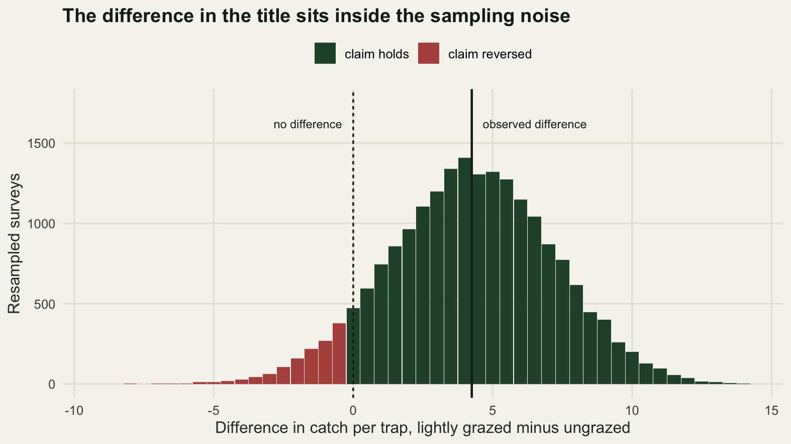
Which brings this post to the failure it was written for. Consider the title “The index stays high while the stock goes”, which is a real shape of error: the sentence was being edited, the author was interrupted, and the ending never arrived. Every automated check passes it.
broken <- "The index stays high while the stock goes"
checks <- c(non_empty = nchar(broken) > 0,
            ascii_only = !grepl("[^ -~]", broken),
            no_dashes = !grepl("[\u2013\u2014]", broken),
            fits_the_room = text_in(broken) < room82,
            keeps_the_margin = text_in(broken) < 0.95 * room82)
print(checks)
non_empty ascii_only no_dashes fits_the_room
TRUE TRUE TRUE TRUE
keeps_the_margin
TRUE c(checks_passed = sum(checks), checks_failed = sum(!checks))checks_passed checks_failed
5 0 Five checks, five passes, and the title is not a sentence. It is complete in the source, it is plain ASCII, it carries no forbidden punctuation, it asks for less width than the panel has, and it keeps the margin as well. The reader’s eye finishes it silently, usually as “down”, and moves on. There is no automated gate for this one, because the string the machine sees is exactly the string the author wrote; the only defence is to read every title out loud as a sentence before the figure ships. That takes a few seconds per figure and it is the only check in this post that cannot be run by a computer.
The honest limit
The width check is a margin test rather than an exact one, and the reason is worth being plain about. Its numbers come from the metrics of a PDF font: tables of advance widths compiled into R, needing no cairo and no font configuration, identical on a laptop, on a server and on whatever machine renders this page. The image above was not drawn with them. It was drawn by a raster device that substituted whatever sans face the system had, and that face carries its own widths. The size of the gap between two faces is measured in check 2 itself: the same sentence set in the serif face is 10.373 per cent narrower than in the sans face. A substitution inside the sans family is far smaller than that, but it is not zero, and it cannot be measured without rendering on the machine that will do the rendering. That unknown ratio is the whole of the residual uncertainty, which is why the gate spends 5 per cent of the room on it and calls anything above 0.95 unproven rather than passed.
The tempting way to close that gap is to render the figure and count the ink in the margin of the bitmap, which is what the first version of this section did. It was the worse check, for a reason that has nothing to do with pixels: it answered differently on machines with different rasterisers, and on a machine whose R was built without the bitmap device it gave no answer at all and stopped the build. A figure check whose result depends on the computer that ran it is not a check, it is a local observation. What is left after the rasteriser comes out is narrower in what it claims and wider in where it holds: an exact statement about a geometry every machine agrees on, plus a stated margin for the one step that is not portable. Size still matters, of course, and for the same reason as before: the same title fits at 8.2 inches and overflows at 6.0, so the check belongs at the size the figure is published and says nothing about any other size.
The gate is also blind to everything that goes wrong inside the frame. Two tick labels that overlap each other in the middle of the axis are both inside the room. A data label clipped at the edge of the panel, rather than the edge of the canvas, is inside the room. A legend that sits on top of the data is inside the room. A figure can pass every check in this post and be unreadable, and the only reason to run these checks is that they catch the failures that a careful look at a small preview does not.
The last limit is the one running through checks 1 and 4. Both measure a gap between what a figure asserts and what the data support, and neither has anything to say about whether the right thing was plotted. The four blocks here were not randomly assigned; grazing came with soil, aspect and a history nobody recorded. The tidiest possible figure of a confounded comparison is a tidy figure of a confounded comparison, and the title check will happily certify a well-measured claim about the wrong quantity.
Where to go next
The cheapest of these four checks is the width rule from check 2, and it is cheap because nothing has to be drawn: measure the title with strwidth on a pdf(NULL) device set to the title font, take the panel width out of ggplotGrob, and compare the two with a margin. Three lines, no image file, no temporary directory, and the same answer wherever it runs. Run it at the size the figure will be published rather than the size it was drafted at, and still look at the rendered image for the things a width cannot see.
For the colour side of check 3, the full treatment of sequential, diverging and qualitative palettes, including what luminance does to a rainbow and what greyscale printing does to a qualitative set, is in Choosing colours for ecological data. For the geometry that check 1 only touches, an ordination plot is the case where the aspect ratio itself changes the distances the reader sees, and that is worked through in Designing an ordination figure. And for the specific problem of check 4, a bar of means with the distribution hidden behind it, Effect plots that show the data measures what the bar is hiding and what to draw instead.
References
Cleveland WS, McGill R 1984 Journal of the American Statistical Association 79(387):531-554 (10.1080/01621459.1984.10478080)
Weissgerber TL, Milic NM, Winham SJ, Garovic VD 2015 PLoS Biology 13(4):e1002128 (10.1371/journal.pbio.1002128)
Rougier NP, Droettboom M, Bourne PE 2014 PLoS Computational Biology 10(9):e1003833 (10.1371/journal.pcbi.1003833)
Brettel H, Vienot F, Mollon JD 1997 Journal of the Optical Society of America A 14(10):2647-2655 (10.1364/JOSAA.14.002647)
Crameri F, Shephard GE, Heron PJ 2020 Nature Communications 11:5444 (10.1038/s41467-020-19160-7)
Wilke CO 2019 Fundamentals of Data Visualization. O’Reilly Media, ISBN 978-1-4920-3108-6