library(ggplot2)

te_pal <- list(forest = "#275139", green = "#2f8f63", sage = "#93a87f",
               clay = "#b5534e", gold = "#cda23f", line = "#dad9ca",
               ink = "#16241d", paper = "#f5f4ee")

theme_te <- function() {
  theme_minimal(base_size = 12) +
    theme(panel.grid.minor = element_blank(),
          panel.grid.major = element_line(colour = "#e7e6dc"),
          plot.background = element_rect(fill = "#f5f4ee", colour = NA),
          panel.background = element_rect(fill = "#f5f4ee", colour = NA),
          plot.title = element_text(face = "bold", colour = te_pal$ink),
          axis.title = element_text(colour = "#2c3a31"))
}Effect plots that show the data
R
data visualisation
ggplot2
ecology tutorial
Bar charts hide the distribution, and a partial effect is not a marginal effect. Measuring what an ecological effect plot in R shows and what it quietly hides.
Step 43 of the Tidy Ecology course, Part eight: make the result hold up.
A colleague sends a figure at half past four with the message “does this look right to you”. It is a bar chart: three bars, three error bars, one asterisk. The bars are mean shoot biomass in three grazing treatments, and the asterisk sits over the tallest one. Nothing about the figure is wrong. Every number in it is correctly computed. What the figure cannot tell you is that one treatment has a gap in the middle of its distribution where no quadrat fell, and another owes its entire error bar to three quadrats out of sixty.
That is the ordinary state of an effect plot. The plot is a claim about what a variable does, and between the model and the picture sit four choices, each of which changes the claim: whether the raw data appear at all, which of three very different quantities the curve is, what the shaded band means, and how the points are drawn when there are too many of them. This tutorial measures the cost of each choice on one small stream survey. Every statement below has a number behind it, because a post about figures with no numbers in it is a post about taste.
The arithmetic behind these plots is covered elsewhere: predicting on the GLM response scale does the back transformation and the standard errors, and contrasts after a GLM does the comparisons between levels. This post starts one step later, at the point where the numbers are correct and the only remaining question is what to draw.
Three samples, one bar chart
Start with the colleague’s figure. Three grazing treatments, sixty quadrats each, shoot biomass in grams per quadrat. The three samples below are constructed to share a mean and a standard deviation exactly, by generating a shape and then shifting and stretching it onto the target moments. One is a plain unimodal spread. One is split into two clumps with nothing in the middle, which is what a treatment effect looks like when half the quadrats respond and half do not. One is a tight low group with a few very high quadrats, which is what a survey looks like when a resource is concentrated in a small part of the plot.
set.seed(20260808)
n_q <- 60
mu_target <- 12.4
se_target <- 0.35
sd_target <- se_target * sqrt(n_q)

on_target <- function(x) (x - mean(x)) / sd(x) * sd_target + mu_target
even  <- on_target(rnorm(n_q))
split <- on_target(c(rnorm(n_q / 2, -1, 0.30), rnorm(n_q / 2, 1, 0.30)))
patch <- on_target(c(rnorm(n_q - 3, 0, 0.30), rnorm(3, 6.5, 0.4)))
samples <- list(even = even, split = split, patch = patch)
lab_q <- c("even", "split", "patchy")

print(round(sapply(samples, function(z)
  c(mean = mean(z), sd = sd(z), se = sd(z) / sqrt(n_q),
    median = median(z), min = min(z), max = max(z))), 4))
even split patch
mean 12.4000 12.4000 12.4000
sd 2.7111 2.7111 2.7111
se 0.3500 0.3500 0.3500
median 12.2239 12.6225 11.8952
min 6.7382 8.1087 10.5475
max 18.5379 16.6034 24.6585c(quadrats_per_treatment = n_q)quadrats_per_treatment
60 The bar chart drawn from that table is the same bar chart three times over. Every summary it displays agrees to four decimal places: a mean of 12.4000 grams, a standard error of 0.3500. A two sample t test between the even and split samples returns a t statistic of 0 and a p value of 1, which is what happens when two samples have identical means and identical variances. There is no test that can separate them from the summaries the bar chart shows, because the bar chart shows only the summaries that are identical.
Underneath, they are not the same data at all.
skewness <- function(z) mean(((z - mean(z)) / sd(z))^3)
ks_gap <- function(a, b) {
  g <- sort(c(a, b))
  max(abs(ecdf(a)(g) - ecdf(b)(g)))
}
ss_top3 <- function(z) {
  s <- sort((z - mean(z))^2, decreasing = TRUE)
  sum(s[1:3]) / sum(s)
}
drop3 <- function(z) mean(z) - mean(sort(z, decreasing = TRUE)[-(1:3)])

print(round(rbind(skewness = sapply(samples, skewness),
                  near_the_mean = sapply(samples, function(z) mean(abs(z - mu_target) <= 1)),
                  variance_from_3_quadrats = sapply(samples, ss_top3),
                  mean_fall_dropping_3 = sapply(samples, drop3),
                  fall_in_standard_errors = sapply(samples, drop3) / se_target), 4))
even split patch
skewness 0.2227 0.0050 3.7041
near_the_mean 0.3500 0.0000 0.7000
variance_from_3_quadrats 0.2257 0.1192 0.9018
mean_fall_dropping_3 0.2904 0.2020 0.6001
fall_in_standard_errors 0.8298 0.5770 1.7145round(c(even_vs_split = ks_gap(even, split), even_vs_patchy = ks_gap(even, patch),
split_vs_patchy = ks_gap(split, patch)), 4) even_vs_split even_vs_patchy split_vs_patchy
0.2167 0.3500 0.4500 print(round(c(t = unname(t.test(even, split, var.equal = TRUE)$statistic),
p = t.test(even, split, var.equal = TRUE)$p.value), 4))t p
0 1 The largest gap between two of the empirical distribution functions is 0.4500, between the split and patchy samples: at some biomass value the share of the sample lying below that value differs by 0.4500 between the two. On this run the split sample has no quadrat at all within one gram of the mean it is being summarised by, and the patchy sample has 0.7000 of its quadrats there. Skewness runs from 0.0050 to 3.7041.
The number that does the most damage is the third row. In the patchy sample, 3 quadrats out of 60 generate 0.9018 of the sum of squares, and therefore essentially all of the error bar. Delete those three quadrats and the mean falls by 0.6001 grams, which is 1.7145 standard errors. In the even sample the same deletion moves the mean by 0.2904 grams. The error bar in the patchy panel is not a summary of sixty quadrats; it is a summary of three, drawn at the same width as the other two.
set.seed(20260808)
n_boot <- 20000
boot_ci <- sapply(samples, function(z) {
  m <- colMeans(matrix(sample(z, n_q * n_boot, replace = TRUE), n_q, n_boot))
  q <- quantile(m, c(0.025, 0.975))
  c(lower = q[[1]], upper = q[[2]],
    asymmetry = (q[[2]] - mu_target) / (mu_target - q[[1]]))
})
c(bootstrap_resamples = n_boot)
bootstrap_resamples
20000 print(round(rbind(boot_ci,
normal_lower = mu_target - 1.96 * se_target,
normal_upper = mu_target + 1.96 * se_target), 4)) even split patch
lower 11.7150 11.7280 11.8020
upper 13.0936 13.0816 13.1520
asymmetry 1.0127 1.0143 1.2576
normal_lower 11.7140 11.7140 11.7140
normal_upper 13.0860 13.0860 13.0860A symmetric error bar also assumes the sampling distribution of the mean is symmetric. Twenty thousand bootstrap resamples say that this holds for the even sample, where the upper half of the interval is 1.0127 times the lower half, and fails for the patchy one, where the ratio is 1.2576. The bar is drawn symmetric because bars are drawn symmetric.
set.seed(20260808)
bar_df <- data.frame(xn = 1:3, mean = mu_target, se = se_target,
                     panel = "Mean with one standard error")
pt_df <- data.frame(xn = rep(1:3, each = n_q) + runif(3 * n_q, -0.17, 0.17),
                    value = unlist(samples, use.names = FALSE),
                    panel = "Every quadrat")
pt_df$panel <- factor(pt_df$panel, levels = c("Mean with one standard error", "Every quadrat"))
bar_df$panel <- factor(bar_df$panel, levels = levels(pt_df$panel))

ggplot() +
  geom_col(data = bar_df, aes(xn, mean), width = 0.62, fill = te_pal$sage,
           colour = te_pal$forest) +
  geom_errorbar(data = bar_df, aes(xn, ymin = mean - se, ymax = mean + se),
                width = 0.22, colour = te_pal$ink, linewidth = 0.7) +
  geom_point(data = pt_df, aes(xn, value), colour = te_pal$forest, size = 1.7,
             alpha = 0.75) +
  facet_wrap(~panel) +
  scale_x_continuous(breaks = 1:3, labels = lab_q) +
  labs(x = "grazing treatment", y = "shoot biomass (g per quadrat)",
       title = "The same bar chart can hide three different samples") +
  theme_te() +
  theme(strip.text = element_text(colour = te_pal$ink, face = "bold"))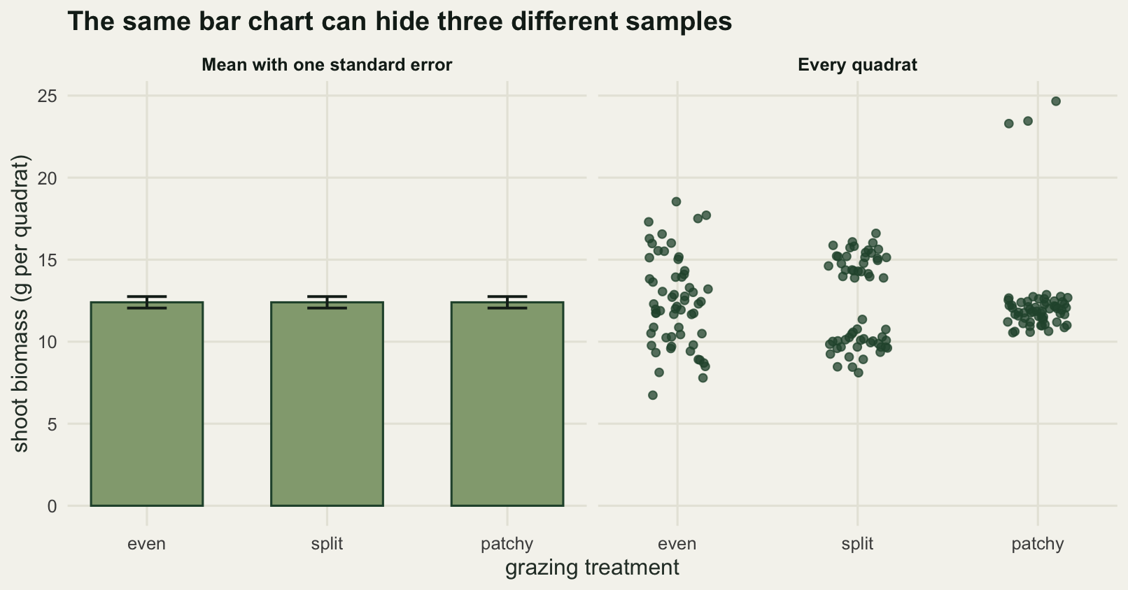
The right panel costs nothing. It is one more layer on the same plot, and it is the difference between a reader who thinks the treatments differ only in noise and a reader who can see that one of them has two states.
A survey where the covariate travels with the predictor
The rest of the post uses one dataset. A hundred and forty riffle sites on a set of upland streams, each with a measured mean flow velocity, a visual estimate of fine sediment cover as a percentage of the bed, and a Surber sample count of mayfly nymphs. Fine sediment settles out where the water is slow, so sediment and flow are not independent: the sediment estimate falls as flow rises, with scatter around that relationship.
set.seed(20260808)
n_site <- 140
flow <- runif(n_site, 0.05, 1.05)
sed <- 65 - 35 * flow + rnorm(n_site, 0, 13)
sed <- pmin(pmax(sed, 3), 92)
b_true <- c(intercept = 2.60, flow = 1.30, sediment = -0.024)
X <- cbind(1, flow, sed)
mu_true <- exp(as.vector(X %*% b_true))
cnt <- rpois(n_site, mu_true)

print(b_true)
intercept flow sediment
2.600 1.300 -0.024 round(c(sites = n_site, flow_min = min(flow), flow_max = max(flow),
sediment_mean = mean(sed), sediment_sd = sd(sed),
correlation_flow_sediment = cor(flow, sed),
mean_count = mean(cnt), max_count = max(cnt), zero_counts = sum(cnt == 0)), 4) sites flow_min flow_max
140.0000 0.0673 1.0489
sediment_mean sediment_sd correlation_flow_sediment
47.5955 16.8459 -0.6239
mean_count max_count zero_counts
11.3500 48.0000 2.0000 fit <- glm(cnt ~ flow + sed, family = poisson)
print(round(summary(fit)$coefficients, 4)) Estimate Std. Error z value Pr(>|z|)
(Intercept) 2.5414 0.1336 19.0232 0
flow 1.3959 0.1128 12.3791 0
sed -0.0232 0.0019 -12.5084 0naive <- glm(cnt ~ flow, family = poisson)
print(round(summary(naive)$coefficients, 4)) Estimate Std. Error z value Pr(>|z|)
(Intercept) 1.0714 0.0705 15.2077 0
flow 2.1887 0.0930 23.5296 0round(c(unadjusted_over_adjusted_slope = unname(coef(naive)[2] / coef(fit)[2])), 4)unadjusted_over_adjusted_slope
1.5679 Flow and sediment correlate at -0.6239. The fitted model recovers the generating coefficients: 1.3959 per metre per second on the log scale for flow, against a true 1.300, and -0.0232 per percentage point of sediment, against a true -0.024. Fit flow on its own, leaving sediment out, and the flow coefficient becomes 2.1887, which is 1.5679 times the adjusted one. That difference is the whole subject of the next two sections, because both numbers are correct answers to different questions, and both get drawn as “the effect of flow”.
Partial, marginal, and what the eye sees
Three curves can be drawn from the two predictor model above, and all three are routinely called the effect of flow.
The partial curve holds sediment at its mean of 47.5955 per cent and sweeps flow across its range. It answers: if I could change the flow at one site and leave its sediment alone, what would happen to the count?
The standardised marginal curve fixes flow at a value, predicts every one of the 140 sites at that flow while keeping each site’s own sediment, and averages the predictions. It answers: what would the average count be if the whole survey experienced this flow?
The observed mixture curve does what the eye does. At each flow it averages predictions over the sediment values that actually occur near that flow, which are high at the slow end and low at the fast end. It answers: what do I see as I walk from the slow sites to the fast ones? Nobody asks for this curve, but it is the one a scatter of raw counts draws in the reader’s head, and it is what an unadjusted single predictor fit estimates.
bh <- coef(fit)
sed_bar <- mean(sed)
grid_n <- 60
fl_grid <- seq(min(flow), max(flow), length.out = grid_n)

partial_curve <- exp(bh[1] + bh[2] * fl_grid + bh[3] * sed_bar)
marginal_curve <- sapply(fl_grid, function(f) mean(exp(bh[1] + bh[2] * f + bh[3] * sed)))
band <- 0.12
mixture_curve <- sapply(fl_grid, function(f) {
  w <- dnorm(flow, f, band)
  sum(w / sum(w) * exp(bh[1] + bh[2] * f + bh[3] * sed))
})
local_raw <- sapply(fl_grid, function(f) {
  w <- dnorm(flow, f, band)
  sum(w / sum(w) * cnt)
})

round(c(kernel_bandwidth = band,
        partial_at_slowest = partial_curve[1], partial_at_fastest = partial_curve[grid_n],
        marginal_at_slowest = marginal_curve[1], marginal_at_fastest = marginal_curve[grid_n],
        mixture_at_slowest = mixture_curve[1], mixture_at_fastest = mixture_curve[grid_n]), 4)
kernel_bandwidth partial_at_slowest partial_at_fastest marginal_at_slowest
0.1200 4.6339 18.2407 5.0022
marginal_at_fastest mixture_at_slowest mixture_at_fastest
19.6906 3.5570 26.9617 round(c(fold_partial = partial_curve[grid_n] / partial_curve[1],
fold_marginal = marginal_curve[grid_n] / marginal_curve[1],
fold_mixture = mixture_curve[grid_n] / mixture_curve[1],
log_slope_partial = log(partial_curve[grid_n] / partial_curve[1]) /
diff(range(fl_grid)),
log_slope_mixture = log(mixture_curve[grid_n] / mixture_curve[1]) /
diff(range(fl_grid))), 4) fold_partial fold_marginal fold_mixture log_slope_partial
3.9364 3.9364 7.5799 1.3959
log_slope_mixture
2.0635 round(c(max_gap_partial_marginal = max(abs(marginal_curve - partial_curve)),
max_percent_partial_marginal = 100 * max(abs(marginal_curve / partial_curve - 1)),
max_gap_partial_mixture = max(abs(mixture_curve - partial_curve)),
max_percent_partial_mixture = 100 * max(abs(mixture_curve / partial_curve - 1)),
max_gap_mixture_vs_local_mean = max(abs(mixture_curve - local_raw))), 4) max_gap_partial_marginal max_percent_partial_marginal
1.4498 7.9483
max_gap_partial_mixture max_percent_partial_mixture
8.7209 47.8102
max_gap_mixture_vs_local_mean
2.0146 The partial curve runs from 4.6339 nymphs at the slowest site to 18.2407 at the fastest, a 3.9364 fold rise. The standardised marginal curve runs from 5.0022 to 19.6906, and the fold rise is 3.9364 again, to four decimal places. The observed mixture curve runs from 3.5570 to 26.9617, a 7.5799 fold rise: well above the fold change of the other two, from the same fitted model, with no recalculation of anything.
On the log scale the partial curve rises at 1.3959 per metre per second, which is the fitted coefficient, and the mixture curve at 2.0635. The largest vertical gap between the partial and mixture curves is 8.7209 nymphs, or 47.8102 per cent of the partial prediction at that flow. If the figure is what the reader remembers, the choice of curve has changed the reported effect of flow by that margin.
The mixture curve is not a modelling artefact. Averaging the raw counts with the same kernel weights, which involves no model at all, gives a curve that never differs from it by more than 2.0146 nymphs across the whole flow range. The mixture curve is a smooth version of what is actually in front of the reader.
This is the same trap as unstandardised catch rates, and it fails in the same direction. In standardising catch per unit effort the nuisance variables are gear, season and vessel, and the trend in raw catch per unit effort tracks the drift in those variables as much as it tracks the stock. Here the nuisance variable is fine sediment, and the apparent flow effect carries the sediment gradient inside it. The mechanism is identical: predicting on the mixture of covariates that happens to occur at each level of the predictor, instead of on a mixture held fixed.
curve_lab <- c("partial (sediment at its mean)",
               "standardised marginal (averaged over all sites)",
               "observed mixture (sediment as it occurs)")
curve_df <- data.frame(
  flow = rep(fl_grid, 3),
  count = c(partial_curve, marginal_curve, mixture_curve),
  curve = factor(rep(curve_lab, each = grid_n), levels = curve_lab))

ggplot(curve_df, aes(flow, count)) +
  geom_point(data = data.frame(flow = flow, count = cnt), aes(flow, count),
             inherit.aes = FALSE, colour = te_pal$sage, size = 1.6, alpha = 0.8) +
  geom_line(aes(colour = curve, linetype = curve), linewidth = 1.05) +
  scale_colour_manual(values = c(te_pal$forest, te_pal$gold, te_pal$clay), name = NULL) +
  scale_linetype_manual(values = c("solid", "22", "solid"), name = NULL) +
  labs(x = "flow velocity (m per s)", y = "mayfly nymphs per Surber sample",
       title = "The same model gives three different effect curves") +
  theme_te() +
  theme(legend.position = "top", legend.direction = "vertical",
        legend.margin = margin(b = -6))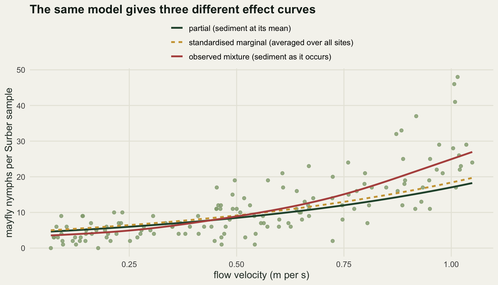
The link decides whether the shape survives
The partial and standardised marginal curves above differ in level and not at all in shape, and that is worth pinning down, because it is a property of the log link rather than a general fact.
With a log link and no interaction, the marginal curve is the partial curve multiplied by the average of exp(b times sediment) over the observed sediment, divided by the same quantity evaluated at mean sediment. That multiplier does not involve flow, so it is the same at every point on the curve. The ratio is above one by Jensen’s inequality, so the marginal curve sits above the partial one whenever the link is a log and the nuisance predictor varies at all.
ratio_curve <- marginal_curve / partial_curve
jensen_factor <- unname(mean(exp(bh[3] * sed)) / exp(bh[3] * sed_bar))
round(c(ratio_min = min(ratio_curve), ratio_max = max(ratio_curve),
        ratio_spread = max(ratio_curve) - min(ratio_curve),
        closed_form_factor = jensen_factor,
        log_slope_difference =
          log(marginal_curve[grid_n] / marginal_curve[1]) -
          log(partial_curve[grid_n] / partial_curve[1])), 6)
ratio_min ratio_max ratio_spread
1.079483 1.079483 0.000000
closed_form_factor log_slope_difference
1.079483 0.000000 The ratio between the two curves is 1.079483 at its smallest and 1.079483 at its largest, matching the closed form to six decimal places, and the difference between the two log scale slopes is 0.000000. Standardising over the sediment distribution lifts the whole partial curve by 7.9483 per cent and leaves its shape untouched. On a log link, the partial and marginal curves cannot cross, and cannot differ in slope.
Change the link and that stops being true. The same 140 sites also have presence and absence records for a cased caddis, modelled with a logit link on the same two predictors.
set.seed(20260809)
pres <- rbinom(n_site, 1, plogis(2.0 + 3.2 * flow - 0.08 * sed))
fit_b <- glm(pres ~ flow + sed, family = binomial)
print(round(summary(fit_b)$coefficients, 4))
Estimate Std. Error z value Pr(>|z|)
(Intercept) 2.4524 1.1884 2.0636 0.0391
flow 2.0198 0.8813 2.2919 0.0219
sed -0.0766 0.0190 -4.0340 0.0001cb <- coef(fit_b)
p_partial <- plogis(cb[1] + cb[2] * fl_grid + cb[3] * sed_bar)
p_marginal <- sapply(fl_grid, function(f) mean(plogis(cb[1] + cb[2] * f + cb[3] * sed)))
p_mixture <- sapply(fl_grid, function(f) {
w <- dnorm(flow, f, band)
sum(w / sum(w) * plogis(cb[1] + cb[2] * f + cb[3] * sed))
})
slope_of <- function(v) diff(v) / diff(fl_grid)
round(c(occupied_sites = sum(pres),
partial_at_slowest = p_partial[1], partial_at_fastest = p_partial[grid_n],
marginal_at_slowest = p_marginal[1], marginal_at_fastest = p_marginal[grid_n],
rise_partial = diff(range(p_partial)), rise_marginal = diff(range(p_marginal)),
max_gap = max(abs(p_marginal - p_partial)),
steepest_partial = max(slope_of(p_partial)),
steepest_marginal = max(slope_of(p_marginal)),
steepest_ratio = max(slope_of(p_marginal)) / max(slope_of(p_partial)),
rise_mixture = diff(range(p_mixture))), 4) occupied_sites partial_at_slowest partial_at_fastest marginal_at_slowest
67.0000 0.2580 0.7163 0.3082
marginal_at_fastest rise_partial rise_marginal max_gap
0.6670 0.4583 0.3587 0.0502
steepest_partial steepest_marginal steepest_ratio rise_mixture
0.5049 0.3806 0.7537 0.7064 Here the marginal curve is genuinely flatter, not merely shifted. It rises 0.3587 in probability across the flow range against the partial curve’s 0.4583, its steepest slope is 0.7537 of the partial curve’s, and the two curves differ by up to 0.0502 in probability while crossing on the way. Averaging a curved function over a spread of covariate values pulls the average towards the flat parts of the curve, and a logistic curve has flat parts at both ends. This is the same attenuation that separates a subject specific from a population averaged coefficient in a mixed model. The observed mixture version of the caddis curve rises 0.7064, which is again the steepest of the three.
The practical rule is short. Say in the caption which one you drew, and hold the other predictors at values you can name. “Sediment at its survey mean of 47.5955 per cent” is a caption. “Adjusted for sediment” is not, because it does not distinguish the three curves in the figure above.
Three intervals that look alike on the page
Now the band. Three different intervals get drawn round an effect curve in the same grey, and they answer three different questions. Take one focal flow of 0.55 metres per second at mean sediment.
The standard error bar is the fitted value plus and minus one standard error. The 95 per cent confidence interval is the fitted value plus and minus 1.96 standard errors on the link scale, back transformed. The 95 per cent prediction interval is the range that contains a new Surber sample, which needs the Poisson variation of the count on top of the uncertainty in the mean.
focal_flow <- 0.55
x0 <- c(1, focal_flow, sed_bar)
eta0 <- sum(coef(fit) * x0)
mu0 <- exp(eta0)
se_eta <- sqrt(as.numeric(t(x0) %*% vcov(fit) %*% x0))
se_mu <- mu0 * se_eta
ci0 <- exp(eta0 + c(-1.96, 1.96) * se_eta)

pred_interval <- function(bhat, vb, x, n_draw) {
  L <- chol(vb)
  bs <- matrix(rnorm(n_draw * length(bhat)), n_draw) %*% L + rep(bhat, each = n_draw)
  quantile(rpois(n_draw, exp(as.vector(bs %*% x))), c(0.025, 0.975))
}
set.seed(20260808)
pi0 <- pred_interval(coef(fit), vcov(fit), x0, 200000)

c(focal_flow = focal_flow)
focal_flow
0.55 round(c(fitted = mu0, standard_error = se_mu,
se_lower = mu0 - se_mu, se_upper = mu0 + se_mu,
ci_lower = ci0[1], ci_upper = ci0[2],
pi_lower = pi0[[1]], pi_upper = pi0[[2]]), 4) fitted standard_error se_lower se_upper ci_lower
9.0906 0.2781 8.8125 9.3687 8.5616
ci_upper pi_lower pi_upper
9.6523 4.0000 15.0000 round(c(width_se_bar = 2 * se_mu, width_ci = diff(ci0), width_pi = pi0[[2]] - pi0[[1]],
ci_over_se_bar = diff(ci0) / (2 * se_mu),
pi_over_ci = (pi0[[2]] - pi0[[1]]) / diff(ci0)), 4) width_se_bar width_ci width_pi ci_over_se_bar pi_over_ci
0.5561 1.0907 11.0000 1.9612 10.0853 At that flow the model predicts 9.0906 nymphs. The standard error bar spans 0.5561 nymphs, the confidence interval 1.0907, and the prediction interval 11.0000. The prediction interval is 10.0853 times as wide as the confidence interval. Drawn as ribbons on the same axes, one of them hugs the curve and the other covers most of the panel, and they are labelled with the same word in most figure captions.
Widths are not the point, though. Coverage is. The block below regenerates the survey 2000 times from the true model at the same design, refits, and asks four questions at the focal flow: does the standard error bar contain the true mean, does the confidence interval contain the true mean, does the confidence interval contain a new observation, and does the prediction interval contain a new observation. The fast refit path is checked against the model already fitted before it is trusted.
fast_fit <- function(y) {
  f <- glm.fit(X, y, family = poisson())
  list(b = f$coefficients, v = chol2inv(f$qr$qr[seq_len(3), seq_len(3), drop = FALSE]))
}
check <- fast_fit(cnt)
round(c(max_coefficient_difference = max(abs(check$b - coef(fit))),
        max_variance_difference = max(abs(check$v - vcov(fit)))), 12)
max_coefficient_difference max_variance_difference
0 0 mu0_true <- exp(sum(b_true * x0))
set.seed(20260808)
n_sim <- 2000
cover <- matrix(NA_real_, n_sim, 4)
for (i in seq_len(n_sim)) {
f <- fast_fit(rpois(n_site, mu_true))
eta <- sum(f$b * x0)
m <- exp(eta)
s <- sqrt(as.numeric(t(x0) %*% f$v %*% x0))
ci <- exp(eta + c(-1.96, 1.96) * s)
pri <- pred_interval(f$b, f$v, x0, 4000)
y_new <- rpois(1, mu0_true)
cover[i, ] <- c(abs(m - mu0_true) <= m * s,
ci[1] <= mu0_true && mu0_true <= ci[2],
ci[1] <= y_new && y_new <= ci[2],
pri[[1]] <= y_new && y_new <= pri[[2]])
}
colnames(cover) <- c("se_bar_holds_true_mean", "ci_holds_true_mean",
"ci_holds_new_count", "pi_holds_new_count")
c(simulations = n_sim, true_mean_at_focal_flow = round(mu0_true, 4)) simulations true_mean_at_focal_flow
2000.000 8.782 print(round(colMeans(cover), 4))se_bar_holds_true_mean ci_holds_true_mean ci_holds_new_count
0.6820 0.9550 0.1365
pi_holds_new_count
0.9645 The fast refit agrees with the fitted model to twelve decimal places on both the coefficients and the covariance matrix, so the loop is doing what glm does. The confidence interval then does its job: it contains the true mean in 0.9550 of the 2000 simulated surveys. The standard error bar contains it in 0.6820, which is the usual one standard error figure and is fine as long as nobody reads it as 95 per cent. The prediction interval contains a new count in 0.9645 of surveys, slightly above nominal because a count interval cannot land on non-integer endpoints.
The fourth number is the one to keep. The 95 per cent confidence interval contains a new observation in 0.1365 of surveys. A reader who looks at a confidence band and thinks “so a site like this has between 8.5616 and 9.6523 nymphs” is wrong about six times in seven. The band does not describe sites. It describes how well the average is known, and at 140 sites the average is known very well while individual sites remain all over the place.
xg <- cbind(1, fl_grid, sed_bar)
set.seed(20260808)
pi_grid <- sapply(seq_len(grid_n), function(i)
  pred_interval(coef(fit), vcov(fit), xg[i, ], 20000))
adj_cnt <- cnt * exp(bh[3] * (sed_bar - sed))

# Both intervals again on a much finer flow grid, for drawing only. On the 60
# point grid above, the prediction band comes out as a coarse blocky staircase.
# The coverage check later in the post keeps using the 60 point version.
fine_n <- 320
fl_fine <- seq(min(flow), max(flow), length.out = fine_n)
xf <- cbind(1, fl_fine, sed_bar)
eta_fine <- as.vector(xf %*% bh)
se_fine <- sqrt(rowSums((xf %*% vcov(fit)) * xf))
set.seed(20260811)
pi_fine <- sapply(seq_len(fine_n), function(i)
  pred_interval(coef(fit), vcov(fit), xf[i, ], 60000))
draw_df <- data.frame(flow = fl_fine, fitted = exp(eta_fine),
                      ci_lo = exp(eta_fine - 1.96 * se_fine),
                      ci_hi = exp(eta_fine + 1.96 * se_fine),
                      pi_lo = pi_fine[1, ], pi_hi = pi_fine[2, ])

band_lab <- c("confidence, for the mean", "prediction, for a new sample")
ggplot(draw_df, aes(flow)) +
  geom_ribbon(aes(ymin = pi_lo, ymax = pi_hi, fill = band_lab[2]), alpha = 0.45,
              colour = te_pal$sage, linewidth = 0.3) +
  geom_ribbon(aes(ymin = ci_lo, ymax = ci_hi, fill = band_lab[1]), alpha = 0.85) +
  geom_point(data = data.frame(flow = flow, adj = adj_cnt), aes(flow, adj),
             inherit.aes = FALSE, colour = te_pal$ink, size = 1.5, alpha = 0.6) +
  geom_line(aes(y = fitted, colour = "fitted partial curve"), linewidth = 1.05) +
  annotate("segment", x = focal_flow, xend = focal_flow, y = mu0 - se_mu, yend = mu0 + se_mu,
           colour = te_pal$clay, linewidth = 2.2) +
  annotate("segment", x = focal_flow, xend = focal_flow + 0.03, y = mu0 + se_mu,
           yend = mu0 + 5.4, colour = te_pal$clay, linewidth = 0.4) +
  annotate("text", x = focal_flow + 0.035, y = mu0 + 5.6, hjust = 0, size = 3.2,
           colour = te_pal$clay, label = "one standard error") +
  scale_fill_manual(name = "95 per cent band", values = setNames(
    c(te_pal$green, te_pal$sage), band_lab), breaks = band_lab) +
  scale_colour_manual(name = NULL, values = c("fitted partial curve" = te_pal$forest)) +
  guides(fill = guide_legend(order = 1), colour = guide_legend(order = 2)) +
  labs(x = "flow velocity (m per s)", y = "mayfly nymphs per Surber sample",
       title = "A confidence band is not a prediction band") +
  theme_te() +
  theme(legend.position = "bottom", legend.box = "horizontal",
        legend.margin = margin(t = -2), legend.title = element_text(size = 9),
        legend.text = element_text(size = 9))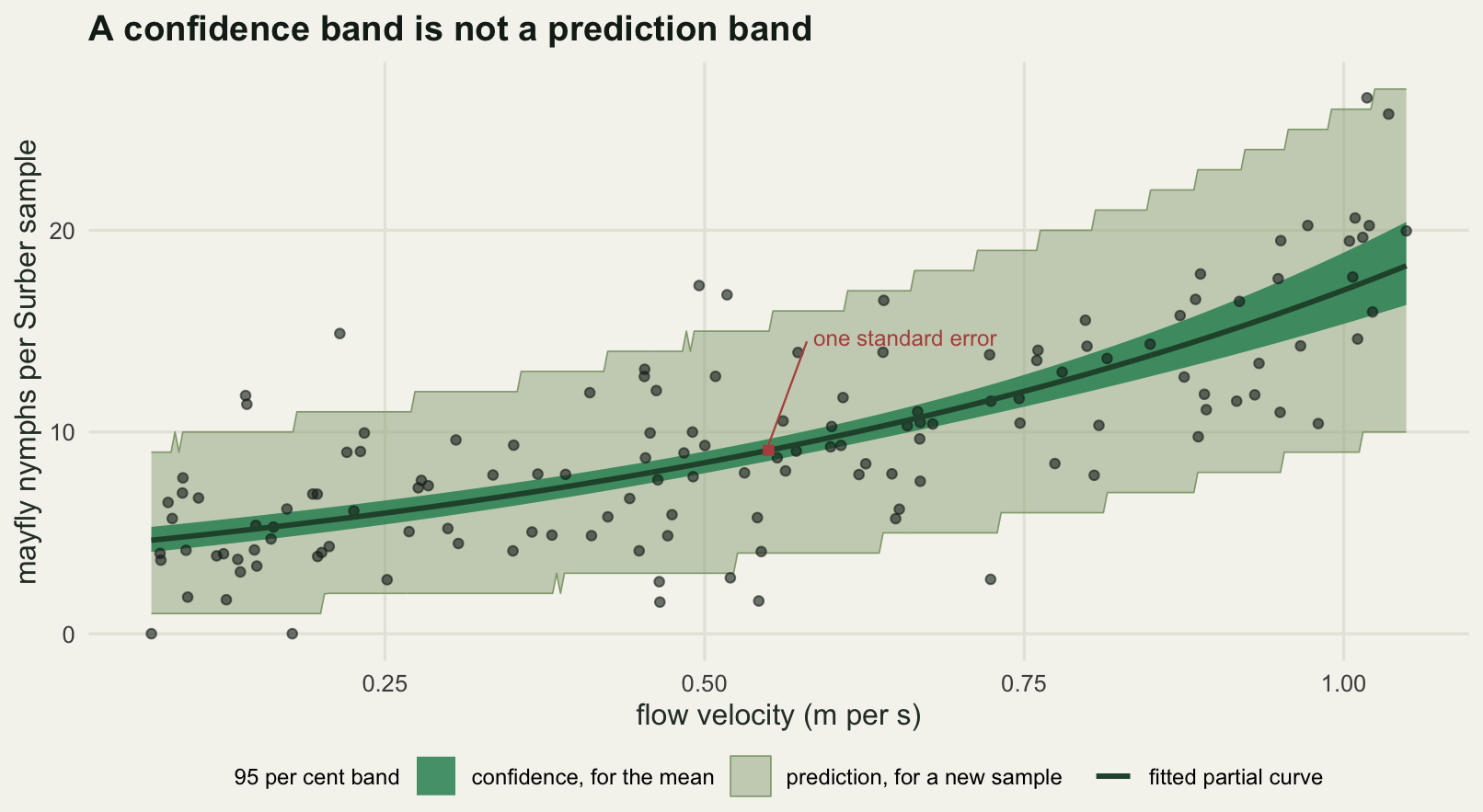
Putting the data back on the plot
Adding the raw data is the advice at the end of every talk about bar charts, and it is right, but it is not free. The caddis presence data make the point at its worst: 140 points that can only take two values, drawn against a continuous predictor.
Overlap is a geometric fact and can be measured. Suppose the panel is 160 millimetres wide and 85 millimetres high, and the markers are drawn 2.2 millimetres across. Project every point into millimetres on that panel, and two markers overlap when their centres are closer than one marker diameter. A marker is completely hidden when every point of its disc lies inside some other disc. The ink ratio below is the area actually covered by ink divided by the area the markers would cover if none of them touched, estimated on a fine grid.
panel_w <- 160
panel_h <- 85
marker_d <- 2.2
to_mm_x <- function(x) (x - min(flow)) / diff(range(flow)) * panel_w
to_mm_y <- function(y) (y + 0.05) / 1.10 * panel_h

overlap_stats <- function(px, py) {
  p <- cbind(px, py)
  n <- nrow(p)
  d <- as.matrix(dist(p))
  diag(d) <- Inf
  touching <- d < marker_d
  n_probe <- 300
  hidden <- sapply(seq_len(n), function(i) {
    ang <- runif(n_probe, 0, 2 * pi)
    rad <- (marker_d / 2) * sqrt(runif(n_probe))
    qx <- p[i, 1] + rad * cos(ang)
    qy <- p[i, 2] + rad * sin(ang)
    got <- rep(FALSE, n_probe)
    for (j in setdiff(seq_len(n), i)) {
      got <- got | ((qx - p[j, 1])^2 + (qy - p[j, 2])^2 < (marker_d / 2)^2)
      if (all(got)) break
    }
    all(got)
  })
  gx <- seq(min(p[, 1]) - marker_d, max(p[, 1]) + marker_d, length.out = 700)
  gy <- seq(min(p[, 2]) - marker_d, max(p[, 2]) + marker_d, length.out = 450)
  g <- expand.grid(x = gx, y = gy)
  inked <- rep(FALSE, nrow(g))
  for (j in seq_len(n))
    inked <- inked | ((g$x - p[j, 1])^2 + (g$y - p[j, 2])^2 < (marker_d / 2)^2)
  c(overlapping_pairs = sum(touching) / 2,
    share_touching = mean(rowSums(touching) > 0),
    most_neighbours = max(rowSums(touching)),
    fully_hidden = sum(hidden),
    ink_ratio = sum(inked) * (gx[2] - gx[1]) * (gy[2] - gy[1]) /
      (n * pi * (marker_d / 2)^2))
}

set.seed(20260810)
jit_small <- pres + runif(n_site, -0.06, 0.06)
jit_wide <- pres + runif(n_site, -0.12, 0.12)
ov <- rbind(plain = overlap_stats(to_mm_x(flow), to_mm_y(pres)),
            jitter_small = overlap_stats(to_mm_x(flow), to_mm_y(jit_small)),
            jitter_wide = overlap_stats(to_mm_x(flow), to_mm_y(jit_wide)))
c(panel_width_mm = panel_w, panel_height_mm = panel_h)
panel_width_mm panel_height_mm
160 85 round(c(marker_mm = marker_d), 2)marker_mm
2.2 print(round(ov, 4)) overlapping_pairs share_touching most_neighbours fully_hidden
plain 157 0.8500 7 6
jitter_small 45 0.4714 3 0
jitter_wide 36 0.3929 5 0
ink_ratio
plain 0.6485
jitter_small 0.9137
jitter_wide 0.9378round(c(widest_displacement = 0.12,
share_of_partial_rise = 0.12 / diff(range(p_partial))), 4) widest_displacement share_of_partial_rise
0.1200 0.2618 Drawn plainly, 0.8500 of the 140 markers touch at least one other, there are 157 overlapping pairs, the most crowded marker has 7 neighbours, and 6 markers are completely hidden behind others: they contribute nothing to the figure at all. The ink covers 0.6485 of the area it would cover if the markers were disjoint, so more than a third of the drawing is redundant.
Jitter of plus or minus 0.06 in the response cuts the overlapping pairs from 157 to 45, removes every hidden marker, and lifts the ink ratio to 0.9137. Doubling the jitter to plus or minus 0.12 buys very little more, 36 pairs and an ink ratio of 0.9378, while moving markers up to 0.12 in probability units away from where they belong, which is 0.2618 of the 0.4583 rise the whole partial curve makes. Jitter is a lie about position told in exchange for a truth about density, and past a certain width the exchange rate turns bad: on this run the second doubling paid a quarter of the effect size for nine fewer overlapping pairs.
Transparency is the other standard answer, and it has a ceiling that is easy to compute. With alpha 0.3, the opacity after k markers pile up is one minus 0.7 to the power k.
alpha_used <- 0.30
c(alpha = alpha_used, one_minus_alpha = 1 - alpha_used)
alpha one_minus_alpha
0.3 0.7 k_stack <- 1:12
opacity <- 1 - (1 - alpha_used)^k_stack
increment <- c(alpha_used, diff(opacity))
print(round(rbind(markers = k_stack, opacity = opacity, increment = increment), 4)) [,1] [,2] [,3] [,4] [,5] [,6] [,7] [,8] [,9] [,10]
markers 1.0 2.00 3.000 4.0000 5.0000 6.0000 7.0000 8.0000 9.0000 10.0000
opacity 0.3 0.51 0.657 0.7599 0.8319 0.8824 0.9176 0.9424 0.9596 0.9718
increment 0.3 0.21 0.147 0.1029 0.0720 0.0504 0.0353 0.0247 0.0173 0.0121
[,11] [,12]
markers 11.0000 12.0000
opacity 0.9802 0.9862
increment 0.0085 0.0059c(first_invisible_addition = min(which(increment < 0.02)))first_invisible_addition
9 The ninth marker on a pile changes the opacity by 0.0173, which is below the roughly 0.02 step a reader can see, and every marker after that changes it by less. Transparency encodes density up to about eight deep and is flat after that. Twelve markers on one spot already sit at an opacity of 0.9862, and nothing stacked above them can be told apart.
Binning is the answer that scales. Cut flow into eight equal bins, plot the observed proportion of occupied sites in each with the sample size shown, and the overlap problem disappears because there are eight markers. The cost is that the reader can no longer see the individual sites, and there is a second cost that is easy to walk into: binned raw data are not comparable with every curve you might draw through them.
n_bin <- 8
brk <- seq(min(flow), max(flow), length.out = n_bin + 1)
bin_id <- cut(flow, brk, include.lowest = TRUE, labels = FALSE)
bin_mid <- (brk[-1] + brk[-(n_bin + 1)]) / 2
bin_n <- as.vector(table(factor(bin_id, levels = seq_len(n_bin))))
bin_p <- as.vector(tapply(pres, factor(bin_id, levels = seq_len(n_bin)), mean))
bin_marg <- approx(fl_grid, p_marginal, bin_mid)$y
bin_mix <- approx(fl_grid, p_mixture, bin_mid)$y
bin_se <- sqrt(bin_p * (1 - bin_p) / bin_n)

print(round(rbind(bin_centre = bin_mid, sites = bin_n, observed = bin_p,
                  binomial_se = bin_se, marginal_curve = bin_marg,
                  mixture_curve = bin_mix), 4))
[,1] [,2] [,3] [,4] [,5] [,6] [,7] [,8]
bin_centre 0.1286 0.2513 0.3740 0.4967 0.6194 0.7421 0.8648 0.9875
sites 24.0000 18.0000 10.0000 25.0000 21.0000 11.0000 13.0000 18.0000
observed 0.2083 0.2222 0.1000 0.4800 0.4762 0.9091 0.6923 0.8889
binomial_se 0.0829 0.0980 0.0949 0.0999 0.1090 0.0867 0.1280 0.0741
marginal_curve 0.3287 0.3715 0.4161 0.4620 0.5086 0.5552 0.6010 0.6455
mixture_curve 0.1681 0.2250 0.3333 0.4499 0.5548 0.6700 0.7755 0.8371round(c(bins = n_bin, smallest_bin = min(bin_n),
mean_binomial_se = mean(bin_se),
mean_deviation_from_marginal = mean(abs(bin_p - bin_marg)),
mean_deviation_from_mixture = mean(abs(bin_p - bin_mix)),
largest_deviation_from_marginal = max(abs(bin_p - bin_marg)),
largest_deviation_from_mixture = max(abs(bin_p - bin_mix)),
bins_within_2_se_of_marginal = sum(abs(bin_p - bin_marg) <= 2 * bin_se),
bins_within_2_se_of_mixture = sum(abs(bin_p - bin_mix) <= 2 * bin_se),
marginal_deviation_over_se = mean(abs(bin_p - bin_marg)) / mean(bin_se)), 4) bins smallest_bin
8.0000 10.0000
mean_binomial_se mean_deviation_from_marginal
0.0967 0.1656
mean_deviation_from_mixture largest_deviation_from_marginal
0.0949 0.3539
largest_deviation_from_mixture bins_within_2_se_of_marginal
0.2391 5.0000
bins_within_2_se_of_mixture marginal_deviation_over_se
6.0000 1.7129 The eight binned proportions sit 0.1656 away from the standardised marginal curve on average and 0.0949 away from the observed mixture curve. The average binomial standard error of a bin is 0.0967, so the bins agree with the mixture curve to within their own sampling noise and miss the marginal curve by 1.7129 times it. Counting bins that fall within two standard errors gives 6 out of 8 for the mixture curve and 5 out of 8 for the marginal one, on bins holding as few as 10 sites.
That is the earlier finding arriving from the other direction. Binned raw proportions are an estimate of the observed mixture, because the sites in the slow bins really do have more fine sediment. Drawing them on top of a standardised marginal curve compares two different quantities and makes a correct model look biased, with the points low at the slow end and high at the fast end, which is exactly the pattern in the table above. Either draw the mixture curve, or adjust the binned points, or say in the caption that the curve holds sediment fixed and the points do not.
p_lab <- c("plain scatter", "jitter and transparency", "eight bins and two curves")
c_lab <- c("observed mixture", "standardised marginal")
plain_df <- data.frame(flow = flow, y = pres, panel = p_lab[1])
jit_df <- data.frame(flow = flow, y = jit_small, panel = p_lab[2])
pt_bin <- data.frame(flow = bin_mid, y = bin_p, sites = bin_n, panel = p_lab[3])
line_df <- data.frame(flow = rep(fl_grid, 2), y = c(p_mixture, p_marginal),
                      curve = factor(rep(c_lab, each = grid_n), levels = c_lab),
                      panel = p_lab[3])
for (dd in c("plain_df", "jit_df", "pt_bin", "line_df"))
  assign(dd, within(get(dd), panel <- factor(panel, levels = p_lab)))

ggplot(mapping = aes(flow, y)) +
  geom_point(data = plain_df, colour = te_pal$forest, size = 1.9) +
  geom_point(data = jit_df, colour = te_pal$forest, size = 1.9, alpha = alpha_used) +
  geom_line(data = line_df, aes(colour = curve, linetype = curve), linewidth = 1) +
  geom_point(data = pt_bin, aes(size = sites), colour = te_pal$forest, alpha = 0.85) +
  facet_wrap(~panel) +
  scale_size_area(max_size = 6, name = "sites", breaks = c(10, 20)) +
  scale_colour_manual(values = c(te_pal$clay, te_pal$gold), name = NULL) +
  scale_linetype_manual(values = c("solid", "22"), name = NULL) +
  scale_y_continuous(breaks = c(0, 0.5, 1)) +
  labs(x = "flow velocity (m per s)", y = "caddis present",
       title = "Jitter and binning show the data the plain scatter hides") +
  theme_te() +
  theme(strip.text = element_text(colour = te_pal$ink, face = "bold"),
        legend.position = "right", legend.box = "vertical")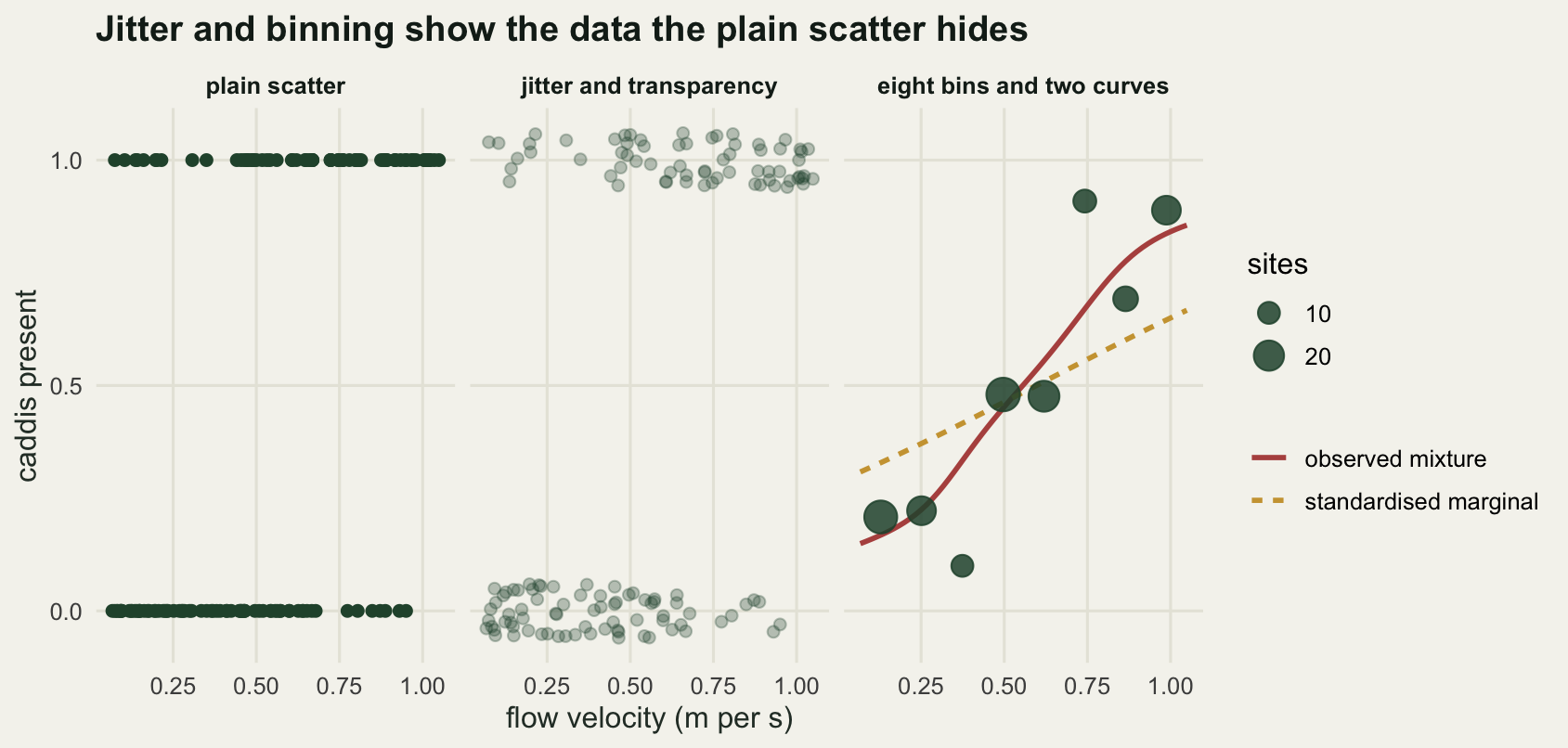
The honest limit
Overlaying the raw data on a partial effect curve is slightly dishonest, and this post has done it both ways. The partial curve is drawn at mean sediment, but the observed counts come from sites with every sediment value in the survey, so the scatter around that curve carries variation the curve has explicitly conditioned away. The three curve figure put raw counts under a partial curve. The interval figure used counts adjusted to mean sediment, which is a partial residual in multiplicative form. The difference between the two is measurable.
mu_hat <- fitted(fit)
partial_at_site <- exp(bh[1] + bh[2] * flow + bh[3] * sed_bar)
rms <- function(v) sqrt(mean(v^2))
round(c(rms_raw_counts = rms(cnt - partial_at_site),
        rms_adjusted_counts = rms(adj_cnt - partial_at_site),
        rms_full_model = rms(cnt - mu_hat),
        reduction_factor = rms(cnt - partial_at_site) / rms(adj_cnt - partial_at_site)), 4)
rms_raw_counts rms_adjusted_counts rms_full_model reduction_factor
6.7379 3.3312 3.4919 2.0226 inside <- function(v) mean(approx(fl_grid, pi_grid[1, ], flow)$y <= v &
v <= approx(fl_grid, pi_grid[2, ], flow)$y)
round(c(raw_inside_prediction_band = inside(cnt),
adjusted_inside_prediction_band = inside(adj_cnt)), 4) raw_inside_prediction_band adjusted_inside_prediction_band
0.8000 0.9071 Raw counts sit 6.7379 nymphs from the partial curve in root mean square; adjusted counts sit 3.3312 away, a factor of 2.0226 tighter, and close to the 3.4919 root mean square residual of the full two predictor fit. Plot the raw counts against the partial curve and the reader sees a cloud much looser than the model’s actual fit, then concludes the model is poor. Plot the adjusted counts and the reader sees the fit, but the values plotted are no longer numbers anyone measured, and they depend on the coefficient being adjusted for. Both versions need a caption that says which was done, and neither is the raw survey.
The prediction band in that figure carries the same problem. Raw counts fall inside it 0.8000 of the time, well short of the 0.95 it advertises, because the band is drawn at one sediment value while the points come from every sediment value in the survey. The adjusted counts do better at 0.9071, and the adjustment carries no guarantee of reaching the nominal level, because multiplying a count by an adjustment factor rescales its Poisson noise along with its mean. A prediction band and a scatter of partial residuals are not quite the same currency, and the raw coverage shortfall is measurable rather than theoretical.
Three further limits. The overlap arithmetic assumed a panel size and a marker size; change the figure width and every number in that section changes, which is precisely why the choice is not cosmetic. The coverage simulation regenerated data from the true model with no overdispersion, so the 0.9550 confidence interval coverage is the best case and real counts with extra-Poisson variation would do worse. And the three curve comparison assumed the model was right: if flow and sediment interact, none of the three curves is a complete answer, because there is then no single curve for the effect of flow.
Where to go next
The first figure in this post is a bar chart of three groups, which is a comparison of means and is better handled as a set of contrasts with intervals. Contrasts after a GLM builds those, and the plotting question there is which comparisons to show rather than how to show one. If the marginal curve is the one you want, the general machinery is prediction on the response scale with the covariates held at stated values, which predicting on the GLM response scale sets out.
For the figure itself, your first ggplot covers what maps to what, and checking a figure runs a set of tests on a finished plot, including the two failures that no text based check will find.
References
Anscombe FJ 1973 American Statistician 27(1):17-21 (10.1080/00031305.1973.10478966)
Cleveland WS, McGill R 1984 Journal of the American Statistical Association 79(387):531-554 (10.1080/01621459.1984.10478080)
Cumming G, Fidler F, Vaux DL 2007 Journal of Cell Biology 177(1):7-11 (10.1083/jcb.200611141)
Zeger SL, Liang KY, Albert PS 1988 Biometrics 44(4):1049-1060 (10.2307/2531734)
Hastie TJ, Tibshirani RJ 1990 Generalized Additive Models. Chapman and Hall, ISBN 978-0-412-34390-2