library(ggplot2)

te_pal <- list(forest = "#275139", green = "#2f8f63", sage = "#93a87f",
               clay = "#b5534e", gold = "#cda23f", line = "#dad9ca",
               ink = "#16241d", paper = "#f5f4ee")

theme_te <- function() {
  theme_minimal(base_size = 12) +
    theme(panel.grid.minor = element_blank(),
          panel.grid.major = element_line(colour = "#e7e6dc"),
          plot.background = element_rect(fill = "#f5f4ee", colour = NA),
          panel.background = element_rect(fill = "#f5f4ee", colour = NA),
          plot.title = element_text(face = "bold", colour = te_pal$ink),
          axis.title = element_text(colour = "#2c3a31"))
}Designing an ordination figure
R
data visualisation
ggplot2
ecology tutorial
An ordination figure draws distances, so panel shape and axis scaling change what your community map says. Measured in base R with stress, hulls and ellipses.
Ninety quadrats from a grazing experiment go into a spreadsheet as counts, come out of an ordination as ninety dots on one page, and everything the reader will believe about that experiment is now a matter of which dots look close to which. Nobody reads the coordinates. They read the gaps. A referee who says the ungrazed plots form a tight cluster is making a statement about distances measured with an eye, off a printed panel whose width and height were chosen by a journal template.
That makes the drawing part of the analysis rather than the decoration on top of it. This tutorial measures what the drawing does. It builds a community matrix from an explicit gradient model, works out Bray-Curtis dissimilarities by hand, runs a classical scaling and a nonmetric scaling written from scratch, and then measures four things: how far the panel shape moves the distances, how often that reverses which pair of sites looks closer, how much of the dissimilarity structure a two-dimensional map leaves out, and how much of a group outline is sample size rather than ecology.
The models themselves are covered elsewhere. NMDS ordination is about fitting the configuration and model-based unconstrained ordination is about doing the same job with a likelihood; this post starts once you have a configuration and asks what happens between it and the page.
A grazing gradient, a dissimilarity and a configuration
The data are simulated so that the truth is known. Ninety quadrats sit at three grazing levels, thirty each, and each quadrat has a position on a latent soil and disturbance gradient: the ungrazed plots sit low on it, the heavily grazed plots high, with enough scatter that the three groups overlap. Thirty species each have an optimum on that gradient, a tolerance, and a peak abundance, so expected counts follow the usual bell along the gradient. Counts are negative binomial around those expectations, which is what makes a real quadrat table lumpy.
set.seed(20260807)
n_grp   <- 3
n_per   <- 30
n_site  <- n_grp * n_per
n_spp   <- 30
grp_lab <- c("ungrazed", "light", "heavy")
grp     <- factor(rep(grp_lab, each = n_per), levels = grp_lab)
grad    <- rep(c(-1.15, 0, 1.15), each = n_per) + rnorm(n_site, 0, 0.42)
opt     <- seq(-2.5, 2.5, length.out = n_spp)
tol     <- runif(n_spp, 0.55, 1.15)
peak    <- exp(runif(n_spp, 1.5, 3.3))
lam_mat <- exp(-(outer(grad, opt, "-")^2) / (2 * rep(tol, each = n_site)^2)) *
  rep(peak, each = n_site)
counts  <- matrix(rnbinom(n_site * n_spp, mu = as.vector(lam_mat), size = 2.5),
                  n_site, n_spp)
print(c(sites = n_site, groups = n_grp, sites_per_group = n_per, species = n_spp,
        empty_rows = sum(rowSums(counts) == 0)))
sites groups sites_per_group species empty_rows
90 3 30 30 0 print(c(total_individuals = sum(counts), median_site_total = median(rowSums(counts))))total_individuals median_site_total
14986.0 164.5 Bray-Curtis is written out rather than called, because the whole post is about what the numbers do and it helps to see them made. For two sites it is the sum of the absolute differences in abundance divided by the sum of the two site totals. The double loop below is the definition; the check underneath is the same quantity assembled from a Manhattan distance and the row sums, which is the identity the vectorised implementations use.
bray_curtis <- function(m) {
  n <- nrow(m)
  out <- matrix(0, n, n)
  for (i in seq_len(n - 1)) for (j in seq(i + 1, n)) {
    v <- sum(abs(m[i, ] - m[j, ])) / sum(m[i, ] + m[j, ])
    out[i, j] <- v; out[j, i] <- v
  }
  out
}
bc <- bray_curtis(counts)
chk <- as.matrix(dist(counts, method = "manhattan")) /
  outer(rowSums(counts), rowSums(counts), "+")
lt <- lower.tri(bc)
dis <- bc[lt]
print(round(c(max_abs_difference = max(abs(bc - chk)), pairs = length(dis),
              min_dissimilarity = min(dis), mean_dissimilarity = mean(dis),
              max_dissimilarity = max(dis)), 6))
max_abs_difference pairs min_dissimilarity mean_dissimilarity
0.000000 4005.000000 0.176471 0.598168
max_dissimilarity
1.000000 The two routes agree to 0, so the matrix is what it claims to be. There are 4005 site pairs, with a mean dissimilarity of 0.5982 and at least one pair sharing no species at all.
Classical scaling, which base R spells cmdscale, turns that matrix into coordinates. It is the principal coordinates analysis of the ecological literature: it finds the configuration whose Euclidean distances match the input dissimilarities as closely as a linear projection can, and it reports eigenvalues that say how much of the total each axis carries.
pc <- cmdscale(as.dist(bc), k = 2, eig = TRUE)
cfg <- pc$points
ev <- pc$eig
pos <- ev[ev > 0]
print(round(c(eigenvalue_1 = ev[1], eigenvalue_2 = ev[2],
              eigenvalue_ratio = ev[1] / ev[2],
              percent_axis_1 = 100 * ev[1] / sum(pos),
              percent_axis_2 = 100 * ev[2] / sum(pos)), 4))
eigenvalue_1 eigenvalue_2 eigenvalue_ratio percent_axis_1
8.7215 2.0782 4.1967 44.4431
percent_axis_2
10.5900 print(round(c(negative_eigenvalues = sum(ev < 0),
negative_share_percent = -100 * sum(ev[ev < 0]) / sum(pos)), 4)) negative_eigenvalues negative_share_percent
41.0000 11.0766 rho <- diff(range(cfg[, 1])) / diff(range(cfg[, 2]))
print(round(c(sd_ratio = sd(cfg[, 1]) / sd(cfg[, 2]),
sqrt_eigenvalue_ratio = sqrt(ev[1] / ev[2]),
range_ratio = rho), 4)) sd_ratio sqrt_eigenvalue_ratio range_ratio
2.0486 2.0486 1.5823 The first axis carries 44.44 per cent of the positive eigenvalue total and the second 10.59 per cent, a ratio of 4.1967 between the two eigenvalues. Forty-one of the eigenvalues are negative, adding up to 11.08 per cent of the positive total, which is Bray-Curtis telling you it is not a Euclidean distance and no flat map can hold it exactly. Keep that number; it comes back at the end.
Two numbers describe the shape of the resulting cloud. The standard deviations of the two axes stand in the ratio 2.0486, which is exactly the square root of the eigenvalue ratio, and the ranges stand in the ratio 1.5823. The second number is the one that decides what an honest panel looks like.
What the panel shape does to the distances
Drawing is a map from configuration units to centimetres of paper. The first axis gets some number of centimetres per unit and the second axis gets another, and if those two numbers differ then every distance in the figure has been multiplied by something that depends on which way the pair points. Call the ratio of the two the stretch. A stretch of 1 is what coord_fixed enforces. A stretch of 2 means one centimetre buys twice as much of the second axis as of the first.
Two measurements follow from that. The first is how badly a distance can be misdrawn: take the ratio of drawn distance to configuration distance for every pair, and divide the largest by the smallest. The second is the one that actually hurts a reader, since nobody measures absolute distances off an ordination but everybody compares them: take two site pairs, ask which is further apart in the configuration, ask which looks further apart on the page, and count how often those two answers disagree. That count has a closed form. For distances without ties the share of disagreeing comparisons is exactly one minus Kendall’s tau, over two.
d_cfg <- as.vector(dist(cfg))
drawn <- function(s) as.vector(dist(cbind(cfg[, 1] * s, cfg[, 2])))
distortion <- function(s) {
  r <- drawn(s) / d_cfg
  c(stretch = s, worst_ratio = max(r) / min(r),
    pearson = cor(drawn(s), d_cfg),
    spearman = cor(drawn(s), d_cfg, method = "spearman"),
    reversed_percent = 100 * (1 - cor(drawn(s), d_cfg, method = "kendall")) / 2)
}
print(round(t(sapply(c(1, 2, 4), distortion)), 6))
stretch worst_ratio pearson spearman reversed_percent
[1,] 1 1.000000 1.000000 1.000000 0.000000
[2,] 2 1.999997 0.984266 0.987247 4.782209
[3,] 4 3.999967 0.971988 0.974178 6.763050At a stretch of 1 the worst ratio is 1 and the reversed share is 0, both exactly, which is what coord_fixed buys and why the number is worth stating rather than assuming. At a stretch of 2 the worst ratio is 1.999997 and at a stretch of 4 it is 3.999967: the worst misdrawing is the stretch itself, reached by comparing a pair lying along the first axis with a pair lying along the second. That is not an empirical accident, it is the geometry, and the measurement recovers it to four decimal places.
The correlations are the part worth staring at. Even at a stretch of 4, where distances are wrong by up to a factor of four, the Pearson correlation between drawn and true distance is 0.9720 and the Spearman correlation is 0.9742. Anyone checking their figure by correlating the two would conclude it was fine. Meanwhile 6.7630 per cent of comparisons between pairs come out backwards: about one comparison in fifteen shows the reader that A and B are closer together than C and D when the configuration says the opposite.
The Kendall identity deserves a check, and while checking it there is a second question to answer. Many reversed comparisons involve two pairs at nearly the same distance, where getting the order wrong is harmless. So the brute force count below also splits out the comparisons where the two true distances differ by more than a tenth, which is a difference a reader would call visible.
set.seed(20260807)
idx <- sample(length(d_cfg), 1200)
material <- function(s) {
  a1 <- d_cfg[idx]; b1 <- drawn(s)[idx]
  sa <- sign(outer(a1, a1, "-")); sb <- sign(outer(b1, b1, "-"))
  up <- upper.tri(sa)
  big <- abs(log(outer(a1, a1, "/"))) > log(1.1)
  c(stretch = s, brute_force_percent = 100 * mean(sa[up] * sb[up] < 0),
    kendall_percent = 100 * (1 - cor(a1, b1, method = "kendall")) / 2,
    reversed_when_gap_over_10_percent = 100 * mean(sa[up & big] * sb[up & big] < 0),
    share_of_comparisons_with_gap = 100 * mean(big[up]))
}
print(round(t(sapply(c(1, 2, 4), material)), 4))
stretch brute_force_percent kendall_percent
[1,] 1 0.0000 0.0000
[2,] 2 4.9202 4.9202
[3,] 4 6.9374 6.9374
reversed_when_gap_over_10_percent share_of_comparisons_with_gap
[1,] 0.0000 91.1517
[2,] 2.4929 91.1517
[3,] 4.4534 91.1517print(c(sampled_pairs = length(idx), comparisons = choose(length(idx), 2)))sampled_pairs comparisons
1200 719400 On a sample of 1200 of the 4005 pairs, the brute force count and the Kendall formula agree to four decimal places at every stretch, so the identity holds and the full-set numbers above can be trusted. Of the 719400 comparisons in that sample, 91.1517 per cent involve two distances that differ by more than a tenth. Among those, a stretch of 4 still reverses 4.4534 per cent. Cutting out the near-ties removes about a third of the reversals and leaves the rest.
One concrete case makes it visible. Search the configuration for the pair of pairs with the largest true ratio that a stretch of 4 nevertheless reverses.
d4 <- drawn(4)
keep <- which(d_cfg >= 0.12)
oo <- keep[order(d4[keep])]
run_true <- cummax(d_cfg[oo])
best <- which.max(c(0, run_true[-length(oo)]) / d_cfg[oo])
pb <- oo[best]
pa <- oo[which(d_cfg[oo] == run_true[best - 1])[1]]
pair_index <- function(k, n) {
  i <- 1
  while (k > n - i) { k <- k - (n - i); i <- i + 1 }
  c(i, i + k)
}
ex_a <- pair_index(pa, n_site); ex_b <- pair_index(pb, n_site)
print(round(c(true_a = d_cfg[pa], true_b = d_cfg[pb],
              true_ratio = d_cfg[pa] / d_cfg[pb],
              drawn_a = d4[pa], drawn_b = d4[pb],
              drawn_ratio = d4[pa] / d4[pb]), 4))
true_a true_b true_ratio drawn_a drawn_b drawn_ratio
0.4190 0.1250 3.3518 0.4916 0.5000 0.9832 print(rbind(pair_a = ex_a, pair_b = ex_b)) [,1] [,2]
pair_a 16 29
pair_b 32 55Sites 16 and 29 are 0.4190 apart in the configuration and sites 32 and 55 are 0.1250 apart, a ratio of 3.3518. Drawn at a stretch of 4 they come out at 0.4916 and 0.5000, a ratio of 0.9832. The pair that is more than three times as far apart in the model is drawn very slightly closer together on the page. Nothing in the figure warns anyone.
grp_col <- c(ungrazed = te_pal$forest, light = te_pal$gold, heavy = te_pal$clay)
box <- data.frame(s = c(1, 2, 4), y0 = c(0, -1.5, -3), h = 1, x0 = 0)
box$w <- box$s * rho
box$lab <- c("stretch 1.00: the shape coord_fixed picks",
             "stretch 2.00: panel twice as wide",
             "stretch 4.00: panel four times as wide")
fit_box <- function(k) {
  b <- box[k, ]
  ux <- (cfg[, 1] - min(cfg[, 1])) / diff(range(cfg[, 1]))
  uy <- (cfg[, 2] - min(cfg[, 2])) / diff(range(cfg[, 2]))
  data.frame(x = b$x0 + 0.05 * b$w + ux * 0.9 * b$w,
             y = b$y0 + 0.05 * b$h + uy * 0.9 * b$h, grp = grp)
}
seg_of <- function(k) {
  pk <- fit_box(k)
  data.frame(x = c(pk$x[ex_a[1]], pk$x[ex_b[1]]),
             y = c(pk$y[ex_a[1]], pk$y[ex_b[1]]),
             xe = c(pk$x[ex_a[2]], pk$x[ex_b[2]]),
             ye = c(pk$y[ex_a[2]], pk$y[ex_b[2]]),
             which = c("pair A", "pair B"))
}
pts <- do.call(rbind, lapply(1:3, fit_box))
segs <- do.call(rbind, lapply(1:3, seg_of))
lab_df <- data.frame(x = 0.03, y = box$y0 + 1.09, lab = box$lab)

ggplot() +
  geom_rect(data = box, aes(xmin = x0, xmax = x0 + w, ymin = y0, ymax = y0 + h),
            fill = NA, colour = te_pal$line, linewidth = 0.8) +
  geom_point(data = pts, aes(x, y, colour = grp), size = 1.5, alpha = 0.85) +
  geom_segment(data = segs, aes(x = x, y = y, xend = xe, yend = ye,
                                linetype = which), colour = te_pal$ink,
               linewidth = 0.75) +
  geom_point(data = segs, aes(x, y), colour = te_pal$ink, size = 1.9, shape = 1) +
  geom_point(data = segs, aes(xe, ye), colour = te_pal$ink, size = 1.9, shape = 1) +
  geom_text(data = lab_df, aes(x, y, label = lab), hjust = 0, size = 3.3,
            colour = "#2c3a31") +
  scale_colour_manual(values = grp_col, name = NULL) +
  scale_linetype_manual(values = c("pair A" = "solid", "pair B" = "22"),
                        name = NULL) +
  coord_fixed(xlim = c(-0.08, 6.42), ylim = c(-3.08, 1.22)) +
  labs(x = NULL, y = NULL,
       title = "Stretching the panel changes which sites look closest") +
  theme_te() +
  theme(axis.text = element_blank(), panel.grid.major = element_blank(),
        legend.position = "bottom", legend.box = "horizontal")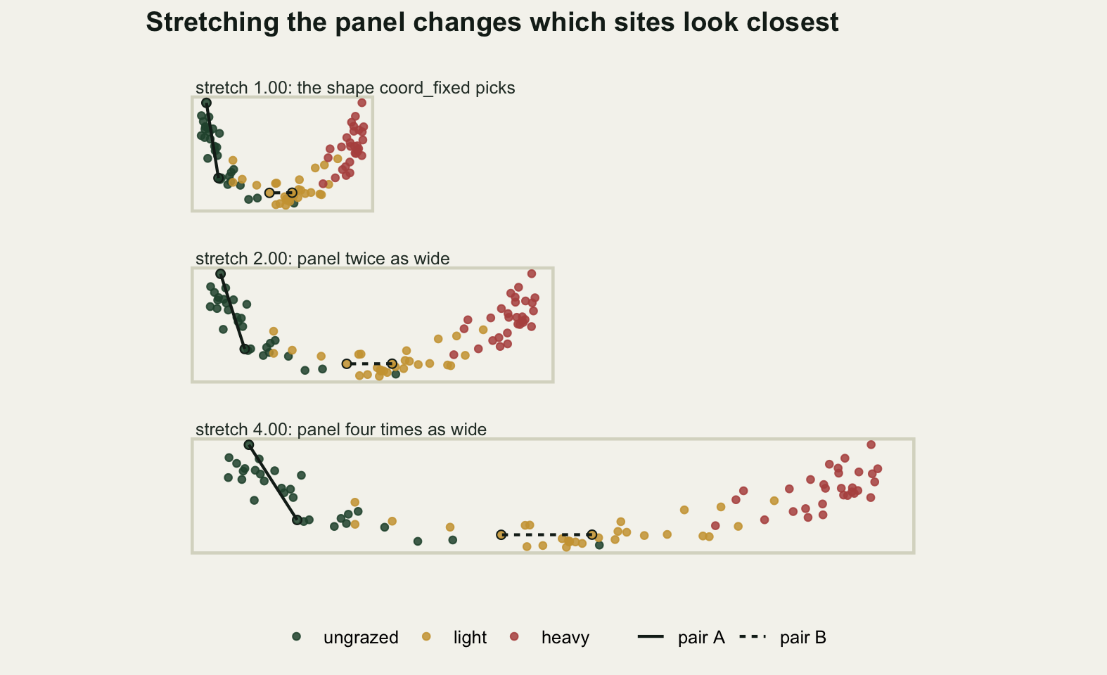
Equal axis lengths are a decision, not a default
The stretch is not something you set directly. What you set is the panel, and the software fills it: each axis maps its own data range onto the side of the panel it owns. So the stretch is the panel width over the panel height, divided by the range on the first axis over the range on the second. For this configuration that second ratio is 1.5823, and the arithmetic that follows is the part most people never do.
panel_draw <- function(a) as.vector(dist(cbind(
  a * cfg[, 1] / diff(range(cfg[, 1])), cfg[, 2] / diff(range(cfg[, 2])))))
panel_row <- function(a) {
  st <- a / rho
  r <- panel_draw(a) / d_cfg
  c(panel_width_over_height = a, stretch = st,
    worst_ratio = max(r) / min(r),
    reversed_percent = 100 *
      (1 - cor(panel_draw(a), d_cfg, method = "kendall")) / 2)
}
print(round(t(sapply(c(1, 2, 4, rho), panel_row)), 4))
panel_width_over_height stretch worst_ratio reversed_percent
[1,] 1.0000 0.6320 1.5823 6.5616
[2,] 2.0000 1.2640 1.2640 2.0890
[3,] 4.0000 2.5279 2.5279 5.6633
[4,] 1.5823 1.0000 1.0000 0.0000print(round(rbind(stretched = distortion(rho), compressed = distortion(1 / rho)), 4)) stretch worst_ratio pearson spearman reversed_percent
stretched 1.5823 1.5823 0.9907 0.9928 3.5979
compressed 0.6320 1.5823 0.9717 0.9755 6.5616A square panel, which is what a reader gets by asking for a figure as tall as it is wide, applies a stretch of 0.6320 and misdraws distances by up to a factor of 1.5823. It reverses 6.5616 per cent of comparisons. A panel twice as wide as tall applies a stretch of 1.2640 and reverses 2.0890 per cent. A panel four times as wide reverses 5.6633 per cent. So the square panel, the shape a reader reaches for when in doubt, is the worst of these three for this configuration, and the long thin one comes out better than the tidy one. Which of the three does least damage depends on the shape of the cloud, and nobody would guess that from looking at any of them.
The two rows printed under that table explain part of it. Stretching the first axis by 1.5823 and compressing it by the same factor give the same worst ratio, 1.5823 both times, but they do not do the same damage: 3.5979 per cent of comparisons reverse under the stretch against 6.5616 per cent under the compression. The cloud is not round. Most of the long pairs in it run along the first axis, and squashing that axis pushes them into competition with the short pairs that run across it, while stretching it just pulls them further apart.
The panel that removes the distortion has width over height equal to 1.5823, and its measured worst ratio is 1 and its reversed share is 0. You do not have to work that number out. Setting coord_fixed(1) finds it, because the ratio of the two ranges is a property of the configuration and the software knows both. The reason the shape has to be respected rather than chosen is the eigenvalue ratio from the previous section: the first axis carries 4.1967 times the second, so its scores are genuinely more spread out, and stretching the second axis to the same screen length as the first is an assertion that they are equally important. They are not, and the eigenvalues say by how much.
Nonmetric scaling changes what that argument rests on but not its conclusion. Its axes are not ordered by variance and carry no eigenvalues; you may rotate or reflect the configuration freely without changing the fit, so there is no per-axis importance to respect. What survives is stronger: in a nonmetric solution the distances are the entire content, because the axes mean nothing at all. A figure that misdraws them by a factor of 1.5823 has misdrawn the only thing on it.
The stress does not appear on the map
Nonmetric multidimensional scaling asks for less than classical scaling. It does not try to reproduce the dissimilarities, only their order: any drawn distances that rise monotonically with the dissimilarities are a perfect fit. The measure of failure is Kruskal’s stress, the root mean squared gap between the drawn distances and the best monotone function of the dissimilarities, divided by the root mean square of the drawn distances.
That best monotone function is an isotonic regression, and the algorithm is short enough to write. Sort the pairs by dissimilarity, walk along the sorted drawn distances, and whenever the running value drops below the one before it, pool the two blocks into their weighted mean and step back to check the block before. That is the pool adjacent violators algorithm.
pava <- function(y) {
  lvl <- y; wt <- rep(1, length(y)); sz <- rep(1, length(y)); k <- 0L
  for (i in seq_along(y)) {
    k <- k + 1L; lvl[k] <- y[i]; wt[k] <- 1; sz[k] <- 1
    while (k > 1L && lvl[k] < lvl[k - 1L]) {
      w2 <- wt[k - 1L] + wt[k]
      lvl[k - 1L] <- (wt[k - 1L] * lvl[k - 1L] + wt[k] * lvl[k]) / w2
      wt[k - 1L] <- w2; sz[k - 1L] <- sz[k - 1L] + sz[k]; k <- k - 1L
    }
  }
  rep(lvl[seq_len(k)], sz[seq_len(k)])
}
set.seed(20260807)
y_test <- rnorm(400) + seq(0, 3, length.out = 400)
print(round(c(max_difference_from_isoreg =
                max(abs(pava(y_test) - isoreg(y_test)$yf))), 12))
max_difference_from_isoreg
0 It agrees with isoreg, the C implementation in the stats package, to 0, so the loop inside the scaling routine can call isoreg for speed with a clear conscience.
The rest of the routine is majorisation. Given the fitted monotone values, move each point towards the position implied by them, which for this loss is a single matrix product known as the Guttman transform, then refit the monotone function and repeat. The configuration is rescaled each round so that the total squared distance matches the dissimilarities, which fixes the arbitrary overall size and lets the drawn distances be read on the Bray-Curtis scale.
target <- sum(dis^2)
ord <- order(dis)
nmds <- function(start, maxit = 250, eps = 1e-9) {
  x <- start - rep(colMeans(start), each = nrow(start))
  x <- x * sqrt(target / sum(as.vector(dist(x))^2))
  s_old <- Inf; s_new <- NA; dh <- NULL
  for (it in seq_len(maxit)) {
    dx <- as.matrix(dist(x))
    dv <- dx[lt]
    dh <- numeric(length(dv))
    dh[ord] <- isoreg(dv[ord])$yf
    dh <- dh * sqrt(sum(dv^2) / sum(dh^2))
    s_new <- sqrt(sum((dv - dh)^2) / sum(dv^2))
    if (is.finite(s_old) && s_old - s_new < eps) break
    s_old <- s_new
    dsafe <- dx; dsafe[dsafe < 1e-12] <- 1e-12
    bmat <- matrix(0, n_site, n_site)
    bmat[lt] <- -dh / dsafe[lt]
    bmat <- bmat + t(bmat)
    diag(bmat) <- -rowSums(bmat)
    x <- (bmat %*% x) / n_site
    x <- x * sqrt(target / sum(as.vector(dist(x))^2))
  }
  list(points = x, stress = s_new, iter = it, dhat = dh, dcfg = dx[lt])
}
run_nmds <- function(k, n_start = 8) {
  best <- NULL; all_s <- numeric(n_start)
  for (s in seq_len(n_start)) {
    st <- if (s == 1) cmdscale(as.dist(bc), k = k) else
      matrix(rnorm(n_site * k, 0, 0.3), n_site, k)
    fit <- nmds(st)
    all_s[s] <- fit$stress
    if (is.null(best) || fit$stress < best$stress) best <- fit
  }
  list(best = best, all = all_s)
}
set.seed(20260807)
r2 <- run_nmds(2)
r3 <- run_nmds(3)
print(round(c(stress_2d = r2$best$stress, stress_3d = r3$best$stress,
              iterations_2d = r2$best$iter, iterations_3d = r3$best$iter,
              starts = length(r2$all)), 4))
stress_2d stress_3d iterations_2d iterations_3d starts
0.1050 0.0856 228.0000 250.0000 8.0000 print(round(sort(r2$all), 4))[1] 0.1050 0.1107 0.1121 0.1126 0.1127 0.1134 0.1146 0.4205Two dimensions give a stress of 0.1050 and three give 0.0856. By the rules of thumb that circulate in ecology, both are respectable and the two-dimensional figure would be published without comment.
The eight starts are there because this loss has local minima and the honest way to find that out is to look. For this seed seven of the eight land between 0.1050 and 0.1146, and one lands at 0.4205, a degenerate solution that has collapsed the configuration. The first start is not a draw: it is the classical scaling from earlier, and the other seven are random. The run that collapsed was one of the random ones, so a single run from a random start would have had a one in seven chance of reporting that number, and, worse, a decent chance of reporting 0.1146 while a better arrangement of the same sites existed.
The 0.1050 is where the reader is left. It is a single number attached to a figure that contains no trace of it, and the figure looks equally convincing whatever it equals. The Shepard diagram is the part that puts the number back on the page: dissimilarity across, drawn distance up, with the monotone fit through it. The vertical scatter around that line is the stress made visible.
principal <- function(x) {
  x <- x - rep(colMeans(x), each = nrow(x))
  x %*% svd(x)$v
}
p2 <- principal(r2$best$points)
p3 <- principal(r3$best$points)
axis_sd3 <- apply(p3, 2, sd)
shep <- function(fit) {
  dv <- fit$dcfg; dh <- fit$dhat
  c(stress = fit$stress,
    scatter_percent_of_mean = 100 * sqrt(mean((dv - dh)^2)) / mean(dv),
    worst_single_pair = max(abs(dv - dh)),
    pearson_with_bray = cor(dv, dis),
    reversed_percent = 100 * (1 - cor(dv, dis, method = "kendall")) / 2)
}
print(round(rbind(two_dimensions = shep(r2$best),
                  three_dimensions = shep(r3$best)), 4))
stress scatter_percent_of_mean worst_single_pair
two_dimensions 0.1050 12.2266 0.3219
three_dimensions 0.0856 9.7067 0.2694
pearson_with_bray reversed_percent
two_dimensions 0.9694 7.5042
three_dimensions 0.9749 6.5011print(round(c(third_axis_sd = axis_sd3[3],
third_axis_share_of_first = axis_sd3[3] / axis_sd3[1],
nmds_range_ratio = diff(range(p2[, 1])) / diff(range(p2[, 2]))), 4)) third_axis_sd third_axis_share_of_first nmds_range_ratio
0.1150 0.2853 2.3750 The two-dimensional map scatters 12.2266 per cent of the mean drawn distance around its own monotone fit, and its worst single pair sits 0.3219 away from where the fit puts it, on a dissimilarity scale whose maximum is 1. Its drawn distances correlate 0.9694 with Bray-Curtis, and 7.5042 per cent of comparisons between pairs come out in the wrong order. Adding a third dimension takes the scatter to 9.7067 per cent and the reversed share to 6.5011 per cent.
The third axis is not a rounding error. Its standard deviation is 0.2853 of the first axis, so there is a direction in the community data carrying more than a quarter of the leading spread that a printed figure cannot show. The two-dimensional picture is not wrong about it. It is silent about it, which is worse, because silence reads as absence.
Compare the two reversal counts on offer. A stretch of 4 reverses 6.7630 per cent of comparisons against the configuration it was drawn from, and still looks, on a correlation check, entirely healthy at 0.9720. A properly drawn two-dimensional nonmetric map reverses 7.5042 per cent of its comparisons against the dissimilarities and correlates 0.9694. The two numbers are the same size. Flattening a community onto paper costs about as much as a badly shaped panel does, which puts the panel in perspective in both directions: one of those costs is unavoidable and is meant to be reported with the figure, and the other is one line of code and is never mentioned at all.
shep_df <- rbind(
  data.frame(bray = dis, drawn = r2$best$dcfg, fitted = r2$best$dhat,
             dim = "two dimensions, stress 0.1050"),
  data.frame(bray = dis, drawn = r3$best$dcfg, fitted = r3$best$dhat,
             dim = "three dimensions, stress 0.0856"))
shep_df$dim <- factor(shep_df$dim, levels = unique(shep_df$dim))

ggplot(shep_df, aes(bray, drawn)) +
  geom_point(colour = te_pal$sage, size = 0.5, alpha = 0.3) +
  geom_line(aes(y = fitted), colour = te_pal$clay, linewidth = 0.9) +
  facet_wrap(~dim) +
  labs(x = "Bray-Curtis dissimilarity between two sites",
       y = "distance in the\nordination",
       title = "Stress is the vertical scatter around the monotone fit") +
  theme_te() +
  theme(strip.text = element_text(colour = te_pal$ink, face = "bold"))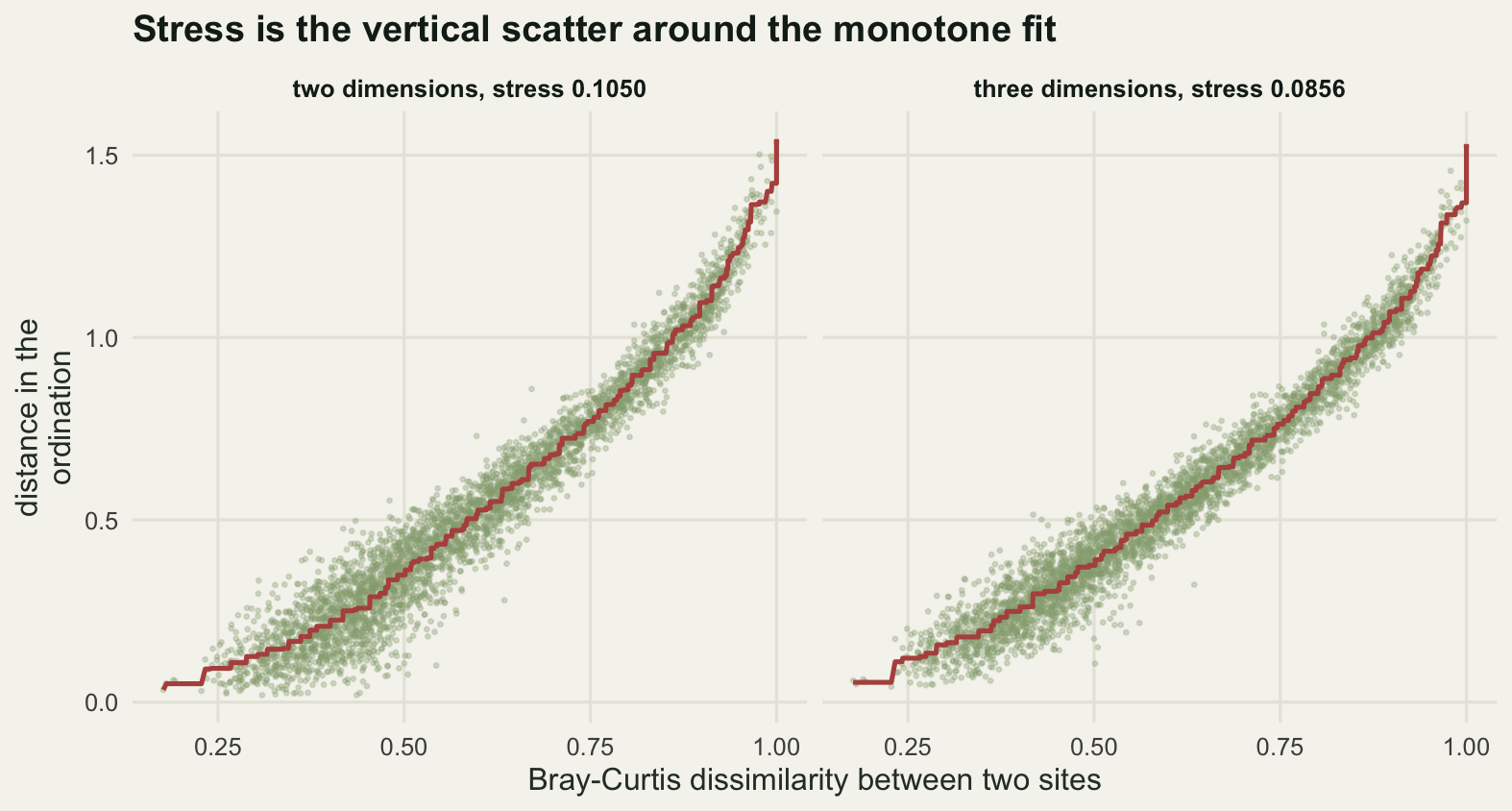
Group outlines are mostly a sample size statistic
The other thing an ordination figure is asked to do is show groups, and the usual device is a convex hull drawn round each one. A hull is the smallest polygon containing every point of the group, which means it is the polygon most exposed to the number of points: add a quadrat and the hull can only grow. Two treatments sampled at different intensities therefore get outlines of different sizes whether or not their communities differ in spread, and the reader reads that as ecology.
The alternative is an ellipse fitted to the group, sized to hold 95 per cent of a normal distribution with the group’s mean and covariance. Its area estimates a property of the population rather than of the sample. That is the claim; the measurement below is the test of it. For each group and each sample size the code draws sites without replacement, computes both areas, and then asks the question the outline is really for: what share of the group’s remaining sites, held out of the fit, falls inside the shape.
poly_area <- function(vx, vy) {
  k <- length(vx); j <- c(k, seq_len(k - 1))
  abs(sum(vx[j] * vy - vx * vy[j])) / 2
}
in_poly <- function(px, py, vx, vy) {
  k <- length(vx); j <- k; inside <- rep(FALSE, length(px))
  for (i in seq_len(k)) {
    cond <- ((vy[i] > py) != (vy[j] > py)) &
      (px < (vx[j] - vx[i]) * (py - vy[i]) / (vy[j] - vy[i]) + vx[i])
    inside <- xor(inside, cond)
    j <- i
  }
  inside
}
chi95 <- qchisq(0.95, 2)
print(round(c(ellipse_percent = 95, nominal_level = 0.95,
              chi_square_cutoff = chi95), 4))
ellipse_percent nominal_level chi_square_cutoff
95.0000 0.9500 5.9915 ell_area <- function(xy) pi * chi95 * sqrt(det(cov(xy)))
in_ell <- function(pts_in, xy) {
mu <- colMeans(xy); si <- solve(cov(xy))
z <- pts_in - rep(mu, each = nrow(pts_in))
rowSums((z %*% si) * z) <= chi95
}
g_check <- p2[grp == "light", ]
h_check <- chull(g_check)
inside_or_on <- in_poly(g_check[, 1], g_check[, 2],
g_check[h_check, 1], g_check[h_check, 2]) |
seq_len(nrow(g_check)) %in% h_check
print(c(points_tested = nrow(g_check), hull_vertices = length(h_check),
all_own_points_inside_own_hull = all(inside_or_on))) points_tested hull_vertices
30 5
all_own_points_inside_own_hull
1 set.seed(20260807)
n_rep <- 60
n_grid <- seq(5, 25, by = 2)
one_cell <- function(nn, g) {
rows <- which(grp == g)
out <- t(replicate(n_rep, {
pick <- sample(rows, nn)
xy <- p2[pick, ]
held <- p2[setdiff(rows, pick), , drop = FALSE]
hu <- chull(xy)
c(hull = poly_area(xy[hu, 1], xy[hu, 2]), ell = ell_area(xy),
cov_hull = mean(in_poly(held[, 1], held[, 2], xy[hu, 1], xy[hu, 2])),
cov_ell = mean(in_ell(held, xy)))
}))
c(hull = mean(out[, "hull"]), ell = mean(out[, "ell"]),
cv_hull = sd(out[, "hull"]) / mean(out[, "hull"]),
cv_ell = sd(out[, "ell"]) / mean(out[, "ell"]),
cov_hull = mean(out[, "cov_hull"]), cov_ell = mean(out[, "cov_ell"]),
lo_hull = quantile(out[, "hull"], 0.1), hi_hull = quantile(out[, "hull"], 0.9),
lo_ell = quantile(out[, "ell"], 0.1), hi_ell = quantile(out[, "ell"], 0.9))
}
cells <- expand.grid(n = n_grid, g = grp_lab, stringsAsFactors = FALSE)
raw <- t(mapply(one_cell, cells$n, cells$g))
sweep_tab <- cbind(n = n_grid, t(sapply(n_grid, function(nn)
colMeans(raw[cells$n == nn, , drop = FALSE]))))
print(round(sweep_tab[, 1:7], 4)) n hull ell cv_hull cv_ell cov_hull cov_ell
[1,] 5 0.0520 0.2926 0.5307 0.5098 0.2636 0.7193
[2,] 7 0.0749 0.3046 0.4645 0.4527 0.3725 0.7710
[3,] 9 0.1035 0.3413 0.3551 0.3358 0.4743 0.8402
[4,] 11 0.1231 0.3451 0.3014 0.2805 0.5404 0.8588
[5,] 13 0.1372 0.3457 0.2886 0.2656 0.5810 0.8614
[6,] 15 0.1543 0.3561 0.2264 0.2021 0.6344 0.8811
[7,] 17 0.1690 0.3599 0.2016 0.1748 0.6688 0.8949
[8,] 19 0.1755 0.3540 0.2044 0.1744 0.6616 0.8783
[9,] 21 0.1863 0.3534 0.1574 0.1288 0.7000 0.8914
[10,] 23 0.1975 0.3556 0.1453 0.1194 0.7040 0.8881
[11,] 25 0.2151 0.3653 0.1087 0.0852 0.7789 0.9200last <- length(n_grid)
print(round(c(replicates_per_cell = n_rep,
hull_area_at_5 = sweep_tab[1, "hull"],
hull_area_at_25 = sweep_tab[last, "hull"],
hull_growth = sweep_tab[last, "hull"] / sweep_tab[1, "hull"],
ellipse_area_at_5 = sweep_tab[1, "ell"],
ellipse_area_at_25 = sweep_tab[last, "ell"],
ellipse_growth = sweep_tab[last, "ell"] / sweep_tab[1, "ell"],
hull_growth_9_to_25 = sweep_tab[last, "hull"] / sweep_tab[3, "hull"]), 4)) replicates_per_cell hull_area_at_5.hull hull_area_at_25.hull
60.0000 0.0520 0.2151
hull_growth.hull ellipse_area_at_5.ell ellipse_area_at_25.ell
4.1411 0.2926 0.3653
ellipse_growth.ell hull_growth_9_to_25.hull
1.2482 2.0789 Between five and twenty-five sites the mean hull area rises from 0.0520 to 0.2151, a factor of 4.1411. Over the same range the mean ellipse area rises from 0.2926 to 0.3653, a factor of 1.2482. The comparison a reader is most likely to make in practice is nine sites against twenty-five, since that is what unbalanced field sampling looks like, and there the hull of an identical community grows by a factor of 2.0789. Two groups with exactly the same composition and spread, sampled at those two intensities, get outlines that differ twofold. There is no ecology in that number at all.
Two honest qualifications. At nine sites the ellipse is only slightly the steadier of the two: its coefficient of variation across replicates is 0.3358 against the hull’s 0.3551. Fitting a covariance to nine points is a noisy business, and the wide band on the left of the figure below says so. What the ellipse mainly buys is the absence of a systematic trend with sample size rather than a large gain in precision. And the ellipse is not free of sample size either; a factor of 1.2482 is small but it is not 1, because the square root of a determinant estimated from few points is biased low.
The coverage measurement is where the hull comes off worst. Fit both shapes to nine sites and ask where the group’s other twenty-one sites fall.
print(round(c(sites_in_the_fit = n_grid[3],
              hull_coverage_at_9 = sweep_tab[3, "cov_hull"],
              ellipse_coverage_at_9 = sweep_tab[3, "cov_ell"],
              hull_coverage_at_25 = sweep_tab[last, "cov_hull"],
              ellipse_coverage_at_25 = sweep_tab[last, "cov_ell"],
              cv_hull_at_9 = sweep_tab[3, "cv_hull"],
              cv_ell_at_9 = sweep_tab[3, "cv_ell"]), 4))
sites_in_the_fit hull_coverage_at_9.cov_hull
9.0000 0.4743
ellipse_coverage_at_9.cov_ell hull_coverage_at_25.cov_hull
0.8402 0.7789
ellipse_coverage_at_25.cov_ell cv_hull_at_9.cv_hull
0.9200 0.3551
cv_ell_at_9.cv_ell
0.3358 A hull built from nine sites contains 0.4743 of the group’s held out sites. It is drawn as a boundary and it excludes more than half of the same community. The ellipse contains 0.8402, short of its nominal 0.95 because its centre and covariance were estimated from nine points rather than known, but a great deal closer to what a reader assumes a boundary means. At twenty-five sites the hull reaches 0.7789 and the ellipse 0.9200. Both improve; only one of them started somewhere defensible.
panel_a <- "area of the group outline"
panel_b <- "share of held out sites inside"
rib_df <- rbind(
  data.frame(n = sweep_tab[, "n"], lo = sweep_tab[, "lo_hull.10%"],
             hi = sweep_tab[, "hi_hull.90%"], what = "convex hull", panel = panel_a),
  data.frame(n = sweep_tab[, "n"], lo = sweep_tab[, "lo_ell.10%"],
             hi = sweep_tab[, "hi_ell.90%"], what = "95 per cent ellipse",
             panel = panel_a))
area_df <- rbind(
  data.frame(n = sweep_tab[, "n"], mid = sweep_tab[, "hull"],
             what = "convex hull", panel = panel_a),
  data.frame(n = sweep_tab[, "n"], mid = sweep_tab[, "ell"],
             what = "95 per cent ellipse", panel = panel_a),
  data.frame(n = sweep_tab[, "n"], mid = sweep_tab[, "cov_hull"],
             what = "convex hull", panel = panel_b),
  data.frame(n = sweep_tab[, "n"], mid = sweep_tab[, "cov_ell"],
             what = "95 per cent ellipse", panel = panel_b))
out_col <- c("convex hull" = te_pal$clay, "95 per cent ellipse" = te_pal$forest)

ggplot(area_df, aes(n, mid, colour = what, fill = what)) +
  geom_ribbon(data = rib_df, mapping = aes(x = n, ymin = lo, ymax = hi, fill = what),
              inherit.aes = FALSE, colour = NA, alpha = 0.18) +
  geom_line(linewidth = 1) +
  geom_point(size = 1.8) +
  facet_wrap(~panel, scales = "free_y") +
  scale_colour_manual(values = out_col, name = NULL) +
  scale_fill_manual(values = out_col, name = NULL) +
  labs(x = "sites drawn from the same group", y = NULL,
       title = "A convex hull grows with sample size; an ellipse mostly does not") +
  theme_te() +
  theme(legend.position = "bottom",
        strip.text = element_text(colour = te_pal$ink, face = "bold"))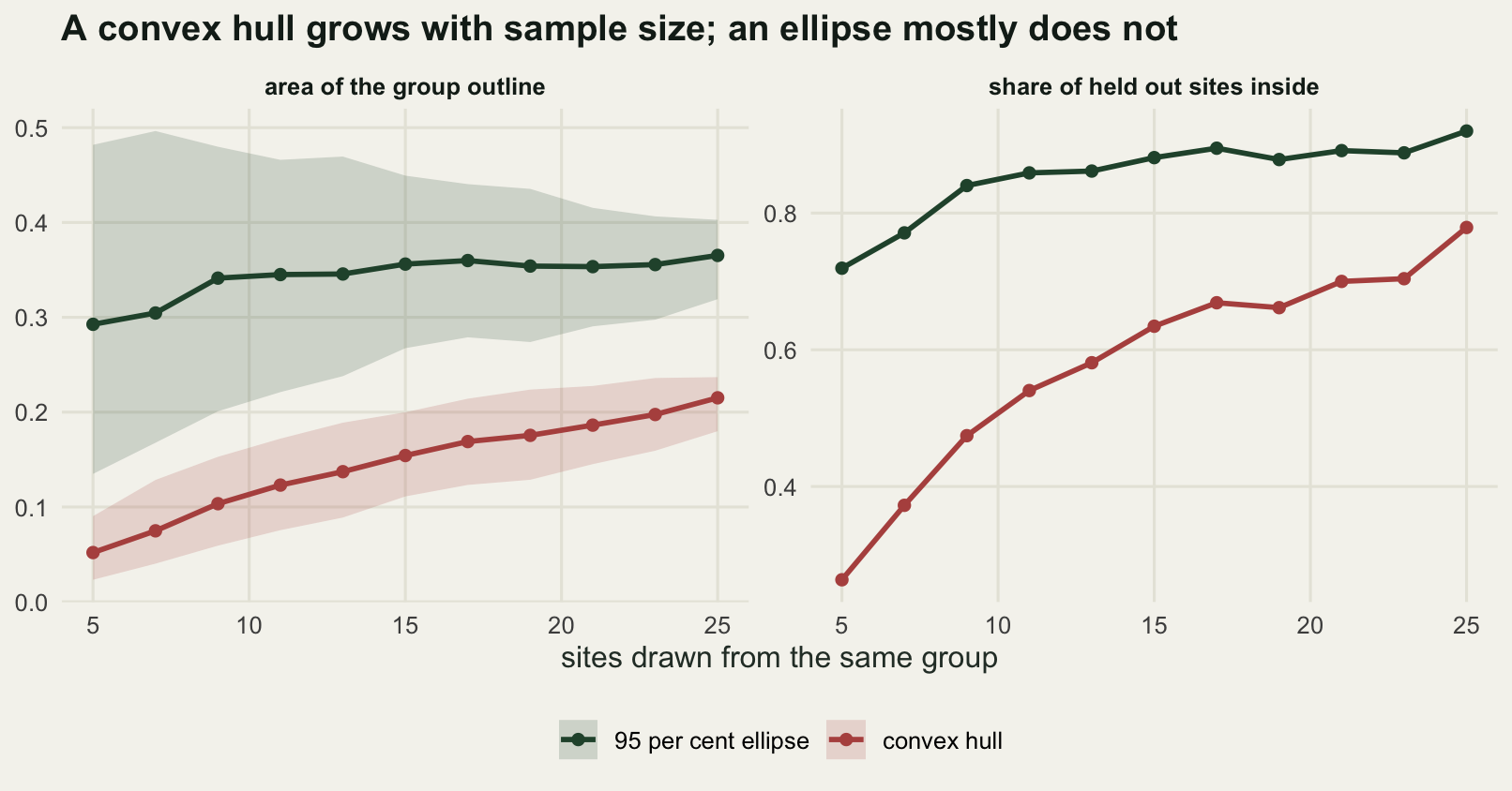
The figure this ends up as
Putting the four decisions together gives a figure with no free parameters left in it. The configuration is the eight-start nonmetric solution. The axes are on one scale, so the distances are the distances. The stress sits in the subtitle, because it is the one thing about the fit the picture cannot show. The groups get ellipses rather than hulls, so their outlines are about composition rather than about how many quadrats each treatment happened to get.
The last of those choices needs its own number, because an outline that overlaps is usually the result the reader most wants to argue with.
cross <- outer(grp_lab, grp_lab, Vectorize(function(a, b)
  mean(in_ell(p2[grp == a, , drop = FALSE], p2[grp == b, , drop = FALSE]))))
dimnames(cross) <- list(sites_from = grp_lab, inside_ellipse_of = grp_lab)
print(round(100 * cross, 2))
inside_ellipse_of
sites_from ungrazed light heavy
ungrazed 96.67 23.33 0.00
light 20.00 93.33 13.33
heavy 0.00 13.33 100.00The ungrazed and heavily grazed ellipses share nothing: 0 per cent of the sites of each fall inside the other. The lightly grazed group is the interesting one. It sits inside the ungrazed ellipse for 20 per cent of its sites and inside the heavy one for 13.33 per cent, and 23.33 per cent of the ungrazed sites fall inside its ellipse. A caption saying grazing separates the plots would be true of the two ends and false in the middle, which is why the figure below says so in the title.
ell_path <- function(xy, gname) {
  eg <- eigen(cov(xy)); mu <- colMeans(xy)
  th <- seq(0, 2 * pi, length.out = 121)
  pp <- cbind(cos(th), sin(th)) %*% diag(sqrt(eg$values * chi95)) %*% t(eg$vectors)
  data.frame(x = pp[, 1] + mu[1], y = pp[, 2] + mu[2], grp = gname)
}
ell_df <- do.call(rbind, lapply(grp_lab, function(g) ell_path(p2[grp == g, ], g)))
ell_df$grp <- factor(ell_df$grp, levels = grp_lab)
sc_df <- data.frame(x = p2[, 1], y = p2[, 2], grp = grp)

ggplot(sc_df, aes(x, y, colour = grp)) +
  geom_path(data = ell_df, aes(x, y, colour = grp), linewidth = 0.8) +
  geom_point(size = 1.9, alpha = 0.9) +
  scale_colour_manual(values = grp_col, name = NULL) +
  coord_fixed(1) +
  labs(x = "NMDS axis 1", y = "NMDS axis 2",
       title = "The two grazing extremes separate and the middle overlaps both",
       subtitle = "Stress 0.1050 in two dimensions, best of eight starts. Ellipses hold 95 per cent of a normal fitted to each group.") +
  theme_te() +
  theme(plot.subtitle = element_text(colour = "#2c3a31", size = 9))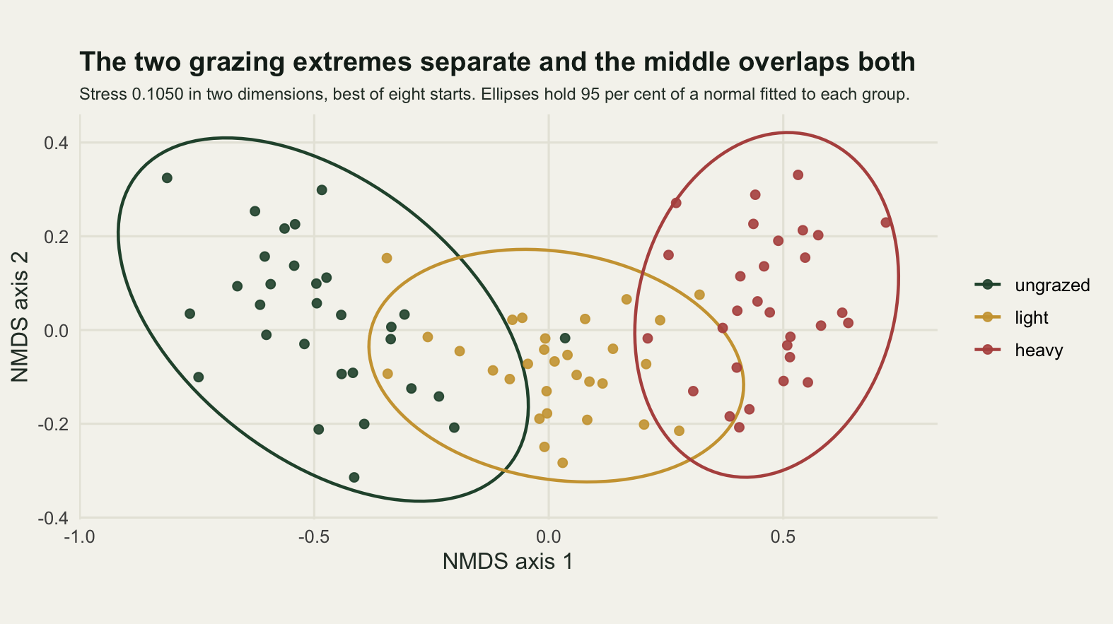
The honest limit
The arch in the first figure is not in the data. It is what classical scaling does to a single long gradient, and it is worth measuring rather than describing, because it decides how much of this post’s own reasoning survives.
gc_centred <- grad - mean(grad)
print(round(c(pcoa_axis1_with_gradient = abs(cor(cfg[, 1], grad)),
              pcoa_axis2_with_gradient = abs(cor(cfg[, 2], grad)),
              pcoa_axis2_with_gradient_squared = abs(cor(cfg[, 2], gc_centred^2)),
              nmds_axis1_with_gradient = abs(cor(p2[, 1], grad)),
              nmds_axis2_with_gradient_squared = abs(cor(p2[, 2], gc_centred^2))), 4))
pcoa_axis1_with_gradient pcoa_axis2_with_gradient
0.9776 0.0273
pcoa_axis2_with_gradient_squared nmds_axis1_with_gradient
0.9145 0.9858
nmds_axis2_with_gradient_squared
0.6440 The first classical axis correlates 0.9776 with the gradient that generated the data, which is the success. The second correlates 0.0273 with that same gradient and 0.9145 with its square. There is only one gradient in this simulation, so the entire second axis is a fold in the first, and any reader interpreting the vertical spacing of the first figure as a second ecological gradient would be interpreting arithmetic. The nonmetric solution reduces the fold: on this configuration its second axis correlates 0.6440 with the squared gradient.
That sets the boundary of everything above. Getting the panel shape right makes the figure show the configuration faithfully. It does not make the configuration true. Three further limits sit alongside it. The 41 negative eigenvalues, worth 11.08 per cent of the positive total, mean Bray-Curtis cannot be laid flat at all, so even a perfectly drawn map is an approximation of an approximation. The 95 per cent ellipse assumes a bivariate normal, and its stated level is a promise about a known centre and covariance rather than ones estimated from nine sites, which is why the coverage measurement gave 0.8402 rather than 0.95 there. And the whole exercise uses one simulated dataset with one gradient, thirty species and a known group structure; the size of every distortion measured here depends on the shape of the cloud, while the direction of each one does not.
Where to go next
The measurement to run on your own figure is the cheapest one here. Take your configuration, take the drawn coordinates as your software will scale them, and compute the reversed share with a single call to Kendall’s tau. If it is not 0, the panel is arguing with the model, and one line of coord_fixed settles it. The next thing to reach for is the Shepard diagram, which turns a stress value nobody can interpret into a picture of the pairs it is failing on.
For the fitting side rather than the drawing side, NMDS ordination covers the choice of dissimilarity and the dimensionality question in full, and model-based unconstrained ordination replaces the distance matrix with a model that has a likelihood and therefore standard errors. Choosing colours for ecological data does for the colour scale what this post did for the panel shape, and checking a figure is the checklist version, including the failure mode this post could not measure: a caption that claims more than the numbers behind it.
References
Kruskal JB 1964 Psychometrika 29(1):1-27 (10.1007/BF02289565)
Kruskal JB 1964 Psychometrika 29(2):115-129 (10.1007/BF02289694)
Gower JC 1966 Biometrika 53(3-4):325-338 (10.1093/biomet/53.3-4.325)
Minchin PR 1987 Vegetatio 69(1-3):89-107 (10.1007/BF00038690)
de Leeuw J, Mair P 2009 Journal of Statistical Software 31(3):1-30 (10.18637/jss.v031.i03)
Legendre P, Legendre L 2012 Numerical Ecology, 3rd English edition. Elsevier, ISBN 978-0-444-53868-0