library(vegan)
library(ggplot2)

te_paper  <- "#f5f4ee"
te_ink    <- "#16241d"
te_body   <- "#2c3a31"
te_forest <- "#275139"
te_rust   <- "#b5534e"
te_gold   <- "#c9b458"
te_line   <- "#dad9ca"

theme_datasheet <- function() {
  theme_minimal(base_size = 12) +
    theme(plot.background  = element_rect(fill = te_paper, colour = NA),
          panel.background = element_rect(fill = te_paper, colour = NA),
          panel.grid.major = element_line(colour = te_line, linewidth = 0.3),
          panel.grid.minor = element_blank(),
          text             = element_text(colour = te_body),
          plot.title       = element_text(colour = te_ink, face = "bold"),
          axis.text        = element_text(colour = te_body))
}

n_sp <- 25

noise_sites <- function(n, lambda = 5) matrix(rpois(n * n_sp, lambda), n, n_sp)

gradient_sites <- function(n, amp = 3, tol = 0.2) {
  x   <- seq(0, 1, length.out = n)
  opt <- seq(0, 1, length.out = n_sp)
  mu  <- outer(x, opt, function(xx, oo) amp * exp(-((xx - oo)^2) / (2 * tol^2))) + 0.3
  matrix(rpois(length(mu), mu), n, n_sp)
}Checking an NMDS stress value
R
vegan
NMDS
ordination
community ecology
ecology tutorial
Stress thresholds for NMDS depend on how many sites you have, and unstructured data at eight sites scores good. A null envelope calibration in R with vegan.
Every NMDS in the literature comes with a stress value, and almost every stress value comes with a verdict from the same table: below 0.05 excellent, below 0.1 good, below 0.2 usable, above 0.3 arbitrary. The table is thirty years old and it is applied as if it were a property of the ordination.
It is not. Stress measures how well a monotone function can map the distances into two dimensions, and that is easier with fewer points, whatever the points are. Eight sites can nearly always be arranged in a plane, so eight sites of pure noise score well. Forty sites along a clean gradient score worse than eight sites of nothing. The thresholds are most flattering exactly where the warning is most needed.
The fix is not a better table. It is to compare your stress with the stress the same design would produce on data with no structure in it.
Two simulators
Unstructured data first: twenty-five species, independent Poisson counts, no gradient. Then a real gradient: species with Gaussian response curves spread along an environmental axis, with Poisson sampling noise on top and a low expected count, so the recovery is imperfect the way a real survey is.
The stress helper counts a warning rather than printing it. When metaMDS reports that the stress is nearly zero, that is information about the design, and it goes into the results below.
near_zero <- 0
fit_stress <- function(m, k = 2) {
  withCallingHandlers(
    suppressMessages(metaMDS(m, k = k, trymax = 20, trace = 0,
                             autotransform = FALSE))$stress,
    warning = function(w) {
      near_zero <<- near_zero + 1
      invokeRestart("muffleWarning")
    })
}
Stress against the number of sites
n_grid <- c(8, 12, 20, 40)
runs   <- 20

set.seed(20260805)
sweep <- data.frame()
for (n in n_grid) {
  near_zero <<- 0
  s_null <- replicate(runs, fit_stress(noise_sites(n)))
  w_null <- near_zero
  near_zero <<- 0
  s_grad <- replicate(runs, fit_stress(gradient_sites(n)))
  w_grad <- near_zero
  sweep <- rbind(sweep, data.frame(
    n = n,
    null_mean = mean(s_null), null_sd = sd(s_null),
    null_min = min(s_null), null_max = max(s_null),
    under_good = mean(s_null < 0.1), under_usable = mean(s_null < 0.2),
    grad_mean = mean(s_grad), grad_sd = sd(s_grad),
    ratio = mean(s_grad) / mean(s_null),
    warned_null = w_null, warned_grad = w_grad))
}
round(sweep, 4)
n null_mean null_sd null_min null_max under_good under_usable grad_mean
1 8 0.0896 0.0311 0.0426 0.1452 0.6 1.00 0.0286
2 12 0.1710 0.0143 0.1387 0.2070 0.0 0.95 0.0698
3 20 0.2330 0.0120 0.2068 0.2505 0.0 0.00 0.0997
4 40 0.2891 0.0116 0.2671 0.3100 0.0 0.00 0.1274
grad_sd ratio warned_null warned_grad
1 0.0191 0.3186 0 2
2 0.0119 0.4079 0 0
3 0.0089 0.4281 0 0
4 0.0101 0.4408 0 0At eight sites, data with no structure whatsoever gives a mean stress of 0.090, and 60 per cent of those runs land below the conventional good threshold of 0.1. Every one of them is below 0.2. At forty sites the same generator gives 0.289, which the same table no longer calls usable.
Nothing about the ecology changed between those two rows. Only the number of points did.
long <- rbind(
  data.frame(n = sweep$n, stress = sweep$null_mean, sd = sweep$null_sd,
             data = "unstructured"),
  data.frame(n = sweep$n, stress = sweep$grad_mean, sd = sweep$grad_sd,
             data = "gradient with sampling noise"))

ggplot(long, aes(x = n, y = stress, colour = data, shape = data)) +
  geom_hline(yintercept = 0.1, linetype = "dotted", colour = te_ink) +
  geom_hline(yintercept = 0.2, linetype = "dotted", colour = te_ink) +
  annotate("text", x = 8, y = 0.108, label = "conventional good (0.1)",
           hjust = 0, colour = te_ink, size = 3.3) +
  annotate("text", x = 8, y = 0.208, label = "conventional usable (0.2)",
           hjust = 0, colour = te_ink, size = 3.3) +
  geom_errorbar(aes(ymin = stress - sd, ymax = stress + sd), width = 1.1,
                linewidth = 0.4, show.legend = FALSE) +
  geom_line(linewidth = 0.8) +
  geom_point(size = 2.8) +
  scale_x_continuous(breaks = n_grid) +
  scale_colour_manual(values = c("unstructured" = te_rust,
                                 "gradient with sampling noise" = te_forest)) +
  scale_shape_manual(values = c(17, 16)) +
  labs(x = "number of sites", y = "stress in two dimensions", colour = NULL, shape = NULL,
       title = "The same verdict table, applied to nothing and to something") +
  theme_datasheet() +
  theme(legend.position = "top")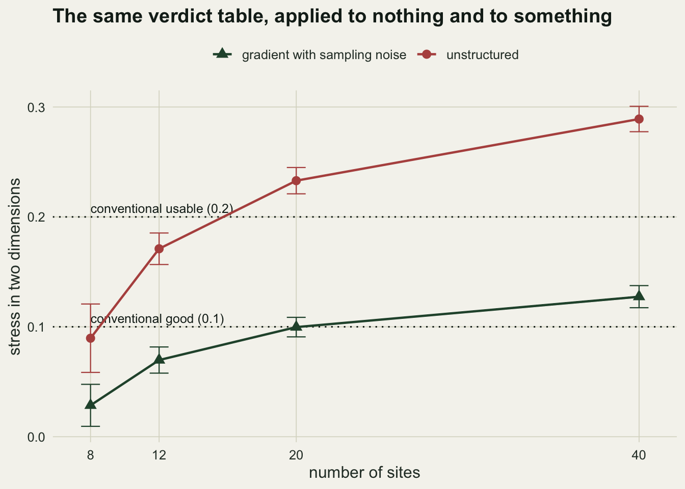
The calibration that replaces the table
The gradient curve in that figure is the useful one. It is not far below the thresholds; at twenty sites it is at 0.100, next to the conventional good line of 0.1 rather than clear of it. What separates it from noise is not its absolute value. It is the distance to the null envelope at the same number of sites.
sweep$gap <- sweep$null_mean - sweep$grad_mean
ratio_8   <- sweep$ratio[sweep$n == 8]
ratio_40  <- sweep$ratio[sweep$n == 40]
Expressed as a fraction of the null at the same sample size, the gradient sits at 0.32 of the unstructured mean at eight sites and 0.44 at forty. The unstructured baseline itself rises by a factor of 3.2 over that range, so the ratio moves far less than the raw number it is built from. That is the behaviour you want from a quantity that is meant to be compared between studies.
The recipe is not new: Dexter, Rollwagen-Bollens and Bollens set it out in 2018, and the argument that the thresholds ignore sample size is theirs. It is short. Keep your matrix shape and your sample size. Permute within each species column, which destroys any association between sites while preserving the abundance distribution of each species, and fit the same NMDS to the permuted matrix. Repeat, and read your own stress against that distribution.
set.seed(404)
observed_matrix <- gradient_sites(20)
observed_stress <- fit_stress(observed_matrix)

envelope <- replicate(50, fit_stress(apply(observed_matrix, 2, sample)))
env_mean <- mean(envelope)
env_min  <- min(envelope)
percentile <- mean(envelope <= observed_stress)
For one twenty-site survey from the gradient generator, the observed stress is 0.112. Fifty permutations of the same matrix give a mean of 0.243 and a minimum of 0.216, and the observed value falls below all 50 of them. That is a statement about this data set at this sample size, and it is the statement the threshold table pretends to make.
ggplot(data.frame(stress = envelope), aes(x = stress)) +
  geom_histogram(bins = 18, fill = te_forest, colour = te_paper) +
  geom_vline(xintercept = observed_stress, linetype = "dashed",
             colour = te_rust, linewidth = 0.9) +
  annotate("text", x = observed_stress, y = Inf, vjust = 1.6, hjust = -0.08,
           colour = te_rust, size = 3.6, label = "observed survey") +
  coord_cartesian(xlim = c(0.9 * observed_stress, 1.02 * max(envelope))) +
  labs(x = "stress in two dimensions", y = "permutations",
       title = "Where the survey sits against its own null envelope") +
  theme_datasheet()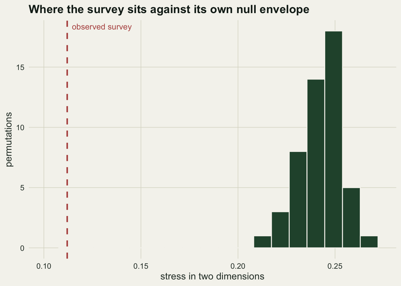
The warning vegan already gives you
At eight sites the gradient fits were flagged: metaMDS raised its nearly-zero stress warning in 2 of 20 runs, against 0 for the unstructured data at the same size. The warning is the honest signal in this situation, and it says the same thing as the calibration: with that many points and that many dimensions, the configuration is underdetermined, and a low stress is arithmetic rather than evidence.
Adding a dimension always helps
The other way to make stress fall is to fit in three dimensions, and it works on any data at all.
set.seed(64)
dim_tab <- data.frame(n = c(12, 20), k2 = NA_real_, k3 = NA_real_)
for (i in seq_len(nrow(dim_tab))) {
  nn <- dim_tab$n[i]
  dim_tab$k2[i] <- mean(replicate(10, fit_stress(noise_sites(nn), k = 2)))
  dim_tab$k3[i] <- mean(replicate(10, fit_stress(noise_sites(nn), k = 3)))
}
dim_tab$drop <- 1 - dim_tab$k3 / dim_tab$k2
dim_tab
n k2 k3 drop
1 12 0.1597914 0.09627406 0.3975014
2 20 0.2305809 0.15502157 0.3276912On unstructured data at twelve sites, moving from two dimensions to three cuts the mean stress from 0.160 to 0.096, a drop of 40 per cent. At twenty sites the drop is 33 per cent. A stress that improves when you add an axis has told you about the geometry of the fit, not about the community.
dim_long <- data.frame(
  n = rep(dim_tab$n, 2),
  stress = c(dim_tab$k2, dim_tab$k3),
  dims = rep(c("two dimensions", "three dimensions"), each = nrow(dim_tab)))
dim_long$dims <- factor(dim_long$dims, levels = c("two dimensions", "three dimensions"))

ggplot(dim_long, aes(x = factor(n), y = stress, fill = dims)) +
  geom_col(position = position_dodge(width = 0.7), width = 0.6) +
  geom_hline(yintercept = 0.1, linetype = "dotted", colour = te_ink) +
  annotate("text", x = 0.55, y = 0.112, label = "conventional good (0.1)",
           hjust = 0, colour = te_ink, size = 3.3) +
  geom_text(aes(label = sprintf("%.3f", stress)),
            position = position_dodge(width = 0.7), vjust = -0.5,
            colour = te_body, size = 3.5) +
  scale_fill_manual(values = c("two dimensions" = te_rust,
                               "three dimensions" = te_gold)) +
  scale_y_continuous(limits = c(0, 0.28)) +
  labs(x = "number of sites", y = "mean stress on unstructured data", fill = NULL,
       title = "An extra axis improves the fit of noise as readily as of signal") +
  theme_datasheet() +
  theme(legend.position = "top")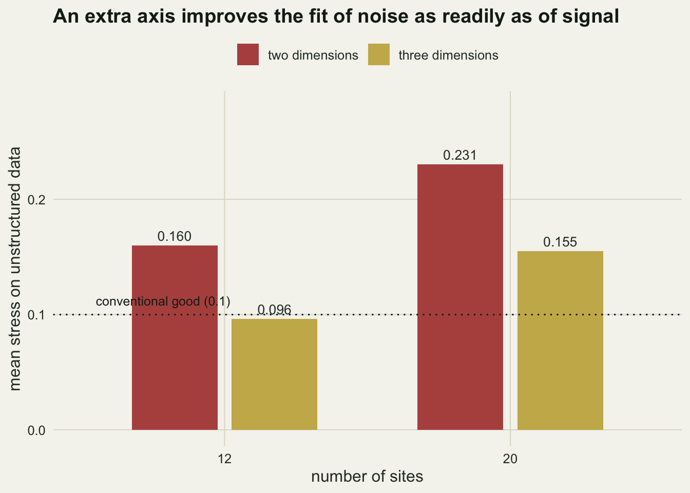
What to report
Report the stress, the number of sites, the number of dimensions and the null envelope at that combination. Three lines of code produce the envelope, and it converts a number that cannot be interpreted on its own into one that can.
If you keep the conventional table anyway, keep it with the sample size attached, and treat any survey below about a dozen sites as uninterpretable on stress alone. The NMDS tutorial covers running the ordination itself; this post is about what the fit statistic can and cannot certify.
Honest limits
The null envelope answers one question: is the low-dimensional configuration better than what this many sites and this many species would give with no association between them. It does not tell you that the axes mean anything ecological, that the gradient is environmental rather than spatial, or that the configuration is stable. A separate check is needed for the last of these, because a low stress can hide a local minimum; running the fit from several random starts and comparing configurations is a different diagnostic with a different failure mode.
Column-wise permutation is one choice of null and not the only one. It removes site-to-site variation in total abundance along with the structure, so the envelope is a little tidier than a real unstructured community would be, and the percentile should be read as approximate. The numbers above also belong to one generator, one dissimilarity index and one range of sample sizes; the qualitative pattern that stress rises with the number of sites is general, but the values are not transferable.
References
Kruskal JB 1964 Psychometrika 29(1):1-27 (10.1007/BF02289565)
Clarke KR 1993 Australian Journal of Ecology 18(1):117-143 (10.1111/j.1442-9993.1993.tb00438.x)
Dexter E, Rollwagen-Bollens G, Bollens SM 2018 Limnology and Oceanography Methods 16(7):434-443 (10.1002/lom3.10257)