library(ggplot2)

te_pal <- list(forest = "#275139", green = "#2f8f63", sage = "#93a87f",
               clay = "#b5534e", gold = "#cda23f", line = "#dad9ca",
               ink = "#16241d", paper = "#f5f4ee")

theme_te <- function() {
  theme_minimal(base_size = 12) +
    theme(panel.grid.minor = element_blank(),
          panel.grid.major = element_line(colour = "#e7e6dc"),
          plot.background = element_rect(fill = "#f5f4ee", colour = NA),
          panel.background = element_rect(fill = "#f5f4ee", colour = NA),
          plot.title = element_text(face = "bold", colour = te_pal$ink),
          axis.title = element_text(colour = "#2c3a31"))
}Choosing colours for ecological data
R
data visualisation
ggplot2
ecology tutorial
Sequential, diverging or qualitative is a question about the data, not about taste. Measured in R: the reading errors each palette choice puts into a figure.
A breeding bird survey is repeated a decade later and the result is a map of change in species richness: a gain of several species in one block, a loss in another, no measurable change over most of the site. The map goes into the report with the colour scheme the GIS offered first, which is a rainbow. At the steering group somebody points at a hard yellow to green edge running across the middle of the site and asks what happened along that line. Nothing happened along that line. The data are smooth there. The edge is in the palette.
That is a reading error, and reading errors made by colour choices can be measured rather than argued about. This post measures four of them in base R, with no colour packages: the lightness profile of a palette and what a non-monotonic one does to an ordered field, how much of a map changes apparent sign when the centre of a diverging palette is moved, how far apart a set of categorical colours stays when a red-green colour vision deficiency is simulated, and what a palette loses when it is printed in grey. Every claim below has a number attached, because a post about figures with no numbers in it is a post about taste.
Two neighbouring tutorials cover the parts this one leaves out. Your first ggplot covers the grammar, including what belongs inside aes() and what does not, and publication-quality ggplot figures covers export: size, resolution, type size and file format. This post sits between them and deals only with the mapping from a quantity to a colour, which is the decision that survives every export setting you choose afterwards.
Three palette types and the question that picks one
A sequential palette runs from one end to the other in a single direction and is for a quantity with an ordered magnitude and no special value in the middle: canopy cover, soil moisture, counts per trap. A diverging palette runs from one hue through a pale centre to another hue and is for a quantity that has a meaningful zero with real cases on both sides: change between two surveys, a residual, a log ratio of observed to expected. A qualitative palette is a set of colours with no order at all and is for unordered categories: habitat class, treatment, species identity.
The question that picks one is about the data, not about the figure. Is the variable ordered? If not, qualitative. If it is ordered, does it have a reference value that readers should be able to find by eye? If yes, diverging, and you must say what that value is. If not, sequential. Everything after that is measurement, and the measurement needs a small amount of colour arithmetic first.
The colour arithmetic, and no packages
Screen colours are stored gamma-encoded, so the numbers in a hex code are not proportional to light. Undo that with the standard sRGB transfer function and you get linear channels, from which relative luminance follows as a fixed weighted sum, the green channel carrying most of the weight because the eye is most sensitive there.
For perceptual distance the linear channels go to CIE XYZ under a D65 white point and then to CIE Lab, where Euclidean distance is a rough stand-in for perceived difference. The version below is CIE76, the 1976 definition, which is the simplest and is the one whose limitations I state later.
Colour vision deficiency needs one more step. The linear channels go to an LMS space, one axis per cone type, and a dichromat is approximated by rebuilding one cone response as a fixed combination of the other two. This is the classic simplified construction with the published coefficients, and it approximates a dichromat, which is the severe end of the range. It is not a clinical simulation, and most people with a red-green deficiency are anomalous trichromats whose experience sits somewhere between the two views shown here.
hex_to_srgb <- function(hex) t(col2rgb(hex)) / 255
srgb_to_hex <- function(m) rgb(m[, 1], m[, 2], m[, 3])

linearise   <- function(u) ifelse(u <= 0.04045, u / 12.92, ((u + 0.055) / 1.055)^2.4)
delinearise <- function(u) ifelse(u <= 0.0031308, 12.92 * u, 1.055 * u^(1 / 2.4) - 0.055)

lum <- function(hex) as.numeric(linearise(hex_to_srgb(hex)) %*% c(0.2126, 0.7152, 0.0722))

m_xyz <- rbind(c(0.4124564, 0.3575761, 0.1804375),
               c(0.2126729, 0.7151522, 0.0721750),
               c(0.0193339, 0.1191920, 0.9503041))
d65 <- c(0.95047, 1, 1.08883)

lab_of <- function(hex) {
  xyz <- linearise(hex_to_srgb(hex)) %*% t(m_xyz)
  ratio <- t(t(xyz) / d65)
  f <- ifelse(ratio > (6 / 29)^3, ratio^(1 / 3), ratio * (29 / 6)^2 / 3 + 4 / 29)
  cbind(L = 116 * f[, 2] - 16, a = 500 * (f[, 1] - f[, 2]), b = 200 * (f[, 2] - f[, 3]))
}

de76 <- function(h1, h2) sqrt(rowSums((lab_of(h1) - lab_of(h2))^2))
de_pairs <- function(hex) {
  lb <- lab_of(hex); n <- length(hex); out <- matrix(0, n, n)
  for (i in seq_len(n)) out[i, ] <- sqrt(rowSums(t(t(lb) - lb[i, ])^2))
  dimnames(out) <- list(hex, hex)
  out
}

m_lms <- rbind(c(17.8824,    43.5161,  4.11935),
               c( 3.45565,   27.1554,  3.86714),
               c( 0.0299566,  0.184309, 1.46709))

simulate_cvd <- function(hex, type = "deutan") {
  lms <- linearise(hex_to_srgb(hex)) %*% t(m_lms)
  s <- diag(3)
  if (type == "deutan") s[2, ] <- c(0.494207, 0, 1.24827)
  if (type == "protan") s[1, ] <- c(0, 2.02344, -2.52581)
  back <- (lms %*% t(s)) %*% t(solve(m_lms))
  back[back < 0] <- 0
  back[back > 1] <- 1
  srgb_to_hex(delinearise(back))
}

round(c(luminance_white = lum("#FFFFFF"), luminance_black = lum("#000000"),
        luminance_mid_grey = lum("#808080"), lstar_mid_grey = lab_of("#808080")[1]), 4)
luminance_white luminance_black luminance_mid_grey lstar_mid_grey
1.0000 0.0000 0.2159 53.5850 round(c(blue_yellow_normal = de76("#0000FF", "#FFFF00"),
blue_yellow_deuteranope = de76(simulate_cvd("#0000FF"), simulate_cvd("#FFFF00")),
red_green_normal = de76("#FF0000", "#00FF00"),
red_green_deuteranope = de76(simulate_cvd("#FF0000"), simulate_cvd("#00FF00"))), 2) blue_yellow_normal blue_yellow_deuteranope red_green_normal
235.15 235.15 170.57
red_green_deuteranope
30.58 Three checks say the arithmetic is behaving. White returns a luminance of 1 and black returns 0. Mid grey #808080 returns a luminance of 0.2159 and an L* of 53.585. Those two numbers are the whole reason this post needs both scales: mid grey carries 0.2159 of the light that white does, but it sits at 53.585 on a perceptual lightness scale running from 0 to 100, which is to say it looks about half as light as white while emitting a fifth as much.
The third check is the interesting one. Pure blue against pure yellow is 235.15 units apart in normal vision and 235.15 units apart in the simulated deuteranope view, unchanged to two decimals. Pure red against pure green falls from 170.57 to 30.58. A dichromat loses one axis and keeps the other, and every result in this post is a consequence of which axis a palette spent its information on.
What a rainbow does to an ordered field
Take 32 levels of a quantity and colour them two ways: with rainbow(), which is in base R and is the ancestor of every GIS default, and with a sequential palette. For the sequential one I write out the eight anchor colours of viridis as literal hex codes and interpolate between them, so no colour package is loaded. Then measure the lightness profile along each palette.
viridis_anchor <- c("#440154", "#46337E", "#365C8D", "#277F8E",
                    "#1FA187", "#4AC16D", "#9FDA3A", "#FDE725")
ramp_from <- function(anchor, n) {
  m <- hex_to_srgb(anchor); k <- nrow(m)
  at <- seq(1, k, length.out = n)
  srgb_to_hex(cbind(approx(seq_len(k), m[, 1], at)$y,
                    approx(seq_len(k), m[, 2], at)$y,
                    approx(seq_len(k), m[, 3], at)$y))
}

n_lev <- 32
pal_rainbow <- rainbow(n_lev)
pal_seq     <- ramp_from(viridis_anchor, n_lev)

turning_points <- function(y) sum(diff(sign(diff(y))) != 0)
inversions <- function(y) {
  n <- length(y)
  sum(sapply(seq_len(n - 1), function(i) sum(y[(i + 1):n] < y[i])))
}
step_de <- function(p) de76(p[-length(p)], p[-1])

y_rain <- lum(pal_rainbow); y_seq <- lum(pal_seq)
s_rain <- step_de(pal_rainbow); s_seq <- step_de(pal_seq)

c(levels = n_lev, pairs = n_lev * (n_lev - 1) / 2, steps = n_lev - 1)
levels pairs steps
32 496 31 round(rbind(
rainbow = c(lightest = max(y_rain), darkest = min(y_rain),
turning_points = turning_points(y_rain),
steps_downhill = sum(diff(y_rain) < 0),
largest_fall = -min(diff(y_rain)),
largest_drawdown = max(cummax(y_rain) - y_rain),
order_inversions = inversions(y_rain)),
sequential = c(max(y_seq), min(y_seq), turning_points(y_seq), sum(diff(y_seq) < 0),
-min(diff(y_seq)), max(cummax(y_seq) - y_seq), inversions(y_seq))), 4) lightest darkest turning_points steps_downhill largest_fall
rainbow 0.8721 0.0753 5 15 0.2689
sequential 0.7817 0.0189 0 0 -0.0039
largest_drawdown order_inversions
rainbow 0.7968 330
sequential 0.0000 0round(rbind(
rainbow = c(mean_step = mean(s_rain), sd_step = sd(s_rain),
cv_step = sd(s_rain) / mean(s_rain), smallest_step = min(s_rain),
largest_step = max(s_rain), largest_over_smallest = max(s_rain) / min(s_rain),
steps_under_half_mean = sum(s_rain < 0.5 * mean(s_rain))),
sequential = c(mean(s_seq), sd(s_seq), sd(s_seq) / mean(s_seq), min(s_seq), max(s_seq),
max(s_seq) / min(s_seq), sum(s_seq < 0.5 * mean(s_seq)))), 4) mean_step sd_step cv_step smallest_step largest_step
rainbow 19.9715 9.9925 0.5003 1.8352 37.7878
sequential 6.9796 1.3538 0.1940 3.8561 9.0520
largest_over_smallest steps_under_half_mean
rainbow 20.5905 5
sequential 2.3474 0round(c(step_cv_ratio = (sd(s_rain) / mean(s_rain)) / (sd(s_seq) / mean(s_seq))), 4)step_cv_ratio
2.5794 lstar_shape <- function(p) {
lstar <- lab_of(p)[, 1]
straight <- seq(lstar[1], lstar[length(lstar)], length.out = length(lstar))
c(darkest_lstar = min(lstar), lightest_lstar = max(lstar),
departure_from_a_straight_line = max(abs(lstar - straight)))
}
round(rbind(rainbow = lstar_shape(pal_rainbow), sequential = lstar_shape(pal_seq)), 4) darkest_lstar lightest_lstar departure_from_a_straight_line
rainbow 32.9727 94.8267 41.5412
sequential 14.9042 90.8580 1.8309round(c(rainbow_turning_points_deuteranope = turning_points(lum(simulate_cvd(pal_rainbow))),
rainbow_inversions_deuteranope = inversions(lum(simulate_cvd(pal_rainbow))),
sequential_turning_points_deuteranope = turning_points(lum(simulate_cvd(pal_seq))),
sequential_inversions_deuteranope = inversions(lum(simulate_cvd(pal_seq)))), 4) rainbow_turning_points_deuteranope rainbow_inversions_deuteranope
5 324
sequential_turning_points_deuteranope sequential_inversions_deuteranope
0 0 The rainbow’s lightness profile has 5 turning points. It climbs to yellow, falls into green, climbs again into cyan, falls into blue, climbs once more into magenta and then falls back towards red, so 15 of the 31 steps go downhill even though the quantity they encode only goes up. The largest single fall is 0.2689 of luminance and the largest fall from a running peak is 0.7968, which is the entire luminance range of the palette, 0.0753 to 0.8721. The sequential palette has 0 turning points, 0 downhill steps and a total drawdown of 0.
That non-monotonicity has a direct consequence for anyone who reads a map by lightness, which is everyone reading a small map or a printed one. Take all 496 pairs of levels and count how often the darker colour encodes the larger value: the rainbow gets 330 of the 496 pairs the wrong way round, and the sequential palette gets 0. Two thirds of the possible comparisons on a rainbow map are inverted relative to what the lightness says.
The step sizes explain the false edge from the opening paragraph. Equal steps in the data should give equal steps in appearance. On the rainbow, consecutive levels are 1.8352 units apart at the narrowest and 37.7878 at the widest, a ratio of 20.5905, and 5 of the 31 steps are less than half the average step. The wide steps look like boundaries and the narrow ones look like uniform ground, and neither corresponds to anything in the data. On the sequential palette the same ratio is 2.3474, no step is below half the average, and the coefficient of variation of the step size is 0.194 against 0.5003 for the rainbow, a ratio of 2.5794.
One feature of the figure below needs explaining rather than defending. The sequential curve in it is convex rather than straight, and that is deliberate. The palette is built to be even in L, the perceptual lightness scale, and L is close to a cube root of luminance, so a palette that steps evenly in perceived lightness must bend when it is drawn against luminance. Measured against a straight line joining its own first and last colours, the sequential palette’s L* departs by at most 1.8309 units across a span from 14.9042 to 90.858. The rainbow departs by 41.5412.
The last block is the one that surprised me least in direction and most in size. Simulate a deuteranope reading the same two ramps. The sequential palette keeps 0 turning points and 0 inversions, so its ordering survives intact. The rainbow keeps all 5 turning points and 324 of its 330 inversions. The rainbow is not merely harder for a dichromat; it is almost exactly as misleading, because its inversions live in the lightness channel, which the deficiency does not touch.
prof <- data.frame(
  pos = rep(seq_len(n_lev), 2),
  luminance = c(y_rain, y_seq),
  swatch = c(pal_rainbow, pal_seq),
  palette = factor(rep(c("rainbow(32)", "sequential, 32 levels"), each = n_lev),
                   levels = c("rainbow(32)", "sequential, 32 levels")))

ggplot(prof, aes(pos, luminance)) +
  geom_line(colour = "#2c3a31", linewidth = 0.7) +
  geom_point(aes(fill = swatch), shape = 21, size = 3.4, stroke = 0.45,
             colour = te_pal$ink) +
  scale_fill_identity() +
  scale_y_continuous(limits = c(0, 1)) +
  facet_wrap(~palette) +
  labs(x = "position along the palette", y = "relative luminance",
       title = "Only one of these two palettes gets lighter as the value rises") +
  theme_te() +
  theme(strip.text = element_text(colour = te_pal$ink, face = "bold"))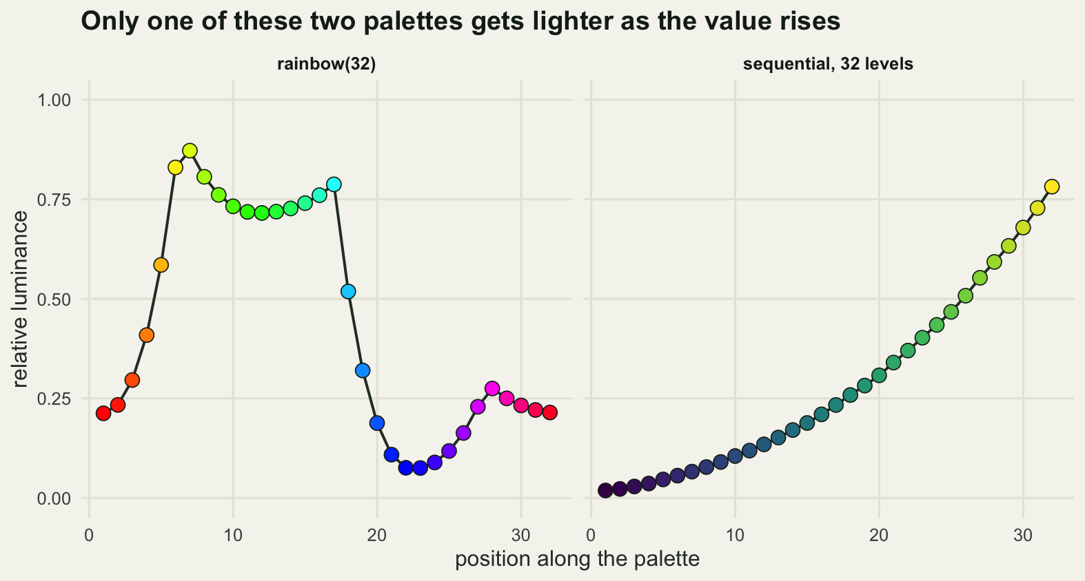
A diverging palette is a claim about zero
Simulate the survey. A 48 by 48 grid of change in species richness between two survey periods, built as a smoothed random field plus a gentle regional trend, so some blocks have gained species and others have lost them. Change data in ecology arrives in that shape: gains and losses on the same map, with nothing that forces zero to sit at the middle of the range.
set.seed(20260806)
grid_n <- 48
smoother <- function(n, bw) exp(-0.5 * (outer(seq_len(n), seq_len(n), "-") / bw)^2)
kern <- smoother(grid_n, 4.5)
noise <- kern %*% matrix(rnorm(grid_n * grid_n), grid_n, grid_n) %*% t(kern)
noise <- noise / sd(as.vector(noise))
axis_u <- seq(0, 1, length.out = grid_n)
change <- 2.3 * noise + outer(axis_u, axis_u, function(a, b) 1.6 * a - 0.9 * b) + 0.55

mid_range <- mean(range(change))
round(c(grid_side = grid_n, cells = grid_n^2, mean_change = mean(change), sd_change = sd(change),
        smallest = min(change), largest = max(change),
        median_change = median(change), range_midpoint = mid_range,
        percent_positive = 100 * mean(change > 0)), 4)
grid_side cells mean_change sd_change
48.0000 2304.0000 1.2130 2.5357
smallest largest median_change range_midpoint
-2.9373 8.1427 0.8121 2.6027
percent_positive
61.0677 round(c(percent_painted_positive_if_centred_on_range_midpoint =
100 * mean(change > mid_range),
percent_of_map_changing_apparent_sign = 100 * mean((change > 0) !=
(change > mid_range)),
percent_of_gains_painted_as_losses = 100 * mean(change[change > 0] < mid_range),
percent_of_losses_painted_as_gains = 100 * mean(change[change < 0] > mid_range),
percent_of_map_flipped_if_centred_on_median =
100 * mean((change > 0) != (change > median(change)))), 4)percent_painted_positive_if_centred_on_range_midpoint
31.7274
percent_of_map_changing_apparent_sign
29.3403
percent_of_gains_painted_as_losses
48.0455
percent_of_losses_painted_as_gains
0.0000
percent_of_map_flipped_if_centred_on_median
11.0677 round(c(position_of_zero_along_a_sequential_ramp_percent =
100 * (0 - min(change)) / diff(range(change)),
percent_of_the_loss_ramp_the_worst_loss_reaches =
100 * abs(min(change)) / max(abs(range(change)))), 4)position_of_zero_along_a_sequential_ramp_percent
26.5101
percent_of_the_loss_ramp_the_worst_loss_reaches
36.0731 The site gained species on 61.0677 per cent of its area, and the mean change is 1.213 species with a standard deviation of 2.5357. Zero is a real number here: it separates blocks that gained from blocks that lost, and it is the number the steering group cares about.
Now the failure. Hand a diverging set of colours to a scale that simply spreads them over the data range, which is what happens whenever a diverging palette is used without setting the midpoint, and the pale centre lands at the middle of the range, 2.6027 species, rather than at zero. The map still looks like a change map, complete with a red region and a green region. It is wrong about 29.3403 per cent of its cells, and the error can only run one way, set by which side of zero the pale centre lands on: 48.0455 per cent of the blocks that actually gained species are painted in the loss colour, while 0 per cent of the blocks that lost species are painted as gains. Centring on the median instead still repaints 11.0677 per cent of the map. In ggplot2 the fix is one argument, midpoint = 0 in scale_fill_gradient2(), and the cost of leaving it out is the number above.
Two smaller measurements come out of the same field. If you use a sequential palette instead, zero sits at 26.5101 per cent of the way along the ramp with nothing to mark it, so the reader cannot locate the boundary between gain and loss at all; that is the honest reason to prefer a diverging palette here, and it has nothing to do with which one looks better. And even with the centre correctly at zero, a symmetric palette stretched to the largest absolute value means the worst loss, at 2.9373 species, reaches 36.0731 per cent of the way along the loss side, so here the deepest reds on the scale never appear on the map. That is a real property of the data rather than an error, but where it happens it needs saying in the caption, otherwise the map understates the losses it shows.
div_anchor <- c("#6f2b27", te_pal$clay, "#c6c1ac", te_pal$green, te_pal$forest)
div_ramp <- ramp_from(div_anchor, 257)
half <- max(abs(range(change)))
rescale_to_key <- function(v, centre, half_width) {
  u <- half * (v - centre) / half_width
  u[u < -half] <- -half
  u[u > half] <- half
  u
}

cells <- expand.grid(x = seq_len(grid_n), y = seq_len(grid_n))
cells$value <- as.vector(change)
panels <- c("Centred on zero", "Spread over the data range")
map_df <- rbind(
  data.frame(cells, shown = rescale_to_key(cells$value, 0, half),
             panel = panels[1]),
  data.frame(cells, shown = rescale_to_key(cells$value, mid_range,
                                           diff(range(change)) / 2),
             panel = panels[2]))
map_df$panel <- factor(map_df$panel, levels = panels)

zero_line <- do.call(rbind, lapply(seq_along(
  contourLines(seq_len(grid_n), seq_len(grid_n), change, levels = 0)), function(i) {
    cl <- contourLines(seq_len(grid_n), seq_len(grid_n), change, levels = 0)[[i]]
    data.frame(x = cl$x, y = cl$y, piece = i)
  }))
zero_line <- do.call(rbind, lapply(panels, function(p)
  data.frame(zero_line, panel = factor(p, levels = panels))))

ggplot(map_df, aes(x, y)) +
  geom_raster(aes(fill = shown)) +
  geom_path(data = zero_line, aes(group = piece), colour = te_pal$ink, linewidth = 0.7) +
  scale_fill_gradientn(colours = div_ramp, limits = c(-half, half),
                       breaks = c(-8, -4, 0, 4, 8),
                       name = "change in species\nrichness (species)") +
  scale_x_continuous(expand = c(0, 0)) +
  scale_y_continuous(expand = c(0, 0)) +
  facet_wrap(~panel) +
  guides(fill = guide_colourbar(barheight = unit(56, "pt"), barwidth = unit(9, "pt"),
                                frame.colour = te_pal$ink, ticks.colour = te_pal$ink)) +
  labs(x = NULL, y = NULL,
       title = "The colour boundary and the true zero are not the same line",
       subtitle = paste("Green is a gain in species richness and red a loss, and the black line is where the change is zero.",
                        "The key is the left-hand scale; on the right the same colours have been stretched over the data range.",
                        sep = "\n")) +
  theme_te() +
  theme(axis.text = element_blank(), axis.ticks = element_blank(),
        panel.grid.major = element_blank(),
        panel.border = element_rect(colour = "#8f8d80", fill = NA, linewidth = 0.5),
        plot.subtitle = element_text(colour = "#2c3a31", size = 9),
        legend.title = element_text(colour = "#2c3a31", size = 9),
        legend.text = element_text(colour = "#2c3a31", size = 8),
        strip.text = element_text(colour = te_pal$ink, face = "bold"))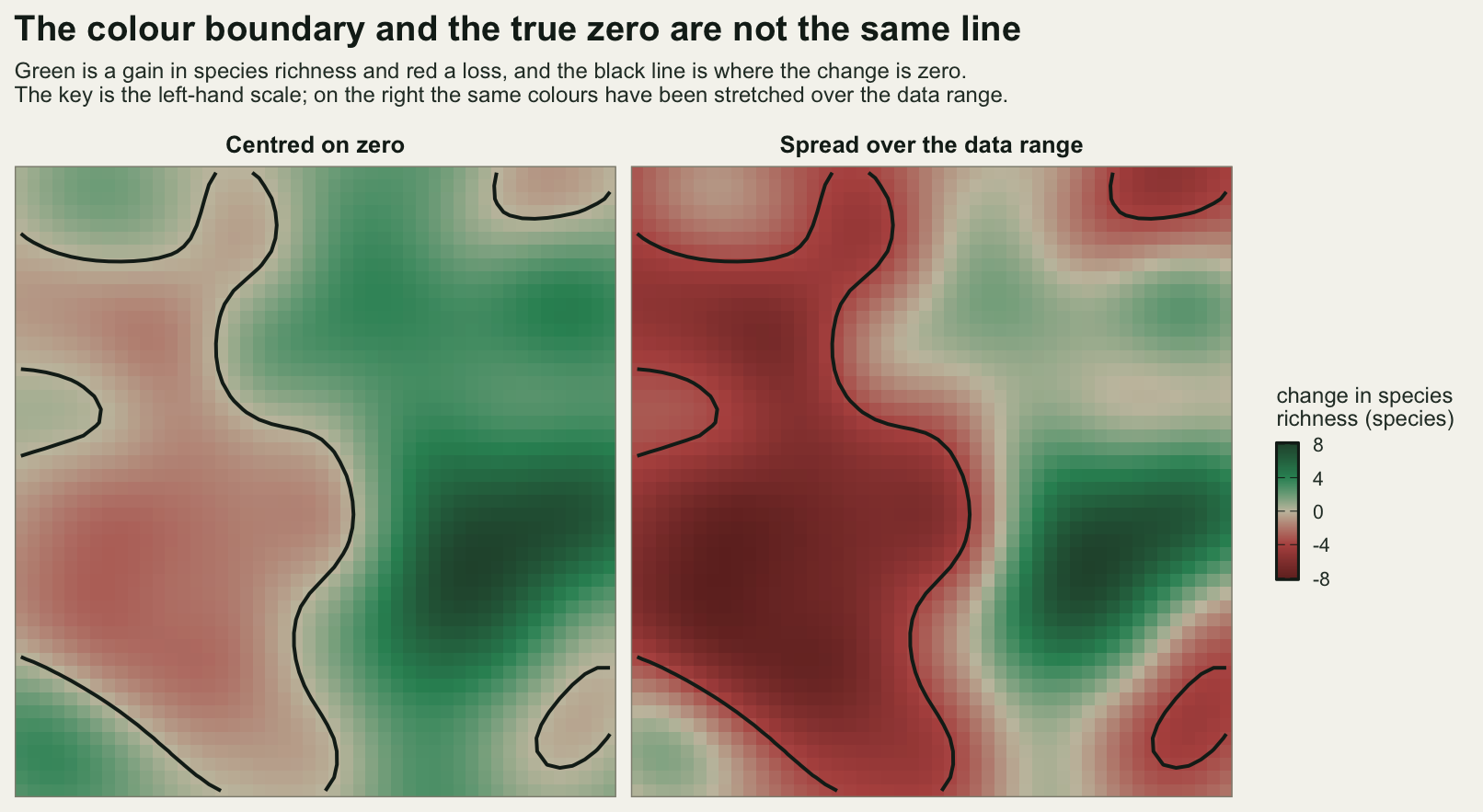
Simulating a dichromat, and finding the default is the problem
Now the categorical case: five habitat classes on the same site, mapped with three palettes. The first is a hand-picked set of the kind that turns up on habitat maps, built around a red and a green. The second is the Okabe-Ito set, designed for colour vision deficiency. The third is what ggplot2 gives you if you say nothing, which is a set of colours at constant lightness and constant chroma, spread evenly around the hue circle. That third palette can be reproduced exactly in base R with hcl(), so it can be measured rather than guessed at.
The measurement is the smallest distance between any two colours in the set, in normal vision and in the simulated deuteranope view. Two categories that are far apart in the palette are easy to tell apart; the pair that is closest is the one that decides whether the figure works. The threshold below is 10 CIE76 units, and it is a convention rather than a fact: about 2.3 units is a just-noticeable difference for two large patches side by side, and small marks scattered across a figure need several times that. The raw minima are printed too, so you can apply your own threshold.
hcl_chroma <- 100
hcl_lightness <- 65
gg_default <- function(n) hcl(h = seq(15, 375, length.out = n + 1)[seq_len(n)],
                              c = hcl_chroma, l = hcl_lightness)
c(hcl_chroma = hcl_chroma, hcl_lightness = hcl_lightness)
hcl_chroma hcl_lightness
100 65 habitat <- c("#d73027", "#1a9850", "#fee08b", "#4575b4", "#8c510a")
okabe <- c("#E69F00", "#56B4E9", "#009E73", "#0072B2", "#D55E00")
default5 <- gg_default(5)
print(rbind(habitat = habitat, okabe_ito = okabe, ggplot2_default = default5)) [,1] [,2] [,3] [,4] [,5]
habitat "#d73027" "#1a9850" "#fee08b" "#4575b4" "#8c510a"
okabe_ito "#E69F00" "#56B4E9" "#009E73" "#0072B2" "#D55E00"
ggplot2_default "#F8766D" "#A3A500" "#00BF7D" "#00B0F6" "#E76BF3"off_diag <- function(m) m[upper.tri(m)]
threshold <- 10
palette_report <- function(p) {
d_normal <- off_diag(de_pairs(p))
d_deutan <- off_diag(de_pairs(simulate_cvd(p)))
c(pairs = length(d_normal), closest_normal = min(d_normal),
closest_deuteranope = min(d_deutan),
largest_loss = max(d_normal - d_deutan),
pairs_below_threshold = sum(d_deutan < threshold))
}
c(threshold_used = threshold, just_noticeable_difference_reference = 2.3) threshold_used just_noticeable_difference_reference
10.0 2.3 print(round(rbind(habitat = palette_report(habitat), okabe_ito = palette_report(okabe),
ggplot2_default = palette_report(default5)), 3)) pairs closest_normal closest_deuteranope largest_loss
habitat 10 43.736 11.514 85.053
okabe_ito 10 26.434 19.747 49.573
ggplot2_default 10 60.579 7.734 88.292
pairs_below_threshold
habitat 0
okabe_ito 0
ggplot2_default 1name_pair <- function(p, m) {
m[lower.tri(m, diag = TRUE)] <- NA
ij <- which(m == max(m, na.rm = TRUE), arr.ind = TRUE)[1, ]
cat(p[ij[1]], "and", p[ij[2]], "seen as",
simulate_cvd(p)[ij[1]], "and", simulate_cvd(p)[ij[2]], "\n")
round(c(normal = de_pairs(p)[ij[1], ij[2]],
deuteranope = de_pairs(simulate_cvd(p))[ij[1], ij[2]]), 3)
}
cat("habitat pair losing the most separation:\n")habitat pair losing the most separation:print(name_pair(habitat, de_pairs(habitat) - de_pairs(simulate_cvd(habitat))))#d73027 and #1a9850 seen as #818111 and #838253
normal deuteranope
113.682 28.629 cat("habitat pair closest after simulation:\n")habitat pair closest after simulation:print(name_pair(habitat, -de_pairs(simulate_cvd(habitat))))#d73027 and #8c510a seen as #818111 and #676700
normal deuteranope
43.736 11.514 cat("ggplot2 default pair closest after simulation:\n")ggplot2 default pair closest after simulation:print(name_pair(default5, -de_pairs(simulate_cvd(default5))))#00B0F6 and #E76BF3 seen as #9696F7 and #9D9DF1
normal deuteranope
79.094 7.734 by_n <- t(sapply(4:8, function(n) {
d_normal <- off_diag(de_pairs(gg_default(n)))
d_deutan <- off_diag(de_pairs(simulate_cvd(gg_default(n))))
c(groups = n, pairs = length(d_normal), closest_normal = min(d_normal),
closest_deuteranope = min(d_deutan), pairs_below_threshold = sum(d_deutan < threshold))
}))
print(round(by_n, 3)) groups pairs closest_normal closest_deuteranope pairs_below_threshold
[1,] 4 6 80.735 31.030 0
[2,] 5 10 60.579 7.734 1
[3,] 6 15 61.974 14.704 0
[4,] 7 21 42.365 7.090 1
[5,] 8 28 34.675 0.929 4okabe8 <- c("#E69F00", "#56B4E9", "#009E73", "#F0E442",
"#0072B2", "#D55E00", "#CC79A7", "#000000")
print(round(rbind(okabe_ito_eight = palette_report(okabe8)), 3)) pairs closest_normal closest_deuteranope largest_loss
okabe_ito_eight 28 26.434 17.175 68.509
pairs_below_threshold
okabe_ito_eight 0The habitat set behaves better than its reputation. Its red and green are 113.682 units apart in normal vision and still 28.629 apart to a simulated deuteranope, which is not a collision. That pair loses 85.053 units of separation, the largest loss anywhere in the palette, and it had the separation to spare. The pair that gets into trouble is the one nobody worries about: the red #d73027 against the brown #8c510a, 43.736 apart normally and 11.514 apart in the simulated view, which clears the threshold of 10 by a margin nobody would choose on purpose. The lesson is not that red and green are forbidden. It is that a red and a green picked at different lightness survive, and that the pair which gets into trouble is whichever two colours differ mainly along the axis the deficiency removes, which you cannot pick out by eye.
The Okabe-Ito set does what it was built to do. Its closest pair is 26.434 apart normally and 19.747 apart in the simulated view, so it loses separation but never approaches the threshold, and its eight colour version keeps a closest pair of 17.175 across all 28 pairs.
The default is the one to worry about. With five groups, ggplot2’s colours are 60.579 apart at their closest in normal vision, which sounds generous, and 7.734 apart in the simulated deuteranope view, which is below the threshold. The pair that collapses is the blue #00B0F6 against the magenta #E76BF3, a comfortable 79.094 apart as drawn, so nothing in the figure as you see it warns you. Push the palette to eight groups and the closest pair falls to 0.929, with 4 of the 28 pairs under the threshold: four pairs of categories that are, for practical purposes, the same colour. The reason is exactly the design of that palette. Holding lightness constant at 65 and chroma constant at 100 means every colour differs from every other only in hue, and a dichromat has lost most of the hue circle. The palette spent all of its information on the one channel the reader may not have.
pal_names <- c("habitat set", "Okabe-Ito", "ggplot2 default")
views <- c("as drawn", "simulated deuteranope")
sw <- do.call(rbind, lapply(seq_along(pal_names), function(k) {
  p <- list(habitat, okabe, default5)[[k]]
  rbind(data.frame(class = seq_len(5), palette = pal_names[k], fill = p, view = views[1]),
        data.frame(class = seq_len(5), palette = pal_names[k],
                   fill = simulate_cvd(p), view = views[2]))
}))
sw$palette <- factor(sw$palette, levels = rev(pal_names))
sw$view <- factor(sw$view, levels = views)
contrast_ratio <- function(a, b) {
  la <- lum(a); lb <- lum(b)
  (pmax(la, lb) + 0.05) / (pmin(la, lb) + 0.05)
}
sw$ink <- ifelse(contrast_ratio(sw$fill, "#000000") >= contrast_ratio(sw$fill, "#ffffff"),
                 "#000000", "#ffffff")

ggplot(sw, aes(class, palette)) +
  geom_tile(aes(fill = fill), colour = te_pal$paper, linewidth = 1.4) +
  geom_text(aes(label = class, colour = ink), size = 4, show.legend = FALSE) +
  scale_fill_identity() +
  scale_colour_identity() +
  scale_x_continuous(breaks = seq_len(5)) +
  facet_wrap(~view) +
  labs(x = "habitat class", y = NULL,
       title = "The ggplot2 default is the palette that fails this test") +
  theme_te() +
  theme(panel.grid.major = element_blank(),
        strip.text = element_text(colour = te_pal$ink, face = "bold"))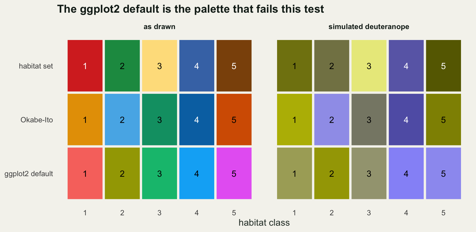
The greyscale test, and what passing it costs
Print the figure in grey and the only thing left is lightness. Convert each colour to its relative luminance, turn that back into a grey, and measure how far apart the categories remain. The natural scale here is L, since a gap of 10 in L is a comfortable difference between two greys and a gap of a fraction of a unit is not visible at all.
to_grey <- function(hex) {
  g <- delinearise(lum(hex))
  rgb(g, g, g)
}
lightness_gaps <- function(p) {
  lstar <- lab_of(p)[, 1]
  off_diag(abs(outer(lstar, lstar, "-")))
}
grey_report <- function(p) {
  gaps <- lightness_gaps(p)
  y <- lum(p)
  c(luminance_range = diff(range(y)),
    contrast_ratio_lightest_to_darkest = (max(y) + 0.05) / (min(y) + 0.05),
    closest_pair_in_lstar = min(gaps), pairs_within_10_lstar = sum(gaps < 10),
    pairs = length(gaps))
}
print(round(rbind(habitat = grey_report(habitat), okabe_ito = grey_report(okabe),
                  ggplot2_default = grey_report(default5),
                  okabe_ito_eight = grey_report(okabe8),
                  sequential_five = grey_report(ramp_from(viridis_anchor, 5))), 4))
luminance_range contrast_ratio_lightest_to_darkest
habitat 0.6476 4.9293
okabe_ito 0.2637 2.3023
ggplot2_default 0.0477 1.1223
okabe_ito_eight 0.7441 15.8811
sequential_five 0.7628 12.0695
closest_pair_in_lstar pairs_within_10_lstar pairs
habitat 0.7174 5 10
okabe_ito 0.7859 3 10
ggplot2_default 0.0355 10 10
okabe_ito_eight 0.7859 7 28
sequential_five 18.1073 0 10print(rbind(as_drawn = default5, in_grey = to_grey(default5))) [,1] [,2] [,3] [,4] [,5]
as_drawn "#F8766D" "#A3A500" "#00BF7D" "#00B0F6" "#E76BF3"
in_grey "#9E9E9E" "#9F9F9F" "#A7A7A7" "#A5A5A5" "#9E9E9E"The ggplot2 default fails the greyscale test completely, and it fails it by construction. Its five colours span a luminance range of 0.0477, a contrast ratio of 1.1223 between the lightest and the darkest, and a closest pair 0.0355 apart in L, which is nothing. All 10 pairs are within 10 L units of each other. Printed in grey the five categories are the same grey, and the printed hex codes above show it.
The obvious reaction is to call that a badly chosen palette, and the numbers say otherwise. Look at what passing the test costs. The Okabe-Ito eight colour set spans a luminance range of 0.7441 and a contrast ratio of 15.8811 between its palest and its darkest member, which is what it takes to be legible in grey. But lightness is an ordered channel: the eye reads dark as heavy and pale as light, so a set of unordered categories drawn at that contrast ratio arrives carrying a ranking the data never claimed. On a habitat map, the black class dominates and the pale yellow class recedes, and a reader will describe the black one as more important without being able to say why. The constant lightness palette is not careless. It is buying equal visual weight for categories that have no order, and it pays for that with the greyscale test and, as the previous section measured, with colour vision deficiency as well.
That is a genuine three-way trade-off between equal visual weight, greyscale legibility and dichromat safety, and no five colour palette gets all three. Even the Okabe-Ito five has 3 of its 10 pairs within 10 L* units, and the habitat set has 5. The sequential palette, for comparison, has a closest pair 18.1073 apart in L*, because putting every category on the lightness axis is exactly what a sequential palette does, and that is why using one for unordered categories invents an order.
So the answer for grey printing is not a different palette. It is a second channel. Redundant encoding, which means giving each category a shape and a line type as well as a colour, survives grey printing, photocopying and every colour vision deficiency at once, and it costs one extra aes() mapping.
set.seed(20260806)
n_year <- 12
years <- seq_len(n_year) + 2013
slopes <- c(0.9, -0.55, 0.3, -0.15, 0.05)
starts <- c(14, 26, 8, 19, 22)
trend_df <- do.call(rbind, lapply(seq_len(5), function(i) {
  data.frame(year = years, species = i,
             count = starts[i] + slopes[i] * seq_len(n_year) + rnorm(n_year, 0, 0.7))
}))

view_lab <- c("as drawn", "printed in grey", "grey plus symbol")
sp_lab   <- paste("species", seq_len(5))
sp_shape <- c(16, 17, 0, 4, 3)
sp_line  <- c("solid", "22", "44", "1343", "12")
panel_df <- do.call(rbind, lapply(seq_along(view_lab), function(k) {
  d <- trend_df
  d$view <- view_lab[k]
  d$col <- if (k == 1) default5[d$species] else to_grey(default5)[d$species]
  d$lt <- if (k == 3) sp_line[d$species] else "solid"
  d$shape <- if (k == 3) sp_shape[d$species] else NA_integer_
  d
}))
panel_df$view <- factor(panel_df$view, levels = view_lab)
key_grey <- to_grey(default5)[1]

ggplot(panel_df, aes(year, count, group = species)) +
  geom_line(aes(colour = col, linetype = lt), linewidth = 0.8) +
  geom_point(data = subset(panel_df, !is.na(shape)),
             aes(colour = col, shape = shape), size = 2.6) +
  scale_colour_identity() +
  scale_linetype_identity(name = NULL, breaks = sp_line, labels = sp_lab,
                          guide = "legend") +
  scale_shape_identity(name = NULL, breaks = sp_shape, labels = sp_lab,
                       guide = "legend") +
  scale_x_continuous(breaks = c(2014, 2018, 2022)) +
  facet_wrap(~view) +
  guides(linetype = guide_legend(nrow = 1, override.aes = list(colour = key_grey)),
         shape = guide_legend(nrow = 1)) +
  labs(x = NULL, y = "count per transect",
       title = "A palette built on hue alone does not survive the photocopier") +
  theme_te() +
  theme(legend.position = "bottom",
        legend.key.width = unit(30, "pt"),
        strip.text = element_text(colour = te_pal$ink, face = "bold"))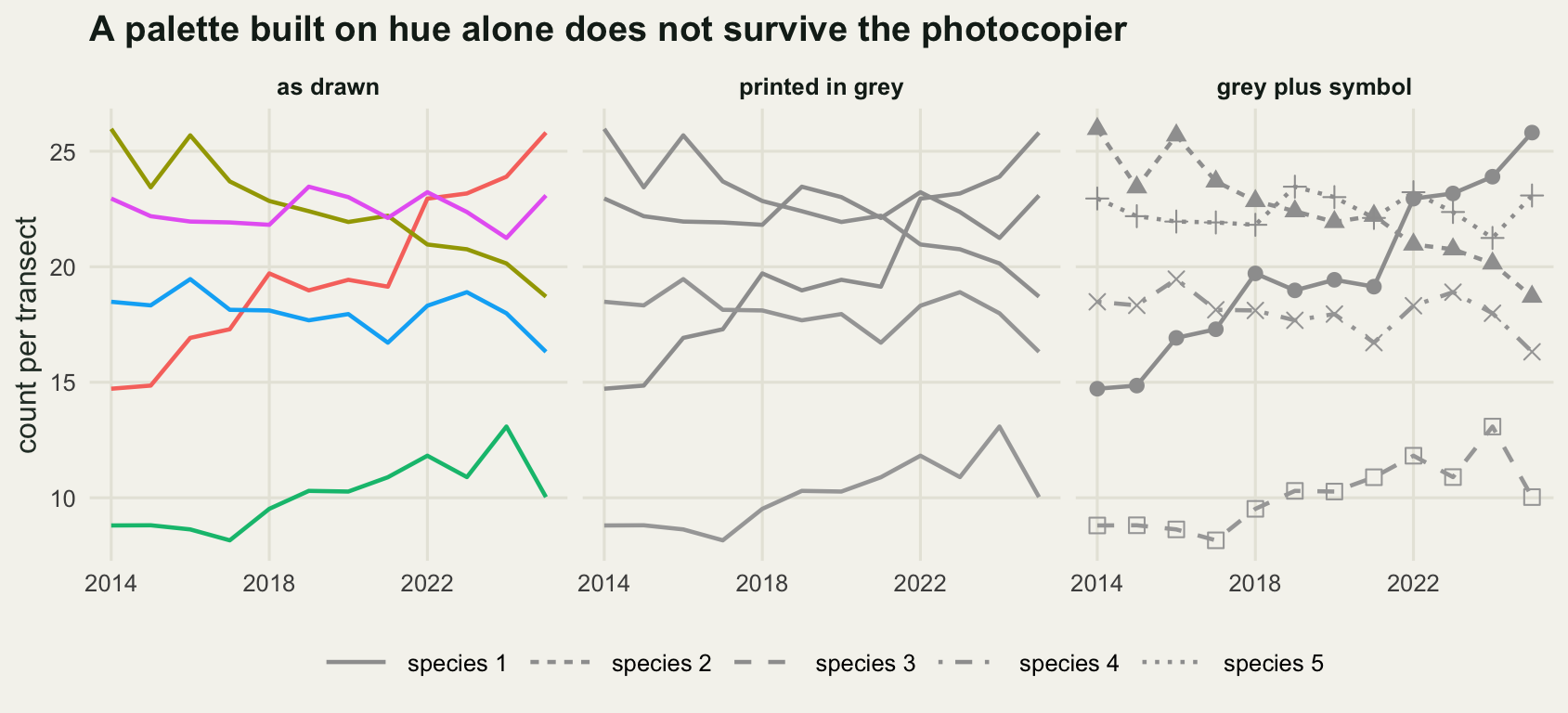
The honest limit
CIE76 is the weakest link in every number above. Euclidean distance in Lab overstates differences between saturated colours, which is why CIE94 and CIEDE2000 were defined, and it is worth being exact about which of my numbers that damages. The colours as drawn are saturated and the simulated ones are not, so the loss figures are the inflated ones: a better measure would shrink the before number more than the after number, and the 85.053 quoted for the habitat red against its green would come down. The numbers that decide whether a figure works are the distances after simulation, between colours of moderate saturation where CIE76 is on firmer ground. They are still approximations, so Okabe-Ito’s 19.747 is a margin rather than a guarantee, and the threshold of 10 is a convention I chose and printed rather than a property of the eye.
The colour vision deficiency simulation is an approximation twice over. It models a dichromat, meaning a complete absence of one cone type, and it uses the simplified fixed matrix construction rather than the more careful two-plane projection. Most people with a red-green deficiency are anomalous trichromats with a shifted rather than a missing pigment, and their view sits between the two panels shown here. The simulation is a screening tool that tells you which pairs are at risk. It is not a statement about what any individual sees.
Three further limits are worth stating. All the distances here are between isolated patches, and a colour on a figure is seen against its neighbours, so a thin line on a pale background is harder than a large filled polygon of the same colour. Nothing here accounts for monitor calibration or for the difference between sRGB on screen and ink on paper, where the gamut is smaller and the losses are largest in exactly the saturated corners the failing palettes used. And the whole post measures discriminability, which is only part of the job: a palette also has to look like the thing it represents, which is why maps of temperature run blue to red and maps of vegetation run brown to green, and no distance measure will tell you that.
Where to go next
The decision that matters most in practice is the one this post opened with: work out whether the variable is ordered, and if it is ordered, whether it has a zero worth finding. Then run the two cheap checks. Plot the luminance profile of whatever palette you were about to use, and simulate a deuteranope reading your categorical colours. Both are a dozen lines of base R, both are in this post, and both take less time than redrawing the figure after review.
Designing an ordination figure takes the same measuring approach to the other half of a figure’s geometry, where the distance between points is the content and the aspect ratio silently changes it. Checking a figure collects the checks that catch the errors a palette audit cannot, including the one that no automatic test finds: a title that makes a claim the data do not support.
References
Borland D, Taylor RM 2007 IEEE Computer Graphics and Applications 27(2):14-17 (10.1109/MCG.2007.323435)
Crameri F, Shephard GE, Heron PJ 2020 Nature Communications 11:5444 (10.1038/s41467-020-19160-7)
Zeileis A, Hornik K, Murrell P 2009 Computational Statistics and Data Analysis 53(9):3259-3270 (10.1016/j.csda.2008.11.033)
Sharma G, Wu W, Dalal EN 2005 Color Research and Application 30(1):21-30 (10.1002/col.20070)
Vienot F, Brettel H, Mollon JD 1999 Color Research and Application 24(4):243-252 (10.1002/(SICI)1520-6378(199908)24:4<243::AID-COL5>3.0.CO;2-3)
Okabe M, Ito K 2008 Color Universal Design (CUD). Online resource at https://jfly.uni-koeln.de/color/ (No DOI)