library(terra)
library(dplyr)
library(tidyr)
library(ggplot2)Evaluating species distribution models in R
R
SDM
model evaluation
ROC
ecology tutorial
Test an SDM in R against held-out data: the ROC curve and AUC, a confusion matrix with sensitivity, specificity and TSS, and how to pick a good threshold.
A model that fits its training data well can still predict badly. The only honest test of a species distribution model is how it classifies occurrences it never saw, so evaluation always starts by holding data back. Two families of metric then apply. Threshold-independent measures, chiefly the area under the ROC curve (AUC), judge how well the predicted suitability ranks presences above absences across every possible cut-off. Threshold-dependent measures, built from a confusion matrix, judge the binary map you get after committing to one cut-off. This post computes both in base R, using the baseline SDM and the same synthetic landscape, then shows why the obvious threshold of 0.5 is a trap.
The landscape and the trained model (as in the baseline post)
pal_paper <- "#f5f4ee"; pal_ink <- "#16241d"; pal_body <- "#2c3a31"
pal_forest <- "#275139"; pal_label <- "#46604a"; pal_line <- "#dad9ca"; pal_faint <- "#5d6b61"
pal_gold <- "#c9b458"; pal_red <- "#b5534e"
theme_te <- function(base_size = 12) {
  theme_minimal(base_size = base_size) +
    theme(text = element_text(colour = pal_body),
          plot.title = element_text(colour = pal_ink, face = "bold", size = rel(1.05)),
          plot.subtitle = element_text(colour = pal_faint),
          axis.title = element_text(colour = pal_label), axis.text = element_text(colour = pal_body),
          panel.grid.minor = element_blank(),
          panel.grid.major = element_line(colour = pal_line, linewidth = 0.3),
          strip.text = element_text(colour = pal_ink, face = "bold"),
          legend.title = element_text(colour = pal_label),
          plot.background = element_rect(fill = pal_paper, colour = NA),
          panel.background = element_rect(fill = "white", colour = NA),
          legend.key = element_rect(fill = pal_paper, colour = NA), legend.position = "top")
}
set.seed(42)
r_template <- rast(nrows = 80, ncols = 80, xmin = 0, xmax = 80, ymin = 0, ymax = 80)
xy <- xyFromCell(r_template, 1:ncell(r_template))
temp_trend <- 22 - 0.18 * xy[, "y"]
temp_noise <- rast(r_template); values(temp_noise) <- rnorm(ncell(r_template), 0, 2)
temp_noise <- focal(temp_noise, w = 9, fun = mean, na.rm = TRUE)
temp <- rast(r_template); values(temp) <- temp_trend; temp <- temp + temp_noise; names(temp) <- "temp"
prec_trend <- 500 + 5 * xy[, "x"]
prec_noise <- rast(r_template); values(prec_noise) <- rnorm(ncell(r_template), 0, 60)
prec_noise <- focal(prec_noise, w = 9, fun = mean, na.rm = TRUE)
prec <- rast(r_template); values(prec) <- prec_trend; prec <- prec + prec_noise; names(prec) <- "prec"
temp_v <- values(temp)[, 1]; prec_v <- values(prec)[, 1]
suit_true <- exp(-((temp_v - 15)^2) / (2 * 2.2^2)) * exp(-((prec_v - 800)^2) / (2 * 110^2))
set.seed(101); pres_cells <- sample(ncell(r_template), 300, prob = suit_true, replace = FALSE)
set.seed(202); bg_cells <- sample(ncell(r_template), 1000)
train <- rbind(data.frame(pa = 1, temp = temp_v[pres_cells], prec = prec_v[pres_cells]),
               data.frame(pa = 0, temp = temp_v[bg_cells],  prec = prec_v[bg_cells]))
train <- train[complete.cases(train), ]
m <- glm(pa ~ poly(temp, 2) + poly(prec, 2), data = train, family = binomial)
A held-out test set
Real evaluation uses occurrences the model never saw: a spatial or temporal split of the records, or an independent survey. Here the simulated landscape lets us do something impossible in the field, draw a fresh set of sites with true presence and absence labels from the known suitability surface. Detection is imperfect, so a suitable site is not guaranteed to be occupied, which mirrors real survey data.
set.seed(777)
test_cells <- sample(ncell(r_template), 800)
p_detect <- 0.75 * (suit_true[test_cells] / max(suit_true))
y_test <- rbinom(length(test_cells), 1, p_detect)
score <- predict(m, data.frame(temp = temp_v[test_cells], prec = prec_v[test_cells]), type = "response")
ok <- complete.cases(score, y_test); y_test <- y_test[ok]; score <- score[ok]
c(sites = length(y_test), presences = sum(y_test), prevalence = round(mean(y_test), 3))
sites presences prevalence
800.000 134.000 0.168 The test set holds 800 sites, 134 of them occupied, a prevalence of 0.17. The model produces a suitability score at each; evaluation asks how well those scores separate the 134 presences from the 666 absences.
The ROC curve and AUC
A threshold turns continuous scores into a presence-absence map, and every threshold gives a different pair of error rates: the true positive rate (sensitivity, the share of presences caught) and the false positive rate (one minus specificity, the share of absences wrongly flagged). Sweeping the threshold from high to low traces the ROC curve. The area under it, the AUC, is the probability that a randomly chosen presence scores higher than a randomly chosen absence. That equivalence gives a direct way to compute it from ranks, which should match integrating the curve.
n1 <- sum(y_test == 1); n0 <- sum(y_test == 0)
# rank-based AUC (the Mann-Whitney form)
auc_rank <- (sum(rank(score)[y_test == 1]) - n1 * (n1 + 1) / 2) / (n1 * n0)

# the ROC curve, then AUC by trapezoidal integration
thr <- sort(unique(c(0, score, 1)))
roc <- as.data.frame(t(sapply(thr, function(t) {
  pos <- score >= t
  c(threshold = t, tpr = sum(pos & y_test == 1) / n1,
    fpr = sum(pos & y_test == 0) / n0, spec = 1 - sum(pos & y_test == 0) / n0)
})))
roc <- roc[order(roc$fpr, roc$tpr), ]
auc_trap <- sum(diff(roc$fpr) * (head(roc$tpr, -1) + tail(roc$tpr, -1)) / 2)
c(auc_rank = round(auc_rank, 3), auc_trapezoid = round(auc_trap, 3))
auc_rank auc_trapezoid
0.897 0.897 Both routes give 0.897. An AUC of about 0.9 means the model ranks a random presence above a random absence roughly nine times in ten: good discrimination.
roc$tss <- roc$tpr + roc$spec - 1
best <- roc[which.max(roc$tss), ]
ggplot(roc, aes(fpr, tpr)) +
  geom_abline(slope = 1, intercept = 0, colour = pal_faint, linetype = "dashed") +
  geom_path(colour = pal_forest, linewidth = 1) +
  geom_point(data = best, aes(fpr, tpr), colour = pal_red, size = 3) +
  annotate("text", x = 0.55, y = 0.30, hjust = 0,
           label = paste0("AUC = ", sprintf("%.3f", auc_rank)), colour = pal_ink, size = 4.2) +
  annotate("text", x = best$fpr + 0.03, y = best$tpr - 0.03, hjust = 0,
           label = "max-TSS operating point", colour = pal_red, size = 3.2) +
  coord_equal() +
  labs(title = "ROC curve for the held-out test set",
       x = "False positive rate (1 - specificity)", y = "True positive rate (sensitivity)") +
  theme_te(12) + theme(legend.position = "none")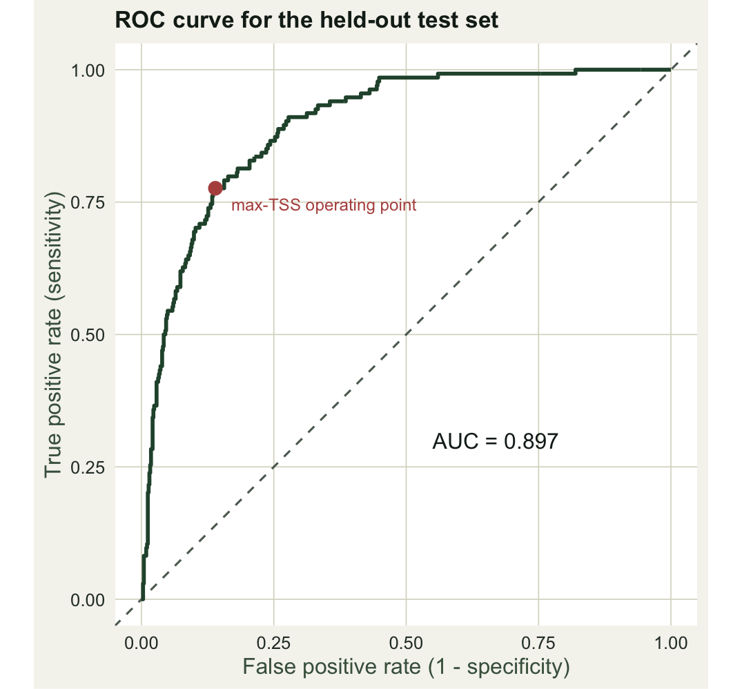
AUC is convenient but not above criticism. It ignores how well the predicted values are calibrated, weights false positives and false negatives equally whether or not that suits the problem, and rewards a model partly for confidently classifying vast unsuitable areas that were never in doubt. For presence-background data in particular, where the zeros are not true absences, a high AUC can reflect the extent of the background as much as the quality of the model (Lobo et al. 2008). It is a summary, not a verdict.
Thresholds and the confusion matrix
To turn suitability into a map of predicted presence and absence you must choose a cut-off, and sensitivity and specificity pull against each other as you move it. A common, defensible rule is to maximise the true skill statistic, TSS = sensitivity + specificity - 1, which is Youden’s J and gives equal weight to catching presences and rejecting absences (Allouche et al. 2006).
thr_star <- best$threshold
ss <- roc %>% select(threshold, tpr, spec) %>%
  pivot_longer(c(tpr, spec), names_to = "metric", values_to = "value") %>%
  mutate(metric = recode(metric, tpr = "Sensitivity", spec = "Specificity"))
ggplot(ss, aes(threshold, value, colour = metric)) +
  geom_line(linewidth = 1) +
  geom_vline(xintercept = thr_star, colour = pal_red, linetype = "dashed") +
  annotate("text", x = thr_star + 0.01, y = 0.15, hjust = 0, label = "max-TSS threshold",
           colour = pal_red, size = 3.2) +
  scale_colour_manual(values = c("Sensitivity" = pal_forest, "Specificity" = pal_gold), name = NULL) +
  labs(title = "The threshold trade-off",
       subtitle = "Sensitivity and specificity move in opposite directions as the cut-off rises",
       x = "Suitability threshold", y = "Rate") +
  theme_te(12)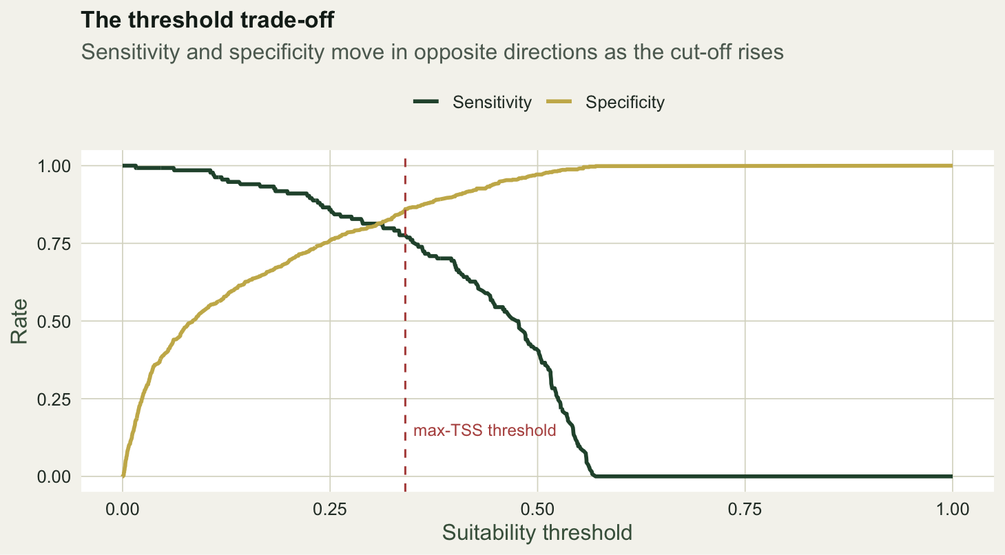
At the maximum-TSS threshold the binary predictions and the truth form a confusion matrix, from which every threshold-dependent metric follows.
pred_pa <- as.integer(score >= thr_star)
cm <- table(predicted = factor(pred_pa, c(1, 0)), observed = factor(y_test, c(1, 0)))
cm
observed
predicted 1 0
1 104 93
0 30 573TP <- cm["1","1"]; FN <- cm["0","1"]; FP <- cm["1","0"]; TN <- cm["0","0"]
sens <- TP / (TP + FN); spec <- TN / (TN + FP)
n <- sum(cm); po <- (TP + TN) / n
pe <- ((TP + FP) * (TP + FN) + (FN + TN) * (FP + TN)) / n^2
kappa <- (po - pe) / (1 - pe)
c(threshold = round(thr_star, 3), sensitivity = round(sens, 3), specificity = round(spec, 3),
TSS = round(sens + spec - 1, 3), kappa = round(kappa, 3)) threshold sensitivity specificity TSS kappa
0.341 0.776 0.860 0.636 0.536 The chosen threshold is 0.34. It catches 78 per cent of the presences (sensitivity) and correctly rejects 86 per cent of the absences (specificity), for a TSS of 0.64 and a Cohen’s kappa of 0.54. Kappa is reported here for familiarity, but it depends on prevalence in a way TSS does not, which is why TSS has become the preferred single-threshold summary in distribution modelling.
Why 0.5 is the wrong default
It is tempting to threshold at 0.5, as one might for an ordinary classifier. The previous post showed why that fails: with presence-background data the predicted values are a relative index whose scale is set by the arbitrary ratio of presences to background, so 0.5 has no fixed meaning. Applied here it is far too strict.
pred_half <- as.integer(score >= 0.5)
sens_h <- sum(pred_half == 1 & y_test == 1) / n1
spec_h <- sum(pred_half == 0 & y_test == 0) / n0
c(sensitivity = round(sens_h, 3), specificity = round(spec_h, 3),
  TSS = round(sens_h + spec_h - 1, 3))
sensitivity specificity TSS
0.403 0.971 0.374 At 0.5 the model finds only 40 per cent of the presences. Specificity climbs to 0.97, but the map now misses most of the species, and TSS collapses from 0.64 to 0.37. The threshold must be learned from the data, whether by maximising TSS, matching predicted prevalence to observed, or another rule suited to the cost of each error type (Liu et al. 2005). It is never a free default.
A caveat carried into the next post
One choice above is quietly optimistic: the test sites were drawn at random across the region, so many sit close to training presences. Because nearby places share environments, a random split lets the model be tested on near-copies of what it learned, and the AUC and TSS reported here are almost certainly flattering. Occurrence data are spatially clustered, and honest evaluation has to account for that. Splitting the data in space, rather than at random, is the subject of the next post.
References
- Fielding AH, Bell JF 1997. Environmental Conservation 24(1):38-49 (10.1017/S0376892997000088)
- Liu C, Berry PM, Dawson TP, Pearson RG 2005. Ecography 28(3):385-393 (10.1111/j.0906-7590.2005.03957.x)
- Allouche O, Tsoar A, Kadmon R 2006. Journal of Applied Ecology 43(6):1223-1232 (10.1111/j.1365-2664.2006.01214.x)
- Lobo JM, Jimenez-Valverde A, Real R 2008. Global Ecology and Biogeography 17(2):145-151 (10.1111/j.1466-8238.2007.00358.x)