library(ggplot2)

te_pal <- list(forest = "#275139", green = "#2f8f63", sage = "#93a87f",
               clay = "#b5534e", gold = "#cda23f", line = "#dad9ca",
               ink = "#16241d")

theme_te <- function() {
  theme_minimal(base_size = 12) +
    theme(panel.grid.minor = element_blank(),
          panel.grid.major = element_line(colour = "#e7e6dc"),
          plot.background = element_rect(fill = "#f5f4ee", colour = NA),
          panel.background = element_rect(fill = "#f5f4ee", colour = NA),
          plot.title = element_text(face = "bold", colour = te_pal$ink),
          axis.title = element_text(colour = "#2c3a31"))
}Estimating Ne from genetic data
R
population genetics
ecology tutorial
ggplot2
Implement the temporal and linkage disequilibrium estimators of effective size in R, and measure how much data each needs before its answer means anything.
Corrected 30 September 2026: the post advised reading a large single-sample Ne estimate as a lower bound; its own simulation shows such estimates overshooting the true size, so it now points to the lower confidence limit instead.
Corrected 27 September 2026: the temporal method section gave the median Ne at ten generations apart as 105.6, which is the two generation value; the printed ten generation median is 108.7.
The previous tutorial derived effective size from a known demography. Real projects have the opposite problem: some genotypes, no pedigree, and a management question that needs a number. Two estimators dominate the literature, and both are short enough to write out in full.
The temporal method compares two samples separated by a known number of generations and reads Ne off how much the allele frequencies drifted. The linkage disequilibrium method needs only one sample: drift in a small population generates non-random associations between unlinked loci, and the strength of those associations scales as 1/(3Ne). This tutorial implements both against simulated data with a known answer, then measures where each one stops working.
The temporal method
Drift over t generations inflates the variance of allele frequencies, and sampling inflates it again. The standardised variance Fc between two samples therefore has a drift part and a sampling part, and the estimator subtracts the sampling part off.
temporal_run <- function(ne, t_gap, n_loci, s0, st, reps, seed) {
  set.seed(seed)
  out <- numeric(reps)
  fc_vec <- numeric(reps)
  for (r in seq_len(reps)) {
    p <- runif(n_loci, 0.1, 0.9)
    x <- rbinom(n_loci, 2 * s0, p) / (2 * s0)
    for (g in seq_len(t_gap)) p <- rbinom(n_loci, 2 * ne, p) / (2 * ne)
    y <- rbinom(n_loci, 2 * st, p) / (2 * st)
    keep <- (x + y) > 0 & (x + y) < 2
    fc <- mean((x[keep] - y[keep])^2 /
                 ((x[keep] + y[keep]) / 2 - x[keep] * y[keep]))
    fc_vec[r] <- fc
    out[r] <- t_gap / (2 * (fc - 1 / (2 * s0) - 1 / (2 * st)))
  }
  list(ne_hat = out, fc = mean(fc_vec))
}
Three lines carry the method. Fc is Nei and Tajima’s standardised variance, averaged over loci. The two subtracted terms are the variance contributed by drawing s0 and st individuals rather than censusing the population. What is left is drift, and drift over t generations in a population of Ne has expectation t/(2Ne).
The simulation gives the estimator a population of exactly 100, samples 50 individuals ten generations apart, and repeats 500 times at three marker panel sizes.
grid_loci <- c(20, 100, 500)
runs <- lapply(grid_loci, function(L)
  temporal_run(ne = 100, t_gap = 10, n_loci = L, s0 = 50, st = 50,
               reps = 500, seed = 465))

tab_loci <- do.call(rbind, Map(function(L, res) {
  est <- res$ne_hat
  data.frame(loci = L, mean_Fc = round(res$fc, 4),
             median_Ne = round(median(est), 1),
             q05 = round(quantile(est, 0.05), 1),
             q95 = round(quantile(est, 0.95), 1),
             negative_or_huge = mean(est < 0 | est > 1000))
}, grid_loci, runs))
print(tab_loci, row.names = FALSE)
loci mean_Fc median_Ne q05 q95 negative_or_huge
20 0.0656 112.5 61.0 295.0 0.004
100 0.0663 107.5 81.9 151.8 0.000
500 0.0669 106.5 93.8 123.1 0.000The estimator is close to unbiased on the median and wildly variable at small panel sizes. With 20 loci the median is 112.5 but the central 90 per cent of estimates runs from 61.0 to 295.0: a study reporting Ne = 61 and a study reporting Ne = 295 could both be sampling the same population of 100. With 500 loci the same interval narrows to 93.8 to 123.1. Note also what happens at the top end of the distribution. The estimate divides by Fc minus the two sampling corrections, so a replicate whose observed drift is no larger than the sampling noise comes back negative or above 1000. Fewer than one per cent of the 20-locus replicates land there, and the 100 and 500 locus rows stay at zero.
dens_df <- do.call(rbind, Map(function(L, res)
  data.frame(ne = res$ne_hat, loci = factor(L, levels = grid_loci)),
  grid_loci, runs))

ggplot(subset(dens_df, ne > 0 & ne < 400), aes(ne, colour = loci)) +
  geom_density(linewidth = 0.9) +
  geom_vline(xintercept = 100, linetype = "dashed", colour = "grey40") +
  scale_colour_manual(values = c(`20` = te_pal$clay, `100` = te_pal$gold,
                                 `500` = te_pal$forest),
                      name = "loci") +
  labs(title = "The temporal estimator needs markers, not just samples",
       subtitle = "true Ne 100, two samples of 50 individuals ten generations apart",
       x = "estimated Ne", y = "density") +
  theme_te()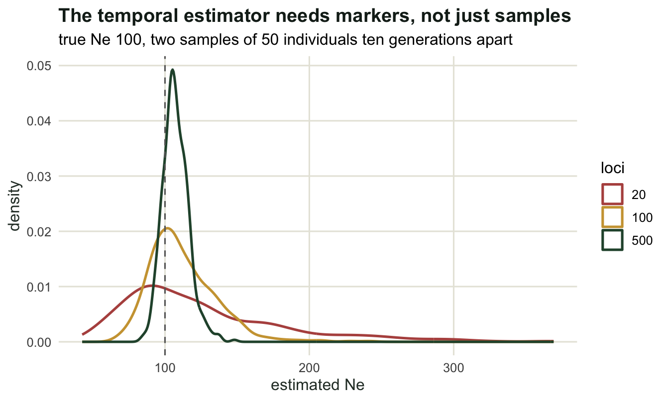
The interval between samples is the other lever, and it behaves differently.
tab_gap <- do.call(rbind, lapply(c(2, 5, 10, 20), function(tg) {
  est <- temporal_run(100, tg, 100, 50, 50, 400, seed = 4650 + tg)$ne_hat
  data.frame(generations_apart = tg, median_Ne = round(median(est), 1),
             IQR = round(IQR(est), 1),
             negative_or_huge = mean(est < 0 | est > 1000))
}))
print(tab_gap, row.names = FALSE)
generations_apart median_Ne IQR negative_or_huge
2 105.6 77.4 0.015
5 106.9 35.0 0.000
10 108.7 25.7 0.000
20 111.2 23.0 0.000Two generations apart, the interquartile range is 77.4 and 1.5 per cent of studies return nonsense: there simply has not been enough drift to measure against the sampling noise. Ten generations brings the range down to 25.7, and twenty only to 23.0, with medians of 108.7 and 111.2 on this run. So a longer interval buys precision quickly at first and then very little, while the assumption it rests on (a constant Ne throughout the interval) gets progressively less plausible. Somewhere around five to ten generations is the sweet spot, and the archived samples in a museum drawer are often what decides it.
The linkage disequilibrium method
Waiting ten generations is not an option for most projects. The alternative uses one sample and a different consequence of drift: in a finite population, alleles at unlinked loci become associated purely by chance, and the expected squared correlation is 1/(3Ne) plus a term for the sampling of individuals.
That sampling term is the whole difficulty, because it is usually much larger than the signal. Rather than taking a formula for it, this implementation measures it: permuting alleles among individuals within each locus destroys any real association while preserving allele frequencies and sample size, so the mean r^2 of the permuted sample is the floor.
sim_ld <- function(n_ind, n_loci = 25, gens = 30, u = 1e-3, seed = 1) {
  set.seed(seed)
  p0 <- runif(n_loci, 0.15, 0.85)
  hap <- matrix(rbinom(2 * n_ind * n_loci, 1, rep(p0, each = 2 * n_ind)),
                nrow = 2 * n_ind)
  for (g in seq_len(gens)) {
    dad <- sample(n_ind, n_ind, replace = TRUE)
    mum <- sample(n_ind, n_ind, replace = TRUE)
    pick <- function(par) {
      rows <- 2 * par - 1 + matrix(sample(0:1, n_ind * n_loci, replace = TRUE),
                                   n_ind, n_loci)
      matrix(hap[cbind(as.vector(rows), rep(seq_len(n_loci), each = n_ind))],
             n_ind, n_loci)
    }
    h1 <- pick(dad)
    h2 <- pick(mum)
    hap <- matrix(0L, 2 * n_ind, n_loci)
    hap[seq(1, 2 * n_ind, by = 2), ] <- h1
    hap[seq(2, 2 * n_ind, by = 2), ] <- h2
    mut <- matrix(runif(length(hap)) < u, nrow(hap), ncol(hap))
    hap[mut] <- 1L - hap[mut]
  }
  hap
}

mean_r2 <- function(hap, maf_min = 0.05) {
  p <- colMeans(hap)
  keep <- pmin(p, 1 - p) >= maf_min
  cr <- suppressWarnings(cor(hap[, keep, drop = FALSE]))
  r2 <- cr[upper.tri(cr)]^2
  mean(r2[is.finite(r2)])
}

ld_estimate <- function(n_ind, n_sample, reps = 10, seed = 466) {
  obs <- floor_r2 <- est <- numeric(reps)
  for (r in seq_len(reps)) {
    hap <- sim_ld(n_ind, seed = seed + r)
    take <- sort(sample(n_ind, n_sample))
    smp <- hap[as.vector(rbind(2 * take - 1, 2 * take)), , drop = FALSE]
    obs[r] <- mean_r2(smp)
    floor_r2[r] <- mean(replicate(5, mean_r2(apply(smp, 2, sample))))
    est[r] <- 1 / (3 * (obs[r] - floor_r2[r]))
  }
  c(N = n_ind, sampled = n_sample, r2_obs = mean(obs),
    r2_floor = mean(floor_r2), Ne_median = median(est), Ne_mean = mean(est))
}

tab_ld <- t(sapply(c(25, 50, 100, 200),
                   function(n) ld_estimate(n, min(n, 50))))
print(round(tab_ld, 4))
N sampled r2_obs r2_floor Ne_median Ne_mean
[1,] 25 25 0.0350 0.0207 23.2100 28.4639
[2,] 50 50 0.0160 0.0100 54.9085 62.5148
[3,] 100 50 0.0133 0.0100 104.4949 108.5959
[4,] 200 50 0.0115 0.0101 320.2283 422.2100Two things to read. First, the permutation floor recovers the theoretical sampling term to within a few per cent: 0.0207 for 25 individuals and 0.0100 for 50, against 1/(2S) values of 0.02 and 0.01, where S is the number of individuals sampled. That agreement is the check that the calibration is doing what it claims.
Second, the estimator works where the signal is comparable to the floor and fails where it is not. At a true size of 25 the observed r^2 is 0.0350 against a floor of 0.0207, and the estimate is 23.2. At 50 it is 0.0160 against 0.0100, giving 54.9. At 100 it is 0.0133 against 0.0100, giving 104.5. At 200 the observed value is 0.0115 against a floor of 0.0101, a gap smaller than the run-to-run scatter, and the estimate is no longer pinned down by the data: on this run the median is 320.2 and the mean 422.2.
ld_df <- as.data.frame(tab_ld)
bar_df <- data.frame(
  N = factor(rep(ld_df$N, 2), levels = ld_df$N),
  value = c(ld_df$r2_floor, ld_df$r2_obs - ld_df$r2_floor),
  part = rep(c("sampling floor", "drift signal"), each = nrow(ld_df)))

ggplot(bar_df, aes(N, value, fill = part)) +
  geom_col(width = 0.65, colour = "white") +
  scale_fill_manual(values = c(`sampling floor` = te_pal$sage,
                               `drift signal` = te_pal$clay), name = NULL) +
  labs(title = "What the LD method has to work with",
       subtitle = "mean r squared over unlinked locus pairs, 25 loci, up to 50 individuals sampled",
       x = "true population size", y = "mean r squared") +
  theme_te()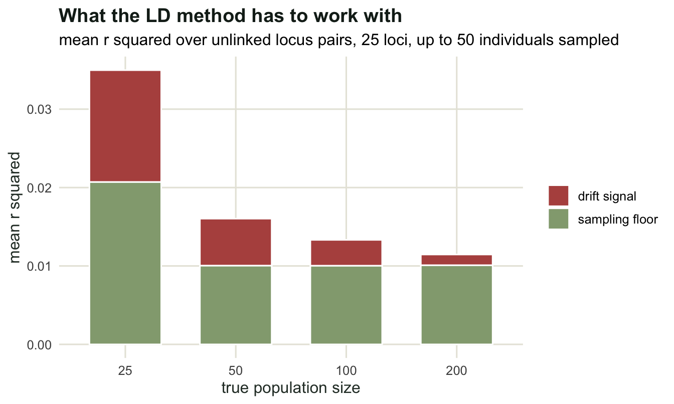
Reading the failure mode correctly
The bar chart is the honest summary of single-sample estimation. The quantity being measured shrinks as 1/(3Ne) while the sampling floor stays where the sample size puts it, so once the true size reaches a couple of hundred the two are indistinguishable and the estimator returns large numbers, infinity, or a negative value. Published implementations handle this by reporting a confidence interval with an infinite upper bound, which is not a defect: it is the correct answer to a question the data cannot resolve.
Three practical consequences follow. Report the interval rather than the point estimate, always. Treat a large Ne estimate from a single sample as neither a measurement nor a lower bound: at the largest true size above, the estimates overshoot it, and the informative number is the lower limit of the confidence interval. And note that the failure is asymmetric in the useful direction for conservation work: small effective sizes, the ones that matter, are exactly the ones this method estimates well.
There is one more asymmetry worth knowing. The two methods do not measure the same time window. The temporal estimate is an average over the generations between the samples. The LD estimate reflects the last handful of generations, because associations between unlinked loci decay by half each generation, so the signal is dominated by recent parents. When both are available and they disagree, the disagreement is information about a changing population, not necessarily an error in either.
Where to go next
Both estimators assume a closed population of constant size with discrete generations. The next tutorial breaks the constant-size assumption on purpose, by pushing a population through a bottleneck and watching which measures of diversity notice and which do not; the one after that collects the assumptions of the whole cluster into a set of checks.
References
Nei M, Tajima F 1981 Genetics 98(3):625-640 (10.1093/genetics/98.3.625)
Hill WG 1981 Genetical Research 38(3):209-216 (10.1017/S0016672300020553)
Waples RS 1989 Genetics 121(2):379-391 (10.1093/genetics/121.2.379)
Waples RS, Do C 2010 Evolutionary Applications 3(3):244-262 (10.1111/j.1752-4571.2009.00104.x)