library(ggplot2)

te_pal <- list(forest = "#275139", green = "#2f8f63", sage = "#93a87f",
               clay = "#b5534e", gold = "#cda23f", line = "#dad9ca",
               ink = "#16241d")

theme_te <- function() {
  theme_minimal(base_size = 12) +
    theme(panel.grid.minor = element_blank(),
          panel.grid.major = element_line(colour = "#e7e6dc"),
          plot.background = element_rect(fill = "#f5f4ee", colour = NA),
          panel.background = element_rect(fill = "#f5f4ee", colour = NA),
          plot.title = element_text(face = "bold", colour = te_pal$ink),
          axis.title = element_text(colour = "#2c3a31"))
}Effective population size in R
R
population genetics
ecology tutorial
ggplot2
Simulate what Ne means in R: the sex ratio, the variance in offspring number and the harmonic mean across bad years, each measured against its formula.
Corrected 14 October 2026: the post said that each formula in the first table covers one departure from the ideal population; it now says that the variance formula, with the variance counted over both sexes, also gets the skewed sex-ratio row right, so the lesson is about the sex-ratio formula, which sees only the sex ratio. It also gave a common range for the ratio of effective to census size whose lower end is the average its own reference reports, and now gives that average and says a census threshold has to be many times larger, not several.
A census of 100 breeding adults does not tell you how fast that population loses genetic diversity. What sets the rate is the effective size Ne, the size of an idealised population that would drift as fast as the real one. In most wild populations Ne is a fraction of the headcount, and the reasons are demographic rather than genetic: who breeds, how unequally, and what happened in the worst year.
This tutorial measures Ne instead of asserting it. A simulation tracks gene diversity through the generations, the decay rate gives a measured Ne, and that measurement is then compared against the textbook formulas for unequal sex ratio, for variance in offspring number, and for fluctuating size.
Measuring Ne from the decay of diversity
Give every allele in the starting population a unique label and let the population reproduce. Diversity is lost whenever two copies of the same ancestral allele meet, so the expected gene diversity after t generations is H0 * (1 - 1/(2Ne))^t. Fit that decay and you have measured Ne, whatever the demography was.
sim_ne <- function(n_m, n_f, gens = 40, reps = 200, seed = 1,
                   equalised = FALSE, w_shape = NULL) {
  set.seed(seed)
  n_tot <- n_m + n_f
  h_mat <- matrix(NA_real_, gens + 1, reps)
  vk <- numeric(reps)
  for (r in seq_len(reps)) {
    pop <- matrix(seq_len(2 * n_tot), ncol = 2, byrow = TRUE)
    for (g in 0:gens) {
      freq <- table(as.vector(pop))
      h_mat[g + 1, r] <- 1 - sum((freq / (2 * n_tot))^2)
      if (g == gens) break
      if (equalised) {
        n_pair <- min(n_m, n_f)
        per_pair <- ceiling(n_tot / n_pair)
        dads <- rep(seq_len(n_pair), each = per_pair)[seq_len(n_tot)]
        mums <- rep(n_m + seq_len(n_pair), each = per_pair)[seq_len(n_tot)]
      } else {
        w_m <- if (is.null(w_shape)) rep(1, n_m) else rgamma(n_m, w_shape, w_shape)
        w_f <- if (is.null(w_shape)) rep(1, n_f) else rgamma(n_f, w_shape, w_shape)
        dads <- sample(seq_len(n_m), n_tot, replace = TRUE, prob = w_m)
        mums <- sample(n_m + seq_len(n_f), n_tot, replace = TRUE, prob = w_f)
      }
      if (g == gens - 1) {
        vk[r] <- var(tabulate(c(dads, mums), nbins = n_tot))
      }
      from_dad <- pop[cbind(dads, sample(1:2, n_tot, replace = TRUE))]
      from_mum <- pop[cbind(mums, sample(1:2, n_tot, replace = TRUE))]
      pop <- cbind(from_dad, from_mum)
    }
  }
  h_bar <- rowMeans(h_mat)
  gen <- 0:gens
  slope <- coef(lm(log(h_bar) ~ gen))[[2]]
  list(h = h_bar, ne_hat = 1 / (2 * (1 - exp(slope))), vk = mean(vk))
}
Four populations, all with a census size of exactly 100 adults, differing only in how reproduction is arranged.
scen <- list(
  "even sex ratio, 50 + 50" = list(n_m = 50, n_f = 50),
  "skewed sex ratio, 10 + 90" = list(n_m = 10, n_f = 90),
  "equalised family size" = list(n_m = 50, n_f = 50, equalised = TRUE),
  "high variance in offspring" = list(n_m = 50, n_f = 50, w_shape = 0.3))

runs <- list()
tab <- NULL
for (nm in names(scen)) {
  a <- scen[[nm]]
  runs[[nm]] <- do.call(sim_ne, c(a, list(gens = 40, reps = 200, seed = 463)))
  tab <- rbind(tab, data.frame(
    scenario = nm, N = a$n_m + a$n_f,
    Vk = round(runs[[nm]]$vk, 3),
    Ne_measured = round(runs[[nm]]$ne_hat, 1),
    Ne_from_sex_ratio = 4 * a$n_m * a$n_f / (a$n_m + a$n_f),
    Ne_from_Vk = round((4 * (a$n_m + a$n_f) - 2) / (runs[[nm]]$vk + 2), 1)))
}
print(tab, row.names = FALSE)
scenario N Vk Ne_measured Ne_from_sex_ratio Ne_from_Vk
even sex ratio, 50 + 50 100 1.966 102.1 100 100.4
skewed sex ratio, 10 + 90 100 9.059 35.7 36 36.0
equalised family size 100 0.000 193.1 100 199.0
high variance in offspring 100 14.112 24.6 100 24.7Four populations of 100, four different effective sizes: 102.1, 35.7, 193.1 and 24.6. The last column is the Crow and Kimura expression (4N - 2)/(Vk + 2), where Vk is the variance in the number of offspring per adult, and it tracks the measurement in every row (100.4, 36.0, 199.0 and 24.7). The sex-ratio formula 4 Nm Nf/(Nm + Nf) is right for the first two rows and badly wrong for the last two, because it sees only the sex ratio. The variance formula also gets the skewed row right, because Vk here is counted over both sexes together and the few males’ large families raise it. That is the practical lesson: a formula that sees only one departure from the ideal population misses the others, and a real population departs in several ways at once.
Two rows deserve a second look. Equalised family size gives Ne = 193.1, nearly twice the census, because forcing every pair to contribute the same number of offspring removes the reproductive lottery that ordinary sampling produces; Vk drops to 0 where random reproduction gives 2. This is the principle behind managed breeding programmes. High variance in offspring goes the other way: Vk of 14.1 pushes Ne down to a quarter of the census, and nothing about that population looks small in the field.
decay_df <- do.call(rbind, lapply(names(runs), function(nm) {
  data.frame(generation = 0:40, h = runs[[nm]]$h,
             scenario = sprintf("%s (Ne %.0f)", nm, runs[[nm]]$ne_hat))
}))

ggplot(decay_df, aes(generation, h, colour = scenario)) +
  geom_line(linewidth = 0.9) +
  scale_y_log10() +
  scale_colour_manual(values = c(te_pal$forest, te_pal$gold, te_pal$sage,
                                 te_pal$clay), name = NULL) +
  labs(title = "Same census size, four rates of genetic loss",
       subtitle = "infinite-allele Wright-Fisher simulation, N = 100 adults throughout",
       x = "generation", y = "gene diversity (log scale)") +
  theme_te()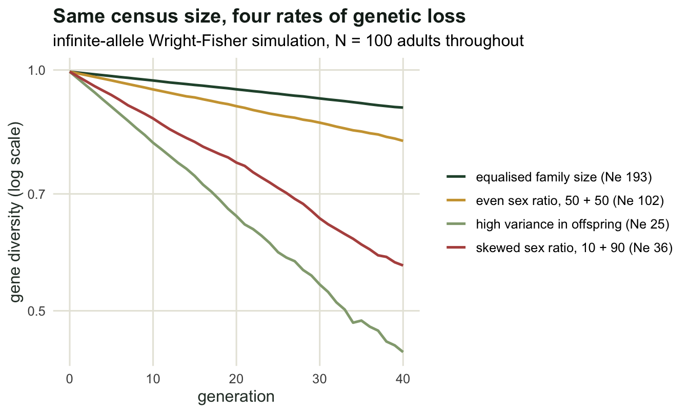
The sex ratio, swept
The sex-ratio formula is worth checking across its whole range, because it is the one most often quoted from memory in management reports. Hold the census at 100 and move the number of breeding males.
sweep_m <- c(2, 5, 10, 25, 50)
sw <- t(sapply(sweep_m, function(m) {
  res <- sim_ne(m, 100 - m, gens = 30, reps = 150, seed = 4630 + m)
  c(males = m, Ne_measured = res$ne_hat,
    Ne_formula = 4 * m * (100 - m) / 100)
}))
print(round(sw, 1))
males Ne_measured Ne_formula
[1,] 2 8.3 7.8
[2,] 5 18.2 19.0
[3,] 10 38.4 36.0
[4,] 25 72.7 75.0
[5,] 50 101.6 100.0With two breeding males out of 100 adults the effective size is 8.3 against a predicted 7.8; with five it is 18.2 against 19.0; at an even ratio it is 101.6 against 100. The formula is harmonic in the two sexes, so the rarer sex dominates: two males in a herd of 100 give the drift of a population of eight. Any management action that concentrates paternity does this whether or not the census changes.
curve_df <- data.frame(males = 2:50)
curve_df$ne <- 4 * curve_df$males * (100 - curve_df$males) / 100

ggplot(curve_df, aes(males, ne)) +
  geom_line(colour = te_pal$sage, linewidth = 1.1) +
  geom_point(data = as.data.frame(sw), aes(males, Ne_measured),
             colour = te_pal$forest, size = 2.6) +
  labs(title = "The rarer sex sets the effective size",
       subtitle = "line: 4 Nm Nf/(Nm + Nf), points: measured from the diversity decay",
       x = "breeding males out of 100 adults", y = "effective size Ne") +
  theme_te()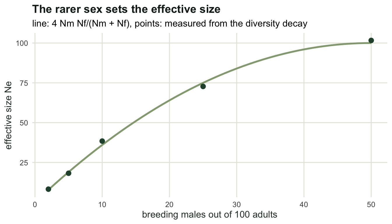
Bad years count more than good ones
Population size is not constant, and the way Ne combines across years is the part that surprises people. Run a population that sits at 1000 for three generations and then crashes to 10, repeatedly.
h_cycle <- function(sizes, gens = 40, reps = 60, seed = 464) {
  set.seed(seed)
  h_mat <- matrix(NA_real_, gens + 1, reps)
  for (r in seq_len(reps)) {
    pop <- matrix(seq_len(2 * sizes[1]), ncol = 2, byrow = TRUE)
    for (g in 0:gens) {
      freq <- table(as.vector(pop))
      h_mat[g + 1, r] <- 1 - sum((freq / (2 * nrow(pop)))^2)
      if (g == gens) break
      n_next <- sizes[(g %% length(sizes)) + 1]
      par1 <- sample(nrow(pop), n_next, replace = TRUE)
      par2 <- sample(nrow(pop), n_next, replace = TRUE)
      pop <- cbind(pop[cbind(par1, sample(1:2, n_next, TRUE))],
                   pop[cbind(par2, sample(1:2, n_next, TRUE))])
    }
  }
  h_bar <- rowMeans(h_mat)
  gen <- 0:gens
  list(h = h_bar,
       ne_hat = 1 / (2 * (1 - exp(coef(lm(log(h_bar) ~ gen))[[2]]))))
}

cycle <- c(1000, 1000, 1000, 10)
cyc <- h_cycle(cycle)
cat("sizes in the cycle:", cycle, "\n")
sizes in the cycle: 1000 1000 1000 10 cat("arithmetic mean:", mean(cycle),
" harmonic mean:", round(length(cycle) / sum(1 / cycle), 2),
" measured Ne:", round(cyc$ne_hat, 1), "\n")arithmetic mean: 752.5 harmonic mean: 38.83 measured Ne: 37 The arithmetic mean of the cycle is 752.5 and the measured effective size is 37, which is the harmonic mean (38.83) rather than anything close to the average census. One generation in four at a size of 10 sets the pace for all four, because the harmonic mean is dominated by its smallest term. A population that spends most of its time large and occasionally collapses is, genetically, a small population.
gen <- 0:40
ref_df <- data.frame(
  generation = rep(gen, 2),
  h = c(cyc$h[1] * (1 - 1 / (2 * mean(cycle)))^gen,
        cyc$h[1] * (1 - 1 / (2 * (length(cycle) / sum(1 / cycle))))^gen),
  which = rep(c("arithmetic mean, 752.5", "harmonic mean, 38.8"),
              each = length(gen)))

ggplot(data.frame(generation = gen, h = cyc$h), aes(generation, h)) +
  geom_line(data = ref_df, aes(generation, h, colour = which),
            linetype = "dashed", linewidth = 0.8) +
  geom_line(colour = te_pal$forest, linewidth = 1) +
  scale_y_log10() +
  scale_colour_manual(values = c(`arithmetic mean, 752.5` = te_pal$gold,
                                 `harmonic mean, 38.8` = te_pal$clay),
                      name = NULL) +
  labs(title = "The crash year sets the rate",
       subtitle = "solid: simulated cycle 1000, 1000, 1000, 10; dashed: constant-size expectations",
       x = "generation", y = "gene diversity (log scale)") +
  theme_te()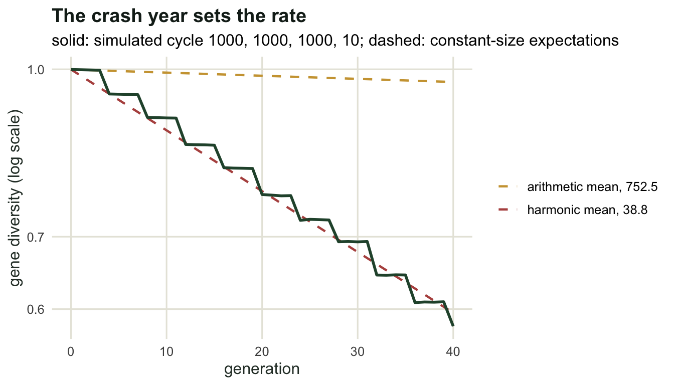
Which Ne, over what window?
Ne is not one quantity. The simulation above measured an inbreeding effective size, the rate at which identity by descent accumulates. A variance effective size, defined from the increase in allele-frequency variance, answers a slightly different question and takes a different value whenever population size is changing. Over a long period both are averages, and the averaging is harmonic, so both are pulled towards the bottlenecks.
That matters for how the number is used. A conservation report that quotes an Ne from a genetic sample is describing recent generations, and how recent depends on the method, which is the subject of the next tutorial. A number quoted from demography (a sex ratio, a variance in reproductive success) describes the current breeding arrangement and predicts the future rather than reporting the past. When the two disagree, they are usually not answering the same question.
The rules of thumb are worth stating with their limits. Ne of 50 is the size at which inbreeding accumulates at roughly one per cent per generation, and Ne of 500 is the size at which mutation can, in theory, replenish quantitative variation as fast as drift removes it. Both are thresholds about processes, not guarantees about populations, and both refer to Ne rather than to the census. With Ne/N ratios in wildlife averaging only about 0.1 once fluctuating size, variance in family size and unequal sex ratio are all counted (Frankham 1995), a census threshold has to be many times larger than the genetic one.
Where to go next
Everything here started from a known demography and derived the genetics. Real projects run the other way: a handful of samples, some markers, and the question of what the effective size is. The next tutorial implements two of those estimators, the temporal method and the linkage-disequilibrium method, and measures how much data each one needs before its answer means anything.
References
Wright S 1931 Genetics 16(2):97-159 (10.1093/genetics/16.2.97)
Crow JF, Kimura M 1970 An Introduction to Population Genetics Theory, Harper and Row; Blackburn Press reprint, ISBN 978-1932846126
Frankham R 1995 Genetical Research 66(2):95-107 (10.1017/S0016672300034455)
Palstra FP, Ruzzante DE 2008 Molecular Ecology 17(15):3428-3447 (10.1111/j.1365-294X.2008.03842.x)