library(ggplot2)

te_pal <- list(forest = "#275139", green = "#2f8f63", sage = "#93a87f",
               clay = "#b5534e", gold = "#cda23f", line = "#dad9ca",
               ink = "#16241d")

theme_te <- function() {
  theme_minimal(base_size = 12) +
    theme(panel.grid.minor = element_blank(),
          panel.grid.major = element_line(colour = "#e7e6dc"),
          plot.background = element_rect(fill = "#f5f4ee", colour = NA),
          panel.background = element_rect(fill = "#f5f4ee", colour = NA),
          plot.title = element_text(face = "bold", colour = te_pal$ink),
          axis.title = element_text(colour = "#2c3a31"))
}Bottlenecks and genetic diversity
R
population genetics
ecology tutorial
ggplot2
Push a simulated population through a bottleneck in R and watch which measures of diversity notice: allelic richness, heterozygosity and the M ratio disagree.
Corrected 14 October 2026: the post put the gap between the predicted and measured heterozygosity loss down to the recovery generations alone, and said that which measure detects a bottleneck first depends on the panel size because gene diversity is estimated precisely over many loci; it now says that the gap comes from mutation, during the crash as well as after it, that heterozygosity shifts further because it varies less between replicate paths relative to its mean, and that a smaller panel widens both standard deviations alike.
Corrected 1 October 2026: the post said that five generations are too few to erode the allele size range and that the M ratio was designed for long bottlenecks, and that the heterozygosity-excess and M-ratio tests use one relationship that fades within a few dozen generations; it now says that the M ratio fell during the crash and was largely restored by mutation during the recovery, that the two tests compare allele number with different quantities, and that how long their signal lasts depends on what follows the crash.
A population that spends five generations at ten individuals and then recovers carries a genetic record of those five generations for a long time. Which record, exactly, depends on what you measure. Allelic richness, heterozygosity and the ratio of allele number to allele size range respond at different speeds and to different features of the crash, and a monitoring programme that tracks only one of them can miss a bottleneck or misdate it.
This tutorial builds a stepwise-mutation population, sends replicate copies through bottlenecks of different depths, and measures all three.
A population with alleles worth losing
Microsatellite-style markers mutate by adding or removing a repeat unit, so alleles are integers and the mutation model is a random walk. The simulation below tracks allele sizes for every gene copy at 60 loci in 300 diploids, with the mutation rate set so that the scaled diversity theta = 4Nu is 10, which is the range typical of real microsatellite panels.
step_gen <- function(pop, n_next, u) {
  n_now <- nrow(pop) / 2
  n_loci <- ncol(pop)
  pick <- function(par) {
    rows <- 2 * par - 1 + matrix(sample(0:1, n_next * n_loci, replace = TRUE),
                                 n_next, n_loci)
    matrix(pop[cbind(as.vector(rows), rep(seq_len(n_loci), each = n_next))],
           n_next, n_loci)
  }
  h1 <- pick(sample(n_now, n_next, replace = TRUE))
  h2 <- pick(sample(n_now, n_next, replace = TRUE))
  out <- matrix(0L, 2 * n_next, n_loci)
  out[seq(1, 2 * n_next, by = 2), ] <- h1
  out[seq(2, 2 * n_next, by = 2), ] <- h2
  mut <- runif(length(out)) < u
  out[mut] <- out[mut] + sample(c(-1L, 1L), sum(mut), replace = TRUE)
  out
}

stats_pop <- function(pop) {
  k <- apply(pop, 2, function(col) length(unique(col)))
  spread <- apply(pop, 2, function(col) diff(range(col)) + 1)
  het <- apply(pop, 2, function(col) 1 - sum((table(col) / length(col))^2))
  c(richness = mean(k), spread = mean(spread), m_ratio = mean(k / spread),
    het = mean(het))
}

set.seed(467)
n_anc <- 300
n_loci <- 60
theta <- 10
u <- theta / (4 * n_anc)
pop <- matrix(as.integer(round(rnorm(2 * n_anc * n_loci, 0, sqrt(theta / 2)))),
              nrow = 2 * n_anc)
for (g in seq_len(150)) pop <- step_gen(pop, n_anc, u)
print(round(stats_pop(pop), 4))
richness spread m_ratio het
9.8333 10.1000 0.9740 0.8013 The ancestral population carries 9.83 alleles per locus spread over 10.1 repeat units, so the ratio of allele number to size range is 0.974, and gene diversity is 0.8013. That is the reference state. Every scenario below starts from this same population, which is why the comparisons are between paths rather than between independent simulations.
The bottleneck itself
Five generations at ten individuals, then ten generations back at 300. The control path stays at 300 for all fifteen generations, so the difference between them is the bottleneck and nothing else. Forty replicate paths of each.
run_path <- function(pop, sizes, u) {
  for (n_next in sizes) pop <- step_gen(pop, n_next, u)
  pop
}

reps <- 40
bott_sizes <- c(rep(10, 5), rep(300, 10))
ctrl_sizes <- rep(300, 15)

set.seed(468)
bott <- t(replicate(reps, stats_pop(run_path(pop, bott_sizes, u))))
ctrl <- t(replicate(reps, stats_pop(run_path(pop, ctrl_sizes, u))))

summ <- function(x, nm) {
  data.frame(path = nm, richness = round(mean(x[, "richness"]), 3),
             m_ratio = round(mean(x[, "m_ratio"]), 4),
             het = round(mean(x[, "het"]), 4))
}
print(rbind(summ(ctrl, "no bottleneck"), summ(bott, "bottleneck to 10")),
      row.names = FALSE)
path richness m_ratio het
no bottleneck 9.698 0.9694 0.7996
bottleneck to 10 7.270 0.9346 0.6633cat("relative loss against the control: richness",
round(1 - mean(bott[, "richness"]) / mean(ctrl[, "richness"]), 4),
" M ratio", round(1 - mean(bott[, "m_ratio"]) / mean(ctrl[, "m_ratio"]), 4),
" heterozygosity",
round(1 - mean(bott[, "het"]) / mean(ctrl[, "het"]), 4), "\n")relative loss against the control: richness 0.2504 M ratio 0.0359 heterozygosity 0.1705 cat("expected heterozygosity loss from 5 generations at N = 10:",
round(1 - (1 - 1 / (2 * 10))^5, 4), "\n")expected heterozygosity loss from 5 generations at N = 10: 0.2262 Allelic richness falls by 25.0 per cent, heterozygosity by 17.1 per cent, and the M ratio by only 3.6 per cent. The ordering of the first two is the classic result and the reason allelic measures are recommended for detecting recent bottlenecks: richness counts alleles, most alleles are rare, and rare alleles are the ones a small sample of parents fails to pass on. Heterozygosity weights alleles by frequency, so losing a rare allele barely moves it.
The heterozygosity number also has a prediction attached. Five generations at ten individuals should cost 1 - (1 - 1/(2N))^5 of the gene diversity, which is 22.6 per cent, and the measurement is 17.1 per cent. The gap is mutation, which that formula leaves out: at a mutation rate this high, new mutations restore some diversity even during the five generations at ten individuals, and the large population that follows goes on rebuilding it, so part of the loss is already repaid by the time anybody samples.
set.seed(471)
track <- function(pop, sizes, u) {
  out <- rbind(stats_pop(pop))
  for (n_next in sizes) {
    pop <- step_gen(pop, n_next, u)
    out <- rbind(out, stats_pop(pop))
  }
  as.data.frame(out)
}
traj_b <- track(pop, bott_sizes, u)
traj_c <- track(pop, ctrl_sizes, u)
print(round(traj_b[c(1, 3, 6, 11, 16), c("richness", "m_ratio", "het")], 4))
richness m_ratio het
1 9.8333 0.9740 0.8013
3 5.3833 0.7634 0.7110
6 4.3167 0.7004 0.6309
11 7.0833 0.9084 0.6487
16 7.5333 0.9286 0.6593Generation by generation the picture is sharper than the endpoint comparison suggests. Richness falls from 9.8333 to 5.3833 within two generations and bottoms at 4.3167 at the end of the bottleneck, because 10 diploids can carry at most 20 copies at a locus. Five generations after the bottleneck ends it has climbed back to 7.0833, and by generation 15 to 7.5333, all of that from new mutation rather than recovery of anything lost. Gene diversity goes 0.8013, then 0.6309 at the bottom, then 0.6487 and 0.6593: it loses less and regains less. The M ratio is the most striking: 0.9740 before, 0.7004 at the bottom, and 0.9286 by generation 15. Measured during the crash it is unmistakable; measured ten generations after the population recovers it is nearly gone.
mk <- function(df, nm) {
  data.frame(generation = 0:(nrow(df) - 1),
             richness = df$richness / df$richness[1],
             het = df$het / df$het[1], path = nm)
}
traj_df <- rbind(mk(traj_b, "bottleneck"), mk(traj_c, "control"))
long_df <- rbind(
  data.frame(traj_df[c("generation", "path")], value = traj_df$richness,
             measure = "allelic richness"),
  data.frame(traj_df[c("generation", "path")], value = traj_df$het,
             measure = "gene diversity"))

ggplot(long_df, aes(generation, value, colour = measure, linetype = path)) +
  annotate("rect", xmin = 0, xmax = 5, ymin = -Inf, ymax = Inf,
           fill = te_pal$sage, alpha = 0.18) +
  geom_line(linewidth = 0.9) +
  scale_colour_manual(values = c(`allelic richness` = te_pal$clay,
                                 `gene diversity` = te_pal$forest),
                      name = NULL) +
  scale_linetype_manual(values = c(bottleneck = "solid", control = "dashed"),
                        name = NULL) +
  labs(title = "A deep crash and a partial, mutation-fed recovery",
       subtitle = "shaded: five generations at N = 10, then ten generations back at N = 300",
       x = "generation", y = "value relative to the start") +
  theme_te()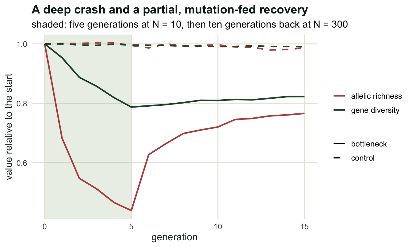
Which alleles actually went
Averages hide the mechanism, so count alleles by frequency class before and after.
spectrum_pop <- function(pop) {
  cls <- c(0, 0.01, 0.05, 0.10, 1)
  out <- sapply(seq_len(ncol(pop)), function(j) {
    fr <- table(pop[, j]) / nrow(pop)
    table(cut(fr, cls, include.lowest = TRUE))
  })
  rowMeans(out)
}

set.seed(470)
pop_ctrl <- run_path(pop, ctrl_sizes, u)
pop_bott <- run_path(pop, bott_sizes, u)
spec <- rbind(control = spectrum_pop(pop_ctrl),
              bottleneck = spectrum_pop(pop_bott))
print(round(spec, 3))
[0,0.01] (0.01,0.05] (0.05,0.1] (0.1,1]
control 1.367 2.467 2.1 3.800
bottleneck 1.800 1.667 0.8 2.967cat("proportional loss by class:\n")proportional loss by class:print(round(1 - spec["bottleneck", ] / spec["control", ], 3)) [0,0.01] (0.01,0.05] (0.05,0.1] (0.1,1]
-0.317 0.324 0.619 0.219 The damage is heaviest in the middle of the spectrum. Alleles between five and ten per cent frequency drop from 2.1 per locus to 0.8, a loss of 62 per cent, and the one to five per cent class from 2.467 to 1.667. Even the commonest class, above ten per cent, gives up 22 per cent of its alleles (3.8 against 2.967): common alleles are the hardest to lose, not the ones a bottleneck spares. The rarest class actually rises, from 1.367 to 1.8, because ten generations at 300 individuals with this mutation rate produce fresh singletons. So a bottlenecked population is not simply a smaller version of the original: it has lost its intermediate-frequency alleles and is refilling the bottom of the spectrum with new mutations.
spec_df <- data.frame(
  class = rep(colnames(spec), 2),
  alleles = c(spec["control", ], spec["bottleneck", ]),
  path = rep(c("control", "bottleneck"), each = ncol(spec)))
spec_df$class <- factor(spec_df$class, levels = colnames(spec))

ggplot(spec_df, aes(class, alleles, fill = path)) +
  geom_col(position = position_dodge(width = 0.75), width = 0.65,
           colour = "white") +
  scale_fill_manual(values = c(control = te_pal$sage,
                               bottleneck = te_pal$clay), name = NULL) +
  labs(title = "The middle of the frequency spectrum is what disappears",
       subtitle = "alleles per locus by frequency class, 60 loci",
       x = "allele frequency class", y = "alleles per locus") +
  theme_te()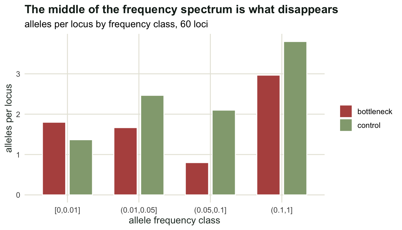
How deep does a bottleneck have to be?
The three measures also differ in how sharply they respond to depth. Repeat the five-generation bottleneck at four sizes.
set.seed(469)
sweep_b <- c(5, 10, 25, 50)
sw <- t(sapply(sweep_b, function(nb) {
  b <- t(replicate(25, stats_pop(run_path(pop, c(rep(nb, 5), rep(300, 10)),
                                          u))))
  c(bottleneck_N = nb, richness = mean(b[, "richness"]),
    m_ratio = mean(b[, "m_ratio"]), het = mean(b[, "het"]))
}))
print(round(sw, 4))
bottleneck_N richness m_ratio het
[1,] 5 6.0740 0.9354 0.5510
[2,] 10 7.3200 0.9327 0.6664
[3,] 25 8.5247 0.9505 0.7469
[4,] 50 9.0093 0.9563 0.7720z_shift <- function(stat) {
(mean(ctrl[, stat]) - mean(bott[, stat])) / sd(ctrl[, stat])
}
cat("shift in control standard deviations: richness",
round(z_shift("richness"), 1), " M ratio", round(z_shift("m_ratio"), 1),
" heterozygosity", round(z_shift("het"), 1), "\n")shift in control standard deviations: richness 22.3 M ratio 6.6 heterozygosity 39.6 cat("control standard deviation: richness",
round(sd(ctrl[, "richness"]), 4),
" M ratio", round(sd(ctrl[, "m_ratio"]), 4),
" heterozygosity", round(sd(ctrl[, "het"]), 4), "\n")control standard deviation: richness 0.1088 M ratio 0.0053 heterozygosity 0.0034 A bottleneck to 50 costs 0.7 alleles per locus and 0.03 of gene diversity: real, and easy to miss with a small marker panel. A bottleneck to five costs 3.6 alleles and 0.25 of diversity. The M ratio moves least across the whole range (0.9327 to 0.9563 against a control 0.9694, and on this run not even monotonic in depth), which is the honest limit of that statistic in this simulation: it did fall during the crash, as the trajectory above shows, but at this mutation rate ten generations back at full size refill most of the gaps in the allele size range, so by the time of sampling most of its signal is gone.
The last two lines correct a folk claim worth stating carefully. Measured in units of the control variation, the heterozygosity shift is the largest of the three (39.6 standard deviations against 22.3 for richness), because gene diversity varies much less from one replicate path to the next, relative to its mean, than allelic richness does: its control standard deviation is 0.0034 while richness carries 0.1088. So allelic richness loses a bigger fraction, and heterozygosity is measured more sharply. Both are means over the same loci, so a smaller marker panel widens both standard deviations by about the same factor and leaves that ordering unchanged; the simulation counts every gene copy rather than a sample of individuals, and the sensible answer is to report both.
What this does and does not license
Three limits belong with any bottleneck analysis.
A single sample cannot separate a recent bottleneck from a long history of small size. Both leave low diversity; only the relationship between allele number and heterozygosity or allele size range, or a second sample from the past, distinguishes them. The heterozygosity-excess test uses the first of those relationships and the M-ratio test the second, and how long either signal lasts depends on what follows the crash: in the simulation above, with a large recovered population and a high mutation rate, the M ratio regains most of its loss within ten generations, while Garza and Williamson report that their test can detect a reduction for far longer in the scenarios they examined.
Recovery of census size is not recovery of diversity. In the simulation the population is back at 300 within ten generations and its diversity is not, because the only source of new alleles is mutation. On the timescales conservation cares about, alleles lost in a bottleneck are lost, and the only fast route back is immigration.
Diversity is not fitness. The simulated loci are neutral markers and say nothing directly about inbreeding depression, adaptive potential or population growth. They measure how much drift the population has experienced, which is a useful proxy precisely because it is a proxy.
Where to go next
The cluster now has an effective size, two ways to estimate it, and a demonstration of what a crash does to the markers. The last tutorial turns all of this into checks: which Ne an estimate refers to, over what window, what migration does to it, and how a fluctuating history quietly breaks the assumptions the estimators are built on.
References
Nei M, Maruyama T, Chakraborty R 1975 Evolution 29(1):1-10 (10.1111/j.1558-5646.1975.tb00807.x)
Cornuet JM, Luikart G 1996 Genetics 144(4):2001-2014 (10.1093/genetics/144.4.2001)
Garza JC, Williamson EG 2001 Molecular Ecology 10(2):305-318 (10.1046/j.1365-294X.2001.01190.x)
Allendorf FW 1986 Zoo Biology 5(2):181-190 (10.1002/zoo.1430050212)