---
title: "Checking a social network analysis"
description: "Three checks for an animal social network in R: the effort confound on centrality, the power to detect real structure, and the group definition it rests on."
date: "2026-06-19 14:00"
categories: [R, social networks, model checking, animal behaviour, ecology tutorial]
image: thumbnail.png
image-alt: "A curve of mean association strength against the time gap used to define a group, rising steeply as the threshold widens until it saturates at one."
date-modified: "2026-10-14"
---
*Corrected 14 October 2026: the caption of the power figure set a threshold of roughly a quarter power below which a non-significant result says more about sampling than about the society, a threshold nothing in the post supports; it now drops that threshold and points to the figure's line of conventional adequate power, which the curve stays below throughout.*
*Corrected 1 October 2026: the power check rested on fifty simulated studies per sample size and said that at the smallest sample the test detected real structure no more often than it would reject a society with no structure, and that power reached about three quarters at the largest; it now runs more simulations and the same test on a society with no structure, which puts power at the smallest sample low but above that false positive rate, and lower than before at the largest.*
*Corrected 30 September 2026: the power check described the detection rate at the smallest sample as never; it now says that rate is no better than the false positive rate of the test.*
*Corrected 27 September 2026: the figure text said the association curve rises steadily with no flat region; it now says the curve saturates at one from a gap of about 1.8, where every pair is always together.*
The network is built, the permutation test has run, the centrality scores are ranked. Before any of it goes in a paper, three checks. Each one targets a way an animal social network analysis can look right and be wrong: a ranking that reflects sampling rather than sociality, a null result that reflects too little data rather than no structure, and a network that reflects an arbitrary choice about what counts as a group. This post closes the social-networks cluster by turning those three risks into a short routine.
```{r}
#| label: setup
#| code-fold: true
#| code-summary: "Setup: packages, colours and plot theme"
#| results: hide
#| message: false
#| warning: false
library(ggplot2)
theme_set(theme_minimal(base_size = 12) +
  theme(plot.background = element_rect(fill = "#f5f4ee", colour = NA),
        panel.background = element_rect(fill = "#f5f4ee", colour = NA),
        panel.grid.minor = element_blank()))
knitr::opts_chunk$set(dev.args = list(bg = "#f5f4ee"))
```
```{r}
#| label: machinery
sri_from_gbi <- function(gbi) {
  co <- crossprod(gbi); n <- diag(co)
  a <- co / (outer(n, n, "+") - co); diag(a) <- 0; a
}
node_degree   <- function(a) rowSums(a > 0)
node_strength <- function(a) rowSums(a)
eigen_cent    <- function(a) { e <- eigen(a, symmetric = TRUE); v <- abs(e$vectors[, 1]); v / max(v) }
swap_data_stream <- function(gbi, n_swaps) {
  nr <- nrow(gbi); nc <- ncol(gbi); done <- 0L
  while (done < n_swaps) {
    batch <- (n_swaps - done) * 30L
    r1 <- sample.int(nr, batch, TRUE); r2 <- sample.int(nr, batch, TRUE)
    c1 <- sample.int(nc, batch, TRUE); c2 <- sample.int(nc, batch, TRUE)
    for (k in seq_len(batch)) {
      i1 <- r1[k]; i2 <- r2[k]; j1 <- c1[k]; j2 <- c2[k]
      if (i1 == i2 || j1 == j2) next
      if (gbi[i1,j1] && gbi[i2,j2] && !gbi[i1,j2] && !gbi[i2,j1]) {
        gbi[i1,j1] <- 0L; gbi[i2,j2] <- 0L; gbi[i1,j2] <- 1L; gbi[i2,j1] <- 1L; done <- done + 1L
      } else if (gbi[i1,j2] && gbi[i2,j1] && !gbi[i1,j1] && !gbi[i2,j2]) {
        gbi[i1,j2] <- 0L; gbi[i2,j1] <- 0L; gbi[i1,j1] <- 1L; gbi[i2,j2] <- 1L; done <- done + 1L
      }
      if (done == n_swaps) break
    }
  }
  gbi
}
```
## Check one: is centrality just sighting effort?
The centrality post showed that raw metrics climb with how often an individual was seen. The check is one line per metric: correlate it with the sighting count. Build a population where effort varies a lot and see how bad it can get.
```{r}
#| label: check-a
set.seed(11)
n_ind <- 24; n_grp <- 60
community <- rep(1:3, each = 8)
effort <- runif(n_ind, 0.5, 3)
gbi <- matrix(0L, n_grp, n_ind)
for (k in 1:n_grp) {
  base <- ifelse(community == sample(1:3, 1), 0.55, 0.06) * (effort / mean(effort))
  gbi[k, ] <- rbinom(n_ind, 1, pmin(base, 0.95))
}
gbi <- gbi[rowSums(gbi) > 0, ]; count <- colSums(gbi)
net <- sri_from_gbi(gbi); str <- node_strength(net)

c(cor_degree_count   = round(cor(node_degree(net), count), 3),
  cor_strength_count = round(cor(str, count), 3),
  cor_eigen_count    = round(cor(eigen_cent(net), count), 3))
```
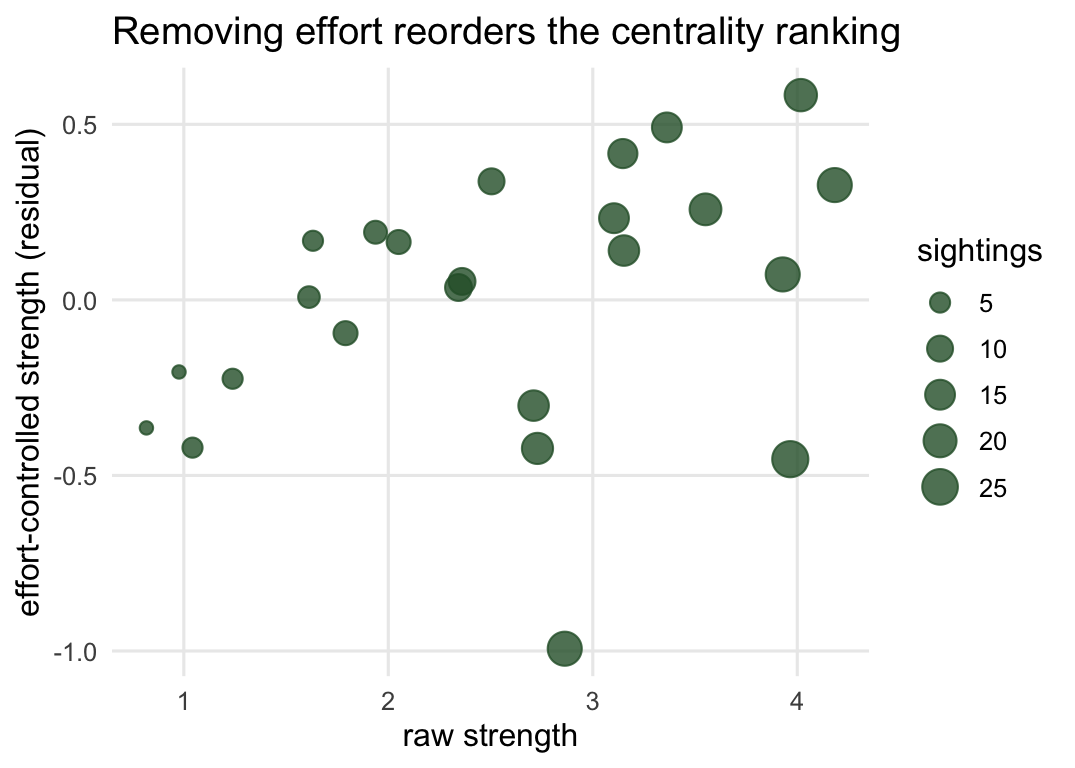
All three metrics correlate with sighting count above 0.8, strength above 0.9. On this dataset a centrality ranking is very nearly a ranking of who the observer recorded most. The fix from the centrality post: take the residual of the metric after regressing on sighting count, and rank on that instead. It changes the answer.
```{r}
#| label: check-a-fix
res_str <- residuals(lm(str ~ count))
c(raw_top_individual = which.max(str),
  effort_controlled_top_individual = unname(which.max(res_str)))
```
The most central animal by raw strength and the most central after removing the effort component are two different individuals. If your headline is "individual thirteen is the social hub", this check decides whether that is biology or bookkeeping.
```{r}
#| label: fig-check-a
#| fig-cap: "Effort-controlled strength against raw strength, each point an individual, sized by sighting count. Points that sit low despite high raw strength are individuals whose ranking drops once effort is removed."
#| fig-alt: "A scatter plot with raw network strength on the x axis and effort-controlled strength on the y axis. Points do not lie on a single line; several well-sighted individuals sit lower than their raw strength would suggest, showing that controlling for sighting effort reorders the ranking."
#| fig-width: 5.6
#| fig-height: 4
dfa <- data.frame(raw = str, controlled = res_str, count = count)
ggplot(dfa, aes(raw, controlled, size = count)) +
  geom_point(colour = "#2b5d34", alpha = 0.8) +
  scale_size_continuous(name = "sightings", range = c(2, 6)) +
  labs(title = "Removing effort reorders the centrality ranking",
       x = "raw strength", y = "effort-controlled strength (residual)")
```
## Check two: could you even detect real structure?
A non-significant test for preferred associations is easy to over-read. It can mean the society is well mixed, or it can mean you did not watch long enough to see the structure that is there. Those are opposite conclusions from the same p-value, and only power tells them apart.
Simulate it. Fix a genuinely structured society (two communities that prefer their own), then vary how many groups you observe, and measure how often the coefficient-of-variation test actually detects the structure. Then run the same test, at twenty groups, on a society with no structure at all, to see how often it rejects by chance.
```{r}
#| label: check-b
cv_stat <- function(a) { v <- a[upper.tri(a)]; sd(v) / mean(v) }
sim_power <- function(n_grp, pref = 0.75, n_ind = 16, n_perm = 120, n_rep = 400) {
  community <- rep(1:2, length.out = n_ind); rej <- logical(n_rep)
  for (r in 1:n_rep) {
    gbi <- matrix(0L, n_grp, n_ind)
    for (k in 1:n_grp) {
      base <- ifelse(community == sample(1:2, 1), pref, 1 - pref) * 0.4
      gbi[k, ] <- rbinom(n_ind, 1, base)
    }
    gbi <- gbi[rowSums(gbi) > 0, ]; gbi <- gbi[, colSums(gbi) > 0]
    if (ncol(gbi) < 6 || nrow(gbi) < 6) { rej[r] <- NA; next }
    obs <- cv_stat(sri_from_gbi(gbi)); g <- gbi; nd <- numeric(n_perm)
    for (b in 1:n_perm) { g <- swap_data_stream(g, 40); nd[b] <- cv_stat(sri_from_gbi(g)) }
    rej[r] <- obs > quantile(nd, 0.95, na.rm = TRUE)
  }
  mean(rej, na.rm = TRUE)
}

set.seed(303)
power <- c(`20 groups` = sim_power(20),
           `45 groups` = sim_power(45),
           `90 groups` = sim_power(90))
round(power, 2)
fpr20 <- sim_power(20, pref = 0.5)   # same test, a society with no preferred associations
round(fpr20, 2)
```
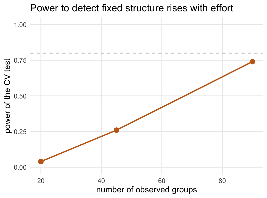
The true structure is identical in all three; only the amount of watching changes. At twenty groups the test detects it in `r sprintf("%.0f", 100 * power[[1]])` per cent of simulated studies, against `r sprintf("%.0f", 100 * fpr20)` per cent for a society with no structure at all: a null result here says very little about whether the society is structured. By ninety groups power has climbed to `r sprintf("%.0f", 100 * power[[3]])` per cent. The lesson for a real study is blunt. If your preferred-association test comes back non-significant, report the power to detect the effect size you care about before you claim the society is well mixed, or the claim is empty.
```{r}
#| label: fig-check-b
#| fig-cap: "Power of the coefficient-of-variation test to detect the same fixed structure, as the number of observed groups rises. The dashed line marks conventional adequate power, and the curve stays below it throughout; the lower the power, the more a non-significant result says about sampling rather than about the society."
#| fig-alt: "A line plot with the number of observed groups (twenty, forty-five, ninety) on the x axis and statistical power on the y axis from zero to one. The line rises from low power at twenty groups to its highest value at ninety groups, still below a dashed horizontal reference line that marks conventional adequate power."
#| fig-width: 5.4
#| fig-height: 4
dfb <- data.frame(groups = c(20, 45, 90), power = as.numeric(power))
ggplot(dfb, aes(groups, power)) +
  geom_hline(yintercept = 0.8, linetype = "dashed", colour = "grey60") +
  geom_line(colour = "#c46a1b", linewidth = 0.9) +
  geom_point(colour = "#c46a1b", size = 3) +
  ylim(0, 1) +
  labs(title = "Power to detect fixed structure rises with effort",
       x = "number of observed groups", y = "power of the CV test")
```
## Check three: is the group real?
The whole network rests on the gambit of the group, and the gambit needs a group. In the field a "group" is usually built from a rule: individuals seen within some time window, or some distance, belong together. That rule is a choice, and the network changes when you change it. This is the assumption to stress-test, because there is no threshold the animals hand you.
Take a stream of timestamped sightings and define a group by a gap: start a new group whenever the time to the next sighting exceeds the threshold. Then sweep the threshold.
```{r}
#| label: check-c
set.seed(9)
n_ind <- 15; n_sight <- 240
times <- sort(runif(n_sight, 0, 100))
grp_of <- rep(1:2, length.out = n_ind); ids <- integer(n_sight)
for (s in 1:n_sight) {
  phase <- (sin(times[s] / 6) > 0) + 1L
  ids[s] <- sample(n_ind, 1, prob = ifelse(grp_of == phase, 3, 1))
}
build_gbi <- function(gap) {
  grp <- c(0, cumsum(diff(times) > gap)) + 1
  m <- matrix(0L, max(grp), n_ind); for (s in 1:n_sight) m[grp[s], ids[s]] <- 1L
  m[rowSums(m) > 0, , drop = FALSE]
}
summarise_gap <- function(gap) {
  a <- sri_from_gbi(build_gbi(gap))
  c(gap = gap, groups = nrow(build_gbi(gap)),
    mean_sri = mean(a[upper.tri(a)]),
    top = which.max(node_strength(a)))
}
t(sapply(c(0.4, 1.2), summarise_gap))
```
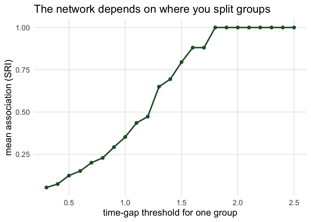
The same sightings give either 104 tight groups or 13 loose ones, and the mean association jumps from about 0.07 to 0.47 depending only on where you drew the line. The most central individual is not even the same animal (number nine under the tight rule, number fifteen under the loose one). A sweep across thresholds shows there is no plateau to hide behind: apart from a one-step pause, the curve only levels off at the top, where the window is so wide that every pair is always together.
```{r}
#| label: fig-check-c
#| fig-cap: "Mean association strength against the time gap that defines a group. It climbs with the gap until it saturates at one: a wider window lumps more individuals together and inflates every edge, with no natural threshold to settle on short of the point where every pair is always together."
#| fig-alt: "A line plot with the time-gap threshold on the x axis and mean association strength on the y axis. The curve rises from low mean association at small gaps, with only a brief pause between 1.6 and 1.7, until about 1.8, where every pair of individuals is always seen together and the mean association saturates at one for all wider gaps. The grouping threshold strongly changes the network over the whole range before saturation."
#| fig-width: 5.6
#| fig-height: 4
gaps <- seq(0.3, 2.5, by = 0.1)
sweep <- data.frame(gap = gaps,
  mean_sri = sapply(gaps, function(gp) { a <- sri_from_gbi(build_gbi(gp)); mean(a[upper.tri(a)]) }))
ggplot(sweep, aes(gap, mean_sri)) +
  geom_line(colour = "#2b5d34", linewidth = 0.9) +
  geom_point(colour = "#2b5d34", size = 1.6) +
  labs(title = "The network depends on where you split groups",
       x = "time-gap threshold for one group", y = "mean association (SRI)")
```
## The routine, and its limit
Three checks, three lines of defence. Correlate every centrality metric with sighting effort and control for it if the correlation is high. Report the power to detect the structure you care about before reading anything into a non-significant test. Sweep the group-definition rule and show your conclusions survive it. None of these is optional, and none is hard; they are the difference between a social network that describes the animals and one that describes your field season.
The limit is honest and worth stating plainly. Even with all three checks passed, the network is a model of association built on the gambit of the group, and association is not the same as a social bond. Co-membership in a group is what you measured; friendship, kinship, dominance, information flow are what you would like to infer, and the gap between them is not something the statistics can close. The checks make the network trustworthy as a description of who was seen with whom. Turning that into biology is the work that comes after, and it needs the animals, not just the matrix.
## Where to go next
This closes the cluster. The association-index post is where the edge weights come from, the permutation post is where the data-stream null that underlies check two comes from, and the centrality post is where the effort confound was first pinned down. The bipartite checking post handles the parallel diagnostics for plant-pollinator and other interaction networks.
## References
Whitehead H 2008 Analyzing Animal Societies: Quantitative Methods for Vertebrate Social Analysis. University of Chicago Press. ISBN 978-0226895215
Farine DR, Whitehead H 2015 Journal of Animal Ecology 84(5):1144-1163 (10.1111/1365-2656.12418)
Farine DR 2017 Methods in Ecology and Evolution 8(10):1309-1320 (10.1111/2041-210X.12772)
## Related tutorials
- [Association indices for social networks](../association-indices-social-networks/)
- [Permutation tests for social networks](../permutation-tests-social-networks/)
- [Network centrality and sampling effort](../network-centrality-sampling-effort/)
- [Checking a network analysis](../checking-a-network-analysis/)