library(ggplot2)
library(grid)

te_pal <- list(forest = "#275139", green = "#2f8f63", sage = "#93a87f",
               clay = "#b5534e", gold = "#cda23f", line = "#dad9ca",
               ink = "#16241d", paper = "#f5f4ee")

theme_te <- function() {
  theme_minimal(base_size = 12) +
    theme(panel.grid.minor = element_blank(),
          panel.grid.major = element_line(colour = "#e7e6dc"),
          plot.background = element_rect(fill = "#f5f4ee", colour = NA),
          panel.background = element_rect(fill = "#f5f4ee", colour = NA),
          plot.title = element_text(face = "bold", colour = te_pal$ink),
          axis.title = element_text(colour = "#2c3a31"))
}Checking a reintroduction analysis
R
conservation
reintroduction
PVA
model diagnostics
ecology tutorial
ggplot2
Four checks on a stage structured population viability projection in R: the horizon, the variance budget, correlated vital rates and density dependence.
The three earlier posts in this cluster each end with a number that goes into a plan. Reintroduction release strategies returns a release schedule: how many animals, of which stage, in how many years. SLOSS and reserve configuration returns a reserve design. Restoration trajectories and recovery returns a recovery time. All three rest on a projection of a small population forward through time, and all three inherit whatever that projection is worth.
This post tries to break them. The object under test is a stage structured population viability projection for a reintroduced population, built by hand so that the truth is known: three stages, binomial survival, Poisson recruitment, and a shared annual environmental deviate. Four checks follow, each a self contained measurement. How much of the hundred year answer comes from the data and how much from the structure of the model. Which of the three uncertainty sources actually dominates the projected outcome, and which ones the software propagates. What a correlation between survival and fecundity is worth, and whether it can be measured. And what the density dependence assumption costs, set against the power of a short time series to choose between the candidate forms.
Almost nothing here is taken from a rule of thumb. Every null distribution, every critical value and every error term used later is measured first in the same simulator, because a number in a guidance document is not a measurement of your population. What stays conventional is stated where it is used: the 0.2 half width the correlation interval is asked to reach, and the one half viability cut the closing check reads its projections against. The last section is the one that matters most: all four checks interrogate the projection, and none of them asks whether the site the animals were released into is still the site that was assessed.
The projection under test
Three stages: juveniles in their first year, subadults, and breeding adults. Each year every juvenile survives to subadult with probability \(s_J\), every subadult becomes an adult with probability \(s_S\), every adult survives with probability \(s_A\), and every adult produces a Poisson number of juveniles with mean \(f\). Survival draws are binomial and recruitment draws are Poisson, which is demographic stochasticity done properly rather than added as noise afterwards. A single standard normal deviate per population per year shifts all three survival probabilities on the logit scale, and a second deviate shifts fecundity on the log scale; that is the environmental term. A population is counted as extinct the first year it falls below two individuals, and the state is absorbing.
Replicates are projected as a vector rather than in a loop. Every replicate holds its own count of each stage, and one call to rbinom with a vector of sizes and a vector of probabilities advances all of them at once, which is what keeps a hundred thousand replicate centuries inside a few seconds.
project <- function(n0, nrep, nyear, pars, sig_s, sig_f, rho = 0,
                    demo = TRUE, env = TRUE, dd = "none", kcap = Inf,
                    beta = 0, trend = 0, t_off = 0, qe = 2, keep_hist = FALSE) {
  qJ <- qlogis(rep_len(pars$sJ, nrep)); qS <- qlogis(rep_len(pars$sS, nrep))
  qA <- qlogis(rep_len(pars$sA, nrep)); lf <- log(rep_len(pars$f, nrep))
  nJ <- rep_len(as.numeric(n0[1]), nrep)
  nS <- rep_len(as.numeric(n0[2]), nrep)
  nA <- rep_len(as.numeric(n0[3]), nrep)
  ext <- rep(Inf, nrep)
  hist <- if (keep_hist) matrix(0, nrep, nyear + 1) else NULL
  if (keep_hist) hist[, 1] <- nJ + nS + nA
  for (t in seq_len(nyear)) {
    if (env) {
      zs <- rnorm(nrep)
      zf <- rho * zs + sqrt(1 - rho^2) * rnorm(nrep)
    } else { zs <- 0; zf <- 0 }
    dec <- trend * (t - 1 + t_off)
    dfac <- if (dd == "ricker") exp(-beta * (nJ + nS + nA)) else 1
    pJ <- plogis(qJ + sig_s * zs - dec)
    pS <- plogis(qS + sig_s * zs - dec)
    pA <- plogis(qA + sig_s * zs - dec)
    ft <- exp(lf + sig_f * zf - sig_f^2 / 2 - dec) * dfac
    if (demo) {
      newJ <- rpois(nrep, nA * ft)
      newS <- rbinom(nrep, nJ, pJ)
      newA <- rbinom(nrep, nS, pS) + rbinom(nrep, nA, pA)
    } else {
      newJ <- nA * ft; newS <- nJ * pJ; newA <- nS * pS + nA * pA
    }
    nJ <- newJ; nS <- newS; nA <- newA
    if (dd == "ceiling") {
      tt <- nJ + nS + nA
      rr <- ifelse(tt > kcap, kcap / pmax(tt, 1e-9), 1)
      if (demo) {
        nJ <- rbinom(nrep, nJ, rr); nS <- rbinom(nrep, nS, rr)
        nA <- rbinom(nrep, nA, rr)
      } else { nJ <- nJ * rr; nS <- nS * rr; nA <- nA * rr }
    }
    gone <- (nJ + nS + nA) < qe
    ext[gone & !is.finite(ext)] <- t
    nJ[gone] <- 0; nS[gone] <- 0; nA[gone] <- 0
    if (keep_hist) hist[, t + 1] <- nJ + nS + nA
  }
  list(ext = ext, final = nJ + nS + nA, stage = cbind(nJ, nS, nA), hist = hist)
}

lam_of <- function(p) {
  mm <- matrix(c(0, 0, p$f, p$sJ, 0, 0, 0, p$sS, p$sA), nrow = 3, byrow = TRUE)
  max(Re(eigen(mm)$values))
}
The vital rates below describe a slow breeding vertebrate with high adult survival, and they were chosen so that the deterministic growth rate sits a little above one while the stochastic growth rate sits closer to it. That is the interesting regime, and it is where most reintroductions live. The release is twelve animals, four subadults and eight adults, which is a typical first cohort.
Parameter uncertainty is generated the way it arises in the field. A monitoring programme follows a fixed number of marked animals in each stage every year; survival is a binomial count against that denominator and fecundity is a Poisson count of offspring. Each simulated monitoring programme returns one set of vital rate estimates, and the scatter across programmes is the sampling distribution the analyst is actually facing.
truth <- list(sJ = 0.32, sS = 0.65, sA = 0.80, f = 1.15)
sig_s <- 0.45; sig_f <- 0.40
n_mon <- 25
release <- c(0, 4, 8)
big_release <- c(0, 40, 80)

draw_pars <- function(ndraw, tmon, tr = truth, nm = n_mon, trend = 0) {
  surv <- function(p) {
    num <- 0
    for (y in seq_len(tmon)) {
      py <- plogis(qlogis(p) + sig_s * rnorm(ndraw) - trend * (y - 1))
      num <- num + rbinom(ndraw, nm, py)
    }
    pmin(pmax(num / (nm * tmon), 0.02), 0.98)
  }
  numf <- 0
  for (y in seq_len(tmon)) {
    fy <- tr$f * exp(sig_f * rnorm(ndraw) - sig_f^2 / 2 - trend * (y - 1))
    numf <- numf + rpois(ndraw, nm * fy)
  }
  list(sJ = surv(tr$sJ), sS = surv(tr$sS), sA = surv(tr$sA),
       f = pmax(numf / (nm * tmon), 0.05))
}

n_base <- 20000
set.seed(20260720)
base <- project(release, n_base, 100, truth, sig_s, sig_f, keep_hist = TRUE)
lam_big <- project(c(0, 3000, 6000), 300, 60, truth, sig_s, sig_f, keep_hist = TRUE)
lg <- mean(log(lam_big$hist[, 61] / lam_big$hist[, 1])) / 60

round(c(founders = sum(release), replicates = n_base, sJ = truth$sJ, sS = truth$sS,
        sA = truth$sA, fec = truth$f, sd_logit_surv = sig_s, sd_log_fec = sig_f,
        lambda_det = lam_of(truth), lambda_stoch = exp(lg)), 4)
founders replicates sJ sS sA
12.0000 20000.0000 0.3200 0.6500 0.8000
fec sd_logit_surv sd_log_fec lambda_det lambda_stoch
1.1500 0.4500 0.4000 1.0269 1.0185 round(c(p_ext_20 = mean(base$ext <= 20), p_ext_50 = mean(base$ext <= 50),
p_ext_100 = mean(base$ext <= 100),
median_N100_survivors = median(base$final[base$final > 0])), 4) p_ext_20 p_ext_50 p_ext_100
0.0935 0.2575 0.3832
median_N100_survivors
102.0000 The deterministic growth rate is 1.0269 and the stochastic one, measured by running a population large enough that demographic noise averages away, is 1.0185. A stochastic growth rate above one is what a recovery plan is written around. Started from twelve animals the population still goes extinct in 0.0935 of replicates within twenty years, 0.2575 within fifty and 0.3832 within a hundred, and the median survivor after a century holds 102 animals. Those three numbers are the output a viability analysis reports, and the rest of this post asks what they are worth.
Check 1: the projection horizon
Extinction probability at twenty years, fifty years and a hundred years is one model run and three lines of arithmetic. The question the horizon raises is different: how much of the hundred year answer is determined by the data, and how much by the structure of the model that carries it that far?
The measurement is a spread. Draw sixty independent monitoring programmes of a given length, take the vital rate estimates each one returns, and run the projection under every one of them. The scatter of the resulting extinction probability across those sixty parameter sets is the part of the answer the data do not pin down. Doing it at both horizons and taking the ratio prices the extra eighty years. Monte Carlo error inside each parameter set is subtracted from the variance before the spread is taken, so what is left is parameter uncertainty alone.
n_draw <- 60; n_each <- 500; t_base <- 12
t_grid <- c(12, 25, 50, 100); h_grid <- seq(5, 100, by = 5)
mc_sd <- function(p, n) sqrt(max(var(p) - mean(p * (1 - p)) / n, 0))

set.seed(4242)
sp_list <- lapply(t_grid, function(tm) {
  pd <- draw_pars(n_draw, tm)
  ii <- rep(seq_len(n_draw), each = n_each)
  rr <- project(release, n_draw * n_each, 100,
                list(sJ = pd$sJ[ii], sS = pd$sS[ii], sA = pd$sA[ii], f = pd$f[ii]),
                sig_s, sig_f)
  gg <- rep(seq_len(n_draw), each = n_each)
  list(curves = sapply(h_grid, function(h) tapply(rr$ext <= h, gg, mean)), pd = pd)
})

sp_tab <- do.call(rbind, lapply(seq_along(t_grid), function(k) {
  cv <- sp_list[[k]]$curves
  p20 <- cv[, h_grid == 20]; p100 <- cv[, h_grid == 100]
  data.frame(tmon = t_grid[k], mean20 = mean(p20), mean100 = mean(p100),
             sd20 = mc_sd(p20, n_each), sd100 = mc_sd(p100, n_each),
             raw20 = sd(p20), raw100 = sd(p100),
             lo20 = as.numeric(quantile(p20, 0.05)),
             hi20 = as.numeric(quantile(p20, 0.95)),
             lo100 = as.numeric(quantile(p100, 0.05)),
             hi100 = as.numeric(quantile(p100, 0.95)))
}))
print(round(sp_tab, 4), row.names = FALSE)
tmon mean20 mean100 sd20 sd100 raw20 raw100 lo20 hi20 lo100 hi100
12 0.1544 0.4873 0.1443 0.3451 0.1450 0.3455 0.0219 0.4225 0.0435 0.9943
25 0.1133 0.4433 0.0663 0.2573 0.0677 0.2580 0.0260 0.2320 0.0775 0.8713
50 0.1192 0.4749 0.0567 0.2172 0.0584 0.2181 0.0359 0.2173 0.0915 0.8462
100 0.1185 0.4866 0.0390 0.1746 0.0415 0.1758 0.0578 0.1924 0.2035 0.7552sl20 <- coef(lm(log(sd20) ~ log(tmon), sp_tab))
sl100 <- coef(lm(log(sd100) ~ log(tmon), sp_tab))
round(c(param_draws = n_draw, reps_each = n_each, base_monitoring_years = t_base,
marked_per_stage_per_year = n_mon,
spread_ratio = sp_tab$sd100[1] / sp_tab$sd20[1],
slope20 = as.numeric(sl20[2]), slope100 = as.numeric(sl100[2]),
years_needed_sqrt = t_base * (sp_tab$sd100[1] / sp_tab$sd20[1])^2,
years_needed_fitted = as.numeric(exp((log(sp_tab$sd20[1]) - sl100[1]) /
sl100[2]))), 3) param_draws reps_each base_monitoring_years
60.000 500.000 12.000
marked_per_stage_per_year spread_ratio slope20
25.000 2.392 -0.581
slope100 years_needed_sqrt years_needed_fitted
-0.314 68.660 178.790 cv1 <- sp_list[[1]]$curves
fan <- data.frame(year = rep(h_grid, each = nrow(cv1)),
p = as.vector(cv1),
draw = rep(seq_len(nrow(cv1)), times = length(h_grid)))
med_fan <- data.frame(year = h_grid, p = apply(cv1, 2, median))
true_fan <- data.frame(year = h_grid, p = sapply(h_grid, function(h) mean(base$ext <= h)))
key_lab <- c(fan = "Sixty parameter sets", truth = "The true vital rates",
med = "Median across the sets")
key_col <- c(te_pal$green, te_pal$ink, te_pal$gold)
names(key_col) <- key_lab
ggplot(fan, aes(year, p, group = draw)) +
geom_line(aes(colour = key_lab[["fan"]]), linewidth = 0.4, alpha = 0.45) +
geom_line(data = true_fan, aes(year, p, colour = key_lab[["truth"]]),
inherit.aes = FALSE, linewidth = 1.1) +
geom_line(data = med_fan, aes(year, p, colour = key_lab[["med"]]),
inherit.aes = FALSE, linewidth = 1.1) +
geom_vline(xintercept = c(20, 100), colour = te_pal$clay,
linetype = "22", linewidth = 0.6) +
scale_colour_manual(values = key_col, limits = unname(key_lab), name = NULL) +
guides(colour = guide_legend(nrow = 1,
override.aes = list(linewidth = c(0.8, 1.1, 1.1),
alpha = 1))) +
labs(x = "Years since release", y = "Probability of extinction by this year",
title = "The hundred year answer is mostly model, not data") +
theme_te() +
theme(legend.position = "top")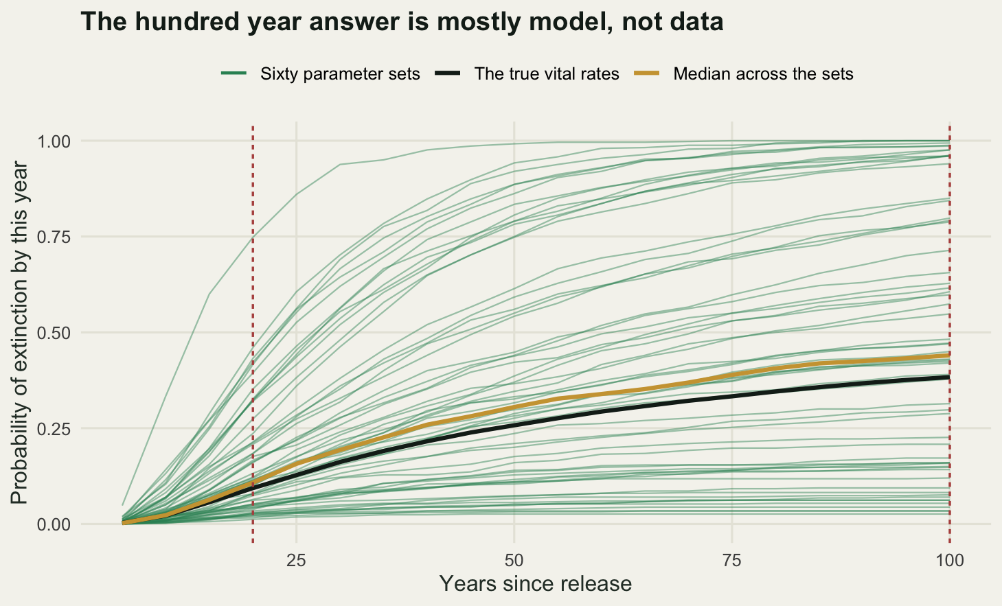
At twelve years of monitoring, which is longer than most reintroduction programmes manage before the first viability analysis is written, the twenty year extinction probability has a spread of 0.1443 across parameter sets and the hundred year one has a spread of 0.3451. The ratio is 2.392. Put as intervals a reader can act on: the middle ninety per cent of the twenty year answers runs from 0.0219 to 0.4225, and the middle ninety per cent of the hundred year answers runs from 0.0435 to 0.9943. The second interval covers essentially the whole range the quantity can take. An analyst who reports a hundred year extinction probability of 0.4873 from twelve years of monitoring is reporting the centre of a distribution that includes both certain persistence and certain loss.
Subtracting the Monte Carlo component barely moves anything, which is a check on the check: the raw twenty year spread is 0.145 against 0.1443 after correction, so the five hundred replicates per parameter set are not what is producing the fan.
How much monitoring would fix it? If the spread shrank as the square root of the monitoring length, matching the hundred year spread to today’s twenty year spread would take \(12 \times 2.392^2\) years, which is 68.66. That is already an unwelcome answer. The measured scaling is worse. Fitting the spread against monitoring length on log axes gives a slope of -0.581 at the twenty year horizon, close to the -0.5 the square root rule predicts, and -0.314 at the hundred year horizon. Solving the fitted hundred year line for today’s twenty year spread gives 178.79 years of monitoring.
The reason the hundred year spread shrinks more slowly is worth stating, because it is not a numerical artefact. At a hundred years the extinction probability under a given parameter set is often close to zero or close to one, so the quantity is no longer responding smoothly to small changes in the vital rates; it is responding to which side of a threshold in the stochastic growth rate the parameter set landed on. Better vital rate estimates move parameter sets around inside that classification, but they do not make the classification less consequential. More data sharpens the twenty year answer at the rate statistical theory promises. It does not do the same for the hundred year answer.
Check 2: which uncertainty dominates
Three sources feed the projection. Demographic stochasticity is the binomial and Poisson sampling of individual fates. Environmental stochasticity is the shared annual deviate. Parameter uncertainty is the sampling distribution of the vital rate estimates. They are usually discussed in that order and propagated in the same order, which is a habit rather than a result.
Switching each one on alone is easy in this engine because they are separate arguments. With demo = TRUE and env = FALSE at the true vital rates, only individual fates vary. With demo = FALSE and env = TRUE, the population is projected as continuous numbers through a randomly varying matrix. With both off but the parameters drawn, each replicate is a deterministic projection under one plausible set of vital rates. The outcome is the log of the population size at fifty years, plus one so that extinct replicates contribute a finite value, and the variance of that outcome is the currency.
n_dec <- 4000; hz <- 50
decomp <- function(n0, seed) {
  set.seed(seed)
  pd <- draw_pars(n_dec, t_base)
  gv <- function(demo, env, par)
    var(log(project(n0, n_dec, hz, if (par) pd else truth, sig_s, sig_f,
                    demo = demo, env = env)$final + 1))
  v <- c(gv(TRUE, FALSE, FALSE), gv(FALSE, TRUE, FALSE), gv(FALSE, FALSE, TRUE))
  c(dem = v[1], env = v[2], par = v[3], sum = sum(v), all = gv(TRUE, TRUE, TRUE),
    pct_dem = 100 * v[1] / sum(v), pct_env = 100 * v[2] / sum(v),
    pct_par = 100 * v[3] / sum(v))
}
dsm <- decomp(release, 71)
dlg <- decomp(big_release, 72)

round(c(replicates = n_dec, horizon = hz, founders_small = sum(release),
        founders_large = sum(big_release)), 3)
replicates horizon founders_small founders_large
4000 50 12 120 print(round(rbind(small = dsm, large = dlg), 3)) dem env par sum all pct_dem pct_env pct_par
small 2.301 0.922 2.883 6.106 5.772 37.684 15.097 47.219
large 0.093 0.958 3.120 4.171 5.085 2.218 22.977 74.805round(c(small_interaction = 100 * (dsm["all"] - dsm["sum"]) / dsm["sum"],
large_interaction = 100 * (dlg["all"] - dlg["sum"]) / dlg["sum"],
small_propagated = as.numeric(dsm["pct_dem"] + dsm["pct_env"]),
large_propagated = as.numeric(dlg["pct_dem"] + dlg["pct_env"])), 2)small_interaction.all large_interaction.all small_propagated
-5.48 21.92 52.78
large_propagated
25.19 src_levels <- c("Demographic stochasticity", "Environmental stochasticity",
"Parameter uncertainty")
vdf <- data.frame(
founders = factor(rep(c("12 founders", "120 founders"), each = 3),
levels = c("12 founders", "120 founders")),
source = factor(rep(src_levels, 2), levels = rev(src_levels)),
pct = c(dsm["pct_dem"], dsm["pct_env"], dsm["pct_par"],
dlg["pct_dem"], dlg["pct_env"], dlg["pct_par"]))
lab_df <- do.call(rbind, lapply(split(vdf, vdf$founders), function(d) {
d <- d[order(as.integer(d$source), decreasing = TRUE), ]
upper <- cumsum(d$pct)
d$ymid <- upper - d$pct / 2
d$outside <- d$pct < 6
d
}))
lab_in <- lab_df[!lab_df$outside, ]
lab_out <- lab_df[lab_df$outside, ]
ggplot(vdf, aes(founders, pct, fill = source)) +
geom_col(width = 0.55) +
geom_text(data = lab_in, aes(founders, ymid, label = sprintf("%.1f", pct)),
inherit.aes = FALSE, colour = te_pal$paper, size = 3.6) +
geom_segment(data = lab_out,
aes(x = as.integer(founders) + 0.29, xend = as.integer(founders) + 0.40,
y = ymid, yend = ymid),
inherit.aes = FALSE, colour = te_pal$ink, linewidth = 0.4) +
geom_text(data = lab_out,
aes(x = as.integer(founders) + 0.44, y = ymid,
label = sprintf("%.1f", pct)),
inherit.aes = FALSE, colour = te_pal$ink, size = 3.6, hjust = 0) +
scale_fill_manual(values = c("Demographic stochasticity" = te_pal$forest,
"Environmental stochasticity" = te_pal$green,
"Parameter uncertainty" = te_pal$clay), name = NULL) +
guides(fill = guide_legend(reverse = TRUE, nrow = 1)) +
labs(x = NULL, y = "Share of the variance, percent",
title = "The largest source is the one nobody propagates") +
theme_te() +
theme(legend.position = "top")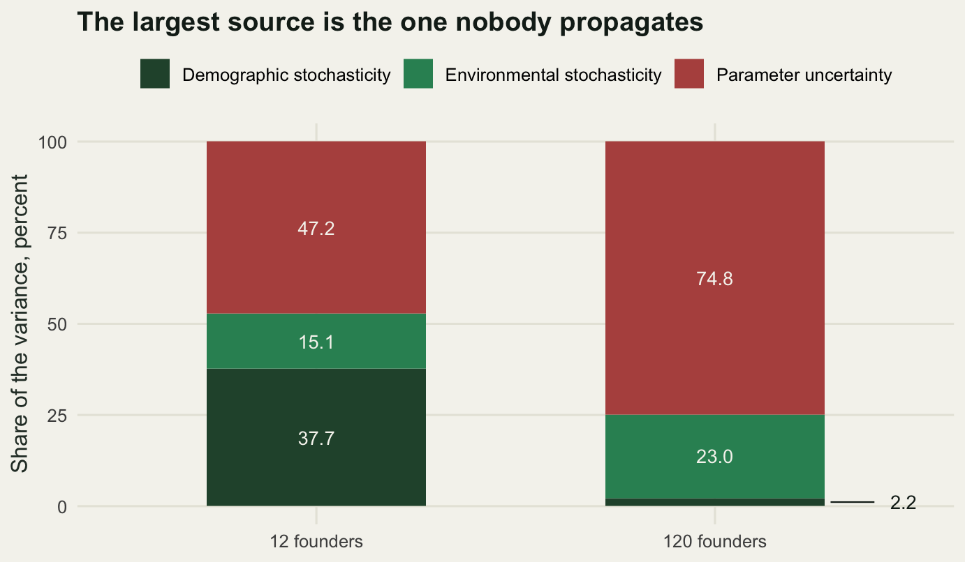
For a release of twelve, demographic stochasticity accounts for 37.684 per cent of the variance, environmental stochasticity 15.097 per cent and parameter uncertainty 47.219 per cent. For a release of a hundred and twenty the ranking changes exactly where theory says it should: demographic stochasticity collapses to 2.218 per cent, because individual fates average out once there are enough individuals, and environmental stochasticity rises to 22.977 per cent, because a bad year is a bad year whatever the population size. Parameter uncertainty rises to 74.805 per cent.
The ranking that changes with population size is the demographic one, and that part is standard. The part that is not standard is what sits on top in both columns. Population viability software in general use propagates demographic and environmental stochasticity, because those are model components; parameter uncertainty is left to the user, who is expected to run the analysis again with different inputs and compare. On these two populations the propagated sources cover 52.78 per cent and 25.19 per cent of the variance respectively. The interval that comes out of the software is therefore built from about half the variance for a small founded population and about a quarter of it for a large one.
The three parts do not add exactly to the whole, and the discrepancy is reported above rather than hidden: the all sources variance differs from the sum of the three one at a time variances by -5.48 per cent for the small release and 21.92 per cent for the large one. The sources interact, because a bad environmental year matters more when parameters put the population near the threshold, and a decomposition of this kind is an accounting device rather than an identity. The ranking it produces is stable enough to act on; the last decimal place is not.
Check 3: correlation between the vital rates
A drought is not polite enough to reduce survival and leave fecundity alone. The engine draws the survival deviate and the fecundity deviate with a correlation \(\rho\), and every projection so far has used \(\rho = 0\) without saying so, which is what most viability analyses do because the correlation is one of the few quantities almost never estimated.
Setting it to something positive at the same marginal variances costs nothing computationally and answers the question directly.
n_rho <- 8000
rho_grid <- c(0, 0.3, 0.5, 0.7, 0.9)
set.seed(909)
rho_tab <- do.call(rbind, lapply(rho_grid, function(rh) {
  rr <- project(release, n_rho, 100, truth, sig_s, sig_f, rho = rh)
  data.frame(rho = rh, p20 = mean(rr$ext <= 20), p50 = mean(rr$ext <= 50),
             p100 = mean(rr$ext <= 100))
}))
print(round(rho_tab, 4), row.names = FALSE)
rho p20 p50 p100
0.0 0.0931 0.2502 0.3784
0.3 0.0999 0.2805 0.4111
0.5 0.1143 0.3144 0.4549
0.7 0.1282 0.3385 0.4818
0.9 0.1330 0.3418 0.4961g100 <- function(r) rho_tab$p100[rho_tab$rho == r]
round(c(replicates = n_rho, ratio_high_vs_zero = g100(0.7) / g100(0),
ratio_top_vs_zero = g100(0.9) / g100(0)), 4) replicates ratio_high_vs_zero ratio_top_vs_zero
8000.0000 1.2732 1.3112 Extinction probability at a hundred years goes from 0.3784 under independent variation to 0.4818 at a correlation of 0.7 and 0.4961 at 0.9. The ratio against the independent case is 1.2732 and 1.3112. That is a real effect and it is smaller than I expected before running it. The mechanism is limited: the shared survival deviate already couples the three survival rates, and fecundity contributes less to the variance of the annual growth rate than survival does, so correlating the two adds less than correlating survival with itself would. A quarter to a third more risk from a parameter nobody measures is still enough to matter when the answer is being compared against a threshold.
The second half of the check is whether it could be measured. Simulate monitoring programmes that record annual adult survival from twenty five marked animals and annual fecundity from the same number of breeders, take the sample correlation between the two series on the logit and log scales, and look at how it behaves as the programme lengthens.
rho_true <- 0.7
rec_cor <- function(tmon, K = 4000) {
  sm <- matrix(0, K, tmon); fm <- matrix(0, K, tmon)
  for (y in seq_len(tmon)) {
    zs <- rnorm(K); zf <- rho_true * zs + sqrt(1 - rho_true^2) * rnorm(K)
    sh <- rbinom(K, n_mon, plogis(qlogis(truth$sA) + sig_s * zs)) / n_mon
    sm[, y] <- qlogis(pmin(pmax(sh, 0.5 / n_mon), 1 - 0.5 / n_mon))
    fm[, y] <- log(pmax(rpois(K, n_mon * truth$f *
                                exp(sig_f * zf - sig_f^2 / 2)), 0.5) / n_mon)
  }
  aa <- sm - rowMeans(sm); bb <- fm - rowMeans(fm)
  rr <- rowSums(aa * bb) / sqrt(pmax(rowSums(aa^2) * rowSums(bb^2), 1e-12))
  rr <- rr[is.finite(rr)]
  c(years = tmon, kept = length(rr), mean = mean(rr), sd = sd(rr),
    halfwidth = 1.96 * sd(rr))
}
set.seed(77)
t_cor <- c(10, 15, 20, 30, 45, 70, 110)
cor_tab <- as.data.frame(t(sapply(t_cor, rec_cor)))
print(round(cor_tab, 4), row.names = FALSE)
years kept mean sd halfwidth
10 4000 0.3876 0.2860 0.5605
15 4000 0.3936 0.2278 0.4466
20 4000 0.3968 0.1927 0.3777
30 4000 0.3978 0.1575 0.3087
45 4000 0.4015 0.1260 0.2469
70 4000 0.3954 0.1028 0.2015
110 4000 0.4025 0.0793 0.1554cf <- coef(lm(log(sd) ~ log(years), cor_tab))
round(c(true_rho = rho_true, slope = as.numeric(cf[2]),
asymptotic_estimate = cor_tab$mean[nrow(cor_tab)],
attenuation = rho_true - cor_tab$mean[nrow(cor_tab)],
years_for_halfwidth = as.numeric(exp((log(0.2 / 1.96) - cf[1]) / cf[2]))), 4) true_rho slope asymptotic_estimate attenuation
0.7000 -0.5286 0.4025 0.2975
years_for_halfwidth
68.5353 p_left <- ggplot(rho_tab, aes(rho, p100)) +
geom_line(colour = te_pal$forest, linewidth = 0.9) +
geom_point(colour = te_pal$forest, size = 2.6) +
labs(x = "Correlation between survival and fecundity",
y = "Extinction probability at 100 years",
title = "Correlated bad years raise the risk") +
theme_te()
p_right <- ggplot(cor_tab, aes(years, halfwidth)) +
geom_hline(yintercept = 0.2, colour = te_pal$clay, linetype = "22", linewidth = 0.7) +
geom_line(colour = te_pal$green, linewidth = 0.9) +
geom_point(colour = te_pal$green, size = 2.6) +
scale_x_log10() +
labs(x = "Years of monitoring", y = "Half width of the 95 percent interval",
title = "Monitoring pins it down slowly") +
theme_te()
grid.newpage()
pushViewport(viewport(layout = grid.layout(1, 2)))
print(p_left, vp = viewport(layout.pos.row = 1, layout.pos.col = 1))
print(p_right, vp = viewport(layout.pos.row = 1, layout.pos.col = 2))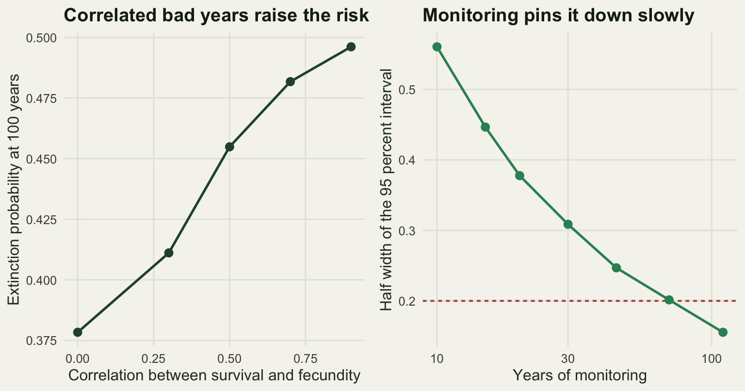
Getting the half width of a ninety five per cent interval on the correlation down to 0.2 takes 68.5353 years of monitoring, from a fitted scaling of -0.5286 which is the square root rate. Very few reintroduction programmes have run that long, and the ones that have did not measure adult survival and fecundity consistently throughout.
There is a worse problem in the same table, and it does not go away with more years. The mean estimated correlation at a hundred and ten years of monitoring is 0.4025 against a true 0.7, an attenuation of 0.2975. Independent sampling error in the annual survival estimate and the annual fecundity estimate is uncorrelated between the two series by construction, so it inflates both variances without inflating the covariance, and the sample correlation is pulled towards zero. The sixty eight year figure is the time needed to estimate a biased quantity precisely. Removing the bias needs bigger annual samples rather than more years, which is a different budget line and usually a harder one.
Check 4: the density dependence assumption
Everything above assumes density independence, which is the honest default for a population far below whatever the site can hold. Three models are compared here, all matched to the same growth rate at low density so that none of them has an unfair advantage in the first years. The ceiling model runs the density independent projection and truncates the population at a cap. The Ricker model multiplies fecundity by \(\exp(-\beta N)\), with \(\beta\) set so that the deterministic growth rate is exactly one when the population reaches the same cap. The fecundity that produces a growth rate of one follows from the characteristic equation of the matrix and is computed rather than guessed.
k_cap <- 60
f_eq <- (1 - truth$sA) / (truth$sJ * truth$sS)
beta_r <- -log(f_eq / truth$f) / k_cap
n_dd <- 5000
set.seed(515)
dd_runs <- lapply(c("none", "ceiling", "ricker"), function(md)
  project(release, n_dd, 100, truth, sig_s, sig_f, dd = md, kcap = k_cap,
          beta = beta_r, keep_hist = TRUE))
names(dd_runs) <- c("none", "ceiling", "ricker")
dd_tab <- do.call(rbind, lapply(names(dd_runs), function(md) {
  rr <- dd_runs[[md]]
  data.frame(model = md, p_ext = mean(rr$ext <= 100),
             med_surv = median(rr$final[rr$final > 0]))
}))
round(c(ceiling_K = k_cap, fec_at_equilibrium = f_eq, ricker_beta = beta_r,
        replicates = n_dd), 5)
ceiling_K fec_at_equilibrium ricker_beta replicates
60.00000 0.96154 0.00298 5000.00000 print(dd_tab, row.names = FALSE, digits = 4) model p_ext med_surv
none 0.3824 102
ceiling 0.4356 30
ricker 0.5058 30round(c(pext_ratio = max(dd_tab$p_ext) / min(dd_tab$p_ext),
size_ratio = max(dd_tab$med_surv) / min(dd_tab$med_surv)), 4)pext_ratio size_ratio
1.3227 3.4000 The extinction probability at a hundred years is 0.3824 with no density dependence, 0.4356 under the ceiling and 0.5058 under the Ricker, a ratio of 1.3227 between the extremes. The median surviving population is 102 without density dependence and 30 under both density dependent models, a ratio of 3.4. The two density dependent models agree almost exactly on the population size a manager would see and disagree by a sixth on the risk, which is the quantity the analysis exists to produce.
Now the sting. A reintroduced population that has been monitored for twenty years provides twenty counts. Fit all three models to those counts as regressions of the annual log growth rate: a constant for density independence, a linear term in the count for the Ricker, and a ceiling that caps the expected log growth rate at whatever is needed to hold the population at the cap. Compare them by AIC, and separately test density dependence with a likelihood ratio between the Ricker and the constant. The critical value for that test is measured from density independent series of the same length and starting size rather than taken from the chi squared table, because the growth rate and the count share an endpoint and the standard test does not know that.
ts_len <- 20; n_ser <- 400
ll_null <- function(y) -length(y) / 2 * (log(2 * pi * mean((y - mean(y))^2)) + 1)
ll_rick <- function(y, x)
  -length(y) / 2 * (log(2 * pi * mean(residuals(lm(y ~ x))^2)) + 1)
ll_ceil <- function(y, x) {
  obj <- function(p) mean((y - pmin(p[1], p[2] - log(x)))^2)
  o <- optim(c(mean(y), log(max(x) * 2)), obj); o <- optim(o$par, obj)
  -length(y) / 2 * (log(2 * pi * o$value) + 1)
}
series_stats <- function(md, nn) {
  rr <- project(release, nn, ts_len, truth, sig_s, sig_f, dd = md, kcap = k_cap,
                beta = beta_r, keep_hist = TRUE)
  hh <- rr$hist[rowSums(rr$hist < 2) == 0, , drop = FALSE]
  as.data.frame(t(apply(hh, 1, function(z) {
    x <- z[-length(z)]; y <- log(z[-1] / x)
    l0 <- ll_null(y); lr <- ll_rick(y, x); lc <- ll_ceil(y, x)
    aa <- c(-2 * l0 + 4, -2 * lr + 6, -2 * lc + 6)
    c(pick = as.numeric(which.min(aa)), lrt = 2 * (lr - l0), maxN = max(z))
  })))
}
set.seed(818)
cal <- series_stats("none", 500)
crit <- as.numeric(quantile(cal$lrt, 0.95))
ev <- lapply(c("none", "ceiling", "ricker"), function(md) series_stats(md, n_ser))
names(ev) <- c("none", "ceiling", "ricker")
pow_tab <- do.call(rbind, lapply(names(ev), function(md) {
  z <- ev[[md]]
  data.frame(truth = md, series = nrow(z),
             pick_none = mean(z$pick == 1), pick_ricker = mean(z$pick == 2),
             pick_ceiling = mean(z$pick == 3),
             naive_lrt = mean(z$lrt > qchisq(0.95, 1)),
             calib_lrt = mean(z$lrt > crit), med_maxN = median(z$maxN))
}))
print(pow_tab, row.names = FALSE, digits = 4)
truth series pick_none pick_ricker pick_ceiling naive_lrt calib_lrt med_maxN
none 359 0.1504 0.8496 0 0.6602 0.05571 39
ceiling 367 0.1199 0.8801 0 0.7057 0.06812 36
ricker 359 0.1170 0.8830 0 0.6797 0.06964 35correct <- c(mean(ev$none$pick == 1), mean(ev$ceiling$pick == 3),
mean(ev$ricker$pick == 2))
nn3 <- sapply(ev, nrow)
round(c(series_len = ts_len, calibration_series = nrow(cal), crit_value = crit,
chisq_value = qchisq(0.95, 1),
accuracy = sum(correct * nn3) / sum(nn3), chance = 1 / 3), 4) series_len calibration_series crit_value chisq_value
20.0000 466.0000 14.1259 3.8415
accuracy chance
0.3419 0.3333 yrs <- 0:100
dd_long <- do.call(rbind, lapply(names(dd_runs), function(md) {
hh <- dd_runs[[md]]$hist
med <- apply(hh, 2, function(z) median(z[z > 0]))
pex <- colMeans(hh < 2)
rbind(data.frame(year = yrs, value = med, model = md,
panel = "Median size of surviving populations"),
data.frame(year = yrs, value = pex, model = md,
panel = "Cumulative extinction probability"))
}))
dd_long$panel <- factor(dd_long$panel,
levels = c("Median size of surviving populations",
"Cumulative extinction probability"))
dd_long$model <- factor(dd_long$model, levels = c("none", "ceiling", "ricker"),
labels = c("no density dependence", "ceiling", "Ricker"))
ggplot(dd_long, aes(year, value, colour = model)) +
geom_vline(xintercept = ts_len, colour = te_pal$ink,
linetype = "22", linewidth = 0.6) +
geom_line(linewidth = 0.9) +
facet_wrap(~panel, scales = "free_y") +
scale_colour_manual(values = c("no density dependence" = te_pal$forest,
"ceiling" = te_pal$gold,
"Ricker" = te_pal$clay), name = NULL) +
labs(x = "Years since release", y = NULL,
title = "The three models separate only after the data end") +
theme_te() +
theme(legend.position = "top",
strip.text = element_text(colour = te_pal$ink, face = "bold"))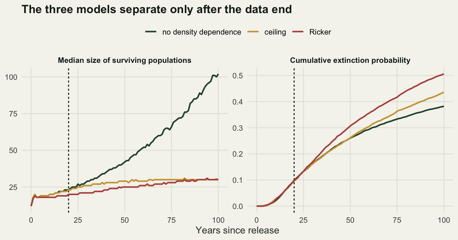
The naive likelihood ratio test flags density dependence in 0.6602 of series that have none. That is not power, it is the shared endpoint artefact: the annual log growth rate contains the count at the start of the year with a negative sign, so any noise in that count produces a negative regression slope whether or not density has anything to do with it. The calibrated critical value is 14.1259 against the 3.8415 the chi squared table supplies, a factor of more than three, and any analysis that used the table would have concluded that this population is regulated.
Against the calibrated threshold the picture is clear and dismal. The test fires on 0.05571 of density independent series, which re-measures the calibration on an independent sample, on 0.06812 of ceiling series and on 0.06964 of Ricker series. Power is 0.06964 against a false positive rate of 0.05571. Twenty years of counts from this population carry almost no information about whether it is regulated.
The three way model choice is no better. Across all series the correct model is picked 0.3419 of the time against a chance rate of 0.3333. The ceiling model is never selected, not once, even in the 367 series generated under it, and the reason is in the last column: the median series reaches a maximum of 36 animals against a cap of 60. The population never gets near the ceiling within the window, so the data contain no evidence of a ceiling to find. AIC instead picks the Ricker in 0.8801 of those series, because the Ricker has a free slope that the spurious negative regression happily fills.
So the assumption that moves the hundred year answer by a factor of 1.3227 is the assumption the data cannot address. That is the check working correctly: it tells the analyst that this choice has to be defended from biology, from what is known about territory size and food supply at the site, and not from the time series.
The check none of these is
Every measurement above interrogates the projection. None of them asks whether the site is still the site that was assessed. Reintroductions are usually into places that were chosen because something had gone wrong there before, and the process that made the species disappear the first time is rarely switched off cleanly.
The measurement is straightforward. Add a slow decline in habitat quality: a constant shift per year on the logit scale for all three survival probabilities and on the log scale for fecundity. Set it small enough that fifteen years of monitoring cannot see it, then fit the standard model to those fifteen years and project fifty years forward under stationary conditions, which is what every viability analysis does. Then run the true population forward from the same state with the decline continuing, and compare. To give the projection the best possible chance, the release here is forty animals rather than twelve, so the population is comfortably established when the analysis is written.
decl <- 0.010; t_mon2 <- 15; hz2 <- 50
release_h <- c(0, 14, 26)
n_trend <- 3000
set.seed(3131)
sl <- matrix(0, n_trend, t_mon2)
for (y in seq_len(t_mon2)) {
  py <- plogis(qlogis(truth$sA) + sig_s * rnorm(n_trend) - decl * (y - 1))
  sh <- rbinom(n_trend, n_mon, py) / n_mon
  sl[, y] <- qlogis(pmin(pmax(sh, 0.5 / n_mon), 1 - 0.5 / n_mon))
}
yr <- seq_len(t_mon2); cy <- yr - mean(yr); sxx <- sum(cy^2)
bhat <- as.vector(sl %*% cy) / sxx
fitv <- outer(rowMeans(sl), rep(1, t_mon2)) + outer(bhat, cy)
s2 <- rowSums((sl - fitv)^2) / (t_mon2 - 2)
tstat <- bhat / sqrt(s2 / sxx)
round(c(decline_per_year_logit = decl, monitoring_years = t_mon2,
        records = n_trend, mean_slope = mean(bhat),
        power_one_sided = mean(tstat < qt(0.05, t_mon2 - 2)),
        adult_survival_year_1 = truth$sA,
        adult_survival_year_15 = plogis(qlogis(truth$sA) - decl * 14),
        adult_survival_year_65 = plogis(qlogis(truth$sA) - decl * 64)), 4)
decline_per_year_logit monitoring_years records
0.0100 15.0000 3000.0000
mean_slope power_one_sided adult_survival_year_1
-0.0108 0.0723 0.8000
adult_survival_year_15 adult_survival_year_65
0.7767 0.6784 A shift of 0.01 per year on the logit scale takes adult survival from 0.8 in the release year to 0.7767 fifteen years later and 0.6784 at the end of the projection. The regression of the annual survival estimate on year recovers a mean slope of -0.0108, close to the true -0.010, and rejects the null of no trend in 0.0723 of monitoring records at a one sided five per cent level. In more than nine records out of ten the programme reports no evidence of a decline, correctly by its own standards.
n_rec <- 250; n_each2 <- 300; n_real <- 12000
set.seed(4141)
est15 <- project(release_h, 20000, t_mon2, truth, sig_s, sig_f, trend = decl)
alive <- est15$final > 0
st15 <- round(apply(est15$stage[alive, ], 2, median))
round(c(founders = sum(release_h), established = mean(alive), start_J = st15[1],
        start_S = st15[2], start_A = st15[3], start_total = sum(st15)), 4)
founders established start_J.nJ start_S.nS start_A.nA start_total
40.0000 0.9977 18.0000 5.0000 19.0000 42.0000 set.seed(5151)
pd <- draw_pars(n_rec, t_mon2, trend = decl)
ii <- rep(seq_len(n_rec), each = n_each2)
pr <- project(st15, n_rec * n_each2, hz2,
list(sJ = pd$sJ[ii], sS = pd$sS[ii], sA = pd$sA[ii], f = pd$f[ii]),
sig_s, sig_f)
gg <- rep(seq_len(n_rec), each = n_each2)
pp <- tapply(pr$ext <= hz2, gg, mean)
real <- project(st15, n_real, hz2, truth, sig_s, sig_f, trend = decl, t_off = t_mon2)
stat <- project(st15, n_real, hz2, truth, sig_s, sig_f)
round(c(records = n_rec, reps_each = n_each2, horizon = hz2,
mean_est_sA = mean(pd$sA), mean_est_f = mean(pd$f),
projected_median = median(pp),
projected_lo = as.numeric(quantile(pp, 0.05)),
projected_hi = as.numeric(quantile(pp, 0.95)),
called_viable = mean(pp < 0.5),
stationary_truth = mean(stat$ext <= hz2),
realised = mean(real$ext <= hz2),
ratio = mean(real$ext <= hz2) / median(pp)), 4) records reps_each horizon mean_est_sA
250.0000 300.0000 50.0000 0.7785
mean_est_f projected_median projected_lo projected_hi
1.0799 0.2750 0.0200 0.8570
called_viable stationary_truth realised ratio
0.7200 0.0629 0.9979 3.6288 Forty founders establish in 0.9977 of replicates and the median survivor holds 42 animals after fifteen years, split 18 juveniles, 5 subadults and 19 adults. The monitoring returns an adult survival estimate averaging 0.7785 and a fecundity estimate averaging 1.0799, both slightly below the release year truth because they average over years that were already degrading, and neither far enough below to look alarming. Projected forward under those estimates the median extinction probability at fifty years is 0.275, and 0.72 of monitoring records return a projection below one half, which most panels would read as a population with a future.
The realised extinction probability over the same fifty years, with the decline continuing at the same undetectable rate, is 0.9979. Had the habitat been stable, the true answer from the same starting state would have been 0.0629. The projection is out by a factor of 3.6288 against reality, and the interesting part is that it is out in a way no check in this post could have caught. The fitted vital rates absorb some of the decline, which is why the projected figure is 0.275 rather than 0.0629, and that partial absorption is what makes the failure quiet: the model does look slightly worse than the release year truth, so it does not obviously contradict anything, and it is still nowhere near right.
Retrospective diagnostics, variance decompositions and assumption sweeps all take the data generating process as fixed and ask how well it is estimated. A site that is slowly getting worse violates that premise rather than any assumption inside it. The only defence is measurement of the habitat itself, on the same schedule as the animals, with the vegetation, prey and disturbance variables recorded whether or not anyone has a hypothesis about them yet. That is a monitoring design decision, made years before the viability analysis is written, and no amount of modelling afterwards substitutes for it.
Where to go next
The cluster closes here. The release strategy post left an honest limit at the founder number, the reserve configuration post at the assumed dispersal kernel, and the restoration trajectory post at the reference state. This post adds the fourth: the projection that all three rest on is well determined only over a horizon far shorter than the one it is asked about, and its largest single source of uncertainty is the one that standard software does not carry. Stochastic population growth in variable environments develops the underlying result about the difference between the arithmetic and geometric mean growth rates, which is what makes the stochastic growth rate of 1.0185 sit below the deterministic 1.0269 here.
References
Beissinger SR, Westphal MI 1998 Journal of Wildlife Management 62(3):821-841 (10.2307/3802534)
Coulson T, Mace GM, Hudson E, Possingham H 2001 Trends in Ecology and Evolution 16(5):219-221 (10.1016/S0169-5347(01)02137-1)
Fieberg J, Ellner SP 2000 Ecology 81(7):2040-2047 (10.1890/0012-9658(2000)081[2040:WIIMTE]2.0.CO;2)
Ellner SP, Fieberg J, Ludwig D, Wilcox C 2002 Conservation Biology 16(1):258-261 (10.1046/j.1523-1739.2002.00553.x)