---
title: "Checking a monitoring design"
description: "Three checks on a monitoring plan in R: what a short pilot does to power, which kind of site dropout biases a trend, and why observer drift is invisible."
date: "2026-06-26 12:00"
date-modified: "2026-10-14"
categories: [R, survey design, monitoring, ecology tutorial]
image: thumbnail.png
image-alt: "Histogram of power values implied by short pilot studies, spread widely around the true power of the planned design"
---
*Corrected 14 October 2026: the check two caption said that nothing in the surviving data marks selective dropout as a problem; it now says that nothing in the annual means of the surviving sites does, and the text adds that the bias belongs to a trend fitted to those means, which a model with a term for each site would not share for a loss that depends only on each site's permanent level. Check three said the design has no information about detection, though it already makes two counts per site per year; it now says the annual means carry none.*
*Corrected 1 October 2026: the closing summary said that a changing network or changing observers make a programme report a change that is not there, leaving missed real changes to the power number; it now says such a bias can also hide a real change, as selective dropout did in check two, and that the power number prices only changes missed through noise.*
*Corrected 27 September 2026: the Figure 1 caption said the spike at power one came from pilots that estimated the year component at or below zero; it now says it comes from pilots that estimated it well below its true value, of which those at or below zero are only a part.*
The previous three posts built a monitoring design and gave it a number: this programme has such and such power to detect such and such a decline. That number rests on assumptions, and this post attacks three of them with simulation.
The first is that the variance components are known. The second is that the sites measured in year twenty are the sites measured in year one. The third is that a count means the same thing in both years. Each check produces a number, and none of them is reassuring.
## The setup
The planned programme: 30 permanent sites, two counts per site per year, twenty years, testing for a three per cent annual decline. The power calculation from the previous post says this design works.
```{r setup}
sd_site <- 0.55; sd_year <- 0.20; sd_sy <- 0.30; sd_res <- 0.35
beta_true <- -0.03
n_rep <- 2

se_trend <- function(n_year, n_site, v = c(sd_year^2, sd_sy^2, sd_res^2), k = n_rep) {
  Sxx <- n_year * (n_year^2 - 1) / 12
  sqrt((v[1] + (v[2] + v[3] / k) / n_site) / Sxx)
}
trend_power <- function(n_year, n_site, beta, v = c(sd_year^2, sd_sy^2, sd_res^2), alpha = 0.05) {
  df <- n_year - 2; ncp <- abs(beta) / se_trend(n_year, n_site, v)
  crit <- qt(1 - alpha / 2, df)
  pt(-crit, df, ncp) + (1 - pt(crit, df, ncp))
}
true_power <- trend_power(20, 30, beta_true)
round(c(se = se_trend(20, 30), power = true_power), 4)
```
```{r sim-fun}
sim_monitoring <- function(n_site, n_year, n_rep, beta) {
  s  <- rnorm(n_site, 0, sd_site)
  a  <- rnorm(n_year, 0, sd_year)
  tc <- (1:n_year) - mean(1:n_year)
  sa <- matrix(rnorm(n_site * n_year, 0, sd_sy), n_site, n_year)
  d  <- expand.grid(rep = seq_len(n_rep), site = seq_len(n_site), year = seq_len(n_year))
  d$y <- 3 + beta * tc[d$year] + s[d$site] + a[d$year] +
         sa[cbind(d$site, d$year)] + rnorm(nrow(d), 0, sd_res)
  d$site <- factor(d$site); d$yearf <- factor(d$year); d$t <- d$year
  d
}
vc_anova <- function(d, n_site, n_year, n_rep) {
  y <- d$y; gm <- mean(y)
  m_si <- tapply(y, d$site, mean); m_yr <- tapply(y, d$yearf, mean)
  m_cell <- tapply(y, list(d$site, d$yearf), mean)
  SS_year <- n_site * n_rep * sum((m_yr - gm)^2)
  SS_sy   <- n_rep * sum((m_cell - outer(m_si, m_yr, "+") + gm)^2)
  SS_res  <- sum((y - m_cell[cbind(as.integer(d$site), as.integer(d$yearf))])^2)
  MS_year <- SS_year / (n_year - 2)                  # one year df spent on the trend
  MS_sy   <- SS_sy / ((n_site - 1) * (n_year - 1))
  MS_res  <- SS_res / (n_site * n_year * (n_rep - 1))
  c(year = (MS_year - MS_sy) / (n_rep * n_site),
    sy   = (MS_sy - MS_res) / n_rep,
    res  = MS_res)
}
```
## Check one: the power number is an estimate
The variance components come from somewhere, and that somewhere is usually a pilot: a couple of seasons at a handful of sites, run before the real programme starts. A pilot estimates the year component from a handful of years, and the year component is the one that dominates trend precision.
Here are `r format(2000, big.mark = ",")` pilots of five years at ten sites, each feeding its own components into the same power calculation for the same planned design.
```{r pilot}
set.seed(370)
pilot_power <- t(replicate(2000, {
  d <- sim_monitoring(10, 5, n_rep, beta_true)
  d$y <- residuals(lm(y ~ t, data = d))
  v <- vc_anova(d, 10, 5, n_rep)
  c(v_year = unname(v["year"]),
    power  = trend_power(20, 30, beta_true, pmax(unname(v), 0)))
}))
round(c(true_year_component = sd_year^2,
        median_estimate     = median(pilot_power[, "v_year"]),
        negative_estimates  = mean(pilot_power[, "v_year"] < 0),
        true_power          = true_power,
        median_power        = median(pilot_power[, "power"]),
        lower_5pc           = unname(quantile(pilot_power[, "power"], 0.05)),
        pc_claiming_over_95 = mean(pilot_power[, "power"] > 0.95)), 4)
```
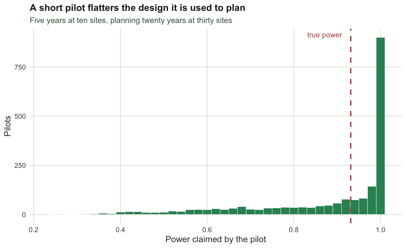
The true power is `r sprintf("%.3f", true_power)`. The median pilot claims `r sprintf("%.3f", median(pilot_power[, "power"]))`, and `r sprintf("%.0f", 100 * mean(pilot_power[, "power"] > 0.95))` per cent of pilots claim above 0.95. One pilot in twenty produces a plan whose real power is fine but whose own calculation says `r sprintf("%.2f", quantile(pilot_power[, "power"], 0.05))` or less.
The bias has a mechanism. Five years give roughly three degrees of freedom for the year component, its moment estimator goes negative in `r sprintf("%.0f", 100 * mean(pilot_power[, "v_year"] < 0))` per cent of pilots and is truncated at zero, and its median is `r sprintf("%.4f", median(pilot_power[, "v_year"]))` against a true `r sd_year^2`. A year component estimated too small makes the design look better than it is, and it is estimated too small more often than not.
```{r fig-pilot}
#| echo: false
#| fig-width: 7.2
#| fig-height: 4.4
#| fig-cap: "Power claimed by 2,000 five-year pilots for the same twenty-year design. The dashed line is the true power of that design. The distribution is not centred on it and it is not narrow: the mass piled against one comes from pilots that estimated the year component well below its true value, including those that put it at or below zero."
#| fig-alt: "Histogram of claimed power values spread from about 0.4 to 1.0 with a tall spike at one, and a dashed vertical reference line near 0.93."
library(ggplot2)
theme_te <- function(base_size = 11) {
theme_minimal(base_size = base_size) +
theme(plot.background = element_rect(fill = "#f5f4ee", colour = NA),
panel.background = element_rect(fill = "#f5f4ee", colour = NA),
panel.grid.minor = element_blank(),
panel.grid.major = element_line(colour = "#dad9ca", linewidth = 0.3),
text = element_text(colour = "#2c3a31"),
plot.title = element_text(colour = "#16241d", face = "bold", size = base_size + 1),
plot.subtitle = element_text(colour = "#46604a", size = base_size - 1))
}
ggplot(data.frame(p = pilot_power[, "power"]), aes(p)) +
geom_histogram(binwidth = 0.02, fill = "#2f8f63", colour = "white", linewidth = 0.2) +
geom_vline(xintercept = true_power, linetype = "dashed", colour = "#b5534e", linewidth = 0.8) +
annotate("text", x = true_power - 0.02, y = Inf, vjust = 1.6, hjust = 1,
label = "true power", colour = "#b5534e", size = 3.3) +
labs(x = "Power claimed by the pilot", y = "Pilots",
title = "A short pilot flatters the design it is used to plan",
subtitle = "Five years at ten sites, planning twenty years at thirty sites") +
theme_te()
```
The practical response is not to abandon the pilot but to report the calculation as an interval, by running the power formula over the plausible range of the year component rather than at its point estimate. A design that only works at the optimistic end is not a design.
## Check two: which kind of dropout matters
Sites are lost. Access is withdrawn, a landowner changes, a volunteer stops. The question is not whether attrition biases the trend but which kind does.
```{r attrition}
run_attrition <- function(mode, B = 1500, n_year = 15, n_site = 30, rate = 0.08) {
  tc <- (1:n_year) - mean(1:n_year)
  t(replicate(B, {
    s <- rnorm(n_site, 0, sd_site); a <- rnorm(n_year, 0, sd_year)
    alive <- rep(TRUE, n_site); annual <- numeric(n_year)
    for (j in 1:n_year) {
      if (j > 1 && mode != "none") {
        p_drop <- if (mode == "random") rep(rate, n_site)
                  else 2 * rate / (1 + exp(3 * (s - mean(s))))   # poor sites go first
        alive <- alive & !(runif(n_site) < p_drop)
      }
      ids <- which(alive)
      annual[j] <- mean(3 + beta_true * tc[j] + s[ids] + a[j] +
                        rnorm(length(ids), 0, sd_sy) +
                        rnorm(length(ids), 0, sd_res / sqrt(n_rep)))
    }
    c(slope = unname(coef(lm(annual ~ tc))[2]), left = sum(alive))
  }))
}
set.seed(3701)
att <- t(sapply(c("none", "random", "selective"), function(m) {
  r <- run_attrition(m)
  c(mean_slope = mean(r[, "slope"]), bias = mean(r[, "slope"]) - beta_true,
    sites_left = mean(r[, "left"]))
}))
round(att, 4)
```
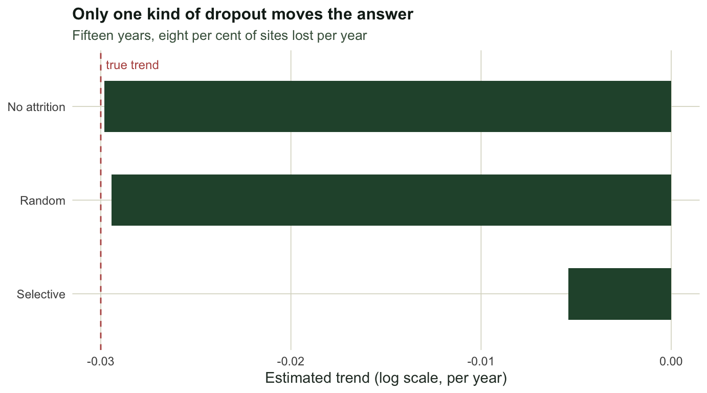
Random attrition removes two thirds of the network over fifteen years, leaving `r sprintf("%.1f", att["random", "sites_left"])` of the original 30 sites, and biases the trend by `r sprintf("%+.4f", att["random", "bias"])` against a true `r beta_true`. It costs precision and nothing else.
Attrition that depends on the site itself is a different matter. When the sites most likely to be lost are the poor ones, the surviving network improves for reasons that have nothing to do with the population. The same nominal per-site loss rate, which in practice leaves a few more sites standing, puts the estimated trend at `r sprintf("%.4f", att["selective", "mean_slope"])`, which is `r sprintf("%.0f", 100 * (1 - att["selective", "mean_slope"] / beta_true))` per cent of the true decline erased.
That bias belongs to the annual means as much as to the loss. Each annual mean is taken over whichever sites remain, so when the poor sites go first the average permanent level of the network rises as it thins, and the regression reads that rise as a trend. Here the loss depends only on each site's permanent level, so a trend model with a term for each site, fitted to the same surviving counts, would not be biased by it; loss that depends on how a site is changing was not simulated.
```{r fig-attrition}
#| echo: false
#| fig-width: 7.2
#| fig-height: 4.0
#| fig-cap: "Estimated trend under three attrition regimes, all applying the same nominal per-site loss rate. Random loss sits on the truth. Loss that depends on the state of the site moves the annual-mean estimate most of the way to zero, and nothing in the annual means of the surviving sites marks it as a problem."
#| fig-alt: "Horizontal bar chart of three estimated trends against a dashed line at the true value: no attrition and random attrition sit on the line, selective attrition sits far towards zero."
ab <- data.frame(mode = factor(c("No attrition", "Random", "Selective"),
levels = c("Selective", "Random", "No attrition")),
slope = att[, "mean_slope"])
ggplot(ab, aes(slope, mode)) +
geom_vline(xintercept = beta_true, linetype = "dashed", colour = "#b5534e") +
geom_col(fill = "#275139", width = 0.55) +
annotate("text", x = beta_true, y = 3.45, label = "true trend",
colour = "#b5534e", size = 3.2, hjust = -0.1) +
labs(x = "Estimated trend (log scale, per year)", y = NULL,
title = "Only one kind of dropout moves the answer",
subtitle = "Fifteen years, eight per cent of sites lost per year") +
theme_te()
```
The diagnostic is available before the analysis: compare the early values of the sites that survived with the early values of the sites that were lost. If those two groups differ, the surviving network is not the network the programme started with, and the trend is partly a trend in membership.
## Check three: the thing the design cannot see
A count is a population multiplied by a detection probability. A monitoring programme measures the product, and the trend it reports is the trend in the product.
```{r drift}
drift_run <- function(pop_trend, detection_trend, B = 1500, n_year = 20, n_site = 30) {
  tc <- (1:n_year) - mean(1:n_year)
  t(replicate(B, {
    d <- sim_monitoring(n_site, n_year, n_rep, pop_trend)
    d$y <- d$y + detection_trend * tc[d$year]      # observers slowly change
    annual <- tapply(d$y, d$yearf, mean)
    co <- summary(lm(annual ~ tc))$coefficients[2, ]
    c(est = unname(co[1]), sig = as.numeric(abs(co[1] / co[2]) > qt(0.975, n_year - 2)))
  }))
}
set.seed(3702)
flat <- drift_run(0, -0.015)
decl <- drift_run(-0.03, -0.015)
round(c(stable_pop_mean_estimate = mean(flat[, "est"]),
        stable_pop_pc_significant = 100 * mean(flat[, "sig"]),
        declining_pop_mean_estimate = mean(decl[, "est"]),
        sum_of_the_two_trends = -0.03 - 0.015), 4)
```
A population that is not changing, monitored by observers whose detection slips by 1.5 per cent a year, produces an estimated trend of `r sprintf("%.4f", mean(flat[, "est"]))` and a statistically significant decline in `r sprintf("%.0f", 100 * mean(flat[, "sig"]))` per cent of programmes. A population that really is declining at three per cent, monitored the same way, gives `r sprintf("%.4f", mean(decl[, "est"]))`: the two trends simply add.
The estimator is doing its job. It is unbiased for the trend in the product, and the product is what was measured. No amount of extra sites or years fixes this, because the annual means carry no information about detection: the same annual means are consistent with a stable population and drifting observers, or a declining population and stable observers.
What does fix it is extra information, not extra effort. Repeat visits within a season support a detection model, a subset of sites can be surveyed by a second method for calibration, and observer identity recorded in the data at least allows the drift to be estimated rather than assumed away. All of these cost visits, which is why they belong in the design conversation rather than the analysis.
## Where this leaves the series
The honest summary of these four posts is that a monitoring programme has two failure modes and they are asymmetric. The first is missing a real change through noise, and that one is calculable in advance from the variance components: it is the power number, and it is mostly a question of how many years the programme survives. The second is a biased trend, which can report a change that is not there or, as selective dropout did in check two, hide one that is, and it does not come from the noise at all. It comes from the network changing under the programme, or the observers changing, and neither shows up in a standard error.
A design that names its detectable change, plans for attrition it can characterise, and records enough to estimate its own detection drift is a design that can be checked. One that promises to detect declines is not.
## References
Legg and Nagy 2006 Journal of Environmental Management 78(2):194-199 (10.1016/j.jenvman.2005.04.016)
Nichols and Williams 2006 Trends in Ecology and Evolution 21(12):668-673 (10.1016/j.tree.2006.08.007)
Kery and Schmidt 2008 Community Ecology 9(2):207-216 (10.1556/ComEc.9.2008.2.10)
Gerrodette 1987 Ecology 68(5):1364-1372 (10.2307/1939220)
## Related tutorials
- [Variance components in monitoring data](../variance-components-in-monitoring/)
- [Observer effects and the first-year dip](../observer-turnover-and-the-first-year-effect/)
- [Power to detect a population trend](../power-to-detect-a-population-trend/)
- [Splicing a monitoring series](../splicing-a-monitoring-series/)