---
title: "Checking a forecast evaluation"
description: "Three checks for ecological forecast evaluation in R: coverage rewards width, sharpness needs calibration, and small test sets may not separate two forecasts."
date: "2026-06-25 11:00"
date-modified: "2026-10-15"
categories: [R, forecasting, model evaluation, model diagnostics, ecology tutorial]
image: thumbnail.png
image-alt: "Two probability integral transform histograms, one flat for a calibrated forecast and one U-shaped for an overconfident forecast."
---
*Corrected 15 October 2026: the third check said that a ranking of two forecasts on a dozen years is not evidence of a real difference and that below about a hundred test points the difference cannot be told from zero; it now says that such a ranking is weak evidence when the gap is as small as this one, that how many test points are needed depends on the gap, and that the figure shows one simulated test set at each size, and its titles say that small test sets may not separate two forecasts.*
The three earlier posts built the machinery: [proper scores](../scoring-ecological-forecasts/), [the CRPS and Brier score](../the-crps-and-brier-score/), and [skill against a baseline](../forecast-skill-and-the-baseline/). This one is the checking step, the same closing move as every other cluster on this blog. A forecast evaluation can produce a clean headline number and still mislead, in three specific ways. Each has a diagnostic, and each diagnostic is a couple of lines of base R.
```{r setup}
#| message: false
#| warning: false
#| code-fold: true
#| code-summary: "Setup: packages, colours and plot theme"
suppressMessages(library(ggplot2))
te_canvas <- theme(plot.background  = element_rect(fill = "#f5f4ee", colour = NA),
                   panel.background = element_rect(fill = "#f5f4ee", colour = NA))
col_main <- "#275139"; col_acc <- "#B5651D"; col_mut <- "#8C8C8C"
base_th <- theme_minimal(base_size = 12) + te_canvas +
  theme(panel.grid.minor = element_blank(),
        plot.title = element_text(face = "bold", size = 13),
        axis.title = element_text(size = 11))
crps_norm <- function(mu, sigma, y) { z <- (y - mu) / sigma
  sigma * (z * (2 * pnorm(z) - 1) + 2 * dnorm(z) - 1 / sqrt(pi)) }
```
## Check 1: coverage on its own rewards a wide forecast
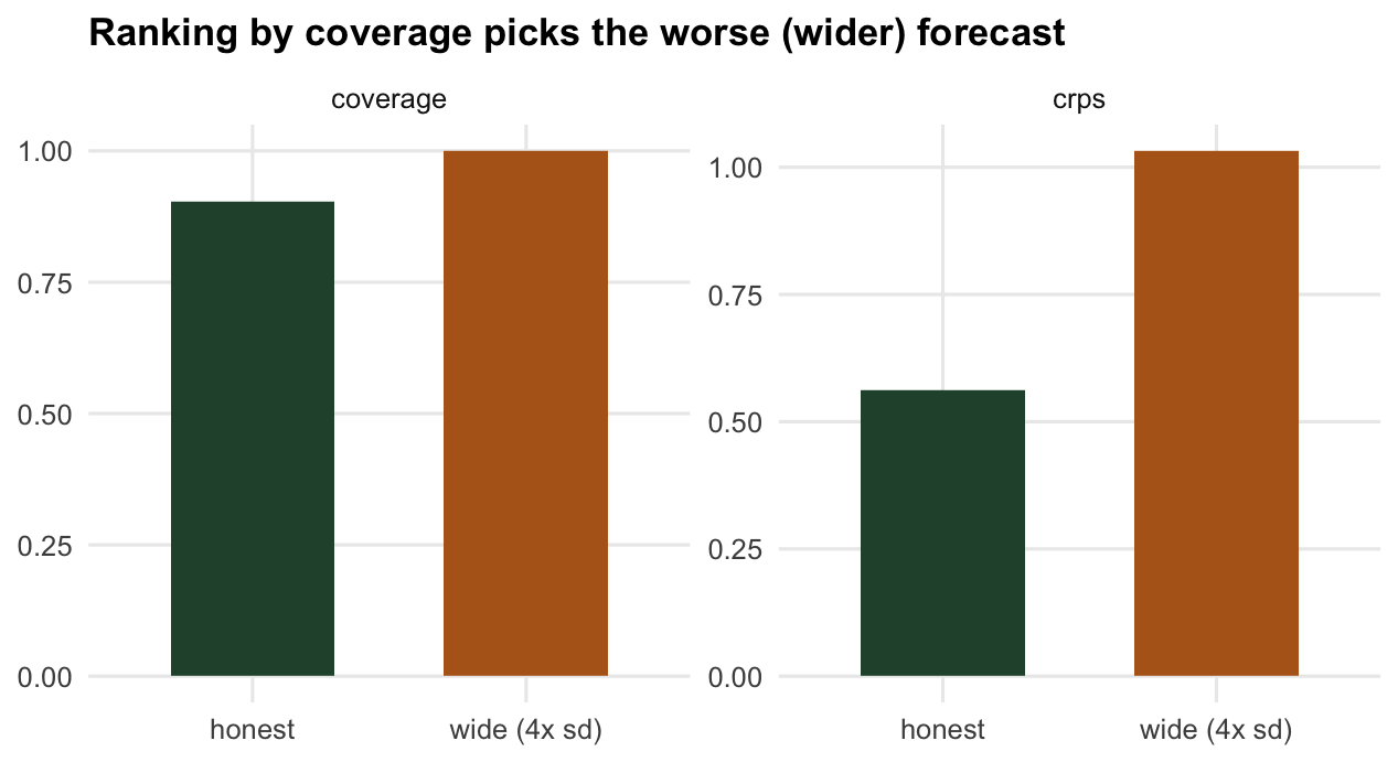
A tempting way to grade a forecast is coverage: what fraction of outcomes fell inside the stated interval? It feels intuitive, and it is a trap, because it is improper. Rank forecasters by "more coverage is better" and the winner is whoever quotes the widest interval. A forecast that reports a spread four times too large covers almost everything, and by the coverage yardstick it beats an honest one.
```{r coverage}
set.seed(909)
mu_t <- 3; sig0 <- 1
y <- rnorm(5000, mu_t, sig0)
cover90 <- function(mu, s, y) { lo <- qnorm(0.05, mu, s); hi <- qnorm(0.95, mu, s)
  mean(y >= lo & y <= hi) }

honest <- c(coverage = cover90(mu_t, sig0, y),     crps = mean(crps_norm(mu_t, sig0, y)))
wide   <- c(coverage = cover90(mu_t, 4 * sig0, y), crps = mean(crps_norm(mu_t, 4 * sig0, y)))
rbind(honest, wide)
```
The wide forecast covers `r sprintf("%.3f", cover90(mu_t, 4 * sig0, y))` of outcomes against the honest forecast's `r sprintf("%.3f", cover90(mu_t, sig0, y))`, so by coverage alone it "wins". But its CRPS is `r sprintf("%.2f", mean(crps_norm(mu_t, 4 * sig0, y)) / mean(crps_norm(mu_t, sig0, y)))` times worse. Coverage is a calibration check, not a ranking rule: the target is coverage equal to the nominal level, not coverage as high as possible. A proper score penalises the wasted width that pure coverage rewards.
```{r fig-coverage}
#| echo: false
#| fig-cap: "Ranking by coverage prefers the wide forecast, but its CRPS is far worse. Coverage checks calibration; it does not rank forecasts."
#| fig-alt: "Two panels of bars for an honest and a wide forecast. The coverage panel shows both near one with the wide one slightly higher; the CRPS panel shows the wide forecast almost twice as high."
#| fig-width: 6.6
#| fig-height: 3.6
d4l <- data.frame(
forecast = rep(c("honest", "wide (4x sd)"), 2),
metric = rep(c("coverage", "crps"), each = 2),
val = c(honest["coverage"], wide["coverage"], honest["crps"], wide["crps"]))
ggplot(d4l, aes(forecast, val, fill = forecast)) + geom_col(width = 0.6) +
facet_wrap(~metric, scales = "free_y") +
scale_fill_manual(values = c(col_main, col_acc), guide = "none") +
labs(title = "Ranking by coverage picks the worse (wider) forecast", x = NULL, y = NULL) + base_th
```
## Check 2: sharpness is a virtue only after calibration
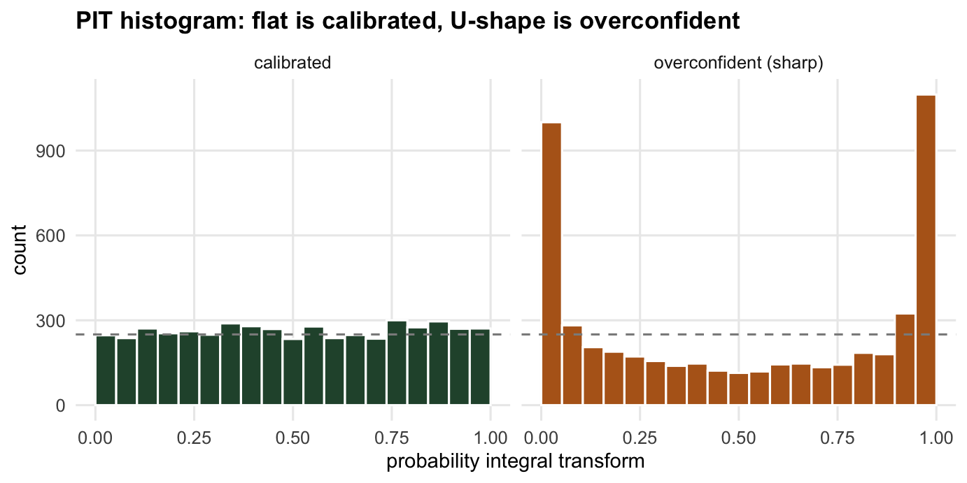
The opposite failure is prizing sharpness: narrow intervals look confident and precise. But a sharp forecast that is wrong is overconfident, and the sign of that is a probability integral transform (PIT) that is not flat. The PIT is the forecast CDF evaluated at each outcome; for a calibrated forecast it is uniform, and for an overconfident one it piles up in the tails, because outcomes keep landing outside the too-narrow intervals.
```{r sharpness}
set.seed(919)
y2 <- rnorm(5000, mu_t, sig0)
width90 <- function(s) qnorm(0.95, 0, s) - qnorm(0.05, 0, s)
pit <- function(mu, s, y) pnorm(y, mu, s)

honest_s <- c(width = width90(sig0),       crps = mean(crps_norm(mu_t, sig0, y2)),
              tail = mean(pit(mu_t, sig0, y2) < 0.05 | pit(mu_t, sig0, y2) > 0.95))
sharp_s  <- c(width = width90(0.5 * sig0), crps = mean(crps_norm(mu_t, 0.5 * sig0, y2)),
              tail = mean(pit(mu_t, 0.5 * sig0, y2) < 0.05 | pit(mu_t, 0.5 * sig0, y2) > 0.95))
rbind(honest_s, sharp_s)
```
The overconfident forecast is sharper: its 90 per cent interval is `r sprintf("%.2f", width90(0.5 * sig0))` wide against `r sprintf("%.2f", width90(sig0))`. If you chased sharpness you would prefer it. But `r sprintf("%.0f", 100 * sharp_s["tail"])` per cent of outcomes fall in its tails instead of the nominal 10, and its CRPS is worse (`r sprintf("%.3f", sharp_s["crps"])` against `r sprintf("%.3f", honest_s["crps"])`). The discipline, from Gneiting et al. (2007), is to maximise sharpness *subject to* calibration: a sharp forecast is better only once the PIT confirms it is honest. A single score cannot tell you which side of that line you are on, which is why the score and the calibration plot are reported together.
```{r fig-pit}
#| echo: false
#| fig-cap: "PIT histograms. Flat means calibrated; the U-shape of the overconfident forecast shows outcomes piling up in the tails."
#| fig-alt: "Two histograms of the probability integral transform. The calibrated one is flat around the dashed uniform line; the overconfident one is U-shaped with tall bars at both ends."
#| fig-width: 7.2
#| fig-height: 3.6
n2 <- length(y2)
d4b <- data.frame(pit = c(pit(mu_t, sig0, y2), pit(mu_t, 0.5 * sig0, y2)),
who = rep(c("calibrated", "overconfident (sharp)"), each = n2))
ggplot(d4b, aes(pit)) +
geom_histogram(aes(fill = who), bins = 20, boundary = 0, colour = "white") +
geom_hline(yintercept = n2 / 20, linetype = "dashed", colour = col_mut) +
facet_wrap(~who) +
scale_fill_manual(values = c(col_main, col_acc), guide = "none") +
labs(title = "PIT histogram: flat is calibrated, U-shape is overconfident",
x = "probability integral transform", y = "count") + base_th
```
## Check 3: a small test set may not separate two forecasts
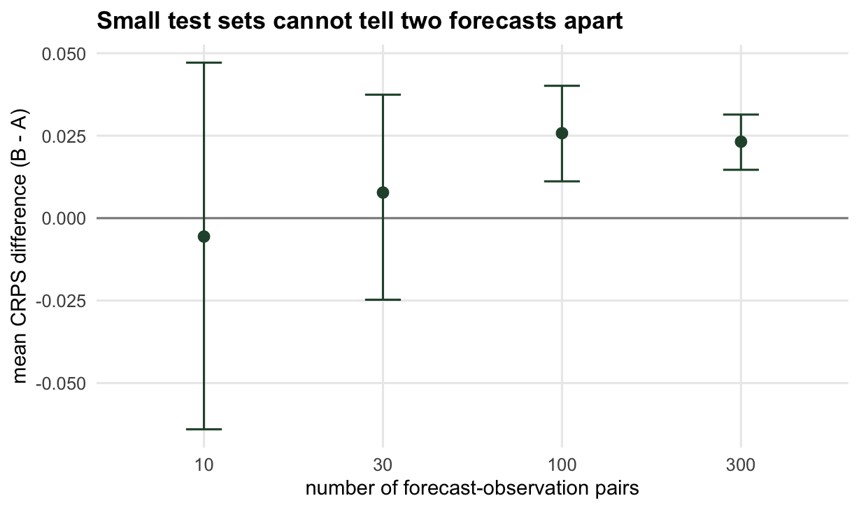
Ecological forecasts are often evaluated on a handful of years or sites. A difference in mean score between two models is itself an estimate, with sampling uncertainty, and on a short test set that uncertainty can swamp the difference. Here model A is the honest forecast and model B is slightly too wide; A is genuinely better. Bootstrapping the per-observation CRPS difference across the test points shows when the evidence is actually there (Diebold and Mariano 1995).
```{r diffci}
crps_diff_ci <- function(ntest, seed, B = 4000) {
  set.seed(seed)
  yy <- rnorm(ntest, mu_t, sig0)
  d <- crps_norm(mu_t, 1.4 * sig0, yy) - crps_norm(mu_t, sig0, yy)   # B minus A, positive = A better
  bs <- replicate(B, mean(sample(d, replace = TRUE)))
  c(mean = mean(d), lo = quantile(bs, 0.025), hi = quantile(bs, 0.975))
}
t(sapply(c(10, 30, 100, 300), function(nt) crps_diff_ci(nt, seed = 1000 + nt)))
```
At 10 test points the interval spans zero and the point estimate even comes out the wrong sign; at 30 it still spans zero; only at 100 and beyond does the interval clear zero and confirm that A beats B. Each size is a single simulated test set, so another draw could move the size at which the interval clears zero. How many test points a comparison needs depends on how large the expected score gap is against the spread of the per-observation differences, and with a gap as small as the one between A and B, a ranking of two forecasts on a dozen years is weak evidence of a real difference. The score can favour one model on a small sample purely by chance, so the interval, not the point estimate, is what settles it.
```{r fig-diffci}
#| echo: false
#| fig-cap: "Bootstrap intervals for the CRPS difference between two forecasts, one simulated test set at each size. In this run the intervals for the two smaller test sets include zero; another draw could move the size at which they clear zero."
#| fig-alt: "Point estimates with error bars for the mean CRPS difference at test sizes ten, thirty, one hundred and three hundred. The first two bars cross the zero line; the last two sit clearly above it."
#| fig-width: 6.4
#| fig-height: 3.8
ns <- c(10, 30, 100, 300)
M <- t(sapply(ns, function(nt) crps_diff_ci(nt, 1000 + nt)))
d4c <- data.frame(n = factor(ns), mean = M[, 1], lo = M[, 2], hi = M[, 3])
ggplot(d4c, aes(n, mean)) +
geom_hline(yintercept = 0, colour = col_mut) +
geom_errorbar(aes(ymin = lo, ymax = hi), width = 0.2, colour = col_main) +
geom_point(size = 2.4, colour = col_main) +
labs(title = "Small test sets may not tell two forecasts apart",
x = "number of forecast-observation pairs", y = "mean CRPS difference (B - A)") + base_th
```
## Where this leaves the series
Put the four posts together and the workflow is complete. Forecast a distribution, not a point. Grade it with a proper score: the Brier score for presence, the CRPS for abundance. Turn the raw score into skill against a baseline that is genuinely hard, and report the baseline. Then check the evaluation itself: coverage is a calibration test and not a ranking, sharpness only counts once the PIT is flat, and a score difference on a short record needs an interval before you believe it. None of this makes a bad model good, but it stops a good score from hiding a bad forecast.
## References
Gneiting T, Balabdaoui F, Raftery AE 2007. Journal of the Royal Statistical Society B 69(2):243-268 (10.1111/j.1467-9868.2007.00587.x)
Broecker J, Smith LA 2007. Weather and Forecasting 22(2):382-388 (10.1175/WAF966.1)
Diebold FX, Mariano RS 1995. Journal of Business and Economic Statistics 13(3):253-263 (10.1080/07350015.1995.10524599)
Dietze MC, Fox A, Beck-Johnson LM, et al. 2018. Proceedings of the National Academy of Sciences 115(7):1424-1432 (10.1073/pnas.1710231115)
## Related tutorials
- [Forecast skill and the baseline](../forecast-skill-and-the-baseline/)
- [The CRPS and the Brier score](../the-crps-and-brier-score/)
- [Scoring ecological forecasts](../scoring-ecological-forecasts/)
- [Checking predictive calibration](../checking-predictive-calibration/)