---
title: "Scoring ecological forecasts"
description: "A point forecast and its RMSE throw away the uncertainty. Proper scoring rules reward an honest probabilistic forecast of ecological outcomes, worked in R."
date: "2026-06-24 14:00"
date-modified: "2026-09-30"
categories: [R, forecasting, model evaluation, ecology tutorial]
image: thumbnail.png
image-alt: "Expected score against reported spread, minimised at the true spread, illustrating a proper scoring rule."
---
*Corrected 30 September 2026: the post defined a proper scoring rule as one whose expected score is best exactly when the forecaster reports their true belief, which is the definition of a strictly proper rule; it now gives both definitions, as the cited paper does.*
You fit a model, and it hands you a forecast for next year: the log-abundance of a population, the arrival date of a migrant, the probability a site is occupied. A good forecast is not a single number. It is a distribution, because the future is uncertain and an honest forecast says so. The question this post answers is how to score such a forecast once the truth arrives, and why the obvious choices quietly reward the wrong behaviour.
The short version: reduce a probabilistic forecast to its mean and grade it with root mean squared error, and you throw away the part that made it a forecast. A **proper scoring rule** grades the whole distribution, and it is built so that the best score, on average, goes to the forecaster who reports what they actually believe. That last property has a name (propriety), and it is worth seeing why it matters.
## A point forecast is blind to the spread
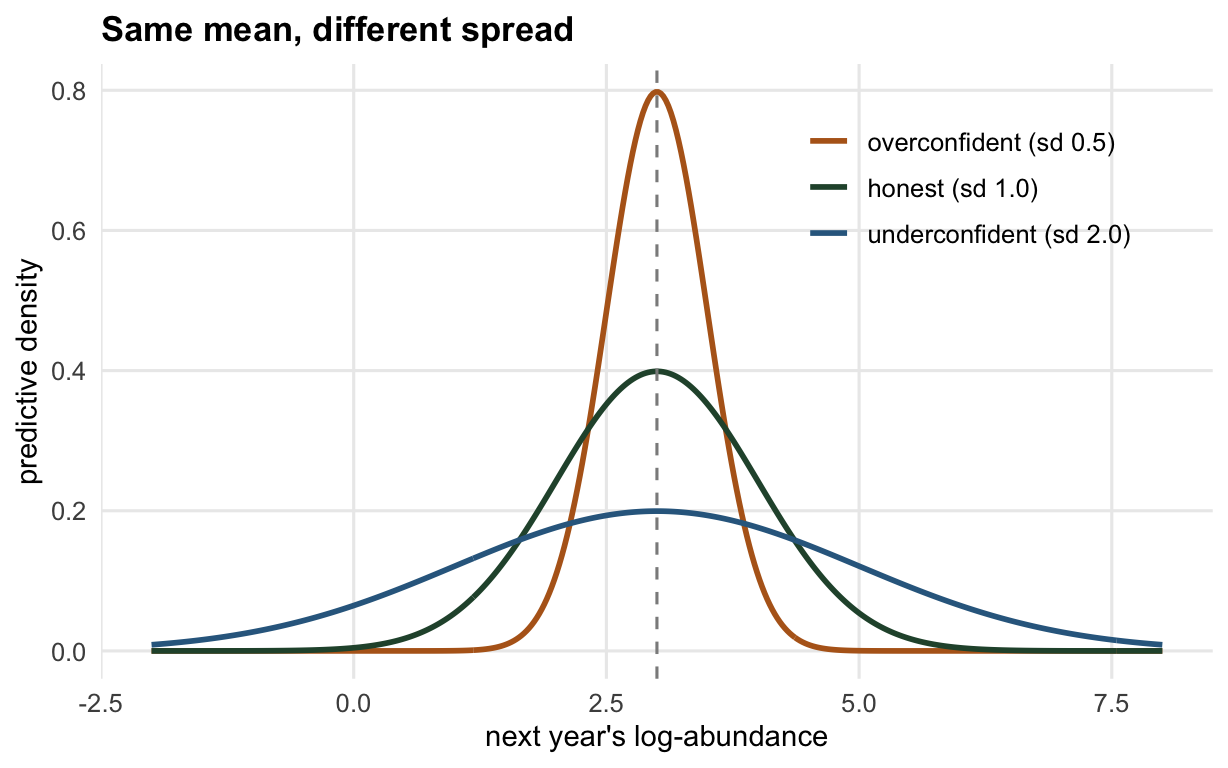
Here are two forecasters. Both centre next year's log-abundance on the same value. One is confident (a narrow predictive distribution); the other is cautious (a wide one). A point forecast keeps only the centre, so root mean squared error cannot tell them apart.
```{r setup}
#| echo: false
#| message: false
#| warning: false
suppressMessages(library(ggplot2))
te_canvas <- theme(plot.background = element_rect(fill = "#f5f4ee", colour = NA),
panel.background = element_rect(fill = "#f5f4ee", colour = NA))
col_main <- "#275139"; col_acc <- "#B5651D"; col_mut <- "#8C8C8C"; col_blu <- "#31688E"
base_th <- theme_minimal(base_size = 12) + te_canvas +
theme(panel.grid.minor = element_blank(),
plot.title = element_text(face = "bold", size = 13),
axis.title = element_text(size = 11))
```
```{r point-forecast}
set.seed(101)
mu0 <- 3.0; sigma0 <- 1.0          # the process: next year ~ Normal(mu0, sigma0)
y_obs <- rnorm(2000, mu0, sigma0)  # realised outcomes over many forecast occasions
fc_A <- list(mu = mu0, sd = 0.5)   # confident forecaster
fc_B <- list(mu = mu0, sd = 2.0)   # cautious forecaster

rmse_A <- sqrt(mean((y_obs - fc_A$mu)^2))   # the sd is never read
rmse_B <- sqrt(mean((y_obs - fc_B$mu)^2))
c(rmse_A = rmse_A, rmse_B = rmse_B)
```
Both land at `r sprintf("%.2f", rmse_A)`. The root mean squared error is identical because it only ever saw the shared mean. Yet the two forecasts are very different: one claims the outcome is pinned to within half a unit, the other spreads its bet across four. A score that cannot separate them is not measuring forecast quality.
```{r fig-densities}
#| echo: false
#| fig-cap: "Three predictive distributions that share a mean. A point forecast keeps only the dashed centre line; a proper score sees the spread."
#| fig-alt: "Three bell curves centred on the same value with standard deviations 0.5, 1.0 and 2.0, all crossing a shared dashed vertical line at the mean."
#| fig-width: 6.4
#| fig-height: 4.0
xs <- seq(-2, 8, length.out = 400)
d1 <- data.frame(x = rep(xs, 3),
dens = c(dnorm(xs, 3, 0.5), dnorm(xs, 3, 1), dnorm(xs, 3, 2)),
who = rep(c("overconfident (sd 0.5)", "honest (sd 1.0)", "underconfident (sd 2.0)"), each = 400))
d1$who <- factor(d1$who, levels = c("overconfident (sd 0.5)", "honest (sd 1.0)", "underconfident (sd 2.0)"))
ggplot(d1, aes(x, dens, colour = who)) + geom_line(linewidth = 1) +
geom_vline(xintercept = 3, linetype = "dashed", colour = col_mut) +
scale_colour_manual(values = c(col_acc, col_main, col_blu), name = NULL) +
labs(title = "Same mean, different spread", x = "next year's log-abundance", y = "predictive density") +
base_th + theme(legend.position = "inside", legend.position.inside = c(0.78, 0.8))
```
## A proper score reads the whole distribution
The **logarithmic score** is the simplest fix. It looks at the predictive density and reports the surprise of the outcome: minus the log density evaluated at what actually happened. A confident forecast that turns out right scores well; a confident forecast that turns out wrong is punished hard, because it placed almost no probability where the outcome landed. Lower is better.
```{r log-score}
logscore <- function(y, m, s) -dnorm(y, m, s, log = TRUE)
ls_A      <- mean(logscore(y_obs, mu0, 0.5))  # overconfident
ls_B      <- mean(logscore(y_obs, mu0, 2.0))  # underconfident
ls_honest <- mean(logscore(y_obs, mu0, 1.0))  # the honest forecast
c(overconfident = ls_A, honest = ls_honest, underconfident = ls_B)
```
The honest forecast wins: mean log score `r sprintf("%.2f", ls_honest)`, against `r sprintf("%.2f", ls_A)` for the overconfident one and `r sprintf("%.2f", ls_B)` for the cautious one. The confident forecaster is not rewarded for looking precise, and the vague forecaster is not rewarded for playing safe. The score sits lowest exactly where the reported spread matches the real spread.
## Why honesty is optimal: propriety
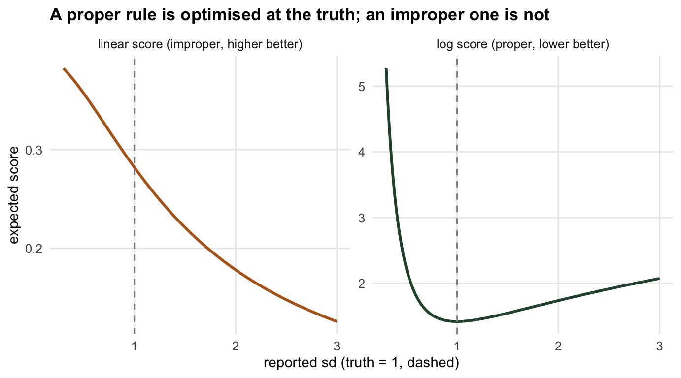
That last sentence is the whole game, so it should be checked rather than asserted. Suppose the truth really is `Normal(mu0, 1)` and you report `Normal(mu0, s)` for some spread `s` of your choosing. The **expected** log score has a closed form, and it is minimised at `s = 1`: the truth. Reporting anything else, in either direction, costs you.
```{r propriety}
elog <- function(s) 0.5 * log(2 * pi) + log(s) + sigma0^2 / (2 * s^2)
sgrid  <- seq(0.3, 3, by = 0.001)
s_star <- sgrid[which.min(elog(sgrid))]   # where the expected log score bottoms out
s_star
```
The expected score bottoms out at `r sprintf("%.2f", s_star)`, the true spread. Reporting an overconfident `s = 0.5` instead of the true `s = 1` costs `r sprintf("%.2f", elog(0.5) - elog(1))` nats of expected score. A rule with this property is called **proper**: the forecaster's expected score is best, which under this sign convention means lowest, when they report their true belief, so there is nothing to gain by shading the answer. When the true belief is the only report that reaches the best score, as it is for the log score, the rule is **strictly proper** (Gneiting and Raftery 2007; Broecker and Smith 2007).
Contrast this with an **improper** rule. The tempting one is the *linear score*: reward the forecaster by the density they placed on the outcome, no logarithm. It sounds fair, but its expected value keeps rising as the reported spread shrinks, so it is maximised by a spike: report a point mass and claim certainty.
```{r linear-score}
elin <- function(s) 1 / sqrt(2 * pi * (sigma0^2 + s^2))   # expected linear score
s_lin_best <- sgrid[which.max(elin(sgrid))]
c(best_reported_sd = s_lin_best,
  score_at_0.3 = elin(0.3), score_at_1 = elin(1), score_at_2 = elin(2))
```
The linear score is highest at the smallest spread on the grid (`r sprintf("%.1f", s_lin_best)`) and falls monotonically as the forecast widens: `r sprintf("%.3f", elin(0.3))` at sd 0.3, `r sprintf("%.3f", elin(1))` at the truth, `r sprintf("%.3f", elin(2))` at sd 2. A forecaster paid this way is paid to lie, to claim more certainty than they have. That is exactly the failure a proper rule is designed to prevent.
```{r fig-scores}
#| echo: false
#| fig-cap: "Expected score against reported spread (truth = 1, dashed). The proper log score bottoms out at the truth; the improper linear score keeps rewarding a narrower report."
#| fig-alt: "Two panels. Left: expected log score, a U-shaped curve with its minimum at the dashed line for spread one. Right: expected linear score, decreasing steadily as the reported spread grows."
#| fig-width: 7.2
#| fig-height: 4.0
d1b <- data.frame(s = rep(sgrid, 2),
score = c(elog(sgrid), elin(sgrid)),
rule = rep(c("log score (proper, lower better)", "linear score (improper, higher better)"), each = length(sgrid)))
d1b$rule <- factor(d1b$rule, levels = c("log score (proper, lower better)",
"linear score (improper, higher better)"))
ggplot(d1b, aes(s, score, colour = rule)) + geom_line(linewidth = 1) +
geom_vline(xintercept = 1, linetype = "dashed", colour = col_mut) +
facet_wrap(~rule, scales = "free_y") +
scale_colour_manual(values = c("log score (proper, lower better)" = col_main,
"linear score (improper, higher better)" = col_acc),
guide = "none") +
labs(title = "A proper rule is optimised at the truth; an improper one is not",
x = "reported sd (truth = 1, dashed)", y = "expected score") + base_th
```
## Where to go next
The log score is the entry point, but it has a hard edge: it is infinite when the forecast puts zero density on an outcome that happens, which makes it brittle for count and presence data. The next post builds the two scores that dominate ecological forecasting in practice, the Brier score for presence and the CRPS for abundance, and shows how they relate. Whatever score you use, the discipline here carries over: grade the distribution, not the point, and make sure the rule rewards honesty. For the framing of prediction as a first-class goal in ecology, Dietze's 2017 book, Ecological Forecasting, and his paper in Ecological Applications from the same year are the natural starting texts.
## References
Broecker J, Smith LA 2007. Weather and Forecasting 22(2):382-388 (10.1175/WAF966.1)
Dietze MC 2017. Ecological Applications 27(7):2048-2060 (10.1002/eap.1589)
Dietze MC 2017. Ecological Forecasting. Princeton University Press (ISBN 978-1-4008-8545-9)
Gneiting T, Raftery AE 2007. Journal of the American Statistical Association 102(477):359-378 (10.1198/016214506000001437)
## Related tutorials
- [The CRPS and the Brier score](../the-crps-and-brier-score/)
- [Forecast skill and the baseline](../forecast-skill-and-the-baseline/)
- [Checking a forecast evaluation](../checking-a-forecast-evaluation/)
- [Bayesian model comparison: WAIC and LOO](../bayesian-model-comparison-waic-loo/)