library(ggplot2)
library(patchwork)

te_paper  <- "#f5f4ee"
te_ink    <- "#16241d"
te_body   <- "#2c3a31"
te_forest <- "#275139"
te_rust   <- "#b5534e"
te_gold   <- "#c9b458"
te_line   <- "#dad9ca"

theme_datasheet <- function() {
  theme_minimal(base_size = 12) +
    theme(plot.background  = element_rect(fill = te_paper, colour = NA),
          panel.background = element_rect(fill = te_paper, colour = NA),
          panel.grid.major = element_line(colour = te_line, linewidth = 0.3),
          panel.grid.minor = element_blank(),
          text             = element_text(colour = te_body),
          plot.title       = element_text(colour = te_ink, face = "bold"),
          plot.subtitle    = element_text(colour = te_body),
          axis.text        = element_text(colour = te_body))
}Attributing one bad year to a warming trend
R
extreme value theory
climate change
selection bias
simulation
ecology tutorial
Keeping the extreme year that triggered an attribution study in a normal trend fit inflates the probability ratio; in a GEV the shape absorbs it. R simulation.
In the summer a river reach loses most of its freshwater mussels. The water was the warmest in the forty years of the gauge record, flow was low, and by August the gravel bars were covered in open shells. The report to the catchment board asks the question that now follows every such summer: how much more likely has the warming of the last four decades made a summer like this one? The analyst has the forty annual values of mean July water temperature, this summer included. A straight line goes through them, the fitted climate of this year and of the first year of the record are compared, and the answer comes back as a probability ratio: the chance of a summer at least this warm now, divided by its chance at the start of the record.
That calculation has one feature that a planned trend analysis does not have. Nobody would have run it this year if this summer had been ordinary. The event chose the moment of the analysis, and the event is also the last and most extreme point in the series the trend is fitted to. A data point that decides whether the analysis happens and then enters the analysis is a selected data point, and the fitted slope has no way of knowing that.
This is a known problem in climate event attribution, not a finding of this post. Barlow, Sherlock and Tawn set it out for flood frequency analysis run after a record flow, as a stopping rule that biases the fit; Miralles and Davison studied the same timing bias for rapid attribution studies and wrote down a likelihood that conditions on the stopping rule; Zeder and colleagues showed with climate model ensembles that including or excluding the trigger event changes the likelihood assessment of a record heatwave. What follows is a demonstration in the simplest setting an ecologist is likely to meet: forty annual values, a linear trend fitted by least squares, and a probability ratio read off the fit.
The site already has the pieces on either side. The non-stationary section of return levels and uncertainty fits a location trend to a GEV and shows how a fifty-year level moves with it, but there the record is fixed before anything happens and no year was selected. Records as a test for trend compares a trend test with a record count on series chosen in advance. Baseline selection and the return to the mean is about selecting the worst sites for treatment; here the selection is of the year in which the question is asked. Testing a monitoring series every year prices repeated looks at a trend with a fixed schedule; here there is one look, and its timing is set by the data.
The trigger year sits at the end of the lever
The generating model is deliberately plain. Forty annual values are normal with standard deviation one and a mean that rises linearly by b standard deviations a year. The last year is the trigger: it is drawn from its own distribution conditional on lying above that year’s 0.99 quantile, so it is a one in a hundred summer for the climate it happened in, whatever the trend. The event magnitude x is that last value. The probability ratio compares the chance of exceeding x in the climate of year forty with the chance in the climate of year one, so with no trend the true ratio is exactly one.
n_yr    <- 40
yrs     <- seq_len(n_yr)
p_trig  <- 0.99
q_trig  <- qnorm(p_trig)

log_surv <- function(x, m, s) pnorm(x, m, s, lower.tail = FALSE, log.p = TRUE)

# least squares for every row of a matrix at once
ols_rows <- function(y_mat, tt) {
  t_c   <- tt - mean(tt)
  s_xx  <- sum(t_c^2)
  b_hat <- as.vector(y_mat %*% t_c) / s_xx
  a_hat <- rowMeans(y_mat) - b_hat * mean(tt)
  res   <- y_mat - a_hat - outer(b_hat, tt)
  s_hat <- sqrt(rowSums(res^2) / (length(tt) - 2))
  list(a = a_hat, b = b_hat, s = s_hat,
       tstat = b_hat / (s_hat / sqrt(s_xx)), dfree = length(tt) - 2)
}

t_cent   <- yrs - mean(yrs)
lever_w  <- t_cent[n_yr] / sum(t_cent^2)
trunc_mn <- dnorm(q_trig) / (1 - p_trig)
b_pred   <- lever_w * trunc_mn
shift_pred <- b_pred * (n_yr - 1)
The size of the problem can be written down before any simulation. A least squares slope is a weighted sum of the observations, and the weight on year forty is its distance from the mean year divided by the centred sum of squares: 0.00366 per year, the largest positive weight in the series (year one carries the same weight with the opposite sign). A normal value drawn above its own 0.99 quantile exceeds its mean by 2.665 standard deviations on average (the mean of a truncated normal, the density at the quantile divided by the tail area). The product is the expected slope that the trigger adds to a series with no trend at all: 0.0098 standard deviations a year, which over the 39 years between the two climates the ratio compares is a fitted warming of 0.38 standard deviations.
set.seed(31907)
y_ex <- rnorm(n_yr)
y_ex[n_yr] <- qnorm(runif(1, p_trig, 1))
fit_in  <- ols_rows(matrix(y_ex, 1), yrs)
fit_out <- ols_rows(matrix(y_ex[-n_yr], 1), yrs[-n_yr])
ex_lpr <- function(f) log_surv(y_ex[n_yr], f$a + f$b * n_yr, f$s) -
  log_surv(y_ex[n_yr], f$a + f$b, f$s)
ex_pr_in  <- exp(ex_lpr(fit_in))
ex_pr_out <- exp(ex_lpr(fit_out))
One record makes it concrete. In a trendless series drawn with the seed above, the trigger summer is 2.66 standard deviations above the long-run mean. The line through all forty years has a slope of 0.0242 a year and returns a probability ratio of 7.94; the line through the first thirty-nine has a slope of 0.0153 and a ratio of 4.18. The true ratio is one. This record drifted upward by chance even without its last summer, which is ordinary in forty noisy years; the trigger added to the drift rather than creating it, and the simulation below separates the two.
No warming, and the analysis finds some
The simulation below runs the same analysis on many records at four trend values, fixed before it ran: none, and 0.01, 0.02 and 0.04 standard deviations a year. Three fits are compared on each record: all forty years, the thirty-nine years before the trigger, and a window of the last thirty years that keeps the trigger (a common choice when the early record is thought less reliable). Attribution is declared two ways, as practitioners do: by a one-sided least squares slope test at five per cent, and when the lower end of a 90 per cent parametric bootstrap interval for the probability ratio lies above one, the kind of interval Paciorek, Stone and Wehner compare for risk ratios. The bootstrap simulates series from each fitted line and holds the event magnitude fixed.
n_rep  <- 1000
n_boot <- 200
b_grid <- c(0, 0.01, 0.02, 0.04)
fit_sets <- list(all = yrs, before = yrs[-n_yr], last30 = (n_yr - 29):n_yr)

sim_main <- function(b_true) {
  mu_t  <- b_true * yrs
  y_mat <- matrix(rnorm(n_rep * n_yr), n_rep) + rep(mu_t, each = n_rep)
  y_mat[, n_yr] <- mu_t[n_yr] + qnorm(runif(n_rep, p_trig, 1))
  x_ev <- y_mat[, n_yr]
  lpr_true <- log_surv(x_ev, mu_t[n_yr], 1) - log_surv(x_ev, mu_t[1], 1)
  per_fit <- lapply(fit_sets, function(tt) {
    f <- ols_rows(y_mat[, tt, drop = FALSE], tt)
    lpr <- log_surv(x_ev, f$a + f$b * n_yr, f$s) - log_surv(x_ev, f$a + f$b, f$s)
    bnd <- vapply(seq_len(n_rep), function(i) {
      y_b <- matrix(rnorm(n_boot * length(tt), 0, f$s[i]), n_boot) +
        rep(f$a[i] + f$b[i] * tt, each = n_boot)
      g <- ols_rows(y_b, tt)
      quantile(log_surv(x_ev[i], g$a + g$b * n_yr, g$s) -
                 log_surv(x_ev[i], g$a + g$b, g$s), c(0.05, 0.95), names = FALSE)
    }, numeric(2))
    data.frame(lpr = lpr, err = lpr - lpr_true, a_hat = f$a, b_hat = f$b, s_hat = f$s,
               att_t = pt(f$tstat, f$dfree, lower.tail = FALSE) < 0.05,
               att_boot = bnd[1, ] > 0,
               cover = bnd[1, ] <= lpr_true & bnd[2, ] >= lpr_true)
  })
  list(fits = per_fit, lpr_true = lpr_true, x_ev = x_ev)
}

set.seed(40115)
sims <- lapply(b_grid, sim_main)

main_tab <- do.call(rbind, lapply(seq_along(b_grid), function(k) {
  do.call(rbind, lapply(names(fit_sets), function(nm) {
    d <- sims[[k]]$fits[[nm]]
    data.frame(b = b_grid[k], fit = nm, med_pr = exp(median(d$lpr)),
               true_pr = exp(median(sims[[k]]$lpr_true)),
               med_err = median(d$err), att_t = mean(d$att_t),
               att_boot = mean(d$att_boot), cover = mean(d$cover),
               mean_b = mean(d$b_hat), mean_s = mean(d$s_hat))
  }))
}))
get_v <- function(bv, nm, col) main_tab[main_tab$b == bv & main_tab$fit == nm, col]
mc_se <- function(p) sqrt(p * (1 - p) / n_rep)
b0_slope_se <- sd(sims[[1]]$fits$all$b_hat) / sqrt(n_rep)
The replication, 1000 records per trend value and 200 bootstrap series per record, was fixed before the run. It puts the Monte Carlo standard error of a rate near five per cent at 0.007 and of a rate near one half at 0.016.
First the arithmetic. With no trend the mean fitted slope over all forty years is 0.0100 (Monte Carlo standard error 0.0004), against the 0.0098 predicted from the lever weight and the truncated mean; without the trigger year it is 0.0002. The trigger does one more thing the slope formula leaves out: it inflates the residual standard deviation, whose mean is 1.068 with the trigger and 0.995 without.
Then the quantity the report quotes. The median probability ratio over records with no trend is 2.87 when the trigger year is in the fit, 1.09 when it is left out, and 5.21 in the thirty-year window, where the lever is longer relative to the record. The slope test declares a warming influence in 13.9 per cent of trendless records with the trigger included, against 4.6 per cent without it and 16.4 per cent in the window. The bootstrap rule gives 16.3, 5.7 and 17.5 per cent. Both rules are nominally five per cent procedures.
ex_df <- data.frame(year = yrs, y = y_ex, trig = yrs == n_yr)
line_df <- rbind(
  data.frame(year = yrs, y = fit_in$a + fit_in$b * yrs, fit = "all forty years"),
  data.frame(year = yrs, y = fit_out$a + fit_out$b * yrs, fit = "trigger year left out"))
p_ex <- ggplot(ex_df, aes(year, y)) +
  geom_line(data = line_df, aes(colour = fit), linewidth = 0.9) +
  geom_point(aes(fill = trig), shape = 21, colour = te_ink, size = 2.2,
             show.legend = FALSE) +
  scale_fill_manual(values = c(te_line, te_rust)) +
  scale_colour_manual(values = c(te_rust, te_forest), name = NULL) +
  labs(x = "year of record", y = "July temperature (SD units)",
       title = "One record, two lines",
       subtitle = "red point: the summer that started the analysis") +
  theme_datasheet() + theme(legend.position = "bottom")

slope_df <- rbind(
  data.frame(b_hat = sims[[1]]$fits$all$b_hat, fit = "all forty years"),
  data.frame(b_hat = sims[[1]]$fits$before$b_hat, fit = "trigger year left out"))
p_sl <- ggplot(slope_df, aes(b_hat, colour = fit)) +
  geom_vline(xintercept = 0, colour = te_body, linewidth = 0.5) +
  geom_vline(xintercept = b_pred, colour = te_rust, linetype = "dashed",
             linewidth = 0.7) +
  stat_density(geom = "line", position = "identity", linewidth = 0.9) +
  scale_colour_manual(values = c(te_rust, te_forest), name = NULL) +
  labs(x = "fitted slope (SD per year)", y = "density",
       title = "The trigger tilts the line",
       subtitle = "dashed: lever weight times truncated mean") +
  theme_datasheet() + theme(legend.position = "bottom")

(p_ex | p_sl) + plot_annotation(theme = theme_datasheet())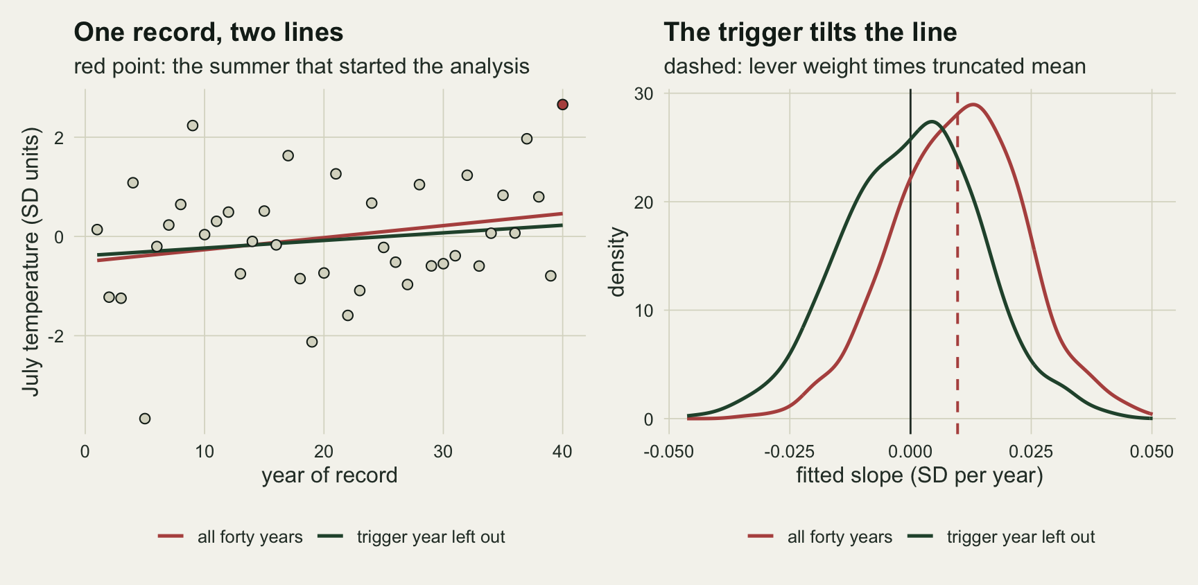
A real trend, and the ratio is still inflated
A record with a genuine trend is the case the report believes it is in, so the useful question is how far the fit overstates a ratio that is really above one. The error is measured as the median of the log of the estimated ratio over the true ratio, record by record, because the true ratio depends on how extreme each trigger summer happened to be.
row_02 <- function(nm, col) get_v(0.02, nm, col)
fold_02 <- exp(row_02("all", "med_err"))
fold_04 <- exp(get_v(0.04, "all", "med_err"))
fold_01 <- exp(get_v(0.01, "all", "med_err"))
fold_02_before <- exp(row_02("before", "med_err"))
cover_rng <- range(main_tab$cover[main_tab$fit == "before"])
cover_all_rng <- range(main_tab$cover[main_tab$fit == "all"])

# split the log error of the all-years fit into two partial errors:
# fitted line with the true SD of one, and true line with the fitted SD
decomp_tab <- do.call(rbind, lapply(seq_along(b_grid), function(k) {
  mu_t <- b_grid[k] * yrs
  x_ev <- sims[[k]]$x_ev
  lt   <- sims[[k]]$lpr_true
  part <- function(d) c(
    line_only = median(log_surv(x_ev, d$a_hat + d$b_hat * n_yr, 1) -
                         log_surv(x_ev, d$a_hat + d$b_hat, 1) - lt),
    sd_only = median(log_surv(x_ev, mu_t[n_yr], d$s_hat) -
                       log_surv(x_ev, mu_t[1], d$s_hat) - lt),
    both = median(d$err))
  data.frame(b = b_grid[k], fit = c("all", "before"),
             rbind(part(sims[[k]]$fits$all), part(sims[[k]]$fits$before)))
}))
get_d <- function(bv, nm, col) decomp_tab[decomp_tab$b == bv & decomp_tab$fit == nm, col]
# Monte Carlo standard error of a median from the order statistics around it
med_se <- function(v) {
  v <- sort(v); n <- length(v); h <- 1.96 * sqrt(n) / 2
  (v[ceiling(n / 2 + h)] - v[floor(n / 2 - h)]) / (2 * 1.96)
}
line_only_se <- max(vapply(seq_along(b_grid), function(k) {
  d <- sims[[k]]$fits$all
  med_se(log_surv(sims[[k]]$x_ev, d$a_hat + d$b_hat * n_yr, 1) -
           log_surv(sims[[k]]$x_ev, d$a_hat + d$b_hat, 1) - sims[[k]]$lpr_true)
}, numeric(1)))
At 0.02 standard deviations a year the median true ratio is 12.7. The fit with the trigger year returns a median of 28.4; record by record its median overstatement is a factor of 2.11. Leaving the trigger out gives a median ratio of 12.8 and a median factor of 0.99, and the thirty-year window returns 52.9, the largest of the three. With the trigger in the fit the overstatement shrinks as the trend grows, from 2.30 at 0.01 to 1.66 at 0.04. The tilt is not what shrinks. Two errors pull against each other, and the chunk above splits them record by record. With the fitted line and the true standard deviation of one, the median log error would be +1.17 with no trend, +1.11 at 0.02 and +1.21 at 0.04: the line alone overstates the ratio by a similar amount at every trend. Each of these medians has a Monte Carlo standard error of up to 0.08, so a modest drift with the trend would not show at this replication; either way, the line-only error does not shrink the way the total error does. With the true line and the fitted standard deviation, which the trigger inflates, it is -0.14, -0.28 and -0.54 at the three real trends. A wider fitted distribution makes a summer far above the year-one climate look less rare there, and the stronger the trend, the further into the year-one tail the event sits and the stronger that pull. Without the trigger year the same partial error is +0.04 at 0.02 and +0.21 at 0.04, so the downward pull comes from the inflation the trigger adds. The two partial errors do not add exactly, because the ratio is not linear in the line and the spread.
Leaving the year out has a price, and it is paid in power. At 0.02 the slope test attributes in 63.9 per cent of records with the trigger and 39.5 per cent without it. The thirty-year window attributes in 44.4 per cent: a larger tilt, but ten fewer years. Part of the first number is real power and part is the same tilt that produced the false attributions at zero trend, and one record cannot tell them apart.
The bootstrap intervals were checked for coverage of the true ratio. Without the trigger year the 90 per cent interval covers in 87.8 to 88.9 per cent of records across the four trends, slightly short of nominal with a Monte Carlo standard error of 0.009; with the trigger, in 83.2 to 88.4 per cent, and the lowest coverage is at zero trend, where the tilt matters most.
fit_lab <- c(all = "all forty years", before = "trigger year left out",
             last30 = "last thirty years")
plot_tab <- main_tab
plot_tab$fit <- factor(fit_lab[plot_tab$fit], levels = fit_lab)
true_tab <- main_tab[main_tab$fit == "all", c("b", "true_pr")]
fit_cols <- c(te_rust, te_forest, te_gold)

p_pr <- ggplot(plot_tab, aes(b, med_pr, colour = fit)) +
  geom_line(data = true_tab, aes(b, true_pr), inherit.aes = FALSE,
            colour = te_ink, linetype = "dashed", linewidth = 0.6) +
  geom_line(linewidth = 0.9) + geom_point(size = 2.2) +
  scale_y_log10() +
  scale_colour_manual(values = fit_cols, name = NULL) +
  labs(x = "true trend (SD per year)", y = "median probability ratio (log scale)",
       title = "The ratio runs high",
       subtitle = "dashed: median true ratio") +
  theme_datasheet() + theme(legend.position = "bottom")

p_att <- ggplot(plot_tab, aes(b, att_t, colour = fit)) +
  geom_hline(yintercept = 0.05, colour = te_ink, linetype = "dashed",
             linewidth = 0.6) +
  geom_line(linewidth = 0.9) + geom_point(size = 2.2) +
  scale_y_continuous(limits = c(0, 1)) +
  scale_colour_manual(values = fit_cols, name = NULL) +
  labs(x = "true trend (SD per year)", y = "share of records attributed",
       title = "Attribution by the slope test",
       subtitle = "dashed: the nominal five per cent") +
  theme_datasheet() + theme(legend.position = "bottom")

(p_pr | p_att) + plot_layout(guides = "collect") +
  plot_annotation(theme = theme_datasheet() + theme(legend.position = "bottom"))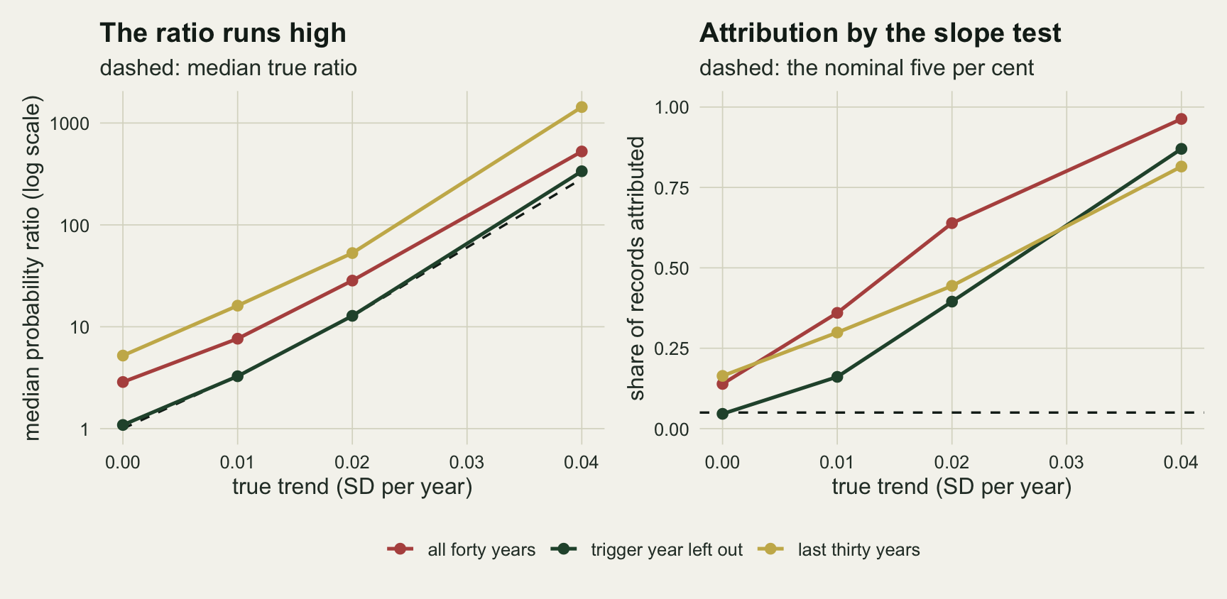
When the quiet years were selected too
Dropping the trigger year is clean in the simulation above because only the last year was selected: the thirty-nine years before it are an ordinary sample. A real stopping rule is often sharper. The analysis starts the first time a fixed level is crossed, say a water temperature at which mussel mortality has been reported, which means every earlier year stayed below that level. Miralles and Davison write the likelihood for exactly this rule: the years before the trigger enter as right-truncated at the threshold, the trigger year as left-truncated, and a variant drops the trigger year while keeping the truncation of the others.
The second simulation uses that rule with the threshold fixed at the 0.99 quantile of the year-one climate, and fits four versions of the same normal trend model by maximum likelihood: the naive fit with all forty years, the naive fit without the trigger year, the full conditional likelihood, and the conditional likelihood without the trigger year. Attribution here is a one-sided Wald test on the slope at five per cent.
eta <- q_trig
n_rep_stop <- 1000
b_stop <- c(0, 0.02)

nll_trend <- function(par, y, tt, cond) {
  m_t <- par[1] + par[2] * tt
  s_t <- exp(par[3])
  ll <- dnorm(y, m_t, s_t, log = TRUE)
  if (cond) {
    pre <- tt < n_yr
    ll[pre]  <- ll[pre] - pnorm(eta, m_t[pre], s_t, log.p = TRUE)
    ll[!pre] <- ll[!pre] - log_surv(eta, m_t[!pre], s_t)
  }
  v <- -sum(ll)
  if (is.finite(v)) v else 1e10
}

fit_trend <- function(y, drop_last, cond) {
  tt <- if (drop_last) yrs[-n_yr] else yrs
  yy <- y[tt]
  par_start <- c(coef(lm(yy ~ tt)), log(sd(yy)))
  o <- optim(par_start, nll_trend, y = yy, tt = tt, cond = cond,
             method = "BFGS", hessian = TRUE)
  se_b <- tryCatch(sqrt(diag(solve(o$hessian)))[2], error = function(e) NA_real_)
  c(o$par[1], o$par[2], exp(o$par[3]), o$par[2] / se_b)
}

stop_fits <- list(naive_all = c(FALSE, FALSE), naive_before = c(TRUE, FALSE),
                  cond_all = c(FALSE, TRUE), cond_before = c(TRUE, TRUE))

sim_stop <- function(b_true) {
  mu_t <- b_true * yrs
  p_below <- pnorm(eta - mu_t)
  res <- replicate(n_rep_stop, {
    u_draw <- c(runif(n_yr - 1, 0, p_below[-n_yr]), runif(1, p_below[n_yr], 1))
    y <- mu_t + qnorm(u_draw)
    x_ev <- y[n_yr]
    lt <- log_surv(x_ev, mu_t[n_yr], 1) - log_surv(x_ev, mu_t[1], 1)
    vapply(stop_fits, function(sw) {
      f <- fit_trend(y, sw[1], sw[2])
      c(err = log_surv(x_ev, f[1] + f[2] * n_yr, f[3]) -
          log_surv(x_ev, f[1] + f[2], f[3]) - lt,
        b_hat = f[2], att = f[4] > qnorm(0.95), lt = lt, s_hat = f[3],
        err_line = log_surv(x_ev, f[1] + f[2] * n_yr, 1) -
          log_surv(x_ev, f[1] + f[2], 1) - lt,
        err_sd = log_surv(x_ev, mu_t[n_yr], f[3]) -
          log_surv(x_ev, mu_t[1], f[3]) - lt)
    }, numeric(7))
  })
  data.frame(b = b_true, fit = names(stop_fits),
             med_err = apply(res[1, , ], 1, median),
             mean_b = apply(res[2, , ], 1, mean),
             se_b = apply(res[2, , ], 1, sd) / sqrt(n_rep_stop),
             att = apply(res[3, , ], 1, mean, na.rm = TRUE),
             true_pr = exp(median(res[4, 1, ])),
             med_s = apply(res[5, , ], 1, median),
             med_err_line = apply(res[6, , ], 1, median),
             med_err_sd = apply(res[7, , ], 1, median))
}

set.seed(52203)
stop_tab <- do.call(rbind, lapply(b_stop, sim_stop))
get_s <- function(bv, nm, col) stop_tab[stop_tab$b == bv & stop_tab$fit == nm, col]
With no trend the four fits give mean slopes of 0.0096 (naive, all years), -0.0003 (naive, trigger left out), -0.0003 (conditional) and -0.0003 (conditional, trigger left out), and attribute in 15.4, 5.1, 4.6 and 4.8 per cent of records.
The trend case separates them. At 0.02 standard deviations a year, the mean fitted slopes are 0.0246, 0.0170, 0.0195 and 0.0196 in the same order, each with a Monte Carlo standard error near 0.0005. The median log error in the probability ratio is +0.784, +0.159, +0.123 and +0.132, and the attribution rates are 60.8, 38.7, 38.1 and 37.7 per cent.
So under this rule leaving the trigger out is no longer enough to recover the slope: the quiet years were held below the threshold, and a line through them is flattened. The two conditional fits recover it, with or without the trigger year. For the question the report asks, the difference is smaller than for the slope. The naive fit without the trigger has a median log error in the ratio of +0.159 against +0.123 for the full conditional fit, its attribution rate differs from the two conditional fits by at most 1.0 percentage points, and all three are far from the naive fit that keeps the trigger.
The closeness of the naive fit without the trigger is partly luck. Splitting its ratio error the same way as before, its flattened line alone gives a median log error of -0.273, a ratio that is too small. The quiet years it is fitted to were held below the threshold, so its fitted standard deviation is too small as well (median 0.899, against 0.958 for the conditional fit and a true value of one), and that alone gives +0.443, a ratio that is too large. The two errors offset here and need not elsewhere. The conditional fits get the line nearly right (-0.038 from the line alone), and their remaining error in the ratio comes from a maximum likelihood standard deviation that runs low (+0.162 from the spread alone). Leaving the year out gets close on the ratio by offsetting errors; the conditional likelihood fixes the slope.
stop_lab <- c(naive_all = "naive, all years", naive_before = "naive, trigger left out",
              cond_all = "conditional", cond_before = "conditional, trigger left out")
stop_plot <- stop_tab
stop_plot$fit <- factor(stop_lab[stop_plot$fit], levels = rev(stop_lab))
stop_plot$trend <- factor(sprintf("true trend %.2f", stop_plot$b))
stop_cols <- c(te_rust, te_forest)
p_sb <- ggplot(stop_plot, aes(mean_b, fit, colour = trend)) +
  geom_vline(xintercept = b_stop, colour = stop_cols, linetype = "dashed",
             linewidth = 0.6) +
  geom_point(size = 2.8) +
  scale_colour_manual(values = stop_cols, name = NULL) +
  labs(x = "mean fitted slope (SD per year)", y = NULL,
       title = "Slope", subtitle = "dashed: the true trends") +
  theme_datasheet() + theme(legend.position = "bottom")
p_sa <- ggplot(stop_plot, aes(att, fit, colour = trend)) +
  geom_vline(xintercept = 0.05, colour = te_ink, linetype = "dashed",
             linewidth = 0.6) +
  geom_point(size = 2.8) +
  scale_x_continuous(limits = c(0, 1)) +
  scale_colour_manual(values = stop_cols, name = NULL) +
  labs(x = "share of records attributed", y = NULL,
       title = "Attribution", subtitle = "dashed: five per cent") +
  theme_datasheet() + theme(legend.position = "bottom",
                            axis.text.y = element_blank())
(p_sb | p_sa) + plot_layout(guides = "collect") +
  plot_annotation(theme = theme_datasheet() + theme(legend.position = "bottom"))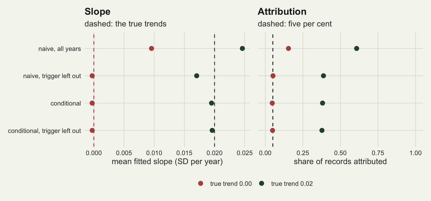
A heavy tail moves the bias into the shape
Summer means are close to normal, but many attribution questions are about maxima: the hottest day, the highest flow, the lowest oxygen. The third simulation replaces the normal with a GEV whose location rises linearly, with shape 0.1 and a scale chosen so that the annual standard deviation is one, so the trend units match the sections above. The trigger is again drawn above its own year’s 0.99 quantile. The model is fitted by maximum likelihood with a hand-coded likelihood, as in the return level post, and attribution is a one-sided signed likelihood ratio test on the location slope. The quantity added here is the estimated probability of the event in the climate of its own year, set against the true one.
xi_true <- 0.1
g_one <- gamma(1 - xi_true)
g_two <- gamma(1 - 2 * xi_true)
sg_true <- xi_true / sqrt(g_two - g_one^2)
n_rep_gev <- 600
b_gev <- c(0, 0.02)

qgev <- function(p, mu, sg, xi) mu + sg * ((-log(p))^(-xi) - 1) / xi
log_surv_gev <- function(x, mu, sg, xi) {
  z_s <- 1 + xi * (x - mu) / sg
  if (z_s <= 0) return(if (xi < 0) -Inf else 0)
  w_s <- z_s^(-1 / xi)
  if (w_s < 1e-8) log(w_s) else log(-expm1(-w_s))
}
nll_gev <- function(par, y, tt) {
  m_t <- par[1] + par[2] * tt
  s_g <- exp(par[3])
  xi  <- par[4]
  z_s <- 1 + xi * (y - m_t) / s_g
  if (any(z_s <= 0) || abs(xi) < 1e-6) return(1e10)
  v <- sum(log(s_g) + (1 / xi + 1) * log(z_s) + z_s^(-1 / xi))
  if (is.finite(v)) v else 1e10
}
fit_gev <- function(y, tt) {
  yy <- y[tt]
  st <- coef(lm(yy ~ tt))
  s0 <- sqrt(6) * sd(yy) / pi
  o1 <- optim(c(st[1] - 0.5772 * s0, st[2], log(s0), 0.1), nll_gev,
              y = yy, tt = tt, method = "BFGS")
  nll_flat <- function(p3) nll_gev(c(p3[1], 0, p3[2], p3[3]), yy, tt)
  o0 <- optim(o1$par[-2], nll_flat, method = "BFGS")
  c(o1$par[1], o1$par[2], exp(o1$par[3]), o1$par[4],
    sign(o1$par[2]) * sqrt(max(0, 2 * (o0$value - o1$value))))
}

sim_gev <- function(b_true) {
  mu_t <- b_true * yrs
  res <- replicate(n_rep_gev, {
    y <- qgev(runif(n_yr), mu_t, sg_true, xi_true)
    y[n_yr] <- qgev(runif(1, p_trig, 1), mu_t[n_yr], sg_true, xi_true)
    x_ev <- y[n_yr]
    ls_end <- log_surv_gev(x_ev, mu_t[n_yr], sg_true, xi_true)
    lt <- ls_end - log_surv_gev(x_ev, mu_t[1], sg_true, xi_true)
    vapply(list(all = yrs, before = yrs[-n_yr]), function(tt) {
      f <- fit_gev(y, tt)
      l_end <- log_surv_gev(x_ev, f[1] + f[2] * n_yr, f[3], f[4])
      c(err = l_end - log_surv_gev(x_ev, f[1] + f[2], f[3], f[4]) - lt,
        p_err = l_end - ls_end, b_hat = f[2], xi_hat = f[4],
        att = f[5] > qnorm(0.95))
    }, numeric(5))
  })
  data.frame(b = b_true, fit = c("all", "before"),
             med_err = apply(res[1, , ], 1, function(v) median(v[is.finite(v)])),
             n_inf = apply(res[2, , ], 1, function(v) sum(!is.finite(v))),
             n_inf_pr = apply(res[1, , ], 1, function(v) sum(!is.finite(v))),
             med_p_err = apply(res[2, , ], 1, median),
             mean_b = apply(res[3, , ], 1, mean),
             med_xi = apply(res[4, , ], 1, median),
             att = apply(res[5, , ], 1, mean),
             xi_all = I(list(res[4, 1, ], res[4, 2, ])))
}

set.seed(63319)
gev_tab <- do.call(rbind, lapply(b_gev, sim_gev))
get_g <- function(bv, nm, col) gev_tab[gev_tab$b == bv & gev_tab$fit == nm, col]
mc_se_gev <- function(p) sqrt(p * (1 - p) / n_rep_gev)
gev_eff <- pi^2 / 6
n_inf_before <- sum(gev_tab$n_inf[gev_tab$fit == "before"])
n_inf_all    <- sum(gev_tab$n_inf[gev_tab$fit == "all"])
n_pr_before  <- sum(gev_tab$n_inf_pr[gev_tab$fit == "before"])
n_pr_all     <- sum(gev_tab$n_inf_pr[gev_tab$fit == "all"])
z_gev_all    <- (get_g(0, "all", "att") - 0.05) / mc_se_gev(get_g(0, "all", "att"))
z_gev_before <- (get_g(0, "before", "att") - 0.05) / mc_se_gev(get_g(0, "before", "att"))
att_gap_se   <- (get_g(0, "all", "att") - get_g(0, "before", "att")) /
  sqrt(mc_se_gev(get_g(0, "all", "att"))^2 + mc_se_gev(get_g(0, "before", "att"))^2)
The GEV scale that gives a standard deviation of one at shape 0.1 is 0.670. With no trend and 600 records, the median fitted shape is 0.219 with the trigger year and 0.110 without it, against a true 0.1. The slope barely moves: its mean with the trigger is 0.0009, a tenth of the 0.0098 that the normal arithmetic predicted, and the median log error of the probability ratio is +0.013. The likelihood ratio test attributes in 7.5 per cent of trendless records with the trigger and 6.3 per cent without; the difference is 0.8 standard errors. Against five per cent, the rate without the trigger is 1.3 Monte Carlo standard errors above it and the rate with the trigger 2.3 above it.
The trigger has not gone away; it has moved from the trend into the tail. A fitted tail that is too heavy makes the event look less rare in its own year: the median log error in the event’s own-year exceedance probability is +1.08 with the trigger in the fit, an overstatement by a factor of 2.9, and +0.03 without it. This is the downward bias in the importance of the event that Miralles and Davison expect from the naive fit. The opposite bias they expect from leaving the event out, an own-year probability that is too small, did not show with no trend (the +0.03 above) and is small at a trend of 0.02 (-0.08). Without the trigger year, 68 of the 1200 fits over both trends put the event beyond the upper end point of the fitted distribution in its own year, so that it had probability zero there. The ratio can also fail to be finite when the event lies beyond the fitted end point in the year-one climate only, and the ratio medians leave out all 78 records without a finite ratio (with the trigger included both counts are 0; for the own-year count that is certain, since the event is then one of the data points).
At a trend of 0.02 the pattern repeats: median shape 0.217 against 0.108, and the heavier fitted tail now makes the ratio too small, where at zero trend it had left it almost unchanged, with a median log error of -0.198 against -0.053. Attribution is 75.5 against 68.8 per cent. Those rates are higher than the normal arm’s at the same trend, partly because maximum likelihood on a skewed parent uses more of the information than a least squares line does (for a Gumbel parent the information on location, per unit of variance, is 1.64 times the least squares figure), so the two arms should not be compared on power.
xi_df <- rbind(
  data.frame(xi_hat = gev_tab$xi_all[[1]], fit = "all forty years"),
  data.frame(xi_hat = gev_tab$xi_all[[2]], fit = "trigger year left out"))
ggplot(xi_df, aes(xi_hat, colour = fit)) +
  geom_vline(xintercept = xi_true, colour = te_ink, linetype = "dashed",
             linewidth = 0.6) +
  stat_density(geom = "line", position = "identity", linewidth = 0.9) +
  scale_colour_manual(values = c(te_rust, te_forest), name = NULL) +
  labs(x = "fitted shape", y = "density",
       title = "The trigger fattens the tail",
       subtitle = "no trend; dashed: the true shape of 0.1") +
  theme_datasheet() + theme(legend.position = "bottom")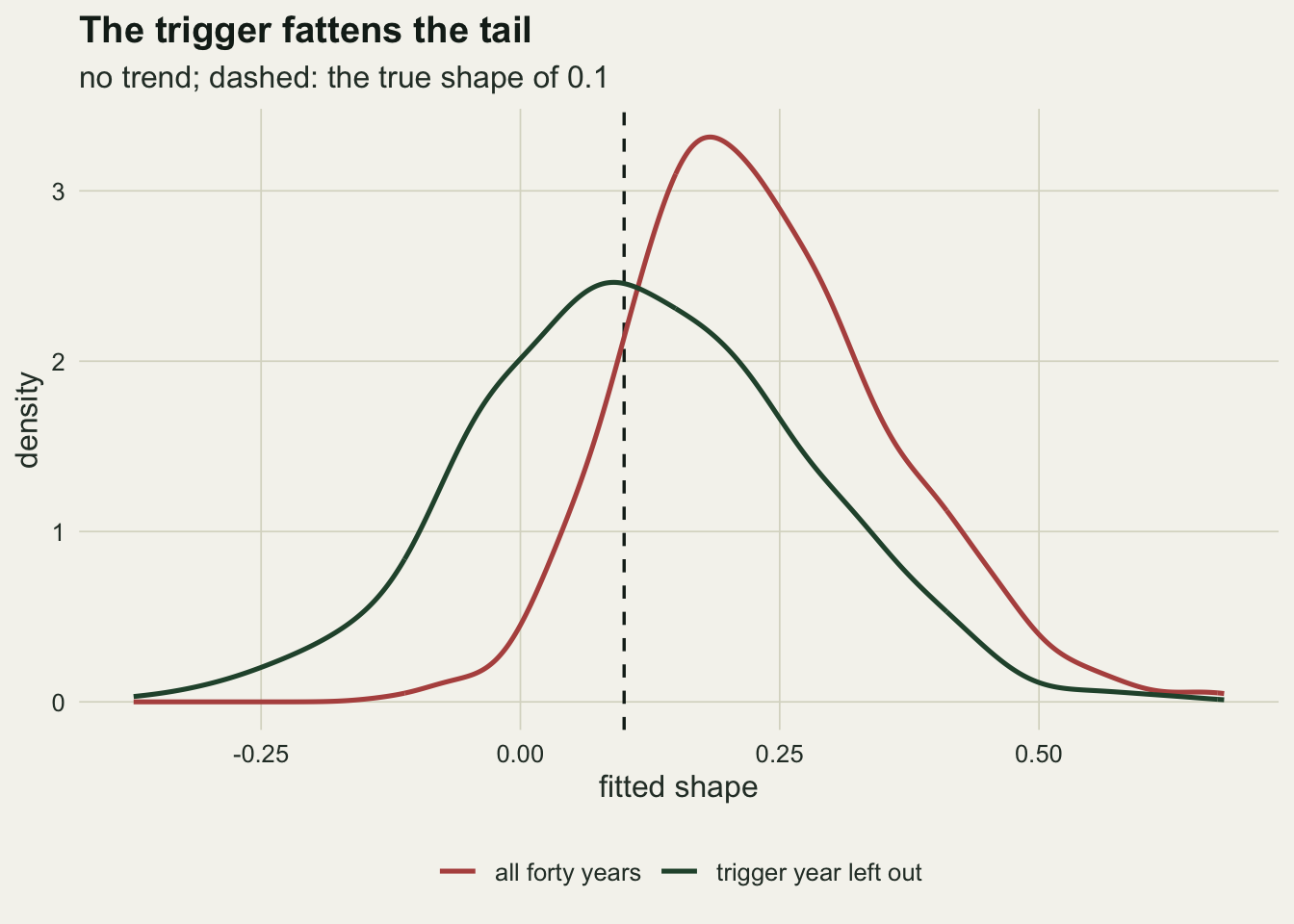
What to report
far <- function(pr) 1 - 1 / pr
far_0_all    <- far(get_v(0, "all", "med_pr"))
far_0_before <- far(get_v(0, "before", "med_pr"))
far_4_all    <- far(get_v(0.04, "all", "med_pr"))
far_4_before <- far(get_v(0.04, "before", "med_pr"))
Say whether the analysis was triggered by the event, and give the answer both ways: with and without the trigger year. On a normal record with no trend the two medians were 2.87 and 1.09; a reader who sees both numbers can see how much of the headline the one summer carries.
The choice of scale matters for how the bias reads. Stott, Stone and Allen expressed their attribution of the 2003 European heatwave as a fraction of attributable risk, one minus the inverse of the ratio. That fraction is a monotone function of the ratio, so it ranks fits identically, but it compresses the top of the scale. With no trend the median ratios above become fractions of 0.65 and 0.08: so a record with no trend at all, analysed with its trigger year, reports that most of the risk of the event is attributable to warming. At 0.04 standard deviations a year the fractions are 0.9981 and 0.9970, and an inflation that is plain on the ratio scale shows up only in the third decimal place. A trend p value, the number many ecological papers quote, carries the false attribution rates measured above but not the size of the ratio, and it can rank the fits differently: at 0.04 the thirty-year window gives the largest median ratio (1435) and the lowest attribution rate (81.5 per cent, against 96.3 with all forty years).
If the analysis was started by crossing a stated level, the conditional likelihood can be fitted in a few lines, as above, and is the method the attribution literature has proposed for this case. If the trigger was informal (a bad summer, a die-off, a newspaper headline), there is no threshold to condition on, and fitting without the trigger year while reporting both answers is the defensible fallback.
Honest limits
The trigger in the first and third simulations was a pure selection of the last year, drawn above its own quantile, with no conditioning on the earlier years. That is the design in which leaving the year out leaves an unselected sample by construction. The second simulation showed that a first-crossing rule also selects the quiet years, and a real analyst rarely knows which rule describes the decision that started the study.
Everything was fitted with a linear trend and independent years. Summer water temperatures carry memory from year to year, and autocorrelation widens every interval and inflates every slope test here; its effect on the false attribution rates was not measured. The trend also stands in for all of climate change: a real attribution compares a factual with a counterfactual climate from models, not the start and end of a fitted line, and the selection bias enters that comparison through whatever observed series is used to fit or evaluate the models.
The probability ratio here was estimated for a year-one climate that is part of the same record. In the thirty-year window that climate lies outside the fitted years and is an extrapolation, which is part of why the window overstated most; it would be fairer to compare the window against its own first year, and that version was not run.
The GEV arm used one shape, one record length and 600 records, and a shape of 0.1 is only one point of a range that runs from bounded temperature maxima to heavy rainfall tails. The bootstrap was run only in the normal arm. Nothing here says what happens in the first-crossing rule under a GEV, which is the case Barlow, Sherlock and Tawn and Miralles and Davison actually treat.
Finally, the ecological step is outside the statistics. A probability ratio for a warm July says how the chance of the temperature changed; it says nothing about whether the temperature killed the mussels, and a die-off in a warm summer can have low flow, a pathogen or an upstream discharge behind it.
References
Barlow AM, Sherlock C, Tawn J 2020 Journal of the Royal Statistical Society Series C 69(4):765-789 (10.1111/rssc.12420)
Miralles O, Davison AC 2023 Weather and Climate Extremes 41:100584 (10.1016/j.wace.2023.100584)
Zeder J, Sippel S, Pasche OC, Engelke S, Fischer EM 2023 Geophysical Research Letters 50(16):e2023GL104090 (10.1029/2023GL104090)
Paciorek CJ, Stone DA, Wehner MF 2018 Weather and Climate Extremes 20:69-80 (10.1016/j.wace.2018.01.002)
Stott PA, Stone DA, Allen MR 2004 Nature 432(7017):610-614 (10.1038/nature03089)