library(ggplot2)

te_pal <- list(forest = "#275139", green = "#2f8f63", sage = "#93a87f",
               clay = "#b5534e", gold = "#cda23f", line = "#dad9ca",
               ink = "#16241d", paper = "#f5f4ee")

theme_te <- function() {
  theme_minimal(base_size = 12) +
    theme(panel.grid.minor = element_blank(),
          panel.grid.major = element_line(colour = "#e7e6dc"),
          plot.background = element_rect(fill = "#f5f4ee", colour = NA),
          panel.background = element_rect(fill = "#f5f4ee", colour = NA),
          plot.title = element_text(face = "bold", colour = te_pal$ink),
          axis.title = element_text(colour = "#2c3a31"))
}Assignment tests and self-assignment
R
population genetics
ecology tutorial
ggplot2
Build genotype assignment likelihoods in base R, measure the leave-one-out bias in self-assignment, and run an exclusion test for an unsampled source.
A clustering analysis answers a question about groups: how many are there, and which individuals belong together. An assignment test answers a question about one individual: given a set of reference populations with estimated allele frequencies, which of them did this animal come from, and how confident can you be? The second question is narrower, and it is the one that customs officers, fisheries managers and reintroduction programmes actually ask.
The narrowing buys something. Assignment is a classification problem, so it has an error rate, and the error rate can be estimated from the baseline itself. This tutorial builds the genotype likelihood by hand, measures the error rate in two ways (one of which is badly optimistic), maps accuracy onto the two quantities that decide it, and then breaks the method on purpose by hiding one of the source populations from it.
The likelihood of a genotype
Under Hardy-Weinberg proportions, an individual carrying two, one or zero copies of the reference allele at a locus where the candidate source has frequency p has probability p^2, 2p(1 - p) or (1 - p)^2. Loci are treated as independent, so the log-likelihood of a whole multilocus genotype under that source is the sum of the per-locus log probabilities. Assignment picks the source with the largest sum, and with equal priors the posterior over sources is the exponentiated log-likelihoods, normalised to add to one.
geno_loglik <- function(geno, p) {
  as.vector(geno %*% log(p) + (2 - geno) %*% log(1 - p)) +
    rowSums(geno == 1) * log(2)
}

posteriors <- function(loglik) {
  shifted <- exp(loglik - apply(loglik, 1, max))
  shifted / rowSums(shifted)
}

est_freq <- function(geno, k = 0.5) {
  (colSums(geno) + k) / (2 * nrow(geno) + 2 * k)
}

sim_freqs <- function(n_loci, n_src, fst) {
  p_anc <- runif(n_loci, 0.05, 0.95)
  shape_a <- p_anc * (1 - fst) / fst
  shape_b <- (1 - p_anc) * (1 - fst) / fst
  matrix(rbeta(n_loci * n_src, rep(shape_a, n_src), rep(shape_b, n_src)),
         n_loci, n_src)
}

sim_geno <- function(p, n_ind) {
  matrix(rbinom(n_ind * length(p), 2, rep(p, each = n_ind)), n_ind, length(p))
}

hudson_fst <- function(g_a, g_b) {
  pa <- colSums(g_a) / (2 * nrow(g_a))
  pb <- colSums(g_b) / (2 * nrow(g_b))
  n_a <- 2 * nrow(g_a)
  n_b <- 2 * nrow(g_b)
  num <- (pa - pb)^2 - pa * (1 - pa) / (n_a - 1) - pb * (1 - pb) / (n_b - 1)
  den <- pa * (1 - pb) + pb * (1 - pa)
  sum(num) / sum(den)
}
Genotypes are stored as counts of the reference allele, so a matrix multiplication does the whole sum over loci at once. Two details in that code are easy to get wrong. Subtracting the row maximum before exponentiating keeps the posterior from underflowing when log-likelihoods differ by hundreds of units, which they routinely do with a hundred loci. The log(2) term for heterozygotes belongs in the likelihood but is the same under every source, so it shifts every log-likelihood equally and never changes an assignment.
freq_demo <- cbind(
  north = c(0.90, 0.15, 0.60, 0.35, 0.75, 0.20, 0.50, 0.85),
  middle = c(0.60, 0.45, 0.30, 0.70, 0.40, 0.55, 0.20, 0.50),
  south = c(0.20, 0.80, 0.10, 0.90, 0.15, 0.85, 0.05, 0.25))
ind_demo <- matrix(c(2, 0, 1, 1, 2, 0, 1, 2), nrow = 1)

ll_demo <- sapply(colnames(freq_demo),
                  function(s) geno_loglik(ind_demo, freq_demo[, s]))
demo_tab <- data.frame(source = colnames(freq_demo),
                       log_likelihood = round(ll_demo, 4),
                       posterior = round(as.vector(
                         posteriors(matrix(ll_demo, nrow = 1))), 4))
print(demo_tab, row.names = FALSE)
source log_likelihood posterior
north -4.0970 0.997
middle -9.9077 0.003
south -22.5823 0.000cat("log-likelihood ratio, best against second best:",
round(sort(ll_demo, decreasing = TRUE)[1] -
sort(ll_demo, decreasing = TRUE)[2], 4), "\n")log-likelihood ratio, best against second best: 5.8106 Eight loci put this individual in the northern source with a log-likelihood of -4.097, a posterior probability of 0.997 under equal priors, and a log-likelihood ratio of 5.8106 over the next best candidate. That looks decisive. The gap between looking decisive and being right is what the rest of this tutorial measures.
A zero frequency is not a zero probability
A baseline of 40 diploids contributes 80 gene copies per locus. If none of them carries the reference allele, the plug-in frequency estimate is exactly zero, and any heterozygote then has probability zero under that source: its log-likelihood is minus infinity, and the source is eliminated on the evidence of a single locus. With a hundred loci and a few dozen baseline individuals this is not a rare event, it is the normal case.
The fix is a prior on the frequencies. Adding half a count to each allele, which is the biallelic case of the Dirichlet correction used in the Rannala and Mountain estimator, replaces the plug-in estimate with a posterior mean that can never hit zero or one.
n_base <- 40
count_a <- 0
p_plug <- count_a / (2 * n_base)
p_corr <- (count_a + 0.5) / (2 * n_base + 1)
het_plug <- log(2) + log(p_plug) + log(1 - p_plug)
het_corr <- log(2) + log(p_corr) + log(1 - p_corr)
cat("gene copies per locus in the baseline:", 2 * n_base, "\n")
gene copies per locus in the baseline: 80 cat("plug-in frequency:", p_plug, " corrected:", round(p_corr, 4), "\n")plug-in frequency: 0 corrected: 0.0062 cat("heterozygote log-likelihood at this locus, plug-in:", het_plug,
" corrected:", round(het_corr, 4), "\n")heterozygote log-likelihood at this locus, plug-in: -Inf corrected: -4.4006 The corrected estimate is 0.0062 and charges the surprising genotype 4.4006 log units instead of ruling the source out. The size of that penalty is set by the prior, which is uncomfortable and unavoidable: having seen 80 gene copies and no reference allele, you do not know whether the true frequency is zero or 0.01, and a method that treats those two as the same thing discards candidate sources for the wrong reason.
Self-assignment, and the bias in it
The baseline is usually all the data there is, so the standard way to estimate the error rate is self-assignment: score every baseline individual against the baselines and count the successes. Simulate three sources by drawing beta-distributed allele frequencies around an ancestral value at a target Fst of 0.03, take 40 individuals and 100 biallelic loci from each, and report the realised pairwise differentiation with Hudson’s estimator before trusting anything downstream.
set.seed(731)
n_loci <- 100
n_src <- 3
n_ind <- 40
fst_target <- 0.03

p_true <- sim_freqs(n_loci, n_src, fst_target)
baseline <- lapply(seq_len(n_src), function(s) sim_geno(p_true[, s], n_ind))
p_hat <- sapply(baseline, est_freq)

pairs_fst <- NULL
for (i in 1:(n_src - 1)) {
  for (j in (i + 1):n_src) {
    pairs_fst <- rbind(pairs_fst, data.frame(
      pair = paste0(i, " and ", j),
      fst = round(hudson_fst(baseline[[i]], baseline[[j]]), 4)))
  }
}
cat("target Fst:", fst_target, " loci:", n_loci,
    " individuals per source:", n_ind, "\n")
target Fst: 0.03 loci: 100 individuals per source: 40 print(pairs_fst, row.names = FALSE) pair fst
1 and 2 0.0417
1 and 3 0.0409
2 and 3 0.0310geno_all <- do.call(rbind, baseline)
origin <- rep(seq_len(n_src), each = n_ind)
ll_in <- sapply(seq_len(n_src), function(s) geno_loglik(geno_all, p_hat[, s]))
loo_loglik <- function(ll, geno_list, who, k = 0.5) {
for (s in seq_along(geno_list)) {
g_s <- geno_list[[s]]
tot <- colSums(g_s)
rows <- which(who == s)
for (q in seq_along(rows)) {
p_out <- (tot - g_s[q, ] + k) / (2 * (nrow(g_s) - 1) + 2 * k)
ll[rows[q], s] <- geno_loglik(g_s[q, , drop = FALSE], p_out)
}
}
ll
}
ll_out <- loo_loglik(ll_in, baseline, origin)
cat("naive self-assignment rate:",
round(mean(apply(ll_in, 1, which.max) == origin), 4),
" leave-one-out rate:",
round(mean(apply(ll_out, 1, which.max) == origin), 4), "\n")naive self-assignment rate: 0.975 leave-one-out rate: 0.9083 cat("mean posterior of the true source, naive:",
round(mean(posteriors(ll_in)[cbind(seq_along(origin), origin)]), 4),
" leave-one-out:",
round(mean(posteriors(ll_out)[cbind(seq_along(origin), origin)]), 4), "\n")mean posterior of the true source, naive: 0.9604 leave-one-out: 0.8785 Realised pairwise Fst is 0.0417, 0.0409 and 0.031, so the three sources are moderately differentiated, in the range that mainland populations of a mobile vertebrate reach. Scored against baselines that contain them, individuals go back to their own source at a rate of 0.975. Remove each individual from its own baseline before scoring it and the rate falls to 0.9083. The mean posterior probability of the true source drops the same way, from 0.9604 to 0.8785.
The mechanism is arithmetic rather than statistical. Each individual contributed 2 of the 80 gene copies behind its own source’s frequency estimates, so those estimates have been pulled towards its own genotype, and the likelihood it earns under its own source is partly a measure of its contribution to that source. The effect is largest exactly where baselines are small.
set.seed(732)
sweep_sizes <- c(10, 20, 40, 100)
n_rep <- 30
sweep_tab <- NULL
for (nb in sweep_sizes) {
  rate_in <- numeric(n_rep)
  rate_out <- numeric(n_rep)
  for (r in seq_len(n_rep)) {
    pf <- sim_freqs(n_loci, n_src, fst_target)
    bl <- lapply(seq_len(n_src), function(s) sim_geno(pf[, s], nb))
    ph <- sapply(bl, est_freq)
    ga <- do.call(rbind, bl)
    who <- rep(seq_len(n_src), each = nb)
    li <- sapply(seq_len(n_src), function(s) geno_loglik(ga, ph[, s]))
    rate_in[r] <- mean(apply(li, 1, which.max) == who)
    lo <- loo_loglik(li, bl, who)
    rate_out[r] <- mean(apply(lo, 1, which.max) == who)
  }
  sweep_tab <- rbind(sweep_tab, data.frame(
    baseline_n = nb, naive = round(mean(rate_in), 4),
    leave_one_out = round(mean(rate_out), 4),
    gap = round(mean(rate_in) - mean(rate_out), 4)))
}
cat("baseline sweep:", n_rep, "replicates per size,", n_loci, "loci\n")
baseline sweep: 30 replicates per size, 100 lociprint(sweep_tab, row.names = FALSE) baseline_n naive leave_one_out gap
10 0.9967 0.6922 0.3044
20 0.9833 0.8189 0.1644
40 0.9619 0.8589 0.1031
100 0.9483 0.9044 0.0439This is the practical trap, and it is worse than a constant bias. The naive rate improves as the baseline shrinks, from 0.9483 at 100 individuals per source to 0.9967 at 10, while the leave-one-out rate does what it should and falls from 0.9044 to 0.6922. The gap widens from 0.0439 to 0.3044. A study with ten reference individuals per population can report a self-assignment rate above 0.99 while its true accuracy is closer to seven in ten, and nothing inside the naive calculation gives any hint of it.
sweep_long <- rbind(
  data.frame(baseline_n = sweep_tab$baseline_n, rate = sweep_tab$naive,
             method = "naive (individual in its own baseline)"),
  data.frame(baseline_n = sweep_tab$baseline_n, rate = sweep_tab$leave_one_out,
             method = "leave-one-out"))

ggplot(sweep_long, aes(baseline_n, rate, colour = method)) +
  geom_line(linewidth = 0.9) +
  geom_point(size = 2.8) +
  scale_x_log10(breaks = sweep_sizes) +
  scale_colour_manual(values = c(`naive (individual in its own baseline)` =
                                   te_pal$clay,
                                 `leave-one-out` = te_pal$forest), name = NULL) +
  coord_cartesian(ylim = c(0.6, 1)) +
  labs(title = "Self-assignment flatters a small baseline",
       subtitle = "three sources, 100 loci, target Fst of 0.03",
       x = "baseline individuals per source (log scale)",
       y = "correct assignment rate") +
  theme_te() +
  theme(legend.position = "top")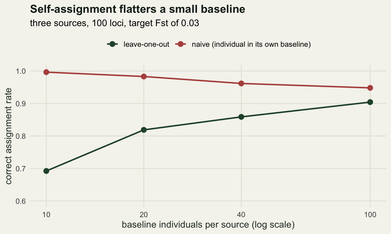
What accuracy actually depends on
Two quantities decide whether assignment works. One is the number of loci, which is a budget decision. The other is how differentiated the candidate sources are, which is not under your control at all, though the choice of which populations to treat as separate sources is. Vary both over a grid, scoring test individuals drawn independently of the baseline so that no leave-one-out correction is needed.
set.seed(733)
loci_grid <- c(20, 50, 100, 200)
fst_grid <- c(0.01, 0.02, 0.05, 0.10)
cell_acc <- function(n_l, fst, nb = 40, n_test = 40, reps = 25) {
  acc <- numeric(reps)
  for (r in seq_len(reps)) {
    pf <- sim_freqs(n_l, 3, fst)
    ph <- sapply(1:3, function(s) est_freq(sim_geno(pf[, s], nb)))
    gt <- do.call(rbind, lapply(1:3, function(s) sim_geno(pf[, s], n_test)))
    who <- rep(1:3, each = n_test)
    li <- sapply(1:3, function(s) geno_loglik(gt, ph[, s]))
    acc[r] <- mean(apply(li, 1, which.max) == who)
  }
  mean(acc)
}
grid_res <- expand.grid(loci = loci_grid, fst = fst_grid)
grid_res$accuracy <- mapply(cell_acc, grid_res$loci, grid_res$fst)

acc_tab <- data.frame(loci = loci_grid)
for (f in fst_grid) {
  acc_tab[[paste0("fst_", f)]] <- round(grid_res$accuracy[grid_res$fst == f], 4)
}
cat("accuracy grid: 25 replicates per cell, 40 baseline and 40 test",
    "individuals per source\n")
accuracy grid: 25 replicates per cell, 40 baseline and 40 test individuals per sourceprint(acc_tab, row.names = FALSE) loci fst_0.01 fst_0.02 fst_0.05 fst_0.1
20 0.4567 0.5343 0.7020 0.8170
50 0.5430 0.6780 0.8600 0.9683
100 0.6193 0.7967 0.9587 0.9967
200 0.7207 0.8863 0.9947 0.9997cat("chance level with three sources:", round(1 / 3, 4),
" cells reaching 0.95:", sum(grid_res$accuracy >= 0.95), "of",
nrow(grid_res), "\n")chance level with three sources: 0.3333 cells reaching 0.95: 5 of 16 Only 5 of the 16 combinations clear an accuracy of 0.95. Confident assignment among three sources in this simulation needs roughly 100 loci at Fst = 0.05 (0.9587) or 50 loci at Fst = 0.1 (0.9683): the two trade off against each other, and their product is a rough guide to where the boundary sits. That guide is only rough, because 200 loci at Fst = 0.01 gives 0.7207 while 20 loci at Fst = 0.1 gives 0.817 for the same product.
The bottom left corner is the one worth remembering. At Fst = 0.01, weak but entirely publishable differentiation, 200 biallelic loci still misassign more than a quarter of individuals, against a chance level of 0.3333. No amount of care in the likelihood repairs that, because the information is not in the markers. Anyone who needs individual assignment at low differentiation needs many more loci than a typical microsatellite panel carries, and this grid does not reach the count that would be enough.
ggplot(grid_res, aes(loci, accuracy, colour = factor(fst))) +
  geom_hline(yintercept = 0.95, linetype = "dashed", colour = "grey55") +
  geom_hline(yintercept = 1 / 3, linetype = "dotted", colour = "grey55") +
  geom_line(linewidth = 0.9) +
  geom_point(size = 2.4) +
  scale_x_log10(breaks = loci_grid) +
  scale_colour_manual(values = c(te_pal$sage, te_pal$gold, te_pal$green,
                                 te_pal$forest), name = "Fst") +
  coord_cartesian(ylim = c(0.3, 1)) +
  labs(title = "Loci and differentiation trade off",
       subtitle = "dashed: 0.95 accuracy, dotted: chance with three sources",
       x = "number of biallelic loci (log scale)",
       y = "correct assignment rate") +
  theme_te()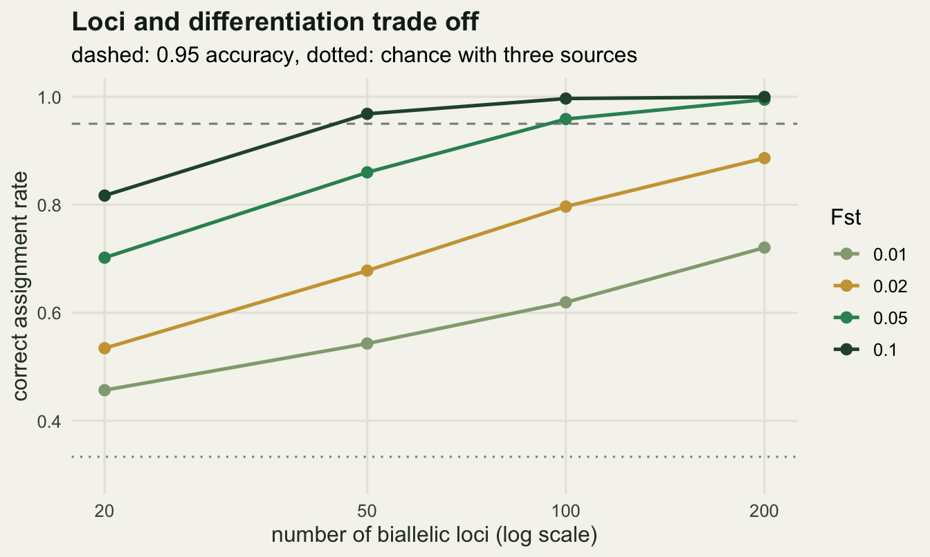
A source nobody sampled
Every number so far assumes the individual came from one of the baselines. Drop that assumption and the method has no way to notice, because the posterior is a comparison among the sources it was given. Simulate a fourth population at the same differentiation, keep it out of the baseline set, and assign individuals from all four. Differentiation is raised to Fst = 0.1 here so that the three baselines are individually well identified: the problem is not a symptom of a weak baseline.
set.seed(734)
fst_high <- 0.10
n_test <- 60
p_four <- sim_freqs(n_loci, 4, fst_high)
base4 <- lapply(1:3, function(s) sim_geno(p_four[, s], n_ind))
p_hat4 <- sapply(base4, est_freq)

g4 <- do.call(rbind, base4)
who4 <- rep(1:3, each = n_ind)
ll4_in <- sapply(1:3, function(s) geno_loglik(g4, p_hat4[, s]))
ll4_out <- loo_loglik(ll4_in, base4, who4)
cat("target Fst here:", fst_high, " test individuals per group:", n_test,
    " mean realised pairwise Fst:",
    round(mean(c(hudson_fst(base4[[1]], base4[[2]]),
                 hudson_fst(base4[[1]], base4[[3]]),
                 hudson_fst(base4[[2]], base4[[3]]))), 4), "\n")
target Fst here: 0.1 test individuals per group: 60 mean realised pairwise Fst: 0.1013 cat("leave-one-out self-assignment among the three baselines:",
round(mean(apply(ll4_out, 1, which.max) == who4), 4), "\n")leave-one-out self-assignment among the three baselines: 0.9833 test_geno <- do.call(rbind, lapply(1:4, function(s) sim_geno(p_four[, s],
n_test)))
test_grp <- rep(1:4, each = n_test)
ll_test <- sapply(1:3, function(s) geno_loglik(test_geno, p_hat4[, s]))
post_test <- posteriors(ll_test)
best_src <- apply(ll_test, 1, which.max)
top_post <- apply(post_test, 1, max)
is_out <- test_grp == 4
cat("top posterior above 0.95, residents:",
round(mean(top_post[!is_out] > 0.95), 4),
" unsampled source:", round(mean(top_post[is_out] > 0.95), 4), "\n")top posterior above 0.95, residents: 0.9889 unsampled source: 0.7167 cat("above 0.99, residents:", round(mean(top_post[!is_out] > 0.99), 4),
" unsampled source:", round(mean(top_post[is_out] > 0.99), 4), "\n")above 0.99, residents: 0.9833 unsampled source: 0.6167 cat("median top posterior, residents:", round(median(top_post[!is_out]), 4),
" unsampled source:", round(median(top_post[is_out]), 4), "\n")median top posterior, residents: 1 unsampled source: 0.9965 Realised differentiation is 0.1013 and leave-one-out self-assignment among the three baselines is 0.9833, so on its own terms the analysis is in good shape. It is also wrong about 60 individuals. Of those drawn from the unsampled fourth population, a proportion of 0.7167 are assigned to some baseline source with a posterior probability above 0.95 and 0.6167 above 0.99, with a median top posterior of 0.9965 against 1 for the true residents. A posterior probability of 0.99 here means only that one baseline fits far better than the other two, which is easy to satisfy when the truth is none of them.
An exclusion test
The repair is to ask an absolute question instead of a relative one: is this genotype the kind of genotype that source produces at all? Draw many genotypes from a candidate source, compute their log-likelihoods under it, and locate the observed individual in that distribution. The proportion of simulated genotypes at or below the observed log-likelihood is a p-value for the hypothesis that the individual came from there, and an individual excluded from every baseline at level alpha has no plausible source in the set.
Where the simulated genotypes come from matters. Drawing them at the estimated frequencies ignores the fact that the frequencies were estimated from 40 individuals, which makes the null too narrow and the test too eager to exclude. Drawing each null genotype at a frequency sampled from the posterior of the frequency instead, which is the beta distribution behind the same Dirichlet correction used earlier, folds that uncertainty in.
set.seed(735)
n_null <- 3000
alpha <- 0.05
p_excl <- matrix(NA_real_, nrow(test_geno), 3)
for (s in 1:3) {
  tot <- colSums(base4[[s]])
  p_star <- matrix(rbeta(n_null * n_loci,
                         rep(tot + 0.5, each = n_null),
                         rep(2 * n_ind - tot + 0.5, each = n_null)),
                   n_null, n_loci)
  null_geno <- matrix(rbinom(n_null * n_loci, 2, as.vector(p_star)),
                      n_null, n_loci)
  null_ll <- geno_loglik(null_geno, p_hat4[, s])
  p_excl[, s] <- sapply(ll_test[, s], function(z) mean(null_ll <= z))
}
own_p <- p_excl[cbind(which(!is_out), test_grp[!is_out])]
best_p <- p_excl[cbind(seq_along(best_src), best_src)]
excl_all <- rowSums(p_excl < alpha) == 3

cat("alpha:", alpha, " null genotypes per source:", n_null, "\n")
alpha: 0.05 null genotypes per source: 3000 cat("residents excluded from their own source:",
round(mean(own_p < alpha), 4),
" from both other sources:",
round(mean(rowSums(p_excl < alpha)[!is_out] - (own_p < alpha) == 2), 4),
"\n")residents excluded from their own source: 0.0611 from both other sources: 0.8611 cat("excluded from all three baselines, residents:",
round(mean(excl_all[!is_out]), 4),
" unsampled source:", round(mean(excl_all[is_out]), 4), "\n")excluded from all three baselines, residents: 0.0611 unsampled source: 0.9667 cat("median exclusion p under the best-matching source, residents:",
formatC(median(best_p[!is_out]), format = "f", digits = 4),
" unsampled source:",
formatC(median(best_p[is_out]), format = "f", digits = 4), "\n")median exclusion p under the best-matching source, residents: 0.4475 unsampled source: 0.0002 cat("unsampled individuals with a top posterior above 0.95 that are excluded:",
round(mean(excl_all[is_out & top_post > 0.95]), 4), "\n")unsampled individuals with a top posterior above 0.95 that are excluded: 0.9767 At alpha of 0.05 the test excludes residents from their own source at a rate of 0.0611, close to the nominal rate, and excludes 0.8611 of residents from both of the other two sources. Individuals from the unsampled population are excluded from all three baselines at a rate of 0.9667 in this run, and of the unsampled individuals that had been assigned with a posterior above 0.95, the exclusion test catches 0.9767. The median exclusion p-value under the best-matching source is 0.4475 for residents and 0.0002 for the unsampled population. Both exclusion rates are single realisations, and a fortunate pair: rerunning the whole simulation with fresh allele frequencies leaves the typical rate clearly below what this run shows and spreads it over a wide range, and most of that spread comes from the frequencies a run happens to draw rather than from the test individuals themselves. The realised Fst among the three baselines barely predicts where a given run lands, so read the exclusion test as a check that usually works rather than as a procedure with a known catch rate.
It is still a large effect from a cheap calculation, and it is the single check that separates a defensible assignment from a confident guess. The reason it works is that the p-value is calibrated against the source itself rather than against the alternatives, so the number of sources in the baseline does not enter.
excl_df <- rbind(
  data.frame(value = best_p, origin_group = ifelse(is_out,
                                                   "unsampled fourth source",
                                                   "baseline resident"),
             quantity = "exclusion p-value, best-matching source"),
  data.frame(value = top_post, origin_group = ifelse(is_out,
                                                     "unsampled fourth source",
                                                     "baseline resident"),
             quantity = "posterior probability of the best source"))
alpha_df <- data.frame(quantity = "exclusion p-value, best-matching source",
                       xint = alpha)

ggplot(excl_df, aes(value, colour = origin_group)) +
  geom_vline(data = alpha_df, aes(xintercept = xint), linetype = "dashed",
             colour = "grey55") +
  stat_ecdf(linewidth = 0.9) +
  facet_wrap(~quantity, scales = "free_x") +
  scale_colour_manual(values = c(`baseline resident` = te_pal$forest,
                                 `unsampled fourth source` = te_pal$clay),
                      name = NULL) +
  labs(title = "The posterior cannot see a missing source, the p-value can",
       subtitle = "three baselines of 40 individuals, 100 loci, realised Fst 0.1013",
       x = NULL, y = "cumulative proportion of individuals") +
  theme_te() +
  theme(legend.position = "top")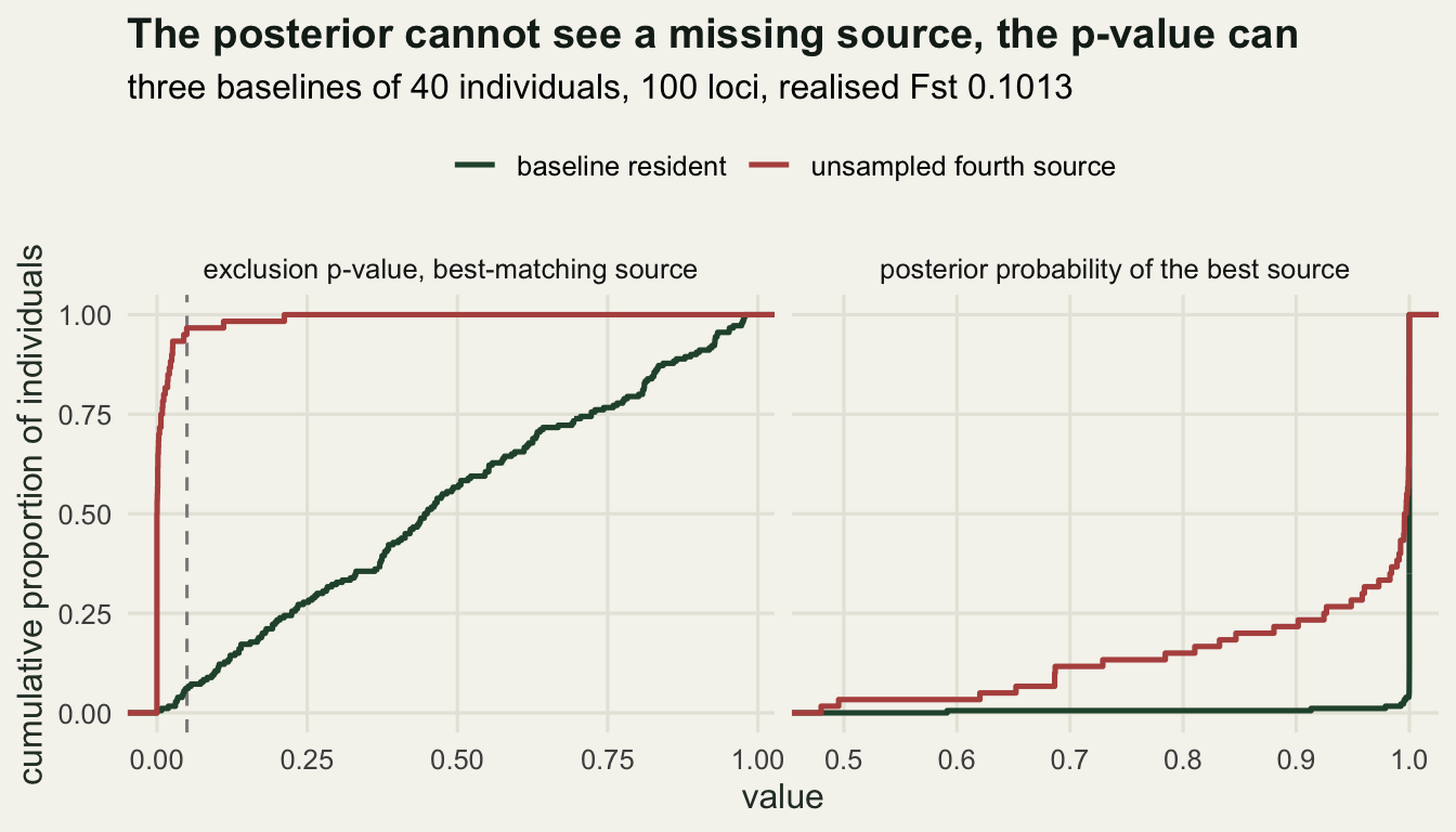
Why this is not clustering
Assignment and clustering answer different questions with the same data. Clustering estimates the groups themselves and has no external standard to be checked against, which is why choosing K is hard and why a clustering result is so easy to over-read. Assignment conditions on a baseline that someone decided on, and asks about one individual, so its output is a classification with an error rate that can be measured, as the tables above do. That measurability is why assignment, not clustering, is the tool in forensic identification, mixed-stock fishery analysis and post-release monitoring of reintroductions. The price is that the baseline has to be right, and the baseline is a decision rather than an estimate.
The honest limits
Every number here depends on the baseline being a fair sample of each candidate source. Sample one river mouth of a river system and the frequencies you estimate describe that river mouth, not the source, and individuals from elsewhere in the system will be assigned by whichever baseline happens to be closest to them. The exclusion test protects against a source that is entirely missing, but not against a source that is present and misdescribed.
Related individuals in the baseline are the quieter version of the same problem. A baseline of 40 that contains sibling groups carries fewer independent gene copies than 80, so the estimated frequencies are pulled towards a few families, the source looks tighter than it is, and both the self-assignment rate and the exclusion test become optimistic. The leave-one-out correction removes one individual, not its siblings.
The likelihood itself assumes Hardy-Weinberg proportions within sources and independence across loci. Inbreeding, cryptic structure within a nominal source or linkage all make the multilocus likelihood too sharp, which inflates posterior probabilities without necessarily changing which source wins. And an exclusion test can only exclude the sources it was told about: the fourth population above was caught because it was excluded from all three baselines, not because anything in the data announced its existence.
Where to go next
The last tutorial in this cluster is the audit. It takes the clustering results from the first two posts and the assignment machinery from this one and asks what has to be checked before either is reported: how sensitive the answer is to the loci included, what a permutation null looks like when there is no structure at all, and how to tell a marker artefact from a biological pattern.
References
Rannala B, Mountain JL 1997 Proceedings of the National Academy of Sciences 94(17):9197-9201 (10.1073/pnas.94.17.9197)
Paetkau D, Calvert W, Stirling I, Strobeck C 1995 Molecular Ecology 4(3):347-354 (10.1111/j.1365-294X.1995.tb00227.x)
Cornuet JM, Piry S, Luikart G, Estoup A, Solignac M 1999 Genetics 153(4):1989-2000 (10.1093/genetics/153.4.1989)
Anderson EC 2010 Molecular Ecology Resources 10(4):701-710 (10.1111/j.1755-0998.2010.02846.x)