library(ggplot2)

te_pal <- list(forest = "#275139", green = "#2f8f63", sage = "#93a87f",
               clay = "#b5534e", gold = "#cda23f", line = "#dad9ca",
               ink = "#16241d", paper = "#f5f4ee")

theme_te <- function() {
  theme_minimal(base_size = 12) +
    theme(panel.grid.minor = element_blank(),
          panel.grid.major = element_line(colour = "#e7e6dc"),
          plot.background = element_rect(fill = "#f5f4ee", colour = NA),
          panel.background = element_rect(fill = "#f5f4ee", colour = NA),
          plot.title = element_text(face = "bold", colour = te_pal$ink),
          axis.title = element_text(colour = "#2c3a31"))
}Admixture and ancestry proportions in R
R
population genetics
clustering
ecology tutorial
ggplot2
Build the STRUCTURE model in R, fit ancestry proportions by EM, and measure how many loci and how much differentiation an honest admixture bar plot needs.
The stacked bar plot is the most reproduced figure in molecular ecology. Every individual is a thin column, every colour is a source population, and the height of each colour is that individual’s ancestry proportion. It looks like a direct readout of history, and it is not: it is the output of a statistical model with strong assumptions, fitted by an algorithm that can only see allele frequencies.
This tutorial writes that model out, fits it in base R with expectation maximisation, and then measures three things the plot never shows: how the precision of an ancestry proportion depends on the number of loci, how it collapses when the sources are barely differentiated, and why a genuinely pure individual always seems to carry a sliver of foreign ancestry.
The model
Assume K source populations. Each source has its own allele frequency at every locus, which is a matrix P of L loci by K sources, where p_lk is the frequency of the counted allele at locus l in source k. Each individual has a vector of ancestry proportions summing to one, collected in a matrix Q of N individuals by K, where q_ik is the fraction of individual i’s genome that came from source k.
The generative rule is one sentence. An allele copy in individual i at locus l came from source k with probability q_ik, and given that source it is the counted allele with probability p_lk. Summing over sources, the copy is the counted allele with probability f_il, the row of Q times the column of P, so the genotype count at that locus is binomial with two trials and success probability f_il.
Three assumptions make that likelihood valid. Loci are independent given ancestry, so no two loci carry the same information. Each source is in Hardy-Weinberg equilibrium, so the two copies in an individual are independent draws. There is no linkage, so nothing correlates neighbouring loci. All three are wrong in detail for real data, and later in this cluster we measure what the breakages cost.
Simulating a known truth
Simulating from the model is the only way to check an estimate of q, because no real data set comes with the answer. Source frequencies are drawn around an ancestral frequency with a beta distribution whose spread is set by a single differentiation parameter, which is the Balding-Nichols construction: it produces source pairs whose realised Fst matches that parameter. Fifty individuals are pure members of each source, and a hundred more are admixed with ancestry spread across the range.
sim_admix <- function(n_loci, fst_par, n_pure = 50, n_admix = 100, seed) {
  set.seed(seed)
  p_anc <- runif(n_loci, 0.1, 0.9)
  shape_a <- p_anc * (1 - fst_par) / fst_par
  shape_b <- (1 - p_anc) * (1 - fst_par) / fst_par
  p_src <- cbind(rbeta(n_loci, shape_a, shape_b),
                 rbeta(n_loci, shape_a, shape_b))
  p_src <- pmin(pmax(p_src, 0.02), 0.98)
  q1 <- c(rep(1, n_pure), rep(0, n_pure), runif(n_admix, 0.05, 0.95))
  q_true <- cbind(q1, 1 - q1)
  f_true <- q_true %*% t(p_src)
  geno <- matrix(rbinom(length(f_true), 2, as.vector(f_true)),
                 nrow = nrow(f_true))
  list(geno = geno, q_true = q_true, p_src = p_src,
       pure = c(rep(TRUE, 2 * n_pure), rep(FALSE, n_admix)))
}

source_fst <- function(p_src) {
  p_bar <- rowMeans(p_src)
  sum((p_src[, 1] - p_src[, 2])^2 / 2) / sum(p_bar * (1 - p_bar))
}

dat <- sim_admix(n_loci = 800, fst_par = 0.05, seed = 4801)
cat("individuals:", nrow(dat$geno), " pure from each source: 50",
    " admixed:", sum(!dat$pure), "\n")
individuals: 200 pure from each source: 50 admixed: 100 cat("loci simulated:", ncol(dat$geno),
" realised Fst between the sources:", round(source_fst(dat$p_src), 4),
"\n")loci simulated: 800 realised Fst between the sources: 0.0515 cat("realised Fst over the first 200 loci:",
round(source_fst(dat$p_src[1:200, ]), 4), "\n")realised Fst over the first 200 loci: 0.0471 cat("genotype counts of 0, 1 and 2 copies:", as.vector(table(dat$geno)), "\n")genotype counts of 0, 1 and 2 copies: 49918 60879 49203 The differentiation is deliberately ordinary. A realised Fst of 0.0515 is the sort of value a study of two regional populations of a widespread species reports, not the value for two species or two continents. Ancestry estimation is easy at high Fst and the interesting behaviour is at low Fst, so it is the ordinary case that has to be measured.
The algorithm
The fit is expectation maximisation, and the model makes both halves explicit. The expectation step asks, for every allele copy, how likely each source is to have produced it. For a copy of the counted allele in individual i at locus l, the posterior probability that it came from source k is q_ik * p_lk / f_il; for a copy of the other allele it is q_ik * (1 - p_lk) / (1 - f_il). Those posterior weights are called responsibilities, and they are the only quantity the expectation step produces.
The maximisation step then treats the responsibilities as if they were observed counts. A row of Q becomes the average responsibility of each source over all 2L copies in that individual, and a row of P becomes a weighted allele frequency: the responsibility-weighted count of counted alleles at that locus divided by the responsibility-weighted count of all copies. Alternate the two steps and the log-likelihood cannot decrease. ADMIXTURE calls this block relaxation and solves the same two blocks with a faster inner solver, but the target and the fixed point are the ones below.
em_admix <- function(geno, n_src = 2, seed = 1, max_iter = 3000, tol = 1e-3) {
  n_ind <- nrow(geno)
  n_loci <- ncol(geno)
  set.seed(seed)
  q_mat <- matrix(runif(n_ind * n_src, 0.2, 0.8), n_ind, n_src)
  q_mat <- q_mat / rowSums(q_mat)
  p_mat <- matrix(runif(n_loci * n_src, 0.1, 0.9), n_loci, n_src)
  g_alt <- 2 - geno
  const <- log(2) * sum(geno == 1)
  ll_old <- -Inf
  for (it in seq_len(max_iter)) {
    f_ind <- q_mat %*% t(p_mat)
    resp_ref <- geno / f_ind
    resp_alt <- g_alt / (1 - f_ind)
    num_q <- q_mat * (resp_ref %*% p_mat + resp_alt %*% (1 - p_mat))
    num_p <- p_mat * crossprod(resp_ref, q_mat)
    den_p <- num_p + (1 - p_mat) * crossprod(resp_alt, q_mat)
    q_mat <- num_q / rowSums(num_q)
    p_mat <- pmin(pmax(num_p / den_p, 1e-6), 1 - 1e-6)
    if (it %% 10 == 0) {
      f_ind <- q_mat %*% t(p_mat)
      ll <- sum(geno * log(f_ind) + g_alt * log(1 - f_ind)) + const
      if (ll - ll_old < tol) break
      ll_old <- ll
    }
  }
  f_end <- q_mat %*% t(p_mat)
  list(q = q_mat, p = p_mat, iterations = it,
       loglik = sum(geno * log(f_end) + g_alt * log(1 - f_end)) + const)
}

match_labels <- function(q_est, q_ref) {
  if (cor(q_est[, 1], q_ref[, 1]) < 0) q_est[, c(2, 1)] else q_est
}
The responsibilities never appear as a three-dimensional array. resp_ref and resp_alt hold the genotype counts divided by the fitted frequencies, and the matrix products then sum q_ik * p_lk / f_il over loci for Q and over individuals for P, which is the same arithmetic with one less dimension. The log-likelihood is checked every tenth iteration and the run stops when ten iterations together add less than a thousandth of a log-likelihood unit.
Fitting P and Q at once means the sources are defined by the data, so their order is arbitrary. match_labels fixes it by flipping the columns when the first one is negatively correlated with the truth. That trick is available here only because the truth was simulated; with real data the labels are pinned by picking a reference individual or a reference population and naming the source that dominates it.
Fitting it
geno_200 <- dat$geno[, 1:200]
fit <- em_admix(geno_200, n_src = 2, seed = 11)
q_hat <- match_labels(fit$q, dat$q_true)

cat("EM iterations:", fit$iterations, " final log-likelihood:",
    round(fit$loglik, 2), "\n")
EM iterations: 1410 final log-likelihood: -33773.13 cat("correlation of estimated with true q:",
round(cor(q_hat[, 1], dat$q_true[, 1]), 4),
" mean absolute error:",
round(mean(abs(q_hat[, 1] - dat$q_true[, 1])), 4), "\n")correlation of estimated with true q: 0.9039 mean absolute error: 0.1456 cat("mean absolute error for the admixed individuals:",
round(mean(abs(q_hat[!dat$pure, 1] - dat$q_true[!dat$pure, 1])), 4),
" for the pure ones:",
round(mean(abs(q_hat[dat$pure, 1] - dat$q_true[dat$pure, 1])), 4), "\n")mean absolute error for the admixed individuals: 0.1303 for the pure ones: 0.1609 cat("largest minority ancestry estimated in a truly pure individual:",
round(max(pmin(q_hat, 1 - q_hat)[dat$pure, 1]), 4), "\n")largest minority ancestry estimated in a truly pure individual: 0.493 Two hundred loci at an Fst of 0.0471 give a correlation of 0.9039 between estimated and true ancestry, which sounds like a success, and a mean absolute error of 0.1456, which does not. Both describe the same fit. A typical individual’s ancestry proportion is out by more than ten percentage points, so a bar that reads as seventy per cent source one is a poor guide to the truth behind it. That is the average miss rather than a bound, and individual bars can miss by a good deal more. The ranking of individuals survives that error; the values do not.
The error is worse for the pure individuals (0.1609) than for the admixed ones (0.1303), which is the opposite of the usual intuition that pure individuals are the easy case. One pure individual is estimated at 0.493 minority ancestry, a coin flip away from being called an equal-ancestry hybrid.
ord <- order(dat$q_true[, 1])
n_ind <- nrow(dat$geno)
bar_df <- data.frame(
  slot = rep(seq_len(n_ind), times = 2),
  ancestry = rep(c("source 1", "source 2"), each = n_ind),
  q = c(q_hat[ord, 1], q_hat[ord, 2]))
truth_df <- data.frame(slot = seq_len(n_ind), q = dat$q_true[ord, 1])
pure_df <- data.frame(slot = which(dat$pure[ord]))

ggplot(bar_df, aes(slot, q, fill = ancestry)) +
  geom_col(width = 1, position = position_stack(reverse = TRUE)) +
  geom_line(data = truth_df, aes(slot, q), inherit.aes = FALSE,
            colour = te_pal$ink, linewidth = 0.7) +
  geom_segment(data = pure_df, aes(x = slot, xend = slot, y = -0.07,
                                   yend = -0.02),
               inherit.aes = FALSE, colour = te_pal$clay, linewidth = 0.4) +
  scale_fill_manual(values = c("source 1" = te_pal$forest,
                               "source 2" = te_pal$gold), name = NULL) +
  scale_y_continuous(breaks = seq(0, 1, 0.25)) +
  labs(title = "The bar plot, with the answer drawn on it",
       subtitle = "line: true source 1 ancestry, red marks: individuals with no admixture at all",
       x = "individual, ordered by true ancestry", y = "ancestry proportion") +
  theme_te() +
  theme(panel.grid.major.x = element_blank())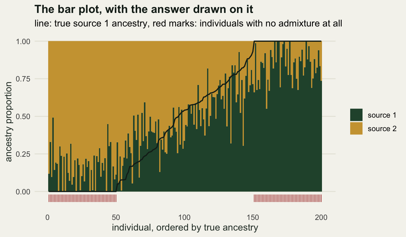
How many loci does a bar plot need?
The obvious knob is the number of loci. Take nested subsets of the same simulated data so that nothing else changes, and fit each one. The last column of the table is the boundary bias: the mean minority ancestry estimated for individuals who have none.
loci_grid <- c(25, 50, 200, 800)
loci_fits <- lapply(loci_grid, function(n_loci) {
  fk <- em_admix(dat$geno[, seq_len(n_loci)], n_src = 2, seed = 11)
  match_labels(fk$q, dat$q_true)
})

loci_tab <- do.call(rbind, lapply(seq_along(loci_grid), function(j) {
  qk <- loci_fits[[j]]
  data.frame(loci = loci_grid[j],
             fst = round(source_fst(dat$p_src[seq_len(loci_grid[j]), ]), 4),
             error_all = round(mean(abs(qk[, 1] - dat$q_true[, 1])), 4),
             error_admixed = round(mean(abs(qk[!dat$pure, 1] -
                                            dat$q_true[!dat$pure, 1])), 4),
             minority_in_pure = round(mean(pmin(qk, 1 - qk)[dat$pure, 1]), 4))
}))
print(loci_tab, row.names = FALSE)
loci fst error_all error_admixed minority_in_pure
25 0.0489 0.2467 0.2002 0.2661
50 0.0527 0.2137 0.1700 0.2506
200 0.0471 0.1456 0.1303 0.1609
800 0.0515 0.0849 0.0743 0.0954cat("error ratio, 25 loci against 800 loci:",
round(loci_tab$error_all[1] / loci_tab$error_all[4], 3),
" square root of the locus ratio:", round(sqrt(800 / 25), 3), "\n")error ratio, 25 loci against 800 loci: 2.906 square root of the locus ratio: 5.657 cat("error from assigning 0.5 to every individual:",
round(mean(abs(0.5 - dat$q_true[, 1])), 4), "\n")error from assigning 0.5 to every individual: 0.3561 Thirty-two times as many loci buy a factor of 2.906 in accuracy, well short of the 5.657 that a square-root rule for independent information would predict. The shortfall has a reason at each end of the table. At 25 loci the mean absolute error is 0.2467 and the no-information level is 0.3561, the error of the do-nothing strategy of assigning half of each ancestry to everybody, so the error at the thin end is pressed towards the level at which the fit says nothing at all rather than rising in step with a square-root rule. At 800 loci it is 0.0849, held up from below by the boundary bias in the last column. The practical reading is unwelcome either way: halving the error costs at least four times the markers, and 800 loci is still too coarse to separate a first-generation backcross from a second.
The last column is the property that most affects how bar plots are read. A truly pure individual cannot be estimated at exactly zero, because zero is the edge of the parameter space and any sampling noise in the wrong direction has nowhere to go except inward. The mean minority ancestry for individuals with no admixture at all falls from 0.2661 at 25 loci to 0.0954 at 800, and it never reaches zero. Every published bar plot that shows a thin fringe of a second colour in every individual is showing this bias at least in part, and the fringe is thicker when the loci are fewer.
loci_lab <- paste(loci_grid, "loci")
est_df <- do.call(rbind, lapply(seq_along(loci_grid), function(j) {
  data.frame(true_q = dat$q_true[, 1], est_q = loci_fits[[j]][, 1],
             status = ifelse(dat$pure, "no admixture", "admixed"),
             panel = factor(loci_lab[j], levels = loci_lab))
}))
lab_df <- data.frame(panel = factor(loci_lab, levels = loci_lab),
                     txt = paste("error", loci_tab$error_all))

ggplot(est_df, aes(true_q, est_q, colour = status)) +
  geom_abline(intercept = 0, slope = 1, colour = "grey55",
              linetype = "dashed") +
  geom_point(size = 1.5, alpha = 0.75) +
  geom_text(data = lab_df, aes(x = 0.04, y = 0.97, label = txt),
            inherit.aes = FALSE, hjust = 0, size = 3.4,
            colour = te_pal$ink) +
  facet_wrap(~panel) +
  scale_colour_manual(values = c(te_pal$green, te_pal$clay), name = NULL) +
  labs(title = "More loci, less scatter, and a boundary that never clears",
       subtitle = "dashed: perfect estimation, error: mean absolute error of q",
       x = "true source 1 ancestry", y = "estimated source 1 ancestry") +
  theme_te()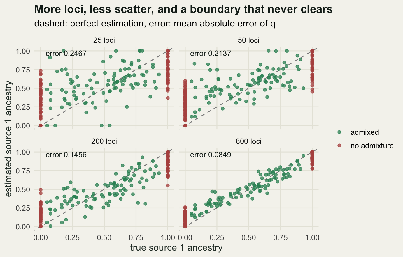
How different do the sources have to be?
The other knob is the differentiation between the sources, and it matters more than the locus count. Simulate at four levels of Fst with 200 loci throughout.
fst_grid <- c(0.005, 0.02, 0.05, 0.15)
fst_tab <- do.call(rbind, lapply(seq_along(fst_grid), function(j) {
  d_j <- sim_admix(n_loci = 200, fst_par = fst_grid[j], seed = 5000 + j)
  f_j <- em_admix(d_j$geno, n_src = 2, seed = 11)
  q_j <- match_labels(f_j$q, d_j$q_true)
  data.frame(fst = round(source_fst(d_j$p_src), 4),
             correlation = round(cor(q_j[, 1], d_j$q_true[, 1]), 4),
             error_all = round(mean(abs(q_j[, 1] - d_j$q_true[, 1])), 4),
             minority_in_pure = round(mean(pmin(q_j, 1 - q_j)[d_j$pure, 1]), 4),
             iterations = f_j$iterations)
}))
print(fst_tab, row.names = FALSE)
fst correlation error_all minority_in_pure iterations
0.0049 0.0110 0.3783 0.3174 3000
0.0180 0.6422 0.2498 0.2618 3000
0.0470 0.9130 0.1548 0.1753 1130
0.1620 0.9767 0.0762 0.0790 890At an Fst of 0.0049 the correlation between estimated and true ancestry is 0.011 on this run, and the mean absolute error is 0.3783, no better than the flat guess of half and half for everybody. The fit still returns an ancestry proportion for each of the 200 individuals, on a defensible scale, and they still stack neatly into a bar plot that carries almost nothing of the truth. That is the regime to be afraid of, and it is not exotic: differentiation of that order between two sampling areas of a well connected species is a completely ordinary measurement.
The recovery is steep. An Fst of 0.018 gives a correlation of 0.6422 and an error of 0.2498, 0.047 gives 0.9130, and 0.162 gives 0.9767 with an error of 0.0762. Everything that matters happens between an Fst of 0.018 and 0.047, which is the range where a great many ecological data sets sit, so whether ancestry can be estimated in a given system is a question about that system, and it can be settled in advance by simulating at the Fst already measured there.
The iteration column carries a warning of its own. The two weakly differentiated runs stop at the 3000-iteration cap rather than at the convergence rule, because with almost no information per locus the log-likelihood surface is nearly flat and the algorithm crawls along it. Slow convergence here is not a numerical nuisance; it is the geometry of a poorly identified problem showing through.
fst_long <- rbind(
  data.frame(fst = fst_tab$fst, value = fst_tab$error_all,
             quantity = "mean absolute error of q"),
  data.frame(fst = fst_tab$fst, value = fst_tab$minority_in_pure,
             quantity = "minority ancestry in pure individuals"))

ggplot(fst_long, aes(fst, value, colour = quantity)) +
  geom_line(linewidth = 0.9) +
  geom_point(size = 2.6) +
  scale_x_log10() +
  scale_colour_manual(values = c(te_pal$forest, te_pal$clay), name = NULL) +
  labs(title = "Differentiation decides whether the plot means anything",
       subtitle = "200 loci throughout, 200 individuals, K = 2 fitted and simulated",
       x = "realised Fst between the sources (log scale)",
       y = "error in ancestry proportion") +
  theme_te() +
  theme(legend.position = "bottom")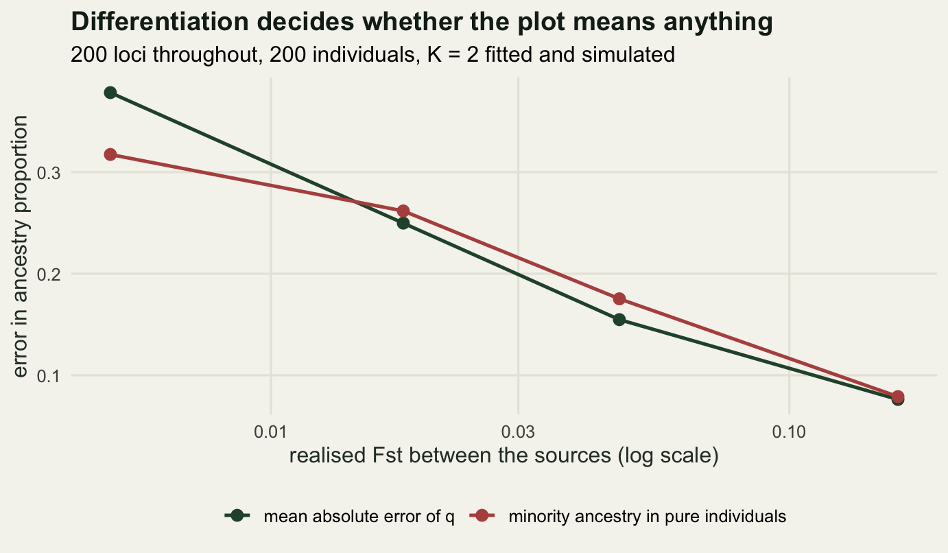
Label switching and local optima
The likelihood does not know which source is which. Permute the columns of Q and the rows of P together and every fitted probability is unchanged, so each optimum comes in K factorial identical copies and the column order is decided by nothing but the starting values. Beyond that exact symmetry there is a second question: does the surface have more than one genuine hill? Run twenty random starts on the two thinnest subsets, where the likelihood carries least information and local optima are most likely.
restart_survey <- function(n_loci, n_start = 20) {
  geno_sub <- dat$geno[, seq_len(n_loci)]
  runs <- do.call(rbind, lapply(seq_len(n_start), function(s) {
    f_s <- em_admix(geno_sub, n_src = 2, seed = 200 + s)
    data.frame(loglik = f_s$loglik,
               source1_first = cor(f_s$q[, 1], dat$q_true[, 1]) > 0,
               error = mean(abs(match_labels(f_s$q, dat$q_true)[, 1] -
                                  dat$q_true[, 1])))
  }))
  data.frame(loci = n_loci, starts = n_start,
             distinct_loglik = length(unique(round(runs$loglik, 2))),
             loglik_spread = round(diff(range(runs$loglik)), 4),
             best_loglik = round(max(runs$loglik), 2),
             source1_first = sum(runs$source1_first),
             error_spread = round(diff(range(runs$error)), 4))
}

restart_tab <- rbind(restart_survey(25), restart_survey(50))
print(restart_tab, row.names = FALSE)
loci starts distinct_loglik loglik_spread best_loglik source1_first
25 20 17 14.2993 -4286.24 8
50 20 6 0.4966 -8454.68 12
error_spread
0.0807
0.0060At 25 loci the surface is genuinely multimodal: twenty starts find 17 distinct log-likelihood values, spread over 14.2993 units, and the mean absolute error of q differs by 0.0807 between the luckiest and the unluckiest start. A single run of a program on data this thin reports whichever hill it happened to climb, and the bar plot it draws would be visibly different from a second run of the same program on the same data.
Doubling the loci nearly removes the problem. At 50 loci the spread is 0.4966 log-likelihood units across the same twenty starts, and the error spread is 0.006, which is convergence slack rather than a different answer. This is why STRUCTURE and ADMIXTURE both tell you to run several starts and keep the best: not as a ritual, but because the number of hills depends on how much information the data hold, and you cannot tell from one run.
The label column is the part that never goes away. Eight of the twenty starts at 25 loci put the first source in the first column and twelve put it in the second, and at 50 loci the split is twelve against eight. Colours in a bar plot therefore mean nothing across runs, across values of K, or across software, and comparing two panels needs an explicit alignment step rather than a hope that green means the same thing twice.
What the plot does not say
Ancestry proportions are relative to the K sources you assumed. The fit answers “what mixture of two sources best explains this genotype”, never “did these two sources exist”. Continuous variation over space produces smooth, plausible-looking q values with no discrete sources anywhere in the system, and the fit will still return them, ordered along the cline. Distinguishing that case from real admixture is a separate exercise, and it is the subject of the next tutorial.
The independence assumption is the other soft spot. Linked loci carry overlapping information, so a data set of a thousand linked SNPs behaves like a much smaller data set of independent ones. The precision curve above then overstates what the markers deliver, because the effective locus count is lower than the nominal one. Falush and colleagues added a linkage model to STRUCTURE for exactly this reason.
Nothing here tests K. The two-source fit above was given the right answer, and the likelihood of a wrong K is not what tells you it was wrong. Every number in this post is conditional on a choice that has not yet been examined.
Where to go next
The next tutorial takes on the choice of K directly: what the log-likelihood does as K grows, why the delta K heuristic became standard, what cross-validation adds, and what all of them do when the data were generated by a cline with no clusters in it at all.
References
Pritchard JK, Stephens M, Donnelly P 2000 Genetics 155(2):945-959 (10.1093/genetics/155.2.945)
Falush D, Stephens M, Pritchard JK 2003 Genetics 164(4):1567-1587 (10.1093/genetics/164.4.1567)
Alexander DH, Novembre J, Lange K 2009 Genome Research 19(9):1655-1664 (10.1101/gr.094052.109)
Lawson DJ, van Dorp L, Falush D 2018 Nature Communications 9(1):3258 (10.1038/s41467-018-05257-7)