---
title: "Why sinks hold high density"
description: "Why a sink can hold more animals than the source that feeds it, worked in R, and why population density alone is a treacherous guide to habitat quality."
date: "2026-07-02 12:00"
date-modified: "2026-10-07"
categories: [ecology tutorial, R, population ecology, conservation, habitat selection]
image: thumbnail.png
image-alt: "A bar chart with a low-quality sink holding far more individuals than the high-quality source that supplies it."
---
*Corrected 7 October 2026: the closing section said that animals filling the good habitat first keep the sink from ever getting crowded; it now says that the post's own arithmetic already fills the source first and the sink still dwarfs it, and that how animals settle decides instead whether the sink fills before the source is full.*
```{r setup}
#| code-fold: true
#| code-summary: "Setup: packages, colours and plot theme"
#| results: hide
#| message: false
#| warning: false
knitr::opts_chunk$set(echo = TRUE, message = FALSE, warning = FALSE,
                      dev = "png", dpi = 120, fig.path = "figures/",
                      fig.width = 7, fig.height = 4.4)
library(ggplot2)
theme_te <- theme_minimal(base_size = 12) +
  theme(panel.background = element_rect(fill = "#f5f4ee", colour = NA),
        plot.background  = element_rect(fill = "#f5f4ee", colour = NA),
        panel.grid.minor = element_blank(),
        plot.title = element_text(face = "bold", size = 12))
theme_set(theme_te)
col_source <- "#3a6b52"; col_sink <- "#b5651d"; col_ref <- "#555555"

l1 <- 1.5; l2 <- 0.84; n1 <- 100
n2 <- n1 * (l1 - 1) / (1 - l2)
ratio <- n2 / n1

set.seed(408)
imm <- 40
habitat <- data.frame(lambda = seq(0.5, 1.5, length = 25))
habitat$density <- ifelse(habitat$lambda >= 1, 80 + rnorm(25, 0, 4),
                          pmin(imm/(1 - habitat$lambda), 400))
cor_dq <- cor(habitat$lambda, habitat$density)
dens_top <- habitat$lambda[order(-habitat$density)[1:3]]
```
The [previous post](../source-sink-dynamics/) ended on a warning: a habitat's local growth rate tells you whether it can sustain itself, not how many animals it holds. This post makes that concrete with the result that most surprises people the first time they meet it. At equilibrium a sink can hold *more* individuals than the source that keeps it alive. The worst habitat on the landscape can be the most crowded.
## The arithmetic of the paradox
A source at equilibrium is capped. It has a fixed number of breeding sites, and once they are full the extra production has nowhere to go but out, so the source sits at its own capacity and exports the rest. A sink has no such cap from below: it keeps accepting immigrants, and its population climbs until the annual shortfall between births and deaths, which grows with population size, finally balances the steady inflow. That balance point is the immigration divided by the per-capita shortfall.
```{r paradox}
l1 <- 1.5; l2 <- 0.84; n1 <- 100          # source growth rate, sink growth rate, source size
surplus <- n1 * (l1 - 1)                    # emigrants the source sends each year
n2 <- surplus / (1 - l2)                    # equilibrium sink size
c(source_size = n1, sink_size = n2, ratio = n2 / n1)
```
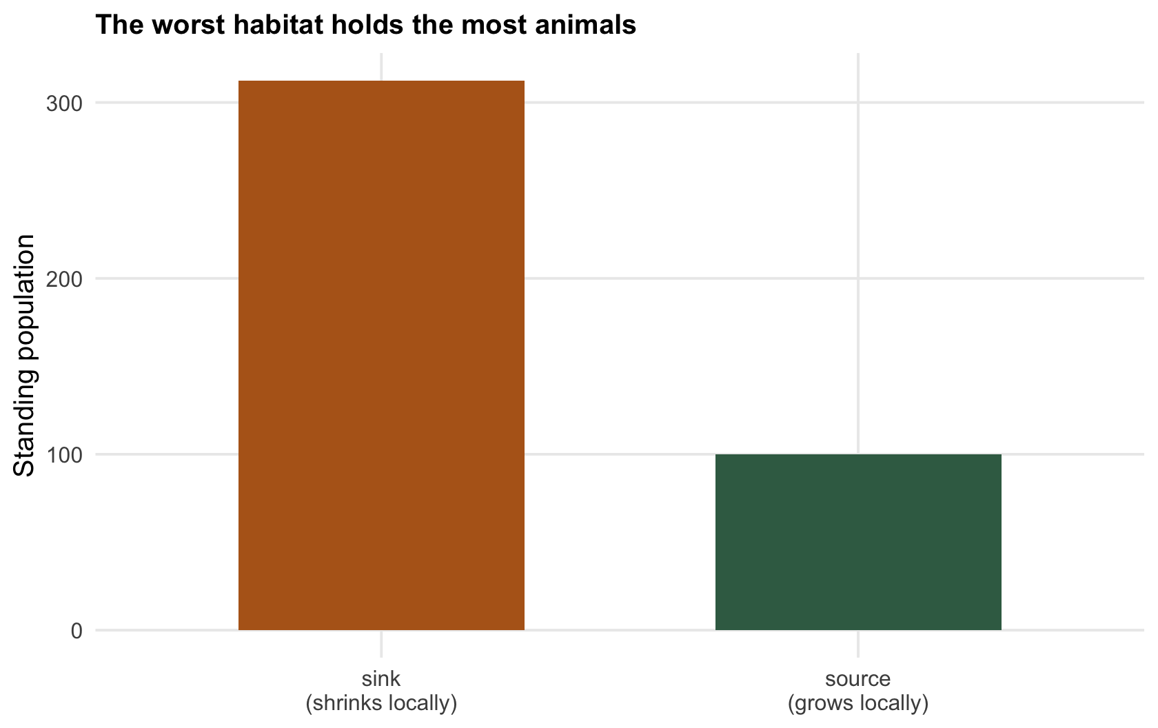
The source holds `r sprintf("%.0f", n1)` breeding adults and exports `r sprintf("%.0f", surplus)` surplus animals a year. The sink, losing `r sprintf("%.0f", 100*(1-l2))` per cent of its population to the shortfall each year, swells until that loss equals the inflow, which happens at `r sprintf("%.1f", n2)`, more than `r sprintf("%.1f", ratio)` times the source. Stand in each habitat and count: the sink looks like the stronghold and the source like the marginal patch. The count has it exactly backwards.
```{r fig-paradox}
#| fig-cap: "Standing population in the source and the sink. The sink (ochre, local growth rate below one) holds several times the source (green, local growth rate above one) that produces every surplus animal it receives."
#| fig-alt: "Two bars: a short green source bar and a much taller ochre sink bar, with labels noting the source grows and the sink shrinks locally."
dp <- data.frame(habitat = c("source\n(grows locally)", "sink\n(shrinks locally)"),
                 N = c(n1, n2), kind = c("source", "sink"))
ggplot(dp, aes(habitat, N, fill = kind)) +
  geom_col(width = 0.6) +
  scale_fill_manual(values = c("source" = col_source, "sink" = col_sink), guide = "none") +
  labs(x = NULL, y = "Standing population", title = "The worst habitat holds the most animals")
```
## Density is a trap for the manager
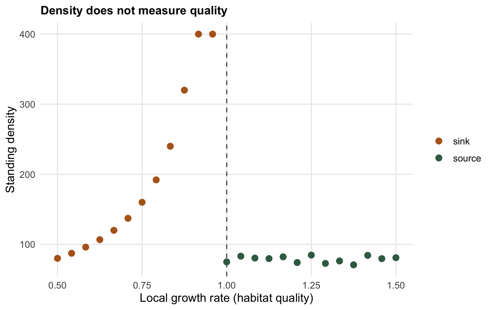
Now put the whole landscape together: many habitats of different quality, some sources, some sinks, all connected by movement. Plot the standing density in each against its local growth rate, the real measure of quality.
```{r density-quality}
set.seed(408)
imm <- 40
habitat <- data.frame(lambda = seq(0.5, 1.5, length = 25))
habitat$density <- ifelse(habitat$lambda >= 1, 80 + rnorm(25, 0, 4),   # sources capped
                          pmin(imm/(1 - habitat$lambda), 400))          # sinks pile up near lambda = 1
c(correlation_density_quality = cor(habitat$lambda, habitat$density))
```
The correlation between density and quality is `r sprintf("%+.2f", cor_dq)`: if anything, slightly negative. The three most crowded habitats have local growth rates of `r sprintf("%.2f", dens_top[1])`, `r sprintf("%.2f", dens_top[2])` and `r sprintf("%.2f", dens_top[3])`, every one of them a sink. A conservation plan that ranks habitats by how many animals they hold, a natural and common thing to do, will pour effort into the crowded sinks and neglect the sparse sources that are quietly producing the entire population (Van Horne's warning, and the reason Pulliam 1988 The American Naturalist 132(5):652-661 mattered so much). Protect the sink and you protect a display; protect the source and you protect the supply.
```{r fig-density}
#| fig-cap: "Standing density against local growth rate across a landscape of habitats. Density does not track quality: the densest habitats (ochre, sinks) grow less than one, while the true sources (green) can be sparse."
#| fig-alt: "Scatter of density against local growth rate; the highest densities occur at growth rates below one, and habitats above one are only moderately dense."
habitat$kind <- ifelse(habitat$lambda >= 1, "source", "sink")
ggplot(habitat, aes(lambda, density, colour = kind)) +
  geom_vline(xintercept = 1, colour = col_ref, linetype = "dashed") +
  geom_point(size = 2.6) +
  scale_colour_manual(values = c("source" = col_source, "sink" = col_sink)) +
  labs(x = "Local growth rate (habitat quality)", y = "Standing density", colour = NULL,
       title = "Density does not measure quality")
```
## When the pattern appears, and when it does not
This upside-down world is not guaranteed: the sink's equilibrium size is its inflow divided by its per-capita shortfall, so a small surplus or a sink that loses animals fast can leave it holding fewer animals than the source. Filling the good habitat first does not prevent it, though. The arithmetic above already works that way, with the source full and only its surplus spilling into the sink, and the sink still ends up dwarfing the source. How animals settle matters in another way: it decides whether the sink fills before the source is full. Animals that keep settling in the sink regardless, because they cannot tell it is poor, can crowd it even while good breeding sites stand empty. That is exactly the setting where a habitat can become a trap, luring settlers into a patch that quietly kills them, which is the [next post](../ecological-traps-and-pseudo-sinks/). And because density has now failed twice as a guide to quality, the [checking post](../checking-a-source-sink-analysis/) turns to what you actually have to measure.
## References
- Pulliam HR 1988. The American Naturalist 132(5):652-661 (10.1086/284880).
- Van Horne B 1983. The Journal of Wildlife Management 47(4):893-901 (10.2307/3808148).
## Related tutorials
- [Source-sink population dynamics](../source-sink-dynamics/)
- [Ecological traps and pseudo-sinks](../ecological-traps-and-pseudo-sinks/)
- [Checking a source-sink analysis](../checking-a-source-sink-analysis/)
- [Resource selection functions](../resource-selection-functions/)