library(vegan)
library(ggplot2)

te_paper  <- "#f5f4ee"
te_ink    <- "#16241d"
te_body   <- "#2c3a31"
te_forest <- "#275139"
te_rust   <- "#b5534e"
te_gold   <- "#c9b458"
te_line   <- "#dad9ca"

theme_datasheet <- function() {
  theme_minimal(base_size = 12) +
    theme(plot.background  = element_rect(fill = te_paper, colour = NA),
          panel.background = element_rect(fill = te_paper, colour = NA),
          panel.grid.major = element_line(colour = te_line, linewidth = 0.3),
          panel.grid.minor = element_blank(),
          text             = element_text(colour = te_body),
          plot.title       = element_text(colour = te_ink, face = "bold"),
          axis.text        = element_text(colour = te_body))
}What SIMPER actually ranks
R
vegan
community ecology
multivariate
ecology tutorial
SIMPER ranks species by their contribution to Bray-Curtis dissimilarity, and a variable species with no group difference can win the table. Measured in R.
A PERMANOVA comes back significant, and the next question is always the same: which species did it? The usual answer is simper(), which returns a tidy table of species with their average contributions and a running cumulative percentage. It looks like a ranking of importance. It is not.
The quantity SIMPER averages is a contribution to a dissimilarity, and dissimilarity grows with variability as readily as it grows with a difference in means. A species that is wildly variable and has exactly the same expected abundance in both groups can sit at the top of that table, while the one species you actually manipulated sits below it. The vegan documentation says in print that SIMPER results are often misinterpreted, including in publications. This post measures the failure on data where the truth is known, then shows the one column in the same output that does keep the ranking honest.
The community
Twelve species over twenty plots, ten per group. Ten species are plain Poisson noise with no group difference. Species sp01 is the treatment effect: its mean doubles in the treated plots. Species sp02 is the trap: a negative binomial with a small size parameter, so its variance is enormous, and an identical expected abundance in both groups.
set.seed(20260805)
n_per <- 10
n_sp  <- 12
grp <- factor(rep(c("reference", "treated"), each = n_per))

make_community <- function(shift = TRUE) {
  m <- matrix(rpois(2 * n_per * n_sp, lambda = 5), nrow = 2 * n_per, ncol = n_sp)
  colnames(m) <- sprintf("sp%02d", seq_len(n_sp))
  m[, 1] <- rpois(2 * n_per, ifelse(grp == "treated" & shift, 16, 8))
  m[, 2] <- rnbinom(2 * n_per, mu = 40, size = 0.4)
  m
}

comm <- make_community(shift = TRUE)

sp01_means <- tapply(comm[, 1], grp, mean)
sp02_means <- tapply(comm[, 2], grp, mean)
sp02_sds   <- tapply(comm[, 2], grp, sd)
sp01_sds   <- tapply(comm[, 1], grp, sd)
In this draw sp01 averages 6.6 in the reference plots and 15.5 in the treated ones, with standard deviations of 2.4 and 3.1. Species sp02 averages 27.5 and 32.5, a difference of no interest, but with standard deviations of 30.0 and 53.5. One species carries a signal; the other carries noise on a much larger scale.
long <- data.frame(
  species = rep(colnames(comm), each = nrow(comm)),
  group   = rep(grp, times = ncol(comm)),
  count   = as.vector(comm))

ggplot(long, aes(x = species, y = count, colour = group)) +
  geom_point(position = position_jitterdodge(jitter.width = 0.15, dodge.width = 0.6),
             alpha = 0.8, size = 1.6) +
  scale_y_sqrt(breaks = c(0, 5, 20, 50, 100, 200), limits = c(0, 210)) +
  scale_colour_manual(values = c(reference = te_forest, treated = te_rust)) +
  labs(x = NULL, y = "count (square-root scale)", colour = NULL,
       title = "sp01 carries the treatment effect, sp02 carries the variance") +
  theme_datasheet() +
  theme(legend.position = "top",
        axis.text.x = element_text(angle = 45, hjust = 1))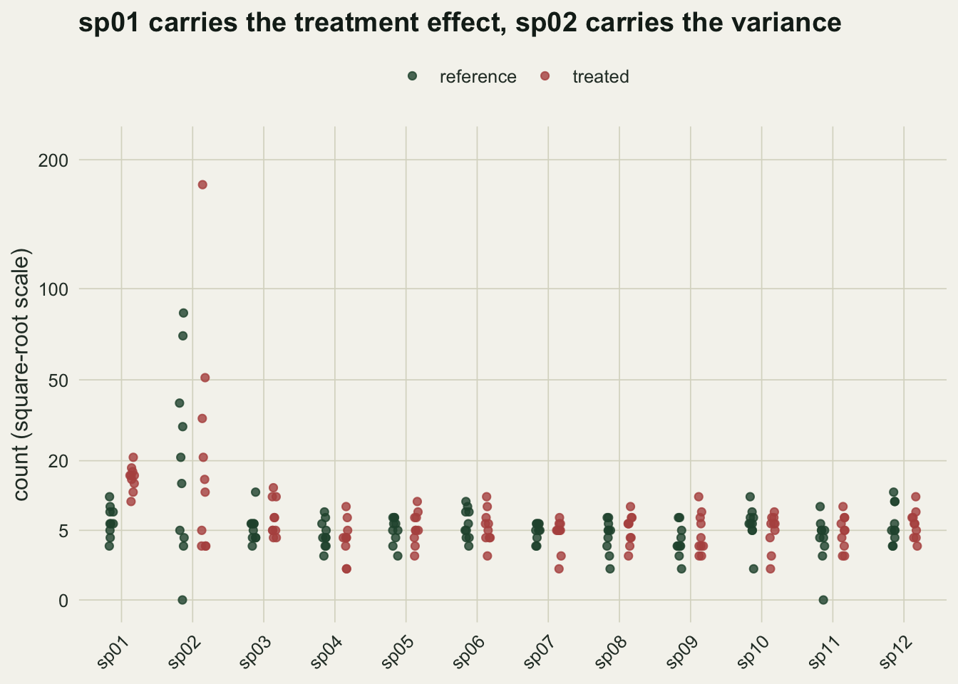
What the contribution actually is
For a pair of plots, one from each group, the contribution of species k to their Bray-Curtis dissimilarity is the absolute difference in that species divided by the total of both plots over all species. SIMPER averages that quantity over every between-group pair. Coding it by hand takes six lines and removes any doubt about what is being ranked.
simper_by_hand <- function(x, g) {
  levs <- levels(g)
  pairs <- expand.grid(i = which(g == levs[1]), j = which(g == levs[2]))
  contr <- matrix(0, nrow = nrow(pairs), ncol = ncol(x))
  for (p in seq_len(nrow(pairs))) {
    xi <- x[pairs$i[p], ]
    xj <- x[pairs$j[p], ]
    contr[p, ] <- abs(xi - xj) / sum(xi + xj)
  }
  avg <- colMeans(contr)
  sdv <- apply(contr, 2, sd)
  ord <- order(avg, decreasing = TRUE)
  data.frame(species = colnames(x)[ord], average = avg[ord], sd = sdv[ord],
             ratio = (avg / sdv)[ord],
             cumulative = cumsum(avg[ord]) / sum(avg), row.names = NULL)
}

hand <- simper_by_hand(comm, grp)
vegan_tab <- summary(simper(comm, grp))[[1]]

max_gap  <- max(abs(sort(hand$average, decreasing = TRUE) -
                    sort(vegan_tab$average, decreasing = TRUE)))
mean_bc  <- mean(as.matrix(vegdist(comm))[grp == "reference", grp == "treated"])
sum_avg  <- sum(hand$average)
head(hand, 4)
species average sd ratio cumulative
1 sp02 0.16726304 0.15239148 1.097588 0.4594549
2 sp01 0.05082287 0.02355136 2.157958 0.5990603
3 sp03 0.01784113 0.01522760 1.171631 0.6480681
4 sp12 0.01731299 0.01428350 1.212097 0.6956251The largest difference between the hand-coded averages and the vegan output is 5.6e-17, so nothing below depends on an implementation detail. There is a second identity worth keeping: the contributions sum to 0.3640, which is exactly the mean between-group Bray-Curtis dissimilarity, 0.3640. SIMPER is a decomposition of that one number, and nothing else.
That is the whole problem in one sentence. The number being decomposed is a dissimilarity, and the pair-level term contains an absolute difference. Two plots that differ only because one species swings wildly contribute exactly as much as two plots that differ because a species responded to the treatment.
top_species  <- hand$species[1]
top_average  <- hand$average[1]
top_share    <- hand$cumulative[1]
sp01_row     <- which(hand$species == "sp01")
sp01_average <- hand$average[sp01_row]
In this data set the table is led by sp02, with an average contribution of 0.1673, which is 45.9 per cent of the entire between-group dissimilarity. The species with the actual treatment effect is second, at 0.0508. A reader given only that table would report the wrong species, and would report it with a percentage attached.
A per-species model gets it right
The alternative is not exotic. Fit a model to each species, correct for multiple testing, and read the ranking off the adjusted p-values.
glm_table <- function(x, g) {
  p <- apply(x, 2, function(y) coef(summary(glm(y ~ g, family = quasipoisson)))[2, 4])
  data.frame(species = colnames(x), p_raw = p, p_bh = p.adjust(p, "BH"),
             row.names = NULL)
}

gt <- glm_table(comm, grp)
gt <- gt[order(gt$p_bh), ]
glm_first  <- gt$species[1]
glm_first_p <- gt$p_bh[1]
sp02_p     <- gt$p_bh[gt$species == "sp02"]
head(gt, 3)
species p_raw p_bh
1 sp01 2.594268e-06 3.113122e-05
2 sp02 7.959583e-01 8.683182e-01
3 sp03 2.341178e-01 8.683182e-01The quasi-Poisson fits put sp01 first, with an adjusted p-value of 3.1e-05, and leave sp02 at 0.87. The model divides the difference by its own uncertainty. SIMPER never does that division, which is why a large and meaningless difference beats a small and real one.
Once is an anecdote, so repeat it
set.seed(7)
reps <- 200
rank_avg   <- integer(reps)
rank_ratio <- integer(reps)
rank_glm   <- integer(reps)
for (r in seq_len(reps)) {
  cm <- make_community(TRUE)
  h  <- simper_by_hand(cm, grp)
  rank_avg[r]   <- which(h$species == "sp01")
  h2 <- h[order(h$ratio, decreasing = TRUE), ]
  rank_ratio[r] <- which(h2$species == "sp01")
  g2 <- glm_table(cm, grp)
  rank_glm[r]   <- rank(g2$p_bh)[1]
}
first_avg   <- mean(rank_avg == 1) * 100
first_ratio <- mean(rank_ratio == 1) * 100
first_glm   <- mean(rank_glm == 1) * 100
med_avg     <- median(rank_avg)
Over 200 fresh data sets from the same generator, the shifted species is ranked first by average contribution in 0.0 per cent of runs, with a median rank of 2. The per-species models rank it first in 99.5 per cent. The failure is not a bad draw; it is what the statistic does.
The interesting column is the third one. ratio is the average contribution divided by its standard deviation across pairs, and ranking on it recovers the shifted species in 80.5 per cent of runs. That column is printed by vegan in the same table, and it is the column that gets dropped when results are summarised.
rank_df <- data.frame(
  criterion = factor(c("SIMPER average", "SIMPER ratio", "per-species GLM"),
                     levels = c("SIMPER average", "SIMPER ratio", "per-species GLM")),
  pct = c(first_avg, first_ratio, first_glm))

ggplot(rank_df, aes(x = pct, y = criterion, fill = criterion)) +
  geom_col(width = 0.55) +
  geom_text(aes(label = sprintf("%.1f%%", pct)), hjust = -0.1, colour = te_body, size = 4) +
  scale_x_continuous(limits = c(0, 112), breaks = seq(0, 100, 25)) +
  scale_fill_manual(values = c("SIMPER average" = te_rust,
                               "SIMPER ratio" = te_gold,
                               "per-species GLM" = te_forest), guide = "none") +
  labs(x = "runs in which the shifted species ranks first (per cent)", y = NULL,
       title = "Same data, same species, three rankings") +
  theme_datasheet()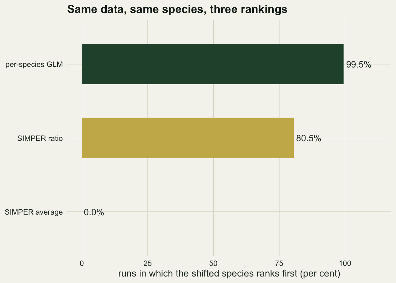
The table looks the same when nothing is happening
The worst property of a summary statistic is that it produces a confident-looking output when there is nothing to summarise. Here both groups are drawn from an identical community, including the same variable sp02.
set.seed(99)
null_reps  <- 200
null_top   <- numeric(null_reps)
null_cum3  <- numeric(null_reps)
null_ratio <- numeric(null_reps)
null_win   <- character(null_reps)
for (r in seq_len(null_reps)) {
  m0 <- make_community(shift = FALSE)
  h0 <- simper_by_hand(m0, grp)
  null_top[r]   <- h0$average[1]
  null_cum3[r]  <- h0$cumulative[3]
  null_ratio[r] <- max(h0$ratio)
  null_win[r]   <- h0$species[1]
}
null_top_mean  <- mean(null_top)
null_cum3_mean <- mean(null_cum3)
null_ratio_max <- max(null_ratio)
sp02_wins      <- mean(null_win == "sp02") * 100
With no group difference at all, the leading species still takes an average contribution of 0.219, and the top three species still account for 66.5 per cent of the dissimilarity on average. The identity of the winner is not random either: sp02 heads the table in 100 per cent of these null runs, because the ranking is tracking variance, and that is where the variance is.
A contribution’s ratio is its average divided by its variation between pairs, so a ratio near one says the two are the same size. Across all 200 null tables the best ratio anywhere reaches 1.97 at most.
ggplot(data.frame(top = null_top), aes(x = top)) +
  geom_histogram(bins = 25, fill = te_forest, colour = te_paper) +
  geom_vline(xintercept = top_average, linetype = "dashed", colour = te_rust, linewidth = 0.9) +
  annotate("text", x = top_average, y = 20, hjust = 1.05, colour = te_rust, size = 3.6,
           label = "leading contribution\nin the signal data set") +
  labs(x = "leading average contribution", y = "null data sets",
       title = "No group difference, and the top of the table looks the same") +
  theme_datasheet()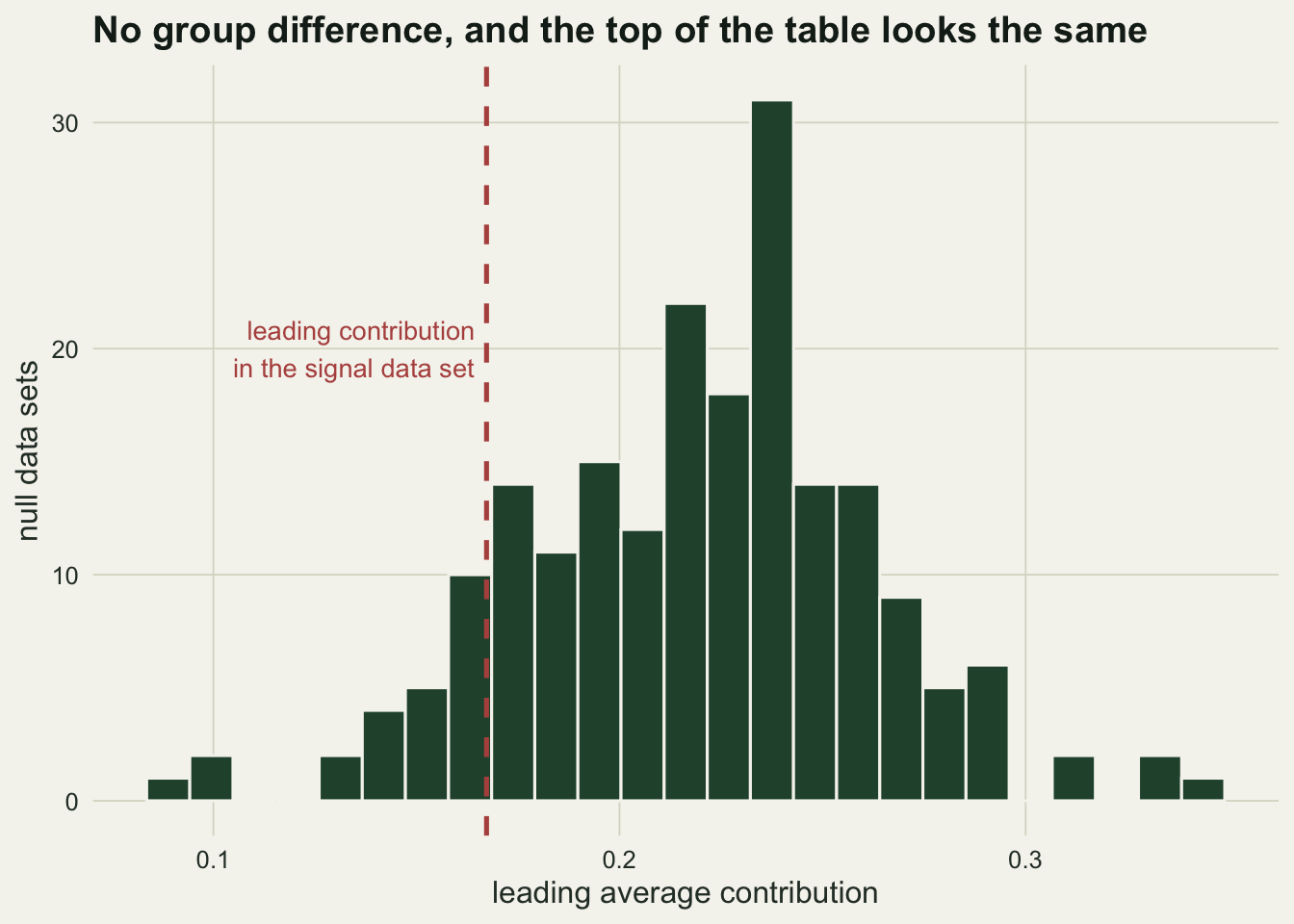
ANOSIM has the same blind spot, for the same reason
ANOSIM compares ranked between-group and within-group dissimilarities, so anything that inflates within-group dissimilarity in one group moves the statistic. Here both groups have the same expected composition and the treated group is simply more variable.
set.seed(4242)
disp_reps <- 200
p_anosim <- numeric(disp_reps)
p_adonis <- numeric(disp_reps)
for (r in seq_len(disp_reps)) {
  base <- matrix(rpois(2 * n_per * n_sp, 20), nrow = 2 * n_per)
  base[grp == "treated", ] <- matrix(rnbinom(n_per * n_sp, mu = 20, size = 1.2),
                                     nrow = n_per)
  d <- vegdist(base)
  p_anosim[r] <- anosim(d, grp, permutations = 199)$signif
  p_adonis[r] <- adonis2(d ~ grp, permutations = 199)$`Pr(>F)`[1]
}
anosim_rate <- mean(p_anosim <= 0.05) * 100
adonis_rate <- mean(p_adonis <= 0.05) * 100
With dispersion as the only difference, ANOSIM declares significance in 99.5 per cent of runs and adonis2 in 26.0 per cent. Neither is a clean location test on this data, but the gap between them is large, and an ANOSIM followed by a SIMPER table is two statistics with the same weakness stacked on each other.
disp_df <- data.frame(test = c("ANOSIM", "adonis2"), rate = c(anosim_rate, adonis_rate))

ggplot(disp_df, aes(x = test, y = rate, fill = test)) +
  geom_col(width = 0.45) +
  geom_hline(yintercept = 5, linetype = "dotted", colour = te_ink) +
  annotate("text", x = 2.15, y = 9, label = "nominal 5 per cent", colour = te_ink, size = 3.4) +
  geom_text(aes(label = sprintf("%.1f%%", rate)), vjust = -0.5, colour = te_body, size = 4) +
  scale_fill_manual(values = c(ANOSIM = te_rust, adonis2 = te_gold), guide = "none") +
  scale_y_continuous(limits = c(0, 112)) +
  labs(x = NULL, y = "runs declared significant (per cent)",
       title = "Dispersion only: no shift in expected composition") +
  theme_datasheet()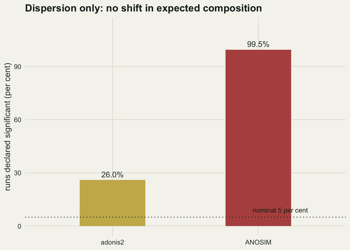
What to do instead
Read the ratio column, not the cumulative percentage. A contribution with a ratio near one is a variance report. Clarke’s original description treats a high ratio as the condition for calling a species a consistent discriminator, and that condition is the part that gets lost when the table is copied into a manuscript.
Better still, answer the species question with a species model. A per-species GLM with a false discovery rate correction, or a model-based multivariate fit, gives you an effect size, an interval and an error rate for each taxon. The mean-variance argument for that route is set out in the model-based multivariate abundance tutorial and is not repeated here.
Honest limits
The numbers above belong to this generator. The rate at which SIMPER is misled depends on how much variance heterogeneity a community carries relative to the size of the treatment effect, and a community without a species like sp02 will not show the reversal at all. What does not depend on the generator is the arithmetic: the contribution term contains an absolute difference and no scaling by variability, so a variable species can always outrank a shifted one, and the cumulative percentage will always add to one whether or not anything happened.
The per-species route has its own costs. It needs a distributional choice per taxon, it loses power when many rare species are included, and the false discovery rate is a statement about the list, not about any single species on it.
References
Clarke KR 1993 Australian Journal of Ecology 18(1):117-143 (10.1111/j.1442-9993.1993.tb00438.x)
Warton DI, Wright ST, Wang Y 2012 Methods in Ecology and Evolution 3(1):89-101 (10.1111/j.2041-210X.2011.00127.x)
Anderson MJ 2001 Austral Ecology 26(1):32-46 (10.1111/j.1442-9993.2001.01070.pp.x)
Benjamini Y, Hochberg Y 1995 Journal of the Royal Statistical Society Series B 57(1):289-300 (10.1111/j.2517-6161.1995.tb02031.x)