---
title: "Resource selection functions in R"
description: "Fit a resource selection function in R with used-available logistic regression, see why selection ratios confound covariates, and why an RSF is relative."
date: "2026-07-09 11:00"
categories: [R, GLM, resource selection, movement ecology, ecology tutorial]
image: thumbnail.png
image-alt: "A covariate surface in shades of green with used locations marked as gold points that cluster in the high-covariate areas."
---
A resource selection function (RSF) asks which parts of a landscape an animal uses more than expected. The standard design compares used locations (where the animal was) against available locations (a random sample of what the landscape offers), and fits the contrast with logistic regression. It is a workhorse of habitat and movement ecology, and it has two traps that catch people constantly: a single-covariate selection ratio confounds correlated covariates, and the fitted function is proportional to use, not a probability. This post builds an RSF from base R on a synthetic landscape and shows both.
## A landscape with two correlated covariates
We make 6000 habitat units, each with two standardised covariates. Only the first, `x1`, drives use; the second, `x2`, has no direct effect but is correlated with `x1`. Used units are drawn with probability proportional to the exponential RSF, and available units are drawn uniformly. The data are illustrative.
```{r}
#| label: setup
#| include: false
te_ink <- "#16241d"; te_body <- "#2c3a31"; te_forest <- "#275139"
te_label <- "#46604a"; te_sage <- "#93a87f"; te_paper <- "#f5f4ee"
te_line <- "#dad9ca"; te_faint <- "#5d6b61"; te_gold <- "#cda23f"; te_red <- "#b5534e"
theme_te <- function(base_size = 12) {
ggplot2::theme_minimal(base_size = base_size) +
ggplot2::theme(
text = ggplot2::element_text(colour = te_body),
plot.title = ggplot2::element_text(colour = te_ink, face = "bold"),
plot.subtitle = ggplot2::element_text(colour = te_faint),
axis.title = ggplot2::element_text(colour = te_label),
axis.text = ggplot2::element_text(colour = te_faint),
panel.grid.major = ggplot2::element_line(colour = te_line, linewidth = 0.3),
panel.grid.minor = ggplot2::element_blank(),
plot.background = ggplot2::element_rect(fill = te_paper, colour = NA),
panel.background = ggplot2::element_rect(fill = te_paper, colour = NA),
legend.key = ggplot2::element_blank(),
legend.title = ggplot2::element_text(colour = te_label),
strip.text = ggplot2::element_text(colour = te_ink, face = "bold"))
}
```
```{r}
#| label: data
#| message: false
library(ggplot2); library(dplyr); library(tidyr)

set.seed(3607)
ncell <- 6000
x1 <- rnorm(ncell)
x2 <- 0.6 * x1 + sqrt(1 - 0.6^2) * rnorm(ncell)   # correlated with x1, no direct effect
b1 <- 1.2; b2 <- 0                                # true selection: x1 only
w <- exp(b1 * x1 + b2 * x2)                       # RSF, exponential form

n_used <- 300
used_id <- sample(ncell, n_used, prob = w)

make_data <- function(k) {
  av_id <- sample(ncell, k * n_used)
  rbind(data.frame(used = 1, x1 = x1[used_id], x2 = x2[used_id]),
        data.frame(used = 0, x1 = x1[av_id],  x2 = x2[av_id]))
}
d <- make_data(5)
round(cor(x1, x2), 2)
```
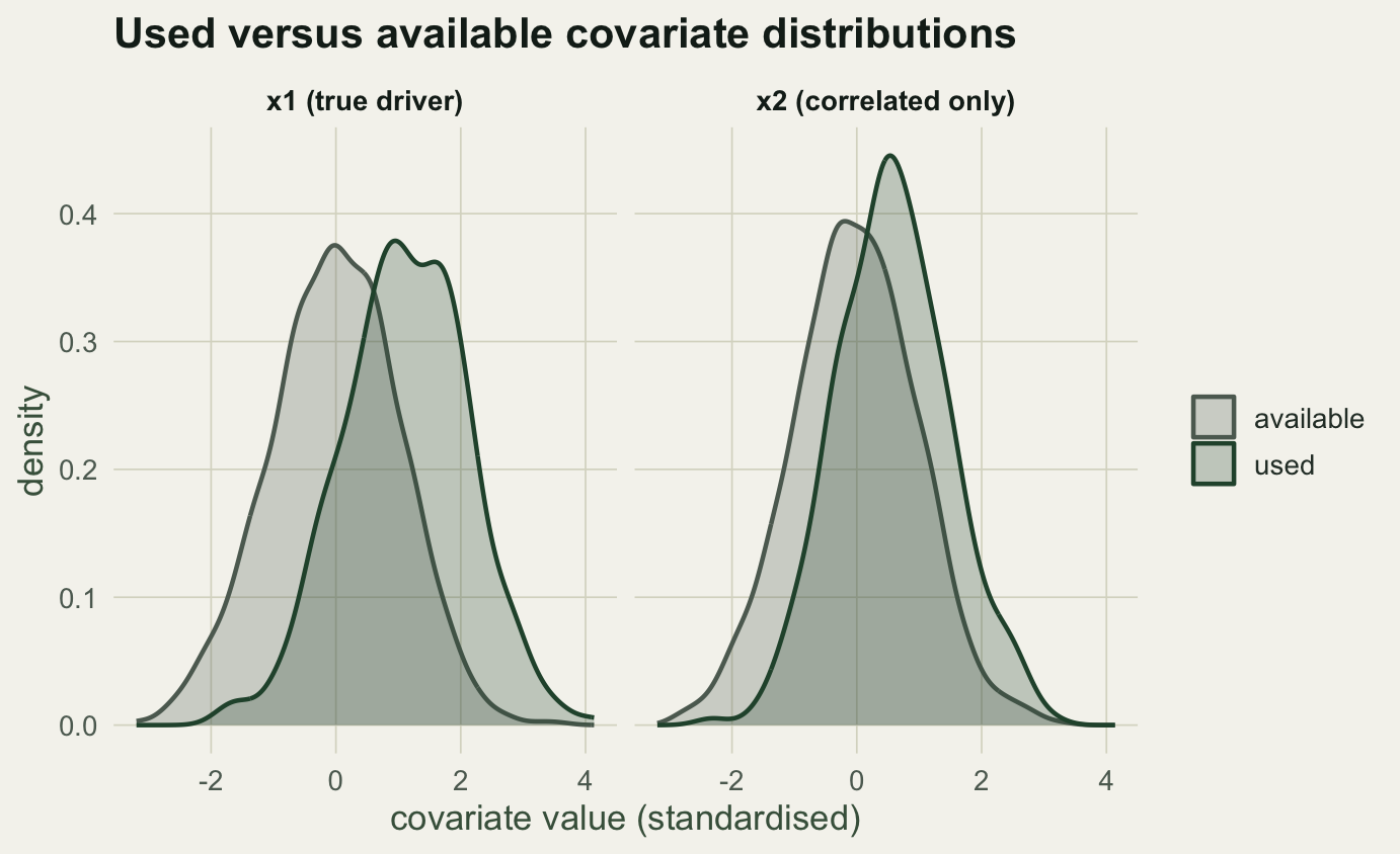
The two covariates correlate at 0.59. That correlation is what makes the naive approach fail.
## The selection ratio confounds
A selection ratio compares the share of used points in a habitat class to the share of available points there: greater than one means the class is used more than its availability. Split `x2` into quartiles and compute it.
```{r}
#| label: selratio
d$x2class <- cut(d$x2, breaks = quantile(d$x2, 0:4 / 4), include.lowest = TRUE, labels = 1:4)
sr <- d %>% group_by(x2class) %>%
  summarise(used_p = mean(used == 1), avail_p = mean(used == 0), .groups = "drop")
sr$ratio <- (sr$used_p / sum(sr$used_p)) / (sr$avail_p / sum(sr$avail_p))
round(sr$ratio, 2)
```
The ratio climbs from 0.32 in the lowest `x2` quartile to 1.94 in the highest, which reads as clear selection for high `x2`. But we built `x2` to have no effect at all. The apparent selection is entirely borrowed from `x1`, which `x2` tracks. A single-covariate analysis cannot tell direct selection from correlation, and this is the standard way habitat studies manufacture selection that is not there.
## Logistic regression, one covariate at a time versus together
The RSF is fitted by logistic regression of used (1) against available (0). Fit `x2` alone, then `x1` and `x2` together, and compare.
```{r}
#| label: rsf
m_x2   <- glm(used ~ x2, family = binomial, data = d)
m_both <- glm(used ~ x1 + x2, family = binomial, data = d)
round(c(x2_alone = coef(m_x2)["x2"],
        both_x1 = coef(m_both)["x1"], both_x2 = coef(m_both)["x2"]), 3)
```
Alone, `x2` gets a coefficient of 0.63, comfortably significant. Add `x1` and the `x2` coefficient collapses to essentially zero, while `x1` lands at 1.13, close to the value of 1.2 used to build the landscape. Controlling for the covariate that actually drives use removes the spurious effect. The lesson is the ordinary one for observational regression: fit the covariates together and watch collinearity, because selection attributed to one variable may belong to another.
```{r}
#| label: fig-densities
#| fig-cap: "Used and available distributions for each covariate. x1 separates strongly (real selection); x2 separates only weakly, through its correlation with x1."
#| fig-alt: "Two density panels. For x1 the used curve sits well to the right of available; for x2 the used curve sits only slightly to the right."
#| fig-width: 7.2
#| fig-height: 4.4
dl <- d %>% select(used, x1, x2) %>%
  pivot_longer(c(x1, x2), names_to = "covariate", values_to = "value") %>%
  mutate(group = ifelse(used == 1, "used", "available"))
ggplot(dl, aes(value, colour = group, fill = group)) +
  geom_density(alpha = 0.25, linewidth = 0.8) +
  facet_wrap(~covariate, labeller = as_labeller(c(x1 = "x1 (true driver)", x2 = "x2 (correlated only)"))) +
  scale_colour_manual(values = c(used = te_forest, available = te_faint), name = NULL) +
  scale_fill_manual(values = c(used = te_forest, available = te_faint), name = NULL) +
  labs(title = "Used versus available covariate distributions",
       x = "covariate value (standardised)", y = "density") +
  theme_te(13)
```
## An RSF is relative, not a probability
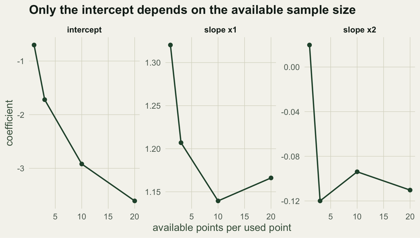
The second trap concerns interpretation. In a used-available design the zeros are not true absences: they are background points, and you choose how many to draw. That choice moves the intercept but not the slopes. Refit the model with an increasing number of available points per used point and watch.
```{r}
#| label: relscale
mult <- c(1, 3, 10, 20)
rs <- lapply(mult, function(k) {
  set.seed(1000 + k)
  m <- glm(used ~ x1 + x2, family = binomial, data = make_data(k))
  data.frame(mult = k, intercept = coef(m)[1], x1 = coef(m)["x1"], x2 = coef(m)["x2"])
})
rs <- do.call(rbind, rs)
round(rs, 3)
```
As the available sample grows from one to twenty points per used point, the intercept slides from -0.70 to -3.61, purely because the ratio of zeros to ones changed. The slopes barely move: `x1` stays near 1.2 and `x2` near zero throughout. So the intercept carries no biological meaning and the fitted values are not probabilities of use; only differences and ratios between locations are interpretable. This is the same relative-scale property as presence-background species distribution models, where the pseudo-absence count sets the intercept.
```{r}
#| label: fig-relscale
#| fig-cap: "Coefficients against the number of available points per used point. The intercept depends on the sample; the slopes do not."
#| fig-alt: "Three panels against available sample size: the intercept falls steadily, while the x1 slope stays near 1.2 and the x2 slope stays near zero."
#| fig-width: 7.4
#| fig-height: 4.2
rl <- rs %>% pivot_longer(c(intercept, x1, x2), names_to = "term", values_to = "estimate") %>%
  mutate(term = factor(term, levels = c("intercept", "x1", "x2"),
                       labels = c("intercept", "slope x1", "slope x2")))
ggplot(rl, aes(mult, estimate)) +
  geom_line(colour = te_forest, linewidth = 0.8) + geom_point(colour = te_forest, size = 2) +
  facet_wrap(~term, scales = "free_y") +
  labs(title = "Only the intercept depends on the available sample size",
       x = "available points per used point", y = "coefficient") +
  theme_te(13)
```
Because slopes are the interpretable part, the useful summary is relative selection strength: how many times more likely a location is to be used for a given change in a covariate, given by the exponential of the coefficient times the change.
```{r}
#| label: rss
round(exp(coef(m_both)["x1"] * 1), 2)
```
A location with `x1` one standard deviation higher is 3.10 times as likely to be used, holding `x2` fixed. That ratio is stable across the available sample sizes above, which is exactly why it, rather than any single fitted value, is what an RSF should report.
## What to take away
Fit resource selection as a multivariate logistic regression of used against available points, and never read selection off one covariate in isolation when covariates are correlated. Treat the output as relative: the intercept is an artefact of how many available points you drew, the fitted values are proportional to use rather than probabilities, and the interpretable quantities are the slopes and the relative selection strengths built from them (Boyce 2002; Avgar 2017). The same used-available machinery, applied to the step rather than the location, gives step selection functions, which bring movement into the model directly.
## References
Johnson 1980 Ecology 61(1):65-71 (10.2307/1937156)
Manly, McDonald, Thomas, McDonald & Erickson 2002 Resource Selection by Animals, 2nd edn, Kluwer Academic Publishers, ISBN 978-1-4020-0677-7
Boyce, Vernier, Nielsen & Schmiegelow 2002 Ecological Modelling 157(2-3):281-300 (10.1016/S0304-3800(02)00200-4)
Avgar, Lele, Keim & Boyce 2017 Ecology and Evolution 7(14):5322-5330 (10.1002/ece3.3122)
## Related tutorials
- [Species distribution models with a GLM](../species-distribution-model-glm/)
- [Pseudo-absence selection for SDMs](../pseudo-absence-selection-sdm/)
- [Step lengths and turning angles](../step-lengths-turning-angles/)
- [Home ranges: MCP versus kernel density](../home-range-mcp-kde/)