library(ggplot2)

te_paper  <- "#f5f4ee"
te_ink    <- "#16241d"
te_body   <- "#2c3a31"
te_forest <- "#275139"
te_rust   <- "#b5534e"
te_gold   <- "#c9b458"
te_line   <- "#dad9ca"

theme_datasheet <- function() {
  theme_minimal(base_size = 12) +
    theme(plot.background  = element_rect(fill = te_paper, colour = NA),
          panel.background = element_rect(fill = te_paper, colour = NA),
          panel.grid.major = element_line(colour = te_line, linewidth = 0.3),
          panel.grid.minor = element_blank(),
          text             = element_text(colour = te_body),
          plot.title       = element_text(colour = te_ink, face = "bold"),
          axis.text        = element_text(colour = te_body))
}

n_site  <- 60
log_mu  <- log(8)

survey <- function(site_sd = 0.15) {
  visits <- sample(2:12, n_site, replace = TRUE)
  truth  <- rnorm(n_site, log_mu, site_sd)
  totals <- rpois(n_site, visits * exp(truth))
  data.frame(site = seq_len(n_site), visits = visits,
             truth = truth, total = totals)
}Ranking sites when every estimate is noisy
R
monitoring
shrinkage
prioritisation
ecology tutorial
League tables of survey sites are mostly noise: the top-ranked site is rarely the best one, and shrinkage improves the estimates without improving the order.
A great deal of applied ecology ends in an ordering. Which reserve holds the most species, which population is declining fastest, which ten sites get the money. The analysis produces a column of estimates, the estimates get sorted, and the sorted column becomes a decision.
The estimates carry standard errors. The ordering does not, and it inherits far more of the noise than most people expect. With survey effort that varies between sites, which is normal, the site at the top of the table is usually not the best site, and the usual statistical repair does not help.
Sixty sites, uneven effort
Counts from sixty sites with between two and twelve visits each. Sites differ genuinely: a site-level term with standard deviation 0.15 on the log scale, which is a modest but real spread of about a thirty per cent range from worst to best.
The estimate for a site is its mean count per visit, on the log scale so that it lives in the same space as the truth. Empirical Bayes then pulls each site towards the overall mean by an amount that depends on how precisely it was measured: a site visited twice gets pulled a long way, a site visited twelve times hardly at all.
estimates <- function(d) {
  raw   <- log((d$total + 0.5) / d$visits)
  v     <- 1 / (d$total + 0.5)          # sampling variance of the log mean
  grand <- mean(raw)
  tau2  <- max(0, var(raw) - mean(v))   # method-of-moments between-site variance
  d$raw    <- raw
  d$shrunk <- grand + (tau2 / (tau2 + v)) * (raw - grand)
  d
}

set.seed(20260806)
one <- estimates(survey())
round(head(one[order(-one$raw), c("site", "visits", "truth", "raw", "shrunk")], 5), 3)
site visits truth raw shrunk
27 27 3 2.244 2.578 2.327
8 8 10 2.470 2.576 2.456
16 16 3 1.982 2.413 2.238
45 45 7 2.263 2.378 2.277
58 58 2 2.134 2.375 2.195The head of that table is the league table a report would print. Note how many of the leading sites have few visits.
How often is the winner the winner
score_once <- function(site_sd = 0.15) {
  d <- estimates(survey(site_sd))
  best <- which.max(d$truth)
  top5 <- order(-d$truth)[1:5]
  c(raw_crowned    = which.max(d$raw)    == best,
    shrunk_crowned = which.max(d$shrunk) == best,
    raw_top5       = length(intersect(order(-d$raw)[1:5], top5)),
    shrunk_top5    = length(intersect(order(-d$shrunk)[1:5], top5)),
    raw_mse        = mean((d$raw    - d$truth)^2),
    shrunk_mse     = mean((d$shrunk - d$truth)^2))
}

set.seed(11)
sc <- rowMeans(replicate(600, score_once()))
round(sc, 4)
raw_crowned shrunk_crowned raw_top5 shrunk_top5 raw_mse
0.3083 0.3650 2.3850 2.4900 0.0243
shrunk_mse
0.0113 Over 600 simulated monitoring programmes the site ranked first by its raw mean is genuinely the best site 31 per cent of the time. Shrinking the estimates first moves that to 36 per cent. A published top five contains 2.38 of the true top five on average from the raw estimates, and 2.49 after shrinkage, out of five.
Meanwhile shrinkage does what it is advertised to do. The mean squared error of the site estimates falls from 0.0243 to 0.0113, an improvement of 53 per cent. It is a better estimator of every individual site and it is barely a better ranker of the set.
That is not a paradox. Shrinkage buys accuracy by pulling estimates towards each other, and pulling estimates towards each other is exactly the operation that destroys information about their order. It improves the ranking a little, because it stops a two-visit site with a lucky count from vaulting to the top, and it cannot improve it much, because the sites it pulls hardest are the ones whose true position was never identifiable.
The rate depends on how different the sites really are
The percentages above are not constants of nature. They depend on how much genuine variation exists between sites relative to the sampling noise, and any number quoted without that context is unusable.
set.seed(12)
sds <- c(0.05, 0.15, 0.30, 0.60)
sw <- do.call(rbind, lapply(sds, function(s) {
  r <- rowMeans(replicate(400, score_once(s)))
  data.frame(site_sd = s,
             raw = 100 * r[["raw_crowned"]], shrunk = 100 * r[["shrunk_crowned"]],
             raw5 = r[["raw_top5"]], shrunk5 = r[["shrunk_top5"]])
}))
round(sw, 2)
site_sd raw shrunk raw5 shrunk5
1 0.05 6.25 5.50 1.01 0.89
2 0.15 26.50 31.75 2.33 2.54
3 0.30 59.25 61.75 3.42 3.44
4 0.60 84.25 83.50 4.28 4.28When the sites are nearly identical, at a site standard deviation of 0.05, the raw table crowns the true best site only 6 per cent of the time, against the 1.7 per cent a blind pick from the sixty would achieve. When the sites differ strongly, at 0.6, the table gets it right 84 per cent of the time. The ranking is informative when the ecology is loud and the survey is not the limiting factor, and it is close to a lottery otherwise.
long <- rbind(data.frame(site_sd = sw$site_sd, pct = sw$raw,    est = "raw means"),
              data.frame(site_sd = sw$site_sd, pct = sw$shrunk, est = "shrunken means"))

ggplot(long, aes(x = site_sd, y = pct, colour = est, shape = est)) +
  geom_hline(yintercept = 100 / n_site, linetype = "dotted", colour = te_ink) +
  annotate("text", x = 0.6, y = 100 / n_site + 4, hjust = 1, size = 3.3,
           colour = te_ink, label = "picking one of the sixty at random") +
  geom_line(linewidth = 0.9) +
  geom_point(size = 2.9) +
  scale_x_continuous(breaks = sds) +
  scale_colour_manual(values = c("raw means" = te_rust,
                                 "shrunken means" = te_forest)) +
  scale_shape_manual(values = c(17, 16)) +
  labs(x = "true between-site standard deviation, log scale",
       y = "per cent of programmes crowning the true best site",
       colour = NULL, shape = NULL,
       title = "When is a league table worth reading") +
  theme_datasheet() +
  theme(legend.position = "top")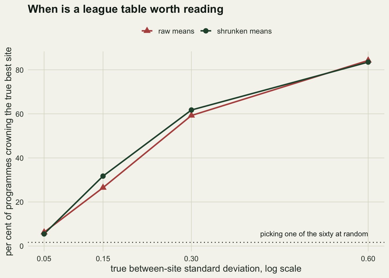
Report the rank with an interval
If the ordering is the deliverable, the ordering needs uncertainty attached, and the way to get it is the same as for any other statistic: simulate new data from the fitted model, re-rank, and look at the spread. A parametric bootstrap does it in a few lines.
rank_interval <- function(d, boots = 500) {
  ranks <- replicate(boots, {
    sim <- d
    sim$total <- rpois(nrow(d), d$visits * exp(d$shrunk))
    rank(-estimates(sim)$shrunk, ties.method = "first")
  })
  data.frame(site   = d$site,
             point  = rank(-d$shrunk, ties.method = "first"),
             lo     = apply(ranks, 1, quantile, 0.05),
             hi     = apply(ranks, 1, quantile, 0.95))
}

set.seed(303)
ri <- rank_interval(one)
ri <- ri[order(ri$point), ]
head(ri, 5)
site point lo hi
8 8 1 1 8
27 27 2 2 42
46 46 3 2 46
45 45 4 2 45
34 34 5 2 34The site at the top of the table has a ninety per cent rank interval running from 1 to 8 out of 60. The site in fifth place could plausibly be anywhere from 2 to 34. There are 24 sites whose interval reaches into the top five, which is the number a decision maker actually needs: not the identity of the top five, but the size of the set that cannot be distinguished from them.
top20 <- head(ri, 20)
top20$visits <- one$visits[match(top20$site, one$site)]
top20$few <- ifelse(top20$visits <= 5, "5 visits or fewer", "more than 5 visits")

ggplot(top20, aes(y = factor(point, levels = rev(top20$point)), x = point,
                  colour = few)) +
  geom_errorbar(aes(xmin = lo, xmax = hi), orientation = "y",
                width = 0.45, linewidth = 0.7) +
  geom_point(size = 2.4) +
  geom_vline(xintercept = 5.5, linetype = "dashed", colour = te_ink) +
  scale_colour_manual(values = c("5 visits or fewer" = te_rust,
                                 "more than 5 visits" = te_forest)) +
  labs(x = "rank among the sixty sites", y = "position in the published table",
       colour = NULL, title = "What a top-twenty list is really saying") +
  theme_datasheet() +
  theme(legend.position = "top")
Warning: Use of `top20$point` is discouraged.
ℹ Use `point` instead.
Use of `top20$point` is discouraged.
ℹ Use `point` instead.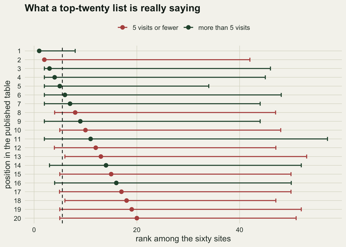
What to hand over instead of a sorted column
Three things travel better than a league table. The estimate for each site with its interval, which is what the analysis actually produced. The rank interval, which says how far a site could move. And, if the decision is genuinely to choose a set, the proportion of bootstrap replicates in which each site falls inside that set, which is a directly usable selection probability rather than a position.
set.seed(404)
sel <- replicate(500, {
  sim <- one
  sim$total <- rpois(nrow(one), one$visits * exp(one$shrunk))
  rank(-estimates(sim)$shrunk, ties.method = "first") <= 5
})
prob <- rowMeans(sel)
round(sort(prob, decreasing = TRUE)[1:8], 3)
[1] 0.918 0.376 0.338 0.332 0.324 0.238 0.212 0.208The strongest site enters the top five in 92 per cent of replicates and the eighth strongest in 21 per cent, so the eighth site is not far behind the fifth on any honest reading. 8 sites clear a twenty per cent chance of belonging in the top five. If the budget stretches to five, that list of 8 is the shortlist, and which five come out of it is a question for the ecology and the cost, not for the sort order.
Honest limits
The numbers here belong to one design: sixty sites, two to twelve visits, Poisson counts around a mean of eight, and independent sites. Change the ratio of true between-site variation to sampling noise and the rates move a long way, as the sweep shows. What transfers is the shape of the result, not the percentages: rank uncertainty is large whenever effort is uneven, and shrinkage does not repair it.
The empirical Bayes estimator used here is deliberately the simplest one that works, with a method-of-moments variance component and a normal approximation on the log scale. A proper hierarchical model gives better intervals and would also give the rank distribution directly from the posterior, which is the cleaner route when one is already being fitted. The conclusion about ranking is the same either way, because it is a property of the information in the data rather than of the fitting machinery.
The bootstrap here treats the shrunken estimates as if they were the truth when simulating, which understates the uncertainty a little, in the direction of intervals that are too narrow. The real intervals are wider than the ones plotted.
Finally, none of this says that ordering sites is a mistake. It says that the order is an estimate like any other, and that a decision resting on positions one to five should be shown how much of the table could be rearranged by another season of the same survey.
References
Efron B, Morris C 1975 Journal of the American Statistical Association 70(350):311-319 (10.1080/01621459.1975.10479864)
Laird NM, Louis TA 1989 Journal of Educational Statistics 14(1):29-46 (10.3102/10769986014001029)
Goldstein H, Spiegelhalter DJ 1996 Journal of the Royal Statistical Society Series A 159(3):385-443 (10.2307/2983325)