library(ggplot2)

te_paper  <- "#f5f4ee"
te_ink    <- "#16241d"
te_body   <- "#2c3a31"
te_forest <- "#275139"
te_rust   <- "#b5534e"
te_gold   <- "#c9b458"
te_line   <- "#dad9ca"

theme_datasheet <- function() {
  theme_minimal(base_size = 12) +
    theme(plot.background  = element_rect(fill = te_paper, colour = NA),
          panel.background = element_rect(fill = te_paper, colour = NA),
          panel.grid.major = element_line(colour = te_line, linewidth = 0.3),
          panel.grid.minor = element_blank(),
          text             = element_text(colour = te_body),
          plot.title       = element_text(colour = te_ink, face = "bold"),
          plot.subtitle    = element_text(colour = te_body),
          axis.text        = element_text(colour = te_body))
}Net primary production from repeated harvests
R
primary production
grassland
sampling
simulation
ecology tutorial
Harvest ANPP depends on the estimator. Simulating in R how noisy clip means inflate summed increments and peak standing crop, and how tissue turnover hides.
A grassland station clips aboveground biomass every few weeks from spring green-up to the end of the growing season. On each date a technician drops a small frame at a handful of random points, cuts everything rooted inside it, sorts out the live material, dries it and weighs it. At the end of the year the table has one row per harvest date, a mean and a standard error, and the number the station reports as aboveground net primary production (ANPP) is computed from that table.
There is no single way to compute it. The simplest reading is the peak standing crop: the largest mean of the season. A second subtracts the smallest mean from the largest. A third walks along the dates and adds up every rise in the mean, on the argument that tissue which grew and died between two peaks is missed by the peak alone. A fourth adds up only the rises that pass a significance test, on the argument that a rise inside the noise should not count. Singh, Lauenroth and Steinhorst reviewed and assessed harvest-based techniques for estimating grassland production in 1975. Scurlock, Johnson and Olson later applied six methods to 31 grassland sites and, like earlier work, found NPP estimates from methods that follow dead matter two to five times higher than peak live biomass. The methods do not disagree by a little.
The disagreement has two sources, and a simulation can pull them apart because it knows the answer. One is biological: live tissue dies while the canopy is still growing, so the standing crop never holds the whole season’s production at once. The other is statistical: every harvest mean is noisy, and the peak and the summed rises both treat noisy means as if they were the truth. Lauenroth, Hunt, Swift and Singh took a simulation approach to estimating grassland production in 1986. The simulation here is a small one in base R, and the four rules below are this post’s own definitions, not a transcription of theirs or of the 1975 review. Nothing here is a discovery; the numbers are this simulation’s, not theirs, and the point is to see each error on its own.
Production on this site so far comes from instruments that run all year. Partitioning net flux into GPP and respiration splits a continuous eddy covariance record, and its trouble is a respiration model fitted at night and evaluated in the day. Here there is no model to fit: the estimate is arithmetic on a few destructive snapshots, and the bias is a property of the sampling schedule. The noisy maximum is also familiar from records as a test for trend, but that post counts how often a running maximum is beaten and ignores the values. Here the value of the largest noisy mean goes straight into a carbon budget. The harvests in checking a decomposition analysis are litterbag retrievals, which measure mass lost, not tissue made.
A season with a production column
The truth needs a column that no harvest can see: the tissue produced. Production arrives at a rate shaped like a beta density over the season, scaled so that it integrates to 300 grams per square metre. Live tissue dies at a constant relative rate, so the live biomass obeys the simplest balance there is: its change is production minus the death rate times the live biomass. True ANPP is defined as the integral of the production rate, everything made during the season whether or not it was still alive at any harvest. Three death rates were fixed before anything was simulated: zero, one and three per season.
anpp_true <- 300                    # g per square metre produced in the season
beta_a    <- 3; beta_b <- 5         # shape of the production rate over the season
n_fine    <- 2600                   # time steps in the season (0 to 1)
t_fine    <- seq(0, 1, length.out = n_fine + 1)
dt_fine   <- 1 / n_fine
prod_rate <- anpp_true * dbeta(t_fine, beta_a, beta_b)
turn_set  <- c(0, 1, 3)             # relative death rate of live tissue, per season

live_curve <- function(r_death) {
  decay <- exp(-r_death * dt_fine)
  add   <- 0.5 * (prod_rate[-length(t_fine)] * decay + prod_rate[-1]) * dt_fine
  live  <- numeric(length(t_fine))
  for (i in seq_len(n_fine)) live[i + 1] <- live[i] * decay + add[i]
  live
}
live_mat <- sapply(turn_set, live_curve)

trap_int  <- function(y) sum((y[-1] + y[-length(y)]) / 2) * dt_fine
produced  <- trap_int(prod_rate)
died      <- turn_set * apply(live_mat, 2, trap_int)
balance   <- live_mat[n_fine + 1, ] + died
bal_gap   <- max(abs(balance - produced))

peak_true <- apply(live_mat, 2, max) / anpp_true
dead_frac <- died / anpp_true
t_peak    <- t_fine[apply(live_mat, 2, which.max)]
The balance closes. For every death rate, the live biomass at the end of the season plus the tissue that died adds up to the integral of production within 2.75e-05 grams per square metre, so the definition of the truth is not a numerical accident. With no death the live curve rises to 1.00 of true ANPP and stays there. At a death rate of one per season 0.46 of the season’s tissue has died by the last day, and the live curve peaks at 0.71 of true ANPP, 0.64 of the way through the season. At a death rate of three the dead share is 0.83 and the peak is 0.46. These are the peak standing crops a harvest with no sampling error at all would report.
season_df <- data.frame(t = rep(t_fine, length(turn_set)),
                        live = as.vector(live_mat),
                        turnover = factor(rep(turn_set, each = length(t_fine))))
cum_df <- data.frame(t = t_fine, produced = cumsum(c(0, (prod_rate[-1] +
                     prod_rate[-length(t_fine)]) / 2 * dt_fine)))
ggplot(season_df, aes(t, live, colour = turnover)) +
  geom_line(linewidth = 1.6) +
  geom_line(data = cum_df, aes(t, produced), inherit.aes = FALSE,
            colour = te_ink, linetype = "dashed", linewidth = 0.6) +
  annotate("text", x = 0.60, y = 290, label = "tissue produced so far",
           colour = te_ink, hjust = 1, size = 3.6) +
  scale_colour_manual(values = c(te_forest, te_gold, te_rust),
                      name = "death rate per season") +
  labs(x = "fraction of the growing season", y = "grams per square metre",
       title = "The same production, three standing crops",
       subtitle = "solid: live biomass a harvest would clip; dashed: cumulative production") +
  theme_datasheet() +
  theme(legend.position = "bottom")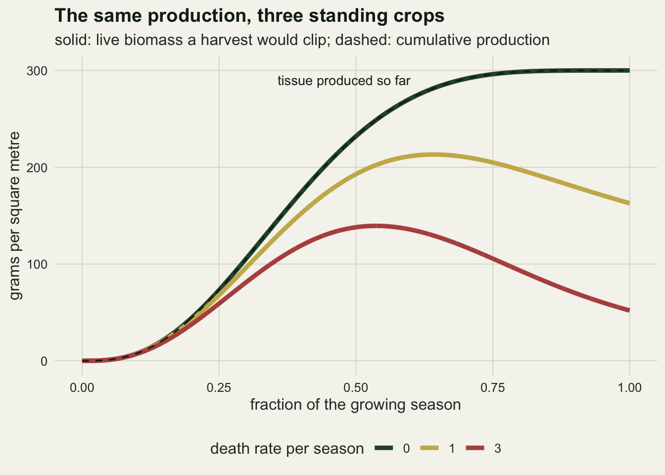
The gold curve is an ordinary grassland season. The rust curve is a canopy with fast leaf turnover, where most tissue produced is dead by the end of the season. The green curve has no death at all, so the dashed line of cumulative production lies on top of it. It is not realistic; it is the control that isolates the sampling error.
Four estimators and one harvest protocol
A harvest date samples k quadrats. Quadrat biomass is gamma distributed around the true live biomass with a coefficient of variation of 0.35, a plausible patchiness for a clipped grassland quadrat, and quadrats on different dates are independent because each clip destroys its plot. The dates are evenly spaced, and the last one falls on the last day of the season. Biomass at green-up is taken as zero, so the first increment is the first harvest mean.
The four estimators are written out as rules on the vector of harvest means, and the code below is the definition. Peak standing crop is the largest mean. Maximum minus minimum subtracts the smallest mean. Summed positive increments adds every positive difference between consecutive means. Summed significant increments adds a positive difference only when a two-sided Welch t test on the quadrat values of the two dates rejects at the five per cent level; for the first harvest the comparison is a one-sample test against the known zero. Methods that also follow dead matter, of the kind Scurlock and colleagues compared, are not used; everything here uses live biomass only.
cv_quad <- 0.35                     # between-quadrat coefficient of variation
alpha_sig <- 0.05                   # level for the significant-increments rule

harvest_estimates <- function(mu_date, k_quad, n_rep) {
  n_date <- length(mu_date)
  quad <- matrix(rgamma(n_rep * n_date * k_quad, shape = 1 / cv_quad^2,
                        scale = rep(mu_date * cv_quad^2, each = n_rep)),
                 n_rep * n_date, k_quad)
  mean_q <- matrix(rowMeans(quad), n_rep, n_date)
  se2_q  <- matrix(rowSums((quad - as.vector(mean_q))^2) / (k_quad - 1) / k_quad,
                   n_rep, n_date)
  peak   <- apply(mean_q, 1, max)
  lowest <- apply(mean_q, 1, min)
  incr   <- mean_q - cbind(0, mean_q[, -n_date, drop = FALSE])
  se2_prev <- cbind(0, se2_q[, -n_date, drop = FALSE])
  se2_diff <- se2_q + se2_prev
  df_welch <- se2_diff^2 / ((se2_q^2 + se2_prev^2) / (k_quad - 1))
  p_incr   <- 2 * pt(-abs(incr / sqrt(se2_diff)), df_welch)
  keep_sig <- incr > 0 & p_incr < alpha_sig
  list(est = cbind(peak = peak, maxmin = peak - lowest,
                   sumpos = rowSums(pmax(incr, 0)),
                   sumsig = rowSums(incr * keep_sig)),
       incr = incr, keep_sig = keep_sig)
}

noise_free <- function(mu_date) {
  incr <- diff(c(0, mu_date))
  c(peak = max(mu_date), maxmin = max(mu_date) - min(mu_date),
    sumpos = sum(pmax(incr, 0)), sumsig = sum(pmax(incr, 0)))
}
Without sampling error the two increment rules coincide, and on a curve that rises once and falls once the sum of positive increments equals the peak exactly: each step up is counted, the steps down are not, and the steps up add to the maximum. So on these curves any difference between the peak and the summed increments is produced by noise, not by turnover.
dates_set <- c(4, 8, 16, 26)
k_set     <- c(3, 5, 10)
n_rep     <- 2000
est_names <- c("peak", "maxmin", "sumpos", "sumsig")

set.seed(1975)
grid_rows <- list()
for (ti in seq_along(turn_set)) for (k_quad in k_set) for (n_date in dates_set) {
  idx_date <- round(seq_len(n_date) / n_date * n_fine) + 1
  mu_date  <- live_mat[idx_date, ti]
  sim      <- harvest_estimates(mu_date, k_quad, n_rep)
  ratio    <- sim$est / anpp_true
  grid_rows[[length(grid_rows) + 1]] <- data.frame(
    turnover = turn_set[ti], k = k_quad, dates = n_date, estimator = est_names,
    ratio = colMeans(ratio), mc_se = apply(ratio, 2, sd) / sqrt(n_rep),
    no_noise = noise_free(mu_date) / anpp_true)
}
grid_df  <- do.call(rbind, grid_rows)
mc_se_hi <- max(grid_df$mc_se)
get_ratio <- function(est, r_death, k_quad, n_date, col = "ratio")
  grid_df[grid_df$estimator == est & grid_df$turnover == r_death &
          grid_df$k == k_quad & grid_df$dates == n_date, col]
The grid crosses the three death rates with 4, 8, 16 and 26 harvest dates and 3, 5 and 10 quadrats per date, and each of the 36 cells was run 2000 times. The replication was set before the grid ran. The largest Monte Carlo standard error of any mean ratio in the grid is 0.0088, so differences of a few hundredths are real, and a difference of one hundredth is not worth reading.
Summed increments grow with the number of harvests
Start with no turnover, where the noise-free peak standing crop is exactly right and so is the sum of positive increments. Noise breaks both, and it breaks the increments much harder.
The inflation of the increments has a closed form, at least approximately. A difference of two harvest means is close to normal, with mean equal to the true increment and variance equal to the sum of the two sampling variances. The expected positive part of a normal variable is its mean times the normal distribution function at mean over standard deviation, plus the standard deviation times the normal density at the same point. Summed over dates, that is the expected estimate. The chunk computes it and uses it only as a check on the simulation, since the gamma quadrats make the normal version an approximation.
expected_sumpos <- function(mu_date, k_quad) {
  mu_prev <- c(0, mu_date[-length(mu_date)])
  mean_d  <- mu_date - mu_prev
  sd_d    <- sqrt(cv_quad^2 * (mu_date^2 + mu_prev^2) / k_quad)
  sum(mean_d * pnorm(mean_d / sd_d) + sd_d * dnorm(mean_d / sd_d))
}
cf_df <- expand.grid(k = k_set, dates = dates_set)
cf_df$closed <- mapply(function(k_quad, n_date) {
  idx_date <- round(seq_len(n_date) / n_date * n_fine) + 1
  expected_sumpos(live_mat[idx_date, 1], k_quad) / anpp_true
}, cf_df$k, cf_df$dates)
cf_df$sim <- mapply(function(k_quad, n_date) get_ratio("sumpos", 0, k_quad, n_date),
                    cf_df$k, cf_df$dates)
cf_df$gap_se <- (cf_df$sim - cf_df$closed) /
  mapply(function(k_quad, n_date) get_ratio("sumpos", 0, k_quad, n_date, "mc_se"),
         cf_df$k, cf_df$dates)
cf_gap_max <- max(abs(cf_df$sim - cf_df$closed))

sp_0_k3_4   <- get_ratio("sumpos", 0, 3, 4)
sp_0_k3_26  <- get_ratio("sumpos", 0, 3, 26)
sp_0_k10_26 <- get_ratio("sumpos", 0, 10, 26)
pk_0_k3_4   <- get_ratio("peak", 0, 3, 4)
pk_0_k3_26  <- get_ratio("peak", 0, 3, 26)
pk_0_k10_26 <- get_ratio("peak", 0, 10, 26)
mm_0_k3_4   <- get_ratio("maxmin", 0, 3, 4)
mm_nn_4     <- get_ratio("maxmin", 0, 3, 4, "no_noise")
The simulated means and the normal approximation agree to within 0.016 of true ANPP in all twelve cells, so the simulation is doing what the arithmetic says it should. The arithmetic also explains the pattern. Once harvests are frequent, each true increment is small against the sampling error of a difference, and the expected positive part of a difference with mean zero is its standard deviation divided by the square root of two pi. Every extra date adds nearly that amount, whether or not anything grew.
With 3 quadrats per date, summed positive increments read 1.13 of true ANPP at 4 dates and 2.49 at 26. Ten quadrats per date slow the growth but do not stop it: 1.73 at 26 dates. The peak standing crop is inflated as well, because the largest of several noisy means near the plateau is biased upwards, but by far less: 1.11 at 4 dates, 1.33 at 26 with 3 quadrats, and 1.17 at 26 with 10. More dates put more means near the maximum, so the peak also inflates with frequency, only slowly.
Maximum minus minimum behaves differently at 4 dates. The first harvest falls a quarter of the way into the season, when some tissue already stands, and subtracting it removes real production: without noise the estimator reads 0.76, and with 3 quadrats 0.87, where the noise in the maximum has pulled it part of the way back.
ggplot(cf_df, aes(dates, sim, colour = factor(k))) +
  geom_hline(yintercept = 1, colour = te_ink, linetype = "dashed", linewidth = 0.5) +
  geom_line(aes(y = closed), linewidth = 0.8) +
  geom_point(size = 2.6) +
  scale_colour_manual(values = c(te_rust, te_gold, te_forest),
                      name = "quadrats per harvest") +
  scale_x_continuous(breaks = dates_set) +
  labs(x = "harvest dates in the season", y = "summed increments / true ANPP",
       title = "Noise alone makes production",
       subtitle = "no turnover; points: simulation; lines: normal approximation") +
  theme_datasheet() +
  theme(legend.position = "bottom")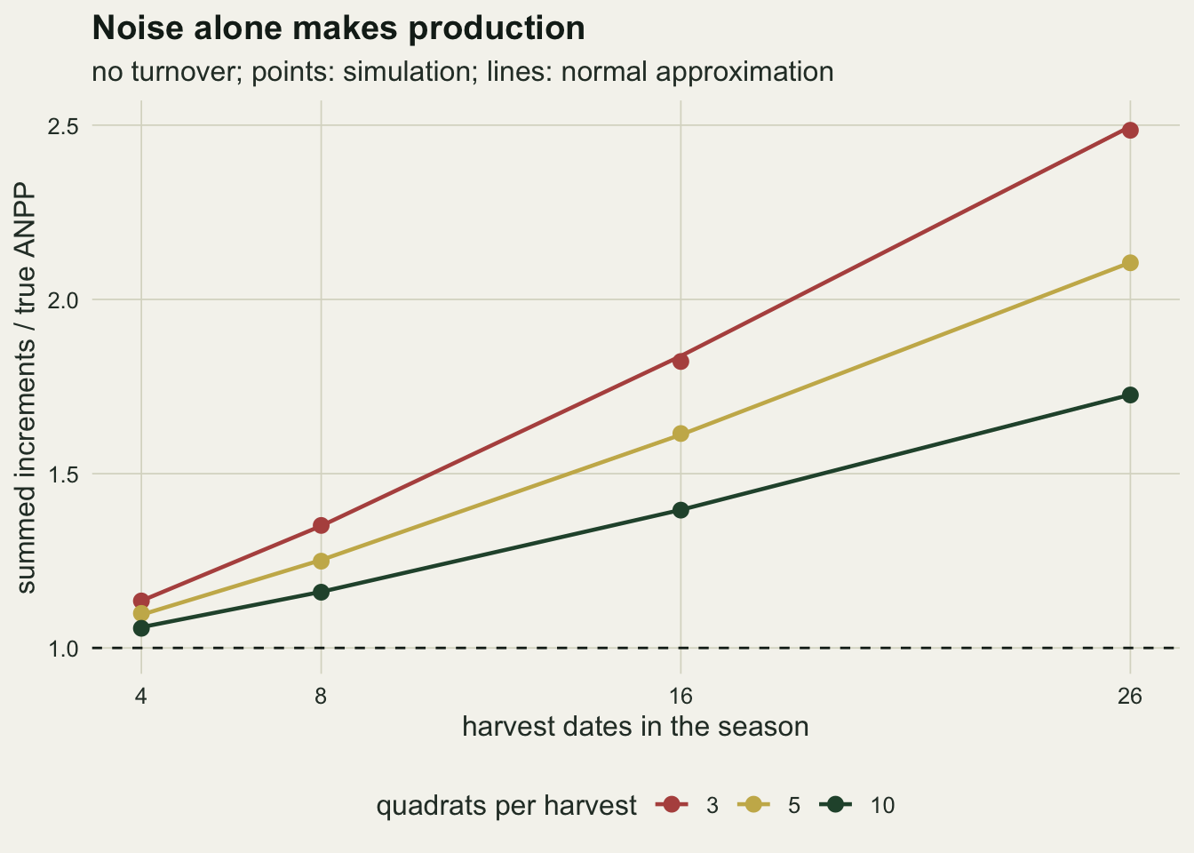
Turnover turns the peak into an underestimate
pk_1_k10_4  <- get_ratio("peak", 1, 10, 4)
pk_3_k10_26 <- get_ratio("peak", 3, 10, 26)
sp_nn_1_26  <- get_ratio("sumpos", 1, 10, 26, "no_noise")
sp_nn_3_26  <- get_ratio("sumpos", 3, 10, 26, "no_noise")
sp_1_k3_26  <- get_ratio("sumpos", 1, 3, 26)
sp_1_k10_16 <- get_ratio("sumpos", 1, 10, 16)
sp_nn_1_16  <- get_ratio("sumpos", 1, 10, 16, "no_noise")
sp_1_k10_4  <- get_ratio("sumpos", 1, 10, 4)
sp_3_k3_26  <- get_ratio("sumpos", 3, 3, 26)
pk_1_max    <- max(grid_df$ratio[grid_df$estimator == "peak" & grid_df$turnover == 1])
Now let tissue die. The noise-free peak falls to the live maximum, 0.71 and 0.46 of true ANPP at the two death rates. Sampling error still inflates the observed peak, but from a lower starting point, and at a death rate of one it does not climb back to the truth anywhere in the grid: the largest value in the grid is 0.92, in the cell with 26 dates and 3 quadrats, and with 4 dates and 10 quadrats it is 0.71. At a death rate of three it reads 0.52 at 26 dates with 10 quadrats.
Summed positive increments do not escape the turnover either. Without noise they equal the peak on these curves, 0.71 and 0.46 of true ANPP at 26 dates. The argument that increments pick up tissue that grew and died between peaks holds only when the live curve being summed has several rises, which happens for a community with two growth pulses or when each species is harvested and summed separately. A single pooled seasonal hump has one rise. What moves the increments above the peak in the figure below is sampling error, and it moves them a long way: at a death rate of one, 26 dates and 3 quadrats give 1.74.
plot_df <- grid_df
plot_df$estimator <- factor(plot_df$estimator, levels = est_names,
  labels = c("peak standing crop", "maximum minus minimum",
             "summed positive increments", "summed significant increments"))
plot_df$turn_lab <- factor(paste("death rate", plot_df$turnover),
                           levels = paste("death rate", turn_set))
plot_df$k_lab <- factor(paste(plot_df$k, "quadrats"), levels = paste(k_set, "quadrats"))
ggplot(plot_df, aes(dates, ratio, colour = estimator, linetype = estimator)) +
  geom_hline(yintercept = 1, colour = te_ink, linetype = "dashed", linewidth = 0.5) +
  geom_line(linewidth = 0.8) +
  geom_point(size = 1.8) +
  facet_grid(turn_lab ~ k_lab) +
  scale_colour_manual(values = c(te_forest, te_ink, te_rust, te_gold), name = NULL) +
  scale_linetype_manual(values = c("solid", "dotted", "solid", "solid"), name = NULL) +
  scale_x_continuous(breaks = dates_set) +
  labs(x = "harvest dates in the season", y = "estimate / true ANPP",
       title = "Each estimator has its own error surface") +
  guides(colour = guide_legend(nrow = 2)) +
  theme_datasheet() +
  theme(legend.position = "bottom",
        strip.text = element_text(colour = te_ink))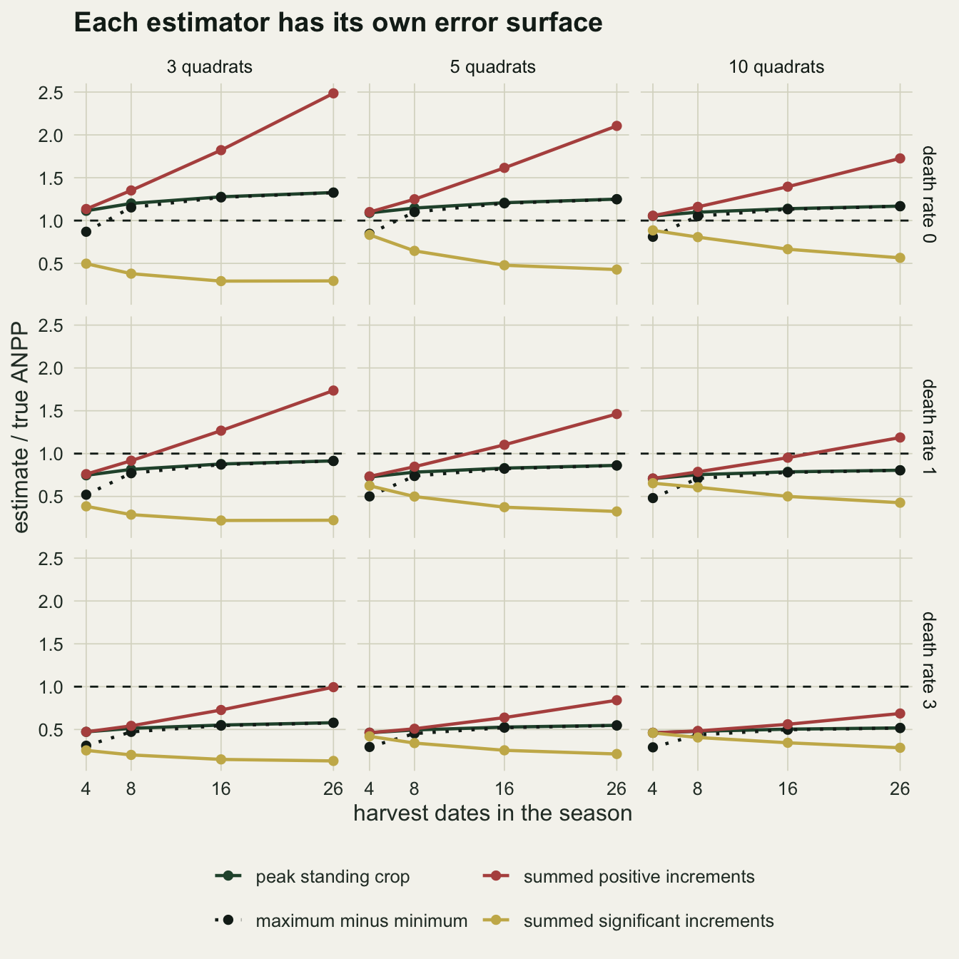
The panels show two opposing slopes. The peak sits below the dashed line whenever there is turnover and rises gently with the number of dates. The summed increments start at the peak with few dates and climb steeply with frequency, and fewer quadrats make them climb faster. Wherever the increments line crosses the dashed line, the estimate is right for the wrong reason.
The cells where summed increments look right
The grid has 36 cells. For each one, the chunk below records the summed-increments ratio and whether it lies within five per cent of true ANPP, above that band or below it.
best_df <- do.call(rbind, lapply(split(grid_df, list(grid_df$turnover, grid_df$k,
                                                     grid_df$dates)), function(cell) {
  j <- which.min(abs(cell$ratio - 1))
  sp <- cell$ratio[cell$estimator == "sumpos"]
  data.frame(turnover = cell$turnover[1], k = cell$k[1], dates = cell$dates[1],
             best_ratio = cell$ratio[j], sumpos = sp,
             sumpos_se = cell$mc_se[cell$estimator == "sumpos"],
             band = ifelse(abs(sp - 1) <= 0.05, "within",
                           ifelse(sp > 1, "above", "below")))
}))
n_cell      <- nrow(best_df)
close_tol   <- 0.05
n_close     <- tapply(abs(grid_df$ratio - 1) <= close_tol, grid_df$estimator, sum)
close_sp    <- grid_df[grid_df$estimator == "sumpos" & abs(grid_df$ratio - 1) <= close_tol, ]
worst_best  <- max(abs(best_df$best_ratio - 1))
mm_0_k3_26  <- get_ratio("maxmin", 0, 3, 26)
b3          <- best_df[best_df$turnover == 3, ]
n_below_3   <- sum(b3$sumpos < 1)
n_below2se_3 <- sum(b3$sumpos < 1 - 2 * b3$sumpos_se)
z_sp_3_k3_26 <- (sp_3_k3_26 - 1) / get_ratio("sumpos", 3, 3, 26, "mc_se")
cell_spread <- tapply(grid_df$ratio, list(grid_df$turnover, grid_df$k, grid_df$dates),
                      function(x) max(x) / min(x))
spread_max  <- max(cell_spread)
Summed positive increments come within five per cent of true ANPP in 2 of the 36 cells, and none of the other three estimators does so in any cell. The two cells are a death rate of one with 16 dates and 10 quadrats, where the ratio is 0.952, and a death rate of three with 26 dates and 3 quadrats, where it is 0.994. Without noise the increments would read 0.71 and 0.46 of the truth in those two settings. The sampling inflation happens to match the missing turnover, and a change in either the quadrat count or the death rate removes the agreement.
Ranking the four estimators cell by cell says little, because part of the ranking is fixed by arithmetic. Maximum minus minimum can never exceed the peak, and at zero turnover with 8 or more dates the smallest mean comes from an early harvest, when little biomass stands, so the two read nearly the same: at 26 dates with 3 quadrats the peak is 1.327 of true ANPP and maximum minus minimum 1.326. Summed positive increments can never be below the peak, so wherever both lie under the truth the increments are the nearer of the two by construction. Nearness also does not mean rightness: in the worst cell the nearest of the four is still 0.54 of true ANPP away from it.
best_df$band_lab <- factor(best_df$band, levels = c("above", "within", "below"),
  labels = c("more than 5 per cent above", "within 5 per cent", "more than 5 per cent below"))
best_df$turn_lab <- factor(paste("death rate", best_df$turnover),
                           levels = paste("death rate", turn_set))
ggplot(best_df, aes(factor(dates), factor(k), fill = band_lab)) +
  geom_tile(colour = te_paper, linewidth = 1.2) +
  geom_text(aes(label = sprintf("%.2f", sumpos),
                colour = band == "within"), size = 3.6, show.legend = FALSE) +
  scale_colour_manual(values = c("FALSE" = te_paper, "TRUE" = te_ink), guide = "none") +
  facet_wrap(~ turn_lab, ncol = 1) +
  scale_fill_manual(values = c("more than 5 per cent above" = te_rust,
                               "within 5 per cent" = te_gold,
                               "more than 5 per cent below" = te_forest),
                    name = NULL, drop = FALSE) +
  labs(x = "harvest dates in the season", y = "quadrats per harvest",
       title = "Summed increments against the truth, cell by cell",
       subtitle = "label: summed positive increments / true ANPP") +
  guides(fill = guide_legend(nrow = 1)) +
  theme_datasheet() +
  theme(legend.position = "bottom", panel.grid.major = element_blank(),
        strip.text = element_text(colour = te_ink))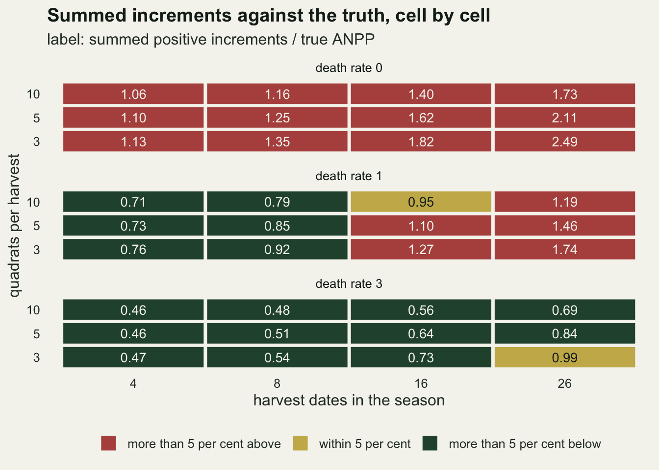
Read the labels down each panel. At zero turnover the summed increments are too high in every cell. At a death rate of three they are below the truth in 12 of the 12 cells, and by more than two Monte Carlo standard errors in 11; the exception is the 0.99 already met, which sits 1.6 standard errors under one and cannot be told from the truth at this replication. A station cannot tell from its own harvest table which panel it is in, because the death rate is exactly what a live harvest does not measure.
A significance gate removes too much
The significant-increments rule is meant to stop noise from adding production, and it does stop that. It also raises the question a statistician asks first: an increment that is counted only because it passed a test is a selected increment, and selected estimates are biased upwards, the winner’s curse described in power analysis by simulation. The chunk measures both effects in one cell, zero turnover with 16 dates and 3 quadrats, where every true increment is known.
ss_0_k3_16  <- get_ratio("sumsig", 0, 3, 16)
ss_0_k10_4  <- get_ratio("sumsig", 0, 10, 4)
ss_0_k10_26 <- get_ratio("sumsig", 0, 10, 26)
ss_1_k10_26 <- get_ratio("sumsig", 1, 10, 26)

set.seed(1986)
n_date_w <- 16; k_w <- 3
idx_w    <- round(seq_len(n_date_w) / n_date_w * n_fine) + 1
mu_w     <- live_mat[idx_w, 1]
sim_w    <- harvest_estimates(mu_w, k_w, n_rep)
true_incr <- matrix(diff(c(0, mu_w)), n_rep, n_date_w, byrow = TRUE)
kept_obs  <- sum(sim_w$incr[sim_w$keep_sig])
kept_true <- sum(true_incr[sim_w$keep_sig])
curse     <- kept_obs / kept_true
share_kept <- mean(sim_w$keep_sig)
share_kept_late <- mean(sim_w$keep_sig[, (n_date_w / 2 + 1):n_date_w])
The winner’s curse is real and large: the increments that passed the test sum to 1.96 times the true increments on the same dates. But only 0.16 of all increments passed, and in the second half of the season, where the true rises are small, the share is 0.021. Lost increments outweigh the inflated ones, and the estimate in that cell is 0.29 of true ANPP.
Across the grid the gated rule falls as the schedule goes from 4 to 16 dates in every combination of quadrats and death rate, and at 26 dates it falls further or levels off, because splitting the season into more dates makes every true increment smaller and less likely to pass. With no turnover and 10 quadrats it reads 0.89 at 4 dates and 0.56 at 26, and with a death rate of one at 26 dates it reads 0.43. The gate trades an estimator that inflates with frequency for one that deflates with it.
What to report
Name the estimator. Peak standing crop, maximum minus minimum and summed increments are different quantities computed from the same table, and in this grid the largest of the four estimates in a cell is up to 8.4 times the smallest. A production value without the rule that made it cannot be compared with anything.
Report the schedule with the number: the dates, the quadrats per date and the quadrat coefficient of variation. The summed-increments estimate inflates with the number of dates at a rate set by the sampling error of a difference, and the closed form above shows, for a known curve and patchiness, how large that inflation is. Two sites sampled on different schedules have estimates with different biases even if their vegetation is identical.
Treat agreement between two estimators as coincidence, not confirmation. The cells where summed increments hit true ANPP are cells where two errors of opposite sign happened to be equal, and on a sparse schedule the peak and the increments agree with each other while both sit well below the truth: with 4 dates, 10 quadrats and a death rate of one they read 0.71 and 0.71.
If turnover matters for the question, measure it. Nothing computed from one pooled live standing crop recovers tissue that died between harvests; that needs standing dead and litter sampled on the same dates, as in the methods that account for dead matter among those Scurlock and colleagues compared, or marked tillers followed through the season.
Honest limits
The live curve rises once and falls once. On that shape the noise-free increments equal the peak, which is why every excess of the increments over the peak here is noise. A season with two growth pulses, one after spring rain and another after autumn rain, has two rises, and there the increments do recover some turnover that the peak misses. The same happens when species with staggered phenology are sorted at each harvest and their increments or peaks are summed species by species, because each species curve can rise while the pooled total does not; that sorting was not simulated here. The balance between the two errors would change, and the grid would have to be rerun on that curve.
Death is a constant relative rate for the whole season, with no separate senescence at the end and no grazing. Real turnover is often concentrated late, and a death rate that rises through the season could move the live peak later and closer to true ANPP than the constant rates used here; that was not simulated. The three death rates are design constants and were not calibrated to any site.
Quadrat biomass is independent gamma noise with one coefficient of variation for every date. Early-season quadrats are often relatively more variable than late ones, and quadrats clipped along a transect are spatially correlated. A higher early variance inflates the first increments more; correlation among quadrats on a date makes the effective number of quadrats smaller than k.
The estimators here use live biomass only. The methods compared by Scurlock et al. include ones that account for the dynamics of dead matter, and those are aimed at exactly the turnover problem this post leaves open. None of them was simulated. The significant-increments rule was implemented as a two-sided Welch test at five per cent on consecutive dates; other gates, a one-sided test or a test against the running maximum, select differently and will give different numbers.
Finally, Lauenroth et al. took a simulation approach to estimating aboveground production in grasslands; this post is a separate, small simulation and does not reproduce theirs. The direction of each error follows from arithmetic and should carry over; the sizes belong to one production curve, one patchiness and a grid of 36 cells, and should not be quoted as properties of any real grassland.
References
Singh JS, Lauenroth WK, Steinhorst RK 1975 Botanical Review 41(2):181-232 (10.1007/BF02860829)
Lauenroth WK, Hunt HW, Swift DM, Singh JS 1986 Ecological Modelling 33(2-4):297-314 (10.1016/0304-3800(86)90045-1)
Scurlock JMO, Johnson K, Olson RJ 2002 Global Change Biology 8(8):736-753 (10.1046/j.1365-2486.2002.00512.x)