library(ggplot2)

te_paper  <- "#f5f4ee"
te_ink    <- "#16241d"
te_body   <- "#2c3a31"
te_forest <- "#275139"
te_rust   <- "#b5534e"
te_gold   <- "#c9b458"
te_line   <- "#dad9ca"

theme_datasheet <- function() {
  theme_minimal(base_size = 12) +
    theme(plot.background  = element_rect(fill = te_paper, colour = NA),
          panel.background = element_rect(fill = te_paper, colour = NA),
          panel.grid.major = element_line(colour = te_line, linewidth = 0.3),
          panel.grid.minor = element_blank(),
          text             = element_text(colour = te_body),
          plot.title       = element_text(colour = te_ink, face = "bold"),
          axis.text        = element_text(colour = te_body))
}

draw_pair <- function(n1, sd1, n2, sd2, centre = 20) {
  list(a = rnorm(n1, centre, sd1), b = rnorm(n2, centre, sd2))
}What a rank test actually tests
R
hypothesis testing
nonparametric statistics
ecology tutorial
The Wilcoxon rank sum test does not compare medians. It compares whole distributions, and with unequal spread it rejects when the medians agree. Simulated in R.
The most common statistical decision in ecology is probably this one: the histogram looks skewed, or the sample is small, or a reviewer once said something about normality, so the t test is replaced by a Wilcoxon test. The replacement is usually described as testing whether the medians differ.
It does not test that. The Wilcoxon rank sum test, which is the same procedure as the Mann-Whitney U test, has a null hypothesis about the two distributions as wholes: that a value drawn at random from one group is equally likely to be above or below a value drawn at random from the other. Medians appear nowhere in it. When the two groups have the same centre but different spread, which happens constantly in field data, the test can reject at several times its nominal rate while the medians are identical by construction.
Two samples with the same centre
A disturbed patch and a reference set. The disturbed patch has the same mean and the same median as the reference, and it is more variable, which is what disturbance usually does. Fifteen quadrats in the patch, forty-five in the reference set.
Both groups are normal with mean 20. Their medians are 20 as well, and the probability that a random patch quadrat exceeds a random reference quadrat is exactly one half, because the difference of two independent normals with equal means is symmetric about zero. Every null hypothesis anyone would want to state about location is true here.
rate <- function(n1, sd1, n2, sd2, reps = 5000, seed = 1) {
  set.seed(seed)
  out <- replicate(reps, {
    d <- draw_pair(n1, sd1, n2, sd2)
    c(wilcox = suppressWarnings(wilcox.test(d$a, d$b)$p.value),
      welch  = t.test(d$a, d$b)$p.value,
      pooled = t.test(d$a, d$b, var.equal = TRUE)$p.value)
  })
  round(100 * rowMeans(out < 0.05), 2)
}

small_group_varies <- rate(15, 4, 45, 1, seed = 101)
large_group_varies <- rate(45, 4, 15, 1, seed = 102)
equal_sizes        <- rate(30, 4, 30, 1, seed = 103)

rbind(`n = 15 varies, n = 45 tight` = small_group_varies,
      `n = 45 varies, n = 15 tight` = large_group_varies,
      `equal n, one varies`         = equal_sizes)
wilcox welch pooled
n = 15 varies, n = 45 tight 14.04 5.02 23.50
n = 45 varies, n = 15 tight 1.32 4.30 0.06
equal n, one varies 7.58 4.92 5.30With the smaller group more variable, the Wilcoxon test rejects 14.0 per cent of the time against a nominal five. The pooled t test is worse at 23.5 per cent, which is the familiar Behrens-Fisher problem and the reason nobody should use it. The Welch t test, which is what t.test gives you by default, sits at 5.0 per cent, right where it should be.
Reverse the design so the larger group is the variable one and the Wilcoxon rate drops to 1.3 per cent: now it is conservative rather than liberal. Even with equal sample sizes it is 7.6 per cent rather than five. The distortion is a function of the design, not a constant you could correct for.
rates <- data.frame(
  design = rep(c("smaller group varies", "equal sizes", "larger group varies"),
               each = 3),
  test   = rep(c("Wilcoxon", "Welch t", "pooled t"), 3),
  pct    = c(small_group_varies[c("wilcox", "welch", "pooled")],
             equal_sizes[c("wilcox", "welch", "pooled")],
             large_group_varies[c("wilcox", "welch", "pooled")]))
rates$design <- factor(rates$design, levels = c("smaller group varies",
                                                "equal sizes",
                                                "larger group varies"))
rates$test <- factor(rates$test, levels = c("Wilcoxon", "Welch t", "pooled t"))

ggplot(rates, aes(x = design, y = pct, fill = test)) +
  geom_hline(yintercept = 5, linetype = "dotted", colour = te_ink) +
  geom_col(position = position_dodge(width = 0.75), width = 0.66) +
  geom_text(aes(label = sprintf("%.1f", pct)),
            position = position_dodge(width = 0.75), vjust = -0.45,
            size = 3.3, colour = te_body) +
  annotate("text", x = 3.45, y = 7.6, label = "nominal 5 per cent",
           hjust = 1, size = 3.3, colour = te_ink) +
  scale_fill_manual(values = c("Wilcoxon" = te_rust, "Welch t" = te_forest,
                               "pooled t" = te_gold)) +
  labs(x = NULL, y = "per cent of tests rejecting at 0.05", fill = NULL,
       title = "All three nulls of location are true in every bar") +
  theme_datasheet() +
  theme(legend.position = "top")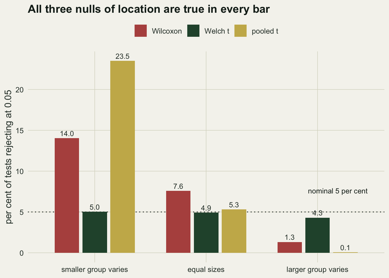
The null that is actually being tested
The rank sum statistic counts, over all pairs of one observation from each group, how many times the first exceeds the second. Its expectation and variance under the null are worked out on the assumption that the two samples come from the same distribution, so that every ordering of the pooled ranks is equally likely. That is a strong null: identical shape, identical spread, identical everything.
If the distributions differ in any way, the permutation variance no longer matches the sampling variance, and the calibration breaks. That is what the table above is showing. The test does not know it is looking at a spread difference; it only knows that the ranks are arranged more unevenly than exchangeability would allow, and it reports that as a significant result which the reader then attributes to location.
The quantity the test is sensitive to has a name and is worth reporting in its own right. Written as the probability that a random observation from group A exceeds a random observation from group B, it is a whole-distribution summary that needs no normality and no equal-variance assumption. It is the same number as the area under a receiver operating characteristic curve, and it comes straight out of the rank sum statistic.
p_superior <- function(a, b) {
  u <- suppressWarnings(wilcox.test(a, b)$statistic)
  as.numeric(u) / (length(a) * length(b))
}

set.seed(9)
same_spread <- replicate(2000, {
  d <- draw_pair(15, 1, 45, 1); p_superior(d$a, d$b) })
diff_spread <- replicate(2000, {
  d <- draw_pair(15, 4, 45, 1); p_superior(d$a, d$b) })

shifted <- replicate(2000, {
  d <- draw_pair(15, 1, 45, 1); p_superior(d$a + 1.2, d$b) })

round(c(mean_equal_spread = mean(same_spread), sd_equal_spread = sd(same_spread),
        mean_wider_group  = mean(diff_spread), sd_wider_group  = sd(diff_spread),
        mean_shifted      = mean(shifted),     sd_shifted      = sd(shifted),
        shifted_theory    = pnorm(1.2 / sqrt(2))), 3)
mean_equal_spread sd_equal_spread mean_wider_group sd_wider_group
0.500 0.087 0.498 0.115
mean_shifted sd_shifted shifted_theory
0.801 0.067 0.802 Averaged over 2000 replicate surveys the estimate sits at 0.500 when the two groups share a spread and 0.498 when the smaller group is four times as variable. Both are the true one half, as they must be. What changes is the scatter: the standard deviation of the estimate goes from 0.087 to 0.115, a factor of 1.3. The rank sum test’s p value is computed from the first of those numbers whatever the data look like, and that single substitution is the whole of the inflation in the table above.
Reported as a summary rather than a test, the quantity behaves well. Move one group up by 1.2 units with equal spread and the estimate averages 0.801 against a true value of 0.802, and it reads directly: a quadrat from the shifted group beats a reference quadrat about 80 times in a hundred. Its scatter across surveys is 0.067, which is the number a reader needs in order to know how seriously to take it. That statement survives any monotone transformation of the response and does not pretend to be about medians.
When a rank test is exactly the right tool
None of this makes rank tests bad. It makes them tests of a different thing, and sometimes that thing is the question. Cover classes, Braun-Blanquet scores, behavioural ranks and any ordinal response have no meaningful arithmetic, so a difference in means is not defined and a rank comparison is the only sensible summary. Where the question really is “does a random individual from one group tend to be larger”, the rank sum test is the direct answer, and the probability above is the effect size to report with it.
The failure mode is narrower than the reputation suggests. It is the case where the groups differ in spread and the sample sizes are unequal, and where the reader is told the result is about location. Both halves have to be present.
shape_check <- rate(15, 4, 45, 4, reps = 5000, seed = 44)
shape_check
wilcox welch pooled
5.18 5.12 5.18 Give the two groups the same spread as each other, however non-normal that spread might be, and the Wilcoxon test is calibrated again: 5.2 per cent here with both groups at the wider standard deviation and the same unequal sample sizes. Equal distributions under the null is the assumption that matters, and normality is not.
Ranking first, then modelling, is a separate trap
The other place ranks turn up is as a pre-treatment: replace the response by its rank and then run an ordinary analysis of variance, on the grounds that this makes the procedure distribution-free. For a one-way comparison that is close to the Kruskal-Wallis test and behaves reasonably. For a factorial design it does not work, because ranking is a nonlinear transformation applied to the pooled response, so what the interaction term sees depends on how far apart the main effects have pushed the cells.
inter_rate <- function(reps = 600, main = 3, inter = 0, seed = 55) {
  set.seed(seed)
  raw <- rankt <- numeric(reps)
  for (i in seq_len(reps)) {
    g <- expand.grid(A = c(0, 1), B = c(0, 1), rep = 1:12)
    g$y <- main * g$A + main * g$B + inter * g$A * g$B + rnorm(nrow(g))
    raw[i]   <- anova(lm(y ~ A * B, data = g))["A:B", "Pr(>F)"]
    g$r      <- rank(g$y)
    rankt[i] <- anova(lm(r ~ A * B, data = g))["A:B", "Pr(>F)"]
  }
  round(100 * c(raw = mean(raw < 0.05), ranked = mean(rankt < 0.05)), 1)
}

rt <- rbind(`no interaction, strong main effects`   = inter_rate(inter = 0),
            `real interaction, strong main effects` = inter_rate(inter = 1.5),
            `real interaction, weak main effects`   = inter_rate(main = 1, inter = 1.5))
rt
raw ranked
no interaction, strong main effects 3.5 0.0
real interaction, strong main effects 70.2 0.0
real interaction, weak main effects 70.2 39.3The first row is the calibration check, and the rank version passes it in the least reassuring way possible: it rejects 0.0 per cent of the time where the raw analysis rejects 3.5. The second row explains why. With an interaction genuinely present, the raw analysis detects it 70 per cent of the time and the rank analysis detects it 0.0 per cent. The interaction has not been mis-estimated; it has been deleted.
The mechanism is in the third row. When the main effects are large, the four cells occupy nearly separate stretches of the rank scale, so the mean rank of each cell is fixed by the ordering of the cells alone and the interaction contrast is forced to zero no matter what the raw means do. Shrink the main effects so the cells overlap and the rank analysis recovers 39 per cent power against the same interaction. The failure is caused by the terms the analyst was not interested in.
set.seed(56)
g <- expand.grid(A = c(0, 1), B = c(0, 1), rep = 1:200)
g$y <- 3 * g$A + 3 * g$B + 1.5 * g$A * g$B + rnorm(nrow(g))
g$r <- rank(g$y)

panel_means <- function(v, name) {
  m <- tapply(v, list(g$A, g$B), mean)
  contrast <- (m["1", "1"] - m["0", "1"]) - (m["1", "0"] - m["0", "0"])
  list(tab = data.frame(scale = name,
                        A = rep(c(0, 1), 2), B = rep(c(0, 1), each = 2),
                        value = as.numeric(m)),
       share = contrast / diff(range(m)))
}
raw_p <- panel_means(g$y, "raw response")
rnk_p <- panel_means(g$r, "ranked response")

cells <- rbind(raw_p$tab, rnk_p$tab)
cells$scale <- factor(cells$scale, levels = c("raw response", "ranked response"))
cells$B <- factor(cells$B, labels = c("B absent", "B present"))

tags <- data.frame(
  scale = factor(c("raw response", "ranked response"),
                 levels = levels(cells$scale)),
  A = 0.55, B = factor("B absent", levels = levels(cells$B)),
  value = c(max(raw_p$tab$value), max(rnk_p$tab$value)),
  lab = sprintf("lines diverge by %.0f per cent\nof the panel height",
                100 * c(raw_p$share, rnk_p$share)))

ggplot(cells, aes(x = factor(A, labels = c("A absent", "A present")),
                  y = value, colour = B, group = B, shape = B)) +
  geom_line(linewidth = 0.9) +
  geom_point(size = 3) +
  geom_text(data = tags, aes(x = A, y = value, label = lab), inherit.aes = FALSE,
            size = 3.3, colour = te_body, hjust = 0, vjust = 1.05) +
  facet_wrap(~ scale, scales = "free_y") +
  scale_colour_manual(values = c("B absent" = te_gold, "B present" = te_forest)) +
  labs(x = NULL, y = "cell mean", colour = NULL, shape = NULL,
       title = "Ranking flattens a real interaction") +
  theme_datasheet() +
  theme(legend.position = "top",
        strip.text = element_text(colour = te_ink, face = "bold"))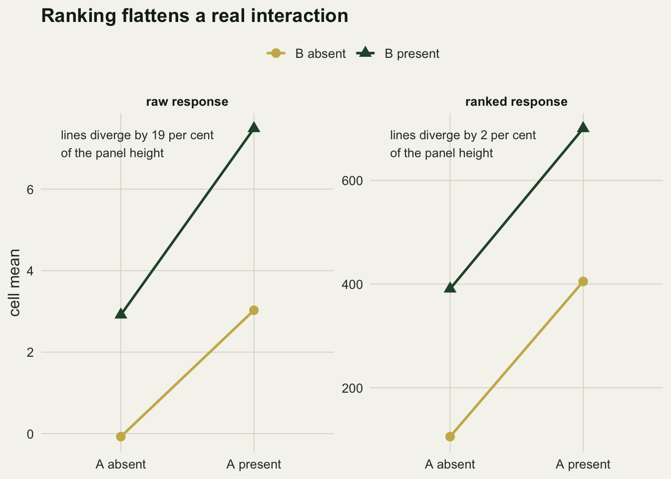
What to do instead
For two independent samples with possibly unequal spread, the Welch t test is the default in R for a reason, and the simulations above show it holding its rate in every design. If the response is heavily skewed or bounded, the better move is usually a model that respects the response: a generalised linear model for counts or proportions, a bootstrap interval for an awkward statistic, or a permutation test that permutes within the structure of the design.
If a rank comparison is what the question calls for, run it and report the probability of superiority alongside the p value, so the reader knows which quantity was compared.
Honest limits
The simulations here use normal samples throughout, deliberately: the point is that the calibration problem comes from unequal distributions and not from non-normality, and normal samples make that impossible to confuse. With skewed distributions the same mechanism operates, and the direction of the error still depends on which group is larger.
The probability of superiority computed from the rank sum statistic ignores ties, which matter for coarse ordinal data and for counts with many repeated values. R warns about this and computes a normal approximation instead of an exact p value; for a serious analysis of tied data the exact conditional treatment is a different piece of work.
The interaction result belongs to one balanced two-by-two design at one noise level, and the rank transform literature reports failures in both directions depending on the configuration: inflated rejection rates are also documented, in designs where the cells overlap more than they do here. The transferable claim is that the rank transform does not preserve the meaning of an interaction term, not the particular percentages above. A method built for the purpose, such as an aligned rank transform, adjusts the response separately for each term before ranking, precisely to break the dependence on the main effects.
Finally, none of the tests here addresses the assumption that usually matters more than any of this: independence. A Wilcoxon test on pseudoreplicated quadrats is wrong for a reason no amount of distribution-free machinery can fix.
References
Wilcoxon F 1945 Biometrics Bulletin 1(6):80-83 (10.2307/3001968)
Mann HB, Whitney DR 1947 Annals of Mathematical Statistics 18(1):50-60 (10.1214/aoms/1177730491)
Fagerland MW, Sandvik L 2009 Statistics in Medicine 28(10):1487-1497 (10.1002/sim.3561)
Divine GW, Norton HJ, Baron AE, Juarez-Colunga E 2018 The American Statistician 72(3):278-286 (10.1080/00031305.2017.1305291)