library(survival)
library(ggplot2)
library(dplyr)Kaplan-Meier survival curves and the log-rank test
R
survival analysis
demography
ecology tutorial
Fit Kaplan-Meier survival curves to right-censored ecological data in R, compare two groups with the log-rank test, and see why a naive mean misleads.
Ecological monitoring often records how long something lasts: how long a radio-tagged animal survives, how long a nest stays active, how long a transplant persists. The complication is that many of these times are never seen to end. A collar fails, the study closes, an animal leaves the area, and all you know is that the individual was still alive at last contact. Throwing those records away or treating the last contact as a death both distort the answer. Survival analysis handles them properly through censoring, and the Kaplan-Meier estimator is the standard non-parametric way to turn censored times into a survival curve. This post fits one in base R with the recommended survival package, compares two groups with the log-rank test, and shows how far a naive average of the observed times can drift from the truth.
Right-censored monitoring data
The example is a radio-telemetry study: 120 tagged individuals split between two habitats, each followed for up to 36 months. An individual contributes an event when it is found dead, and a censored record when its collar fails, it emigrates, or the study ends with the animal still alive. The Surv object pairs each time with a status flag, 1 for a death and 0 for a censored record.
set.seed(71)
n <- 60
t_ctrl <- rweibull(n, shape = 1.3, scale = 17)     # riparian: shorter lives
t_trt  <- rweibull(n, shape = 1.3, scale = 30)     # upland: longer lives
cens_lt <- rexp(2 * n, rate = 1 / 70)              # collar failure or emigration
admin <- 36                                        # study closes at 36 months
tt  <- c(t_ctrl, t_trt)
grp <- factor(rep(c("Riparian", "Upland"), each = n))
ctime  <- pmin(cens_lt, admin)
time   <- pmin(tt, ctime)
status <- as.integer(tt <= ctime)                  # 1 = death seen, 0 = censored
d <- data.frame(time = round(time, 2), status = status, habitat = grp)

table(d$habitat, ifelse(d$status == 1, "death", "censored"))
           censored death
  Riparian       10    50
  Upland         27    33
Half of the records are deaths and about 31 per cent are censored, more of them in the upland group because those animals live long enough to outlast their collars or the study. That imbalance is exactly why the censoring cannot be ignored: the longest-lived animals are the ones most likely to be censored, so dropping or truncating them would bias survival downward, and unequally between groups.
The Kaplan-Meier estimator
The estimator steps down at each observed death by the fraction of the still-at-risk group that died at that instant, and holds flat where records are only censored. Multiplying those conditional survival factors together gives the survival curve without assuming any parametric shape.
fit <- survfit(Surv(time, status) ~ habitat, data = d)
fit
Call: survfit(formula = Surv(time, status) ~ habitat, data = d)
n events median 0.95LCL 0.95UCL
habitat=Riparian 60 50 11.5 9.46 18.3
habitat=Upland 60 33 25.6 20.21 32.8The median survival, the time at which the curve crosses one half, is about 11.5 months in the riparian group and 25.6 months in the upland group, more than double. The confidence limits on the medians do not overlap, a first sign that the groups differ. Reading survival at fixed horizons sharpens the contrast.
st <- summary(fit, times = c(12, 24))
data.frame(habitat = sub("habitat=", "", st$strata), month = st$time,
           survival = round(st$surv, 3),
           lower = round(st$lower, 3), upper = round(st$upper, 3))
habitat month survival lower upper
1 Riparian 12 0.497 0.382 0.648
2 Riparian 24 0.213 0.127 0.357
3 Upland 12 0.719 0.608 0.851
4 Upland 24 0.563 0.439 0.721At one year about 50 per cent of the riparian animals are still alive against 72 per cent of the upland animals; by two years the gap widens to roughly 21 per cent against 56 per cent. These are estimates that use every record, censored ones included, right up to the moment each leaves the risk set.
grid <- seq(0, 36, by = 0.2)
band <- lapply(levels(d$habitat), function(g) {
  s <- summary(fit[paste0("habitat=", g)])
  data.frame(habitat = g, time = grid,
             surv  = stepfun(s$time, c(1, s$surv))(grid),
             lower = stepfun(s$time, c(1, s$lower))(grid),
             upper = stepfun(s$time, c(1, s$upper))(grid))
}) |> bind_rows()

ggplot(band, aes(time, surv, colour = habitat, fill = habitat)) +
  geom_ribbon(aes(ymin = lower, ymax = upper), colour = NA, alpha = 0.18) +
  geom_line(linewidth = 0.9) +
  scale_colour_manual(values = c(Riparian = te_brick, Upland = te_forest)) +
  scale_fill_manual(values = c(Riparian = te_brick, Upland = te_forest)) +
  annotate("text", x = 34, y = 0.10, label = "Riparian", colour = te_brick, hjust = 1, size = 3.2) +
  annotate("text", x = 34, y = 0.62, label = "Upland", colour = te_forest, hjust = 1, size = 3.2) +
  coord_cartesian(ylim = c(0, 1)) +
  labs(title = "Survival differs between habitats",
       subtitle = "Kaplan-Meier estimate with 95 per cent confidence bands",
       x = "Months since tagging", y = "Survival probability") +
  theme_te()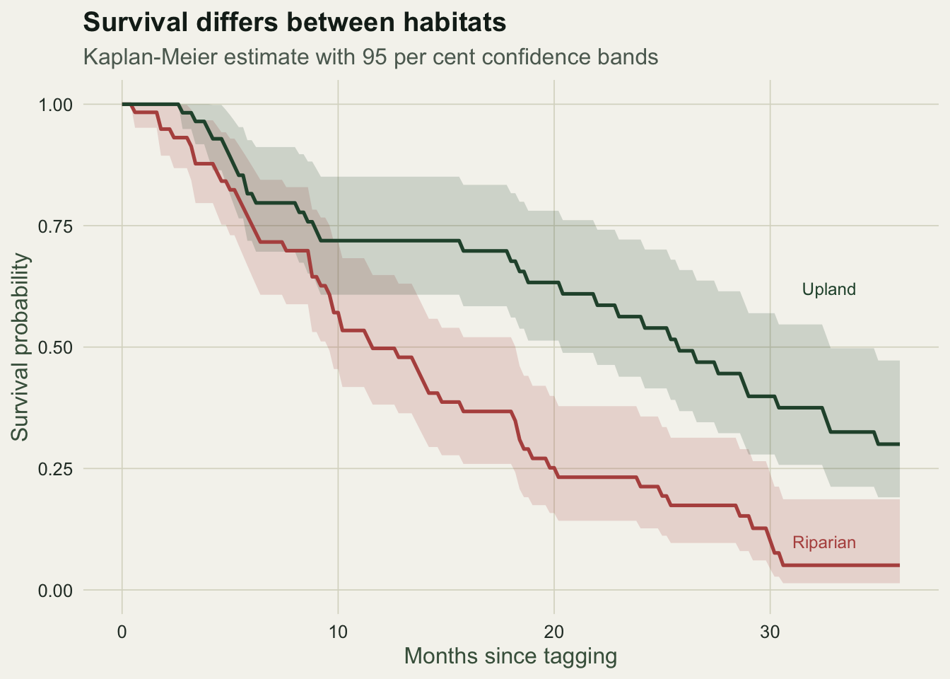
The log-rank test
The visual gap needs a test. The log-rank test compares the whole curves rather than survival at one chosen time: at every death it contrasts the observed deaths in each group with the number expected if the groups shared one survival curve, then accumulates those differences into a single chi-squared statistic.
lr <- survdiff(Surv(time, status) ~ habitat, data = d)
lr
Call:
survdiff(formula = Surv(time, status) ~ habitat, data = d)
N Observed Expected (O-E)^2/E (O-E)^2/V
habitat=Riparian 60 50 33.1 8.64 15.1
habitat=Upland 60 33 49.9 5.73 15.1
Chisq= 15.1 on 1 degrees of freedom, p= 1e-04 c(chisq = round(lr$chisq, 3),
p_value = signif(1 - pchisq(lr$chisq, length(lr$n) - 1), 3)) chisq p_value
15.098000 0.000102 The statistic is about 15.1 on one degree of freedom, giving a p-value near 0.0001. The riparian group accumulated about 50 deaths where roughly 33 were expected under a shared curve, and the upland group the mirror image, so the separation is far larger than sampling noise would produce. The test weights every death equally across the follow-up; when hazards cross or diverge only late, weighted variants such as the Peto-Peto test shift emphasis toward early or late times.
Why the naive average misleads
The temptation is to summarise each group by the mean of its recorded times. That average is wrong, and wrong in a direction that matters. Censored times are cut short, so they enter the mean as underestimates of the true lifespans, and the group with more censoring is pulled down hardest.
naive <- tapply(d$time, d$habitat, mean)
rmean <- summary(fit, rmean = 36)$table[, "rmean"]
data.frame(habitat = names(naive),
           naive_mean_time = round(naive, 2),
           km_restricted_mean = round(rmean, 2),
           median = round(summary(fit)$table[, "median"], 2))
habitat naive_mean_time km_restricted_mean median
Riparian Riparian 13.16 14.53 11.52
Upland Upland 18.65 23.07 25.61The naive mean of the observed times is about 13.2 months for the riparian group and 18.7 for the upland group, a gap of five and a half months. The Kaplan-Meier restricted mean, which integrates the survival curve to the 36-month horizon and so credits the censored animals for the time they were known to be alive, gives about 14.5 against 23.1, a gap of nearly nine months. The naive figure understates both survival and the difference between habitats, precisely because the longer-lived upland group is the more heavily censored one.
med <- summary(fit)$table[, "median"]
cmp <- data.frame(
  habitat = rep(c("Riparian", "Upland"), each = 3),
  metric = factor(rep(c("Naive mean", "KM restricted mean", "Median"), 2),
                  levels = c("Naive mean", "KM restricted mean", "Median")),
  value = c(naive["Riparian"], rmean["Riparian"], med["habitat=Riparian"],
            naive["Upland"],   rmean["Upland"],   med["habitat=Upland"]))

ggplot(cmp, aes(habitat, value, fill = metric)) +
  geom_col(position = position_dodge(0.8), width = 0.72) +
  geom_text(aes(label = round(value, 1)), position = position_dodge(0.8),
            vjust = -0.4, size = 3, colour = te_body) +
  scale_fill_manual(values = c("Naive mean" = te_brick,
                               "KM restricted mean" = te_forest, "Median" = te_gold)) +
  labs(title = "The naive mean understates survival",
       subtitle = "Naive mean, restricted mean and median by habitat",
       x = NULL, y = "Months", fill = NULL) +
  theme_te() +
  theme(legend.position = "top")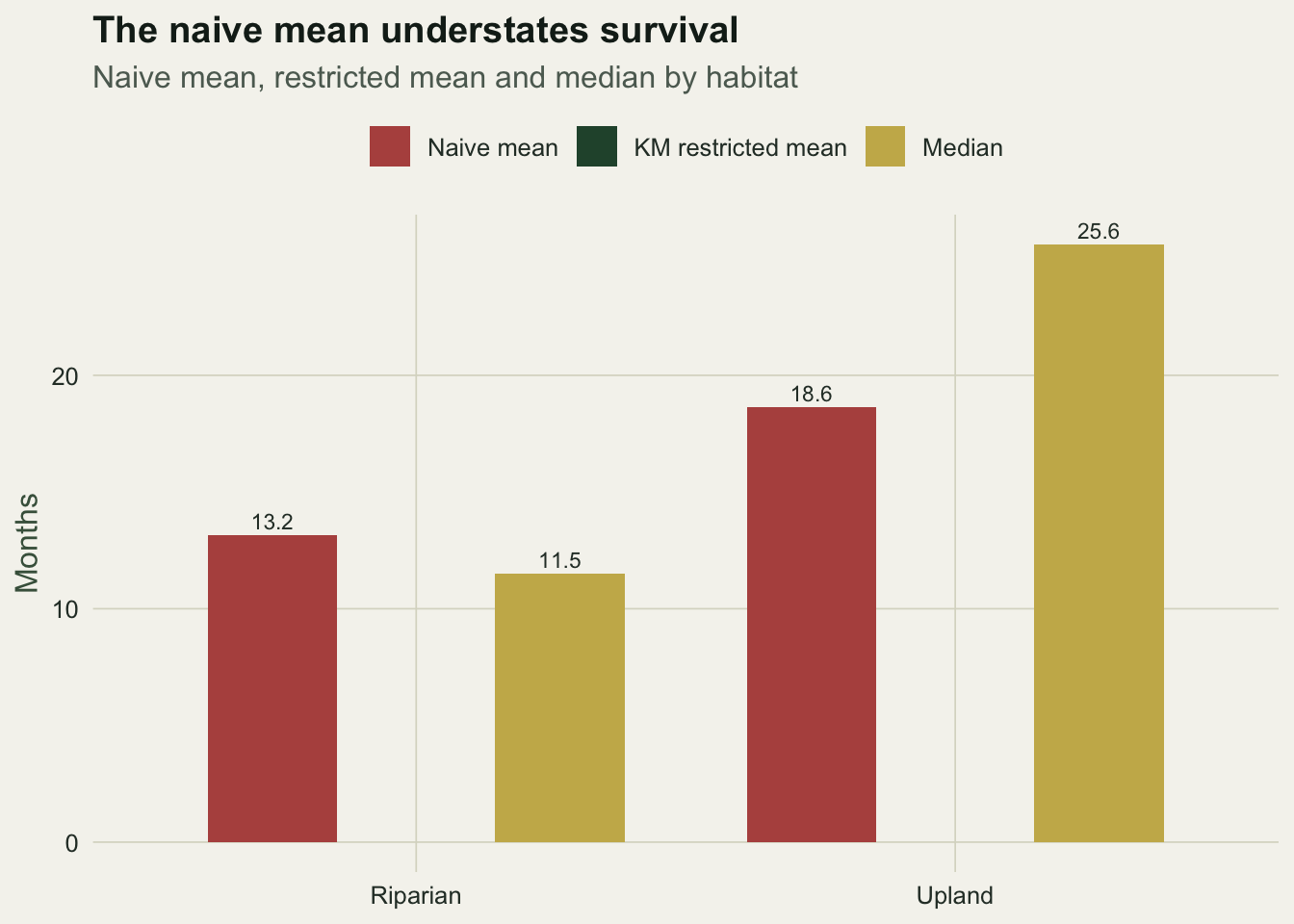
The estimator built for censored data recovers the contrast the naive average erodes.
Where to go next
The Kaplan-Meier curve and log-rank test are the entry point to time-to-event analysis and stop where covariates begin: they compare a handful of groups but cannot adjust for continuous predictors or several factors at once. That is the job of the Cox proportional hazards model in the companion post. The survival probabilities here are also the raw material of demography, the age-specific survivorship that a life table turns into a growth rate, and when survival must be inferred from repeated captures rather than known fates, the Cormack-Jolly-Seber model estimates it while separating mortality from detection.
References
Kaplan EL, Meier P 1958. Journal of the American Statistical Association 53(282):457-481 (10.1080/01621459.1958.10501452).
Peto R, Peto J 1972. Journal of the Royal Statistical Society: Series A 135(2):185-206 (10.2307/2344317).
Harrington DP, Fleming TR 1982. Biometrika 69(3):553-566 (10.1093/biomet/69.3.553).
Therneau TM, Grambsch PM 2000. Modeling Survival Data: Extending the Cox Model. Springer. ISBN 978-0-387-98784-2.