---
title: "Modelling inhomogeneous point patterns in R"
description: "Fit an inhomogeneous Poisson process in base R: kernel intensity, a trend via Poisson GLM, and the inhomogeneous K that separates trend from interaction."
date: "2026-07-04 12:00"
categories: [R, spatial, point patterns, ecology tutorial]
image: thumbnail.png
image-alt: "A point pattern over a gradient intensity surface beside two panels of L(r) minus r: homogeneous K showing spurious clustering and inhomogeneous K staying flat."
---
Every method so far has rested on one assumption: that the expected density of points is the same everywhere in the study area. When that holds, any structure Ripley's K picks up is genuine interaction between points. When it fails, the whole reading changes. A species that is simply more common on warmer slopes will pack more points into the warm end of a map, and those points will sit closer together there, and a homogeneous K will call that clustering. It is not clustering in any biological sense. It is a first-order trend in abundance masquerading as a second-order interaction.
Separating the two is the point of this post. We simulate a pattern whose density varies with an environmental gradient but whose points are otherwise independent, show that a naive K reports clustering that is not there, then fit the trend and use the inhomogeneous K to strip it out. What remains is a flat curve, correctly telling us there is no interaction once the trend is accounted for.
## Simulating an inhomogeneous Poisson process
We let the intensity, the expected number of points per unit area, rise log-linearly along a covariate that runs from one edge of the window to the other. The covariate here is a simple gradient, standing in for temperature, elevation or any smoothly varying driver.
The standard way to place points under a varying intensity is thinning, due to Lewis and Shedler. Generate a homogeneous pattern at the maximum intensity, then keep each candidate point with a probability equal to the local intensity divided by that maximum. Points survive in proportion to the local rate, which reproduces the target process exactly.
```{r}
#| label: setup
#| message: false
#| warning: false
library(ggplot2)
library(dplyr)
library(tidyr)

te_ink    <- "#16241d"; te_body   <- "#2c3a31"; te_forest <- "#275139"
te_label  <- "#46604a"; te_sage   <- "#93a87f"; te_paper  <- "#f5f4ee"
te_line   <- "#dad9ca"; te_faint  <- "#5d6b61"; te_gold   <- "#c9b458"
te_rust   <- "#b5534e"

theme_te <- function(base_size = 12) {
  theme_minimal(base_size = base_size) +
    theme(
      panel.grid.minor = element_blank(),
      panel.grid.major = element_line(colour = te_line, linewidth = 0.3),
      plot.background  = element_rect(fill = te_paper, colour = NA),
      panel.background = element_rect(fill = te_paper, colour = NA),
      text        = element_text(colour = te_body),
      plot.title  = element_text(colour = te_ink, face = "bold"),
      axis.title  = element_text(colour = te_label),
      axis.text   = element_text(colour = te_faint),
      strip.text  = element_text(colour = te_ink, face = "bold"),
      legend.text = element_text(colour = te_body)
    )
}

A <- 1
b0 <- 5.17; b1 <- 1.5                      # true intensity coefficients
covariate <- function(x, y) 2 * (x - 0.5)  # gradient, ranges over -1 to 1
intensity <- function(x, y) exp(b0 + b1 * covariate(x, y))
lam_max   <- exp(b0 + b1 * 1)              # maximum, at the high edge

set.seed(7801)
N_max <- rpois(1, lam_max * A)
ux <- runif(N_max); uy <- runif(N_max)
keep <- runif(N_max) < intensity(ux, uy) / lam_max
X <- data.frame(x = ux[keep], y = uy[keep])
n <- nrow(X)
n
```
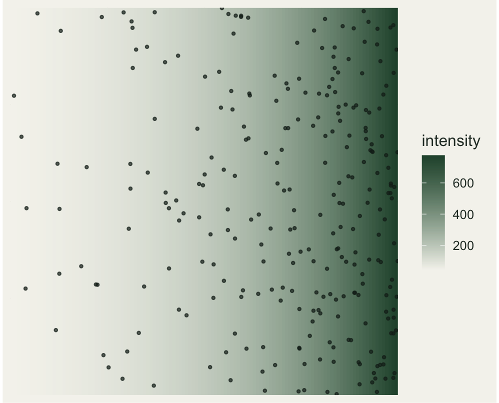
Thinning a maximum of `r 819` candidates leaves `r 271` points, packed towards the high-intensity edge. Drawn over the true intensity surface, the gradient in density is obvious, and it is exactly the kind of gradient that a homogeneous analysis would misread.
```{r}
#| label: fig-intensity
#| fig-cap: "The simulated pattern over its true intensity surface, denser towards the high-intensity edge."
#| fig-alt: "A square panel with a background shaded from pale to dark along the horizontal axis, and points scattered on top that grow denser towards the darker, high-intensity edge."
#| fig-width: 5.2
#| fig-height: 4.2
grid <- expand.grid(x = seq(0.005, 0.995, length.out = 120),
                    y = seq(0.005, 0.995, length.out = 120))
grid$lam <- intensity(grid$x, grid$y)
ggplot() +
  geom_raster(data = grid, aes(x, y, fill = lam)) +
  geom_point(data = X, aes(x, y), colour = te_ink, size = 0.8, alpha = 0.7) +
  scale_fill_gradient(low = te_paper, high = te_forest, name = "intensity") +
  coord_equal(expand = FALSE) +
  labs(x = NULL, y = NULL) +
  theme_te() +
  theme(axis.text = element_blank(), panel.grid = element_blank(),
        legend.position = "right")
```
## Fitting the trend with a Poisson GLM
To recover the trend we divide the window into a grid of cells, count the points in each, and model the counts. A Poisson process carved into cells produces Poisson counts whose mean is the intensity integrated over the cell, so a Poisson GLM of cell count on the covariate, with the log cell area as an offset, estimates the same coefficients that generated the pattern. This is the point-process link to the [count GLM](../glm-count-data-abundance/) and to [offsets for densities](../offsets-for-rates-and-densities/): fitting intensity is just a count model with an area offset.
```{r}
#| label: glm-trend
G <- 20
edges  <- seq(0, 1, length.out = G + 1)
centre <- (edges[-1] + edges[-(G + 1)]) / 2
cell_area <- (1 / G)^2

bx <- cut(X$x, edges, include.lowest = TRUE)
by <- cut(X$y, edges, include.lowest = TRUE)
cnt <- as.data.frame(table(bx, by))
names(cnt) <- c("bx", "by", "count")
cnt$cx  <- centre[as.integer(cnt$bx)]
cnt$cy  <- centre[as.integer(cnt$by)]
cnt$cov <- covariate(cnt$cx, cnt$cy)

fit <- glm(count ~ cov, family = poisson,
           offset = rep(log(cell_area), nrow(cnt)), data = cnt)
dev_explained <- 1 - fit$deviance / fit$null.deviance
round(c(coef(fit), deviance_explained = dev_explained), 3)
summary(fit)$coefficients
```
The fit recovers the truth well. The estimated intercept is 5.27 against a true value of 5.17, and the estimated slope is 1.45 against a true 1.5, both close to the values that generated the pattern. The trend accounts for a deviance-explained of 0.30. We keep the fitted intensity function for the next step.
```{r}
#| label: lam-hat
lam_hat <- function(x, y) exp(coef(fit)[1] + coef(fit)[2] * covariate(x, y))
```
## Where a naive K goes wrong
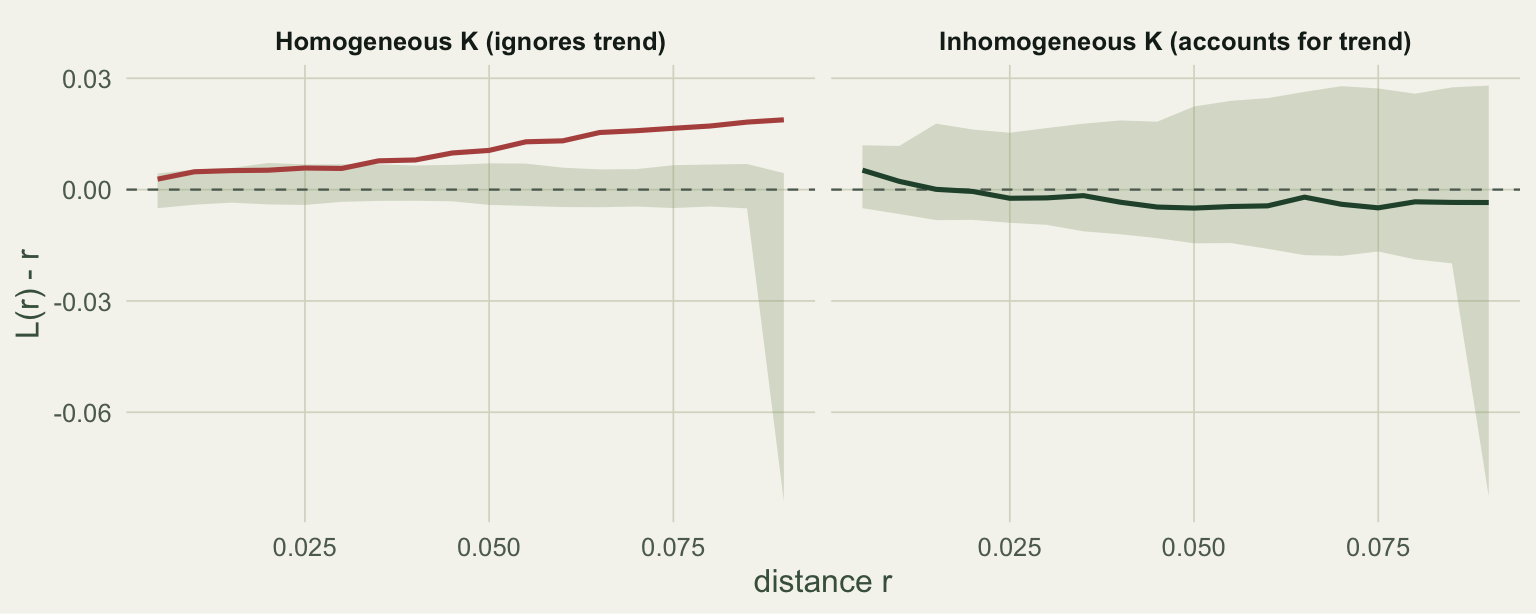
Now the punchline. We run an ordinary, homogeneous Ripley's K on this pattern, using the same translation-corrected estimator and L transform from the [previous post](../ripleys-k-function/), and compare it against a random envelope. Because the pattern really is denser at one edge, points there are closer together, and the homogeneous K reads that as aggregation.
```{r}
#| label: estimators
pair_dw <- function(x, y) {
  dx <- abs(outer(x, x, "-")); dy <- abs(outer(y, y, "-"))
  D  <- sqrt(dx^2 + dy^2); W <- 1 / ((1 - dx) * (1 - dy))
  ut <- upper.tri(D)
  list(d = D[ut], w = W[ut], i = row(D)[ut], j = col(D)[ut])
}

L_hom <- function(x, y, r_seq) {
  pw <- pair_dw(x, y); o <- order(pw$d)
  cw <- cumsum(pw$w[o])
  idx <- findInterval(r_seq, pw$d[o])
  K <- (A / (n * (n - 1))) * 2 * ifelse(idx > 0, cw[idx], 0)
  sqrt(K / pi) - r_seq
}

L_inhom <- function(x, y, r_seq, lam_fun) {
  pw <- pair_dw(x, y); li <- lam_fun(x, y)
  w_l <- pw$w / (li[pw$i] * li[pw$j])
  o <- order(pw$d); cw <- cumsum(w_l[o])
  idx <- findInterval(r_seq, pw$d[o])
  K <- (1 / A) * 2 * ifelse(idx > 0, cw[idx], 0)
  sqrt(K / pi) - r_seq
}

r_seq <- seq(0.005, 0.09, by = 0.005)
obs_hom   <- L_hom(X$x, X$y, r_seq)
obs_inhom <- L_inhom(X$x, X$y, r_seq, lam_hat)
```
For the homogeneous envelope we simulate ordinary random patterns with the same number of points. For the inhomogeneous envelope we simulate inhomogeneous Poisson patterns with the known trend, and re-weight each by the intensity, so the band shows what a pure trend with no interaction looks like once the trend is removed. Each envelope uses its own seed.
```{r}
#| label: envelopes
set.seed(7811); n_sim <- 199
E_hom <- matrix(NA, n_sim, length(r_seq))
for (s in 1:n_sim) E_hom[s, ] <- L_hom(runif(n), runif(n), r_seq)
h_lo <- apply(E_hom, 2, min); h_hi <- apply(E_hom, 2, max)

set.seed(7821)
E_inh <- matrix(NA, n_sim, length(r_seq))
for (s in 1:n_sim) {
  Nm <- rpois(1, lam_max * A); vx <- runif(Nm); vy <- runif(Nm)
  kp <- runif(Nm) < intensity(vx, vy) / lam_max
  E_inh[s, ] <- L_inhom(vx[kp], vy[kp], r_seq, intensity)
}
i_lo <- apply(E_inh, 2, min); i_hi <- apply(E_inh, 2, max)

at <- function(v, r0) v[which.min(abs(r_seq - r0))]
data.frame(
  estimator = c("homogeneous", "inhomogeneous"),
  max_abs   = c(round(max(abs(obs_hom)), 4), round(max(abs(obs_inhom)), 4)),
  outside_env = c(sum(obs_hom > h_hi | obs_hom < h_lo),
                  sum(obs_inhom > i_hi | obs_inhom < i_lo))
)
```
The homogeneous curve leaves the random envelope, climbing to an L minus r of about 0.019 at the largest distances: a clear, and entirely spurious, signal of clustering. The inhomogeneous curve is a different animal. Its largest excursion is only 0.005, and it stays inside the envelope at every distance. Once the trend is divided out, the residual second-order structure is flat, which is the correct answer: these points were independent all along.
```{r}
#| label: fig-kinhom
#| fig-cap: "L(r) minus r for the same pattern under a homogeneous K (left) and an inhomogeneous K (right), each against its own envelope."
#| fig-alt: "Two panels of L(r) minus r. On the left, labelled homogeneous, the curve rises out of the shaded envelope, a spurious clustering signal. On the right, labelled inhomogeneous, the curve stays flat and inside the envelope."
#| fig-width: 8.0
#| fig-height: 3.2
df <- rbind(
  data.frame(r = r_seq, val = obs_hom,   lo = h_lo, hi = h_hi,
             which = "Homogeneous K (ignores trend)"),
  data.frame(r = r_seq, val = obs_inhom, lo = i_lo, hi = i_hi,
             which = "Inhomogeneous K (accounts for trend)"))
df$which <- factor(df$which, levels = c("Homogeneous K (ignores trend)",
                                        "Inhomogeneous K (accounts for trend)"))
ggplot(df, aes(r)) +
  geom_ribbon(aes(ymin = lo, ymax = hi), fill = te_sage, alpha = 0.30) +
  geom_hline(yintercept = 0, colour = te_faint, linetype = "dashed", linewidth = 0.4) +
  geom_line(aes(y = val, colour = which), linewidth = 0.9) +
  facet_wrap(~ which) +
  scale_colour_manual(values = c(te_rust, te_forest), guide = "none") +
  labs(x = "distance r", y = "L(r) - r") +
  theme_te()
```
## Reading the result, and its limits
The two curves together carry the whole lesson. A hot-spot of high density looks identical to clustering under a homogeneous analysis, because both crowd points closer together. Only by modelling the first-order trend can you ask the second-order question cleanly: given where the density is high and low, are points still closer, or farther, than independence would put them? Here the answer is neither, and the inhomogeneous K says so. Had we layered genuine clustering on top of the trend, the same inhomogeneous K would have flagged the leftover aggregation while ignoring the gradient, which is the whole reason the tool exists.
Two cautions keep this honest. The inhomogeneous K is only as good as the intensity you feed it, and the intensity is estimated from the same points you are testing. Fit too flexible a trend and it will soak up real clustering, flattening a signal that should show; fit too rigid a trend and leftover density variation will leak through as spurious interaction. There is a genuine identifiability tension between a smoothly varying intensity and short-range clustering, because both put extra points close together, and no amount of arithmetic fully resolves it from a single pattern. The safe practice is to justify the trend model on external grounds, from the covariates you believe drive abundance, rather than tuning it until the K curve looks the way you expected.
That closes the loop this series opened. Quadrats gave a first, coarse test of randomness; nearest-neighbour distances sharpened it to the finest scale; Ripley's K spread it across all scales; and the inhomogeneous K let the density itself vary, so that the pattern in the points can finally be told apart from the pattern in their abundance.
## References
Baddeley, A.J., Moller, J. and Waagepetersen, R. (2000) Statistica Neerlandica 54(3): 329-350. doi:10.1111/1467-9574.00144
Lewis, P.A.W. and Shedler, G.S. (1979) Naval Research Logistics Quarterly 26(3): 403-413. doi:10.1002/nav.3800260304
Wiegand, T. and Moloney, K.A. (2014) Handbook of Spatial Point-Pattern Analysis in Ecology. Chapman and Hall/CRC. ISBN 978-1-4200-8254-8
Diggle, P.J. (2013) Statistical Analysis of Spatial and Spatio-Temporal Point Patterns, 3rd edition. Chapman and Hall/CRC. ISBN 978-1-4665-6023-9
## Related tutorials
- [Ripley's K and the pair correlation function](../ripleys-k-function/)
- [Modelling count data with GLMs in R](../glm-count-data-abundance/)
- [Offsets for rates and densities in R](../offsets-for-rates-and-densities/)
- [Kriging and spatial interpolation in R](../kriging-spatial-interpolation/)