library(ggplot2)
library(patchwork)

te_paper  <- "#f5f4ee"
te_ink    <- "#16241d"
te_body   <- "#2c3a31"
te_forest <- "#275139"
te_rust   <- "#b5534e"
te_gold   <- "#c9b458"
te_line   <- "#dad9ca"

theme_datasheet <- function() {
  theme_minimal(base_size = 12) +
    theme(plot.background  = element_rect(fill = te_paper, colour = NA),
          panel.background = element_rect(fill = te_paper, colour = NA),
          panel.grid.major = element_line(colour = te_line, linewidth = 0.3),
          panel.grid.minor = element_blank(),
          text             = element_text(colour = te_body),
          plot.title       = element_text(colour = te_ink, face = "bold"),
          axis.text        = element_text(colour = te_body))
}

# Three latent trait syndromes, two measured traits each.
make_pool <- function(n_sp = 40) {
  z1 <- rnorm(n_sp); z2 <- rnorm(n_sp); z3 <- rnorm(n_sp)
  data.frame(body   = z1 + 0.3 * rnorm(n_sp), gape   = z1 + 0.4 * rnorm(n_sp),
             leg    = z2 + 0.3 * rnorm(n_sp), wing   = z2 + 0.5 * rnorm(n_sp),
             gut    = z3 + 0.4 * rnorm(n_sp), clutch = z3 + 0.6 * rnorm(n_sp))
}

# Gower distance for continuous traits: mean of per-trait ranges-scaled distances.
gower <- function(tr) {
  spans <- apply(tr, 2, function(x) diff(range(x)))
  acc <- matrix(0, nrow(tr), nrow(tr))
  for (j in seq_len(ncol(tr))) acc <- acc + as.matrix(dist(tr[, j])) / spans[j]
  as.dist(acc / ncol(tr))
}

# FRic in one dimension is a length; in two it is the area of the convex hull.
fric_1d <- function(sc) diff(range(sc))
fric_2d <- function(sc) {
  h <- chull(sc); xx <- sc[h, 1]; yy <- sc[h, 2]
  abs(sum(xx * c(yy[-1], yy[1]) - c(xx[-1], xx[1]) * yy)) / 2
}

# FDis: mean distance from the species to their own centroid, any dimension.
fdis <- function(sc) {
  sc <- as.matrix(sc)
  cen <- colMeans(sc)
  mean(sqrt(rowSums((sc - rep(cen, each = nrow(sc)))^2)))
}

n_sp <- 40; n_com <- 12; rich <- 12
set.seed(174)
pool  <- make_pool(n_sp)
pcoa  <- cmdscale(gower(pool), k = 6, eig = TRUE)
axes  <- pcoa$points
eigs  <- pmax(pcoa$eig, 0)
sets  <- replicate(n_com, sample(n_sp, rich), simplify = FALSE)

var2 <- sum(eigs[1:2]) / sum(eigs)
var4 <- sum(eigs[1:4]) / sum(eigs)Checking a functional diversity analysis
R
functional diversity
traits
model diagnostics
ecology tutorial
Functional richness is measured in a trait space whose dimensions you chose. Adding one PCoA axis reorders the communities, and the winner usually changes.
A functional diversity analysis usually ends with a ranking. These plots hold more functional richness than those; grazed grassland lost more trait space than mown; the restored sites have caught up with the reference sites on FRic but not on FDis. The number that carries the claim comes out of a chain with one step in it that nobody reports: the traits are turned into a distance matrix, the distance matrix is turned into a set of ordination axes, and then somebody decides how many of those axes to keep.
That decision is not a detail of the plotting. Functional richness is the volume of the trait space the species occupy, and volume is defined only once you have said how many dimensions the space has. A community can be wide on one axis and narrow on the next, and whether it looks diverse depends on which of those two facts you let into the calculation.
This post generates communities from a known species pool, holds richness fixed so that the familiar richness confound cannot do any work, and measures how much of the ranking survives a change in the number of axes. The index family itself, and what each index means, is on the site already; this is about the step before them.
A pool, a distance, and a set of axes
Forty species, six traits arranged in three correlated pairs, so that the trait space has real structure rather than six independent dimensions. Gower distance handles the mixed scales, and principal coordinates analysis turns it into coordinates. Community richness is fixed at twelve species throughout, which removes the one driver of FRic that is already well known.
The first two axes carry 59 per cent of the variation in this pool and the first four carry 82 per cent. Those are the numbers a reader would use to defend a choice: two axes is where the scree plot flattens, four axes is where you cross the usual thresholds. Both are defensible, and they are the two options the rest of the post compares.
The same two communities, ranked twice
Take the community with the largest one-dimensional trait span and the community with the largest two-dimensional hull, and look at them together.
span1 <- sapply(sets, function(i) fric_1d(axes[i, 1]))
area2 <- sapply(sets, function(i) fric_2d(axes[i, 1:2]))

best1 <- which.max(span1)
best2 <- which.max(area2)
rank2 <- rank(-area2)

span_ratio <- span1[best1] / span1[best2]
area_ratio <- area2[best2] / area2[best1]
drop1      <- rank2[best1]
Community 7 has the widest span on the first axis, 1.20 times wider than community 3. Add the second axis and community 3 encloses 1.97 times the trait space of community 7, which has fallen to rank 8 of 12. Nothing about the communities changed. One axis was added to the space they are measured in.
duo <- c(best1, best2)
lab <- paste("community", duo)
pts <- do.call(rbind, lapply(1:2, function(k)
  data.frame(x = axes[sets[[duo[k]]], 1], y = axes[sets[[duo[k]]], 2],
             ypos = c(2, 1)[k], who = lab[k])))
segs <- data.frame(who = lab, ypos = c(2, 1),
                   xmin = sapply(duo, function(p) min(axes[sets[[p]], 1])),
                   xmax = sapply(duo, function(p) max(axes[sets[[p]], 1])))
hulls <- do.call(rbind, lapply(1:2, function(k) {
  sc <- axes[sets[[duo[k]]], 1:2]; h <- chull(sc)
  data.frame(x = sc[h, 1], y = sc[h, 2], who = lab[k])
}))
pal <- setNames(c(te_rust, te_forest), lab)

p_left <- ggplot(segs) +
  geom_segment(aes(x = xmin, xend = xmax, y = ypos, yend = ypos, colour = who),
               linewidth = 3.2, lineend = "round", alpha = 0.55) +
  geom_point(data = pts, aes(x = x, y = ypos, colour = who), size = 1.7) +
  geom_text(aes(x = (xmin + xmax) / 2, y = ypos + 0.28,
                label = sprintf("span %.2f", xmax - xmin), colour = who),
            size = 3.4, fontface = "bold") +
  scale_colour_manual(values = pal, guide = "none") +
  scale_y_continuous(breaks = 1:2, labels = rev(lab), limits = c(0.6, 2.6)) +
  labs(x = "principal coordinate 1", y = NULL, title = "One axis: a span") +
  theme_datasheet() + theme(panel.grid.major.y = element_blank())

p_right <- ggplot(pts, aes(x, y, colour = who)) +
  geom_polygon(data = hulls, aes(fill = who, colour = who), alpha = 0.18,
               linewidth = 0.7) +
  geom_point(size = 1.8) +
  scale_colour_manual(values = pal, name = NULL) +
  scale_fill_manual(values = pal, guide = "none") +
  labs(x = "principal coordinate 1", y = "principal coordinate 2",
       title = "Two axes: an area") +
  theme_datasheet() +
  theme(legend.position = "bottom", legend.text = element_text(size = 9))

p_left + p_right + plot_annotation(theme = theme_datasheet())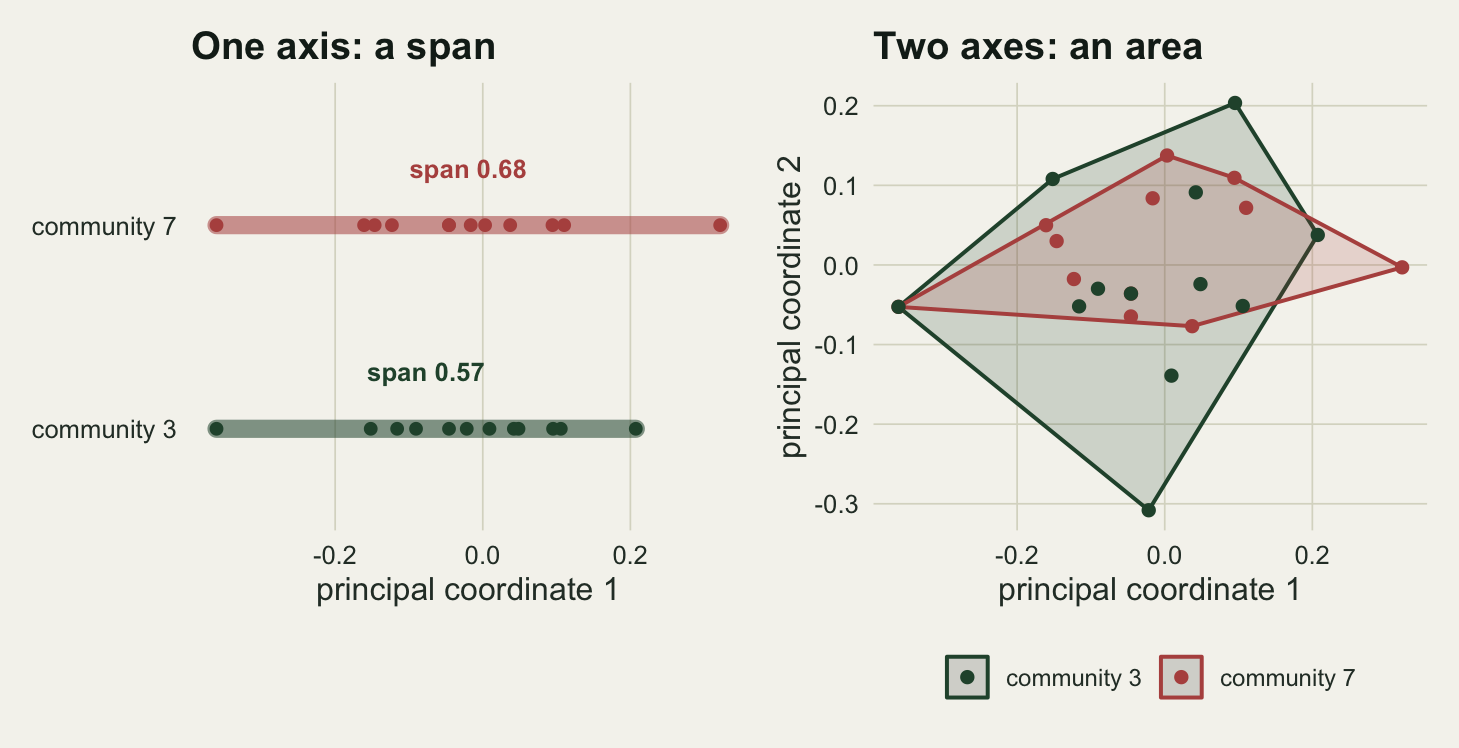
The mechanism is visible in the right hand panel. Community 7 is stretched along the first axis and squashed on the second, so it is a long thin sliver. Community 3 is more compact on the first axis but occupies the second, so it is a fat polygon. In one dimension the sliver wins by construction, because the second dimension is where its narrowness lives.
Which of the two is functionally more diverse is not a question the data can answer without a decision about how many trait dimensions matter. That decision is the analysis.
How often the ranking turns over
One draw is an anecdote. Repeat the whole thing: new pool, new communities, rank them on one axis and on two, and compare the two rankings.
draw_once <- function() {
  pl <- make_pool(n_sp)
  pc <- cmdscale(gower(pl), k = 6, eig = TRUE)
  ax <- pc$points; ev <- pmax(pc$eig, 0)
  cm <- replicate(n_com, sample(n_sp, rich), simplify = FALSE)
  s1 <- sapply(cm, function(i) fric_1d(ax[i, 1]))
  a2 <- sapply(cm, function(i) fric_2d(ax[i, 1:2]))
  dd <- sapply(1:6, function(k) sapply(cm, function(i) fdis(ax[i, 1:k, drop = FALSE])))
  c(rho      = cor(rank(-s1), rank(-a2), method = "spearman"),
    same_top = as.numeric(which.max(s1) == which.max(a2)),
    fell_to  = rank(-a2)[which.max(s1)],
    swapped  = mean(outer(s1, s1, ">") != outer(a2, a2, ">")),
    rho_d    = cor(dd[, 2], dd[, 4], method = "spearman"),
    same_d   = as.numeric(which.max(dd[, 2]) == which.max(dd[, 4])),
    ax70     = which(cumsum(ev) / sum(ev) >= 0.70)[1])
}
set.seed(9021)
sweep_fd <- as.data.frame(t(replicate(400, draw_once())))

rho_mean  <- mean(sweep_fd$rho)
top_same  <- 100 * mean(sweep_fd$same_top)
fell_med  <- median(sweep_fd$fell_to)
swap_pct  <- 100 * mean(sweep_fd$swapped)
d_rho     <- mean(sweep_fd$rho_d)
d_same    <- 100 * mean(sweep_fd$same_d)
ax70_med  <- median(sweep_fd$ax70)
Across 400 draws, the two FRic rankings agree at a Spearman correlation of 0.58. The community with the most functional richness on one axis is still the richest on two axes in 30 per cent of draws; its median rank on two axes is 2 of 12. Taken pair by pair, 25 per cent of the comparisons between two communities come out the other way round.
An agreement of 0.58 is not noise. It is the level at which the ranking is recognisably the same ranking and any particular claim about any particular pair is a coin weighted about three to one. Papers are written about single pairs.
d_hist <- data.frame(rho = sweep_fd$rho)
d_fell <- as.data.frame(table(factor(sweep_fd$fell_to, levels = 1:n_com)))
names(d_fell) <- c("rk", "n")
d_fell$rk <- as.integer(as.character(d_fell$rk))

ph <- ggplot(d_hist, aes(rho)) +
  geom_histogram(bins = 30, fill = te_forest, colour = NA) +
  geom_vline(xintercept = rho_mean, colour = te_rust, linetype = "dashed", linewidth = 0.9) +
  labs(x = "Spearman correlation of the two rankings", y = "simulated pools",
       title = "One axis against two") +
  theme_datasheet()

pb <- ggplot(d_fell, aes(rk, n)) +
  geom_col(fill = te_gold, colour = NA, width = 0.8) +
  scale_x_continuous(breaks = 1:n_com) +
  labs(x = "its rank once the second axis is added", y = "simulated pools",
       title = "Fate of the one axis winner") +
  theme_datasheet()

ph + pb + plot_annotation(theme = theme_datasheet())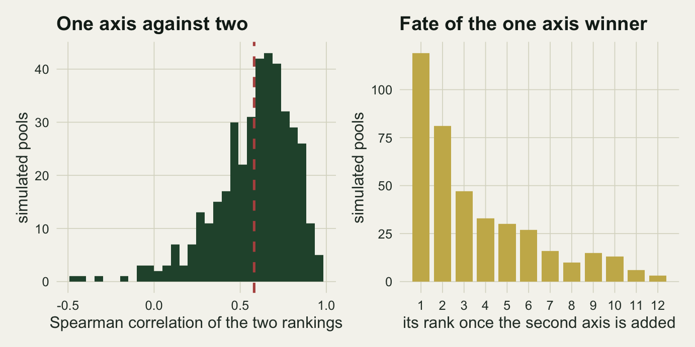
The dispersion indices move less, and still move
FRic is a volume, so it responds to dimensionality by construction: every axis you add multiplies the space the hull can fill. The dispersion measures are averages of distances, which do not have that property, and they are the usual recommendation when FRic looks unstable. Measuring the same thing for FDis between two and four axes gives a Spearman correlation of 0.83 and the same top community 60 per cent of the time.
That is better, and it is not stability. One community in three still changes places at the top when the analyst keeps four axes instead of two, on data where nothing about the communities differs except which species were drawn. The recommendation to prefer dispersion indices when FRic behaves badly is sound; the implication that the axis count then stops mattering is not.
set.seed(3308)
pl <- make_pool(n_sp)
pc <- cmdscale(gower(pl), k = 6)
cm <- replicate(n_com, sample(n_sp, rich), simplify = FALSE)
traj <- do.call(rbind, lapply(1:6, function(k) {
  v <- sapply(cm, function(i) fdis(pc[i, 1:k, drop = FALSE]))
  data.frame(k = k, community = factor(seq_len(n_com)), rk = rank(-v))
}))
first_rank <- traj$rk[traj$k == 1]
traj$shade <- first_rank[as.integer(traj$community)]

ggplot(traj, aes(k, rk, group = community, colour = shade)) +
  geom_line(linewidth = 0.9) +
  geom_point(size = 1.7) +
  scale_y_reverse(breaks = 1:n_com) +
  scale_x_continuous(breaks = 1:6) +
  scale_colour_gradient(low = te_rust, high = te_forest, guide = "none") +
  labs(x = "number of retained principal coordinate axes",
       y = "rank on FDis (1 is most dispersed)",
       title = "Where the ranking goes as axes are added") +
  theme_datasheet()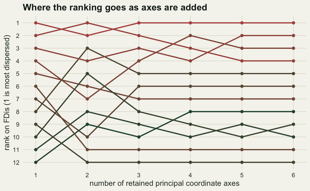
The check
The check is the sweep, run on your own data rather than on a simulation. Compute your index at every axis count from one up to the largest your smallest community can support, and look at the ranks rather than the values. It costs one loop.
axis_sweep <- function(scores, communities, index = fdis, k_max = 5) {
  out <- sapply(1:k_max, function(k)
    rank(-sapply(communities, function(i) index(scores[i, 1:k, drop = FALSE]))))
  data.frame(community = seq_along(communities),
             best_rank = apply(out, 1, min), worst_rank = apply(out, 1, max))
}
rng <- axis_sweep(axes, sets)
unstable <- sum(rng$worst_rank - rng$best_rank >= 4)
In the worked example above, 4 of the 12 communities move by four ranks or more across the sweep. If the pair your conclusion rests on is one of those, the conclusion is about the ordination settings.
Three things belong in the methods section, and the third is the one that goes missing: the distance measure, the ordination, and the number of axes retained with the rule that chose it. Maire and colleagues proposed a quality criterion for exactly this choice in 2015, based on how faithfully the reduced space reproduces the original distances, and it is a better answer than a scree plot because it is about the distances the index will use rather than about variance.
If the conclusion is a ranking, say whether it survives the sweep. A sentence of the form “the ordering of the four treatments was unchanged for two to five axes” is worth more than the index value to three decimal places, and anyone who has run the sweep already has the sentence.
Honest limits
FRic here is compared between one axis and two, which is the smallest change in dimensionality anybody would ever make. Computing the convex hull volume in three or more dimensions needs a hull routine from a package rather than base R, so this post cannot show what happens between three and five axes, which is the range real analyses argue about. There is no reason to think the ranking settles down there: the hull keeps gaining dimensions to grow into, and the species that define it change.
The pool has six continuous traits in three correlated pairs. Categorical traits, missing values and strongly redundant traits all change how quickly the eigenvalues decay, and with them how much a marginal axis carries. A pool whose variation is genuinely two dimensional will give a stable ranking, and there is nothing wrong with the analysis in that case; the point is that the eigenvalues tell you whether you are in that case, and they are usually not reported.
Richness is held fixed at twelve species. That is a deliberate simplification, because the dependence of FRic on richness is documented and covered elsewhere on the site. In real data the two problems arrive together, and a difference in the axis count can either mask or manufacture a richness effect.
The communities here are random draws from the pool, so no ecological process is sorting them. Real assembly produces communities that are structured along particular trait axes, and if the sorting happens to run along the first principal coordinate then the ranking will be more stable than these numbers suggest. If it runs along the third, it will be worse, and the analysis that kept two axes will report no effect.
Finally, the Gower distance used here is the plain mean over range-scaled traits. Weighting schemes, alternative mixed-variable distances and the various corrections for negative eigenvalues each produce a different set of axes, which is another decision upstream of the one this post measures.
References
Villeger S, Mason NWH, Mouillot D 2008 Ecology 89(8):2290-2301 (10.1890/07-1206.1)
Laliberte E, Legendre P 2010 Ecology 91(1):299-305 (10.1890/08-2244.1)
Maire E, Grenouillet G, Brosse S, Villeger S 2015 Global Ecology and Biogeography 24(6):728-740 (10.1111/geb.12299)