library(ggplot2)
library(patchwork)

te_paper  <- "#f5f4ee"
te_ink    <- "#16241d"
te_body   <- "#2c3a31"
te_forest <- "#275139"
te_rust   <- "#b5534e"
te_gold   <- "#c9b458"
te_line   <- "#dad9ca"

theme_datasheet <- function() {
  theme_minimal(base_size = 12) +
    theme(plot.background  = element_rect(fill = te_paper, colour = NA),
          panel.background = element_rect(fill = te_paper, colour = NA),
          panel.grid.major = element_line(colour = te_line, linewidth = 0.3),
          panel.grid.minor = element_blank(),
          text             = element_text(colour = te_body),
          plot.title       = element_text(colour = te_ink, face = "bold"),
          plot.subtitle    = element_text(colour = te_body),
          axis.text        = element_text(colour = te_body))
}Census interval bias in tree mortality rates
R
survival analysis
forest dynamics
demography
simulation
ecology tutorial
Unseen differences in risk make annual tree mortality fall as the census interval lengthens. Measuring the bias in R with gamma frailty and a cohort of trees.
Two permanent forest plots report annual tree mortality. One was recensused every five years, the other was measured at establishment and again twenty years later. The first reports a higher rate, and the comparison table in the synthesis paper puts the difference down to site. Nothing in the arithmetic is wrong: both plots used the same annualisation, the one Sheil, Burslem and Alder recommended in 1995, and both counted the survivors of a marked cohort without error.
The difference can still be manufactured by the census interval. Trees in a plot do not share one risk of death. Some are suppressed, some are hollow, some stand on a slope that slips, and none of that is recorded as a covariate. The trees at high risk die first, so the cohort that is left after twenty years is a selected set of low risk trees, and the average rate over the whole interval is lower than the rate over its first five years. Sheil and May set this out for tropical forest plots in 1996, and demographers had described the same selection effect in human mortality under the name of frailty since Vaupel, Manton and Stallard in 1979.
This site already treats frailty as a variance to estimate. The post on frailty and recurrent event models fits a gamma frailty shared by animals at a site and asks what it does to the standard error of a covariate; the frailty there is a nuisance to be absorbed by the model. Here nothing is fitted, and the frailty belongs to each tree rather than to a cluster. The quantity of interest is a plain ratio of counts, and the question is what that ratio means once the counted trees differ in risk. The post on nest survival with logistic exposure deals with intervals of unequal length as well, but its heterogeneity is an observed covariate, nest age, which the model can use. The heterogeneity in this post is the kind nobody measured.
The post works through a closed form for the bias, checks it against simulated cohorts, separates the part that comes from heterogeneity from the part that comes from the choice of formula, prices the bias against the sampling noise of a one hectare plot, and tests the empirical interval correction of Lewis and colleagues against the model. Recruitment is excluded throughout: every rate is the mortality of a cohort of trees tagged at the first census.
A cohort of trees with unequal risk
Each tree carries a frailty, a multiplier on a baseline hazard that is constant in time. A tree with frailty two dies at twice the baseline rate for as long as it lives, and a tree with frailty one half at half of it. Frailties are drawn from a gamma distribution with mean one, so the baseline hazard is also the mean hazard of the cohort on the day it is tagged. The coefficient of variation of the frailty is the single parameter that says how unequal the trees are.
Integrating the individual survival curve over that gamma distribution gives the survival of the cohort in closed form, the result Vaupel and colleagues used:
S(t) = (1 + theta h t)^(-1/theta),
where h is the baseline hazard and theta is the frailty variance, the square of the coefficient of variation. As theta goes to zero this becomes exp(-h t), the survival of a cohort in which every tree has the same risk.
Two annualisations are in use. Sheil, Burslem and Alder give the annual mortality rate m = 1 - (N1/N0)^(1/t), with N0 trees alive at the first census and N1 of them alive t years later. Lewis and colleagues work with the instantaneous form lambda = (ln N0 - ln N1)/t. The two carry the same information, since m = 1 - exp(-lambda), and the post reports m where rates are compared and lambda where the Lewis correction is applied, because that correction is defined on lambda.
h_base   <- 0.02                      # baseline hazard per year, fixed in advance
cv_main  <- 0.8                       # frailty coefficient of variation
cv_grid  <- c(0, 0.4, 0.8, 1.2, 1.6)
cv_cols  <- c("CV 0.0" = te_ink, "CV 0.4" = te_gold, "CV 0.8" = te_forest,
              "CV 1.2" = te_rust, "CV 1.6" = "#7a8a7f")   # one key for every figure
t_short  <- 5
t_long   <- 20

surv_gamma <- function(t, cv, h) {
  theta <- cv^2
  if (theta == 0) exp(-h * t) else exp(-log1p(theta * h * t) / theta)
}
m_sheil  <- function(s_frac, t) 1 - s_frac^(1 / t)
lam_log  <- function(s_frac, t) -log(s_frac) / t

m_short <- m_sheil(surv_gamma(t_short, cv_main, h_base), t_short)
m_long  <- m_sheil(surv_gamma(t_long, cv_main, h_base), t_long)
m_ratio <- m_short / m_long
m_true  <- 1 - exp(-h_base)

bias_tab <- data.frame(cv = cv_grid,
  m5  = vapply(cv_grid, function(v) m_sheil(surv_gamma(t_short, v, h_base), t_short), 0),
  m20 = vapply(cv_grid, function(v) m_sheil(surv_gamma(t_long, v, h_base), t_long), 0))
bias_tab$ratio    <- bias_tab$m5 / bias_tab$m20
bias_tab$pct_drop <- 100 * (1 - bias_tab$m20 / bias_tab$m5)
q_frail <- qgamma(c(0.5, 0.9), shape = 1 / max(cv_grid)^2, rate = 1 / max(cv_grid)^2)
q_ratio <- q_frail[2] / q_frail[1]
The baseline hazard of 0.02 per year was fixed before anything was computed, as a round value close to the pan-tropical stem turnover of about 1.8 per cent per year that Lewis and colleagues report; on the day of tagging it corresponds to an annual mortality of 0.0198. With a frailty coefficient of variation of 0.8, the five year census gives an annual mortality of 0.0192 and the twenty year census 0.0176, a ratio of 1.088.
| frailty CV | m from 5 years | m from 20 years | ratio | fall from 5 to 20 years (per cent) |
|---|---|---|---|---|
| 0.0 | 0.01980 | 0.01980 | 1.000 | 0.0 |
| 0.4 | 0.01965 | 0.01920 | 1.023 | 2.3 |
| 0.8 | 0.01920 | 0.01765 | 1.088 | 8.1 |
| 1.2 | 0.01851 | 0.01567 | 1.181 | 15.3 |
| 1.6 | 0.01765 | 0.01368 | 1.290 | 22.5 |
The direction is the one Sheil and May described, and it is monotone in the coefficient of variation. The size is modest. This post was planned around a five year rate one and a half times the twenty year rate at a coefficient of variation of 0.8; at a baseline hazard of 0.02 the model gives a ratio of 1.088, and even at a coefficient of variation of 1.6, where a tree at the ninetieth percentile of frailty dies 8.0 times faster than the median tree, the ratio is only 1.290.
ratio_at <- function(cv, h) m_sheil(surv_gamma(t_short, cv, h), t_short) /
                            m_sheil(surv_gamma(t_long, cv, h), t_long)
cv_for_15 <- uniroot(function(v) ratio_at(v, h_base) - 1.5, c(0.5, 10))$root
h_for_15  <- uniroot(function(hh) ratio_at(cv_main, hh) - 1.5, c(0.001, 5))$root
m_h15     <- 1 - exp(-h_for_15)
A ratio of one and a half needs either a coefficient of variation of 2.33 at the same baseline hazard, or a baseline hazard of 0.189 per year at a coefficient of variation of 0.8, which is an annual mortality of 0.172 on the day of tagging. The first is a population in which most trees are almost immortal and a few die fast; the second is a stand of short lived pioneers. For a closed canopy stand with ordinary mortality the fall in annual mortality from a five to a twenty year census runs from 2.3 to 22.5 per cent across the non-zero frailty spreads in the grid, and the rest of the post keeps that scale in view.
The bias comes from selection, not from the formula
The obvious objection is that the bias might be a property of the annualisation rather than of the trees. The test is to feed the same formula a cohort in which every tree has the same risk.
m_cv0_short <- m_sheil(exp(-h_base * t_short), t_short)
m_cv0_long  <- m_sheil(exp(-h_base * t_long), t_long)
gap_cv0     <- m_cv0_short - m_cv0_long
near_zero   <- vapply(c(1e-2, 1e-4, 1e-6), function(v)
  m_sheil(surv_gamma(t_long, v, h_base), t_long) - m_cv0_long, 0)

m_linear <- function(s_frac, t) (1 - s_frac) / t
lin_short <- m_linear(exp(-h_base * t_short), t_short)
lin_long  <- m_linear(exp(-h_base * t_long), t_long)
lin_ratio <- lin_short / lin_long

x_invar <- function(cv, h, t) cv^2 * h * t
m_a <- m_sheil(surv_gamma(t_long, 0.8, h_base), t_long)
m_b <- m_sheil(surv_gamma(t_short, 1.6, h_base), t_short)
invar_gap <- m_a - m_b
With no heterogeneity the five year and twenty year rates from the Sheil formula differ by 0.00e+00 in floating point: both equal 0.01980, the annual mortality implied by the constant hazard, whatever the interval. The gamma formula approaches that answer as the frailty variance shrinks: at coefficients of variation of one hundredth, one ten thousandth and one millionth the twenty year rate is off by -3.92e-07, -3.92e-11 and -4.00e-15. (The survival function is computed through log1p(); written as a plain power it loses accuracy to cancellation long before the frailty variance reaches zero.) So the compound annualisation has no interval bias of its own, and everything in the table above belongs to the heterogeneity.
That is not true of every annualisation. The simple proportion dead divided by years, which still appears in older plot reports, falls with interval length even when every tree is identical: under a constant hazard it gives 0.01903 from five years and 0.01648 from twenty, a ratio of 1.155. At a coefficient of variation of 0.8 that formula artefact is larger than the heterogeneity effect it would be blamed for. The compound or logarithmic form is the only one of the two that separates the interval from the trees.
The closed form also shows what the bias depends on. The logarithmic rate is lambda = h ln(1 + x) / x with x = theta h t, so the interval and the frailty variance enter only through their product. Quadrupling the interval does the same thing as doubling the coefficient of variation: the twenty year rate at a coefficient of variation of 0.8 and the five year rate at 1.6 differ by 0.00e+00. A plot manager cannot see theta, but can see t, and that product is why the interval matters.
t_seq <- seq(1, 40, by = 0.5)
form_df <- rbind(
  data.frame(t = t_seq, rate = m_sheil(exp(-h_base * t_seq), t_seq),
             formula = "1 - (N1/N0)^(1/t)"),
  data.frame(t = t_seq, rate = m_linear(exp(-h_base * t_seq), t_seq),
             formula = "(1 - N1/N0) / t"))
p_form <- ggplot(form_df, aes(t, rate, colour = formula)) +
  geom_line(linewidth = 0.9) +
  scale_colour_manual(values = c(te_rust, te_forest), name = NULL) +
  labs(x = "census interval (years)", y = "annual mortality",
       title = "No heterogeneity",
       subtitle = "same cohort, two annualisations") +
  theme_datasheet() + theme(legend.position = "bottom")

t_pts <- c(5, 10, 20, 40)
coll_df <- do.call(rbind, lapply(cv_grid[-1], function(v)
  data.frame(x = x_invar(v, h_base, t_pts),
             rel = lam_log(surv_gamma(t_pts, v, h_base), t_pts) / h_base,
             cv = sprintf("CV %.1f", v))))
x_line <- seq(0, max(coll_df$x), length.out = 200)
p_coll <- ggplot(coll_df, aes(x, rel, colour = cv)) +
  geom_line(data = data.frame(x = x_line[-1], rel = log1p(x_line[-1]) / x_line[-1]),
            aes(x, rel), inherit.aes = FALSE, colour = te_line, linewidth = 2.5) +
  geom_point(size = 2.4) +
  scale_colour_manual(values = cv_cols, name = NULL) +
  labs(x = "theta times h times t", y = "lambda relative to h",
       title = "Gamma frailty",
       subtitle = "pale band: ln(1 + x) / x") +
  guides(colour = guide_legend(nrow = 2)) +
  theme_datasheet() + theme(legend.position = "bottom")

p_form + p_coll + plot_annotation(theme = theme_datasheet())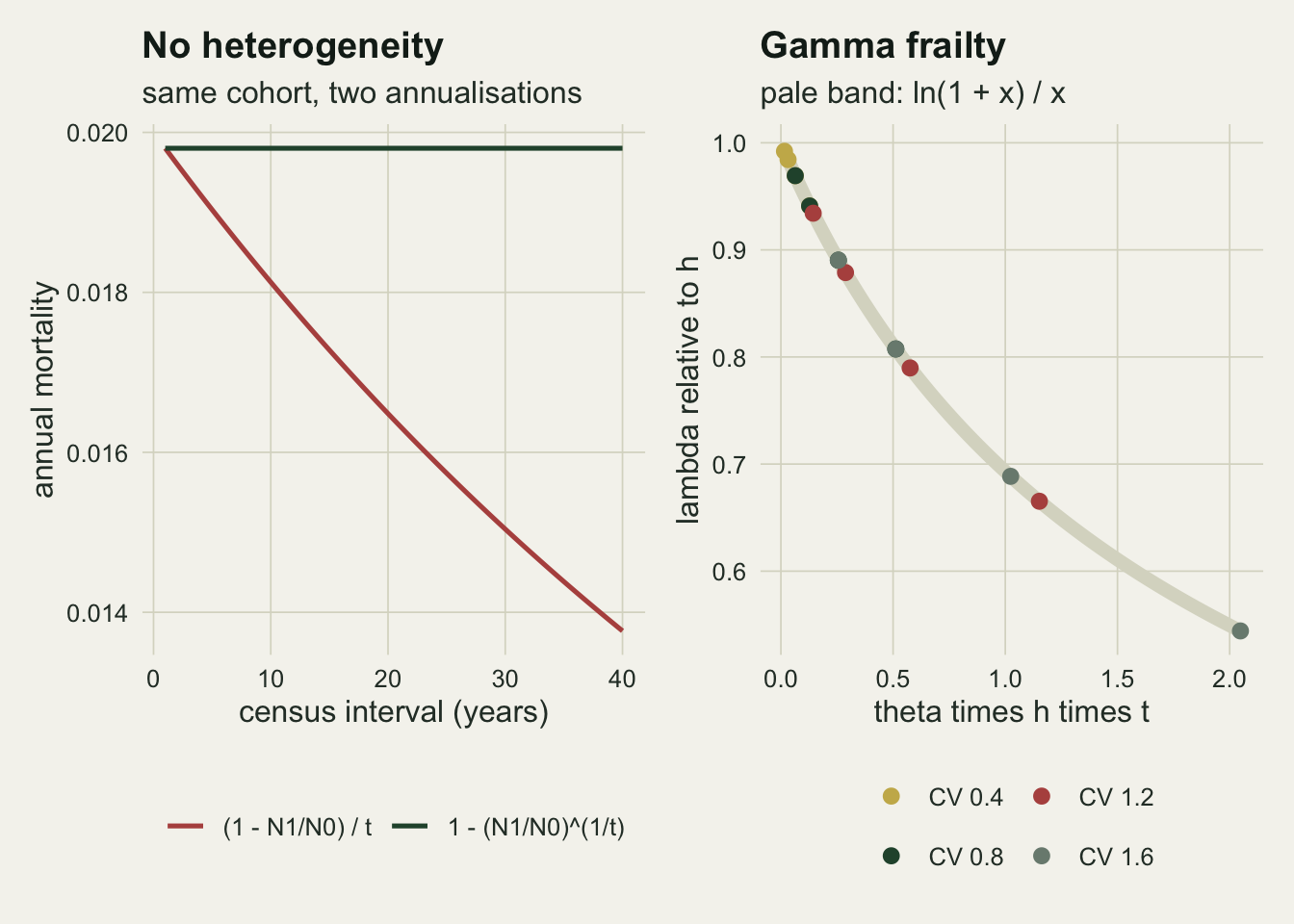
Simulated cohorts agree with the closed form
The closed form is an expectation over an infinite cohort. Simulating trees one at a time checks the algebra and shows the mechanism directly, because a simulated tree keeps its frailty and the survivors can be inspected.
n_big <- 200000
theta_main <- cv_main^2
set.seed(4127)
frail_big <- rgamma(n_big, shape = 1 / theta_main, rate = 1 / theta_main)
death_big <- rexp(n_big, rate = frail_big * h_base)

t_check  <- c(t_short, 10, 15, t_long)
sim_m    <- vapply(t_check, function(tt) m_sheil(mean(death_big > tt), tt), 0)
exact_m  <- vapply(t_check, function(tt) m_sheil(surv_gamma(tt, cv_main, h_base), tt), 0)
se_m     <- vapply(t_check, function(tt) {
  s_hat <- mean(death_big > tt)
  sqrt(s_hat * (1 - s_hat) / n_big) * s_hat^(1 / tt - 1) / tt
}, 0)
sim_z_max <- max(abs(sim_m - exact_m) / se_m)

frail_mean_t <- vapply(t_check, function(tt) mean(frail_big[death_big > tt]), 0)
frail_exact  <- 1 / (1 + theta_main * h_base * t_check)
hazard_pop   <- h_base * frail_exact

edges <- seq(0, t_long, by = t_short)
alive_at <- vapply(edges, function(tt) sum(death_big > tt), 0)
seq_lam  <- log(alive_at[-length(alive_at)] / alive_at[-1]) / t_short
seq_mean <- mean(seq_lam)
lam_long_sim <- log(alive_at[1] / alive_at[length(alive_at)]) / t_long
seq_gap  <- seq_mean - lam_long_sim
A cohort of 200000 simulated trees gives annual mortality rates within 0.7 standard errors of the closed form at all 4 census intervals checked, from 5 to 20 years (the standard error comes from the binomial variance of the surviving fraction, carried through the annualisation by the delta method).
The selection is visible in the survivors. The mean frailty of the trees still alive is 0.940 after 5 years and 0.795 after 20, against 0.940 and 0.796 from the gamma update 1/(1 + theta h t). No tree changed its risk. The hazard of the average surviving tree fell from 0.0200 to 0.0159 per year only because the frail trees were removed.
That also settles what a long interval measures. Splitting the twenty years into four consecutive five year intervals, each annualised on the trees alive at its start, gives logarithmic rates of 0.01941, 0.01823, 0.01709 and 0.01642. Their mean differs from the single twenty year logarithmic rate by 1.04e-17, which is rounding, because the logarithms telescope. A long interval is not a noisy version of a short one. It is the average of the short intervals that a remeasured plot would have reported, including the late ones in which the cohort had already been thinned of its frail trees.
curve_df <- do.call(rbind, lapply(cv_grid, function(v)
  data.frame(t = t_seq, m = m_sheil(surv_gamma(t_seq, v, h_base), t_seq),
             cv = sprintf("CV %.1f", v))))
pts_df <- data.frame(t = t_check, m = sim_m)
ggplot(curve_df, aes(t, m, colour = cv)) +
  geom_vline(xintercept = c(t_short, t_long), colour = te_line, linewidth = 0.6) +
  geom_line(linewidth = 0.9) +
  geom_point(data = pts_df, aes(t, m), inherit.aes = FALSE, shape = 21,
             size = 2.6, fill = te_paper, colour = te_ink, stroke = 0.9) +
  scale_colour_manual(values = cv_cols, name = "frailty") +
  labs(x = "census interval (years)", y = "annual mortality, 1 - (N1/N0)^(1/t)",
       title = "Longer intervals report lower mortality",
       subtitle = "lines: closed form; circles: 200000 simulated trees; pale lines: 5 and 20 years") +
  theme_datasheet() + theme(legend.position = "bottom")
Against the noise of a one hectare plot
A fall of 8.1 per cent matters only if it is large against the sampling noise of the plots being compared. A hectare of lowland forest holds a few hundred stems above ten centimetres in diameter, so the next simulation tags 500 trees per plot and repeats the plot many times.
n_tree <- 500
n_plot <- 4000                     # fixed before any rate was inspected
set.seed(8830)
plot_rates <- function(cv, t_cen) {
  theta <- cv^2
  frail <- if (theta == 0) rep(1, n_tree * n_plot) else
    rgamma(n_tree * n_plot, shape = 1 / theta, rate = 1 / theta)
  dead_t <- matrix(rexp(n_tree * n_plot, rate = frail * h_base), nrow = n_plot)
  m_sheil(rowMeans(dead_t > t_cen), t_cen)
}
p5_het  <- plot_rates(cv_main, t_short)
p20_het <- plot_rates(cv_main, t_long)
p5_hom  <- plot_rates(0, t_short)
p20_hom <- plot_rates(0, t_long)

mean_diff_het <- mean(p5_het) - mean(p20_het)
se_diff_het   <- sqrt(var(p5_het) / n_plot + var(p20_het) / n_plot)
mean_diff_hom <- mean(p5_hom) - mean(p20_hom)
se_diff_hom   <- sqrt(var(p5_hom) / n_plot + var(p20_hom) / n_plot)
sd5_het  <- sd(p5_het); sd20_het <- sd(p20_het)
p_higher <- mean(p5_het > p20_het)
p_higher_hom <- mean(p5_hom > p20_hom)
sd_pair  <- sqrt(sd5_het^2 + sd20_het^2)
plots_needed <- ceiling((2 * sd_pair / mean_diff_het)^2)
plots_80     <- ceiling(((qnorm(0.975) + qnorm(0.8)) * sd_pair / mean_diff_het)^2)
se_p_hom     <- sqrt(p_higher_hom * (1 - p_higher_hom) / n_plot)
m5_grid      <- m_sheil((0:n_tree) / n_tree, t_short)   # exact binomial check, identical trees
m20_grid     <- m_sheil((0:n_tree) / n_tree, t_long)
p_exact_hom  <- sum(outer(dbinom(0:n_tree, n_tree, exp(-h_base * t_short)),
                          dbinom(0:n_tree, n_tree, exp(-h_base * t_long))) *
                    outer(m5_grid, m20_grid, ">"))
deaths5  <- n_tree * (1 - surv_gamma(t_short, cv_main, h_base))
Over 4000 independent plots of 500 trees each, the five year rate has a mean of 0.01921 and a standard deviation between plots of 0.00281; the twenty year rate has a mean of 0.01767 and a standard deviation of 0.00144. A five year census of such a plot records about 46 deaths, which is why the short interval is the noisier of the two. The mean difference of 0.00154 (Monte Carlo standard error 0.00005) matches the closed form difference of 0.00155.
Set against a single pair of plots, that difference is small. A plot censused over five years reports a higher rate than an independent plot censused over twenty in 68.8 per cent of pairs, where identical trees would give 48.9 per cent; the exact binomial value for identical trees is 49.6 per cent, and the gap is Monte Carlo error (standard error 0.8 percentage points). For the expected difference to reach two standard errors of the difference in plot means would take about 17 plots on each side, and about 34 for an 80 per cent chance of detecting it at the 5 per cent level. So for one pair of hectare plots the interval effect at a coefficient of variation of 0.8 is smaller than the counting noise. In a synthesis of many plots the noise averages away and the bias does not, which is where unequal intervals do their damage.
The identical tree control has its own small offset. With no heterogeneity the plot mean difference is -0.000047 with a Monte Carlo standard error of 0.000052: the closed form bias is exactly zero, and at this replication the small sample curvature of the annualisation is not distinguishable from zero either.
plot_df <- rbind(data.frame(m = p5_het, census = "5 year census"),
                 data.frame(m = p20_het, census = "20 year census"))
plot_df$census <- factor(plot_df$census, levels = c("5 year census", "20 year census"))
mean_df <- data.frame(census = factor(levels(plot_df$census), levels = levels(plot_df$census)),
                      m = c(m_short, m_long))
ggplot(plot_df, aes(m, fill = census)) +
  geom_density(alpha = 0.45, adjust = 2, colour = NA) +
  geom_vline(data = mean_df, aes(xintercept = m, colour = census),
             linewidth = 0.9, linetype = "dashed", show.legend = FALSE) +
  scale_fill_manual(values = c(te_rust, te_forest), name = NULL) +
  scale_colour_manual(values = c(te_rust, te_forest)) +
  labs(x = "annual mortality of one plot", y = "density",
       title = "The bias is smaller than one plot's noise",
       subtitle = "dashed lines: closed form rates for an infinite cohort") +
  theme_datasheet() + theme(legend.position = "bottom")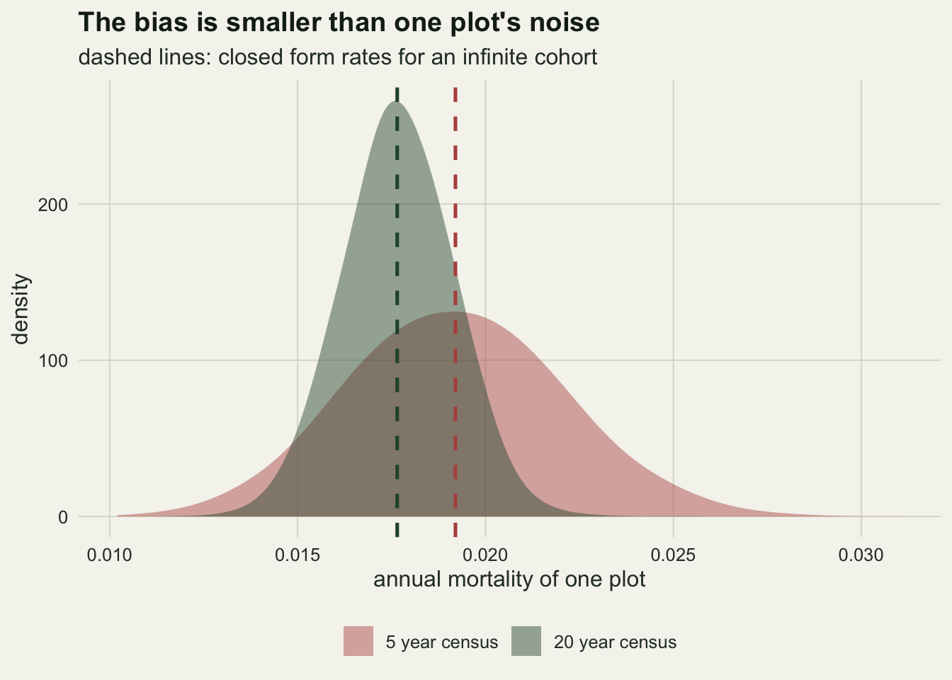
The Lewis correction against the model
Lewis and colleagues estimated how fast observed rates fell with interval length in multicensus tropical plots and proposed standardising logarithmic rates with lambda_corr = lambda t^0.08, with t in years; since t^0.08 is one at t = 1, the correction rescales every rate to what a one year census would have reported. The exponent is empirical. Under gamma frailty the model has its own local exponent, the slope of ln lambda against ln t, and the comparison shows what a single fixed exponent assumes.
lewis_b <- 0.08
elast <- function(t, cv, h) {
  x <- cv^2 * h * t
  x / ((1 + x) * log1p(x)) - 1
}
el_main_10 <- elast(10, cv_main, h_base)
el_main_5  <- elast(t_short, cv_main, h_base)
el_main_20 <- elast(t_long, cv_main, h_base)
cv_lewis   <- uniroot(function(v) elast(10, v, h_base) + lewis_b, c(0.1, 5))$root

lam_c <- function(t, cv) lam_log(surv_gamma(t, cv, h_base), t) * t^lewis_b
corr_tab <- data.frame(cv = cv_grid,
  raw_ratio  = vapply(cv_grid, function(v)
    lam_log(surv_gamma(t_short, v, h_base), t_short) /
    lam_log(surv_gamma(t_long, v, h_base), t_long), 0),
  corr_ratio = vapply(cv_grid, function(v) lam_c(t_short, v) / lam_c(t_long, v), 0))
corr_cv0  <- corr_tab$corr_ratio[1]
corr_main <- corr_tab$corr_ratio[3]
raw_main  <- corr_tab$raw_ratio[3]
At a coefficient of variation of 0.8 the model exponent is -0.0304 at five years, -0.0579 at ten and -0.1058 at twenty, so rates fall more steeply the longer the interval, and no single power of t describes the curve. The exponent of the Lewis correction is matched at ten years by a coefficient of variation of 0.96, at the baseline hazard used here.
Applied to the model, the correction does what its exponent implies. At a coefficient of variation of 0.8 the ratio of five year to twenty year logarithmic rates is 1.089 before correction and 0.974 after it, so the corrected twenty year rate now sits above the five year rate. With identical trees the correction introduces a bias where there was none: the corrected ratio is 0.895, which is just (5/20)^0.08. The correction summarises how steeply rates fell with interval in the plots behind it, whatever the cause, and it is right for a plot only to the extent that the plot resembles them.
cv_show <- c(0, 0.8, 1.6)
lew_df <- do.call(rbind, lapply(cv_show, function(v) rbind(
  data.frame(t = t_seq, lam = lam_log(surv_gamma(t_seq, v, h_base), t_seq),
             cv = sprintf("CV %.1f", v), version = "as measured"),
  data.frame(t = t_seq, lam = lam_c(t_seq, v),
             cv = sprintf("CV %.1f", v), version = "times t^0.08"))))
ggplot(lew_df, aes(t, lam, colour = cv, linetype = version)) +
  geom_hline(yintercept = h_base, colour = te_line, linewidth = 0.8) +
  geom_line(linewidth = 0.9) +
  scale_colour_manual(values = cv_cols, name = NULL) +
  scale_linetype_manual(values = c("solid", "dashed"), name = NULL) +
  labs(x = "census interval (years)", y = "lambda = ln(N0 / N1) / t",
       title = "One exponent cannot fit every stand",
       subtitle = "pale line: the baseline hazard") +
  guides(colour = guide_legend(order = 1), linetype = guide_legend(order = 2)) +
  theme_datasheet() + theme(legend.position = "bottom", legend.box = "vertical")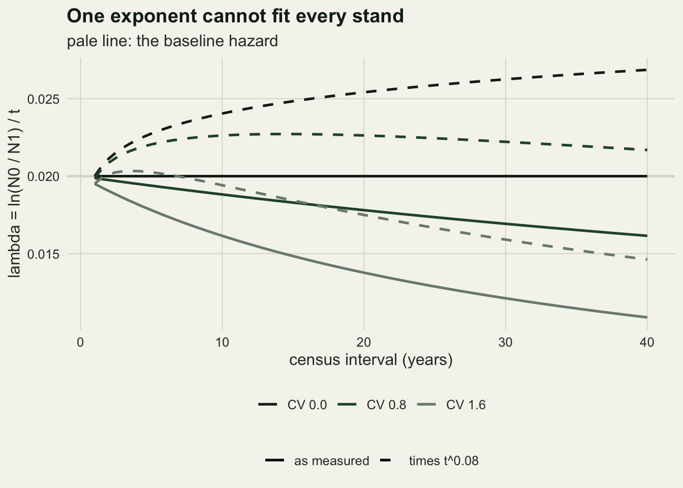
What to report
Report the census interval next to every mortality rate, and report the formula. A table of plot rates without intervals cannot be read, because the same forest gives different numbers from different intervals even when every count is exact.
Use the compound or logarithmic annualisation. The proportion dead divided by years has an interval bias under a constant hazard, and in this model that artefact was larger than the heterogeneity effect at a coefficient of variation of 0.8.
Compare plots on equal intervals when the raw censuses allow it. A plot remeasured every five years for twenty can be reported both ways, and because consecutive logarithmic rates average exactly to the long rate, both numbers come from the same data without any modelling. Where only unequal intervals exist, state that the plot with the shorter interval is expected to report the higher rate, and give the size of the bias for a plausible frailty spread as a sensitivity range rather than a correction.
If a correction is applied, say which and why. The Lewis exponent is an empirical average from the multicensus plots it was fitted to; under this model it overcorrects a stand with a coefficient of variation of 0.8 and adds bias to a stand of identical trees.
Honest limits
The frailty model is the simplest that produces the effect: a gamma distribution of risk that each tree keeps for life, and a baseline hazard constant in time. Real trees change risk as they grow, are released by a neighbour’s death, or are hit by a drought year that kills the frail and the sturdy together. An ageing or size related hazard produces a trend in the rates that the census interval cannot be separated from, and a gamma frailty was chosen because it has a closed form, not because tree risk is known to follow it. Other frailty distributions give the same direction with different sizes.
Recruitment is excluded. Every rate here is the mortality of a closed cohort. In a plot that tags new recruits at each census, the new trees are small stems that may partly refill the high risk class, which would change the size of the bias for stand level rates; Sheil and May treat recruitment rates as well, and none of that is simulated here.
The baseline hazard and the grid of frailty spreads were fixed in advance, and the frailty variance of a real stand is not observable from two censuses of a cohort. Everything quantitative above is conditional on those values. The plot simulation adds only binomial counting noise; spatial clumping of mortality, tree fall gaps and stand wide disturbance would all widen the between plot spread and make a single plot pair even less informative about the interval bias.
The Lewis correction was judged only against this model. Its exponent was fitted to real multicensus plots, which carry every kind of heterogeneity and change the model leaves out, so the finding here is that a fixed exponent cannot be right for stands of different heterogeneity, not that the published value is wrong for the plots it came from.
References
Sheil D, Burslem DFRP, Alder D 1995 Journal of Ecology 83(2):331-333 (10.2307/2261571)
Sheil D, May RM 1996 Journal of Ecology 84(1):91-100 (10.2307/2261703)
Lewis SL, Phillips OL, Sheil D et al 2004 Journal of Ecology 92(6):929-944 (10.1111/j.0022-0477.2004.00923.x)
Vaupel JW, Manton KG, Stallard E 1979 Demography 16(3):439-454 (10.2307/2061224)