library(ggplot2)
library(patchwork)

te_paper  <- "#f5f4ee"
te_ink    <- "#16241d"
te_body   <- "#2c3a31"
te_forest <- "#275139"
te_rust   <- "#b5534e"
te_gold   <- "#c9b458"
te_line   <- "#dad9ca"

theme_datasheet <- function() {
  theme_minimal(base_size = 12) +
    theme(plot.background  = element_rect(fill = te_paper, colour = NA),
          panel.background = element_rect(fill = te_paper, colour = NA),
          panel.grid.major = element_line(colour = te_line, linewidth = 0.3),
          panel.grid.minor = element_blank(),
          text             = element_text(colour = te_body),
          plot.title       = element_text(colour = te_ink, face = "bold"),
          plot.subtitle    = element_text(colour = te_body),
          axis.text        = element_text(colour = te_body))
}

n_sp   <- 30
n_yr   <- 20
sd_log <- 0.04

set.seed(2026)
trend_log <- rnorm(n_sp, 0, sd_log)
idx_sp    <- exp(outer(trend_log, 0:n_yr))
arith_one <- colMeans(idx_sp)
geom_one  <- exp(colMeans(log(idx_sp)))
med_one   <- apply(idx_sp, 2, median)

kind_three <- c("arithmetic mean", "geometric mean", "median species")
mean_trend_one <- mean(trend_log)
n_up      <- sum(trend_log > 0)
best_one  <- max(idx_sp[, n_yr + 1])
worst_one <- min(idx_sp[, n_yr + 1])Combining species trends into one index
R
monitoring
biodiversity
time series
ecology tutorial
The arithmetic mean of species indices climbs when the average species is flat. Building a multi-species biodiversity indicator in R, and pricing the logs.
A breeding bird scheme counts thirty species at a fixed set of sites, once a year, for twenty years. Each species ends up with its own annual index, scaled so that the first year equals one. The scheme then publishes a single headline: the multi-species indicator, the average of those thirty indices, and a sentence saying whether the group is up or down.
The averaging step looks like bookkeeping. It is not. An index is a ratio, ratios compound multiplicatively, and the arithmetic mean of a set of ratios is not the average ratio in any sense a reader would recognise. A species that doubles arrives at the sum as two. A species that halves arrives as one half. As biology those two are equal and opposite; as arithmetic they are not, and the imbalance has a direction. It is always upwards.
This post measures the size of that imbalance. First on communities whose species trends are drawn around a mean of exactly zero, so that any movement in the indicator is the indicator talking about itself. Then on populations that are completely stable, where the only thing left is Poisson counting error. Then on the two ways an indicator is assembled from annual ratios, the chained form and the base year form, which are the same number by algebra until the set of species stops being the same set.
Two other posts here cover the gap between an arithmetic and a geometric mean, and both are about a different object. Bet-hedging is about one lineage multiplied through successive years, where the geometric mean is the growth rate that survives. Allometry and log-log regression is about back-transforming a single fitted value from the log scale, where the correction is a variance term. Here the average is taken sideways, across species within a year, and only then followed through time. The two earlier posts are useful preparation, and neither of them answers the question below. Estimating a population trend deals with one population; this is the arithmetic of putting many of them in the same sentence.
The arithmetic mean climbs when the average species is flat
Thirty species, twenty years, one log trend per species drawn from a normal centred on zero. Every species is a clean exponential with no observation error at all, so there is nothing here but the averaging.
In this one community 14 of the 30 species are increasing and the rest are decreasing, and the mean log trend that came out of the draw is -0.0029 per year, which is very slightly negative. After 20 years the best species stands at 4.60 times its starting value and the worst at 0.13.
The three ways of summarising that spread disagree. The arithmetic mean of the thirty indices is 1.338, the geometric mean is 0.944, and the median species is 0.906. One of those three says the group has gained a third. The other two say it has lost ground, which is what the mean log trend says as well.
sp_long <- data.frame(
  year = rep(0:n_yr, each = n_sp), index = as.vector(idx_sp),
  species = rep(seq_len(n_sp), times = n_yr + 1))
avg_long <- data.frame(
  year = rep(0:n_yr, 3), index = c(arith_one, geom_one, med_one),
  kind = rep(kind_three, each = n_yr + 1))
ggplot(sp_long, aes(year, index)) +
  geom_line(aes(group = species), colour = te_body, alpha = 0.22, linewidth = 0.35) +
  geom_line(data = avg_long, aes(colour = kind), linewidth = 1.1) +
  scale_colour_manual(values = c(te_rust, te_forest, te_gold), name = NULL) +
  scale_y_log10(breaks = c(0.2, 0.5, 1, 2, 5)) +
  labs(x = "year", y = "index (first year = 1, log scale)",
       title = "One community, three summaries",
       subtitle = "on a log axis the geometric mean sits in the middle of the bundle") +
  theme_datasheet() +
  theme(legend.position = "bottom")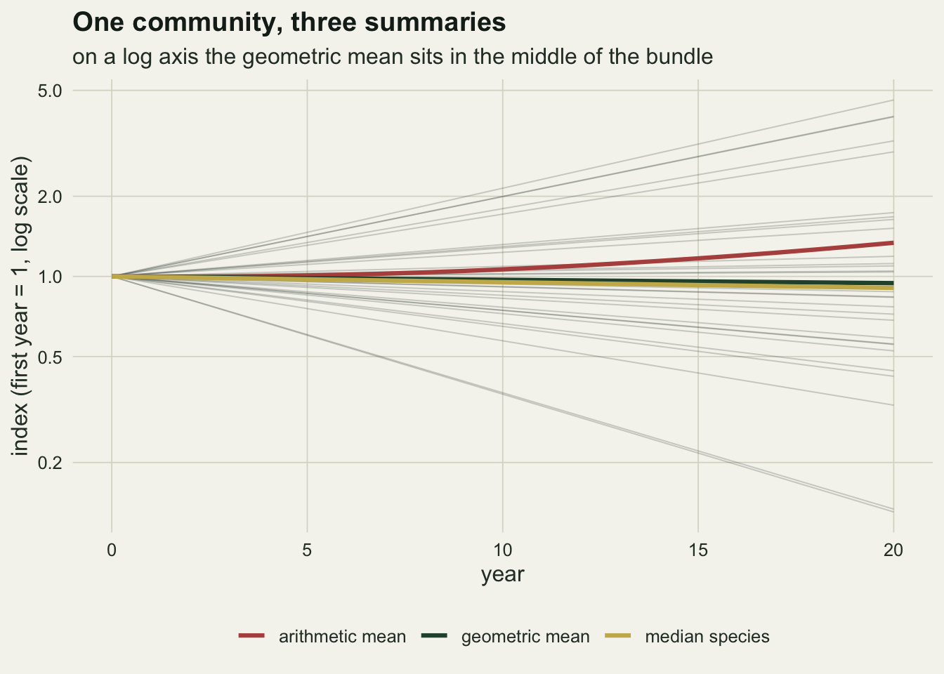
The log axis is doing something specific in that figure. On it, the geometric mean is the ordinary average of the drawn lines, which is why it tracks the centre of the bundle. The arithmetic mean is not the centre of anything; it is pulled by the top of the fan, and the fan opens upwards because an exponential does.
The gap is the variance of the trends, and it grows with the square of time
One community is one draw. Repeat it, holding the generating mean log trend at exactly zero, and the arithmetic mean is not merely noisy: it is biased, and the bias has a closed form.
n_rep <- 2000
set.seed(1867)
sim_acc <- replicate(n_rep, {
  trend_i <- rnorm(n_sp, 0, sd_log)
  path_i  <- exp(outer(trend_i, 0:n_yr))
  rbind(colMeans(path_i), exp(colMeans(log(path_i))), apply(path_i, 2, median))
})
traj_out <- apply(sim_acc, c(1, 2), mean)
sim_out  <- sim_acc[, n_yr + 1, ]
arith_bar <- mean(sim_out[1, ])
geom_bar  <- mean(sim_out[2, ])
med_bar   <- mean(sim_out[3, ])
arith_pct <- 100 * (arith_bar - 1)
share_up  <- mean(sim_out[1, ] > 1)
mc_se     <- sd(sim_out[1, ]) / sqrt(n_rep)
arith_theory <- exp((sd_log * n_yr)^2 / 2)
arith_cond   <- exp((sd_log * n_yr)^2 * (1 - 1 / n_sp) / 2)
geom_theory  <- exp((sd_log * n_yr)^2 / (2 * n_sp))
Across 2000 communities the arithmetic indicator averages 1.3748 at year 20, a rise of 37.5 per cent produced by species whose log trends were drawn from a distribution centred on zero. The Monte Carlo standard error on that average is 0.0053, so the rise is not a sampling accident. It goes the same way in 96.3 per cent of the simulated communities. The geometric indicator averages 1.0075 and the median species 1.0136.
The closed form is the lognormal mean. If the log trends have standard deviation s and the horizon is t years, the expected arithmetic index is exp(t^2 * s^2 / 2), which for these settings is 1.3771. That expectation is taken over the draw as a whole, and the realised mean log trend of any one community is not exactly zero: the first community above came out at -0.0029. Conditioning on a realised mean of exactly zero costs one part in 30 of the exponent, exp(t^2 * s^2 * (1 - 1 / S) / 2) or 1.3625, so the scatter of realised means accounts for almost none of the rise. The geometric index has the same exponent divided by the number of species, exp(t^2 * s^2 / (2 * S)), or 1.0107 here, because the geometric mean of the indices is the exponential of an average of 30 log trends and it is that average, not each trend, that has to be exponentiated.
sd_grid  <- seq(0, 0.08, by = 0.01)
n_sweep  <- 20000
set.seed(4004)
sweep_rep <- lapply(sd_grid, function(sd_i) replicate(n_sweep, {
  final_i <- exp(rnorm(n_sp, 0, sd_i) * n_yr)
  c(mean(final_i), exp(mean(log(final_i))))
}))
sweep_out <- vapply(sweep_rep, rowMeans, numeric(2))
sd_fine  <- seq(0, max(sd_grid), length.out = 200)
sd_hi    <- max(sd_grid)
hi_both  <- sweep_out[, length(sd_grid)]
hi_theory <- exp((sd_hi * n_yr)^2 / 2)
hi_se    <- sd(sweep_rep[[length(sd_grid)]][1, ]) / sqrt(n_sweep)
sp_hi    <- exp(sd_hi * n_yr)
The sweep repeats the experiment across a range of trend spreads, and the log trends behind every point on it are centred on zero. At the widest spread on the grid, a log trend standard deviation of 0.08, a species one standard deviation above the mean multiplies by 4.95 over the twenty years and its opposite number divides by the same factor. The arithmetic indicator ends at 3.580 and the geometric at 1.042. That top point is the noisiest number in the post: an average of lognormal ratios has a long right tail, so even 20000 communities leave it with a standard error of 0.015 against a closed form of 3.5966.
traj_long <- data.frame(
  year = rep(0:n_yr, 3), index = as.vector(t(traj_out)),
  kind = rep(kind_three, each = n_yr + 1))
p_traj <- ggplot(traj_long, aes(year, index, colour = kind)) +
  geom_line(linewidth = 1.1) +
  scale_colour_manual(values = c(te_rust, te_forest, te_gold), name = NULL) +
  labs(x = "year", y = "mean indicator value",
       title = "Trends centred on zero",
       subtitle = "averaged over 2000 communities") +
  theme_datasheet() +
  theme(legend.position = "bottom", legend.direction = "horizontal")
sweep_long <- data.frame(
  sd_trend = rep(sd_grid, 2), index = as.vector(t(sweep_out)),
  kind     = rep(kind_three[1:2], each = length(sd_grid)))
theory_long <- data.frame(
  sd_trend = rep(sd_fine, 2), kind = rep(kind_three[1:2], each = length(sd_fine)),
  index = exp((sd_fine * n_yr)^2 / rep(c(2, 2 * n_sp), each = length(sd_fine))))
p_sweep <- ggplot(sweep_long, aes(sd_trend, index, colour = kind)) +
  geom_line(data = theory_long, linewidth = 0.7, alpha = 0.7) +
  geom_point(size = 2.2) +
  scale_colour_manual(values = c(te_rust, te_forest), name = NULL) +
  labs(x = "standard deviation of species log trend",
       y = "indicator at year 20",
       title = "How fast the gap opens",
       subtitle = "lines: lognormal expectation") +
  theme_datasheet() +
  theme(legend.position = "none")
p_traj + p_sweep + plot_layout(guides = "collect") +
  plot_annotation(theme = theme_datasheet() + theme(legend.position = "bottom"))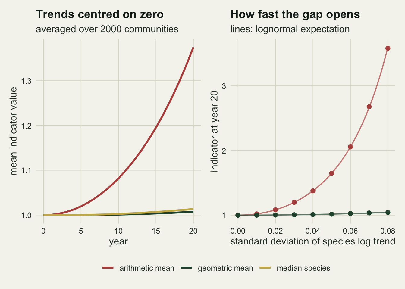
Counting error alone is enough
The first result needs real heterogeneity among species. The second needs nothing at all. Take thirty populations that never change, count them with a Poisson detector, and form each species index as the count in year t over the count in the base year. Zero counts are replaced by a floor of one half, which is the sort of patch a real indicator applies and which is examined further below.
lam_set    <- c(40, 5, 2)
zero_floor <- 0.5
n_pois     <- 4000
index_pair <- function(cnt) {
  y_use <- pmax(cnt, zero_floor)
  ratio <- y_use / y_use[, 1]
  rbind(colMeans(ratio), exp(colMeans(log(ratio))))
}
set.seed(5150)
pois_rep <- lapply(lam_set, function(lam) {
  replicate(n_pois, index_pair(matrix(rpois(n_sp * (n_yr + 1), lam), n_sp)))
})
pois_traj <- lapply(pois_rep, function(a_i) apply(a_i, c(1, 2), mean))
pois20 <- vapply(pois_traj, function(m_i) m_i[, n_yr + 1], numeric(2))

k_grid  <- 0:400
pois_ex <- function(lam, f_i) sum(f_i(k_grid) * dpois(k_grid, lam))
inv_y   <- function(k_i) 1 / pmax(k_i, zero_floor)
flat_ex <- function(lam) pois_ex(lam, function(k_i) pmax(k_i, zero_floor)) *
                         pois_ex(lam, inv_y)
recip_lo    <- pois_ex(lam_set[3], inv_y)
recip_infl  <- recip_lo * lam_set[3]
flat_lo     <- flat_ex(lam_set[3])
wobble_lo   <- range(pois_traj[[3]][1, -1])
v_log_lo    <- pois_ex(lam_set[3], function(k_i) log(pmax(k_i, zero_floor))^2) -
               pois_ex(lam_set[3], function(k_i) log(pmax(k_i, zero_floor)))^2
geo_pred_lo <- exp(2 * v_log_lo / (2 * n_sp))
geo_se_lo   <- sd(pois_rep[[3]][2, n_yr + 1, ]) / sqrt(n_pois)
excess_ratio <- min((pois20[1, ] - 1) / (pois20[2, ] - 1))
pois_se <- vapply(pois_rep, function(a_i) sd(a_i[1, n_yr + 1, ]), 0) / sqrt(n_pois)
At a mean count of 40 birds per species per year, which is a well surveyed common species, the arithmetic indicator reaches 1.0275 by year 20 on populations that did not move. At a mean count of 5 it reaches 1.3455, and at a mean count of 2 it reaches 1.6010. The geometric indicator over the same three settings gives 1.0020, 1.0081 and 1.0204.
The mechanism is the base year. A ratio has a random denominator, and for a small count the expectation of the reciprocal sits above the reciprocal of the mean, multiplicatively rather than additively. A raw Poisson count has no expected reciprocal at all, because zero has positive probability; with the floor in place, at a mean count of 2 the expected reciprocal is 0.7692, which is 1.538 times one over the mean against a second order prediction of one plus one over the mean, 1.500. Species that happened to be undercounted in the base year get a permanently inflated index for the rest of the series, and no later year cancels it, because the base year appears in every ratio. The arithmetic mean adds those inflated values up.
The geometric mean adds their logarithms, where the same species is exactly as far below zero in a bad base year as it would be above zero in a good one, so the expected log ratio is zero. Exponentiating that average does not give one, though, and the reason is the closed form of the previous section: the geometric index carries exp(v / (2 * S)) with v the variance of a single species log ratio. At the smallest mean count that predicts 1.0161 against the measured 1.0204, whose standard error is 0.0029. The geometric indicator is not exactly one either. Its excess over one is smaller than the arithmetic excess by a factor of at least 14 across the three mean counts, which is why the recommendation below is still to average on the log scale.
The figure shows a level shift rather than a trend, and the shift is finished after a single year. For any year after the base year the numerator and the denominator are independent counts from the same distribution, so the expected index is the expected count times the expected reciprocal whatever the year: 1.5905 at the smallest mean count, in year one and in year 20 alike. There is nothing for the remaining 19 years to accumulate, and what the simulated trajectory does over those years is wobble, between 1.5921 and 1.6047: a band 0.013 wide against a first year step from one to 1.5905. The band sits a little above the exact value as a whole, because every year in a replicate divides by the same base year counts and their Monte Carlo errors move together. That is the signature to look for: a step at the start of the series that no biology accounts for, followed by a flat line at the wrong level.
set.seed(7150)
drop_out <- vapply(lam_set, function(lam) {
  rowMeans(replicate(n_pois, {
    cnt  <- matrix(rpois(n_sp * (n_yr + 1), lam), n_sp)
    keep <- cnt[, 1] > 0 & cnt[, n_yr + 1] > 0
    c(mean(cnt[keep, n_yr + 1] / cnt[keep, 1]), mean(keep))
  }))
}, numeric(2))
drop_theory <- function(lam) {
  p_pos <- dpois(k_grid[-1], lam) / (1 - dpois(0, lam))
  sum(k_grid[-1] * p_pos) * sum(p_pos / k_grid[-1])
}
floor_share <- vapply(lam_set, function(lam)
  100 * (flat_ex(lam) - drop_theory(lam)) / (flat_ex(lam) - 1), 0)
p0_hi     <- dpois(0, lam_set[1])
drop_lo   <- drop_theory(lam_set[3])
discard_lo <- 100 * (1 - (1 - dpois(0, lam_set[3]))^2)
The floor is not all of it, and how much of it the floor is depends entirely on the mean count. Start at the top of the range, where the question settles cleanly: at a mean count of 40 the chance that a species scores a zero in a given year is \(4.2 \times 10^{-18}\), so the floor is essentially never applied, and the indicator still reaches 1.0275. Nothing there is a patch. It is the ratio.
Lower down the floor does carry a share, and it is worth measuring rather than asserting. Drop the species with a zero at either end instead of flooring them and the expected index at the smallest mean count falls to 1.3337 from 1.5905, so the floor supplies 43 per cent of the excess over one; the simulation puts the dropped version at 1.3326. At the middle mean count the expected index falls to 1.2976 from 1.3485, so the floor’s share is 15 per cent; the simulation puts the dropped version at 1.3034 against 1.3455 for the floor. Dropping is not the cheap way out either: at the smallest mean count it discards 25.2 per cent of the species, which is one minus the square of one minus the zero probability and needs no simulation to know.
This is the sharper of the two results, because rare species are exactly the ones an indicator exists to watch. A scheme can avoid heterogeneous trends by choosing a narrow group of species. It cannot avoid small counts.
lam_lab <- sprintf("mean count %d", lam_set)
pois_long <- do.call(rbind, lapply(seq_along(lam_set), function(k) data.frame(
  year = rep(0:n_yr, 2), index = as.vector(t(pois_traj[[k]])),
  kind = rep(kind_three[1:2], each = n_yr + 1),
  lam  = factor(lam_lab[k], levels = lam_lab))))
ggplot(pois_long, aes(year, index, colour = lam, linetype = kind)) +
  geom_line(linewidth = 0.9) +
  scale_colour_manual(values = c(te_forest, te_gold, te_rust), name = NULL) +
  scale_linetype_manual(values = c("solid", "22"), name = NULL) +
  labs(x = "year", y = "indicator value",
       title = "Stable populations, moving indicator",
       subtitle = "every population has a constant expected count") +
  theme_datasheet() +
  theme(legend.position = "bottom", legend.box = "vertical",
        legend.spacing.y = unit(0, "pt"))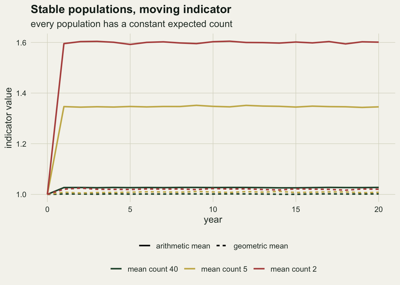
Chaining and rebasing are the same index until the species set moves
Indicators are built in two ways. The base year form compares every year with the first year: the index is the geometric mean over species of y[i, t] / y[i, 0]. The chained form multiplies annual ratios: each year contributes the geometric mean over species of y[i, s] / y[i, s - 1], and the index is the running product.
With a complete matrix of counts these are the same number, and the reason is two lines. The log of the chained index at year t is the sum over steps of the mean over species of log(y[i, s]) - log(y[i, s - 1]). Swapping the order of the two sums, the inner sum over steps telescopes to log(y[i, t]) - log(y[i, 0]), which leaves the mean over species of the base year log ratio. That is the log of the base year index.
set.seed(6120)
trend_id <- rnorm(n_sp, 0, sd_log)
count_id <- exp(outer(trend_id, 0:n_yr)) *
  matrix(rlnorm(n_sp * (n_yr + 1), 0, 0.15), n_sp)
log_id     <- log(count_id)
base_form  <- exp(colMeans(log_id - log_id[, 1]))
step_mean  <- colMeans(log_id[, -1] - log_id[, -(n_yr + 1)])
chain_form <- exp(c(0, cumsum(step_mean)))
gap_id   <- max(abs(base_form - chain_form))
equal_id <- isTRUE(all.equal(base_form, chain_form))
On a series with process noise on every species in every year, the two forms return 0.809228 and 0.809228 at year 20, and over the whole series the two agree to within floating-point rounding. The check all.equal returns TRUE. This is not a finding about data; it is an identity, and anyone who reports it as an agreement between two methods has reported nothing.
The identity holds because every species appears in every term. It fails the moment that stops being true, and there are two ordinary ways for it to stop.
n_late    <- 10
yr_enter  <- 10
rate_late <- -0.05
sd_stable <- 0.01
n_stag    <- 2000
stagger_once <- function() {
  trend_i <- c(rnorm(n_sp - n_late, 0, sd_stable), rep(rate_late, n_late))
  log_i   <- log(exp(outer(trend_i, 0:n_yr)) *
                 matrix(rlnorm(n_sp * (n_yr + 1), 0, 0.10), n_sp))
  log_i[(n_sp - n_late + 1):n_sp, 1:yr_enter] <- NA
  keep0  <- !is.na(log_i[, 1])
  base_v <- exp(colMeans(log_i[keep0, , drop = FALSE] - log_i[keep0, 1]))
  step_v <- vapply(2:(n_yr + 1), function(j) {
    ok <- !is.na(log_i[, j]) & !is.na(log_i[, j - 1])
    mean(log_i[ok, j] - log_i[ok, j - 1])
  }, 0)
  rbind(base_v, exp(c(0, cumsum(step_v))), exp(mean(trend_i) * (0:n_yr)))
}
set.seed(303)
stag <- apply(replicate(n_stag, stagger_once()), c(1, 2), mean)
stag_pct <- 100 * (1 - exp(rate_late * (n_yr - yr_enter)))
The first is staggered entry. Two thirds of the species are monitored from the start and are close to stable; the remaining 10 join the scheme in year 10 and are declining at 0.05 on the log scale per year, which is a loss of 39 per cent over the years they are watched. The base year form can only use species with a base year record, so it never sees them: it ends at 1.0015. The chained form picks them up from the year they enter and ends at 0.8474. The whole community, if every species had been monitored throughout, would have ended at 0.7167.
Neither form is the truth, and they are wrong in different ways. The base year index is a complete answer about an incomplete set of species. The chained index is an incomplete answer about a complete set, because a species contributes only the ratios it was present for. The chained form uses more of the data and is the standard choice for that reason, but its year 20 value is no longer a comparison of anything with the base year.
break_once <- function(lam) {
  cnt <- matrix(rpois(n_sp * (n_yr + 1), lam), n_sp)
  log_i <- log(cnt)
  log_i[!is.finite(log_i)] <- NA
  keep0  <- !is.na(log_i[, 1]) & !is.na(log_i[, n_yr + 1])
  step_v <- vapply(2:(n_yr + 1), function(j) {
    ok <- !is.na(log_i[, j]) & !is.na(log_i[, j - 1])
    mean(log_i[ok, j] - log_i[ok, j - 1])
  }, 0)
  c(exp(mean(log_i[keep0, n_yr + 1] - log_i[keep0, 1])), exp(sum(step_v)))
}
gap_cut <- 0.1
set.seed(909)
brk       <- replicate(n_pois, break_once(lam_set[3]))
gap_break <- abs(brk[1, ] - brk[2, ])
gap_share <- mean(gap_break > gap_cut)
The second way is zeros, and it is the more common one. A count of zero has no logarithm, so every practical indicator does something about it, and the most defensible looking option is to drop that species from the years where it is absent. That is exactly the move that makes the species set vary from year to year. On the stable Poisson populations of the previous section at a mean count of 2, dropping zeros leaves the base year form at 1.0089 and the chained form at 1.0390 on average, but the two forms applied to the same data set differ by a median of 0.183 and by as much as 1.87. They disagree by more than 0.1 index units in 71 per cent of the simulated schemes, on an indicator whose correct value is one.
The geometric mean is not free, and the price is the zeros
The recommendation that follows from all of the above is to average on the log scale. The cost arrives with the first zero count, because that is where the log scale has no answer at all, and a declining species generates zeros exactly when the indicator most needs to hear from it.
n_dec     <- 6
lam_start <- 20
rate_dec  <- -0.25
trend_dec <- c(rep(0, n_sp - n_dec), rep(rate_dec, n_dec))
lam_grid  <- lam_start * exp(outer(trend_dec, 0:n_yr))
truth_dec <- exp(mean(trend_dec) * n_yr)
loss_dec  <- 100 * (1 - exp(rate_dec * n_yr))
gm_last   <- function(m_i) exp(mean(log(m_i[, n_yr + 1]) - log(m_i[, 1])))
floor_one <- 1
set.seed(515)
patch_out <- replicate(n_pois, {
  cnt  <- matrix(rpois(length(lam_grid), lam_grid), n_sp)
  keep <- cnt[, 1] > 0 & cnt[, n_yr + 1] > 0
  floored <- pmax(cnt, zero_floor)
  c(gm_last(floored),
    gm_last(pmax(cnt, floor_one)),
    gm_last(cnt + floor_one),
    exp(mean(log(cnt[keep, n_yr + 1] / cnt[keep, 1]))),
    mean(keep),
    mean(floored[, n_yr + 1] / floored[, 1]))
})
patch_mean <- rowMeans(patch_out)
names(patch_mean) <- c("floor 0.5", "floor 1", "add 1", "drop",
                       "kept", "arithmetic mean")
The scenario is 30 species starting at a mean count of 20, of which 6 decline at 0.25 on the log scale per year and lose 99.3 per cent of their population over the 20 years. By the final year a declining species has an expected count of 0.13, so it is recorded as absent in 87 per cent of surveys. The correct geometric indicator, computed from the true trends, is 0.3679.
Four ordinary patches give four different answers. Flooring zero counts at 0.5 returns 0.4909. Flooring at 1.0 returns 0.5541. Adding 1.0 to every count, which is the same patch applied evenly rather than only to the zeros, returns 0.5577. Dropping any species with a zero at either end returns 0.9246, having discarded 17 per cent of the species, and those are not a random 17 per cent: they are the declining ones.
The spread across those four is the honest measure of what a zero costs. The worst of them, dropping the species, is also the most natural thing to write in code, and it turns a 63 per cent loss into an indicator reading of 0.9246. For comparison the arithmetic mean on the same data returns 0.8517, which is what an average of ratios does when most ratios are near one: the species that held their ground drown out the ones that vanished.
stag_long <- data.frame(
  year = rep(0:n_yr, 3), index = as.vector(t(stag)),
  kind = rep(c("base year form", "chained form", "all species, if monitored"),
             each = n_yr + 1))
p_stag <- ggplot(stag_long, aes(year, index, colour = kind, linetype = kind)) +
  geom_line(linewidth = 1) +
  scale_colour_manual(values = c(te_body, te_forest, te_rust), name = NULL) +
  scale_linetype_manual(values = c("22", "solid", "solid"), name = NULL) +
  labs(x = "year", y = "indicator value",
       title = "Ten species join in year 10",
       subtitle = "and they are the ones declining") +
  theme_datasheet() +
  theme(legend.position = "bottom", legend.direction = "horizontal")
patch_df <- data.frame(index = unname(patch_mean[1:4]),
  patch = factor(names(patch_mean)[1:4], levels = names(patch_mean)[1:4]))
p_patch <- ggplot(patch_df, aes(patch, index)) +
  geom_hline(yintercept = truth_dec, colour = te_body,
             linetype = "22", linewidth = 0.6) +
  geom_point(size = 3.4, colour = te_forest) +
  scale_y_continuous(limits = c(0, 1)) +
  labs(x = "zero handling", y = "indicator at year 20",
       title = "Four patches, four answers",
       subtitle = "dashed: the true geometric indicator") +
  theme_datasheet()
p_stag + p_patch + plot_layout(guides = "collect") +
  plot_annotation(theme = theme_datasheet() + theme(legend.position = "bottom"))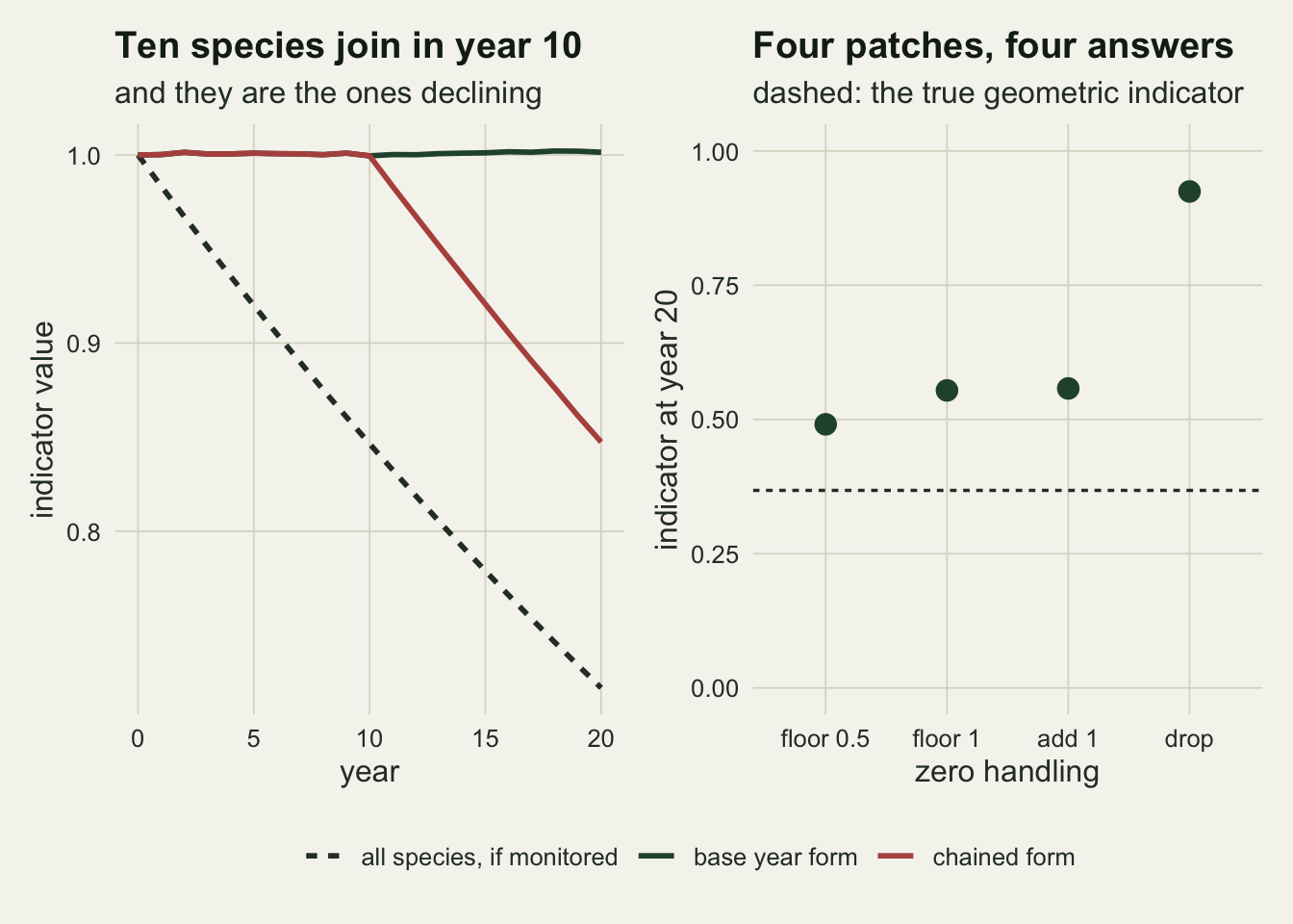
What to report
State which mean was taken. An indicator described only as “the average of the species indices” is ambiguous in a way that changes the headline by tens of per cent, and the ambiguity is invisible to a reader who does not run the numbers. The wording used by van Strien, Soldaat and Gregory is the clear one: name the mean, and say what the indicator is meant to be an average of.
Report the spread of the species trends alongside the indicator. It is the quantity that sets the size of the gap between the two means, through exp(t^2 * s^2 / 2), and it is worth having for its own sake: an indicator of one hides a community where half the species doubled and half halved just as happily as it hides a community where nothing happened.
Say how many species entered and left the scheme, and in which years. If the indicator is chained, its value at the end of the series is not a comparison with the base year and should not be described as one. Buckland and Johnston set out the design consequences of a shifting species set, and they are not repairable after the fact.
A minimum series length is the same kind of filter as a zero rule, and it fails the same way when series leave the database because the population went rather than because the funding did. Report the length distribution of the series you kept and the ones you dropped, and the reason each series ended where the source records it.
Say what was done about zeros, with the number of species and species years affected. This is the single line most often missing, it is not a technicality, and on the declining community above, the four patches spread the answer wider than the choice of mean did on the same data.
Give the individual species trends, or a link to them. A composite index is a summary of a table, and the table is small enough to publish.
Honest limits
The geometric mean is undefined at zero, and no argument in this post removes that. Every practical indicator patches it: the Living Planet Index described by Loh and colleagues works with modelled or interpolated population values rather than raw counts, and the diversity weighted version by McRae, Deinet and Freeman adds a further layer of aggregation before any averaging happens. A floor, an imputation and a smoother are all defensible; what is not defensible is picking one silently. If a monitoring scheme routinely records zeros, the recommendation to use the geometric mean is a recommendation to make a modelling decision, not to avoid one.
The species indices here are exact ratios of counts. Real schemes fit a model per species first, usually a Poisson or negative binomial regression with site and year effects, and take the fitted year effects as the index. That step removes some of the base year problem measured above, because a fitted index borrows strength across sites and years rather than resting on one count. It does not remove all of it, and it introduces a second question, which is how the uncertainty in each species index propagates into the composite. Buckland, Studeny, Magurran, Illian and Newson treat that propagation directly.
Every species is given equal weight throughout. Real indicators weight by taxonomic group, by region, or by the reliability of the underlying series, and a weighted geometric mean has the same algebra with the weights inside the average of logs. Nothing here says what the weights should be.
The trends are independent across species by construction. They are not independent in a real community: a wet decade lifts most waders together, and a run of dry years pushes them down together. Correlation does not change the direction of the arithmetic bias, but it changes the variance of the indicator sharply, so the interval around a real composite index is wider than an independence calculation suggests. Buckland, Magurran, Green and Fewster discuss what a composite index can and cannot be asked to represent when its components move together.
The simulations use 2000 communities for the main result, 2000 for the staggered entry study, 4000 for the Poisson and zero handling experiments, and 20000 for each point of the sweep. The Monte Carlo error is not the same size across those. The arithmetic Poisson indicator means have standard errors of at most 0.0049, which sits in the third decimal place while the excesses they measure run from the second decimal place to the first. The widest point of the sweep is the exception at 0.015, in the second decimal place, which is why the closed form rather than the simulated point is the thing to trust there. The last digit quoted anywhere above should be read against those numbers, not as exact.
References
van Strien AJ, Soldaat LL, Gregory RD 2012 Ecological Indicators 14(1):202-208 (10.1016/j.ecolind.2011.07.007)
Buckland ST, Studeny AC, Magurran AE, Illian JB, Newson SE 2011 Ecosphere 2(9):art100 (10.1890/ES11-00186.1)
Buckland ST, Magurran AE, Green RE, Fewster RM 2005 Philosophical Transactions of the Royal Society B 360(1454):243-254 (10.1098/rstb.2004.1589)
Loh J, Green RE, Ricketts T, Lamoreux J, Jenkins M, Kapos V, Randers J 2005 Philosophical Transactions of the Royal Society B 360(1454):289-295 (10.1098/rstb.2004.1584)
Buckland ST, Johnston A 2017 Biological Conservation 214:23-34 (10.1016/j.biocon.2017.07.034)
McRae L, Deinet S, Freeman R 2017 PLoS ONE 12(1):e0169156 (10.1371/journal.pone.0169156)