library(vegan)
library(ggplot2)

te_paper  <- "#f5f4ee"
te_ink    <- "#16241d"
te_body   <- "#2c3a31"
te_forest <- "#275139"
te_rust   <- "#b5534e"
te_gold   <- "#c9b458"
te_line   <- "#dad9ca"

theme_datasheet <- function() {
  theme_minimal(base_size = 12) +
    theme(plot.background  = element_rect(fill = te_paper, colour = NA),
          panel.background = element_rect(fill = te_paper, colour = NA),
          panel.grid.major = element_line(colour = te_line, linewidth = 0.3),
          panel.grid.minor = element_blank(),
          text             = element_text(colour = te_body),
          plot.title       = element_text(colour = te_ink, face = "bold"),
          strip.text       = element_text(colour = te_ink, face = "bold"),
          axis.text        = element_text(colour = te_body))
}Power for a community study
R
vegan
PERMANOVA
community ecology
study design
ecology tutorial
How many plots does a PERMANOVA need? Simulation shows the answer depends on the dissimilarity index, which decides what counts as a community difference.
Sample size questions have a standard answer for a t-test and no answer at all for a community study. The literature is full of designs with five or eight plots per group, an adonis2 result, and no statement of what the study could have detected. The gap is not that power analysis is hard here; it is that the first input is missing. Before you can ask how many plots, you have to say what a difference between communities means, and that decision is made by the dissimilarity index, not by the test.
This post simulates a PERMANOVA design end to end: a known difference, a sample size grid, three common indices, and a null case as a calibration check. The result is that the power of the same design, on the same data, over the same range of sample sizes, spans the full interval from nothing to certainty depending on which index you picked in the first line of the script.
A community and two ways of changing it
Thirty species with log-normal mean abundances and negative binomial counts, so the mean-variance relationship is realistic rather than Poisson. Two treatment scenarios, both plausible field outcomes.
n_sp <- 30
set.seed(20260805)
mu_base <- exp(rnorm(n_sp, mean = 1.6, sd = 0.9))

## scenario A: every taxon multiplied by 1.5, so proportions are untouched
mu_A <- mu_base * 1.5

## scenario B: turnover, with the community total held at the reference total
odd  <- seq_len(n_sp) %% 2 == 1
mu_B <- mu_base
mu_B[odd]  <- mu_base[odd] * 1.6
mu_B[!odd] <- mu_base[!odd] *
  (sum(mu_base) - sum(mu_base[odd] * 1.6)) / sum(mu_base[!odd])

a_mult    <- unique(round(mu_A / mu_base, 6))
b_up      <- max(mu_B / mu_base)
total_ref <- sum(mu_base)
total_A   <- sum(mu_A)
total_B   <- sum(mu_B)
b_down    <- min(mu_B / mu_base)
Scenario A is more of everything: every taxon is 1.5 times as abundant in the treated plots, so the expected community total rises from 337 to 506 individuals while relative composition is untouched. Scenario B is turnover: half the species rise by 60 per cent, the other half fall to 48 per cent of their reference means, and the expected total stays at 337. A field ecologist would call both a treatment effect. Two of the three indices below disagree.
scen <- data.frame(
  species  = rep(order(order(mu_base)), 3),
  mu       = c(mu_base, mu_A, mu_B),
  scenario = rep(c("reference", "A: all taxa x 1.5", "B: turnover, total held"),
                 each = n_sp))
scen$scenario <- factor(scen$scenario,
                        levels = c("reference", "A: all taxa x 1.5", "B: turnover, total held"))

ggplot(scen, aes(x = species, y = mu, colour = scenario, shape = scenario)) +
  geom_point(size = 2.1, alpha = 0.9) +
  scale_y_log10() +
  scale_colour_manual(values = c("reference" = te_body,
                                 "A: all taxa x 1.5" = te_forest,
                                 "B: turnover, total held" = te_rust)) +
  scale_shape_manual(values = c(16, 17, 15)) +
  labs(x = "species, ordered by reference abundance",
       y = "expected abundance (log scale)", colour = NULL, shape = NULL,
       title = "Two treatment scenarios a field study would both call an effect") +
  theme_datasheet() +
  theme(legend.position = "top")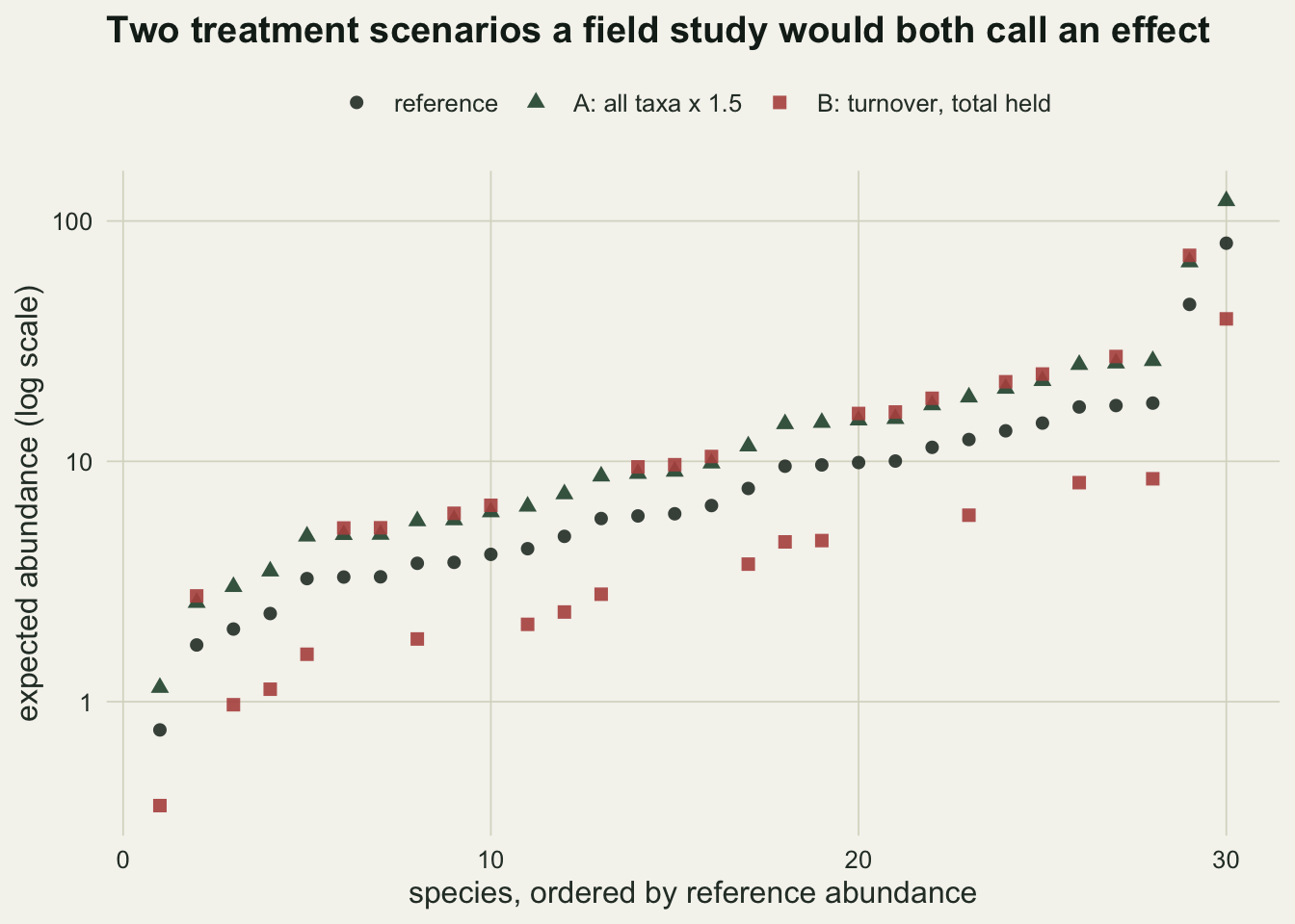
Three indices, one design
Bray-Curtis on raw counts, binary Jaccard on presence and absence, and Euclidean distance on Hellinger-transformed counts. All three are standard, all three are defensible, and they answer different questions. Bray-Curtis on raw counts responds to total abundance because it is not closed. The Hellinger transformation divides each plot by its own total, so it discards abundance and keeps proportions. Binary Jaccard discards abundance entirely.
draw <- function(mu, n, size = 5) {
  matrix(rnbinom(n * n_sp, mu = rep(mu, each = n), size = size), n, n_sp)
}

dist_of <- function(m, index) {
  if (index == "Bray-Curtis") vegdist(m, "bray")
  else if (index == "Jaccard (binary)") vegdist(m, "jaccard", binary = TRUE)
  else dist(decostand(m, "hellinger"))
}

one_run <- function(mu_treat, n, index, base = mu_base, size = 5, perms = 199) {
  m <- rbind(draw(base, n, size), draw(mu_treat, n, size))
  g <- factor(rep(c("reference", "treated"), each = n))
  a <- adonis2(dist_of(m, index) ~ g, permutations = perms)
  c(p = a$`Pr(>F)`[1], r2 = a$R2[1])
}
n_grid <- c(5, 8, 12, 20)
indices <- c("Bray-Curtis", "Jaccard (binary)", "Hellinger")
reps <- 200
grid <- expand.grid(n = n_grid, index = indices,
scenario = c("A: all taxa x 1.5", "B: turnover, total held"),
stringsAsFactors = FALSE)
grid$power <- NA_real_
grid$r2 <- NA_real_
set.seed(11)
for (k in seq_len(nrow(grid))) {
mu_t <- if (grid$scenario[k] == "A: all taxa x 1.5") mu_A else mu_B
out <- replicate(reps, one_run(mu_t, grid$n[k], grid$index[k]))
grid$power[k] <- mean(out["p", ] <= 0.05)
grid$r2[k] <- median(out["r2", ])
}
pick <- function(sc, ix, nn) {
grid$power[grid$scenario == sc & grid$index == ix & grid$n == nn]
}
sc_A <- "A: all taxa x 1.5"
sc_B <- "B: turnover, total held"
mc_se <- sqrt(0.05 * 0.95 / reps)At twenty plots per group, scenario A is detected by Bray-Curtis in 1.000 of runs, by binary Jaccard in 0.065 and by Hellinger in 0.050. The last two numbers are not low power. They are the nominal error rate: those indices see no difference at all, because the difference was removed before the test ran. Eight plots per group would have been ample for the first index and useless for the other two.
Scenario B reverses part of the ranking. Bray-Curtis reaches 0.985 at five plots per group, Hellinger 0.995, and binary Jaccard climbs slowly from 0.120 to 0.720 over the whole grid.
offsets <- c("Bray-Curtis" = -0.45, "Jaccard (binary)" = 0, "Hellinger" = 0.45)
grid$n_off <- grid$n + offsets[grid$index]

ggplot(grid, aes(x = n_off, y = power, colour = index, shape = index)) +
  geom_hline(yintercept = 0.05, linetype = "dotted", colour = te_ink) +
  annotate("text", x = 12, y = 0.115, label = "nominal 0.05",
           colour = te_ink, size = 3.3) +
  geom_line(linewidth = 0.8) +
  geom_point(size = 2.6) +
  facet_wrap(~ scenario) +
  scale_x_continuous(breaks = n_grid) +
  scale_y_continuous(limits = c(0, 1.02)) +
  scale_colour_manual(values = c("Bray-Curtis" = te_forest,
                                 "Jaccard (binary)" = te_rust,
                                 "Hellinger" = te_gold)) +
  scale_shape_manual(values = c(16, 17, 15)) +
  labs(x = "plots per group", y = "power at alpha = 0.05", colour = NULL, shape = NULL,
       title = "The same design, the same effect, three answers") +
  theme_datasheet() +
  theme(legend.position = "top")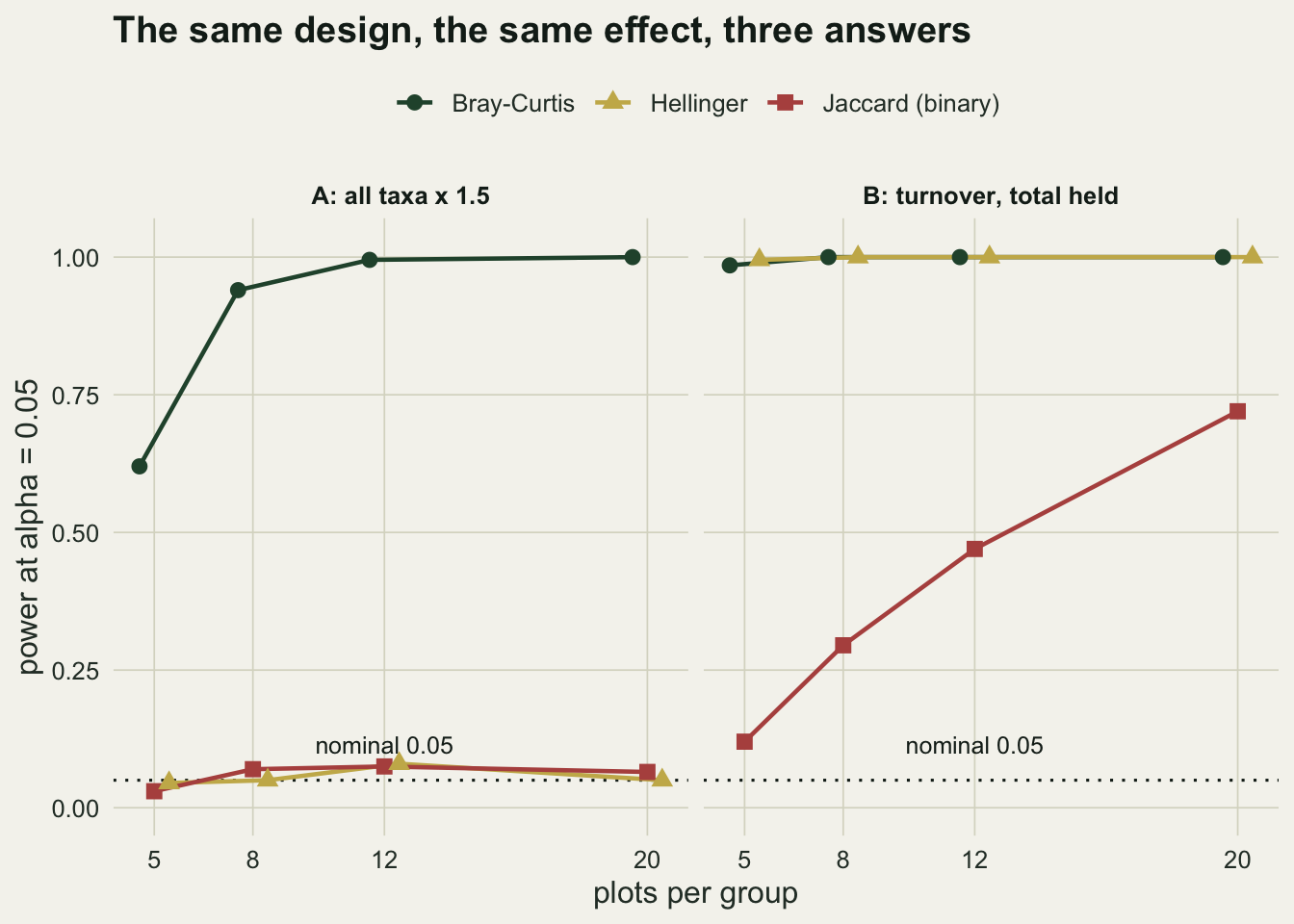
The null case, which is the part that gets skipped
A power curve without a null run is a curve with no zero on it. Here both groups are drawn from the reference community, so every rejection is a false one.
set.seed(303)
null_rate <- sapply(indices, function(ix) {
  mean(replicate(reps, one_run(mu_base, 12, ix)["p"]) <= 0.05)
})
null_rate
Bray-Curtis Jaccard (binary) Hellinger
0.075 0.045 0.060 At twelve plots per group the three indices reject in 0.075, 0.045 and 0.060 of runs. With 200 replicates the Monte Carlo standard error on a rate near the nominal level is 0.015, so all three sit within sampling error of 0.05. That matters for reading the power table: the flat Jaccard and Hellinger curves in scenario A are exactly this rate, not a weak signal.
null_df <- data.frame(index = factor(names(null_rate), levels = indices),
                      rate = as.numeric(null_rate))
null_df$lo <- pmax(0, null_df$rate - 1.96 * mc_se)
null_df$hi <- null_df$rate + 1.96 * mc_se

ggplot(null_df, aes(x = index, y = rate, fill = index)) +
  geom_col(width = 0.5) +
  geom_errorbar(aes(ymin = lo, ymax = hi), width = 0.12, colour = te_ink) +
  geom_hline(yintercept = 0.05, linetype = "dotted", colour = te_ink) +
  annotate("text", x = 0.62, y = 0.062, label = "nominal", colour = te_ink, size = 3.4) +
  scale_fill_manual(values = c("Bray-Curtis" = te_forest,
                               "Jaccard (binary)" = te_rust,
                               "Hellinger" = te_gold), guide = "none") +
  labs(x = NULL, y = "false positive rate", title = "Calibration check: no difference in the data") +
  theme_datasheet()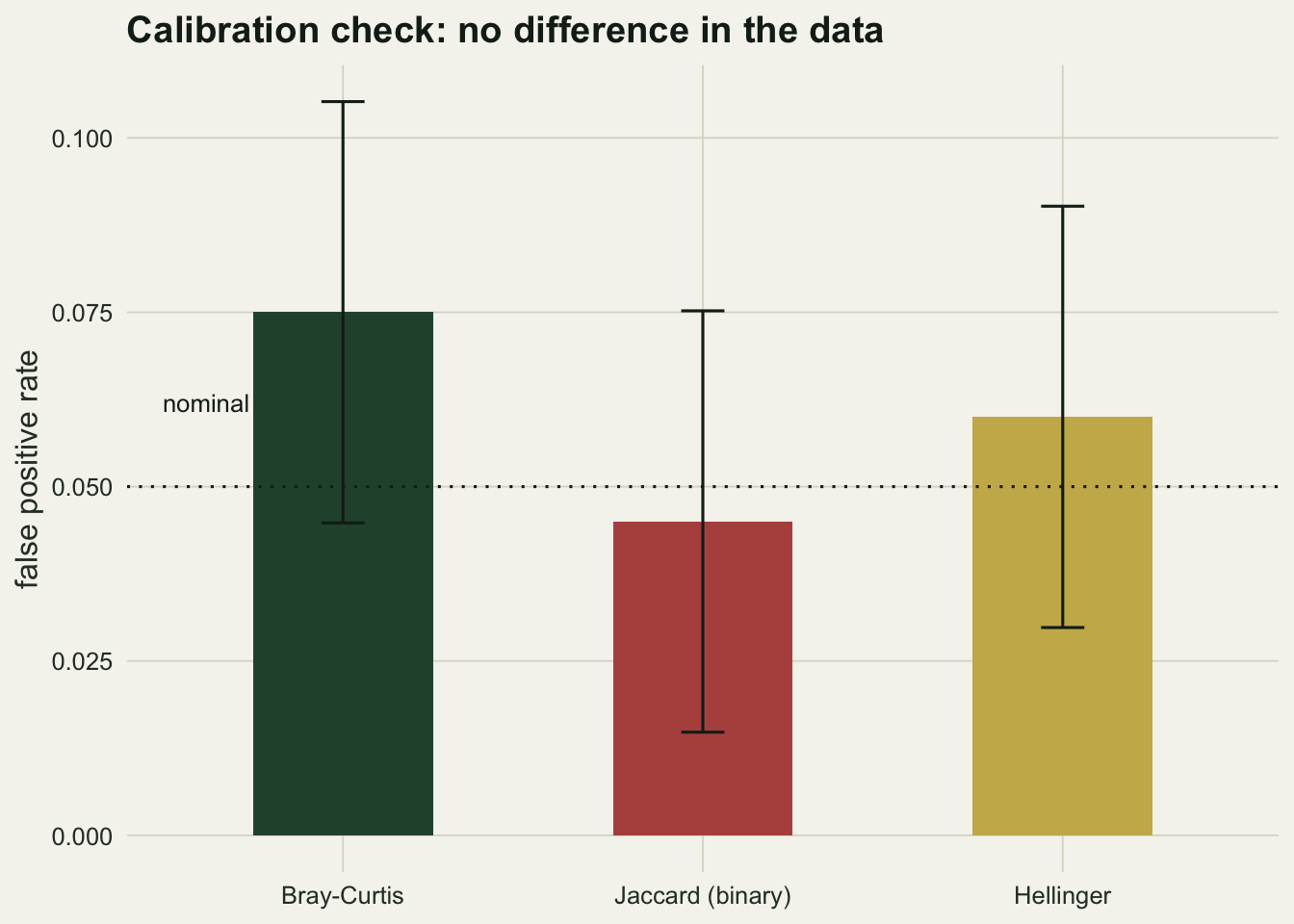
Effect size on each scale
The reason the three curves separate is visible in the variance explained. The same twenty-plot study gives a median R-squared of 0.150 for Bray-Curtis under scenario A, against 0.026 for Hellinger. Under scenario B those become 0.256 and 0.239. The index is not filtering noise; it is defining the signal.
Would binary Jaccard do better in a sparser community?
The matrix above is species-rich and nearly filled, so presence and absence carries almost nothing. That is a property of the simulation, not of Jaccard, and it is worth measuring rather than assuming. The same means divided by twelve give a matrix with many zeros.
mu_s  <- mu_base / 12
mu_sA <- mu_s * 1.5
mu_sB <- mu_s
mu_sB[odd]  <- mu_s[odd] * 1.6
mu_sB[!odd] <- mu_s[!odd] * (sum(mu_s) - sum(mu_s[odd] * 1.6)) / sum(mu_s[!odd])

set.seed(202)
occupancy <- mean(draw(mu_s, 500) > 0)
sparse <- expand.grid(index = indices, scenario = c(sc_A, sc_B), stringsAsFactors = FALSE)
sparse$power <- NA_real_
for (k in seq_len(nrow(sparse))) {
  mu_t <- if (sparse$scenario[k] == sc_A) mu_sA else mu_sB
  sparse$power[k] <- mean(replicate(reps, one_run(mu_t, 12, sparse$index[k],
                                                  base = mu_s)["p"]) <= 0.05)
}
sparse_jac_A <- sparse$power[sparse$index == "Jaccard (binary)" & sparse$scenario == sc_A]
rich_jac_A   <- pick(sc_A, "Jaccard (binary)", 12)
With 44 per cent of cells occupied, binary Jaccard detects scenario A in 0.205 of runs at twelve plots per group, against 0.075 in the rich matrix. Adding individuals to a sparse community also adds detections, so a presence index stops being blind to abundance. The lesson survives in a weaker form: the index still decides what the study can see, and now sparsity decides how much.
comp <- rbind(
  data.frame(index = grid$index[grid$n == 12], scenario = grid$scenario[grid$n == 12],
             power = grid$power[grid$n == 12], matrix = "rich (few zeros)"),
  data.frame(index = sparse$index, scenario = sparse$scenario,
             power = sparse$power, matrix = "sparse (many zeros)"))
comp$index <- factor(comp$index, levels = indices)

ggplot(comp, aes(x = index, y = power, fill = matrix)) +
  geom_col(position = position_dodge(width = 0.7), width = 0.62) +
  facet_wrap(~ scenario) +
  scale_fill_manual(values = c("rich (few zeros)" = te_forest,
                               "sparse (many zeros)" = te_gold)) +
  scale_y_continuous(limits = c(0, 1.05)) +
  labs(x = NULL, y = "power at twelve plots per group", fill = NULL,
       title = "Sparsity changes what a presence index can detect") +
  theme_datasheet() +
  theme(legend.position = "top", axis.text.x = element_text(angle = 20, hjust = 1))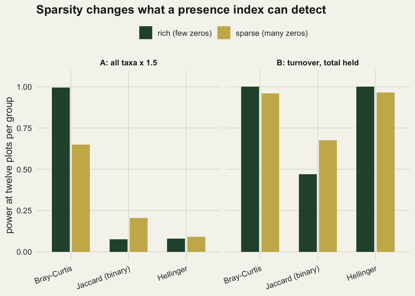
Cover classes are a transformation you cannot undo
Everything above assumes the counts reach the analyst intact. Vegetation surveys usually do not work that way. The field sheet carries a Braun-Blanquet class, so the compression happens with a clipboard in hand, months before anyone argues about square roots, and nothing later can undo it. That puts the recording protocol on the same ladder as the transformations, and the position on the ladder can be measured with the design already built.
To get both onto one scale, read the simulated abundances as cover through a single conversion, the same constant in every plot, set so the reference community fills the quadrat on average. Absolute abundance survives that step, so scenario A still raises cover everywhere, and Bray-Curtis on the converted matrix is the same analysis as Bray-Curtis on the counts, because the index does not notice a common multiplier. The conversion carries one part that is not a multiplier: it clips at a hundred per cent, because no quadrat can hold more cover than it has area. That bites on a handful of cells across the whole ladder, the richest plots of the treated group, and a field sheet would record those at full cover too, so the clipping belongs to the recording protocol rather than to the simulation. Without it the two dissimilarity matrices agree to machine precision. Then code the same plots five ways and hand each version to the same test.
cover_of <- function(m) pmin(100 * m / total_ref, 100)
bb_break <- c(0, 1, 5, 25, 50, 75, 100)
bb_mid   <- c(0.5, 3, 15, 37.5, 62.5, 87.5)
bb_edges <- paste(bb_break[-1], collapse = ", ")
bb_mids  <- paste(bb_mid, collapse = ", ")

code_as <- function(m, how) {
  p <- cover_of(m)
  if (how == "cover per cent") p
  else if (how == "square root") sqrt(p)
  else if (how == "cover classes")
    ifelse(p <= 0, 0, bb_mid[pmax(findInterval(p, bb_break, left.open = TRUE), 1)])
  else if (how == "fourth root") p^0.25
  else (p > 0) * 1
}

codings <- c("cover per cent", "square root", "cover classes", "fourth root", "presence only")
lad_n   <- c(5, 8)
ladder  <- expand.grid(n = lad_n, coding = codings, stringsAsFactors = FALSE)
ladder$power <- NA_real_

set.seed(8081)
for (nn in lad_n) {
  ps <- replicate(reps, {
    m <- rbind(draw(mu_base, nn), draw(mu_A, nn))
    g <- factor(rep(c("reference", "treated"), each = nn))
    sapply(codings, function(h)
      adonis2(vegdist(code_as(m, h), "bray") ~ g, permutations = 199)$`Pr(>F)`[1])
  })
  ladder$power[ladder$n == nn] <- rowMeans(ps <= 0.05)[ladder$coding[ladder$n == nn]]
}

lad5 <- setNames(ladder$power[ladder$n == 5], ladder$coding[ladder$n == 5])
lad8 <- setNames(ladder$power[ladder$n == 8], ladder$coding[ladder$n == 8])
se_of <- function(p) sqrt(p * (1 - p) / reps)
class_same <- sum(code_as(rbind(mu_base), "cover classes") ==
                  code_as(rbind(mu_A), "cover classes"))
The classes are the usual cover bands, with upper edges at 1, 5, 25, 50, 75, 100 per cent and each band scored at its midpoint, 0.5, 3, 15, 37.5, 62.5, 87.5 per cent, which is what a field data set carries by the time it reaches an analyst. The lowest band holds both the r and the plus of the full scale: those two differ by number of individuals rather than by cover, and cover is all this simulation has.
At five plots per group the same simulated studies are detected in 0.625 of runs from the recorded percentage, 0.805 after a square root, 0.450 from the class codes, 0.640 after a fourth root and 0.035 from presence alone, with a Monte Carlo standard error of about 0.035 on the middle of that range. The top rung is the earlier grid’s Bray-Curtis cell in different units, and it lands where it should: 0.625 here against 0.620 there, which is the check that the conversion itself did nothing.
Two of those numbers do not follow the compression story. The square root beats the untransformed percentage, because shrinking the dominants also shrinks their negative binomial noise, and the test is comparing a difference against that variance. The class codes are weaker than the fourth root although they compress less: a root transform keeps every small difference and squashes it, while the bands delete the small differences outright. At the expected covers, the fifty per cent rise moves 10 of the thirty species across a boundary and leaves the other 20 recorded exactly as before, so most of the effect never reaches the file. At eight plots per group the ordering holds, 0.870 for the classes against 0.970 for the fourth root.
ladder$coding <- factor(ladder$coding, levels = codings)
ladder$plots  <- factor(paste(ladder$n, "plots per group"),
                        levels = paste(lad_n, "plots per group"))

ggplot(ladder, aes(x = coding, y = power, colour = plots, shape = plots, group = plots)) +
  geom_hline(yintercept = 0.05, linetype = "dotted", colour = te_ink) +
  geom_line(linewidth = 0.8) +
  geom_point(size = 2.8) +
  scale_colour_manual(values = c("5 plots per group" = te_forest,
                                 "8 plots per group" = te_rust)) +
  scale_shape_manual(values = c(16, 17)) +
  scale_y_continuous(limits = c(0, 1.02)) +
  labs(x = "how the same plots were recorded", y = "power at alpha = 0.05",
       colour = NULL, shape = NULL,
       title = "The recording sheet is a transformation") +
  theme_datasheet() +
  theme(legend.position = "top", axis.text.x = element_text(angle = 20, hjust = 1))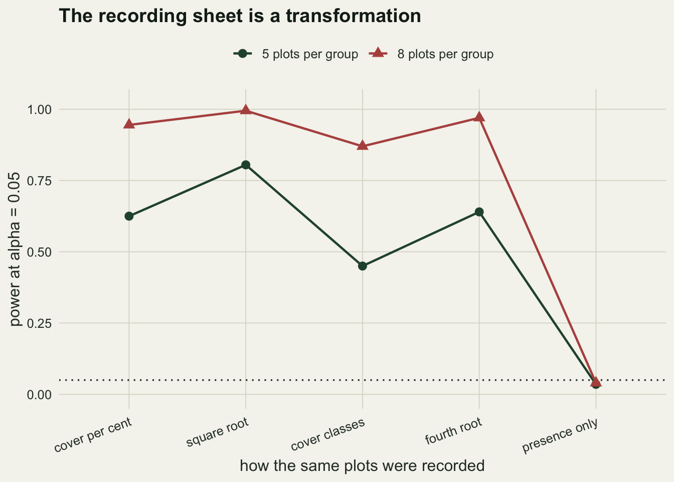
The spread across codings at five plots per group, 0.355 between the best and the worst of the four abundance codings, takes the same study from the conventional eighty per cent target down to under a half. Whoever wrote the recording protocol made a power decision, and it is never in the methods section.
When the change falls on the rare half
Neither scenario so far singles out species by abundance; scenario A multiplies every taxon alike and scenario B splits them by position in the list, so the common species carry the effect either way. Plenty of field outcomes do the opposite: the dominants hold their ground while a set of uncommon species arrives or disappears. Bray-Curtis is a ratio of absolute differences, so species that hold a small share of the individuals between them can move it only a little, whatever the treatment does to them. A test that models each species on its own scale and adds up the evidence has no such weighting.
That test here is a summed likelihood ratio: for each species a negative binomial model with a group effect against one without, at the dispersion the generator used, summed over the thirty species, with the p-value from permutations of the group labels. Both tests read the same simulated studies. The model-based test is handed the true dispersion, so what follows is its best case rather than what an analyst would get with the dispersion estimated.
lr_sum <- function(y, ist, size = 5) {
  nn <- nrow(y); nt <- length(ist); nr <- nn - nt
  st <- colSums(y[ist, , drop = FALSE]); sa <- colSums(y); sr <- sa - st
  ll <- function(sy, mu, k) {
    mu <- pmax(mu, 1e-8)
    sy * log(mu / (mu + size)) + k * size * log(size / (mu + size))
  }
  2 * sum(ll(st, st / nt, nt) + ll(sr, sr / nr, nr) - ll(sa, sa / nn, nn))
}

p_two <- function(y, n, perms = 199) {
  g   <- factor(rep(c("reference", "treated"), each = n))
  obs <- lr_sum(y, seq_len(n) + n)
  nul <- replicate(perms, lr_sum(y, sample(2 * n, n)))
  c(bray = adonis2(vegdist(y, "bray") ~ g, permutations = perms)$`Pr(>F)`[1],
    lr   = (1 + sum(nul >= obs)) / (1 + perms))
}

rare_half <- rank(mu_base) <= n_sp / 2
mu_rare   <- mu_base
mu_rare[rare_half] <- mu_base[rare_half] * 1.6
mu_common <- mu_base
mu_common[!rare_half] <- mu_base[!rare_half] * 1.6

## the fair version of the other end: same individuals added, not the same multiplier
match_f    <- 1 + (sum(mu_rare) - total_ref) / sum(mu_base[!rare_half])
mu_matched <- mu_base
mu_matched[!rare_half] <- mu_base[!rare_half] * match_f
share_rare <- sum(mu_base[rare_half]) / total_ref
add_ratio  <- (sum(mu_common) - total_ref) / (sum(mu_rare) - total_ref)

falls <- c("rare half, x 1.6", "common half, x 1.6", "common half, matched")
rar <- expand.grid(test = c("Bray-Curtis", "summed likelihood ratio"),
                   where = falls, stringsAsFactors = FALSE)
rar$power <- NA_real_

set.seed(8082)
for (w in falls) {
  mu_t <- switch(w, "rare half, x 1.6" = mu_rare,
                 "common half, x 1.6" = mu_common, mu_matched)
  ps <- replicate(reps, p_two(rbind(draw(mu_base, 8), draw(mu_t, 8)), 8))
  rar$power[rar$where == w] <- c(mean(ps["bray", ] <= 0.05), mean(ps["lr", ] <= 0.05))
}

null_reps <- 5 * reps
null_lr <- mean(replicate(null_reps,
                          p_two(rbind(draw(mu_base, 8), draw(mu_base, 8)), 8)[["lr"]]) <= 0.05)
rar_get <- function(tt, w) rar$power[rar$test == tt & rar$where == w]
The rare half is the fifteen species with the lowest reference means, holding 16 per cent of the individuals between them. With those species raised by sixty per cent, at eight plots per group, Bray-Curtis rejects in 0.225 of runs and the summed likelihood ratio in 0.855, with Monte Carlo standard errors of 0.030 and 0.025. The gap is not a calibration failure. With both groups drawn from the reference community the model-based test rejects in 0.066 of 1000 runs, against a nominal 0.05 with a Monte Carlo standard error of 0.008: a shade high on a permutation p-value that is exact by construction, and nothing like the difference in power it would have to explain.
A gap that size invites the wrong conclusion, so the same change belongs at the other end of the abundance distribution as a check. Multiply the common half by the same sixty per cent and Bray-Curtis reaches 0.965 against 0.995: the advantage of 0.630 falls to 0.030, but the ordering does not turn over, and both tests are near the ceiling where nothing can. That version also moves 5.1 times as many individuals as the rare-half version, so the honest swap matches on individuals added rather than on the multiplier: the common half rises by 11.8 per cent instead. On that version Bray-Curtis reaches 0.065 and the summed likelihood ratio 0.090: both sit near the floor, because a rise that small against negative binomial noise is invisible to either test.
rar$where <- factor(rar$where, levels = falls)
rar$test  <- factor(rar$test, levels = c("Bray-Curtis", "summed likelihood ratio"))

ggplot(rar, aes(x = where, y = power, fill = test)) +
  geom_col(position = position_dodge(width = 0.7), width = 0.62) +
  geom_hline(yintercept = 0.05, linetype = "dotted", colour = te_ink) +
  scale_fill_manual(values = c("Bray-Curtis" = te_forest,
                               "summed likelihood ratio" = te_gold)) +
  scale_y_continuous(limits = c(0, 1.05)) +
  labs(x = "where the treatment falls", y = "power at eight plots per group", fill = NULL,
       title = "A distance-based test cannot weight a rare species up") +
  theme_datasheet() +
  theme(legend.position = "top", axis.text.x = element_text(angle = 20, hjust = 1))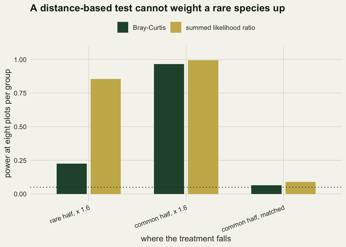
So the reversal check fails in the strict sense: on this generator the model-based test is never measurably behind, at either end. The matched common-half pair is the weakest of the three claims and should be read as a tie: the two rates quoted for it differ by less than the Monte Carlo standard error of their difference, so a rerun of the same design can put either test in front. What changes across the pairs that do separate is the size of the model-based advantage, and that is the part that depends on where the treatment lands. The rare-half result is therefore a statement about Bray-Curtis rather than a ranking of tests: an index built on absolute differences cannot weight up a species that contributes little to the plot total, and no sample size repairs that. If the effect you would not want to miss sits in the uncommon species, the power question and the test question are the same question.
Turning this into a design
The machinery is short enough to adapt in an afternoon. Write down the community you expect, write down the change you would not want to miss, choose the index that matches the question you are actually asking, run the grid, and run the null case as well. The choice of index deserves the same paragraph in the methods as the sample size, because the two are not separable: reporting that a study had eighty per cent power says nothing until the index is named.
If the question is about total abundance, an index that normalises by plot totals will not answer it. If the question is about relative composition, an index that responds to total abundance will answer a different question and may answer it very convincingly. The dissimilarity index tutorial sets out which index tracks which gradient; this post prices those properties in plots per group.
Honest limits
Every number here belongs to this generator: thirty species, this abundance distribution, this dispersion parameter, balanced groups, and a treatment applied uniformly across taxa. Real communities have patchy responses, correlated species, and unbalanced designs, all of which move power. The rates carry a Monte Carlo standard error of about 0.035 at the steep part of a curve, so differences of a few percentage points between neighbouring cells are noise.
The deeper limit is that a simulated power analysis needs an assumed effect, and if you knew the effect you would not be running the study. The output is not a prediction; it is a statement of what the design could have found had the assumption been right, which is exactly what a reader needs when the result is not significant.
References
Anderson MJ 2001 Austral Ecology 26(1):32-46 (10.1111/j.1442-9993.2001.01070.pp.x)
Legendre P, Gallagher ED 2001 Oecologia 129(2):271-280 (10.1007/s004420100716)
Warton DI, Wright ST, Wang Y 2012 Methods in Ecology and Evolution 3(1):89-101 (10.1111/j.2041-210X.2011.00127.x)