library(MASS)
library(ggplot2)
library(dplyr)

# two-group negative binomial GLM; treatment mean = base * ratio
sim_nb <- function(n_per, ratio, size = 2, base = 12,
                   nsim = 600, alpha = .05, want = "power") {
  b0 <- log(base); b1 <- log(ratio)
  p <- est <- numeric(nsim)
  for (i in seq_len(nsim)) {
    grp <- rep(c(0, 1), each = n_per)
    y   <- rnbinom(2 * n_per, mu = exp(b0 + b1 * grp), size = size)
    r <- tryCatch({
      m <- suppressWarnings(glm.nb(y ~ grp))
      c(coef(m)[2], coef(summary(m))[2, 4])     # estimate and Wald p-value
    }, error = function(e) c(NA, NA))
    est[i] <- r[1]; p[i] <- r[2]
  }
  ok <- !is.na(p)
  if (want == "power") return(mean(p[ok] < alpha))
  list(power = mean(p[ok] < alpha), est = est[ok], sig = p[ok] < alpha, b1 = b1)
}Power analysis by simulation in R
R
study design
power analysis
simulation
statistics
Run a power analysis by simulation in R: build a power curve over sample size, check the Type-I rate, and see why post-hoc power and low-power studies mislead.
Before a field season starts, the question that decides whether it is worth doing is whether the design can detect the effect you care about. If a survey of twenty sites per treatment has little chance of finding a real forty percent drop in abundance, you want to know that before you spend the summer counting, not after. A power analysis answers that question. For a two-sample t-test there is a tidy formula, but ecological data rarely fit it: counts are overdispersed, designs are unbalanced, and the model is a GLM or a mixed model rather than a t-test. The general tool that covers all of those cases is simulation, and it needs nothing beyond the model you already plan to fit.
The recipe
Power is the probability that your test returns a significant result when the effect is real. Simulation estimates it directly. Decide on the model and a plausible effect size, generate many datasets in which that effect is present, fit the model to each, and record whether the test is significant. The fraction of significant fits is the power. The same loop, run with no effect, returns the false-positive rate, which is a built-in check that the test is calibrated.
We work with a common ecological design: two groups, a control and a treatment, with overdispersed counts modelled by a negative binomial GLM. The treatment mean is set as a multiple of the control mean, so a ratio of 0.6 is a forty percent reduction. The function below simulates one scenario and returns either the power or, when asked, the full set of estimates and significance flags.
How many sites? The power curve
The first job is sizing the study. We hold the effect fixed at a forty percent reduction and sweep the number of sites per group, reading off where the power crosses the conventional eighty percent target.
set.seed(2026)
ns   <- c(5, 10, 15, 20, 25, 30, 40, 50)
powA <- sapply(ns, function(nn) sim_nb(nn, 0.6, nsim = 600))
data.frame(n_per_group = ns, power = round(powA, 3))
n_per_group power
1 5 0.275
2 10 0.412
3 15 0.478
4 20 0.565
5 25 0.655
6 30 0.702
7 40 0.848
8 50 0.908n80 <- approx(powA, ns, xout = .8)$y
cat("sites per group for 80% power, by interpolation:", round(n80, 1), "\n")sites per group for 80% power, by interpolation: 36.7 At five sites per group the design has only a 28 percent chance of detecting the reduction; at twenty it is still about 57 percent, a coin flip dressed up as a study. Power climbs past the eighty percent line somewhere around 37 sites per group. That single number reframes the field plan: a design that felt generous at twenty sites is underpowered for the effect of interest, and the simulation says so before any data are collected.
curveA <- data.frame(n_per = ns, power = powA)
ggplot(curveA, aes(n_per, power)) +
  geom_hline(yintercept = .8, colour = te_red, linetype = "dashed", linewidth = .5) +
  geom_line(colour = te_forest, linewidth = 1) +
  geom_point(colour = te_forest, size = 2.4) +
  annotate("segment", x = n80, xend = n80, y = 0, yend = .8,
           colour = te_gold, linewidth = .7, linetype = "dotted") +
  annotate("text", x = n80, y = .06, label = paste0("n = ", round(n80)),
           colour = te_ink, hjust = -0.15, size = 3.6) +
  annotate("text", x = 5, y = .83, label = "80% power",
           colour = te_red, hjust = 0, size = 3.4) +
  scale_y_continuous(limits = c(0, 1), labels = scales::percent) +
  labs(title = "Power curve: how many sites per treatment?",
       subtitle = "Detecting a 40% abundance reduction with a negative binomial GLM",
       x = "Sample size per group", y = "Power") + base_t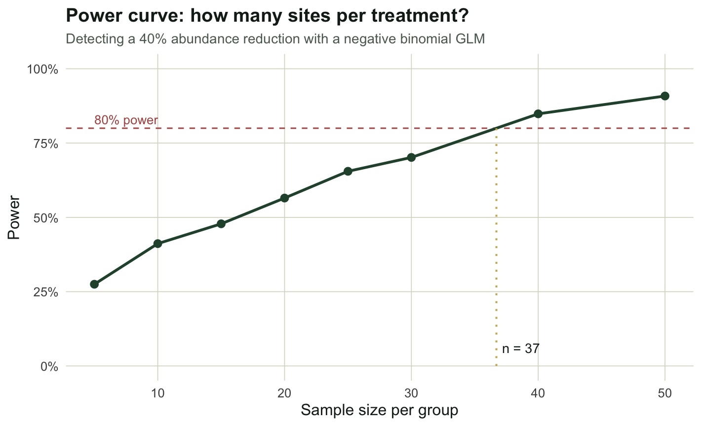
Power depends on the effect size, and the null is a check
Power is not a property of a design alone; it depends on the effect you are trying to detect. We fix the sample at twenty per group and vary the effect from a forty percent reduction up to no effect at all.
set.seed(7)
ratios <- c(1.0, 0.9, 0.8, 0.7, 0.6, 0.5, 0.4)
powB <- sapply(ratios, function(rr) sim_nb(20, rr, nsim = 600))
data.frame(ratio = ratios, reduction_pct = round(100 * (1 - ratios)),
           power = round(powB, 3))
ratio reduction_pct power
1 1.0 0 0.067
2 0.9 10 0.082
3 0.8 20 0.170
4 0.7 30 0.313
5 0.6 40 0.552
6 0.5 50 0.788
7 0.4 60 0.953At a ratio of one there is no treatment effect, so what the loop measures is the false-positive rate, and it lands at 0.07, close to the nominal five percent. That is the calibration check: if this number had come out far from alpha, the test itself would be suspect and any power figure built on it untrustworthy. As the effect strengthens, power rises steeply, reaching about 79 percent only once the reduction is as large as fifty percent. The lesson for design is that the effect size you assume drives everything, so it pays to run the curve for the smallest effect you would still care about, not the one you are hoping for.
curveB <- data.frame(ratio = ratios, power = powB)
ggplot(curveB, aes(ratio, power)) +
  geom_hline(yintercept = .05, colour = "#5d6b61", linetype = "dashed", linewidth = .5) +
  geom_hline(yintercept = .8, colour = te_red, linetype = "dashed", linewidth = .5) +
  geom_line(colour = te_high, linewidth = 1) +
  geom_point(colour = te_high, size = 2.4) +
  annotate("text", x = 0.99, y = .13, label = "Type-I rate at the null (no effect)",
           colour = "#5d6b61", hjust = 0, size = 3.2) +
  scale_x_reverse() +
  scale_y_continuous(limits = c(0, 1), labels = scales::percent) +
  labs(title = "Power depends on the effect size you assume",
       subtitle = "Fixed n = 20 per group; mean ratio of 1.0 means no treatment effect",
       x = "Mean ratio (treatment / control)  <- stronger effect", y = "Power") + base_t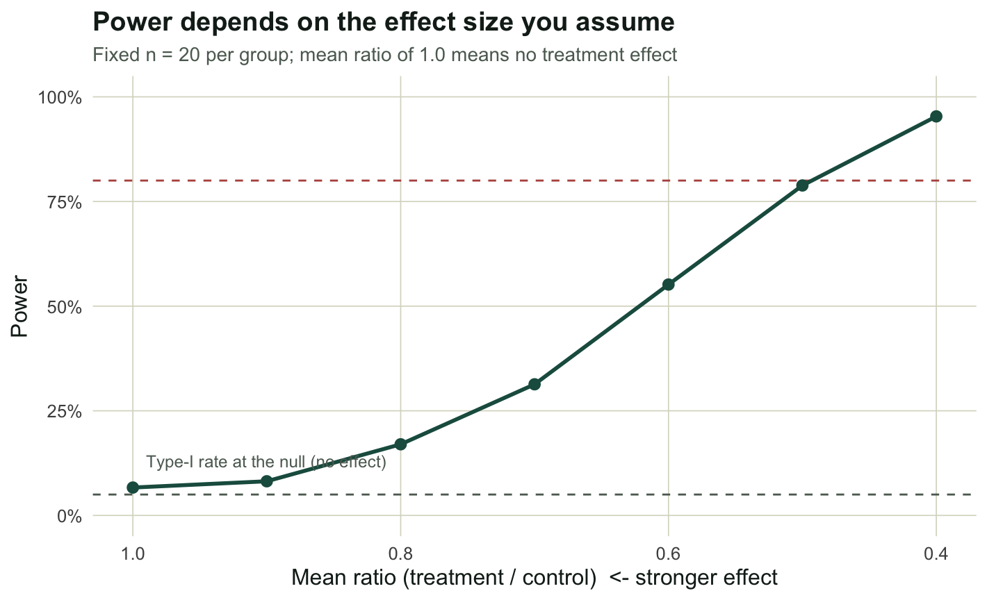
The winner’s curse: Type-S and Type-M errors
There is a subtler reason to avoid underpowered designs, and it is the most important idea in this post. When power is low, a significant result is not merely rare; it is biased. To detect a small effect with a small sample, the estimate has to be large by chance to clear the significance threshold, so the significant estimates are systematically inflated, and a few of them even point the wrong way. Gelman and Carlin call these the Type-M (magnitude) and Type-S (sign) errors. We make them visible in a deliberately weak design: eight sites per group, a mild twenty percent reduction, run two thousand times so the tails are well sampled.
set.seed(99)
resC    <- sim_nb(8, 0.8, nsim = 2000, want = "full")
sig_est <- resC$est[resC$sig]
type_m  <- mean(abs(sig_est)) / abs(resC$b1)
type_s  <- mean(sign(sig_est) != sign(resC$b1))

cat("power:", round(mean(resC$sig), 3), "\n")
power: 0.135 cat("true effect (log ratio):", round(resC$b1, 3), "\n")true effect (log ratio): -0.223 cat("mean magnitude among significant:", round(mean(abs(sig_est)), 3),
" vs true", round(abs(resC$b1), 3), "\n")mean magnitude among significant: 0.855 vs true 0.223 cat("Type-M exaggeration ratio:", round(type_m, 2), "\n")Type-M exaggeration ratio: 3.83 cat("Type-S (significant with wrong sign):", round(type_s, 3), "\n")Type-S (significant with wrong sign): 0.074 The design has only a 14 percent chance of significance. When it does reach significance, the estimated effect averages 0.86 on the log scale against a true value of 0.22: an exaggeration of almost four times. And about seven percent of the significant results have the wrong sign, reporting an increase where the truth is a decrease. A published estimate from a study like this, taken at face value, would overstate the effect by a factor of four and occasionally get its direction backwards. This is why a barely significant result from a small, noisy study is weak evidence, not strong evidence.
estdf <- data.frame(est = resC$est,
                    sig = ifelse(resC$sig, "significant (p < 0.05)", "not significant"))
ggplot(estdf, aes(est, fill = sig)) +
  geom_histogram(bins = 45, colour = "white", linewidth = .1, position = "stack") +
  geom_vline(xintercept = resC$b1, colour = te_ink, linewidth = .9) +
  geom_vline(xintercept = mean(sig_est), colour = te_red, linewidth = .9, linetype = "dashed") +
  annotate("text", x = resC$b1, y = Inf, label = "true effect  ",
           colour = te_ink, hjust = 1, vjust = 1.6, size = 3.3) +
  annotate("text", x = mean(sig_est), y = Inf, label = "  mean of significant",
           colour = te_red, hjust = 0, vjust = 3.0, size = 3.3) +
  scale_fill_manual(values = c("significant (p < 0.05)" = te_red,
                               "not significant" = te_sage)) +
  labs(title = "The winner's curse in a low-power study",
       subtitle = "Estimated treatment effect across 2000 simulations; significant results exaggerate the truth",
       x = "Estimated effect (log mean ratio)", y = "Simulations", fill = NULL) + base_t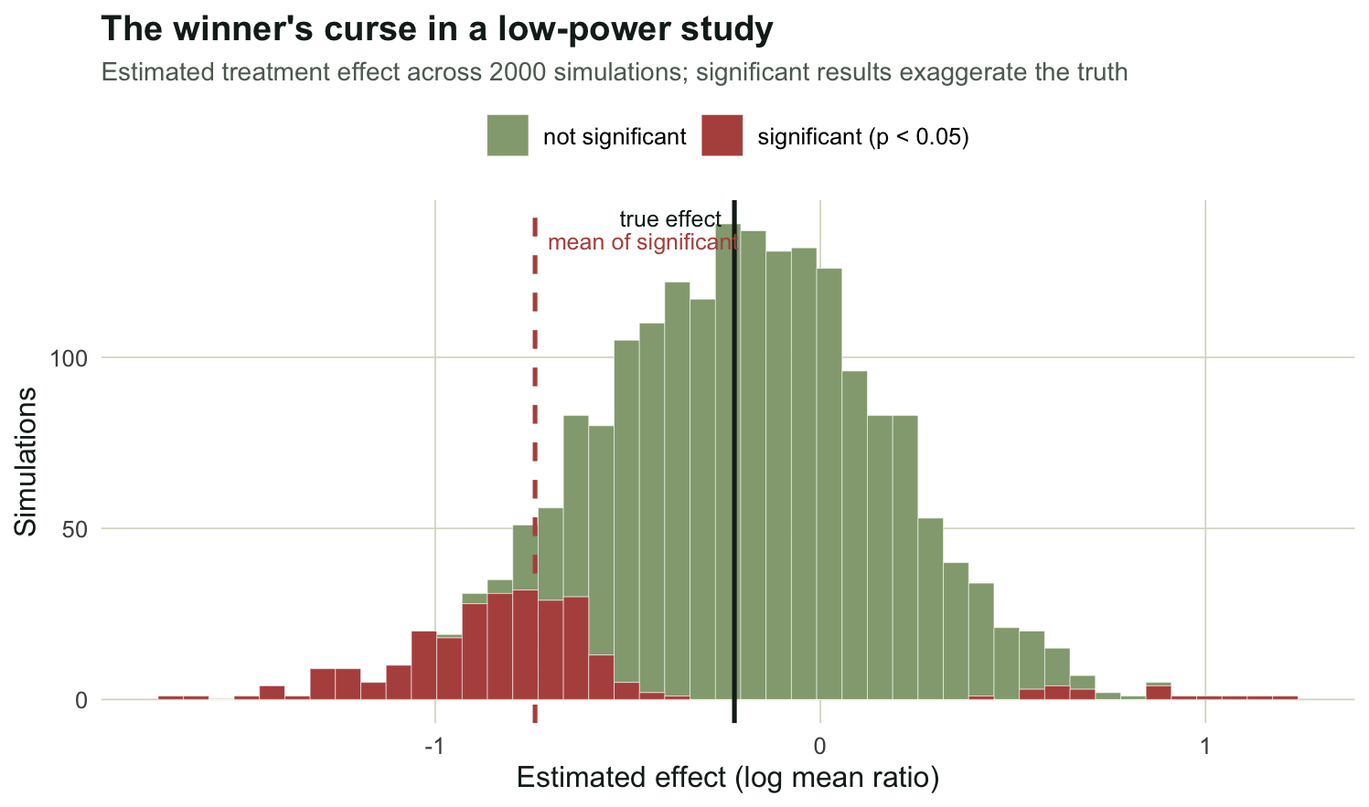
Why post-hoc power is the wrong fix
A tempting move after a non-significant result is to compute the power the study had for the effect it observed, and report it as a measure of how convincing the negative result is. Hoenig and Heisey showed this is circular. Observed power is a one-to-one function of the p-value, so it carries no information beyond what the p-value already gave you: a non-significant result always comes with low observed power, by construction, and learning that adds nothing. Power analysis belongs before the study, run for an effect size you decide is worth detecting, not after, run for the effect you happened to estimate. If a non-significant result needs interpreting, the honest summary is the estimate and its confidence interval, which say directly how large an effect the data can and cannot rule out.
What you have to assume, and how to be honest about it
Two inputs to every power simulation are guesses, and the result is only as good as they are. The first is the effect size, which is why the curve over effect sizes matters: report the sample size needed for the smallest effect of interest, and the design is honest about what it can miss. The second is the variability, here the negative binomial dispersion, which is easy to underestimate from a pilot; running the simulation across a range of dispersion values shows how sensitive the plan is to that guess. Beyond the assumptions, two mechanical points: use enough simulations that the Monte Carlo error in the power estimate is small, a few hundred for a curve and more where you need precision in the tails, and simulate the exact model you intend to fit, including its random effects, so the power figure applies to the analysis you will actually run. With those cautions, simulation gives a power analysis for designs that no formula covers, and the Type-S and Type-M view turns it from a box-ticking sample-size calculation into a guard against the exaggerated, occasionally backwards results that low power produces. The same simulate-and-fit machinery underlies the GLMM pseudoreplication post and the count data GLM post, which are the models most worth sizing this way.
References
Hoenig JM, Heisey DM 2001 The American Statistician 55(1):19-24 (10.1198/000313001300339897)
Gelman A, Carlin J 2014 Perspectives on Psychological Science 9(6):641-651 (10.1177/1745691614551642)
Bolker BM 2008. Ecological Models and Data in R. Princeton University Press (ISBN 978-0-691-12522-0)