---
title: "PCA for environmental data: scaling and axes"
description: "Run PCA on environmental data in R: why to standardise variables, how the broken-stick rule chooses axes, and reading scaling 1 versus scaling 2 biplots."
date: "2026-06-25 12:00"
categories: [ordination, multivariate, vegan, R]
image: thumbnail.png
image-alt: "Several arrows radiating from an origin, a stylised principal component biplot."
---
The ordination posts so far have worked on species data through a dissimilarity matrix: NMDS, distance-based RDA, correspondence analysis. Principal component analysis is the other foundation, and it works differently. It is a linear ordination for continuous, roughly symmetric variables, which makes it the natural tool not for the species table but for the environmental one: climate, soil chemistry, topography. PCA takes a set of correlated variables and rotates them into a smaller set of uncorrelated axes that capture as much of the total variance as possible.
Three decisions decide whether a PCA is read correctly: whether to standardise the variables, how many axes to keep, and how to read the biplot. This post takes each in turn, using `vegan` and a synthetic set of environmental measurements.
## The data, and why scale matters
Build 70 sites with seven environmental variables driven by two latent gradients, a climate gradient and a soil gradient, plus slope as a near-independent variable. The variables are in their natural units, which is the realistic and dangerous part.
```{r}
#| message: false
#| warning: false
library(vegan)
set.seed(57)
n <- 70
f1 <- rnorm(n)   # climate latent factor
f2 <- rnorm(n)   # soil latent factor
env <- data.frame(
  temp      = 15 + 4.0 * f1 + rnorm(n, 0, 0.8),     # degrees C
  precip    = 800 - 190 * f1 + rnorm(n, 0, 40),     # mm
  elevation = 1000 - 280 * f1 + rnorm(n, 0, 60),    # m
  pH        = 6.0 + 0.7 * f2 + rnorm(n, 0, 0.20),   # pH units
  soilN     = 0.30 + 0.09 * f2 + rnorm(n, 0, 0.03), # percent
  soilC     = 4.0 + 1.4 * f2 + rnorm(n, 0, 0.5),    # percent
  slope     = runif(n, 0, 30)                       # degrees
)
round(apply(env, 2, var), 4)
```
The variances span seven orders of magnitude, from 0.008 for soil nitrogen to 114000 for elevation. PCA works on variance, so on the raw data elevation and precipitation would swamp everything else, not because they matter more ecologically but because they are measured in larger numbers. Standardising each variable to unit variance, which is the same as running PCA on the correlation matrix, removes the units and lets every variable compete on equal footing. In `vegan` that is `scale = TRUE`.
```{r}
pca <- rda(env, scale = TRUE)
ev <- pca$CA$eig
prop <- ev / sum(ev)
rbind(eigenvalue = round(ev, 3),
      prop_variance = round(prop, 3),
      cumulative = round(cumsum(prop), 3))
```
The first axis carries 42.1% of the variance and the second 39.2%, so two axes together hold 81.4%. The near-even split between the first two axes is the signature of the two latent gradients built into the data.
## How many axes to keep
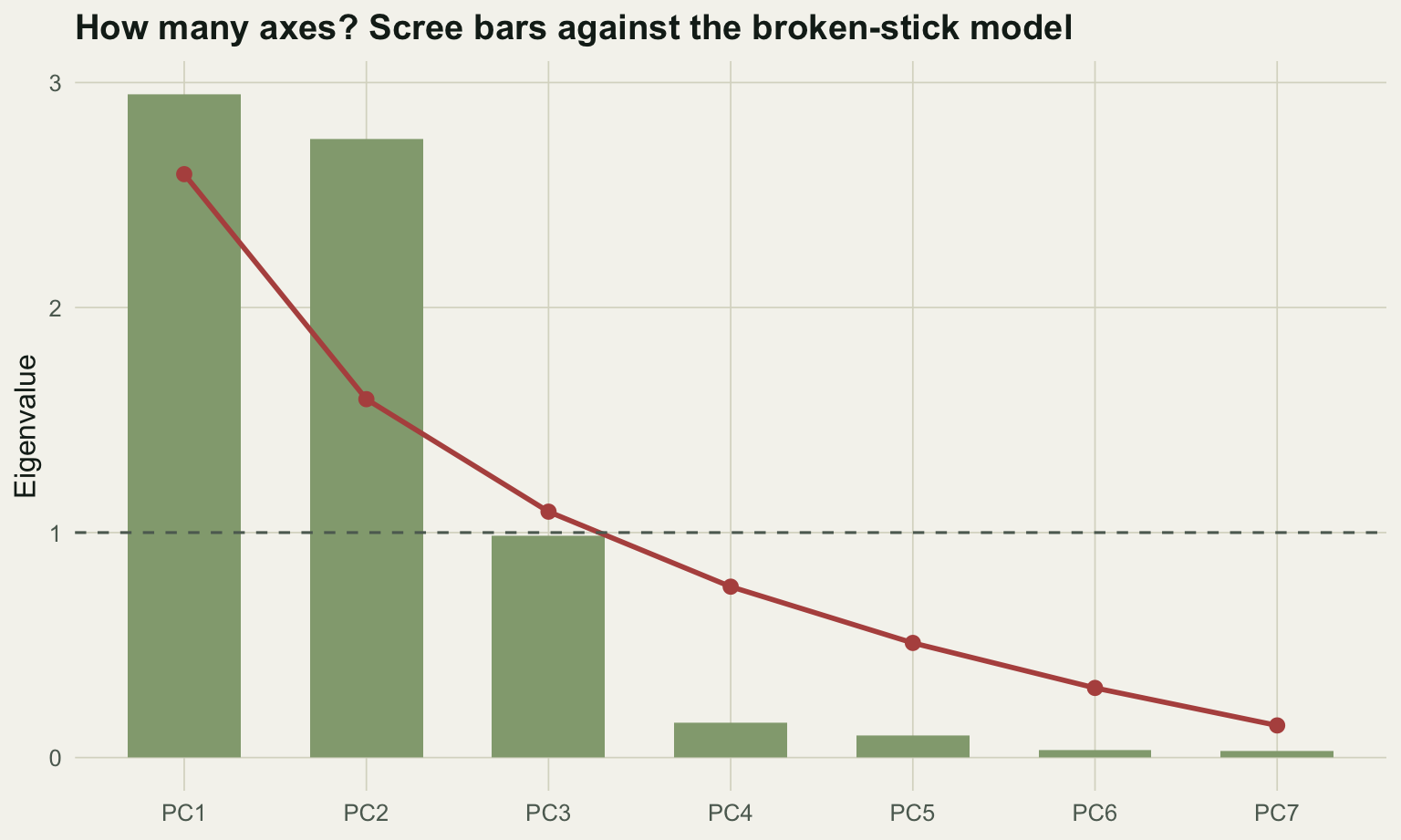
The eigenvalues tell you how much variance each axis holds, but not how many axes are worth interpreting. Several rules exist, and they disagree. The Kaiser-Guttman rule keeps axes with eigenvalues above the average (above 1 for a correlation PCA). The broken-stick model compares each eigenvalue against what you would expect if the total variance were broken at random, and keeps only axes that beat that null expectation.
```{r}
bs <- bstick(pca)                    # broken-stick expectation
data.frame(eigenvalue = round(ev, 3), broken_stick = round(bs, 3),
           beats_bstick = ev > bs, beats_kaiser = ev > 1)[1:4, ]
```
Both rules keep two axes here, which matches the two gradients in the data. The third axis is the instructive case: its eigenvalue of 0.985 falls just below the Kaiser cutoff of 1 and just below its broken-stick expectation of 1.093, so both rules correctly leave it out. This agreement is convenient but not guaranteed. Jackson (1993) compared these rules on simulated data and found the broken-stick model the most reliable, while the Kaiser-Guttman rule and the scree plot both tend to retain too many axes. When they disagree, the broken-stick model is the more conservative choice.
```{r}
#| label: fig-scree
#| fig-cap: "Eigenvalues (bars) against the broken-stick expectation (line) and the Kaiser cutoff (dashed). Only the first two axes exceed both."
#| fig-alt: "A scree bar chart with a descending red broken-stick curve overlaid. The first two bars rise above the curve and above a dashed line at eigenvalue one; the third bar falls just below both."
#| fig-width: 8
#| fig-height: 4.8
#| message: false
#| warning: false
library(ggplot2); library(dplyr); library(tidyr)
pap <- "#f5f4ee"; ink <- "#16241d"; line <- "#dad9ca"
forest <- "#275139"; accent <- "#b5534e"; gold <- "#c9b458"; sage <- "#93a87f"; teal <- "#1d5b4e"
te_theme <- theme_minimal(base_size = 12) + theme(
  plot.background = element_rect(fill = pap, colour = NA),
  panel.background = element_rect(fill = pap, colour = NA),
  panel.grid.minor = element_blank(),
  panel.grid.major = element_line(colour = line, linewidth = .3),
  axis.title = element_text(colour = ink), axis.text = element_text(colour = "#5d6b61"),
  plot.title = element_text(colour = ink, face = "bold"),
  plot.subtitle = element_text(colour = "#5d6b61"), strip.text = element_text(colour = ink, face = "bold"),
  legend.title = element_text(colour = ink), legend.text = element_text(colour = "#5d6b61"))

sc <- data.frame(axis = factor(paste0("PC", seq_along(ev)), levels = paste0("PC", seq_along(ev))),
                 eig = ev, bstick = bs)
ggplot(sc, aes(axis)) +
  geom_col(aes(y = eig), fill = sage, width = .62) +
  geom_line(aes(y = bstick, group = 1), colour = accent, linewidth = 1) +
  geom_point(aes(y = bstick), colour = accent, size = 2.4) +
  geom_hline(yintercept = 1, linetype = "dashed", colour = "#5d6b61") +
  labs(x = NULL, y = "Eigenvalue",
       title = "How many axes? Scree bars against the broken-stick model") +
  te_theme
```
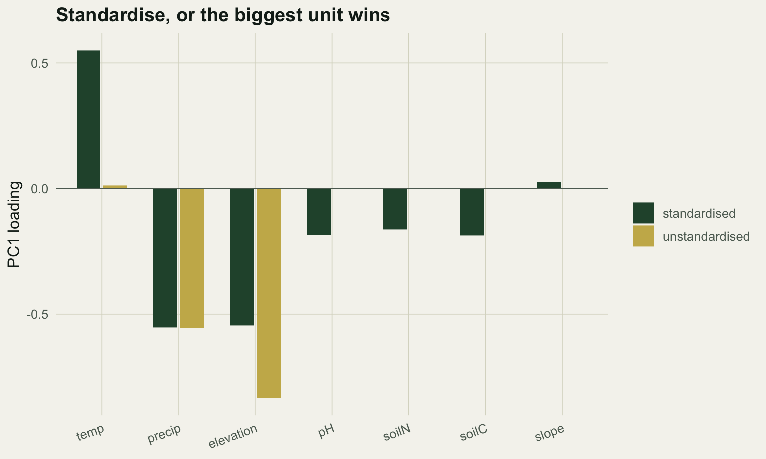
## Standardise, or the biggest unit wins
It is worth seeing what skipping the standardisation does, because the failure is silent. Run the same PCA without scaling and look at what loads on the first axis.
```{r}
pca_raw <- rda(env, scale = FALSE)
L1_raw <- scores(pca_raw, display = "species", choices = 1, scaling = 0)[, 1]
L1_std <- scores(pca,     display = "species", choices = 1, scaling = 0)[, 1]
# PCA axis signs are arbitrary; flip both so precipitation loads negative, for a fair comparison
if (L1_raw["precip"] > 0) L1_raw <- -L1_raw
if (L1_std["precip"] > 0) L1_std <- -L1_std
data.frame(unstandardised = round(L1_raw, 3), standardised = round(L1_std, 3))
```
On the unstandardised PCA the first axis is almost entirely elevation (about 0.83) and precipitation (about 0.55), the two variables measured in the largest numbers. The three soil variables, which carry a real and separate gradient, load at essentially zero. That first axis appears to explain a huge share of the variance, but the share is an artefact of the units.
```{r}
round(100 * pca_raw$CA$eig[1] / sum(pca_raw$CA$eig), 1)
```
It captures 98.4% of the variance, and the number is almost meaningless: it is the variance of elevation in metres, dressed up as a principal component. The standardised version spreads the loading across the three climate variables at about 0.55 each and brings the soil variables in at about 0.18, which is the structure that actually exists. For environmental data measured in mixed units, standardising is not optional.
```{r}
#| label: fig-scaling
#| fig-cap: "First-axis loadings without and with standardisation. Unstandardised, only the large-unit variables contribute."
#| fig-alt: "Grouped bar chart of PC1 loadings by variable. The unstandardised bars are large only for elevation and precipitation and near zero elsewhere; the standardised bars are moderate across all variables."
#| fig-width: 8
#| fig-height: 4.8
#| message: false
#| warning: false
Lt <- data.frame(var = names(L1_raw), unstandardised = as.numeric(L1_raw),
                 standardised = as.numeric(L1_std)) |>
  pivot_longer(-var, names_to = "type", values_to = "loading")
Lt$var <- factor(Lt$var, levels = c("temp","precip","elevation","pH","soilN","soilC","slope"))
ggplot(Lt, aes(var, loading, fill = type)) +
  geom_col(position = position_dodge(width = .7), width = .62) +
  scale_fill_manual(values = c(unstandardised = gold, standardised = forest), name = NULL) +
  geom_hline(yintercept = 0, colour = "#5d6b61", linewidth = .3) +
  labs(x = NULL, y = "PC1 loading", title = "Standardise, or the biggest unit wins") +
  te_theme + theme(axis.text.x = element_text(angle = 20, hjust = 1))
```
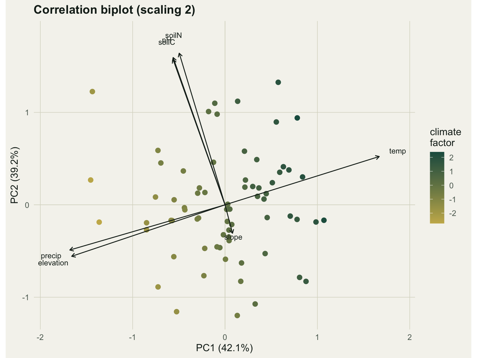
## Reading the biplot: scaling 1 and scaling 2
A PCA biplot draws sites and variables on the same axes, and there is a choice in how to do it that changes what the picture means (Gabriel 1971). The two conventions cannot both be optimal at once, because one preserves the distances between sites and the other preserves the relationships between variables.
```{r}
v1 <- scores(pca, display = "species", choices = 1:2, scaling = 1)[, 1]
v2 <- scores(pca, display = "species", choices = 1:2, scaling = 2)[, 1]
s1 <- mean(abs(scores(pca, display = "sites", choices = 1, scaling = 1)))
s2 <- mean(abs(scores(pca, display = "sites", choices = 1, scaling = 2)))
c(var_score_scaling1 = round(mean(abs(v1)), 2), var_score_scaling2 = round(mean(abs(v2)), 2),
  site_score_scaling1 = round(s1, 2), site_score_scaling2 = round(s2, 2))
```
The numbers show the trade. Under scaling 1, the distance biplot, the variable scores are larger (about 1.5 on average) and the site scores smaller (about 0.29); the Euclidean distances between site points approximate their true distances, so scaling 1 is the one to use when you want to read how sites relate to each other. Under scaling 2, the correlation biplot, the balance reverses (variable scores about 1.0, site scores about 0.44), and the angles between variable arrows approximate the correlations between variables: a small angle means a strong positive correlation, a right angle means none, and opposite arrows mean a strong negative correlation. The figure below is a scaling 2 biplot.
```{r}
#| label: fig-biplot
#| fig-cap: "Correlation biplot (scaling 2). Sites are coloured by the climate factor; arrows are environmental variables."
#| fig-alt: "A biplot with temperature pointing one way and precipitation and elevation pointing opposite, the three soil variables clustered at a right angle, and slope a short arrow near the origin. Sites grade in colour along the temperature axis."
#| fig-width: 8
#| fig-height: 6
#| message: false
#| warning: false
si <- as.data.frame(scores(pca, display = "sites", choices = 1:2, scaling = 2)); names(si) <- c("PC1","PC2")
sp <- as.data.frame(scores(pca, display = "species", choices = 1:2, scaling = 2)); names(sp) <- c("PC1","PC2")
sp$lab <- rownames(sp)
# fix axis signs so the figure is reproducible regardless of platform
if (sp["temp","PC1"] < 0) { si$PC1 <- -si$PC1; sp$PC1 <- -sp$PC1 }
if (sp["soilC","PC2"] < 0) { si$PC2 <- -si$PC2; sp$PC2 <- -sp$PC2 }
si$clim <- f1

ggplot() +
  geom_hline(yintercept = 0, colour = line, linewidth = .3) +
  geom_vline(xintercept = 0, colour = line, linewidth = .3) +
  geom_point(data = si, aes(PC1, PC2, colour = clim), size = 2.4) +
  scale_colour_gradient(low = gold, high = teal, name = "climate\nfactor") +
  geom_segment(data = sp, aes(x = 0, y = 0, xend = PC1, yend = PC2),
               arrow = arrow(length = unit(.18, "cm")), colour = ink, linewidth = .5) +
  geom_text(data = sp, aes(PC1 * 1.12, PC2 * 1.12, label = lab), colour = ink, size = 3.2) +
  labs(x = "PC1 (42.1%)", y = "PC2 (39.2%)", title = "Correlation biplot (scaling 2)") +
  coord_equal() + te_theme
```
Temperature points one way and precipitation and elevation point the opposite way, the near-180-degree angle marking the strong negative correlation among the climate variables: warm sites are dry and low. The three soil variables cluster together at roughly a right angle to the climate set, which is the second, independent gradient. Slope is a short arrow near the origin, contributing little to either axis. The sites grade in colour from one end of the temperature arrow to the other, confirming that the first axis is the climate gradient.
## The one assumption to remember
PCA is built on Euclidean geometry and linear relationships between variables, which is exactly right for environmental data of this kind and exactly wrong for raw species composition. Along a long ecological gradient, species turn over completely, abundances are full of zeros, and the linear correlations PCA relies on break down, producing the curved horseshoe artefacts that the [dissimilarity-index post](../choosing-a-dissimilarity-index/) describes. That is why community ordination reaches for correspondence analysis or NMDS instead, or applies a Hellinger transformation first so that a linear method becomes defensible. The [RDA versus CCA post](../rda-vs-cca-gradient-length/) works through exactly that boundary. PCA on the environmental table and an appropriate ordination of the species table are complementary halves of the same analysis, and the [variance partitioning post](../variance-partitioning-varpart/) shows how to bring them back together.
## References
Gabriel 1971 Biometrika 58(3):453-467 (10.1093/biomet/58.3.453)
Jackson 1993 Ecology 74(8):2204-2214 (10.2307/1939574)
Jolliffe 2002 Principal Component Analysis, 2nd edition, Springer (ISBN 978-0-387-95442-4)
Legendre & Legendre 2012 Numerical Ecology, 3rd English edition, Elsevier, Developments in Environmental Modelling 24 (ISBN 978-0-444-53868-0)