library(vegan)
library(ggplot2)
library(dplyr)Putting statistics on an ordination: envfit and PERMANOVA
R
vegan
ordination
PERMANOVA
community ecology
An NMDS shows the pattern. Use envfit to fit environmental variables onto it, adonis2 to test whether groups differ, and betadisper to keep the test honest.
The ordination post built an NMDS and even confirmed that its first axis recovered a known moisture gradient. A map is a good start, but it leaves two questions open. Which of the variables you measured in the field actually line up with the pattern? And when sites fall into groups, such as different management regimes, do those groups really differ in composition, or do they only look separated because the eye is generous? envfit() answers the first question and adonis2() answers the second. A third function, betadisper(), stops the second answer from fooling you.
A grassland survey
The dataset is a constructed one again, so that we know the right answer in advance. Thirty grassland plots fall into three management regimes, ten plots each: grazed, mown, and abandoned. For every plot we have soil moisture, soil pH, and counts for fourteen plant species. Moisture drives a turnover of specialists from dry to wet ground. Management acts on top of that: grazing favours low ruderal species and suppresses tall ones, abandonment does the reverse, and mowing sits in between. Soil pH was measured too, but it was scattered at random across the plots, so it should turn out to explain nothing. That last point matters, because a method worth using has to be able to return a clear negative.
set.seed(42)

n_per <- 10
mgmt  <- factor(rep(c("Grazed", "Mown", "Abandoned"), each = n_per),
                levels = c("Grazed", "Mown", "Abandoned"))
n <- length(mgmt)

moisture <- round(runif(n, 1, 9), 1)     # structuring gradient
pH       <- round(runif(n, 5.2, 7.3), 1) # measured, but random by design

species <- c("Thymus", "Sedum", "Festuca", "Briza", "Trifolium", "Plantago",
             "Lotus", "Filipendula", "Juncus", "Carex", "Taraxacum", "Poa",
             "Achillea", "Urtica")
peaks <- seq(0.5, 9.5, length.out = length(species))
base  <- outer(moisture, peaks, function(m, p) 8 * exp(-((m - p)^2) / (2 * 1.8^2)))
colnames(base) <- species

# management shifts the balance of ruderal and tall competitor species
ruderal    <- c("Taraxacum", "Poa", "Trifolium", "Plantago", "Lotus")
competitor <- c("Filipendula", "Urtica", "Carex")
mult <- matrix(1, n, length(species), dimnames = list(NULL, species))
mult[mgmt == "Grazed",    ruderal]    <- 2.4
mult[mgmt == "Grazed",    competitor] <- 0.35
mult[mgmt == "Abandoned", ruderal]    <- 0.4
mult[mgmt == "Abandoned", competitor] <- 2.4

comm <- matrix(rpois(length(base * mult), as.vector(base * mult)), nrow = n)
colnames(comm) <- species
rownames(comm) <- sprintf("S%02d", 1:n)

env <- data.frame(moisture = moisture, pH = pH, mgmt = mgmt)
table(mgmt)
mgmt
Grazed Mown Abandoned
10 10 10 comm[1:5, 1:7] Thymus Sedum Festuca Briza Trifolium Plantago Lotus
S01 0 0 0 0 1 2 5
S02 0 0 0 0 1 1 1
S03 3 2 6 9 17 16 11
S04 0 0 0 0 2 5 1
S05 0 1 1 2 9 9 17The ordination, briefly
The ordination itself is the same recipe as last time: Bray-Curtis dissimilarities, then metaMDS(). The earlier post covers what the arguments mean and how to read the stress.
set.seed(42)
ord <- metaMDS(comm, distance = "bray", k = 2, trymax = 100,
               autotransform = FALSE, trace = FALSE)
ord$stress
[1] 0.0715636A stress around 0.07 is a good fit, so the map is worth interpreting. Everything below works from this ord object and the matching env table.
envfit: which variables line up with the map?
envfit() takes the ordination and a table of environmental variables and asks, for each variable, how well it aligns with the arrangement of sites. A continuous variable is fitted as a vector: the direction across the plot along which it increases fastest, with an r-squared for how tightly the sites follow that direction and a permutation p-value for whether the alignment beats chance. A factor is fitted as a set of centroids, one mean position per group, with its own r-squared and test.
set.seed(42)
fit <- envfit(ord, env, permutations = 999)
fit
***VECTORS

            NMDS1    NMDS2     r2 Pr(>r)
moisture -0.97781 -0.20950 0.9756  0.001 ***
pH       -0.55593 -0.83123 0.0361  0.624
---
Signif. codes:  0 '***' 0.001 '**' 0.01 '*' 0.05 '.' 0.1 ' ' 1
Permutation: free
Number of permutations: 999

***FACTORS:

Centroids:
                NMDS1   NMDS2
mgmtGrazed     0.0525 -0.5261
mgmtMown       0.0208  0.0242
mgmtAbandoned -0.0733  0.5019

Goodness of fit:
         r2 Pr(>r)
mgmt 0.2189  0.017 *
---
Signif. codes:  0 '***' 0.001 '**' 0.01 '*' 0.05 '.' 0.1 ' ' 1
Permutation: free
Number of permutations: 999
The reading is clean. Moisture aligns almost perfectly with the ordination (r-squared near 0.98) and is highly significant. Management separates its three centroids and is significant as well, though it accounts for less. Soil pH, exactly as built, lands near zero and is not significant, so we have our negative control back. On the plot we draw only the vector that earned its place.
mgmt_cols <- c(Grazed = "#cda23f", Mown = "#2f8f63", Abandoned = "#b5534e")
site_sc <- as.data.frame(scores(ord, "sites"))
site_sc$mgmt <- mgmt

# scale the significant vector by hand so its length reflects strength
arr    <- scores(fit, "vectors")
radius <- max(abs(as.matrix(site_sc[, 1:2])))
mul    <- 0.78 * radius / max(sqrt(rowSums(arr^2)))
moist  <- as.data.frame(arr["moisture", , drop = FALSE] * mul)

ggplot(site_sc, aes(NMDS1, NMDS2)) +
  geom_hline(yintercept = 0, color = "#e2e1d4") +
  geom_vline(xintercept = 0, color = "#e2e1d4") +
  stat_ellipse(aes(color = mgmt), linewidth = 0.6, level = 0.95) +
  geom_point(aes(color = mgmt, fill = mgmt), size = 3.4, shape = 21, stroke = 0.3) +
  geom_segment(data = moist, aes(x = 0, y = 0, xend = NMDS1, yend = NMDS2),
               arrow = arrow(length = unit(0.18, "cm")),
               color = "#16241d", linewidth = 0.8) +
  annotate("text", x = moist$NMDS1 * 1.05, y = moist$NMDS2 * 1.05 - 0.07,
           label = "moisture", hjust = 1, color = "#16241d",
           fontface = "italic", size = 3.3) +
  scale_color_manual(values = mgmt_cols, name = "Management") +
  scale_fill_manual(values = mgmt_cols, name = "Management") +
  coord_equal(xlim = c(-2.3, 1.8), ylim = c(-0.9, 0.9)) +
  theme_minimal(base_size = 12)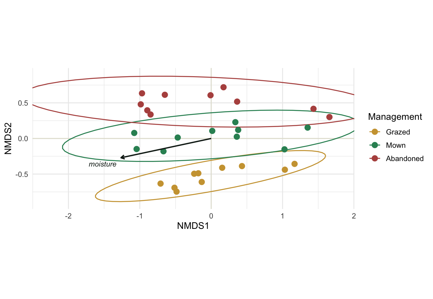
Two things are worth keeping in mind about envfit. A vector arrow assumes the variable changes smoothly and roughly linearly across the ordination plane. When a variable instead peaks in the middle and falls off at both ends, a straight arrow misrepresents it, and ordisurf() is the better tool: it drapes a fitted smooth surface over the ordination instead of a single direction. And a significant envfit result describes alignment with an existing picture, not a formal model of composition. For the latter, the next function is the one you want.
PERMANOVA with adonis2: do the groups really differ?
Seeing three ellipses stack up is suggestive, but eyes find groups in noise. adonis2() runs PERMANOVA, which partitions the dissimilarity matrix among the predictors and asks, by reshuffling group labels many times, whether each predictor explains more of the total composition than random labelling would.
set.seed(42)
adonis2(vegdist(comm, "bray") ~ mgmt + moisture + pH,
        data = env, permutations = 999, by = "terms")
Permutation test for adonis under reduced model
Terms added sequentially (first to last)
Permutation: free
Number of permutations: 999
adonis2(formula = vegdist(comm, "bray") ~ mgmt + moisture + pH, data = env, permutations = 999, by = "terms")
Df SumOfSqs R2 F Pr(>F)
mgmt 2 1.4106 0.22436 9.0308 0.001 ***
moisture 1 2.8622 0.45524 36.6484 0.001 ***
pH 1 0.0620 0.00986 0.7940 0.501
Residual 25 1.9525 0.31054
Total 29 6.2874 1.00000
---
Signif. codes: 0 '***' 0.001 '**' 0.01 '*' 0.05 '.' 0.1 ' ' 1Each row carries a pseudo-F, an R-squared, and a permutation p-value. The R-squared is the share of the total multivariate variation that the term accounts for. Moisture takes the largest share, management a solid further chunk, and pH almost nothing, with a p-value that confirms it. The residual line is the variation left unexplained.
One detail decides how you read the table. by = "terms" adds the predictors in order, so each is tested on what is left after the ones above it. by = "margin" instead tests each predictor with all the others already accounted for. When predictors are independent, as moisture and management are here by construction, the two versions agree closely. When predictors are correlated, they can disagree sharply, and the order you wrote the formula in starts to change the story. Reaching for by = "margin" is the safer habit whenever you are unsure.
betadisper: is the difference real, or just uneven spread?
PERMANOVA has a trap that catches a lot of published work. It can return a significant result not because the group centroids sit in different places, but because the groups differ in how spread out they are internally. A tight cluster and a diffuse cloud can test as significantly different even with the same centre. betadisper() measures each plot’s distance to its own group centroid and tests whether that spread differs between groups.
bd <- betadisper(vegdist(comm, "bray"), mgmt)
set.seed(42)
permutest(bd, permutations = 999)
Permutation test for homogeneity of multivariate dispersions
Permutation: free
Number of permutations: 999

Response: Distances
          Df  Sum Sq  Mean Sq      F N.Perm Pr(>F)
Groups     2 0.05701 0.028504 0.9162    999  0.401
Residuals 27 0.84001 0.031112 data.frame(mgmt = mgmt, dist = bd$distances) %>%
ggplot(aes(mgmt, dist, fill = mgmt)) +
geom_boxplot(width = 0.55, outlier.shape = NA, alpha = 0.85) +
geom_jitter(width = 0.12, size = 1.6, color = "#2c3a31") +
scale_fill_manual(values = mgmt_cols, guide = "none") +
labs(x = NULL, y = "Distance to group centroid") +
theme_minimal(base_size = 12)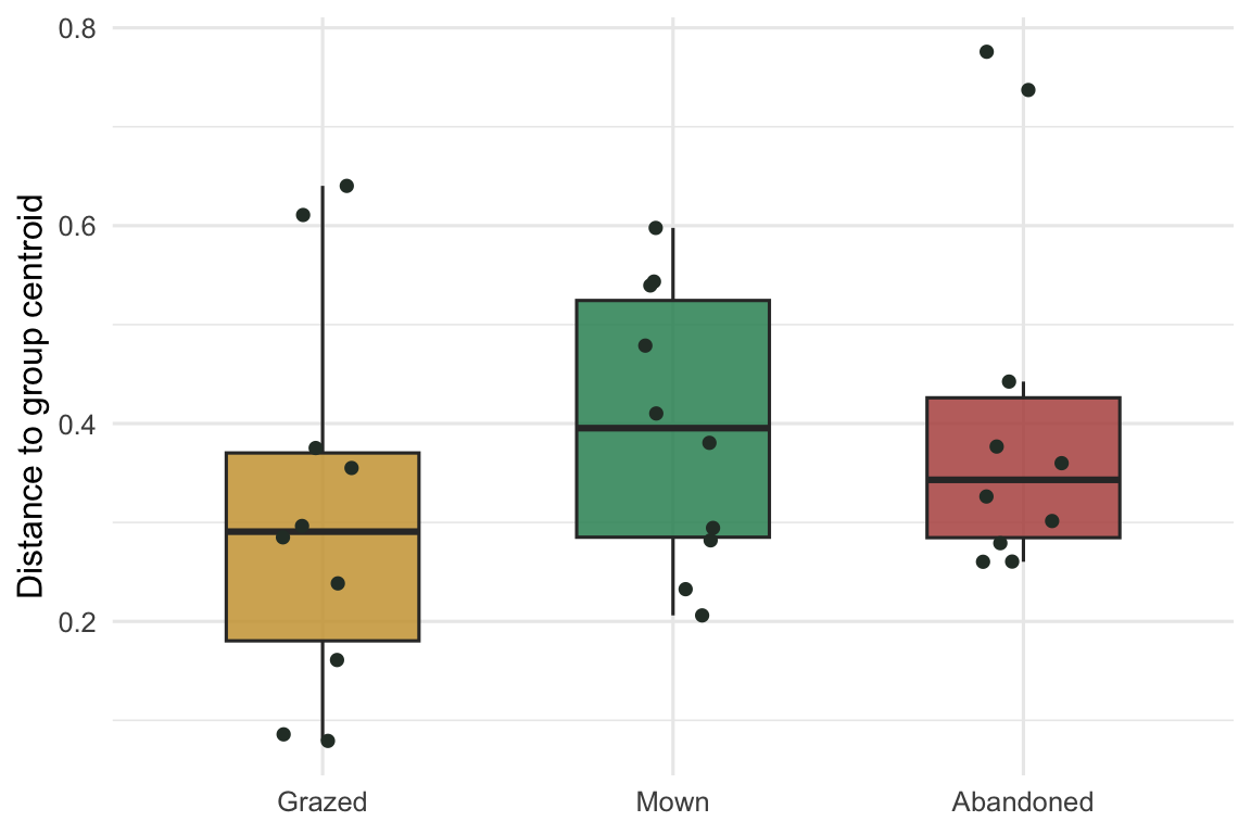
The test comes back non-significant (p around 0.4), and the box plot agrees: the three groups scatter to a similar degree around their centres. That clears the PERMANOVA. The significant management effect is a genuine difference in where the groups sit in composition space, not an artefact of one regime being more variable than another. Had betadisper() been significant, the PERMANOVA p-value would have been unsafe to read as a centroid difference, and you would say so rather than quietly report the F-test. Running the two together, and reporting both, is the honest minimum.
Where to go next
The three functions form a small workflow: envfit() to see which gradients align with the map, adonis2() to test whether groupings explain composition, and betadisper() to make sure that test means what you think. From here, a pairwise PERMANOVA tells you which specific managements differ rather than just that some do; ordisurf() handles variables whose response curves bend; and constrained methods such as distance-based RDA (capscale() and dbrda()) let you model composition directly against predictors instead of fitting them onto an unconstrained map after the fact.