library(vegan)
library(ggplot2)
library(dplyr)
library(tidyr)Ordination with NMDS in R
R
vegan
ordination
community ecology
Turn a site-by-species table into a map of community composition with vegdist and metaMDS, then read the stress and decide how many dimensions you need.
The previous post gave each plot a single diversity number. That answers how much is growing somewhere, but not how two plots resemble each other. Two sites can share an identical Shannon index and have no species in common. To compare what is actually growing where, we need a method that works on composition rather than on totals. Ordination is that method, and non-metric multidimensional scaling (NMDS) is the version most community ecologists reach for first.
This post builds a small dataset whose structure we already know, runs an NMDS with vegan, and then spends most of its time on the parts that decide whether the result is trustworthy: how well the map fits, how many dimensions it needs, and whether the algorithm settled on a stable answer.
What ordination is for
A community dataset is wide. One row per site, one column per species, counts in the cells. Past three species you can no longer plot the sites directly, because every species is its own axis. Ordination compresses those many axes down to two or three that you can look at, while keeping similar sites close together and different sites far apart. The input is not the raw table but a matrix of pairwise dissimilarities between sites, so the first real decision is how to measure dissimilarity.
A dataset with a known answer
Survey data never arrives with a key, so for learning it helps to build a table whose answer you already know. Below are sixteen sites along a moisture gradient, running from a dry ridge to a wet hollow. Nine specialist species each peak at a different point on that gradient, and three generalists turn up across the whole transect at low numbers. The counts are deliberately small, so every cell carries some sampling noise, the way real plots do.
set.seed(1)

n_sites  <- 16
gradient <- seq(0, 10, length.out = n_sites)   # true moisture, dry to wet

# nine specialists, each peaking at a different point on the gradient
specialists <- c("Thymus", "Sedum", "Festuca", "Briza", "Trifolium",
                 "Plantago", "Filipendula", "Juncus", "Carex")
peaks  <- seq(0.5, 9.5, length.out = length(specialists))
lambda <- outer(gradient, peaks, function(g, p) 7 * exp(-((g - p)^2) / (2 * 1.5^2)))
spec_counts <- matrix(rpois(length(lambda), as.vector(lambda)), nrow = n_sites)

# three generalists present across the whole transect at low numbers
generalists <- matrix(rpois(n_sites * 3, lambda = 4), nrow = n_sites)

comm <- as.data.frame(cbind(spec_counts, generalists))
colnames(comm) <- c(specialists, "Taraxacum", "Poa", "Achillea")
rownames(comm) <- sprintf("Site%02d", seq_len(n_sites))

comm[1:6, 1:7]
Thymus Sedum Festuca Briza Trifolium Plantago Filipendula
Site01 5 5 1 0 0 0 0
Site02 6 12 1 1 0 0 0
Site03 6 6 6 1 0 0 0
Site04 7 9 7 5 2 0 0
Site05 1 9 9 5 0 1 0
Site06 3 2 3 5 6 0 0A picture of the whole table makes the structure obvious.
sp_levels <- c(specialists, "Taraxacum", "Poa", "Achillea")
long <- comm %>%
  mutate(Site = rownames(comm)) %>%
  pivot_longer(-Site, names_to = "Species", values_to = "Abundance") %>%
  mutate(Species = factor(Species, levels = sp_levels),
         Site    = factor(Site, levels = rev(rownames(comm))))

ggplot(long, aes(Species, Site, fill = Abundance)) +
  geom_tile(color = "white", linewidth = 0.4) +
  scale_fill_gradient(low = "#f5f4ee", high = "#275139") +
  labs(x = NULL, y = NULL, fill = "Count") +
  theme_minimal(base_size = 11) +
  theme(axis.text.x = element_text(angle = 45, hjust = 1))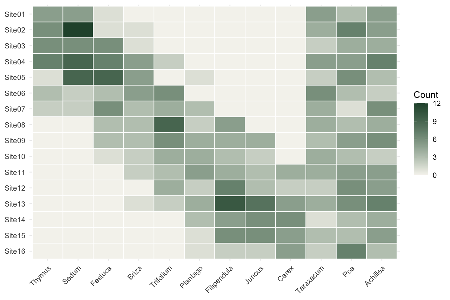
Reading down any specialist column, the species rises and falls as you move along the transect; the generalists stay flat. This staircase of overlapping peaks is the signal NMDS has to recover. It also explains why we do not simply run PCA on the raw counts. Species do not track a gradient in straight lines: they appear, peak, and drop out again. A method that assumes linear relationships distorts that badly. NMDS avoids the problem by working only from the rank order of dissimilarities, so the exact shape of each response curve stops mattering.
Measuring dissimilarity first
vegdist() turns the site-by-species table into pairwise dissimilarities. Bray-Curtis is the usual choice for abundance data. It runs from 0 (identical composition) to 1 (no shared species), and it ignores shared absences, so two sites are not counted as alike merely because the same rare species is missing from both.
bray <- vegdist(comm, method = "bray")
round(as.matrix(bray)[1:5, 1:5], 2)
Site01 Site02 Site03 Site04 Site05
Site01 0.00 0.23 0.25 0.32 0.50
Site02 0.23 0.00 0.26 0.25 0.36
Site03 0.25 0.26 0.00 0.24 0.29
Site04 0.32 0.25 0.24 0.00 0.23
Site05 0.50 0.36 0.29 0.23 0.00Neighbouring sites sit near zero; sites from opposite ends of the transect climb toward one. That ordering is the only thing NMDS will use.
Running the NMDS
metaMDS() does the work. It computes the dissimilarities, drops the sites onto the plane at random, then shifts them around until the map distances line up with the dissimilarity ranks as closely as possible, repeating the whole thing from many random starts so a single unlucky start cannot decide the outcome.
set.seed(1)
ord <- metaMDS(comm, distance = "bray", k = 2, trymax = 100,
               autotransform = FALSE, trace = FALSE)
ord
Call:
metaMDS(comm = comm, distance = "bray", k = 2, trymax = 100,      autotransform = FALSE, trace = FALSE)

global Multidimensional Scaling using monoMDS

Data:     comm
Distance: bray

Dimensions: 2
Stress:     0.08219387
Stress type 1, weak ties
Best solution was repeated 11 times in 20 tries
The best solution was from try 7 (random start)
Scaling: centring, PC rotation, halfchange scaling
Species: expanded scores based on 'comm'
Each argument earns its place. k = 2 asks for a two-dimensional map. trymax = 100 caps how many random starts are allowed. autotransform = FALSE is worth a note: left on its default, metaMDS() will square-root the counts and apply a standardisation before measuring distance, which is sensible for messy field data but would no longer match the Bray-Curtis matrix we just inspected. Turning it off keeps the steps aligned. set.seed() matters because the starting positions are random, so the run only reproduces if the seed is fixed. trace = FALSE simply silences the per-iteration log.
The printed summary reports the stress (here about 0.08) and a line such as Best solution was repeated 11 times in 20 tries, which says how many of the random starts agreed on the same answer. Those two figures drive the next two sections.
Stress: does the map fit?
Stress measures how much the flat map has to distort the original dissimilarity ranks to fit them into two dimensions. Zero would be a perfect rank match; larger values mean the map is forcing relationships that the data do not support. Clarke’s much-quoted rule of thumb runs roughly: under 0.05 is excellent, under 0.1 is good, under 0.2 is usable but needs a second look, and over 0.3 is barely better than random. A stress near 0.08 sits in the good band, so the picture is worth reading.
To see the fit rather than summarise it, stressplot(ord) draws the Shepard diagram: observed dissimilarities against the map distances, with a step line for the fitted monotonic regression. Points hugging that line are what you want.
How many dimensions?
Two dimensions was a choice, not a rule. One way to test it is to refit the same NMDS across a range of dimensions and watch where the stress stops falling sharply.
stress_k <- sapply(1:4, function(k) {
  set.seed(1)
  metaMDS(comm, distance = "bray", k = k, trymax = 100,
          autotransform = FALSE, trace = FALSE)$stress
})
round(stress_k, 3)
[1] 0.177 0.082 0.049 0.027ggplot(data.frame(k = 1:4, stress = stress_k), aes(k, stress)) +
geom_hline(yintercept = 0.1, linetype = "dashed", color = "#b9534e") +
geom_line(color = "#93a87f", linewidth = 0.9) +
geom_point(color = "#275139", size = 3.2) +
scale_x_continuous(breaks = 1:4) +
labs(x = "Dimensions (k)", y = "Stress") +
theme_minimal(base_size = 12)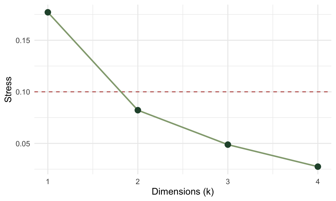
The big improvement from one dimension to two tells us a single axis is too cramped for this data. The small gains after two tell us that further dimensions would mostly be fitting noise. Two is also the number you can actually plot, which is why it is so often where people stop.
Convergence: did it settle?
Because every run starts from random coordinates, one NMDS could land on a poor arrangement by chance. metaMDS() guards against that by repeating the fit and checking whether the best arrangement keeps coming back. A summary line like Best solution was repeated 11 times in 20 tries is the reassurance: when most of the starts reach the same configuration, the result is unlikely to be a quirk of one random seed. If instead you see no convergent solutions, or a best solution found only once, raise trymax and treat the result as provisional until it stabilises.
Reading the map
site_sc <- as.data.frame(scores(ord, display = "sites"))
site_sc$moisture <- gradient
spec_sc <- as.data.frame(scores(ord, display = "species"))
spec_sc$species <- rownames(spec_sc)ggplot(site_sc, aes(NMDS1, NMDS2)) +
geom_hline(yintercept = 0, color = "#dad9ca") +
geom_vline(xintercept = 0, color = "#dad9ca") +
geom_text(data = spec_sc, aes(label = species),
color = "#9a6a2f", fontface = "italic", size = 3.2) +
geom_point(aes(color = moisture), size = 5) +
geom_text(aes(label = sub("Site", "", rownames(site_sc))),
color = "white", size = 2.6, fontface = "bold") +
scale_color_gradient(low = "#c9b458", high = "#1d5b4e", name = "Moisture") +
coord_equal() +
theme_minimal(base_size = 12)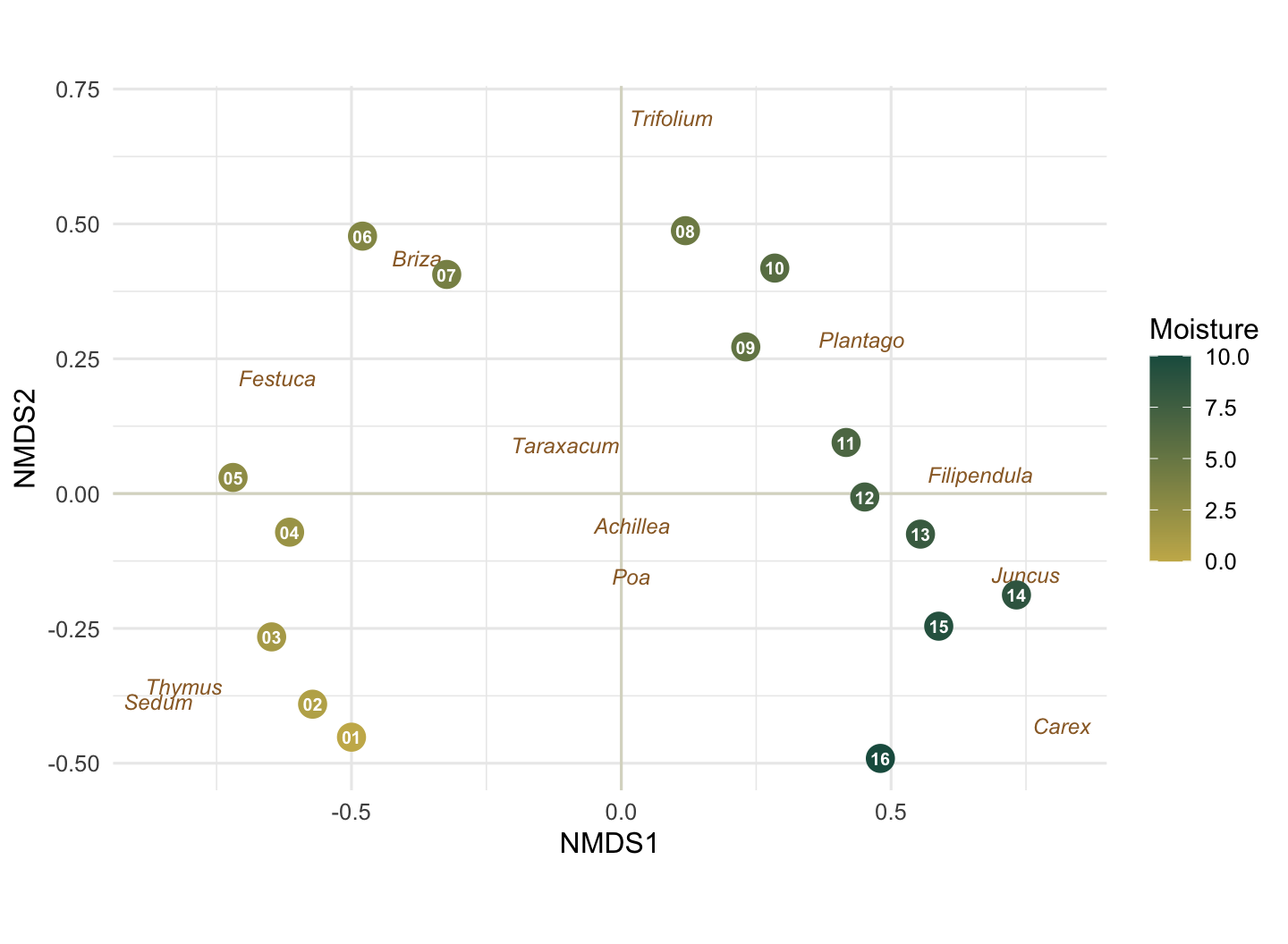
The sites are coloured by their true position on the moisture gradient, the one piece of information NMDS never saw. They line up almost cleanly along the first axis, dry gold on the left, wet green on the right. We can attach a number to that:
abs(cor(site_sc$NMDS1, site_sc$moisture))[1] 0.9305619A correlation around 0.93 between the first axis and the real gradient, recovered from nothing but the species counts. The sign of an NMDS axis is arbitrary, so left versus right carries no meaning beyond the ordering itself. The species labels say the same thing from the other direction: the dry-ground plants (Thymus, Sedum) sit at one end, the sedges and rushes (Carex, Juncus) at the other, and the three generalists fall near the centre, because turning up everywhere is much the same as preferring nowhere.
Where to go next
NMDS hands you the picture; the natural follow-ups put statistics on it. envfit() overlays measured environmental variables as arrows, so you can ask which of them align with the ordination axes. adonis2() runs PERMANOVA, testing whether groups of sites differ in composition more than chance would allow, which is the formal counterpart to seeing clusters by eye. Both work from the same dissimilarity matrix you already built here.