library(sf)
library(dplyr)
library(ggplot2)Mapping species richness in R with sf
R
sf
spatial
GIS
mapping
Turn species occurrence records into a gridded richness map with the sf package, then export a GeoPackage you can open in QGIS.
The posts so far have treated a survey as a table: rows are sites, columns are species. Field data usually carries one more thing, which is where each record sat on the ground. Once coordinates are in play, a different question opens up. Not how many species there are overall, but where the richness is concentrated. This post takes a set of occurrence records, builds a grid, counts species per cell, and draws the map, all in R with the sf package. It ends by writing a GeoPackage, which is the clean handoff to QGIS for anyone who wants to finish the cartography there.
Occurrence records
The data is synthetic so the pattern is known up front. It holds occurrence records for twelve species across a study region, each record a species name and a longitude and latitude. Two gradients are built in. One runs east to west and decides which species occur where, so composition turns over across the region. The other runs south to north and sets how many species a place can support, standing in for something like productivity. The result should be a richness map that rises toward the north and thins at the dry and wet edges of the compositional gradient.
set.seed(7)
lon_range <- c(23.40, 23.72)
lat_range <- c(46.62, 46.90)

n_pts <- 900
pool <- data.frame(lon = runif(n_pts, lon_range[1], lon_range[2]),
                   lat = runif(n_pts, lat_range[1], lat_range[2]))

# east-west gradient drives which species occur; south-north drives how many
pool$env  <- 10 * (pool$lon - lon_range[1]) / diff(lon_range)
pool$prod <- (pool$lat - lat_range[1]) / diff(lat_range)   # 0 south .. 1 north

species <- sprintf("sp%02d", 1:12)
opt <- seq(1, 9, length.out = length(species))   # each species peaks at its own point
w   <- 1.6
occ <- do.call(rbind, lapply(seq_along(species), function(i) {
  prob <- (0.2 + 0.8 * pool$prod) * exp(-((pool$env - opt[i])^2) / (2 * w^2))
  hit  <- runif(n_pts) < prob
  if (!any(hit)) return(NULL)
  data.frame(species = species[i], lon = pool$lon[hit], lat = pool$lat[hit])
}))

nrow(occ)
[1] 2325head(occ) species lon lat
1 sp01 23.43702 46.89398
2 sp01 23.47800 46.68298
3 sp01 23.45307 46.86184
4 sp01 23.43082 46.79905
5 sp01 23.42710 46.88506
6 sp01 23.40279 46.65932From a data frame to spatial points
Right now occ is an ordinary data frame with two columns that happen to hold coordinates. st_as_sf() turns it into a spatial object by naming those columns and stating their coordinate reference system. The records are longitude and latitude in degrees, which is the system EPSG code 4326, also called WGS84.
pts <- st_as_sf(occ, coords = c("lon", "lat"), crs = 4326)
pts
Simple feature collection with 2325 features and 1 field
Geometry type: POINT
Dimension: XY
Bounding box: xmin: 23.40047 ymin: 46.62073 xmax: 23.71754 ymax: 46.89957
Geodetic CRS: WGS 84
First 10 features:
species geometry
1 sp01 POINT (23.43702 46.89398)
2 sp01 POINT (23.478 46.68298)
3 sp01 POINT (23.45307 46.86184)
4 sp01 POINT (23.43082 46.79905)
5 sp01 POINT (23.4271 46.88506)
6 sp01 POINT (23.40279 46.65932)
7 sp01 POINT (23.50131 46.83239)
8 sp01 POINT (23.45943 46.69458)
9 sp01 POINT (23.50225 46.74057)
10 sp01 POINT (23.45209 46.73221)The print now shows a geometry column and a header describing the CRS and the bounding box. Each row is still one occurrence, but the position is a real point that sf can measure and join against.
Projecting before measuring
Degrees are fine for storing where something is, but poor for measuring. A degree of longitude covers a different ground distance at the equator than near the poles, so a grid built in degrees would have cells of unequal area. The fix is to project the points onto a flat system whose units are metres. This region sits in UTM zone 34 north, EPSG code 32634, so a grid built there is honest about distance.
pts_utm <- st_transform(pts, 32634)
st_crs(pts_utm)$epsg
[1] 32634A grid, and species per cell
st_make_grid() lays a regular net over the extent of the points. A two kilometre cell is a reasonable resolution for this region. Wrapping the result with st_sf() and a cell_id makes it a proper layer that can carry attributes.
grid <- st_make_grid(pts_utm, cellsize = 2000, square = TRUE)
grid <- st_sf(cell_id = seq_along(grid), geometry = grid)
nrow(grid)
[1] 208st_join() attaches to every point the cell it falls in (the default test is st_intersects). After that, richness per cell is a plain grouped count of distinct species. Cells that caught no records drop out, so the map shows only the surveyed area.
grid_rich <- st_join(pts_utm, grid) |>
  st_drop_geometry() |>
  group_by(cell_id) |>
  summarise(richness = n_distinct(species), n_records = n(), .groups = "drop") |>
  right_join(grid, by = "cell_id") |>
  st_as_sf() |>
  filter(!is.na(richness))

range(grid_rich$richness)
[1] 1 11The map
geom_sf() reads the geometry directly, so the grid and the points need no x and y aesthetics. Filling the cells by richness and dropping the raw points on top shows both the pattern and the sampling behind it.
ggplot() +
  geom_sf(data = grid_rich, aes(fill = richness), color = "white", linewidth = 0.25) +
  geom_sf(data = pts_utm, size = 0.3, color = "#16241d", alpha = 0.22) +
  scale_fill_gradient(low = "#f5f4ee", high = "#275139", name = "Species\nrichness") +
  labs(x = NULL, y = NULL) +
  theme_minimal(base_size = 12)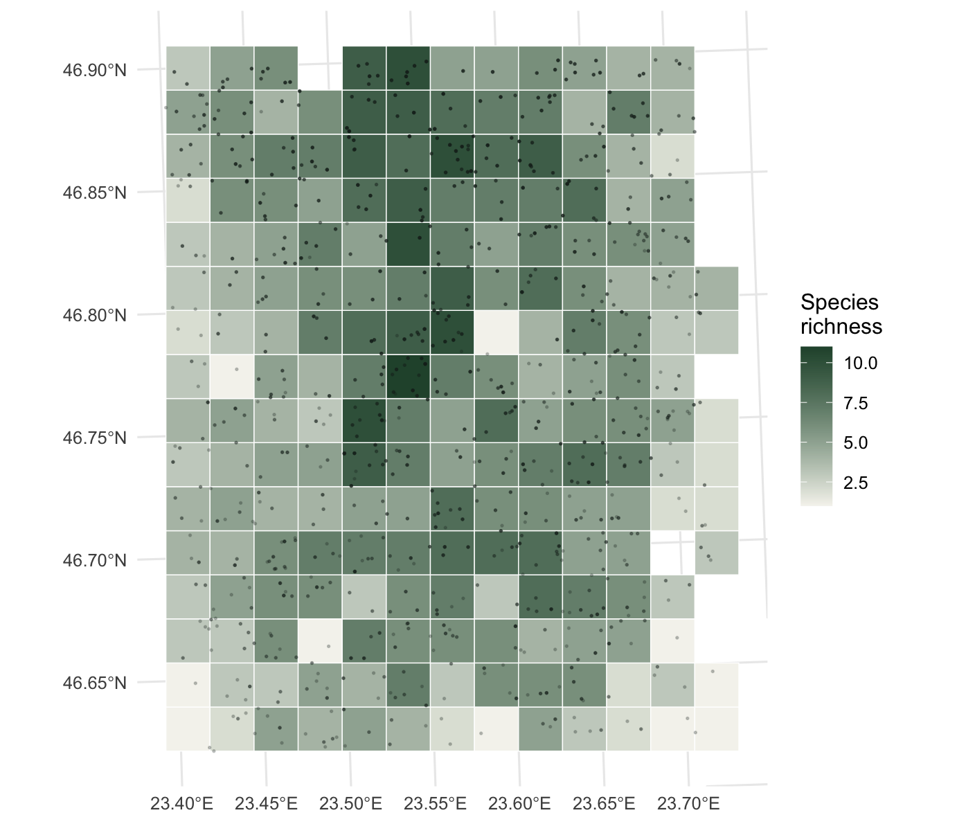
The map reads the way the data was built. The north holds the richest cells, the south is thinner, and within any band the middle of the region carries more species than the far east or west, because the edge species of the compositional gradient drop out there. The graticule still shows degrees even though the data is now in metres, because geom_sf() reprojects the grid lines for display.
Handing off to QGIS
R is good at the analysis; QGIS is often where the final cartography happens. A GeoPackage moves the result across cleanly. It is a single open file that QGIS opens natively, and st_write() produces it. The same call works for the points, so both layers travel together.
st_write(grid_rich, "richness_grid.gpkg", delete_dsn = TRUE)
st_write(pts_utm,   "occurrences.gpkg",   delete_dsn = TRUE)
Open richness_grid.gpkg in QGIS and the cells arrive with the richness field ready to style, project, and lay out as a finished figure.
Where to go next
sf is the backbone for vector work in R: points, lines, and polygons, with joins, buffers, and distance calculations on top. From here, the same grid can be joined to polygons such as protected areas or administrative units to summarise richness within them, st_buffer() and st_distance() answer proximity questions, and the terra package covers the raster side when the environment comes as continuous surfaces rather than points. With the GeoPackage written, the rest of the map can move to QGIS whenever that is the better tool for the layout.