---
title: "Counting species the right way: Poisson and negative binomial GLMs in R"
description: "Why logging abundance counts is the wrong reflex, how to fit a Poisson GLM, how to tell it is too tight, and how a negative binomial and an effort offset fix it."
date: "2026-06-22 10:00"
categories: [Regression, Count data]
image: thumbnail.png
image-alt: "Counts of a species rising with canopy openness, with a negative binomial mean curve and a widening interval band."
---
Abundance data are counts: whole numbers, never negative, usually a pile of low values with a long tail of high ones. The old reflex is to take logs and run a linear regression. That reflex causes more trouble than it removes. Generalized linear models handle counts on their own terms, and the workflow is short: fit a Poisson model, check whether it holds, move to a negative binomial when it does not, and add an offset when sampling effort varies. This post does all four with `glm` and `MASS`.
## The data
One species, counted in 160 plots along a canopy-openness gradient. The expected count rises with openness, and the counts are overdispersed: the spread is wider than a Poisson process would produce. That is the ordinary state of field count data, not a special case.
```{r}
#| label: data
#| message: false
#| warning: false
library(MASS)
library(ggplot2)

set.seed(48)

n <- 160
canopy <- runif(n, 0, 1)             # canopy openness, 0 closed .. 1 open
mu <- exp(0.4 + 2.6 * canopy)        # true expected count
count <- rnbinom(n, mu = mu, size = 1.6)   # overdispersed counts

dat <- data.frame(count = count, canopy = canopy)
c(mean = mean(count), variance = var(count), zeros = sum(count == 0))
```
About a tenth of the plots are zeros, and a few carry counts above 40. Any model has to cope with both.
## Why not log-transform
The shortcut is `log(count + 1)` followed by `lm`. It runs, but it carries two problems that do not go away. The `+ 1` is arbitrary: add a different constant and the slope changes, with no principled way to pick one. And a linear model assumes constant variance around the line, which counts do not have, because their variance climbs with their mean. On top of that, predictions come back on the log scale and need a back-transform that is biased for the mean (O'Hara & Kotze 2010).
```{r}
#| label: lm-log
lm_log <- lm(log(count + 1) ~ canopy, data = dat)
round(coef(summary(lm_log)), 3)
```
The slope here is on the `log(count + 1)` scale, so it does not even mean the same thing as a count model's slope. Better to model the counts directly.
## The Poisson GLM
A Poisson GLM with a log link is the natural first model for counts. The log link keeps predictions positive, and the linear predictor sits on the log scale.
```{r}
#| label: poisson
pois <- glm(count ~ canopy, family = poisson, data = dat)
round(coef(summary(pois)), 3)
```
The canopy slope is about 3.0 and looks extremely precise, with a tiny standard error. That precision is the catch. A Poisson model assumes the variance equals the mean, and if the real spread is wider, the model still reports the narrow Poisson standard errors. Always check.
```{r}
#| label: dispersion
# Pearson dispersion statistic: near 1 is fine, well above 1 is overdispersion
disp <- sum(residuals(pois, type = "pearson")^2) / pois$df.residual
c(resid_dev_over_df = pois$deviance / pois$df.residual,
  pearson_dispersion = disp)
```
The dispersion statistic comes out around 5, far above 1, so the data are overdispersed and the Poisson standard errors are too small. One caution: the raw variance-to-mean ratio of the counts is even larger, but that number is misleading, because it ignores the canopy gradient. The dispersion statistic above conditions on the fitted mean, which is the comparison that matters.
## The negative binomial GLM
The negative binomial adds one parameter, theta, that lets the variance exceed the mean. `MASS::glm.nb` estimates it.
```{r}
#| label: negbin
#| warning: false
#| message: false
nb <- glm.nb(count ~ canopy, data = dat)
round(coef(summary(nb)), 3)
c(theta = nb$theta, theta_se = nb$SE.theta)
```
```{r}
#| label: compare
#| warning: false
#| message: false
# slopes are nearly identical; standard errors are not
data.frame(
  model = c("Poisson", "Negative binomial"),
  slope = round(c(coef(pois)["canopy"], coef(nb)["canopy"]), 3),
  slope_se = round(c(coef(summary(pois))["canopy", "Std. Error"],
                     coef(summary(nb))["canopy", "Std. Error"]), 3),
  AIC = round(c(AIC(pois), AIC(nb)), 1)
)
```
This is the whole point in one table. The slope barely moves, from about 3.0 to about 2.9, but the standard error roughly doubles, and the AIC drops by hundreds. The Poisson model was not wrong about the trend; it was wrong about how sure to be, and it would have handed you a confidence interval less than half as wide as the data justify.
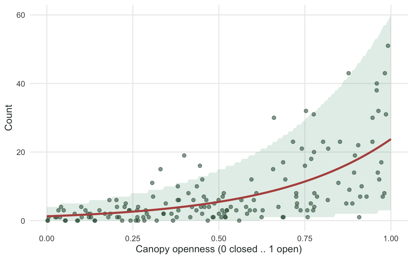
The fitted mean and the spread it expects both track the data.
```{r}
#| label: fig-fit
#| warning: false
#| message: false
#| fig-cap: "Counts against canopy openness. The red line is the negative binomial mean, and the band is the central 90% of counts the model expects at each openness, which widens as the mean grows."
#| fig-alt: "Scatter of counts rising with canopy openness, a red exponential mean curve, and a shaded band that widens toward the right."
#| fig-width: 7
#| fig-height: 4.4
newx <- data.frame(canopy = seq(0, 1, length.out = 200))
newx$fit <- exp(predict(nb, newx, type = "link"))
newx$lwr <- qnbinom(0.05, mu = newx$fit, size = nb$theta)
newx$upr <- qnbinom(0.95, mu = newx$fit, size = nb$theta)

ggplot(dat, aes(canopy, count)) +
  geom_ribbon(data = newx, aes(x = canopy, ymin = lwr, ymax = upr),
              inherit.aes = FALSE, fill = "#2f8f63", alpha = 0.15) +
  geom_point(alpha = 0.55, colour = "#275139", size = 1.8) +
  geom_line(data = newx, aes(canopy, fit), inherit.aes = FALSE,
            colour = "#b5534e", linewidth = 1.2) +
  labs(x = "Canopy openness (0 closed .. 1 open)", y = "Count") +
  theme_minimal(base_size = 12) +
  theme(panel.grid.minor = element_blank(),
        text = element_text(colour = "#2c3a31"))
```
## Reading the coefficients
GLM coefficients live on the link scale, here the log scale, so exponentiate them to talk about counts. `exp(intercept)` is the expected count at the reference (closed canopy), and `exp(slope)` is the multiplicative change per unit of the predictor.
```{r}
#| label: interpret
#| warning: false
#| message: false
round(exp(coef(nb)), 2)
```
Canopy openness runs from 0 to 1, so one unit is the full step from closed to open. The expected count is therefore about 19 times higher in fully open canopy than in fully closed canopy. Multiplicative, not additive: that is what the log link buys you.
## Quasi-Poisson or negative binomial
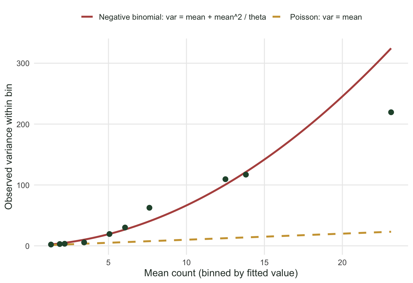
Both handle overdispersion with the same parameter count, and they often agree, but they assume different shapes for how variance grows with the mean. A quasi-Poisson model takes the variance as a constant multiple of the mean, so variance is linear in the mean. A negative binomial takes variance as mean plus mean squared over theta, which curves upward (Ver Hoef & Boveng 2007). The way to choose is to look at the mean-variance relationship in the data.
```{r}
#| label: fig-meanvar
#| fig-cap: "Within-bin variance against bin mean, after grouping plots by their fitted Poisson value. The observed spread (green) climbs faster than the Poisson line (variance equals mean) and follows the negative binomial curve, so the negative binomial is the better description here."
#| fig-alt: "Scatter of observed within-bin variance against mean, rising steeply along a red negative binomial curve and far above a gold dashed Poisson line."
#| fig-width: 7
#| fig-height: 4.8
fitted_mu <- fitted(pois)
bins <- cut(fitted_mu, breaks = quantile(fitted_mu, probs = seq(0, 1, 0.1)),
            include.lowest = TRUE)
agg <- aggregate(count ~ bins,
                 data = data.frame(count = count, bins = bins),
                 FUN = function(z) c(m = mean(z), v = var(z)))
mv <- data.frame(mean = agg$count[, "m"], var = agg$count[, "v"])
mv <- mv[is.finite(mv$var), ]

grid_m <- seq(min(mv$mean), max(mv$mean), length.out = 100)
ref <- rbind(
  data.frame(mean = grid_m, var = grid_m, model = "Poisson: var = mean"),
  data.frame(mean = grid_m, var = grid_m + grid_m^2 / nb$theta,
             model = "Negative binomial: var = mean + mean^2 / theta")
)

ggplot() +
  geom_line(data = ref, aes(mean, var, colour = model, linetype = model),
            linewidth = 1.1) +
  geom_point(data = mv, aes(mean, var), colour = "#275139", size = 2.6) +
  scale_colour_manual(
    values = c("Poisson: var = mean" = "#cda23f",
               "Negative binomial: var = mean + mean^2 / theta" = "#b5534e"),
    name = NULL) +
  scale_linetype_manual(
    values = c("Poisson: var = mean" = "dashed",
               "Negative binomial: var = mean + mean^2 / theta" = "solid"),
    name = NULL) +
  labs(x = "Mean count (binned by fitted value)",
       y = "Observed variance within bin") +
  theme_minimal(base_size = 12) +
  theme(panel.grid.minor = element_blank(),
        legend.position = "top",
        text = element_text(colour = "#2c3a31"))
```
## Offsets for uneven sampling effort
Counts depend on how hard you looked. If plots were searched for different lengths of time, the count scales with effort, and effort belongs in the model as an offset: a term whose coefficient is fixed at 1, placed on the log scale. That turns the model into a description of a rate per unit effort rather than a raw count.
Effort matters most when it correlates with a predictor. Suppose open plots were quicker to walk and so were searched longer, putting effort and canopy in step.
```{r}
#| label: offset
#| warning: false
#| message: false
set.seed(77)
effort <- round(pmax(0.4, 0.6 + 1.0 * canopy + rnorm(n, 0, 0.25)), 2)
count_eff <- rnbinom(n, mu = mu * effort, size = 1.6)
dat2 <- data.frame(count = count_eff, canopy = canopy, effort = effort)

nb_noeff <- glm.nb(count ~ canopy, data = dat2)
nb_off   <- glm.nb(count ~ canopy + offset(log(effort)), data = dat2)

data.frame(
  model = c("effort ignored", "effort as offset"),
  canopy_slope = round(c(coef(nb_noeff)["canopy"], coef(nb_off)["canopy"]), 3),
  slope_se = round(c(coef(summary(nb_noeff))["canopy", "Std. Error"],
                     coef(summary(nb_off))["canopy", "Std. Error"]), 3)
)
```
Effort correlates with canopy at about 0.78 here. Ignoring it pushes the canopy slope up to about 3.6, because part of the extra counts in open plots came from longer searches, and the model with no effort term credits all of it to canopy. The offset puts effort back where it belongs and the slope returns to about 2.5, close to the value the counts were built from. An offset is not the same as adding effort as a free predictor: the offset enforces the exact proportional scaling that counts follow, which a free coefficient would not.
## References
Nelder, J. A., & Wedderburn, R. W. M. (1972). Generalized linear models. *Journal of the Royal Statistical Society, Series A*, 135(3), 370-384. https://doi.org/10.2307/2344614
O'Hara, R. B., & Kotze, D. J. (2010). Do not log-transform count data. *Methods in Ecology and Evolution*, 1(2), 118-122. https://doi.org/10.1111/j.2041-210X.2010.00021.x
Ver Hoef, J. M., & Boveng, P. L. (2007). Quasi-Poisson vs. negative binomial regression: how should we model overdispersed count data? *Ecology*, 88(11), 2766-2772. https://doi.org/10.1890/07-0043.1