library(betapart)
library(dplyr)
library(tidyr)
library(ggplot2)

set.seed(101)

S     <- 30   # regional species pool
n_per <- 8    # sites per region

## Region 1, "Ridge": an environmental gradient.
## Each species has a niche optimum; each site sees a sliding window of
## species, so identity shifts across the gradient while richness stays flat.
ridge_pos  <- seq(0.10, 0.90, length.out = n_per)  # site positions
sp_optimum <- seq(0.00, 1.00, length.out = S)      # species optima
bw <- 0.12                                          # niche half-width

ridge_pa <- matrix(0L, nrow = n_per, ncol = S)
for (i in seq_len(n_per)) {
  d <- abs(sp_optimum - ridge_pos[i])
  p <- ifelse(d < bw, 0.92, ifelse(d < 1.8 * bw, 0.12, 0))
  ridge_pa[i, ] <- rbinom(S, 1, p)
}
rownames(ridge_pa) <- paste0("R", 1:n_per)

## Region 2, "Slope": a richness gradient.
## Site k holds the commonest rich_k species, so poor sites are subsets of
## rich ones. A little noise keeps it from being perfectly nested.
rich_k   <- round(seq(19, 5, length.out = n_per))   # decreasing richness
slope_pa <- matrix(0L, nrow = n_per, ncol = S)
for (i in seq_len(n_per)) {
  core <- seq_len(rich_k[i])
  slope_pa[i, core] <- 1L
  if (rich_k[i] > 2 && runif(1) < 0.5) slope_pa[i, sample(core, 1)] <- 0L
  out <- setdiff(seq_len(S), core)
  if (length(out) > 0 && runif(1) < 0.5) slope_pa[i, sample(out, 1)] <- 1L
}
rownames(slope_pa) <- paste0("S", 1:n_per)Partitioning beta diversity in R: turnover vs nestedness with betapart
community ecology
beta diversity
R
A single dissimilarity number hides two very different processes: species replacement and species loss. Here is how to separate them in R with the betapart package and the Baselga framework.
Beta diversity gets reported as one number: a Sorensen or Jaccard dissimilarity, an NMDS spread, a PERMANOVA effect. That number answers “how different are these communities?” but not “different in what way?”. Two regions can carry the same total dissimilarity for opposite reasons. In one, species replace each other from site to site. In the other, the poor sites are just stripped-down versions of the rich ones. Those are different ecological stories, and they call for different conservation answers, yet a raw dissimilarity collapses them into the same value.
The fix is to split total beta diversity into two additive parts. This post does that in R with betapart, following the framework from Baselga (2010, 2012).
Two ways to be different
Say site A holds species 1 to 5 and site B holds species 1 to 10. They share five species; B has five extra. The dissimilarity here comes from B being richer, not from the two sites supporting different biotas. Site A is nested inside site B. This is nestedness: dissimilarity driven by ordered species loss or gain.
Now say site A holds species 1 to 5 and site B holds species 6 to 10. Same richness, zero overlap. Every species in A has been swapped for a different species in B. This is turnover (also called species replacement): dissimilarity driven by substitution, not by differences in richness.
Most real dissimilarity is a blend of the two. The point of partitioning is to measure how much of each.
The Baselga partition
For a pair of sites, write a for the number of shared species, b and c for the species unique to each site. Total Sorensen dissimilarity, its turnover component (Simpson dissimilarity), and the nestedness-resultant component are:
\[ \beta_{sor} = \frac{b+c}{2a+b+c}, \qquad \beta_{sim} = \frac{\min(b,c)}{a+\min(b,c)}, \qquad \beta_{sne} = \beta_{sor} - \beta_{sim} \]
Two things make this useful. First, the parts sum back to the whole exactly: \(\beta_{sor} = \beta_{sim} + \beta_{sne}\), every time, by construction. Second, \(\beta_{sim}\) ignores richness differences (it uses the smaller of the two unique-species counts), so it isolates replacement. Whatever dissimilarity is left over after replacement is the nestedness-resultant part.
betapart also offers the Jaccard family (beta.jtu for turnover, beta.jne for nestedness, beta.jac for the total) if you prefer Jaccard over Sorensen. The logic is identical; only the index changes.
A worked example: two synthetic regions
To see the partition do its job, here are two regions built from one 30-species pool, constructed so each isolates one process. The data is synthetic and illustrative, not field data.
The richness profiles confirm the design. Ridge sites all carry a similar number of species; Slope sites step down from rich to poor.
rowSums(ridge_pa) # Ridge: flat richnessR1 R2 R3 R4 R5 R6 R7 R8
7 7 8 8 7 6 8 7 rowSums(slope_pa) # Slope: declining richnessS1 S2 S3 S4 S5 S6 S7 S8
19 16 15 14 11 9 8 5 Plotting the two presence-absence matrices makes the structure visible before any index is computed. Ridge shows a diagonal band that slides across species as you move down the sites (replacement). Slope shows a left-packed staircase, each row a subset of the one above (nestedness).
to_long <- function(m, region) {
  df <- as.data.frame(m); df$site <- rownames(m)
  df <- pivot_longer(df, -site, names_to = "sp", values_to = "pres")
  df$sp <- as.integer(gsub("V", "", df$sp)); df$region <- region
  df
}
inc <- bind_rows(to_long(ridge_pa, "Ridge: gradient turnover"),
                 to_long(slope_pa, "Slope: nestedness"))
inc$site <- factor(inc$site, levels = c(paste0("S", 8:1), paste0("R", 8:1)))

ggplot(inc, aes(sp, site, fill = factor(pres))) +
  geom_tile(color = "white", linewidth = 0.4) +
  facet_wrap(~region, scales = "free_y") +
  scale_fill_manual(values = c("0" = "#ece9df", "1" = "#275139"),
                    labels = c("absent", "present"), name = NULL) +
  scale_x_continuous(breaks = c(1, 10, 20, 30), expand = c(0, 0)) +
  labs(x = "species (ordered by niche / commonness)", y = NULL) +
  theme_minimal(base_size = 12) +
  theme(panel.grid = element_blank(), legend.position = "top")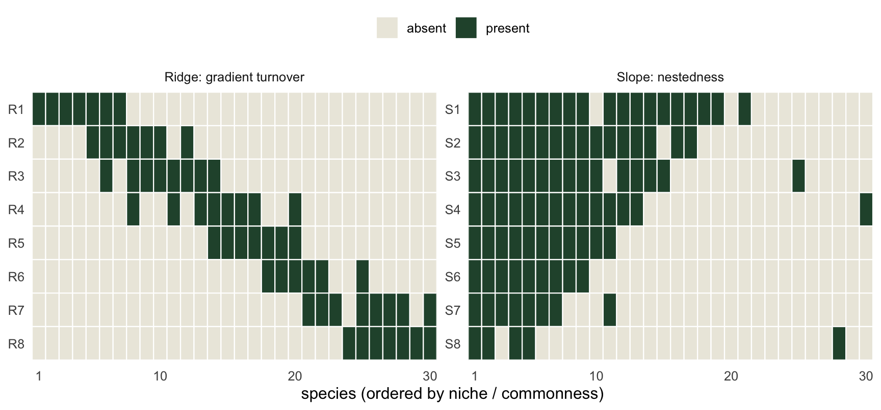
Multi-site partitioning
beta.multi() gives one set of values for a whole region: how much turnover and how much nestedness across all sites at once. Run it on each region.
ridge_multi <- beta.multi(ridge_pa, index.family = "sorensen")
slope_multi <- beta.multi(slope_pa, index.family = "sorensen")

ridge_multi
$beta.SIM
[1] 0.8502674
$beta.SNE
[1] 0.008318479
$beta.SOR
[1] 0.8585859slope_multi$beta.SIM
[1] 0.2210526
$beta.SNE
[1] 0.3548786
$beta.SOR
[1] 0.5759312The contrast is the whole point. Ridge total Sorensen lands near 0.86, and almost all of it (about 99 percent) is turnover: the gradient genuinely swaps species from one end to the other. Slope total Sorensen is lower, near 0.58, but most of that (about 62 percent) is nestedness: the dissimilarity is largely the poor sites being impoverished subsets, not different communities.
multi_df <- tibble(
  region    = rep(c("Ridge", "Slope"), each = 2),
  component = rep(c("turnover (SIM)", "nestedness (SNE)"), 2),
  value     = c(ridge_multi$beta.SIM, ridge_multi$beta.SNE,
                slope_multi$beta.SIM, slope_multi$beta.SNE))
multi_df$component <- factor(multi_df$component,
                             levels = c("nestedness (SNE)", "turnover (SIM)"))
tot <- multi_df %>% group_by(region) %>% summarise(sor = sum(value), .groups = "drop")

ggplot(multi_df, aes(region, value, fill = component)) +
  geom_col(width = 0.6, color = "white", linewidth = 0.5) +
  geom_text(data = tot, aes(region, sor, label = sprintf("SOR = %.2f", sor)),
            inherit.aes = FALSE, vjust = -0.5, size = 3.6, color = "#16241d") +
  scale_fill_manual(values = c("turnover (SIM)"   = "#275139",
                               "nestedness (SNE)" = "#c98a2e"), name = NULL) +
  scale_y_continuous(limits = c(0, 1), expand = expansion(mult = c(0, 0.12))) +
  labs(x = NULL, y = "beta diversity (Sorensen family)") +
  theme_minimal(base_size = 12) + theme(legend.position = "top")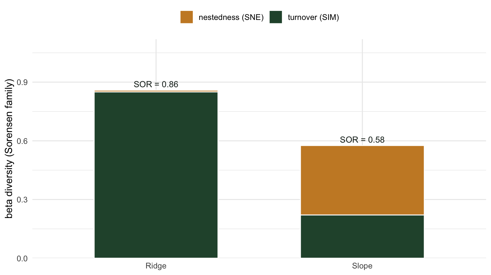
Notice the totals are not equal, and they cannot easily be made equal. Turnover can push total dissimilarity all the way toward 1, because two sites can share nothing. Nestedness has a lower ceiling under Sorensen, because a nested pair always shares the smaller site’s whole list. So a high turnover region will tend to read as more dissimilar overall than a strongly nested one, even though both are “very beta-diverse” in everyday language. The partition is what tells you not to compare the raw totals at face value.
Pairwise partitioning
beta.pair() returns distance matrices instead of single numbers: one value of turnover and one of nestedness for every pair of sites. This is what you feed into ordination, clustering, or a Mantel test when you want to map a single component rather than total dissimilarity.
ridge_pair <- beta.pair(ridge_pa, index.family = "sorensen")
slope_pair <- beta.pair(slope_pa, index.family = "sorensen")

# each element is a dist object; here are the means per component
sapply(ridge_pair, mean)
beta.sim beta.sne beta.sor
0.82738095 0.01135531 0.83873626 sapply(slope_pair, mean) beta.sim beta.sne beta.sor
0.08993313 0.22109273 0.31102586 The pairwise means echo the multi-site result. In Ridge, pairwise turnover is high and nestedness near zero; in Slope, turnover is low and nestedness carries the dissimilarity. The boxplots show the full spread over all site pairs.
pair_df <- bind_rows(
  tibble(region = "Ridge", component = "turnover",   value = as.vector(ridge_pair$beta.sim)),
  tibble(region = "Ridge", component = "nestedness", value = as.vector(ridge_pair$beta.sne)),
  tibble(region = "Slope", component = "turnover",   value = as.vector(slope_pair$beta.sim)),
  tibble(region = "Slope", component = "nestedness", value = as.vector(slope_pair$beta.sne)))
pair_df$component <- factor(pair_df$component, levels = c("turnover", "nestedness"))

ggplot(pair_df, aes(component, value, fill = component)) +
  geom_boxplot(width = 0.55, outlier.size = 0.6, color = "#16241d", alpha = 0.9) +
  facet_wrap(~region) +
  scale_fill_manual(values = c("turnover" = "#275139", "nestedness" = "#c98a2e"),
                    guide = "none") +
  scale_y_continuous(limits = c(0, 1)) +
  labs(x = NULL, y = "pairwise beta (Sorensen family)") +
  theme_minimal(base_size = 12)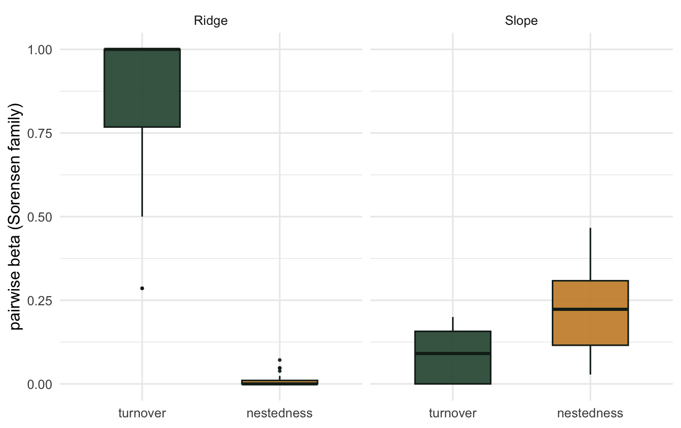
Why the distinction matters
The split is not bookkeeping; it changes what you would do on the ground. A turnover-dominated landscape means species are genuinely partitioned across sites, so no single reserve captures the regional pool. You protect it through complementarity: a network of sites, each adding species the others lack. A nestedness-dominated landscape means the species-poor sites mostly repeat what the rich sites already hold, so protecting the richest sites captures most of the diversity, and the poor sites add little that is new. Reading total dissimilarity alone, you might build the wrong reserve network for either case. Socolar et al. (2016) work through these conservation consequences in detail.
The same logic applies to detecting change. If a disturbance is causing nestedness to climb over time, that is a signal of biotic homogenization through ordered species loss, which a stable total Sorensen would hide while the components shift underneath it.
Caveats and alternatives
A few things to keep in mind before you reach for this on real data.
The functions above use presence-absence. If abundances matter, beta.pair.abund() and beta.multi.abund() give the Bray-Curtis analogue, splitting dissimilarity into balanced variation in abundance and abundance gradients (Baselga 2013). Same idea, different currency.
The beta.sne term is the nestedness-resultant component, meaning the dissimilarity that remains after turnover is removed. It is not a direct index of nestedness like NODF; it is the share of beta diversity attributable to nested patterns. Keep the wording precise when you report it.
There is a long methodological debate about how to partition beta diversity. Podani and Schmera (2011) and Carvalho et al. (2012) propose alternative decompositions (replacement and richness-difference) that behave differently from the Baselga turnover and nestedness components. They are not interchangeable, and which one fits depends on the question. If you publish a partition, say which framework you used and why.
Finally, both components are sensitive to sampling. Undersampled sites look artificially species-poor, which inflates apparent nestedness. The richness checks and the accumulation-curve thinking from earlier posts apply here too: make sure the richness differences driving your nestedness are real before you interpret them.
References
Baselga, A. (2010). Partitioning the turnover and nestedness components of beta diversity. Global Ecology and Biogeography, 19, 134-143.
Baselga, A. (2012). The relationship between species replacement, dissimilarity derived from nestedness, and nestedness. Global Ecology and Biogeography, 21, 1223-1232.
Baselga, A. (2013). Separating the two components of abundance-based dissimilarity. Methods in Ecology and Evolution, 4, 552-557.
Podani, J., and Schmera, D. (2011). A new conceptual and methodological framework for exploring and explaining pattern in presence-absence data. Oikos, 120, 1625-1638.
Socolar, J.B., Gilroy, J.J., Kunin, W.E., and Edwards, D.P. (2016). How should beta-diversity inform biodiversity conservation? Trends in Ecology and Evolution, 31, 67-80.